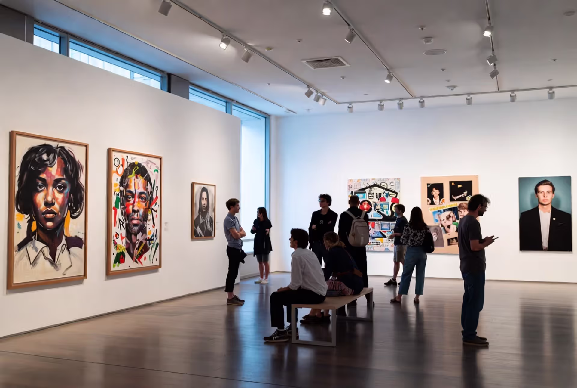
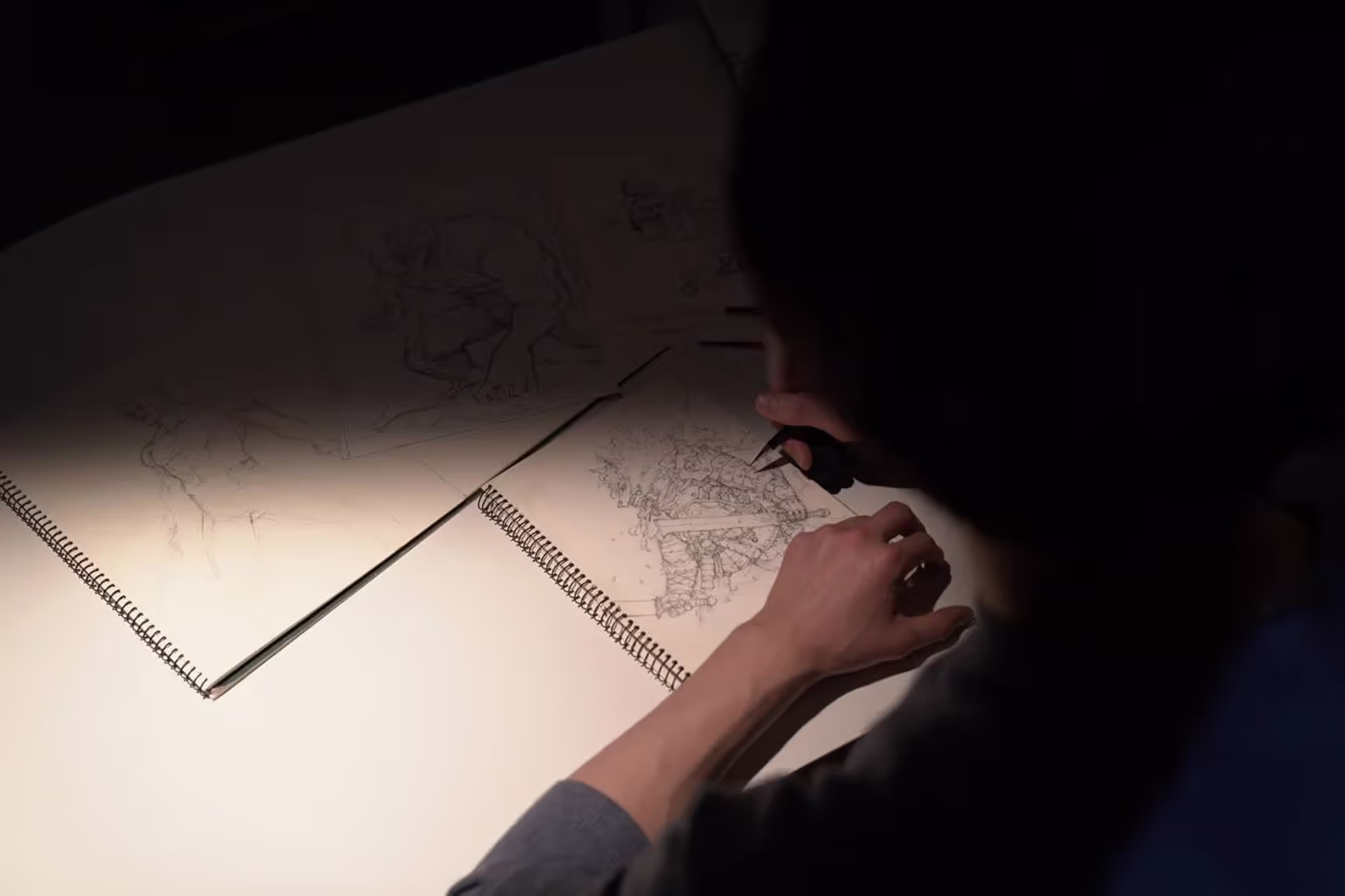
Writing about your own artwork feels awkward at first. You're standing in front of a blank page, trying to translate visual ideas into sentences that don't sound pretentious or hollow. Every art student faces this challenge, whether applying to programs, submitting portfolio reviews, or preparing for exhibitions. The good news: artist statements follow recognizable patterns, and seeing real examples makes the process much clearer.
An artist statement explains why you make art, how you make it, and what you want viewers to understand about your work. For students, this document typically runs 150–300 words and serves specific purposes: college applications, scholarship portfolios, class critiques, or exhibition labels.
Student statements differ from professional ones in several ways. You're not expected to have decades of exhibitions or a fully formed artistic philosophy. Admissions committees and instructors want to see self-awareness, curiosity, and genuine engagement with materials and ideas—not a polished manifesto.
Strong student statements share three components: clear artistic intent (what drives your work), process description (your methods and materials), and thematic connection (how ideas link across pieces). They avoid two common traps: over-explaining every symbol and hiding behind vague abstractions.
The difference between student and professional contexts matters. A professional artist might write, "My practice interrogates...