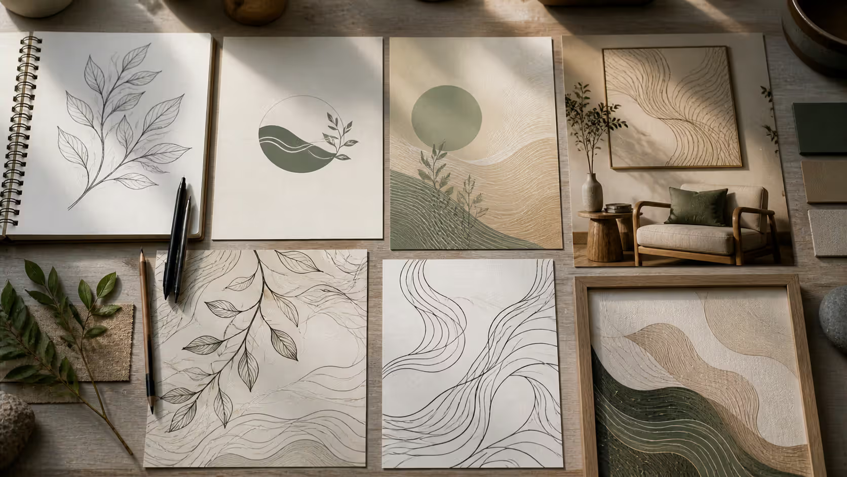
Think about the last time you traced a river on a map or noticed how tree branches spread against the sky. Those irregular, flowing paths? That's what organic lines look like in art and design. They're everywhere in nature—and when you bring them into your creative work, something interesting happens. Your compositions suddenly feel less rigid, more alive.
Here's what makes these lines so compelling: they don't follow rules the way geometric shapes do. A perfectly drawn circle has mathematical precision. But an organic line? It curves where it wants to curve. It thickens and thins based on movement, not measurement. When you look at work that uses these natural, irregular forms, your eye doesn't just scan the information—it takes a journey.
I've watched design students struggle with this concept initially, then have breakthrough moments when they realize organic lines aren't about being "messy" or "random." They're about capturing the visual rhythm you see in everything from Art Nouveau architecture to the interfaces on your phone. Once you understand how to spot and create these lines, you'll start seeing opportunities to use them in every project you touch.
How Organic Lines Differ from Geometric Lines
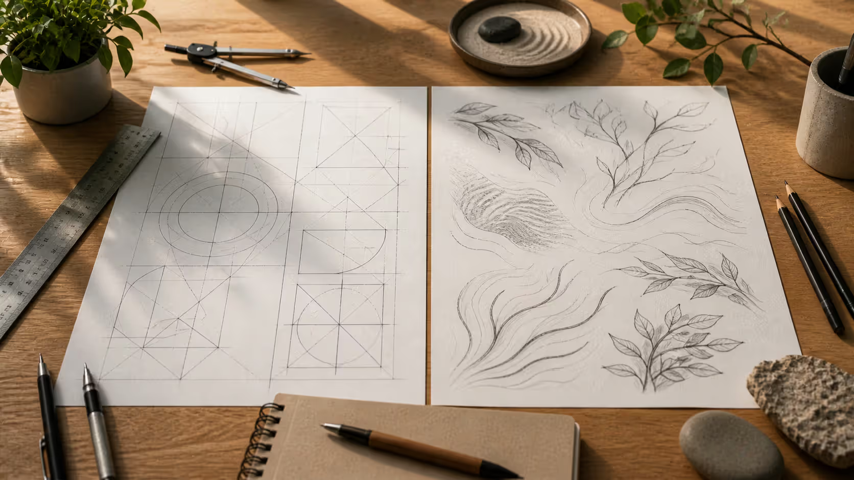
Pull out a compass and draw a circle. Now grab a stick and trace a circle in sand. See the difference? That's the split between geometric and organic lines in a nutshell.
Geometric lines need tools to exist—rulers, French curves, digital grids. They're reproducible. Draw a 45-degree angle once, you can draw it exactly the same way a thousand times. These lines communicate "we built this with intention and control." There's a reason architectural blueprints don't feature hand-drawn squiggles.
Organic lines, though? They come from your hand moving freely across paper or your stylus gliding across a tablet without guides. When you sketch someone's profile or draw the outline of a monstera leaf, you're creating fluid line design that can't be perfectly replicated. Even you can't draw it exactly the same way twice—and that's the point.
This distinction matters more than you might think. A tech company's logo built from perfect circles and 90-degree angles tells you "we're precise, reliable, engineered." Add some flowing line composition elements—maybe soften those corners, introduce an asymmetric curve—and suddenly the same company feels more human, more approachable.
Aspect
Organic Lines
Geometric Lines
Characteristics
They curve unpredictably, change thickness as they go, resist perfect duplication
Measured angles, consistent proportions, every replica looks identical
Visual Effect
Your eye slows down and follows the path; creates warmth and suggests movement
Eye quickly grasps the structure; establishes hierarchy and professional clarity
Common Uses
Character illustrations, botanical drawings, wellness brand identity, abstract paintings
Blueprint drafting, UI wireframes, corporate logos that need to scale perfectly, data visualization
Best Applications
When you want emotional connection or need to reference nature and living systems
Projects requiring exact measurements, technical precision, or formal business presence
Tools/Techniques
Freehand sketching, brush pens that respond to pressure, observation drawing from real objects
Straightedges, compass tools, vector programs with snap-to-grid enabled, CAD software
Most work that really clicks combines both approaches. Look at a well-designed website—it'll probably use a geometric grid system to organize content, but the logo might incorporate organic elements. Architectural renderings show buildings in precise geometric detail, then add trees and landscaping with natural curves.
The trick is knowing when each line type does its job best. Want people to extract information quickly? Geometric wins. Need them to pause and feel something? That's where fluid line design comes in.
Author: Adrian Lowell;
Source: crafterholic.com
Common Types and Characteristics
You'll run into certain organic line patterns again and again once you start looking for them. Here's what shows up most frequently.
Flowing curves are your bread-and-butter organic lines. They shift direction gradually, the way a ribbon moves when you wave it through air. Good calligraphers master these—their letterforms swell and taper without any harsh corners. Product designers use them too. Pick up any ergonomic tool and you're holding flowing curves designed to fit your grip.
Irregular patterns go the opposite direction. Think about cracked pottery or the texture of tree bark. These lines zig when you expect them to zag. They're unpredictable, which makes them perfect for adding grit or suggesting rough natural materials. I've seen illustrators use irregular line patterns to show weathered wood or rocky cliff faces—the randomness sells the realism.
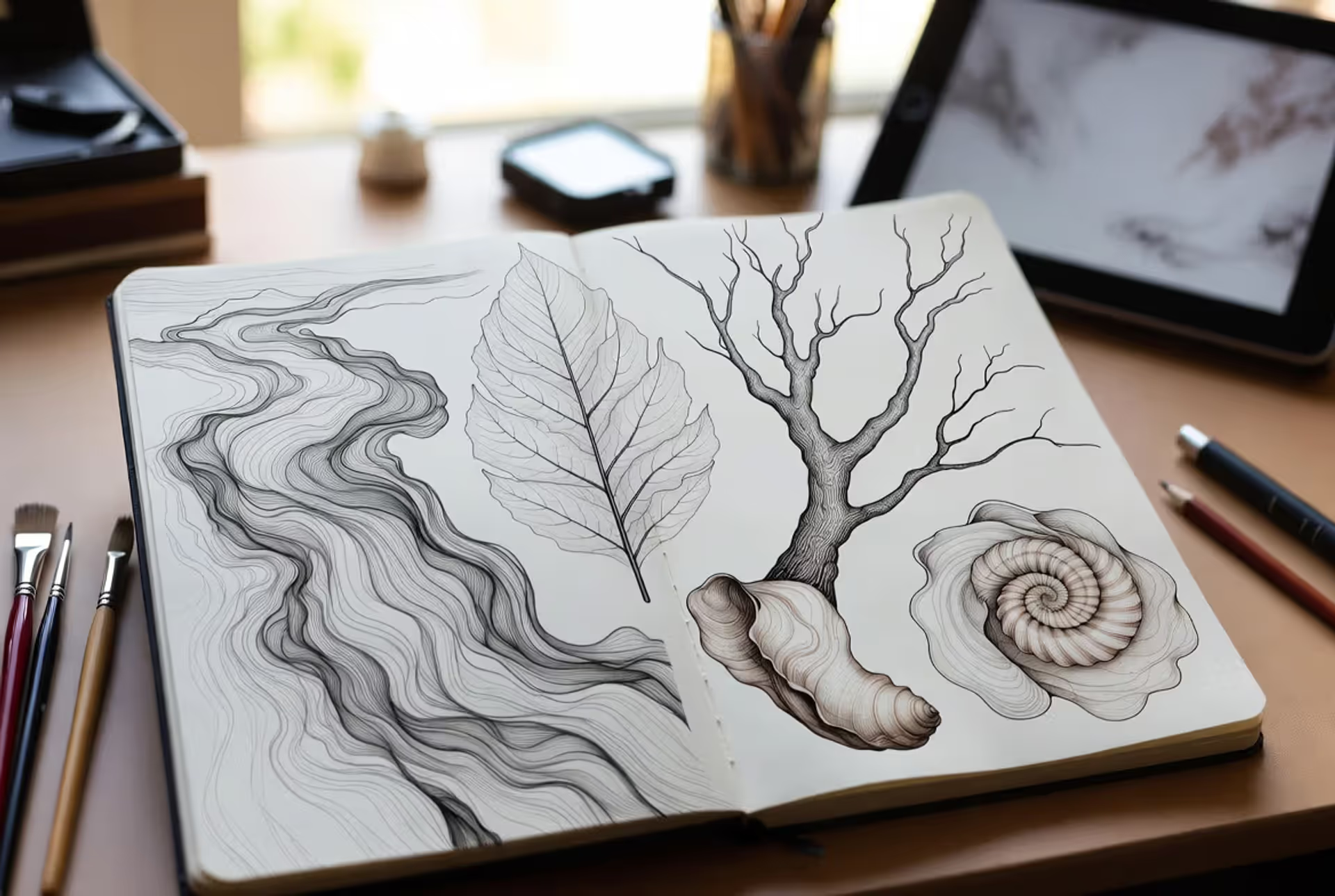
Natural curve in art often copies specific things from the real world. The S-curve of a human spine shows up constantly in figure drawing. Shell spirals (you know, the Fibonacci sequence thing) appear in logo designs and architectural details. Leaf veins create branching patterns that designers reference when building navigation structures or data trees.
Biomorphic shapes in design take this further into abstraction. Instead of drawing a recognizable leaf, you create a kidney-shaped blob that just feels organic without depicting anything specific. Mid-century furniture designers loved this approach—those kidney-shaped coffee tables and amoeba-shaped Noguchi tables don't look like any particular organism, but they're clearly not geometric.
Natural contour lines in art wrap around three-dimensional forms. When you draw a person, these lines follow over muscles and around bones, describing volume through their path. They're organic because they respond to what's underneath rather than following a predetermined pattern you decided in advance.
Here's something that trips people up: line weight variation. An organic line might start thin, swell in the middle, then taper to nothing. Try that with a ruler. Can't do it, right? That thickness change—which happens naturally when you draw freehand with pressure-sensitive tools—gives organic linework much of its energy and movement.
Author: Adrian Lowell;
Source: crafterholic.com
How to Create Organic Lines in Your Work
Creating convincing organic lines means retraining some habits you might not even realize you have. The approach changes depending on whether you're working on paper or screen, but certain principles work everywhere.
Traditional Drawing Techniques
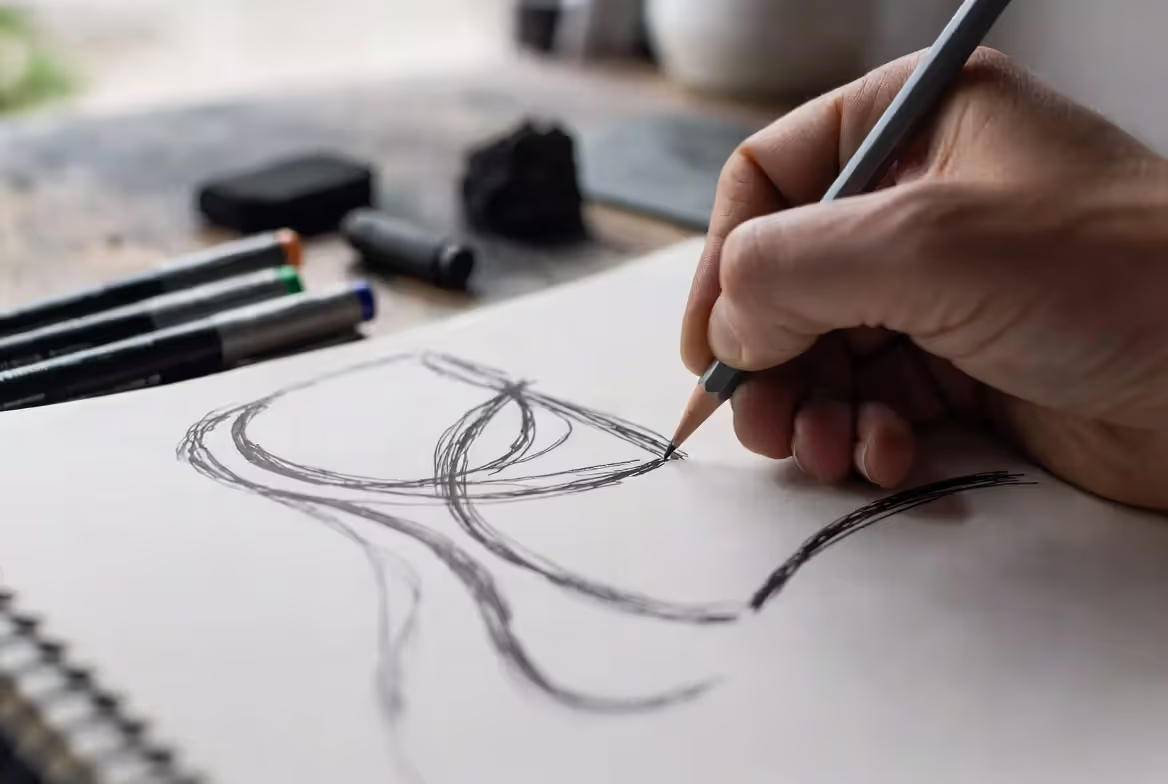
First thing: stop strangling your pencil. I mean it. Most beginners grip their drawing tools like they're trying to choke them. That death grip locks up your wrist and gives you tight, cramped lines. Hold your pencil lightly—almost like it might slip out of your hand (but not quite). Let it glide.
Next: draw from your shoulder, not your fingers. This feels weird at first. Your fingers want to control everything because that's how you learned to write. But finger movements create small, tentative marks. Shoulder movements—and sometimes elbow movements for medium-sized curves—give you those sweeping, confident lines that actually look natural.
Try this exercise tonight: set a timer for forty-five seconds. Draw a single continuous line that never leaves the paper. Curve it, loop it back on itself, change directions, speed up and slow down. Don't draw anything recognizable—just let your hand wander. Do this for five minutes and you'll notice your flowing linework style getting looser and more confident.
Want to really level up? Put a shell or an interesting leaf in front of you. Spend twenty minutes drawing just its outline. Don't worry about getting it perfect—focus on capturing how its curves actually curve. Where do they speed up? Where do they ease into direction changes? Your hand learns nature inspired linework by copying nature itself.
Different tools teach different lessons. Brush pens force you to think about pressure—press hard and the line swells, lighten up and it thins. Charcoal sticks are too chunky for tiny details, so they make you work loose. Felt-tip markers are slippery and confident—they punish hesitation and reward bold strokes.
Digital Design Methods
Adobe Illustrator's Pencil tool has a smoothing slider that nobody talks about enough. Crank it up to around 80% when you're starting out. You'll draw a wobbling mess, but the software interprets your intent and gives you smooth curves. As you get better, dial the smoothing down to maybe 40%. Eventually you want some of those wobbles—they're what makes organic shape drawing look hand-made rather than computer-generated.
Pressure-sensitive tablets change everything. A Wacom Intuos, a Huion Kamvas, an iPad with Apple Pencil—these respond to how hard you press, automatically varying line thickness the way a real brush would. Mouse-drawn organic lines always look stiff because a mouse can't sense pressure. If you're serious about digital organic work, a tablet isn't optional.
Here's a vector tip that'll save you hours of frustration: use fewer anchor points. Beginners place points every time the curve changes even slightly, creating lumpy, segmented lines instead of smooth flows. A really good organic curve might only have two or three anchor points total. Each point should mark a major direction change, and you adjust the handles to create the smooth transitions in between.
Illustrator's Blob Brush tool works differently than the regular brush—it merges overlapping strokes into single shapes. This is perfect for building up complex curved abstract design elements. You can layer strokes on top of each other, adding volume and variation, and it all becomes one editable shape.
Want a hybrid approach? Sketch your organic lines on paper with a brush pen. Photograph them with your phone (scan them if you want higher quality). Bring that image into Illustrator and use Image Trace. Fiddle with the settings—usually you want to reduce the number of paths and increase corner fidelity. Now you've got vector versions of your actual hand-drawn lines, which you can edit digitally while keeping that authentic quality.
Astute Graphics makes a plugin called DynamicSketch that adds controlled randomness to your vector paths. Or you can use Illustrator's built-in Roughen effect. Either way, these tools introduce subtle irregularities that make digital curves feel less mechanical, more human.
Author: Adrian Lowell;
Source: crafterholic.com
Using Organic Lines Across Different Media
The way you use organic lines shifts dramatically depending on what you're making, but the underlying goal stays consistent: create visual flow that feels natural rather than constructed.
Illustration lives and breathes organic linework. Character designers know that curved silhouettes read as friendly and appealing—notice how almost every successful animated character uses flowing lines rather than sharp angles. Editorial illustrators add irregular line patterns for texture and energy. A flat illustration gains depth and movement when the linework varies in weight and direction.
Graphic design uses organic elements more strategically. A poster for a yoga studio might feature nature-inspired linework throughout, while a cybersecurity company's materials use organic accents sparingly within a geometric framework. The challenge? Maintaining readability while adding visual interest. Too many curves and your hierarchy gets muddy.
Logos present specific constraints—they need to scale from favicon size to billboard dimensions. Delicate organic lines can fall apart at small sizes or become blurry. Successful organic logos (think of the Twitter bird before it got geometric, or the original Apple rainbow logo) use bold, simplified curves that maintain character at any size.
Abstract art gives organic lines their wildest freedom. Kandinsky built entire compositions from biomorphic forms that suggested natural processes without depicting specific objects. Miró's work looks like it's from another planet, but it's all organic shapes and flowing line composition. Contemporary abstract painters like Julie Mehretu layer organic marks until they create dense, map-like surfaces.
Typography occasionally embraces organic qualities, though you've got to be careful. Display fonts might feature flowing terminals or curves that reference brush calligraphy. But body text almost always needs geometric construction—readability trumps style. Custom letterforms for logos or headlines, though? That's where you can push fluid line design effectively.
Interior design translates these principles into three-dimensional space. A curved sectional sofa, a freeform area rug, sculptural lighting fixtures—these introduce natural flow into rooms that are typically all right angles. Even small touches matter. A round mirror instead of rectangular, a vase with an asymmetric profile—these soften architectural spaces and make them feel more inviting.
The key across everything: intentionality. Don't add organic lines just because they look interesting. A bank's annual report probably shouldn't feature flowing, irregular borders—that design language contradicts the message of stability and trustworthiness. A children's book illustration, on the other hand? Go wild with organic curves. The medium and message should guide your choices.
Artists and Movements Known for Organic Linework
Art Nouveau basically made organic lines its entire personality. From the 1890s through the early 1900s, artists and designers went all-in on flowing, nature-inspired forms. Alphonse Mucha's poster work—those women with cascading hair surrounded by floral patterns—shows how organic lines can structure complex compositions. Look at the architecture: Antoni Gaudí's Sagrada Família in Barcelona has barely a straight line in it. Hector Guimard's Paris Métro entrances look like they grew out of the ground.
The biomorphic movement hit in the 1930s and 40s, taking organic forms into pure abstraction. Jean Arp created smooth, blob-like sculptures that suggested living organisms without representing anything specific. Yves Tanguy painted dreamlike landscapes full of soft, amoeba-like shapes. Their influence spread beyond fine art—furniture designers, graphic designers, even industrial designers started incorporating these forms.
Contemporary artists keep exploring organic linework through new tools. Kara Walker's monumental silhouette installations use flowing contours to create powerful historical narratives. Takashi Murakami mixes organic curves with geometric elements in his superflat style, creating something distinctly his own. Digital artists working in motion graphics build entire pieces around flowing, morphing shapes that couldn't exist before computers—but they still follow organic principles established decades ago.
Organic lines connect us to the physical world in ways that geometric forms cannot. They remind us that design doesn't exist in abstract space—it lives alongside bodies, plants, and landscapes.
— Ellen Lupton
That observation hits differently now that we spend so much time staring at screens. Designers increasingly use natural curves and irregular patterns to make digital experiences feel less mechanical. The rounded corners that showed up in iOS and spread everywhere? Those were conscious decisions to introduce organic qualities. App transition animations that flow and bounce rather than cut hard? Same reasoning. We're using organic lines to humanize technology.
Looking at historical and contemporary examples reveals patterns worth copying. The strongest work balances organic elements against structure—you need both to create tension and interest. It uses variation on purpose, not randomly. And it stays consistent within its chosen approach. You might use only gentle, flowing curves, or you might embrace aggressive irregular forms, but mixing them without a clear plan usually creates visual confusion.
Author: Adrian Lowell;
Source: crafterholic.com
Common Mistakes When Working with Organic Lines
Slapping organic lines onto everything creates visual noise, not visual interest. I've seen posters where the text flows, the borders curve, the background has irregular patterns, and decorative organic elements fill the margins. Nothing stands out because everything's competing. Your eye needs rest—geometric stability against organic flow, active areas against quiet zones. Contrast makes both elements stronger.
Balance gets tricky with organic work. Yeah, these lines should feel natural and unpredictable, but "natural" doesn't mean "random chaos." A logo with wildly varying line weights going in twelve different directions might technically be "organic," but it fails if viewers can't quickly grasp its form. The best organic work has underlying structure even when it looks loose.
Forcing natural elements where they don't belong creates awkwardness instead of appeal. Not every project benefits from organic lines. Technical manuals need geometric precision for their diagrams. A luxury watch brand might deliberately choose angular, geometric design to communicate precision and craftsmanship—adding organic flourishes would undercut that message. Know when to say no.
Flow problems happen when curves don't follow through properly. Organic lines should guide your eye along intentional paths, but poorly executed curves create visual hiccups. This usually means too many direction changes too close together, or curves that don't have appropriate momentum—they feel like they stop short or overshoot. Each curve should emerge naturally from what came before it.
Negative space deserves as much attention as the lines themselves. Organic linework creates complex positive shapes, sure, but the spaces between and around those shapes matter equally. Strong organic compositions consider both the marks and the emptiness. Cluttered compositions usually ignore negative space entirely.
Style mixing without hierarchy looks amateurish. Combining delicate, flowing calligraphic lines with aggressive, irregular textural marks can work—but only when their relationship is intentional. Random style mixing just looks like you couldn't decide on an approach.
Technical problems plague digital organic work especially. Vector curves where you can see the anchor points sticking out. Uneven line weights that come from poor tablet pressure control. Organic elements that don't quite align with the geometric components they're supposed to integrate with. These execution issues undermine solid concepts.
Fix most of these by stepping back from your work. Literally—pin it to a wall and walk across the room. Does each organic element earn its place? Do the curves actually guide viewers where you want them looking? Would removing or simplifying some elements make the whole thing stronger? Fresh perspective reveals problems that your close-up work mode misses.
Frequently Asked Questions
What is the difference between organic and inorganic lines?
Organic lines flow irregularly—they mimic curves, spirals, and asymmetrical paths you'd find in plants, water, or living creatures. Inorganic (geometric) lines follow mathematical principles: straight edges, perfect circles, measured angles. The difference shows up in how they're made and how they feel. Organic lines look hand-drawn even when created digitally, while geometric lines appear measured and controlled. Emotionally, organic lines read as warmer and more approachable. Geometric lines project order and reliability. Neither is better—they solve different problems.
How do I practice drawing organic lines?
Start with timed exercises: draw continuously for forty-five seconds without lifting your pen, creating flowing curves that change direction smoothly. No recognizing objects, just movement. Study real natural objects—grab a leaf, shell, or piece of driftwood and spend fifteen minutes drawing only its outline. Focus on capturing how the curves actually behave rather than perfect accuracy. Practice drawing from your shoulder instead of your fingers to create larger, more fluid movements. Fill entire sketchbook pages with random curves, spirals, and S-shapes until the motions become automatic. Use brush pens or felt-tip markers that reward confident strokes rather than tentative scratching.
Can organic lines work in minimalist design?
Absolutely—minimalism requires restraint, not geometry. A single, well-placed organic curve can anchor an entire minimalist composition. Many minimalist logos use simplified organic shapes. Think about certain automotive or fashion brand marks that feature flowing curves but nothing else. The key is using organic elements sparingly and with clear purpose. Each curve needs to serve the design's core idea rather than decorate it. Some of the strongest minimalist work I've seen uses one organic element against a field of geometric simplicity—the contrast makes both elements more powerful.
What are the best tools for creating organic lines digitally?
Pressure-sensitive tablets (Wacom, Huion, XP-Pen) or iPads with Apple Pencil give you the most natural control. For software, Adobe Illustrator's Pencil tool with smoothing enabled works well, along with the Blob Brush. Fresco's live brushes mimic real media convincingly. Procreate on iPad offers exceptional brush customization—you can tweak pressure curves and smoothing to match your drawing style. For vector work, remember: fewer anchor points with carefully adjusted Bézier handles beat many points every time. Many professionals sketch organic elements with brush pens on paper, scan them, then vectorize—this hybrid approach keeps the authentic quality while giving you digital editability.
How do organic lines affect viewer emotion?
Organic lines typically evoke comfort, naturalness, and approachability because they mirror forms we encounter in nature and living beings. Gentle curves read as calming and friendly—there's a reason children's book illustrations use them heavily. More aggressive, irregular organic lines suggest energy, chaos, or raw natural power. The emotional impact depends entirely on execution. Smooth flowing curves create different responses than jagged, unpredictable ones. Viewers also process organic lines more slowly than geometric shapes, which encourages contemplation rather than quick information scanning. Use this when you want people to linger with your work.
Where can I find inspiration for organic line patterns?
Nature provides unlimited reference material. Photograph tree branches against the sky, ripples in water, rock formations, cloud shapes, how plants grow and branch. Museums and galleries showcase Art Nouveau posters, biomorphic sculptures, and abstract paintings packed with organic forms. Instagram and Pinterest work for curated collections if you search for botanical illustration, brush calligraphy, or abstract art. Observe everyday phenomena: how fabric drapes, how smoke moves through air, how cracks form in dried mud. Keep a dedicated sketchbook just for copying interesting organic patterns you encounter. This builds a personal visual library while training your hand to reproduce these forms.
Organic lines sit in that sweet spot between rigid geometric precision and complete chaos. They bring warmth, movement, and natural rhythm to visual compositions whether you're sketching characters, building brand identities, or creating abstract paintings. Understanding how these lines function gives you powerful tools for guiding viewer attention and emotion.
The most effective approach comes from observation combined with regular practice. Study how nature creates curves—how living forms flow and branch. Train your hand through daily sketching exercises until flowing movements become second nature. Learn to balance organic elements against geometric structure, creating compositions that feel both dynamic and purposeful.
Remember that organic lines serve your creative goals—they're not decorative sprinkles to scatter randomly. Each curve should guide the eye, suggest meaning, or contribute to the overall emotional tone you're building. Used thoughtfully, organic lines transform static designs into experiences that feel alive, inviting viewers to explore and connect with your work on a deeper level.
Start small. Add a single organic element to your next project and see how it changes the feel. Pay attention to what works and what doesn't. Over time, you'll develop intuition for when organic lines strengthen your work and when they distract from it. That's when things get interesting.
Master yearbook spread design with expert guidance on layout planning, grid systems, photo composition, and text balance. Learn to create two-page layouts that tell compelling stories while avoiding common mistakes and maintaining visual consistency across your yearbook.
Timeline arrows guide viewers through chronological information, transforming static data into dynamic narratives. This comprehensive guide covers arrow styles, process visualization techniques, common design mistakes, and practical tools for creating effective directional elements in timelines and infographics.
Symbols compress complex creative concepts into instant visual recognition. This comprehensive guide explores the psychology behind creativity symbols, catalogs the most effective options from lightbulbs to geometric forms, and provides a practical framework for choosing the right symbol for your design, branding, or communication project.
Learn professional postcard design principles for print and direct mail. Covers standard formats, layout composition, visual hierarchy, style approaches, and proven strategies that increase response rates. Includes size comparison chart, expert insights, and common mistakes to avoid.
The content on this website is provided for general informational and educational purposes only. It is intended to explain concepts related to digital design, visual art, color theory, art techniques, design principles, and design history.
All information on this website, including articles, guides, and examples, is presented for general educational purposes. Creative outcomes may vary depending on individual skill, tools, and practice.
This website does not provide professional design services or guarantee results, and the information presented should not be used as a substitute for formal education or professional consultation.
The website and its authors are not responsible for any errors or omissions, or for any outcomes resulting from decisions made based on the information provided on this website.