Postcards remain one of the most cost-effective marketing tools available, delivering tangible messages directly into prospects' hands. Unlike digital ads that disappear with a scroll, a well-designed postcard occupies physical space, demanding at least a moment of attention. But that brief window is all you get—which makes every design decision critical.
The challenge lies in the format itself: a small, rectangular canvas that must communicate your message instantly while competing with bills, catalogs, and other mail. Success requires understanding both design fundamentals and the unique constraints of direct mail production.
Understanding Postcard Format and Size Standards
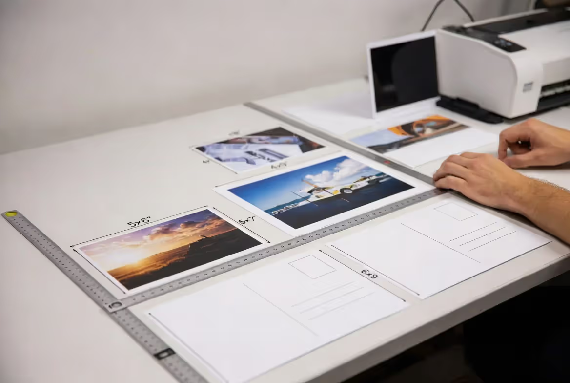
Standard postcard dimensions follow USPS regulations that directly impact both postage costs and design approach. The most common sizes are 4x6 inches, 5x7 inches, 6x9 inches, and 6x11 inches. Each falls into specific postal categories that determine mailing rates.
For First-Class or Marketing Mail, postcards must meet minimum dimensions of 3.5x5 inches and maximum dimensions of 6x9 inches to qualify for postcard rates. Anything larger gets classified—and priced—as a letter or flat. The rectangular format design must maintain an aspect ratio between 1.3:1 and 2.5:1, meaning extreme proportions won't qualify.
Bleed areas extend 0.125 inches beyond the trim line on all sides. This extra space ensures that background colors or images extend to the edge without leaving white borders if the cutting isn't perfectly precise. Safe zones sit 0.25 inches inside the trim edge—keep all critical text, logos, and design elements within this boundary to prevent accidental cropping.
The USPS requires a specific address block area on the back: the right half must remain mostly clear for the mailing address, return address, and postage indicia. This postal regulation fundamentally shapes postcard layout composition, forcing designers to work with essentially half the back surface for marketing content.
Paper stock thickness matters too. Postcards must be at least 0.007 inches thick (roughly 7-point cardstock) to qualify for postcard rates. Most direct mail uses 14-point or 16-point cardstock—thick enough to feel substantial without requiring an envelope, but not so heavy that it increases postage costs unnecessarily.
Author: Sophie Calder;
Source: crafterholic.com
Core Design Principles for Limited Space
Working within constrained dimensions demands ruthless prioritization. Limited space design principles start with identifying the single most important message—the one thing recipients must understand within three seconds of seeing your postcard.
Visual postcard hierarchy guides the eye through your design in a deliberate sequence. Size contrast creates this hierarchy most effectively: your primary message should be significantly larger than secondary elements. A common mistake is making everything medium-sized, which creates visual noise rather than clarity.
The rule of thirds applies powerfully to postcard composition. Divide your canvas into a 3x3 grid mentally, then place key elements along these lines or at their intersections. This creates more dynamic, engaging layouts than centering everything. A hero image might occupy two-thirds of the front, with text in the remaining third, rather than splitting the space evenly.
White space—or negative space—gives your design room to breathe. Cramming content edge-to-edge signals desperation and makes everything harder to read. Strategic emptiness actually increases the perceived importance of what remains. A postcard with 40% white space often outperforms one with 90% coverage, despite containing less information.
Focal points need intentional creation. The human eye seeks contrast—light against dark, large against small, color against neutral. If everything contrasts equally, nothing stands out. Choose one element as your focal point and subordinate everything else to support it.
Typography at postcard scale requires careful selection. Body text below 10 points becomes difficult to read, especially for older demographics. Headlines should jump to at least 24-36 points to create adequate contrast. Limit yourself to two typeface families maximum—one for headlines, one for body copy—to maintain visual coherence.
Author: Sophie Calder;
Source: crafterholic.com
Layout Composition Strategies That Convert
The front-back division creates two distinct design opportunities. The front functions like a billboard: it must grab attention and communicate the core offer instantly. The back provides space for details, calls-to-action, and required postal elements. Treating them as separate but related designs works better than attempting visual continuity across both sides.
Grid systems bring order to small formats. A simple two-column grid on a 6x9 postcard creates clear content zones without feeling rigid. Align elements to the grid to create invisible structure—recipients won't see the grid, but they'll sense the organization. Breaking the grid occasionally for emphasis works, but only if you've established it first.
Visual postcard balance doesn't require symmetry. Asymmetrical balance—a large element on one side balanced by several smaller elements on the other—creates more dynamic compositions. A dominant image on the left might balance with text blocks and a logo on the right, creating tension that holds attention.
Alignment choices communicate professionalism. Left-aligned text reads most naturally for Western audiences, while centered text feels more formal or celebratory. Right-aligned text should be used sparingly, mainly for design effect. Mixing alignments without purpose creates amateur-looking layouts.
The Z-pattern and F-pattern describe how eyes scan rectangular formats. Western readers typically enter at the top left, sweep right, diagonal down-left, then right again—forming a Z. For text-heavy backs, they scan top to bottom on the left (forming an F). Design with these patterns in mind by placing your most important elements along these sight lines.
Borders and frames can enhance or detract. A thin border (1-2 points) can separate your design from other mail and create definition, but thick borders waste precious space. Internal frames around specific elements draw attention but should be used selectively—one framed element per side maximum.
Visual Style Approaches for Different Postcard Types
Photographic Postcard Design
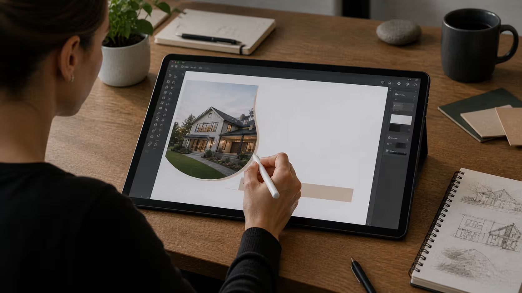
Photography-driven postcards rely on strong imagery to carry the message. The photograph should tell a story or evoke emotion independently of text. For real estate postcards, this means compelling property shots with excellent lighting. For restaurant promotions, food photography that triggers appetite.
Image quality cannot be compromised. Photos must be at least 300 DPI at final print size to avoid pixelation. A 6x4 inch image area requires a source file of 1800x1200 pixels minimum. Upscaling lower-resolution images always looks muddy in print.
Text overlay on photographs requires careful contrast management. Add semi-transparent overlays, use drop shadows, or place text on naturally dark or light areas of the image. White text needs dark backgrounds; dark text needs light backgrounds. The text must remain legible even if the postcard gets slightly damaged or dirty.
Full-bleed photography creates impact but leaves no margin for error. The image must extend into the bleed area, and critical subjects should stay within the safe zone. A person's face positioned at the trim line might lose an eye to cutting variations.
Minimal and Modern Compositions
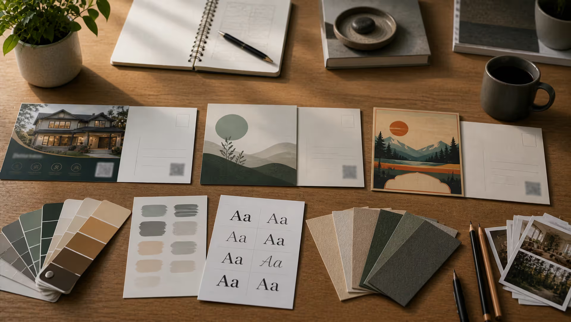
Minimal postcard composition embraces restraint. These designs use ample white space, limited color palettes (often two or three colors maximum), and clean sans-serif typography. The aesthetic communicates sophistication and confidence—the brand doesn't need to shout to get attention.
Geometric shapes add visual interest without clutter. A single circle, triangle, or rectangle can serve as a container for text or images while creating modern visual appeal. Overlapping shapes in different opacities create depth without complexity.
Color blocking divides the canvas into distinct regions using solid colors. A 6x9 postcard might split into thirds—two-thirds brand color, one-third white—with text and imagery placed strategically within each zone. This approach works particularly well for service businesses and B2B marketing.
Minimalism requires exceptional typography. With fewer elements competing for attention, your typeface choices become more visible. Invest in quality fonts with multiple weights. Use size and weight variation to create hierarchy rather than adding decorative elements.
Retro and Vintage Aesthetics
Retro postcard aesthetics tap into nostalgia, evoking specific eras through deliberate design choices. Mid-century modern styles use muted color palettes (mustard yellow, burnt orange, avocado green), geometric patterns, and sans-serif fonts with rounded terminals. 1980s-inspired designs embrace bold colors, geometric shapes, and grid patterns.
Texture adds authenticity to vintage designs. Subtle paper texture overlays, halftone patterns, or grain effects make designs feel period-appropriate. These effects should enhance rather than obscure—keep them at 10-20% opacity.
Typography signals era immediately. Script fonts evoke 1950s elegance, while chunky slab serifs recall 1970s advertising. Distressed or letterpress effects add tactile interest but should be used judiciously to maintain legibility.
Color palettes must match the chosen era. Research authentic color combinations from your target period—vintage travel posters, old advertisements, or historical design archives provide excellent references. Avoid using modern bright colors that didn't exist in earlier printing processes.
Travel Postcard Design Elements
Travel postcard design style balances imagery with information. Classic travel postcards feature landmark photography or illustrated scenes with bold, readable typography announcing the location. Modern interpretations might use illustrated maps, collaged elements, or stylized graphics.
Multiple image layouts work well for travel themes. A grid of four to six smaller photos showcases variety better than a single image. This approach works for destination marketing, tour packages, or event promotions where showing range matters.
Illustrated elements add personality. Hand-drawn landmarks, decorative borders, or vintage stamps create charm that photography alone might not achieve. These work particularly well for boutique hotels, local tourism boards, or cultural events.
Typography should reflect destination character. Beach destinations might use relaxed, flowing scripts. Urban locations could employ bold, modern sans-serifs. Mountain retreats benefit from sturdy, outdoor-inspired fonts. The type choice becomes part of the destination branding.
Direct Mail Design Principles for Response Rates
Author: Sophie Calder;
Source: crafterholic.com
Direct mail design principles prioritize action over aesthetics alone. Every element should guide recipients toward your desired response, whether that's visiting a website, calling a number, or using a coupon code.
Call-to-action placement determines response rates significantly. The CTA should appear on both front and back—prominently on the front to capture quick scanners, and detailed on the back for those who flip it over. Use action verbs: "Schedule Your Free Consultation" outperforms "Learn More."
Personalization areas increase engagement measurably. Variable data printing allows you to customize recipient names, locations, or offers. Even simple personalization like "Dear [Name]" or "Exclusively for [City] Residents" lifts response rates. Design templates with designated areas for variable content.
Offer visibility must be immediate. If you're promoting a discount, free trial, or limited-time offer, make it the largest text element on the front. Use contrasting colors and shapes to create visual separation from other elements. Burying your offer in body copy wastes the postcard's potential.
Address block integration affects both function and aesthetics. The USPS requires the mailing address in the lower right quadrant of the back, but you can design around this constraint. Use the left half for additional messaging, testimonials, or secondary offers. Some designers create a visual frame around the address area to incorporate it into the overall design.
Testing variables reveals what works for your specific audience. Print small batches with different headlines, images, or layouts. Track response rates using unique URLs, phone numbers, or promo codes. A 6x9 postcard might outperform a 4x6 for your audience, or vice versa—assumptions don't replace data.
Urgency triggers action. Time-limited offers ("Expires March 31"), scarcity messaging ("Only 50 spots available"), or seasonal relevance ("Spring Sale") give recipients a reason to respond now rather than later. Without urgency, postcards get set aside and forgotten.
Requires letter postage; best for high-value propositions only
4-6% for targeted audiences when value justifies higher cost
The postcard that gets kept is the postcard that gets used. Design for utility—whether that's a valuable offer, useful information, or visual appeal worth displaying—and you'll see response rates that justify every cent of production and postage.
— Anna Chen
Common Postcard Design Mistakes to Avoid
Overcrowding kills effectiveness faster than any other mistake. Designers often try to cram every possible message, benefit, and image onto the limited canvas. The result: visual chaos that recipients discard immediately. Choose one primary message and two to three supporting points maximum.
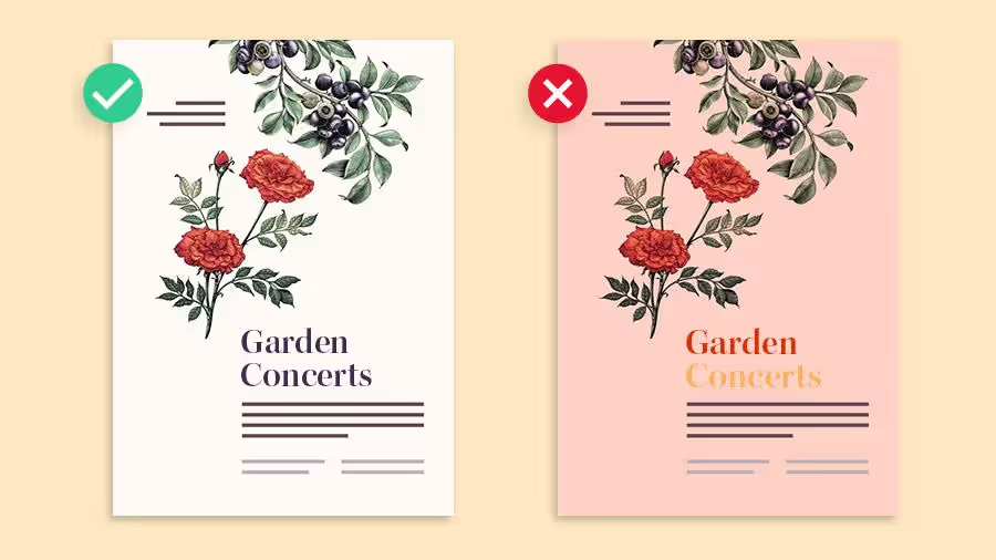
Poor contrast makes text illegible. Light gray text on white backgrounds might look sophisticated on screen but disappears in print. Similarly, text overlaid on busy photographs without adequate contrast becomes unreadable. Test your design by printing it on a standard office printer—if you can't read it easily, neither can your recipients.
Illegible fonts doom your message. Decorative scripts, ultra-thin weights, or condensed typefaces might look appealing in large sizes but become indecipherable at postcard scale. Body text should use simple, readable fonts at 10-12 points minimum. Test legibility by viewing your design at actual size on screen, not zoomed in.
Author: Sophie Calder;
Source: crafterholic.com
Weak calls-to-action waste opportunities. Phrases like "Contact us" or "Visit our website" lack specificity and urgency. Strong CTAs tell recipients exactly what to do and why: "Call 555-0123 for Your Free Quote" or "Visit SaveNow.com/SPRING to Claim Your 20% Discount."
Ignoring postal regulations creates expensive problems. Postcards that don't meet size requirements, lack proper address placement, or use prohibited materials get rejected or charged higher rates. Review USPS guidelines before finalizing designs, not after printing.
Balance issues create amateur appearances. One heavy element without counterbalance makes designs feel lopsided. Distribute visual weight across the canvas—a large image on one side needs substantial text or graphic elements on the other to create equilibrium.
Low-resolution images appear pixelated and unprofessional in print. Screen resolution (72 DPI) looks fine on monitors but terrible when printed. All images must be 300 DPI at final size. A blurry photo undermines credibility regardless of how strong your offer is.
Inconsistent branding confuses recipients. Your postcard should align with your website, business cards, and other marketing materials in terms of colors, fonts, and visual style. Inconsistency makes your business appear disorganized or untrustworthy.
FAQ
What resolution should postcard images be for print?
Images must be 300 DPI (dots per inch) at the final printed size. For a 6x4 inch image area, you need a file that's at least 1800x1200 pixels. Lower resolution causes visible pixelation and fuzzy edges. If you're using stock photography, download the highest resolution version available. For photos from smartphones, check the file properties—most recent phones capture at sufficient resolution, but older models or heavily cropped images may fall short.
How much text is too much on a postcard?
If more than 50-60% of your postcard surface contains text, you've likely exceeded the optimal amount. Recipients should be able to grasp your main message in three seconds. Aim for 50-75 words on the front and 100-150 words on the back maximum. Use bullet points, short paragraphs, and plenty of white space. If you need more room to explain your offer, direct recipients to a landing page rather than cramming everything onto the postcard.
What's the difference between 4x6 and 6x9 postcard design?
Beyond the obvious size difference, these formats serve different strategic purposes. A 4x6 postcard works best for simple, focused messages with minimal text—think appointment reminders or single-item promotions. The 6x9 format provides space for multiple messages, detailed explanations, or several images. Larger postcards also stand out more in mailboxes and feel more substantial, which can increase perceived value. However, 4x6 postcards cost less to print and mail, making them better for high-volume campaigns where cost per piece matters more than impact per piece.
Should the back of a postcard be designed differently than the front?
Yes, they serve distinct functions. The front acts as your attention-grabber—it should feature your strongest visual element and clearest benefit statement. Design it like a billboard that must work in one glance. The back provides space for details, explanations, calls-to-action, and required postal elements. Many successful postcards use a primarily visual front and a more text-heavy back. Remember that postal regulations require the right half of the back to remain relatively clear for addressing, so design your content for the left half.
What fonts work best for postcard readability?
Sans-serif fonts like Helvetica, Arial, Open Sans, or Montserrat work well for headlines and short text blocks. For body copy, both sans-serif and clean serif fonts like Georgia or Merriweather perform well. Avoid script fonts for anything smaller than 18 points, and never use more than two font families on a single postcard. Font weight matters as much as style—use bold or semi-bold weights for important information, as thin or light weights can disappear in print. Always test readability by printing a proof at actual size.
How do I create visual hierarchy on a small postcard?
Size contrast is your most powerful tool. Make your most important element (usually your main benefit or offer) at least twice as large as secondary elements. Use color to create emphasis—a bright color against neutral tones draws the eye immediately. Positioning matters too: elements in the upper left or center receive attention first. Create clear separation between different content sections using white space, lines, or color blocks. Limit yourself to three hierarchy levels maximum: primary message, secondary supporting points, and tertiary details like disclaimers or contact information.
Effective postcard design balances creative appeal with direct marketing pragmatism. The format's physical constraints—limited space, postal requirements, production considerations—demand strategic choices at every step. Success comes from understanding these limitations as creative parameters rather than obstacles.
Start with clarity: identify your single most important message and build everything around it. Apply fundamental design principles—hierarchy, contrast, alignment, white space—with discipline. Choose a visual style that matches both your brand identity and your audience's preferences. Test different approaches systematically to discover what resonates with your specific market.
The postcards that generate results don't necessarily win design awards. They communicate clearly, motivate action, and respect the recipient's limited attention. Master these fundamentals, and your postcards will consistently outperform digital alternatives in situations where tangible, targeted communication matters most.
Master yearbook spread design with expert guidance on layout planning, grid systems, photo composition, and text balance. Learn to create two-page layouts that tell compelling stories while avoiding common mistakes and maintaining visual consistency across your yearbook.
Timeline arrows guide viewers through chronological information, transforming static data into dynamic narratives. This comprehensive guide covers arrow styles, process visualization techniques, common design mistakes, and practical tools for creating effective directional elements in timelines and infographics.
Symbols compress complex creative concepts into instant visual recognition. This comprehensive guide explores the psychology behind creativity symbols, catalogs the most effective options from lightbulbs to geometric forms, and provides a practical framework for choosing the right symbol for your design, branding, or communication project.
Organic lines form the visual language of nature itself. Unlike rigid geometric forms, these flowing curves bring movement and life to compositions. Discover how to recognize, create, and apply organic lines effectively in your art and design work through practical techniques and real-world examples.
The content on this website is provided for general informational and educational purposes only. It is intended to explain concepts related to digital design, visual art, color theory, art techniques, design principles, and design history.
All information on this website, including articles, guides, and examples, is presented for general educational purposes. Creative outcomes may vary depending on individual skill, tools, and practice.
This website does not provide professional design services or guarantee results, and the information presented should not be used as a substitute for formal education or professional consultation.
The website and its authors are not responsible for any errors or omissions, or for any outcomes resulting from decisions made based on the information provided on this website.