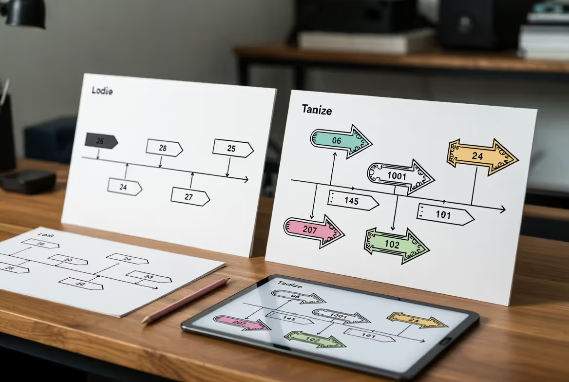
Look at any timeline on your screen right now. See those arrows? They're doing heavy lifting you probably don't notice.
Here's what actually happens when you add an arrow to a timeline: You're building a visual roadmap. The arrow tells someone "start here, move this direction, end there." Without it, you've got a random scatter of dates and events. With it, you've got a story that flows.
The science backs this up, though not in the way most design articles claim. Your brain doesn't really process visuals "60,000 times faster" than text—that's a misquoted stat from a 3M study. What actually happens: directional cues cut down the mental effort needed to figure out what comes next. You follow an arrow without thinking about it.
Western audiences scan left-to-right by default. Timeline arrows either work with that habit or fight against it. Fighting can work—if you're trying to make someone pause and really look at a specific milestone. But most timelines aren't art pieces. They're information delivery vehicles.
Bad arrows create problems no color palette can fix. I've seen corporate timelines where the arrows curved back on themselves so many times that executives gave up trying to follow them. The meeting got rescheduled. The point got lost.
Arrows tap into something universal: the human pointing gesture. Every culture understands "that way." When you translate that into timeline graphic design, you're using thousands of years of evolved communication shortcuts. That's why they work, even when everything else about your design feels wrong.
One study from the Interaction Design Foundation (2024) measured retention rates for process diagrams. Participants remembered 42% more steps when arrows connected them versus layouts using just numbered boxes. The arrow as design element isn't decoration—it's functional infrastructure.
Common Timeline Arrow Styles and Visual Variations
You've got options. Too many, honestly.
Straight arrows handle 80% of professional work. They're boring on purpose. In quarterly reports, legal timelines, and technical documentation, boring means clear. Clear wins. A straight horizontal line with a triangle head scales perfectly, prints reliably, and nobody misinterprets it.
Curved arrows bring energy. Marketing teams love them because curves suggest movement and momentum. Educational materials use them to keep younger audiences engaged. The curve itself doesn't add information, but it changes how the information feels. Playful versus serious. Dynamic versus static.
Then you've got the specialty options: dotted arrows for "maybe this happens," thick arrows for "this is the main path," and those gradient-heavy 3D arrows from 2012 that really need to stay retired. I still see them in conference presentations, always paired with Comic Sans. It's a whole vibe—not a good one.
Current trends lean flat. Instagram's design language reshaped what looks "professional" to an entire generation. Subtle shadows made a comeback in 2025, but we're talking 2-pixel offsets, not the drop shadows from the WordArt era. The distinction matters: infographic arrow styles either enhance readability or distract from it.
Material Design (Google's framework) uses arrows with 2dp elevation and specific easing curves for animations. Apple's Human Interface Guidelines recommend 1-point strokes for standard arrows, 2-point for emphasis. These aren't arbitrary rules—they're tested against millions of users across different devices and contexts.
Author: Adrian Lowell;
Source: crafterholic.com
Horizontal vs. Vertical Arrow Orientations
Horizontal works for most desktop presentations. You're matching the aspect ratio of screens and the reading pattern of English text. PowerPoint slides, website headers, printed handouts—horizontal arrows just fit.
Vertical arrows own mobile. Scroll down, keep reading, see what happens next. Every social media platform conditions users to expect downward progression. Fighting that expectation costs you attention.
Here's where it gets tricky: mixed orientations. An S-curve timeline or zigzag layout can look incredible in a portfolio piece. I've also watched conference attendees squint at them for thirty seconds before giving up. Tech startups use these patterns to signal innovation. Law firms stick with straight lines. Both choices make sense for their audiences.
The real question isn't "which orientation is better" but "will my specific viewers follow this specific arrow without getting lost?" Test it. Show the timeline to someone who doesn't know the content. Watch their eyes. If they pause, confused about where to look next, redesign the arrows.
Author: Adrian Lowell;
Source: crafterholic.com
Decorative vs. Functional Arrow Designs
Functional arrows prioritize one thing: getting you from point A to point B without confusion. High contrast against the background. Arrowhead big enough to register instantly. Consistent styling that doesn't make you wonder "wait, is this a different kind of connection?"
Decorative arrows express brand personality. A children's museum timeline might use hand-drawn arrows that look like crayons. A luxury watch company could style arrows to match their serif logo. These choices build emotional connection but sacrifice some clarity.
The sweet spot: functional structure with decorative accents. Use a clear, simple arrow for the main timeline backbone. Then add illustrated touches at major milestones or section breaks. This gives you personality without losing anyone.
I worked on a brewery anniversary timeline once. The main arrows were straightforward—just clean lines showing progression through their 150-year history. But at each decade marker, we replaced the standard arrowhead with a small illustration of that era's bottle design. Decorative, yes. But it didn't interfere with navigation.
Author: Adrian Lowell;
Source: crafterholic.com
How to Use Arrows in Process Visualization and Flow Diagrams
Process diagrams need arrows that carry more information than "go this way." They're showing relationships, decisions, feedback loops, and alternative paths all at once.
Arrow thickness tells a story. In customer journey maps, the fattest arrow shows the path 70% of users take. Thinner arrows branch off to show what the other 30% do. You can read probability just by looking at line weight. No percentages needed, though adding them doesn't hurt.
Flow diagram arrows get complicated fast. You'll need different styles for different meanings: solid for forward progress, dashed for feedback loops, dotted for optional steps. The key is picking these distinctions once and sticking with them across every diagram your organization produces. Consistency across documents matters more than the specific choices.
Decision trees present special challenges because arrows must branch cleanly without creating visual spaghetti. Give each branch enough space. Seriously—double the spacing you think you need. Color helps: green for approved paths, red for rejections, amber for conditional routes. But remember colorblind users exist, so also vary the line styles or add icons.
Manufacturing process documentation uses arrows as data carriers. An arrow might show "4.5 hours" for duration, "Team A" for responsibility, or "QC checkpoint" for requirements. The arrow becomes an annotated connector. This demands larger arrows with internal space for text, which affects your entire layout density.
Sequential design elements in software user flows often include numbered arrows: 1, 2, 3. Redundant? Maybe. But when someone screenshots step 4 and shares it out of context, that number saves confusion. Build in redundancy for the ways people actually use your diagrams, which often differs from how you intended them to be used.
Author: Adrian Lowell;
Source: crafterholic.com
Timeline Arrow Design Mistakes to Avoid
Overcrowding kills more timelines than any other mistake. I've reviewed designs with seventeen arrows fighting for attention in a single PowerPoint slide. Nobody could follow them. The solution isn't smaller arrows—it's better information architecture. Break the content into phases. Use multiple slides. Your timeline doesn't have to show everything simultaneously.
Inconsistent styling makes viewers wonder whether different arrow types mean something or if the designer just got sloppy. Establish rules early: "Solid arrows show completed phases, dashed arrows show planned work, blue arrows connect dependencies." Write these rules down. Follow them obsessively. Every exception you make trains your audience to ignore the patterns.
Contrast failures happen when designers fall in love with their brand colors without testing readability. Navy arrows on a dark blue background might match the style guide perfectly and still be completely invisible. Grab a contrast checker tool. Aim for 4.5:1 minimum on directional design elements. If it passes the test, ship it. If it doesn't, adjust the colors until it does.
Confusing flow happens when arrows point in unexpected directions without signaling why. If your timeline suddenly reverses direction halfway through, add explicit labels. "Earlier" and "Later" prevent the viewer from backtracking to figure out what happened. Or use numbered circles along the arrow path. Redundant cues save cognitive energy.
Accessibility problems emerge when arrows communicate meaning through color alone. "Follow the green arrow for approved items" fails immediately for colorblind users and completely for screen reader users. Add icons, vary line styles, include text labels. Layer multiple cues for the same information.
Undersized arrowheads create ambiguity. Is this a line with some pixels stuck to the end or an actual directional indicator? Make the arrowhead at least 1.5× wider than the arrow shaft. Smaller than that and you're hoping for good eyesight and high-resolution screens. Don't hope—design for reality.
Author: Adrian Lowell;
Source: crafterholic.com
Choosing Arrow Styles for Different Timeline Layouts
Linear timelines need simple arrows. The layout already does the work of showing sequence. Your arrow just confirms direction. A basic triangle on a solid line handles this job perfectly. Don't complicate what's already clear.
Chronological visual design for historical content benefits from period-appropriate styling. A medieval history timeline could use arrows that reference illuminated manuscript decorations—think Celtic knots or Gothic tracery, simplified. A tech company product timeline should look like it was designed in the same decade it represents. Match the arrow to the era.
Circular timelines require curved arrows that follow the circle's radius. Straight arrows placed tangentially look wrong—they fight the circular logic. The technical challenge: keeping the arrowhead properly oriented at every point along the curve. Most design software makes you adjust this manually. Budget extra time for it.
S-curve layouts need prominent arrows at every turn. These transition points are where viewers lose the thread. Bigger arrows, brighter colors, or subtle animations at these pivot points help maintain narrative flow in design. Don't make people hunt for where to look next.
Branching narratives—timelines showing alternative outcomes or parallel tracks—demand careful arrow orchestration. Each branch needs its own clearly marked path. Use color, position, and line weight to show which branches are primary versus secondary. A company history might show the main product line in thick arrows with smaller arrows showing spin-off divisions or discontinued products.
Infographic-specific work requires thinking about how arrows interact with charts, icons, and data blocks. An arrow should never obscure a data point or create ambiguous connections. When arrows pass near multiple elements, use Z-axis layering (put arrows behind content boxes) or add subtle shadows to clarify depth relationships.
The Atlantic's timeline graphics typically use minimal arrows with significant whitespace. The New York Times often employs bold, thick arrows for emphasis. Both approaches work because they're consistent with each publication's overall visual language. Your arrow choices should fit your broader design system, not fight against it.
Arrows are the silent narrators of visual design. They don't just point—they create anticipation, establish rhythm, and transform disconnected information into coherent stories. The best timeline arrows are invisible in their function; viewers follow them instinctively without conscious recognition of being guided.
— Ellen Lupton
Tools and Techniques for Creating Timeline Arrows
Adobe Illustrator remains the professional standard for custom work. The stroke panel gives you independent control over arrowhead size, position, and style. You can save arrow styles as graphic styles and reuse them across projects. For timeline graphic design requiring perfect alignment, Illustrator's smart guides and snap-to-grid functionality solve 90% of positioning problems.
Figma took over collaborative design work around 2023. The component system lets you create arrow variants that stay consistent even when five designers touch the same file. Auto-layout means arrows resize appropriately when timeline content expands or contracts. For remote teams, Figma's multiplayer editing beats emailing Illustrator files back and forth.
PowerPoint and Google Slides handle basic business timelines adequately. Their connector features automatically maintain arrow positions when you move connected text boxes around—super useful during iterative revisions. But customization hits a ceiling. If you need arrows that don't look like default PowerPoint, you're building them from basic shapes.
Canva democratized design for non-designers, including timeline templates with pre-made arrows. Great for quick internal documents where speed beats originality. Terrible if brand differentiation matters. Everyone's arrows look similar because everyone's using the same templates. Modify heavily or skip it.
Specialized timeline software like Preceden or TimelineJS focuses exclusively on chronological visualization. These tools understand timeline-specific arrow behaviors—automatically spacing events, handling zoom levels, managing interactive reveals. Less flexible for non-standard layouts. Perfect for standard ones.
Custom arrow creation from basic shapes gives you complete control. Circle + triangle = arrow. Add gradient fills, adjust stroke weights, include subtle shadows, and you've got something unique. Time-intensive, requires design skills, delivers exactly what you envision.
SVG format preserves arrow quality at any size—critical for responsive web design. An arrow that looks crisp on a 27-inch monitor and a 5-inch phone screen needs vector scaling. For web implementation, CSS-based arrows offer maximum flexibility. Change colors, sizes, and orientations without creating new image files.
Animation has evolved beyond simple movement. In 2026, subtle micro-animations—arrows that gently pulse at key milestones or draw themselves as viewers scroll—boost engagement without becoming annoying. Trigger these on user interaction, not autoplay loops. Respect prefers-reduced-motion settings for accessibility.
Legacy formats, specific brand requirements (rare in 2026)
High
Manufacturing, real estate (declining rapidly)
Minimalist hairline
Mobile apps, web interfaces, digital-first products
Very minimal
SaaS platforms, startups, tech companies
FAQ
What is the purpose of arrows in timeline design?
Arrows establish reading order and eliminate guesswork about sequence. They connect related events, create visual momentum, and transform a collection of dates into an actual narrative. Without arrows, you're asking viewers to figure out the path themselves—some will, many won't bother.
Should timeline arrows always point right or down?
Not always, but those directions work with natural reading and scrolling patterns. Point left or up when you've got a specific reason—maybe you're showing regression or comparing past versus future. Unconventional directions need extra support like labels or numbers to prevent confusion. Don't make people work to understand direction.
How do I choose between simple and decorative arrow styles?
Match the arrow to your context and audience. Data-heavy professional timelines need simple, clear arrows. Brand-focused or educational materials can handle decorative elements. Test both versions with actual users. If anyone hesitates about which way to read, simplify immediately. Clarity beats creativity in functional design.
What colors work best for timeline arrows in infographics?
High-contrast colors that pop against your background while fitting your overall palette. Never rely on color alone to communicate meaning—combine it with shape or style variations. Check contrast ratios: aim for 4.5:1 minimum. Test how your arrows look to colorblind viewers using simulation tools. A beautiful arrow nobody can see helps nobody.
Can I use multiple arrow styles in one timeline?
Yes, if each style has a clear, consistent job. Solid for completed work, dashed for planned work, thick for primary paths, thin for secondary connections. More than three distinct styles usually creates confusion instead of clarity. Document your arrow system and apply it uniformly across the entire timeline—exceptions break the pattern your viewers are learning.
Are there accessibility concerns with timeline arrows?
Absolutely. Screen readers can't interpret visual arrows, so alt text must describe both direction and meaning. Color can't be your only differentiator. Size and contrast matter for users with visual impairments. Interactive timelines need keyboard navigation that follows arrow-indicated sequence. Animations should respect prefers-reduced-motion settings. Design for everyone or you're designing for some and hoping others can figure it out.
Timeline arrows do one job really well: they guide people through sequential information without making them think about it. The best arrow for your project depends on context—simple triangles for clarity-critical work, decorative variations when brand expression matters, specialized designs for complex process flows.
Technical execution matters as much as aesthetics. Consistent styling, adequate contrast, appropriate sizing, and accessibility features separate professional work from amateur efforts. Tools from Figma to Illustrator give you the capabilities, but your judgment determines whether those capabilities actually serve your audience.
Visual communication keeps evolving toward more interactive and responsive formats. Timeline arrows will adapt while keeping their core function: moving viewers through sequences with minimal friction. The strongest arrow designs in 2026 balance innovation with usability, adding visual interest without sacrificing fundamental clarity.
Whether you're building a company history, project roadmap, or educational infographic, treat arrows as critical infrastructure, not decoration. They're the thread connecting disconnected moments into stories that people actually follow and remember. Get them right, and everything else works better. Get them wrong, and even brilliant content gets lost.
Master yearbook spread design with expert guidance on layout planning, grid systems, photo composition, and text balance. Learn to create two-page layouts that tell compelling stories while avoiding common mistakes and maintaining visual consistency across your yearbook.
Symbols compress complex creative concepts into instant visual recognition. This comprehensive guide explores the psychology behind creativity symbols, catalogs the most effective options from lightbulbs to geometric forms, and provides a practical framework for choosing the right symbol for your design, branding, or communication project.
Learn professional postcard design principles for print and direct mail. Covers standard formats, layout composition, visual hierarchy, style approaches, and proven strategies that increase response rates. Includes size comparison chart, expert insights, and common mistakes to avoid.
Organic lines form the visual language of nature itself. Unlike rigid geometric forms, these flowing curves bring movement and life to compositions. Discover how to recognize, create, and apply organic lines effectively in your art and design work through practical techniques and real-world examples.
The content on this website is provided for general informational and educational purposes only. It is intended to explain concepts related to digital design, visual art, color theory, art techniques, design principles, and design history.
All information on this website, including articles, guides, and examples, is presented for general educational purposes. Creative outcomes may vary depending on individual skill, tools, and practice.
This website does not provide professional design services or guarantee results, and the information presented should not be used as a substitute for formal education or professional consultation.
The website and its authors are not responsible for any errors or omissions, or for any outcomes resulting from decisions made based on the information provided on this website.