Think about the last time you saw a lightbulb icon. You didn't pause to decode its meaning—your brain just knew: "idea." That's the power of a good symbol for creativity. It skips the slow, rational part of your brain and hits instant recognition.
Here's why that matters for your work: Whether you're mocking up a logo, building an app interface, or throwing together slides for Tuesday's pitch, you need visuals that communicate fast. Creative symbols do exactly that—they're shortcuts your audience already understands.
But not all creativity symbols work the same way. A palette means something different than gears, and a lightbulb doesn't fit every situation (despite what stock photo libraries suggest). This guide shows you which symbols actually work, when to use them, and how to avoid the obvious mistakes that make designs feel generic.
What Makes a Symbol Represent Creativity
Symbols don't just pop up fully formed. They earn their meaning through repeated exposure—thousands of people using them the same way until the association sticks. Show someone a lightbulb enough times when discussing ideas, and eventually their brain wires those two concepts together.
Some shapes just feel creative before you even think about it. Asymmetry breaks expectations. Spirals keep your eye moving, suggesting growth rather than static completion. Open forms—like a "C" shape instead of a closed circle—imply possibilities still unfolding.
But here's where it gets tricky: culture shapes everything. Western audiences connect lightbulbs with ideas because Thomas Edison became famous in the early 1900s, then cartoonists spent decades drawing bulbs over characters' heads. In Japan, you'll sometimes see cherry blossoms representing creative renewal. Chinese design traditions favor bamboo—it bends without breaking, adapts to conditions, keeps growing. Same concept (flexibility, creative adaptation), completely different visual.
A few symbols do cross borders pretty reliably. The human brain works everywhere, so brain imagery suggests cognition globally. Stars point upward in most cultures, connecting to aspiration. Water flows around obstacles—a universal metaphor for creative problem-solving that needs no translation.
The sweet spot? Familiar enough that people get it immediately, distinctive enough that it doesn't disappear into background noise. Too weird, and you're explaining your symbol instead of communicating with it. Too generic, and it might as well be clip art from 2003.
Colors shift everything, by the way. Paint that brain icon electric blue, and you're talking about AI or tech innovation. Use warm purple instead, and suddenly it feels more artistic, more human. A palette in an art store catalog just shows products. That same palette in a consulting firm's logo suggests creative business solutions.
Author: Marcus Ellery;
Source: crafterholic.com
Most Common Symbols Used for Creativity
Let's catalog what actually works in professional design. These symbols show up constantly because they've proven effective across industries:
Lightbulb – Still the heavyweight champion for "idea" or "innovation" in Western markets. Edison's legacy runs deep, and those decades of cartoons cemented the association. You can't go wrong with it, but you might disappear into sameness.
Human brain – Works for anything involving thinking, intelligence, or mental processes. Tech companies add circuit patterns. Education brands keep it organic. Psychology practices often use it straight, no embellishment needed.
Artist's palette – This one's specific. It says "art" or "design," not general creativity. Perfect for actual art supplies or creative software. Weird choice for an innovation consultancy.
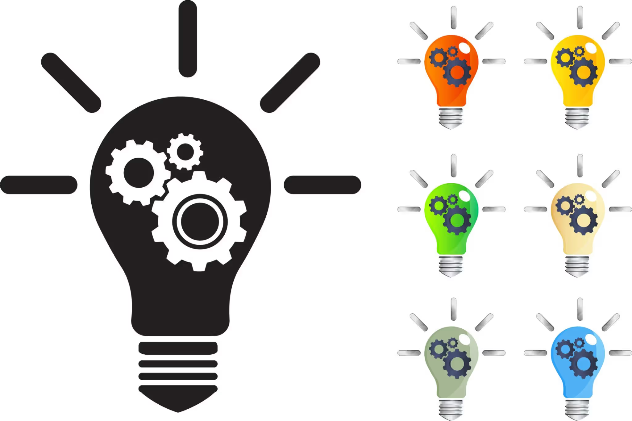
Gears/cogs – The mechanical creativity symbol. Engineers love these. They suggest problem-solving, systems thinking, everything working together. Less "inspiration strikes" and more "methodical innovation."
Spiral – Growth, evolution, processes that build on themselves. The golden ratio spiral adds mathematical elegance. Design thinking workshops use spirals constantly because they visualize iteration.
Starburst/explosion – That moment when the idea hits. Energy, sudden breakthroughs, excitement. Marketing teams use these for product launches. Maybe too energetic for serious B2B contexts.
Puzzle pieces – Problem-solving made visual. Also suggests collaboration—pieces coming together. Autism awareness claimed this symbol pretty thoroughly, so consider that association.
Infinity symbol – Endless possibilities, continuous improvement, thinking without limits. Tech startups love it. Sustainability brands use it for circular economy concepts.
Abstract brushstroke – Pure artistic expression, the human hand at work, spontaneity. Works great for anything where the creative process itself matters.
Connected nodes/network – Ideas linking together, collaborative thinking, systems-level creativity. Every collaboration tool and innovation platform uses some variation of this.
Symbol
What It Looks Like
What It Means
When to Use It
Who Uses It
Lightbulb
Glass bulb shape, sometimes just the outline
Sudden insight, bright ideas, innovation moment
General creativity needs, education, tech
GE (historically), countless innovation labs
Brain
Organic curves or geometric brain outline
Intelligence, cognitive work, mental processes
AI platforms, learning apps, psychology services
Lumosity, Headspace, brain training apps
Palette
Traditional artist's mixing board with paint dabs
Artistic creation, visual design, color work
Art supplies, creative software, design studios
Elements of Adobe's branding, art schools
Spiral
Curved line expanding outward from center
Growth processes, evolution, iterative development
Consulting, transformation work, coaching
Design thinking workshops, agile methodology
Gears
Interlocking toothed wheels
Systematic problem-solving, mechanics of creativity
Engineering, productivity tools, process improvement
Collaboration, idea relationships, connected thinking
Team tools, social platforms, mapping software
Miro, Slack, collaboration platforms
Infinity loop
Continuous figure-eight on its side
Limitless potential, ongoing innovation, cycles
Sustainability, continuous improvement, tech
Circular economy brands, SaaS platforms
Author: Marcus Ellery;
Source: crafterholic.com
The Lightbulb and Its Evolution as an Idea Symbol
Before lightbulbs dominated "idea" symbolism, cartoonists tried everything. Candles. Torches. Characters literally scratching their heads. But when Edison's incandescent bulb transformed daily life in the early 1900s, it created an irresistible metaphor. Darkness (not knowing) becomes light (understanding). Simple. Powerful. Visual.
Comic strips in the 1920s started drawing bulbs above characters during "aha!" moments. The convention spread through syndicated newspapers—same comics running in hundreds of cities simultaneously. Each appearance reinforced the pattern. By mid-century, you didn't need to explain it. Everyone just knew.
Modern designers keep reworking the basic form. Minimal versions strip it down to five or six lines. Some incorporate the filament pattern as a brain or other symbol—layering meanings. Others update to LED aesthetics, though that raises an interesting question: will kids who've never seen incandescent filaments still get the reference?
Research says yes, actually. Testing shows strong recognition even among people born after LEDs took over. The symbol's momentum carries it forward. Though some companies deliberately avoid lightbulbs precisely because they're everywhere. They want fresher alternatives.
Despite overuse concerns, the lightbulb keeps working. It's too embedded in our visual language to fail. You can stylize it a thousand ways and people still recognize it instantly.
Author: Marcus Ellery;
Source: crafterholic.com
Geometric Shapes in Creative Symbol Systems
Basic geometry carries weight you might not expect. Circles suggest completeness, cycles, inclusive thinking. They have no beginning or end, no hierarchy. That makes them perfect for brainstorming contexts—all ideas equal, all directions possible.
Triangles point. They create direction, establish hierarchy, suggest movement. Point them upward and you've got aspiration, growth, upward thinking. Their structural stability makes them popular in design thinking icons, especially representing foundational concepts.
Squares and rectangles feel organized, structured, systematic. That sounds anti-creative, right? But they're essential for symbols representing creative processes rather than pure inspiration. Innovation methodologies need structure. The square provides that visual anchor.
Hexagons split the difference beautifully. They're geometric (structured) but tessellate like honeycomb (organic, natural). Tech companies discovered this—hexagons suggest both systematic thinking and nature's patterns. Google's Material Design uses hexagons frequently.
Combining shapes creates visual tension. A circle breaking through a square? That's innovation disrupting established systems. Overlapping triangles forming new shapes? Ideas combining into novel concepts. The geometry mirrors the creative process.
Negative space adds sophistication. Cut strategic pieces from a triangle and you might reveal a recognizable object while keeping geometric simplicity. This layered meaning—seeing multiple things at once—reflects how creativity actually works.
Author: Marcus Ellery;
Source: crafterholic.com
How Designers Use Creativity Symbols
Logo design puts the most pressure on symbol choice. Your company mark needs to communicate instantly while standing apart from competitors. Browse tech startup logos and you'll see endless abstract geometric symbols—they suggest innovation without spelling it out literally. Consulting firms go more representational—lightbulbs, connected nodes—because they need that immediate "we solve creative problems" signal.
UI design employs these symbols functionally. Brainstorming apps use starburst icons on "new idea" buttons. Note apps might use palette symbols for color selection. Each symbol occupies precious screen space, so it better communicate clearly at 24×24 pixels.
Presentation design leans heavily on creativity symbols for structure. That spiral could organize content showing iterative development stages. Gears introduce process sections. The challenge? Avoiding stock imagery that makes your slides look like everyone else's.
Marketing materials use symbols to set context before people read a word. Event poster with interconnected nodes? Networking opportunity. Course catalog with brain imagery? Intellectual development awaits. Your symbol choice needs to match category expectations while differentiating from the competition.
Physical spaces incorporate these symbols too. Innovation labs paint lightbulb murals. Design studios install oversized palette sculptures. These environmental applications reinforce identity and signal purpose to visitors instantly.
Software icon systems require careful distinction. Adobe's Creative Suite uses tool-specific symbols (brush, pen, camera) rather than generic creativity markers. But features within those apps—"generate ideas" or "explore variations"—often employ the universal symbols we've discussed.
Common mistakes? Using an artist's palette for a data analytics platform confuses people. Adding too much detail that disappears at functional sizes. These errors happen constantly, usually because designers pick symbols they like rather than what communicates clearly.
Symbols for Innovation vs. Artistic Creativity
Business innovation and artistic expression need different visual languages, and mixing them creates confusion. Icons for innovation in corporate contexts emphasize process, collaboration, measurable progress. Think gears, network diagrams, ascending arrows. They suggest systematic advancement, not lightning-strike inspiration.
Artistic symbols go organic. Brushstrokes, palettes, freeform shapes communicate spontaneity and individual expression. They work beautifully for galleries, art schools, creative services focused on aesthetic output. Less great for enterprise software.
The lightbulb bridges both worlds—equally comfortable representing engineering breakthroughs and artistic inspiration. That versatility makes it popular but sometimes imprecise. Context and styling determine which interpretation dominates.
Industries develop their own norms. Pharmaceutical research might use molecular structures or microscopes to represent creative drug development. Fashion brands would never touch those symbols, opting instead for thread spools, scissors, abstract fabric patterns. Same "creativity," completely different visual vocabulary.
Audience sophistication matters significantly. Enterprise software targeting corporate innovation teams can use abstract, conceptual symbols. Consumer-facing creative products often require more literal, immediately recognizable imagery. A startup founder understands abstract nodes representing connected thinking. A casual app user might just see dots.
Hybrid symbols work for organizations spanning multiple domains. A design-engineering firm might combine geometric precision with organic elements. Music technology companies merge waveforms with circuit patterns. These combinations signal capability across boundaries.
Color and style shift meaning dramatically. Render a brain in metallic silver with circuit patterns and you're talking AI, technological innovation. Same brain outline in watercolor gradients? Now it's emotional intelligence, human-centered creativity. The symbol stays the same, but the treatment completely changes the message.
A symbol is the best possible expression of something essentially unknown. It reaches into the unconscious and speaks to us in a language older than words.
— Carl Jung
Choosing the Right Creative Symbol for Your Project
Start by getting specific about what you're actually communicating. "Creativity" covers idea generation, artistic expression, problem-solving, technical innovation, and imagination. Which aspect matters for your situation? A brainstorming workshop needs different symbols than a design portfolio.
Your audience's visual literacy shapes everything. Corporate executives might find abstract geometric symbols sophisticated and professional. Middle schoolers need more representational imagery. Cultural background affects interpretation too—research symbol meanings in your actual target markets, don't assume.
Check what competitors are doing. If everyone in your space uses lightbulbs, you've got a decision: join the convention for immediate recognition, or differentiate with alternative symbols. Neither choice is automatically right. Your strategic goals determine the better path.
Medium constraints matter practically. A favicon needs extreme simplicity—maybe just a starburst or spiral. Large-format posters allow complex, detailed symbolic compositions. Mobile interfaces require symbols that remain clear when displayed tiny. Test at actual implementation sizes, not just on your design screen.
Think about longevity, especially for brand identity work. Trendy geometric styles might date quickly. More timeless forms—spirals, basic shapes—age better. You're balancing contemporary appeal with enduring clarity.
Test symbols with actual representative users before committing. Show options without explanation, ask what each communicates. Misinterpretation at this stage saves expensive rebranding later. Five user tests beat guessing every time.
Watch out for these pitfalls: - Literal overload: Cramming lightbulb + brain + palette + gears together creates chaos, not clarity - Cultural blindness: Assuming Western conventions translate globally without checking - Trend chasing: Adopting geometric styles or colors that feel dated within months - Scale ignorance: Choosing symbols with detail that vanishes at functional sizes - Context mismatch: Using playful artistic symbols for serious technical innovation (or vice versa)
Here's a practical framework: Write three words describing your creative message. Find symbols associated with each. Sketch combinations. Simplify ruthlessly—remove anything non-essential. Show five people unfamiliar with your project. Refine based on their interpretations, not your intentions.
Remember, symbols work within systems. A single symbol rarely carries your entire communication load. It partners with typography, color, imagery, copy. Evaluate how your symbol integrates with other brand elements rather than judging it in isolation.
Frequently Asked Questions About Creativity Symbols
What is the most recognized symbol for creativity?
The lightbulb dominates global recognition for creativity and ideas. Cross-cultural studies consistently rank it at the top for "idea" associations. That said, context shifts things—in specifically artistic settings, the artist's palette rivals the lightbulb for immediate recognition. But if you need one universal choice that translates across most contexts and cultures, the lightbulb wins.
Why is the lightbulb used to represent ideas?
Early 20th-century cartoonists created this association. Thomas Edison's fame as the lightbulb inventor coincided with the "light dawning" metaphor for understanding—a phrase that predates electric lights. Cartoons in the 1920s started drawing bulbs over characters' heads during moments of realization. Decades of repetition in comics, advertising, and editorial illustrations reinforced this association until it became automatic. Now it's so embedded that even people born after LED lights took over still recognize the incandescent bulb as an "idea" symbol.
Are creativity symbols universal across cultures?
No symbol achieves truly universal recognition, though some come closer than others. The lightbulb, brain, and basic geometric patterns like spirals translate reasonably well across cultures. However, specific artistic tools—like Western artist's palettes—carry less meaning in cultures with different artistic traditions. Color associations vary significantly too. Purple suggests creativity in Western contexts but carries completely different meanings elsewhere. Always research your specific target markets rather than assuming symbolic meanings transfer automatically.
What symbols work best for tech innovation brands?
Technology innovation typically benefits from symbols suggesting systematic thinking, connectivity, and forward progress. Network nodes, geometric abstractions, ascending arrows, and brain imagery with circuit patterns all perform well. Avoid overtly artistic symbols like palettes or brushstrokes—they suggest aesthetic creativity rather than technical innovation. The lightbulb works but risks feeling generic unless you style it distinctively. Hexagons, tessellations, and molecular structures can suggest both precision and innovation. Test with your actual audience segment since B2B enterprise responds differently than consumer tech.
Can I combine multiple creativity symbols in one design?
You can, but it's risky. Combining symbols adds nuance but often creates visual clutter and confused messaging. Successful combinations usually layer meanings subtly—like a lightbulb filament shaped as a brain, or gear teeth forming a spiral pattern. Simply placing multiple distinct symbols together (lightbulb + palette + brain all visible) typically weakens communication rather than strengthening it. If you genuinely need multiple symbols, consider using them in a system across different contexts rather than cramming them all together. Exception: infographics or educational materials explaining different creativity types can productively display multiple symbols with clear labels explaining each.
How do color choices affect creativity symbols?
Color shifts symbolic interpretation significantly. Warm colors (orange, red, yellow) suggest energy, passion, spontaneous creativity. Cool colors (blue, purple) imply thoughtful innovation and intellectual creativity. Purple specifically associates with imagination and artistic creativity in Western contexts. Bright, saturated colors feel playful and accessible. Muted tones suggest sophistication and seriousness. A yellow lightbulb reinforces the illumination metaphor. That same bulb in blue suggests technological innovation instead. Consider both the symbol's inherent meaning and how color modifies that message. Test color variations with target audiences since preferences and interpretations vary by demographic, culture, and industry expectations.
Choosing effective creativity symbols requires understanding both universal psychological triggers and your specific context. The lightbulb, brain, palette, and geometric forms carry distinct associations serving different communication goals. Technical innovation demands different visual language than artistic expression. Audience sophistication shapes whether you can use abstract symbols or need literal imagery.
Effective symbol use goes beyond picking recognizable imagery. You need strategic thinking about message precision, cultural context, medium constraints, and integration with broader visual systems. The symbols cataloged here provide a starting vocabulary, but their real power emerges through thoughtful application tailored to your specific project, audience, and goals.
Test your choices with actual users. Avoid overused combinations. Remember that symbols work best as part of cohesive visual communication rather than standalone solutions. Whether you're designing a logo, building an interface, or creating presentation materials, the right creativity symbol compresses complex ideas into instant recognition—if you choose and deploy it strategically.
Master yearbook spread design with expert guidance on layout planning, grid systems, photo composition, and text balance. Learn to create two-page layouts that tell compelling stories while avoiding common mistakes and maintaining visual consistency across your yearbook.
Timeline arrows guide viewers through chronological information, transforming static data into dynamic narratives. This comprehensive guide covers arrow styles, process visualization techniques, common design mistakes, and practical tools for creating effective directional elements in timelines and infographics.
Learn professional postcard design principles for print and direct mail. Covers standard formats, layout composition, visual hierarchy, style approaches, and proven strategies that increase response rates. Includes size comparison chart, expert insights, and common mistakes to avoid.
Organic lines form the visual language of nature itself. Unlike rigid geometric forms, these flowing curves bring movement and life to compositions. Discover how to recognize, create, and apply organic lines effectively in your art and design work through practical techniques and real-world examples.
The content on this website is provided for general informational and educational purposes only. It is intended to explain concepts related to digital design, visual art, color theory, art techniques, design principles, and design history.
All information on this website, including articles, guides, and examples, is presented for general educational purposes. Creative outcomes may vary depending on individual skill, tools, and practice.
This website does not provide professional design services or guarantee results, and the information presented should not be used as a substitute for formal education or professional consultation.
The website and its authors are not responsible for any errors or omissions, or for any outcomes resulting from decisions made based on the information provided on this website.