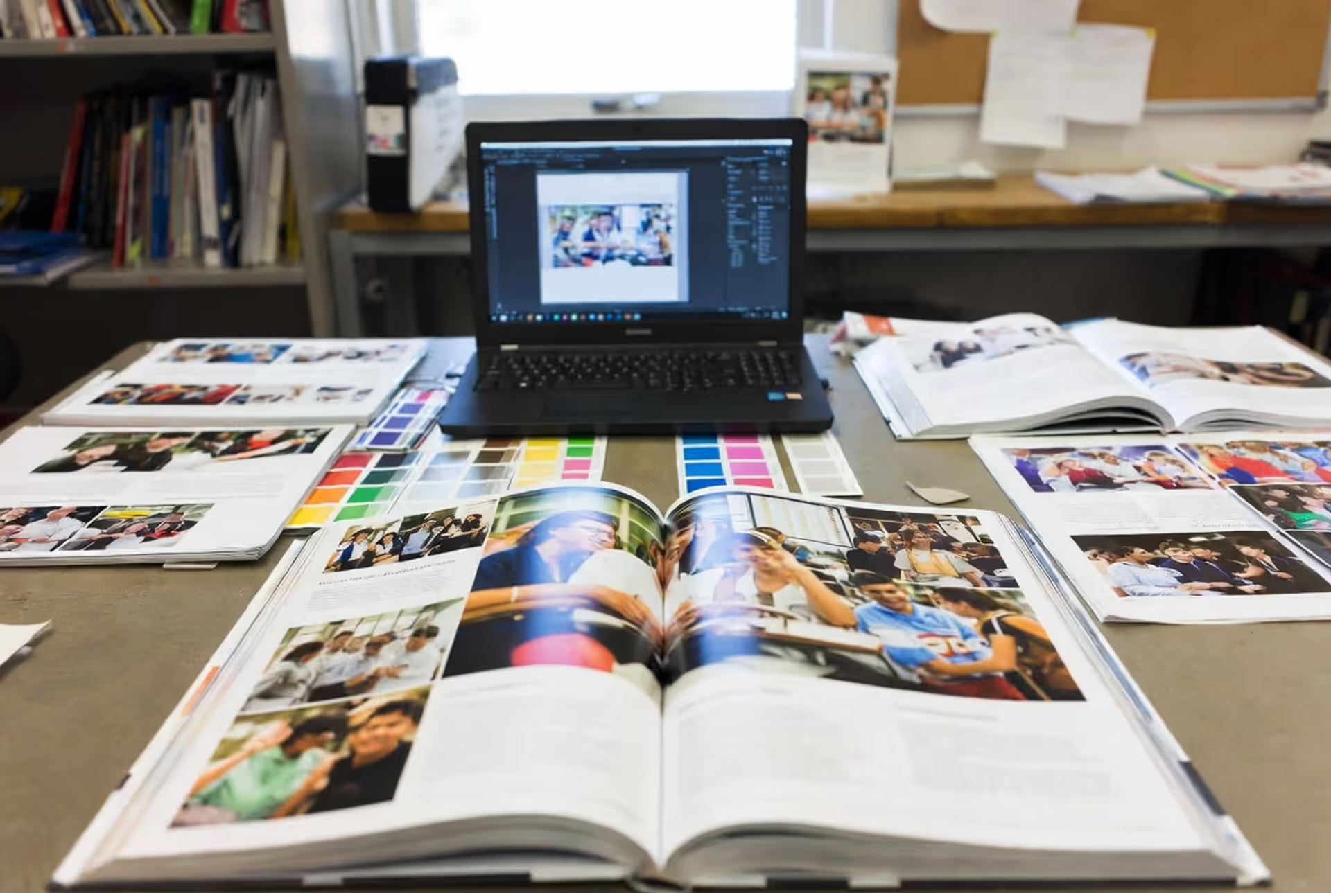
Here's the thing about yearbook spreads—they're basically the DNA of your entire yearbook. You've got two facing pages to work with, and what you do with that real estate determines whether students flip past quickly or actually stop to relive a moment. We're not talking about slapping photos onto pages and calling it done.
The real goal? Make someone who wasn't even at homecoming feel like they missed out. Create layouts that pull readers in and keep them there. When you nail the hierarchy, balance your elements properly, and build deliberate visual paths, you turn a random collection of photos into something people actually want to look at years later.
What Makes a Yearbook Spread Effective
Think of your spread as one continuous panorama, not two separate pages that happen to sit next to each other. That's your canvas for mixing photos with headlines, body copy, and captions—all working together to tell one coherent story about an event, a group, or a theme.
But documentation alone won't cut it. You need engagement. How do you get it? Strategic design decisions that tell readers exactly where to look first, what to check out next, and how all the pieces connect. Visual hierarchy is your roadmap here—typically your biggest photo grabs attention first, then supporting images, then text fills in the details.
Size matters enormously in photo spread composition. Make everything the same size and you've created visual noise. Nothing stands out. The spreads that actually work? They feature one or two commanding photos that anchor everything else. Those smaller supporting images add context and extra details, but they don't compete with your star player.
Every single element on your spread should advance the story. Your primary image needs to capture the essence—the game-winning touchdown, the lead actor's dramatic moment, the chaos of spirit week. Secondary photos show different angles, candid reactions, or details that flesh out the narrative. Text doesn't just describe what's already obvious in the photos; it adds meaning and context.
Want better engagement? Work with how people actually read. In Western cultures, eyes move left to right, top to bottom. Put your strongest visual in the upper left or upper right quadrant and you're already ahead. And please—never split faces or critical elements down the gutter (that's where the pages meet in the middle). It's frustrating and kills the reading flow.
White space isn't wasted space. It gives readers breathing room. New designers panic and try filling every square inch, but strategic emptiness actually makes your content hit harder and helps people process what they're seeing.
Author: Olivia Hartwell;
Source: crafterholic.com
Planning Your Layout Before You Start Designing
Jumping straight into design without prep work is how you end up with scattered, unfocused spreads. Start by nailing down your theme and gathering everything you've got. Say you're covering the homecoming dance—you might have 50+ photos of decorations, dancers, the crowning ceremony, and crowd shots. Your job is picking the ones that tell the complete story without overwhelming anyone.
Photo selection requires brutal honesty. Pick images with strong composition, proper exposure, and genuine moments instead of stiff posed shots. You want variety—wide shots that establish the scene, medium shots showing interactions, tight crops capturing emotion. Toss the near-duplicates. You don't need five photos of basically the same moment from slightly different angles.
Now plan your text. Headlines should be specific and grab attention—"Record 847 Students Pack Homecoming Dance Floor" beats "School Dance" every time. Body copy usually runs 100-200 words with context, quotes, or details that enhance what the photos show. Captions identify people and contribute information that images can't communicate alone.
Even a simple design brief keeps you focused. Which photo is your dominant image? What are your secondary photos? How long are your headline and copy? Any mandatory elements like sponsor logos or specific requirements?
Choosing Between Portrait and Landscape Orientations
Portrait versus landscape describes your dominant image orientation, not the page format itself (yearbooks typically use landscape binding anyway). Portrait-dominant spreads feature vertical photos as the main attraction. Landscape-dominant spreads emphasize horizontal images.
Use portrait when it makes sense—individual profiles, fashion spreads, or events where vertical framing creates impact. Think graduation processions, basketball games, or theater performances. Portrait creates height and formality.
Go landscape for group shots, sweeping scenes, or action that benefits from horizontal framing. Field trips, football games, classroom activities—these work better horizontally. Landscape feels expansive and energetic.
The best spreads often mix both. Maybe a large horizontal photo dominates the top, with vertical images arranged below. This variety adds visual interest and accommodates different photo shapes without awkward cropping.
Author: Olivia Hartwell;
Source: crafterholic.com
Establishing Theme Consistency Across Multiple Spreads
Consistency builds unity as readers move from sports to clubs to academics. They should recognize your visual language even when subject matter shifts dramatically.
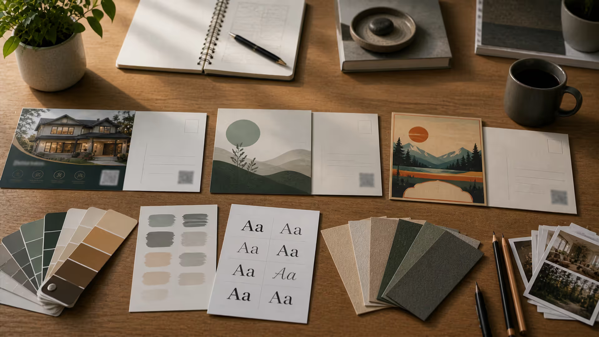
How do you achieve this? Repeat specific design choices. Maybe you use color schemes that reflect school identity. Perhaps you stick with certain typeface combinations for headlines versus body text. Or you standardize how you position captions. When fall sports spreads use bold sans-serif headlines positioned flush left, spring sports spreads should follow suit.
Templates help maintain consistency without creating cookie-cutter pages. Develop flexible frameworks that designate zones for headlines, copy, and captions while letting photo arrangements shift based on content. A football spread might need space for dramatic action photography. A cross-country spread might work better with multiple smaller images of individual runners.
Section dividers signal topic changes while preserving overall unity. Distinctive title pages for athletics, academics, student activities—they introduce visual variety without abandoning your core design principles.
Grid Systems and Structure for Two-Page Layouts
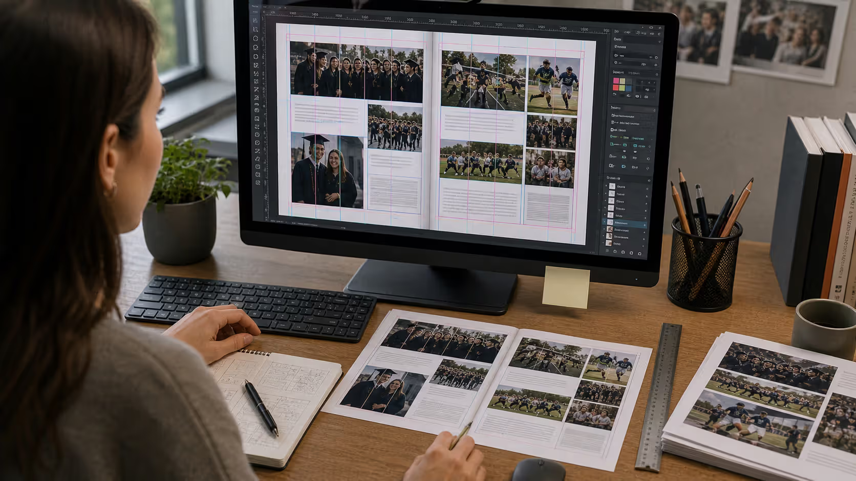
Think of grids as the invisible architecture beneath your visible design. Readers don't see them directly, but they create the organization that makes layouts feel polished and readable.
Basic grids divide spreads into equal-width columns with gutters (those spaces between columns) separating them. Images and text blocks align to these columns, creating visual relationships and consistent spacing. Three-column grids are simple and bold. Four-column grids offer more flexibility. Five-column grids enable sophisticated, magazine-quality designs.
Margins create boundaries between your content and page edges. Adequate margins prevent cramped-looking designs and ensure important elements won't get trimmed during production. Standard margins run 0.5 to 0.75 inches, though your printer's specs might vary.
Modular grids divide pages both horizontally and vertically, creating a matrix of rectangular modules. This works brilliantly for photo-heavy spreads that need multiple images at various sizes while maintaining clean alignment.
That center fold—the gutter—needs special attention in two-page layouts. Leave at least 0.5 inches clear on both sides. Never run text or faces across this area. The fold hides content and awkwardly splits faces.
Grid Type
Columns
Works Best For
Advantages
Limitations
3-column
3
Simple layouts, large photos, beginners
Easy to implement, creates bold statements, quick to execute
Limited flexibility, can feel repetitive across many pages
4-column
4
Mixed text and photos, versatile arrangements, general yearbook work
Flexible sizing options, professional look, handles varied content well
Takes more planning than 3-column, can look generic if overused
Precise alignment, organized presentation of many images, flexible scaling
Time-consuming to set up, can feel rigid, demands careful planning
Baseline grids add another layer of structure by aligning text across columns to invisible horizontal guides. This synchronizes text blocks on facing pages and contributes to that refined, professional look.
Grids shouldn't constrain creativity—they should enable it. Once you understand the underlying structure, you can break rules strategically for emphasis. A photo that bleeds off page edges or spans multiple columns creates impact precisely because it contrasts with surrounding grid-aligned elements.
Balancing Photos and Text in Your Spread
How images and text interact determines whether your layout feels balanced or lopsided. A solid starting point: dedicate 60-75% of your spread to photographs and 25-40% to text and breathing room. Photo-heavy spreads suit visual events like games or performances. Text-heavier layouts work for academic awards or clubs where explanation matters more than action shots.
Your dominant image sets the entire mood. This should be your strongest photo—sharp focus, engaging composition, authentic emotion, and direct relevance to your theme. Make it substantially bigger than supporting photos. If your dominant image measures 8×10 inches, secondary images might range from 3×5 to 5×7 inches. This size difference creates unmistakable hierarchy.
Supporting photos build narrative depth. When your dominant image shows the lead actor in an intense close-up, supporting photos might reveal ensemble cast members, backstage prep, or audience reactions. Together, they construct a complete picture no single photo can deliver.
Captions need precision and efficiency. Identify people left to right using full names (check your style guide for whether to include grade levels). Add context beyond the obvious: "Junior Maya Chen adjusts her microscope while analyzing cell samples during AP Biology" tells readers more than "Maya Chen in biology class." Keep it brief—one to two sentences usually does the job.
Position headlines where they'll grab attention without dominating. Common spots include the upper-left area, centered across both pages, or integrated within colored bars spanning top or bottom edges. Headlines should be your largest text element, typically 36-72 points depending on length and available space.
The path readers follow through your content matters. Start with the dominant photo positioned strategically—upper left, upper right, or center. Arrange supporting photos to create a natural progression from one element to the next. Avoid isolated clusters where photos bunch on one page while text monopolizes the other.
Strong photo spread composition requires variety in image shapes and sizes. Mix horizontal and vertical photos. Include at least one tight crop revealing detail or emotion alongside broader shots establishing the setting. This variation maintains visual interest and prevents monotonous patterns.
Text blocks need to be readable. Body copy typically runs 10-12 points in clean sans-serif or serif typefaces. Line length affects comprehension—40-60 characters per line is optimal. Longer lines strain eyes. Shorter lines feel choppy and generate excessive hyphenation.
Space between elements prevents crowding. Provide breathing room around photos, between text blocks, and along margins. When elements sit too close together, spreads feel suffocating and readers struggle distinguishing separate components.
A great yearbook spread doesn't just show what happened—it makes you feel like you were there. The best designs guide the eye naturally from the dominant image through supporting photos to the story itself.
— Jennifer Sauer
Common Yearbook Spread Design Mistakes to Avoid
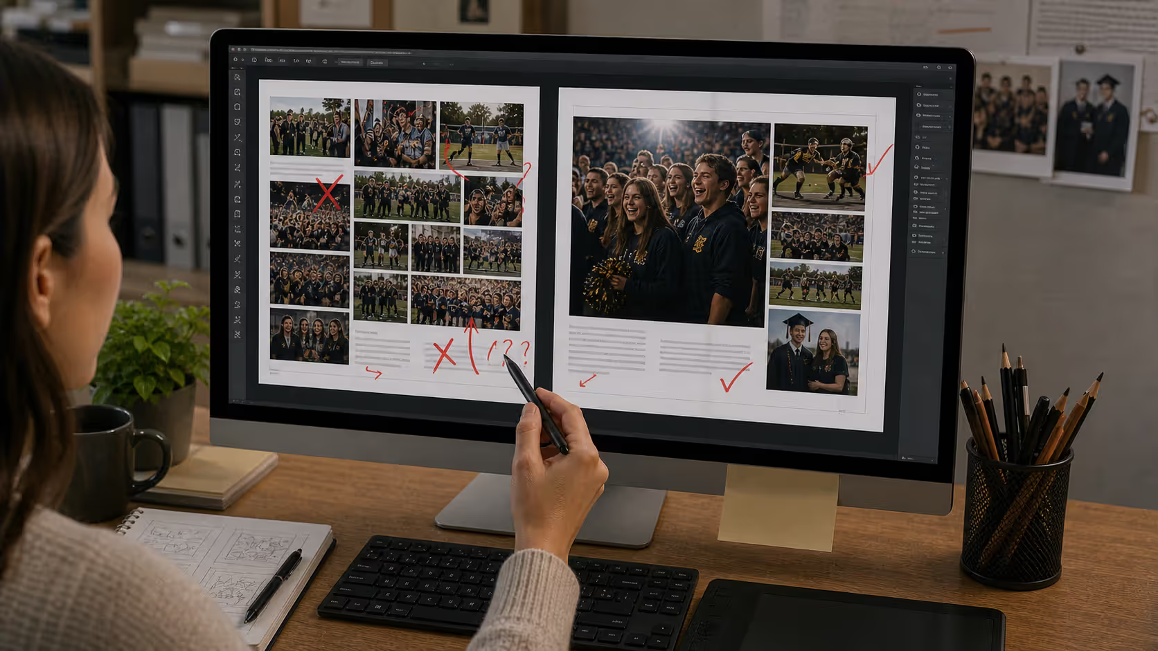
Overcrowding tops the list of yearbook layout disasters. Trying to cram every photo from an event creates visual chaos. Twelve tiny photos scattered across a spread diminishes impact and confuses readers. Five powerful images with proper sizing hierarchy outperforms a dozen mediocre ones squeezed together.
Inconsistent spacing sabotages visual unity. When gaps between photos fluctuate randomly—a quarter inch here, half an inch there—layouts look amateurish. Use your grid system to maintain uniform gutters between elements. If you establish a 0.25-inch gap between photos, apply it consistently across the entire spread.
Poor photo quality undermines even brilliant layouts. Blurry images, exposure problems, or low resolution can't be fixed with clever design. Yearbooks print at 300 dpi (dots per inch), so images must meet this standard. An image that looks fine on screen at 72 dpi will print blurry and pixelated.
Weak focal points leave readers uncertain where to look first. When all photos carry similar size and placement, nothing provides guidance. Establish an obvious entry point with your dominant image, then position supporting elements to create a logical viewing sequence.
Breaking the gutter splits faces, bodies, or critical visual information across the center fold. This creates awkward interruptions and frustrates viewers. Keep critical content at least 0.5 inches from the gutter on both sides.
Misaligned elements project carelessness. When photos don't align to common edges or grid references, layouts appear sloppy. Use software alignment tools to snap elements to grids and to each other. Consistent alignment communicates professionalism.
Ignoring the fold creates problems during printing and binding. Your spread's center will curve into the gutter, hiding content positioned too close. Similarly, content placed within 0.25 inches of outer edges risks getting trimmed.
Inconsistent text formatting confuses audiences. Introducing a person as "Sarah Martinez" in one caption and "Martinez" in another creates uncertainty. Develop formatting standards and stick with them.
Typography errors include using too many typefaces (stick to two or three max), setting body copy too small (nothing below 10 points), or applying decorative fonts to body text (save these for headlines only). Poor typography choices hurt readability and create visual clutter.
Author: Olivia Hartwell;
Source: crafterholic.com
Tools and Templates for Creating Yearbook Layouts
Adobe InDesign remains the professional standard for editorial page design. It offers precise control over grids, master pages, typography, and image positioning. The learning curve is steeper than simpler alternatives, but the capabilities justify the effort for serious yearbook production. InDesign supports CMYK color mode (required for professional printing), handles high-resolution images efficiently, and includes tools built specifically for multi-page publication layout.
Canva provides an accessible alternative for schools with tight budgets or limited design experience. The platform offers yearbook-specific templates and an intuitive drag-and-drop interface. While it lacks some of InDesign's advanced capabilities, Canva handles basic yearbook layout design well and makes collaboration among multiple staff members easier. The free tier has restrictions, but Canva Pro unlocks additional templates and features at reasonable cost.
Yearbook-specific platforms like TreeRing, Entourage, and Fusion integrate design tools with ordering and distribution infrastructure. These platforms supply templates that comply with printing specifications, reducing technical errors. They're particularly valuable for schools producing their first yearbook or those without dedicated design expertise.
Templates speed up the design process while maintaining consistency. Many yearbook companies provide templates customized for their printing specs. Balfour, Jostens, and Herff Jones offer template libraries ensuring layouts meet technical requirements for bleed, margins, and color profiles.
Working with print specifications requires attention to technical details. Most yearbook printers require PDF files with specific configurations: CMYK color mode (not RGB), 300 dpi image resolution, 0.125-inch bleed extending beyond trim lines, and fonts either embedded or converted to outlines. Confirm specifications with your printer before starting design work to prevent costly revisions.
Color management affects how spreads look in print versus on screens. Monitors display color through RGB (red, green, blue) light, while printers use CMYK (cyan, magenta, yellow, black) ink. Vibrant colors that look brilliant on screens may print noticeably duller. Use soft-proofing tools in InDesign or request printed proofs from your yearbook company to verify color accuracy.
File organization prevents chaos as deadlines approach. Create folder structures separating photos by event or section, maintain master folders for finalized spread files, and keep backups of everything. Nothing derails production faster than missing files or confusion about which version is current.
Master pages in InDesign streamline template development. Set up master pages with your grid, margins, page numbers, and recurring design elements. Applying a master page to working spreads automatically populates these elements, ensuring consistency and saving time.
Collaboration tools matter when multiple staff members contribute to yearbook design. Cloud-based platforms enable simultaneous access and editing. Google Drive, Dropbox, or Adobe Creative Cloud Libraries facilitate file sharing and version management.
FAQ
How many photos should be on a yearbook spread?
Most spreads work best with 3-7 photos. This lets you feature a clear primary image plus supporting shots without creating clutter. Event coverage might need more photos (8-10), while feature spreads or portraits function well with fewer (2-4). Quality and visual hierarchy beat quantity—five well-chosen, properly sized photos create more impact than twelve small, redundant images fighting for attention.
What is the best size for a dominant photo in a yearbook layout?
Your primary photo should occupy roughly 40-60% of total image space on the spread. For standard 17×11-inch yearbook spreads (two 8.5×11-inch pages), this translates to approximately 60-90 square inches. A typical approach uses a half-page dominant image (around 8×10 inches or 7×11 inches) with smaller supporting photos ranging from 3×5 to 5×7 inches. The key factor is creating obvious size differentiation—your dominant image must be noticeably larger than any other photo on the spread.
Should yearbook spreads use portrait or landscape orientation?
Your content determines this decision. Use portrait-oriented dominant images for individual subjects, vertical action (basketball, theater, climbing walls), or formal portraits. Choose landscape orientation for group photos, horizontal action (football, swimming, track), panoramic scenes, or classroom environments. The strongest spreads frequently combine both orientations, respecting each photo's natural shape rather than forcing everything into uniform orientation. Let your content drive the choice.
How do you maintain theme consistency across different yearbook sections?
Build a design system with specific typefaces (one for headlines, one for body copy, one for captions), a color palette connecting to school colors or yearbook themes, consistent grid structure (use identical column systems throughout), and recurring design elements (similar headline styling, standardized caption positioning). Develop templates for different spread categories (event coverage, portraits, clubs) sharing these foundational elements while allowing flexibility for varied content. Document your design decisions in a style guide that all staff members can reference.
What resolution should photos be for yearbook printing?
Images need 300 dpi (dots per inch) at final printed size. A photo printing at 8×10 inches requires minimum dimensions of 2400×3000 pixels (8 inches × 300 dpi = 2400 pixels). Lower resolution produces blurry, pixelated prints that look unprofessional. Check image resolution in your design software or photo editor before adding images to layouts. When enlarging photos significantly from original sizes, verify they maintain 300 dpi at new dimensions. When in doubt, choose the highest resolution version available from your source files.
Can you split one photo across both pages of a spread?
Technically possible, but rarely a good idea. Splitting a photo across the gutter creates multiple problems: faces or crucial elements get hidden by the fold, the image appears warped where pages curve into the binding, and readers must mentally reconstruct the separated image. If you absolutely must span the gutter, choose a landscape photo where the center contains less critical content (sky, background, neutral space) rather than faces or text. Better approach: use a large single-page photo as your dominant image and keep it entirely on one side of the spread for uninterrupted viewing.
Creating effective yearbook spreads comes down to thoughtful preparation, solid design fundamentals, and careful execution. Establish clear visual hierarchy, use grid systems to organize content, balance photos and text with purpose, and maintain consistency throughout your yearbook. These practices help you develop layouts that engage readers and preserve memories with professional polish.
Start with strong photo selection and clear themes. Build your layout on a grid structure that provides organization without rigidity. Size your dominant image substantially larger than supporting photos to create an obvious entry point. Use white space deliberately to prevent crowding and enhance readability.
Avoid common mistakes like overcrowding spreads, splitting critical content across the gutter, or using inconsistent spacing. Choose design tools that match your skill level and resources, whether professional software like InDesign or accessible platforms like Canva.
Great yearbook spreads do more than document events—they construct narratives that transport readers to specific moments. Apply these principles consistently and you'll transform your yearbook from a simple photo collection into a visual story students will treasure for years.
Timeline arrows guide viewers through chronological information, transforming static data into dynamic narratives. This comprehensive guide covers arrow styles, process visualization techniques, common design mistakes, and practical tools for creating effective directional elements in timelines and infographics.
Symbols compress complex creative concepts into instant visual recognition. This comprehensive guide explores the psychology behind creativity symbols, catalogs the most effective options from lightbulbs to geometric forms, and provides a practical framework for choosing the right symbol for your design, branding, or communication project.
Learn professional postcard design principles for print and direct mail. Covers standard formats, layout composition, visual hierarchy, style approaches, and proven strategies that increase response rates. Includes size comparison chart, expert insights, and common mistakes to avoid.
Organic lines form the visual language of nature itself. Unlike rigid geometric forms, these flowing curves bring movement and life to compositions. Discover how to recognize, create, and apply organic lines effectively in your art and design work through practical techniques and real-world examples.
The content on this website is provided for general informational and educational purposes only. It is intended to explain concepts related to digital design, visual art, color theory, art techniques, design principles, and design history.
All information on this website, including articles, guides, and examples, is presented for general educational purposes. Creative outcomes may vary depending on individual skill, tools, and practice.
This website does not provide professional design services or guarantee results, and the information presented should not be used as a substitute for formal education or professional consultation.
The website and its authors are not responsible for any errors or omissions, or for any outcomes resulting from decisions made based on the information provided on this website.