Proximity gestalt describes how the human brain automatically groups visual elements that sit close together, perceiving them as related or part of the same unit. This perceptual organization design principle emerged from the Gestalt school of psychology, founded in the early 20th century by German psychologists Max Wertheimer, Kurt Koffka, and Wolfgang Köhler. They demonstrated that humans perceive whole patterns rather than isolated components—"the whole is different from the sum of its parts."
The proximity principle operates unconsciously. When you glance at a page, your visual system scans spatial relationships before you consciously read content. Elements positioned near each other form implicit associations, while increased distance signals separation or difference. This gestalt principles overview reveals why proximity ranks among the most powerful tools for organizing information: it requires no color, shape, or typography changes to work effectively.
In design contexts, proximity gestalt helps establish relationships between headings and body text, group navigation items, cluster form fields, and create visual hierarchies without adding explicit dividers. Understanding this principle transforms how designers structure layouts, moving from decoration-driven approaches to perception-based composition.
How the Law of Proximity Works in Visual Perception
The gestalt law of proximity operates through the brain's pattern-recognition systems, which evolved to make rapid sense of complex environments. When processing visual information, your brain seeks efficiency—grouping nearby objects reduces cognitive load by creating fewer distinct "chunks" to track and remember.
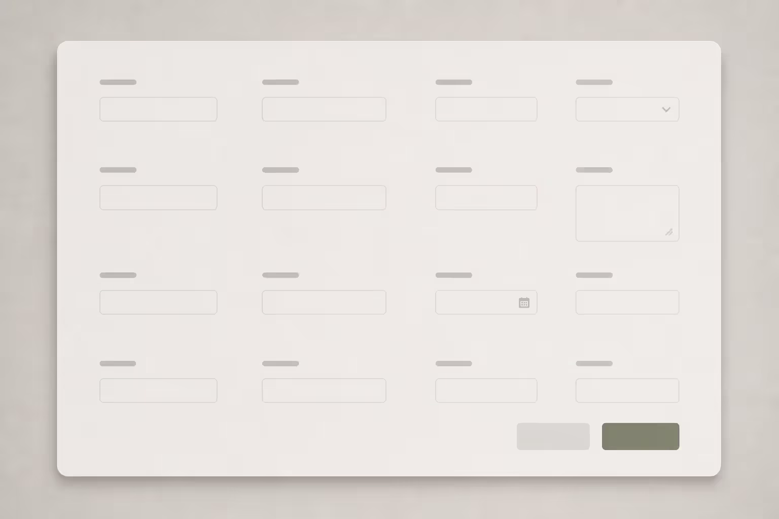
Neuroscience research shows that proximity processing happens in early visual cortex areas, before conscious attention kicks in. Neurons respond more strongly to clusters of elements than to scattered items, essentially pre-organizing the visual field. This explains why you immediately see a grid of icons as related app functions rather than 16 separate squares, or why three paragraphs with tight line spacing read as one block while widely spaced paragraphs feel like distinct sections.
Author: Adrian Lowell;
Source: crafterholic.com
Everyday examples demonstrate visual grouping in design constantly. Parking lot spaces marked with lines create implicit boundaries—cars parked close together suggest carpooling or a group arrival. Grocery store shelving clusters products by category through proximity alone; the physical gap between cereal and pasta sections communicates difference more clearly than signage. Restaurant menus use white space to separate appetizers from entrees, allowing diners to scan categories without reading every item.
The threshold for proximity varies by context. In dense environments like financial dashboards, even 8-pixel spacing can signal grouping, while minimalist landing pages might require 40-60 pixels to establish clear separation. Cultural reading patterns also influence perception—Western audiences accustomed to left-to-right scanning may perceive horizontal proximity differently than vertical spacing.
Applying the Proximity Principle in Design
The proximity principle in design translates perceptual psychology into practical layout decisions. Successful application requires deliberate control of white space, consistent spacing systems, and awareness of how proximity interacts with other visual properties.
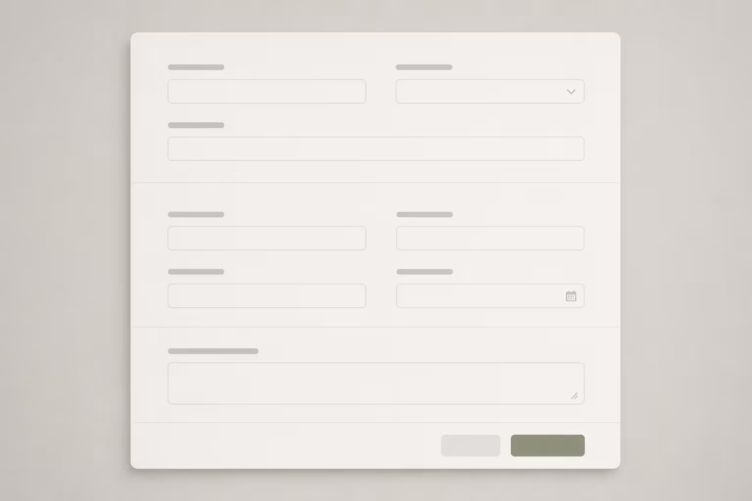
Start by identifying logical relationships in your content. Form labels belong with their input fields. Product prices pair with product names. Author bylines connect to article headlines. Once you've mapped these relationships, use proximity to make them visually obvious. Place related elements 8-16 pixels apart while separating distinct groups by 24-48 pixels—roughly 1.5-3× the internal spacing. This ratio creates clear differentiation without requiring borders or backgrounds.
Navigation menus demonstrate grouping elements by proximity in action. Primary navigation items cluster together with minimal gaps (perhaps 12-16 pixels), while secondary utilities like account settings or search sit apart by 40+ pixels. The spatial break communicates hierarchy and function without color changes or dividers.
Card-based layouts rely heavily on proximity. Each card's internal elements—image, headline, description, button—sit close together, while generous margins (20-32 pixels) separate cards from neighbors. Users instantly perceive each card as a discrete unit containing related information.
Author: Adrian Lowell;
Source: crafterholic.com
Spacing and White Space Strategies
White space isn't empty—it's an active design element that controls grouping. Effective spacing systems use mathematical ratios rather than arbitrary values. A common approach multiplies a base unit (8 pixels) to create a scale: 8, 16, 24, 32, 48, 64. This ensures consistent spacing that reinforces grouping patterns across an entire interface.
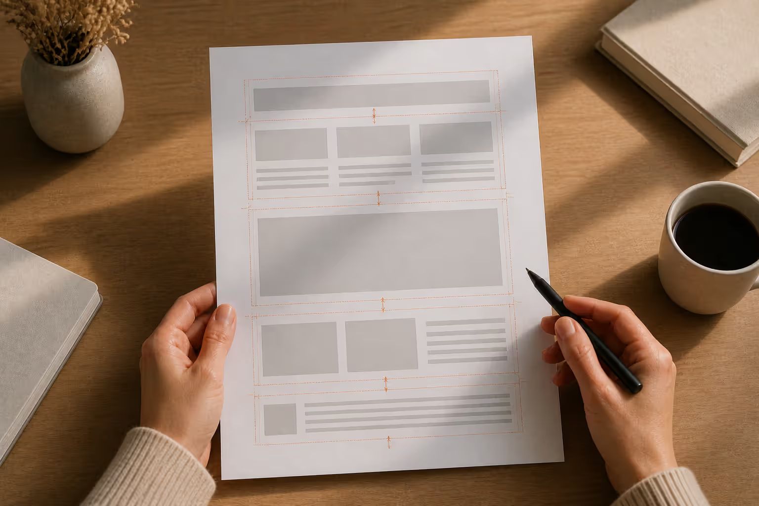
Macro white space (the large gaps between major sections) works with micro white space (the small gaps within components) to create nested hierarchies. A blog post might use 8 pixels between lines, 16 pixels between paragraphs, 32 pixels between subsections, and 64 pixels between major sections. Each level of spacing signals a different relationship tier.
Responsive design complicates proximity because spacing must adapt to screen sizes. A 48-pixel gap that clearly separates desktop sections might shrink to 24 pixels on mobile, potentially weakening the grouping effect. Maintain proportional relationships rather than fixed pixel values—if desktop internal spacing is 1/3 of external spacing, preserve that 1:3 ratio on smaller screens.
Alignment reinforces proximity. Elements that share both close positioning and edge alignment read as more strongly related than nearby but misaligned items. A form with left-aligned labels and left-aligned inputs creates clearer grouping than centered labels over left-aligned inputs, even at identical vertical spacing.
Author: Adrian Lowell;
Source: crafterholic.com
Common Mistakes When Using Proximity
Inconsistent spacing destroys proximity's effectiveness. When some related items sit 12 pixels apart while others use 18 pixels, the brain struggles to identify patterns. Users waste cognitive energy decoding whether spacing variations carry meaning or reflect sloppy execution.
Insufficient contrast between grouped and ungrouped spacing creates ambiguity. If related elements sit 16 pixels apart but separate groups only have 20-pixel gaps, the 4-pixel difference is too subtle. Aim for at least 1.5× difference, preferably 2-3×, to make grouping unambiguous.
Over-reliance on proximity while ignoring other Gestalt principles produces weak designs. Proximity works best when reinforced by similarity (consistent styling within groups) or continuity (aligned edges). A list of items with varied fonts, colors, and sizes won't cohere through proximity alone.
Ignoring reading patterns causes proximity failures. In left-to-right languages, horizontal spacing often matters more than vertical spacing for establishing relationships. A label positioned 8 pixels to the left of an input feels more connected than a label 8 pixels above, even though the distance is identical.
Author: Adrian Lowell;
Source: crafterholic.com
Proximity vs. Other Gestalt Principles
Gestalt psychology identified multiple principles that govern perceptual organization. Understanding when to apply proximity versus other principles prevents design conflicts and creates more sophisticated compositions.
The gestalt similarity principle groups elements based on shared visual properties—color, shape, size, or texture. A page with blue headings and black body text uses similarity to distinguish content types, regardless of spacing. Similarity works across distance; blue headings scattered throughout a long article still read as related. Proximity, conversely, requires spatial closeness. Use similarity when grouping elements that can't sit near each other, and proximity when spatial relationships can reinforce logical connections.
Gestalt closure in design describes how viewers mentally complete incomplete shapes or patterns. A circle drawn with a 270-degree arc still reads as a circle because your brain fills the gap. Logos often exploit closure to create memorable, simplified marks. While proximity organizes separate elements into groups, closure unifies partial elements into wholes. Proximity asks "which items belong together?" while closure asks "what complete form do these fragments suggest?"
The figure ground relationship determines which elements viewers perceive as foreground objects versus background context. High contrast, enclosure, or size differences establish figure-ground separation. A modal dialog uses figure-ground (the bright overlay versus dimmed background) to focus attention, while proximity within the modal groups form fields. Figure-ground establishes what to look at; proximity organizes information within that focus area.
Continuity suggests that aligned or flowing elements belong together, even across gaps. A curved line passing behind an object appears as one continuous line rather than two separate segments. Navigation breadcrumbs use continuity (the horizontal flow) reinforced by proximity (tight spacing between items). When elements follow a clear path or alignment, continuity strengthens the grouping proximity creates.
The fundamental formula of Gestalt theory might be expressed in this way: There are wholes, the behavior of which is not determined by that of their individual elements, but where the part-processes are themselves determined by the intrinsic nature of the whole.
— Kurt Koffka
Real-World Examples of Proximity in Graphic Design
E-commerce product grids demonstrate gestalt laws in graphic design through careful proximity control. Each product occupies a cell with an image, title, price, and rating clustered tightly (8-12 pixels between elements). Generous spacing (24-40 pixels) separates products from neighbors, creating clear boundaries. Shoppers scan dozens of products quickly because proximity pre-organizes information into digestible units.
Dashboard interfaces for analytics platforms use proximity to group related metrics. A revenue widget might cluster the current value, percentage change, and sparkline chart within 12 pixels, while sitting 32 pixels from a separate user-count widget. Color-coding or borders could achieve similar grouping, but proximity alone reduces visual noise and speeds comprehension.
Magazine layouts exploit proximity for editorial hierarchy. A feature article's headline sits 8-12 pixels from its deck (subheading), which sits 16 pixels from the byline, which sits 24 pixels from body text. The opening paragraph might sit 16 pixels from the second paragraph, but 48 pixels separate the article from sidebar content. These spacing variations guide readers through content tiers without explicit labels.
Mobile app settings screens group related options through proximity and dividers. Account settings (name, email, password) cluster together, separated by a 1-pixel divider and 24 pixels of white space from notification settings (push, email, SMS). The divider reinforces the proximity-created grouping rather than creating it—remove the divider and the spacing alone still communicates separation.
Email newsletters use proximity to distinguish content blocks. A header with logo and navigation might have 16 pixels of internal spacing but 40 pixels separating it from the hero article. Article previews stack with 32-pixel gaps, while footer links cluster with 8-pixel spacing. Subscribers skim content effortlessly because spatial relationships match logical structure.
Gestalt Principle
Definition
Primary Use Case
Design Application
Proximity
Elements close together are perceived as related
Grouping related content or controls
Form field clusters, navigation menus, card layouts with tight internal spacing and generous external margins
Similarity
Elements sharing visual properties are perceived as related
Categorizing or labeling across distance
Consistent heading styles, color-coded status indicators, icon sets with uniform styling
Closure
Viewers mentally complete incomplete shapes
Creating simplified, memorable forms
Logo designs with implied shapes, progress indicators with partial circles, iconography using minimal strokes
Continuity
Aligned or flowing elements are perceived as connected
Modal dialogs over dimmed backgrounds, hero sections with contrasting backgrounds, card elevation effects
Best Practices for Grouping Elements by Proximity
Establish a spacing scale before designing individual components. Define 5-7 spacing values (e.g., 4, 8, 16, 24, 40, 64, 96 pixels) and assign semantic meaning: 4px for tightly coupled items, 8px for related elements, 16px for loose relationships, 24px+ for distinct groups. Codifying these values in design systems ensures consistency across teams and projects.
Audit spacing with squint tests. Blur your eyes or view designs at thumbnail size—proximity patterns should remain obvious. If blurred sections blend together when they should separate, increase spacing. If distinct items appear disconnected, tighten gaps.
Test with real content, not placeholder text. Lorem ipsum of identical length masks how varied content affects proximity. A three-word headline followed by a two-sentence description creates different spacing needs than a ten-word headline with a five-sentence description. Build flexibility into spacing systems to accommodate content variation.
Consider accessibility when grouping elements by proximity. Screen reader users don't perceive spatial relationships, so semantic HTML structure must mirror visual grouping. If proximity groups a label with an input, the HTML should explicitly associate them via for and id attributes. Visual proximity should reinforce, not replace, programmatic relationships.
Use grid systems to maintain proximity consistency. A 12-column grid with 16-pixel gutters provides natural spacing units. Components that span 4 columns naturally sit 16 pixels from neighbors. Grid-based layouts automatically enforce spacing ratios that support proximity grouping.
Iterate based on user testing. Eye-tracking studies reveal whether users perceive the groupings you intended. If users pause or backtrack when scanning content, proximity may be ambiguous. Heatmaps show which elements attract attention—isolated items may need tighter grouping, while crowded sections may need more separation.
Combine proximity with other principles for robust designs. Use proximity for spatial grouping, similarity for visual consistency within groups, and alignment for structural clarity. A form with left-aligned labels (continuity), consistent label styling (similarity), and 8-pixel label-to-input spacing (proximity) creates stronger grouping than any single principle alone.
Frequently Asked Questions About Proximity Gestalt
What is the difference between proximity and similarity in Gestalt theory?
Proximity groups elements based on spatial closeness, while similarity groups them based on shared visual properties like color, shape, or size. Proximity requires elements to sit near each other; similarity works across any distance. A scattered collection of blue circles reads as related through similarity despite wide spacing. Use proximity when spatial relationships can reinforce logical connections, and similarity when related elements must appear far apart.
How does proximity affect user experience in web design?
Proximity reduces cognitive load by pre-organizing information into scannable chunks. Users grasp page structure faster when related elements cluster together, improving comprehension and task completion rates. Poor proximity forces users to consciously decode relationships, slowing interaction and increasing errors. Forms with properly grouped fields see higher completion rates because users understand which information belongs together.
Can you use multiple Gestalt principles together?
Yes—combining principles creates more robust designs than relying on one alone. Proximity might group navigation items spatially while similarity (consistent styling) reinforces the grouping. Closure might suggest a complete shape while figure-ground separates it from the background. The principles work synergistically when they support the same organizational goals, but create confusion when they contradict each other.
What is the ideal spacing to create visual grouping?
No universal value exists—ideal spacing depends on element size, visual density, and context. A rule of thumb: use 1.5-3× more spacing between groups than within groups. For example, if related items sit 12 pixels apart, separate distinct groups by 24-36 pixels minimum. Dense interfaces like dashboards might use smaller absolute values (8px internal, 20px external) while spacious marketing pages use larger values (16px internal, 48px external).
How does proximity relate to information hierarchy?
Proximity creates hierarchy by making primary relationships more obvious than secondary ones. Tight spacing between a headline and deck signals a primary connection, while larger spacing between the deck and body text indicates a secondary relationship. Nested grouping—items clustered into small groups, which cluster into larger sections—builds multi-level hierarchies that mirror content structure.
Does the proximity principle apply to mobile design?
Absolutely. Mobile's limited screen space makes proximity even more critical—you can't rely on expansive white space to separate sections. Mobile designs often use tighter absolute spacing values but maintain the same proportional relationships as desktop versions. A 2:1 ratio between external and internal spacing works on both 375px and 1440px widths, even if the actual pixel values differ.
Proximity gestalt transforms spatial relationships into meaningful organization, helping users navigate complex information with minimal cognitive effort. By understanding how the brain automatically groups nearby elements, designers can create layouts that feel intuitive and scannable without relying on excessive visual styling.
The principle's power lies in its simplicity—controlling white space alone can establish clear hierarchies, group related content, and guide user attention. Yet effective application requires systematic thinking: establishing consistent spacing scales, maintaining sufficient contrast between grouped and separated elements, and testing designs with real content and real users.
Proximity works best alongside other Gestalt principles. Combine spatial grouping with visual similarity, align elements to reinforce continuity, and use figure-ground contrast to focus attention. This multi-principle approach creates resilient designs that communicate structure through multiple perceptual channels.
Whether designing a mobile app, website, or print layout, proximity deserves consideration at every stage. Before adding borders, backgrounds, or decorative elements to distinguish sections, ask whether spacing alone could achieve the same goal. Often, the answer is yes—and the resulting design will be cleaner, faster to scan, and easier to maintain.
Modernism transformed 20th-century art and design by rejecting historical tradition and ornament in favor of rationalism, functionalism, and industrial aesthetics. Learn about its origins in industrialization, key philosophical ideas, influence on visual culture, and lasting legacy.
Visual language uses color, shape, typography, and imagery to communicate ideas instantly. Discover how visual elements function as a communication system, how semiotics creates meaning in design, and how to apply graphic communication principles across media effectively.
Discover how mathematical proportions like the golden ratio (1.618), rule of thirds, and aspect ratios create visual balance in design. Learn practical applications, compare popular ratio systems, and avoid common mistakes when applying proportional design principles to logos, layouts, and interfaces.
A single page can carry an entire pitch, summarize a complex project, or distill a career into a scannable snapshot. This guide breaks down proven layout frameworks, hierarchy techniques, and composition strategies to help you create one-pagers that communicate fast and stick.
The content on this website is provided for general informational and educational purposes only. It is intended to explain concepts related to digital design, visual art, color theory, art techniques, design principles, and design history.
All information on this website, including articles, guides, and examples, is presented for general educational purposes. Creative outcomes may vary depending on individual skill, tools, and practice.
This website does not provide professional design services or guarantee results, and the information presented should not be used as a substitute for formal education or professional consultation.
The website and its authors are not responsible for any errors or omissions, or for any outcomes resulting from decisions made based on the information provided on this website.