Here's what's brutal about one-pagers: you've got maybe 200 square inches to convince someone your idea matters. Could be a startup pitch. Could be your entire professional history. Could be why someone should show up to your event next Thursday.
Most people treat this constraint like a game of Tetris—cram harder, stack tighter, shrink fonts until everything fits. Wrong approach. The designers who nail one-pagers do the opposite. They cut ruthlessly, then arrange what's left so your eye can't help but follow the intended path.
This guide walks through structural frameworks that actually work in practice, hierarchy tricks that direct attention without feeling manipulative, and composition tactics tailored to specific document types. By the end, you'll know how to make a single page do heavy lifting.
What Makes a One Pager Layout Effective
Three things separate forgettable one-pagers from ones that stick: instant visual clarity, scannable organization, and structure matched to purpose.
Clarity first. Someone should identify your main point in under five seconds. Not "understand everything"—just grasp what this document's about. If your headline hides in the middle of the page or your key visual fights with three other images for attention, you've already lost them.
Contrast drives clarity. Your most critical element needs to dominate. Could be through size (72pt headline vs. 12pt body copy). Could be color (electric blue against neutral grays). Could be placement (top-center with white space surrounding it). Pick one element to win the attention battle. When you try to make five things "pop," nothing actually does—they just create visual noise.
Scannable doesn't mean "easy to skim." It means organized to match how eyes actually move across a page. For English readers, that's left-to-right, top-to-bottom. Fight this pattern and you're asking people to work harder than they're willing to work for a single-page document.
Author: Olivia Hartwell;
Source: crafterholic.com
Purpose-driven structure means your layout choice reflects what you're trying to accomplish. A project timeline? Linear vertical structure showing progression. A product with six distinct features? Modular grid letting readers jump to what interests them. A fundraising ask? Emotion-first radial design with the beneficiary at the center and everything else supporting that human story.
White space deserves its own paragraph. Beginners fear empty areas like they're admitting defeat. "I paid for the whole page, I'm using the whole page!" Professional one page information design does the opposite—aims for 40-50% white space. Emptiness frames content, creates breathing room, and paradoxically makes information feel more important.
Core Structure Options for One Page Documents
You've got five structural frameworks that handle 90% of one-pager scenarios. Pick based on your content type and how you want people to navigate information.
Linear Vertical Layout
Single column, top to bottom, no branching. Think of it like a short article—readers start at the beginning and progress through each section in order.
Works brilliantly for: case studies, process explanations, timelines, executive summaries, any narrative with a clear start and finish.
Strengths? Stupid simple to design. Mobile-friendly without modification. Forces logical flow—you can't confuse readers about where to look next because there's only one path.
Limitations? Gets visually boring fast. No good way to present side-by-side comparisons. If someone wants information from section four, they're scrolling past sections one through three to find it.
Author: Olivia Hartwell;
Source: crafterholic.com
Modular Grid Layout
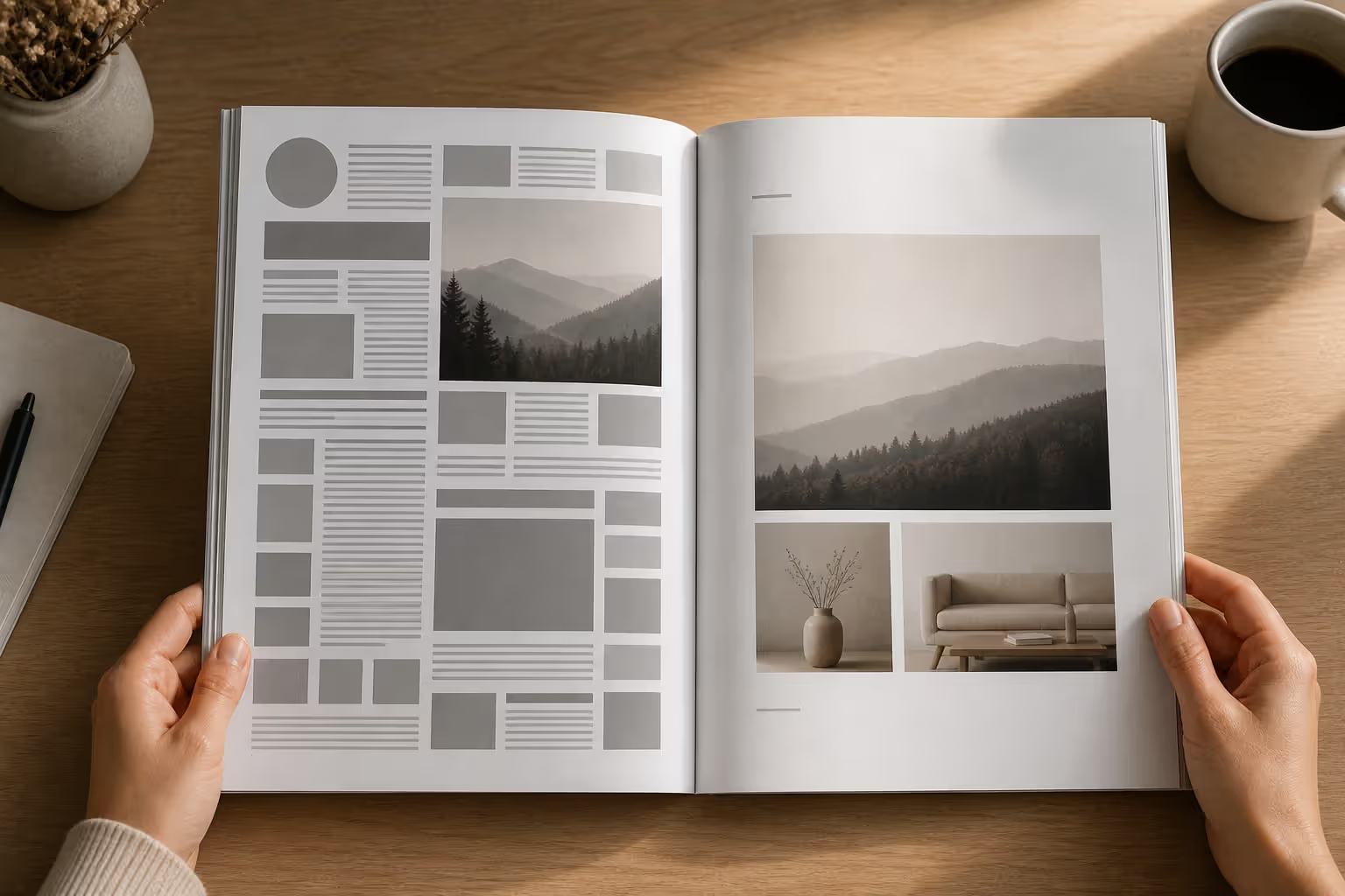
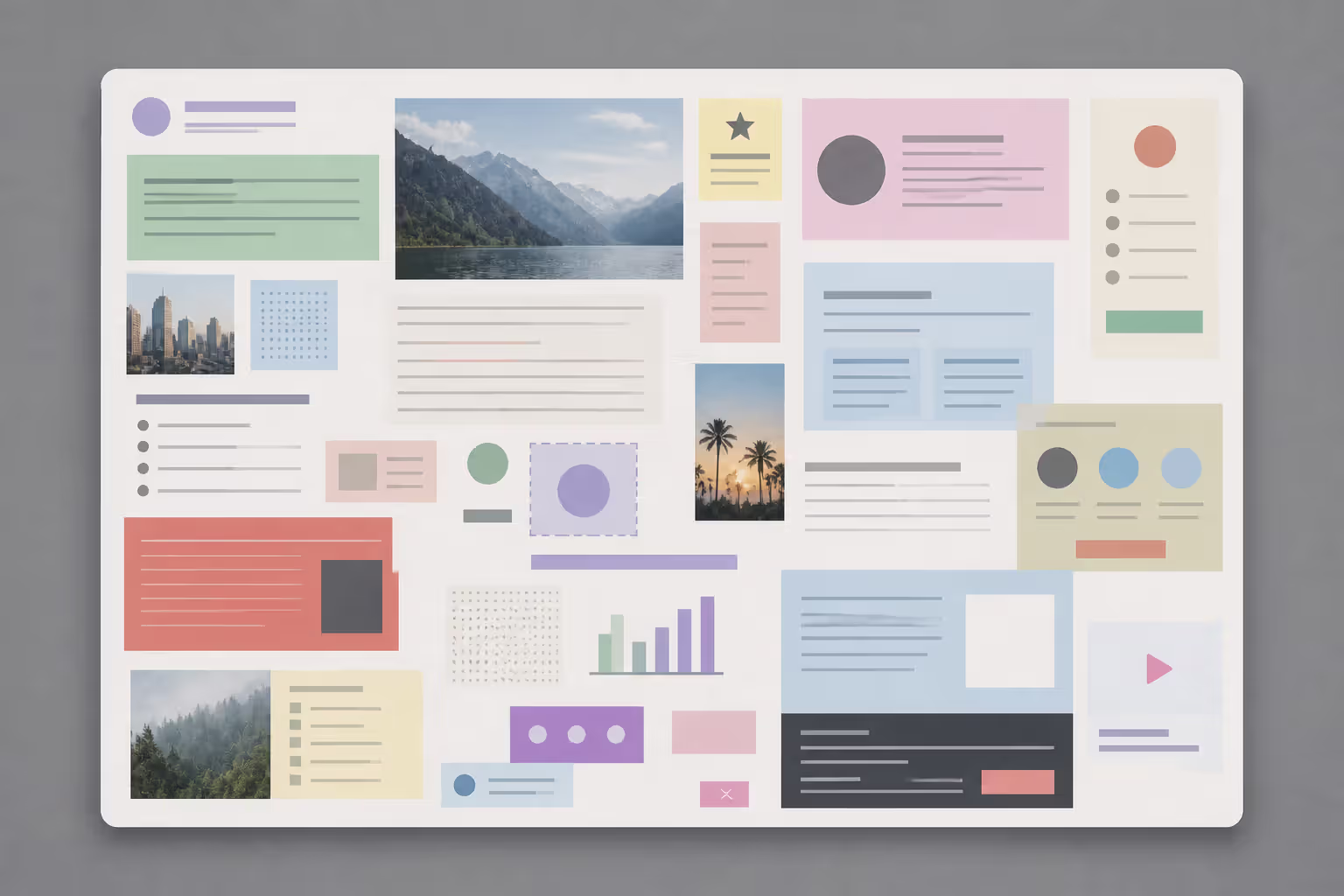
Divide your page into 4-9 rectangular blocks. Each block contains one self-contained idea. Think dashboard design or magazine spreads.
Ideal for: product spec sheets, service menus, portfolio summaries, any situation where you've got multiple distinct topics of roughly equal importance.
The upside? Readers can jump straight to relevant sections without reading sequentially. Handles dense information better than other structures. Creates visual variety through different block sizes.
The catch? Requires serious alignment discipline. Sloppy grid layouts with uneven gutters or misaligned edges look chaotic instead of organized. You need strong visual hierarchy within each module or everything flattens into same-level importance.
Visual Hierarchy Patterns
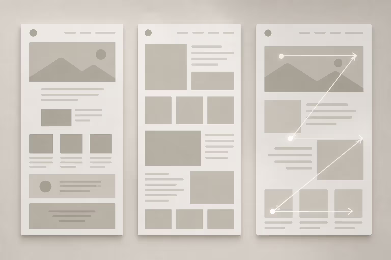
Instead of rigid structure, you're using size, color, and positioning to create a reading path. Two patterns dominate: F and Z.
F-pattern: headline spans the full width at top, content blocks stack down the left side with supporting details extending right. Mirrors how people actually read web pages according to eye-tracking studies—heavy attention to top horizontal and left vertical, less engagement with bottom-right.
Best for: text-heavy documents, reports, blog post summaries, anything where you've got a main headline plus multiple subsections.
Z-pattern: four key elements positioned at the corners of an invisible Z. Top-left (usually a compelling image), top-right (headline or key message), bottom-left (supporting visual or secondary info), bottom-right (call-to-action). The eye naturally zigzags this path.
Author: Olivia Hartwell;
Source: crafterholic.com
Perfect for: event flyers, promotional materials, landing pages, anywhere you've got fewer elements and want strong visual movement.
Radial or hub designs put your focal point dead center—logo, key message, main photo—with supporting elements radiating outward like spokes. Less common but powerful for brand-centric documents or concept diagrams where everything connects back to one central idea.
One Pager Layout Types: Structure Comparison
Layout Type
Best For
Visual Flow
Complexity Level
Ideal Content Volume
Linear Vertical
Process docs, narratives, timelines
Top-to-bottom single path
Simple to execute
300-600 words max
Modular Grid
Product sheets, portfolios, service lists
Reader-directed, non-sequential
Moderate difficulty
400-800 words possible
F-Pattern
Text-focused reports, blog summaries
Horizontal top, vertical left emphasis
Moderate difficulty
500-700 words comfortable
Z-Pattern
Flyers, promo materials, simple pitches
Four-point diagonal movement
Easy to implement
200-400 words ideal
Radial/Hub
Brand statements, concept visualizations
Center outward, no fixed sequence
Challenging balance
150-300 words recommended
Visual Hierarchy Techniques for Single Page Design
Your one pager visual hierarchy determines reading order. Without intentional hierarchy, eyes bounce randomly and brains retain nothing.
Type scale means using size to signal importance. Common ratio: headlines at 36-48pt, subheadings at 18-24pt, body text at 10-12pt. Stick to three sizes maximum. Four or more creates confusion about what's actually important. When you make ten elements "large," you've effectively made zero elements stand out.
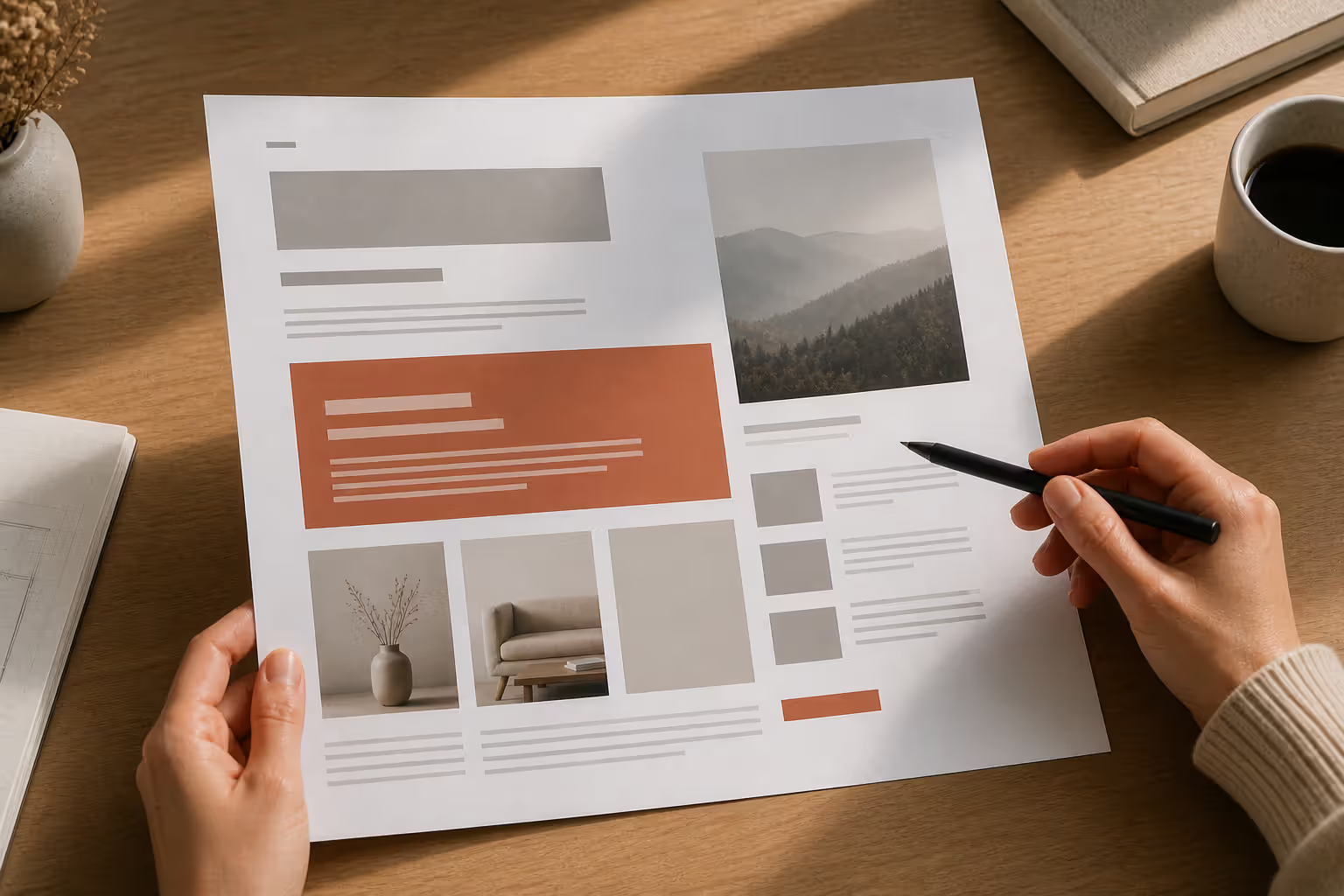
Visual weight combines size with color intensity and thickness. A tiny element in bright red can grab more attention than a huge gray block. Use weight strategically for critical data, calls-to-action, or key takeaways. One designer I know has a useful rule: if you've marked five things as "critical," you actually have zero critical things—just five medium-priority items fighting each other.
White space manipulation guides eye movement. Tight spacing (12pt between list items) signals "these belong together." Generous spacing (36pt around a headline) signals "this stands alone." Beginners make everything uniformly spaced—same 18pt gap between every element. That's like speaking in monotone. Vary your gaps intentionally to communicate relationships.
Color contrast serves two purposes: creating focal points and maintaining readability. High contrast (black text on white background) for body copy is non-negotiable. Lower contrast works fine for secondary information like captions or footnotes. Never sacrifice legibility chasing aesthetic sophistication. If someone squints at your text, they'll quit reading entirely.
Directional cues subtly point readers toward the next element. Arrows and connecting lines are obvious options. Less obvious: the gaze direction of people in photos. If your header image shows someone looking right, readers will follow that gaze. Numbered sequences. Diagonal lines. Overlapping elements that suggest layering and therefore reading order. Information hierarchy single page design relies heavily on these subliminal nudges.
Layout Composition Strategies by Use Case
Different document types demand different layout composition ideas. A resume and a product sheet serve different audiences with different expectations.
Business summaries and proposals need credibility fast. Lead with your value proposition in the top third—what problem you're solving and why it matters. Middle section breaks down your approach in 3-4 digestible points (bullets, icons, or short paragraphs). Bottom third covers next steps and contact info. Two-column grid works well for dense information: left column for section headers, right column for details. Include one strong visual—a chart showing ROI, a diagram of your process, or a relevant case study photo. Resist adding decorative imagery that communicates nothing.
Project proposals follow problem-solution logic. Top section establishes the problem with a compelling statistic or scenario that hits emotionally. Middle presents your solution via 3-5 key points (icons help here). Bottom shows timeline, budget snapshot, and crystal-clear next action. Visual layout for summaries like this performs best with alternating text-heavy and image-heavy blocks—keeps engagement without overwhelming.
Resumes demand extreme scanability. Use linear vertical structure with obvious section breaks (Experience, Education, Skills, etc.). Left-align everything—centering text on a resume wastes those critical left-column seconds where recruiters' eyes focus most. Reserve bold formatting exclusively for job titles or company names, not random words you think sound impressive. Avoid decorative fonts, borders, or graphics that add zero information. Recruiters give initial resumes 6-8 seconds. Design for those seconds.
Product sheets showcase features and benefits visually. Modular grid shines here: hero image top-left, headline and brief description top-right, then a 2×3 grid of six feature blocks below, specifications or pricing table at bottom. Use icons representing each feature—processed faster than text and creates visual variety. Common mistake: listing features without explaining benefits. "Cloud-based storage" means nothing; "Access your files from any device" tells me why I care.
Event flyers prioritize emotion and logistics. Z-pattern layout crushes here: attention-grabbing image or illustration top-left, event name and compelling tagline top-right, date/time/location in a high-contrast box bottom-left, registration link or QR code bottom-right. Minimize text ruthlessly. If it's not critical to deciding whether to attend, delete it. You can provide details after they register.
Common One Pager Design Mistakes to Avoid
Even experienced designers hit these traps when working within compact layout principles.
Overcrowding destroys readability. When your margins shrink below half an inch or text runs edge-to-edge, the page feels claustrophobic. Aim for 40-50% of your page being white space. If you're pushing 60% content coverage, you're trying to fit too much. Cut content, increase page count, or accept that not everything makes the final version.
Poor contrast makes text vanish. Light gray text on white backgrounds might look refined on your calibrated monitor but becomes invisible when printed on a standard office printer or viewed on someone's dimmed laptop screen. Test your contrast ratio: 4.5:1 minimum for body text, 3:1 for large headings. Online contrast checkers verify this in seconds.
Inconsistent alignment creates amateur-hour chaos. Pick an alignment system (all left-aligned, or left-aligned body copy with centered headlines) and stick with it throughout. Mixing left, center, and right alignment without clear reasoning looks like you couldn't make a decision.
Unclear focal points leave readers directionless. Each section needs one dominant element—the thing that draws attention first. If you can't identify the visual entry point of a section within two seconds, neither can anyone else.
Ignoring gutters between columns or sections makes distinct ideas bleed together. Columns need at least 0.25-inch separation; major sections need 0.5-1 inch. Tight spacing creates run-on visuals where readers can't tell where one thought ends and another begins.
Font size disasters range from illegible disclaimers to wasteful headers. Body text under 10pt is unreadable for most people. Headlines over 60pt waste precious space unless you're designing a poster for viewing from 15 feet away. Concise layout design requires proportional sizing based on page dimensions and viewing distance.
Inconsistent styling confuses information hierarchy. If some headings are blue and others black for no systematic reason, readers can't build a mental model of what's important. Create a simple style system: one color for headings, one for body text, one accent color for highlights. Done.
Author: Olivia Hartwell;
Source: crafterholic.com
One Pager Design Examples and Templates
Theory makes sense; examples show how it actually looks in practice.
Tech startup pitch one-pager: Z-pattern with company logo and tagline top-left, problem statement with a shocking statistic top-right ("83% of small businesses lack disaster recovery plans"), solution visualization center-left, traction metrics bottom-right ("12,000 users in 6 months"). Background uses a subtle gradient from white to light blue. Typography is clean sans-serif (Helvetica or Inter). Why it works: three-second clarity on what the company does and why it matters.
Nonprofit fundraising flyer: Radial design with an emotional photo of program beneficiaries centered—actual faces, not stock imagery. Mission statement circles the photo. Donation impact bullets radiate outward: "$50 provides school supplies for two students," "$100 funds a week of meals," "$250 covers after-school tutoring for one month." QR code and donation URL in bottom corner. Why it works: emotional connection first, rational giving options second.
Freelance designer resume: Linear vertical, name and contact info as header, skills presented as icon grid (recognizable software logos for Photoshop, Illustrator, Figma), experience section with small company logos next to job titles, mini portfolio thumbnails at bottom with QR codes linking to full projects. Why it works: the layout itself demonstrates design skill while remaining scannable.
SaaS product comparison sheet: Modular grid with feature categories down the left column (Security, Integration, Support, etc.), three pricing tiers across the top (Basic, Pro, Enterprise), checkmarks and X marks in grid cells, "Most Popular" tier highlighted with subtle background color. Bottom section addresses four common objections in mini-FAQ format. Why it works: instant visual comparison without reading paragraphs, pricing differentiation obvious.
Conference workshop one-pager: F-pattern with workshop title and presenter headshot spanning the top third, left column listing five learning objectives with checkmark icons, right column showing schedule and logistics (time, room number, prerequisites), bottom strip contains prominent registration button and early-bird deadline ("Register by March 15 for $50 off"). Why it works: busy professionals can scan in ten seconds and decide whether to register.
Real estate property sheet: Top third is high-quality property photo. Middle third splits into two columns—left shows key specs (3 bed / 2 bath / 1,850 sqft) in large, easy-to-scan format; right shows price and standout features (updated kitchen, walkable to metro, low HOA fees). Bottom third includes small neighborhood map and agent contact info in a colored box. Why it works: visual appeal hooks interest, practical details enable decision-making, action step is clear.
Template sources vary in quality. Canva offers hundreds of free one-pager templates across categories, though serious customization requires their Pro subscription. Adobe Express provides templates with better typography controls out of the box. Figma Community has designer-contributed templates (many free) with full editing flexibility if you're comfortable with design tools. Microsoft Office templates work when you're in corporate environments prioritizing compatibility over cutting-edge design.
Good design is as little design as possible. Less, but better—because it concentrates on the essential aspects.
— Dieter Rams
Frequently Asked Questions About One Pager Layouts
What is the ideal size for a one pager layout?
Standard US letter (8.5" × 11") remains most practical for business contexts—prints easily on any office printer, displays well digitally, fits in standard folders. A4 (8.27" × 11.69") is the international equivalent. For digital-only distribution, consider 1080px × 1920px (portrait orientation) or 1920px × 1080px (landscape) to match common screen aspect ratios. Event flyers sometimes use 11" × 17" (tabloid) for visibility when posted on bulletin boards, but this limits distribution options—most people can't print tabloid at home.
Which software is best for designing one page documents?
Depends on your skill level and collaboration needs. Beginners thrive in Canva—drag-and-drop interface, decent template library, low learning curve. Professional designers prefer Adobe InDesign for precise typography and layout control. Collaborative teams benefit from Figma's real-time editing and commenting features. Corporate environments often stick with Microsoft PowerPoint or Publisher to ensure everyone can open and edit files. For data-heavy one-pagers with lots of charts, Google Slides surprisingly handles tables and graphs well while enabling easy sharing via link.
How much text should go on a one pager?
Maximum 600-800 words for text-heavy layouts, 300-400 words for visual-focused designs. Exceeding 1,000 words means you need two pages or much tighter editing. Here's a practical test: print your layout and hand it to someone unfamiliar with the content. If they can't identify the main point within ten seconds, cut text until they can. Also consider density—400 words in tight paragraphs feels heavier than 400 words broken into bullets and short sections.
Should one pagers be designed for print or digital viewing?
Design for both unless distribution will definitely be exclusive to one format. Key technical differences: print requires CMYK color mode and 300 DPI resolution minimum; digital uses RGB and 72-150 DPI suffices. Print demands larger fonts (10pt absolute minimum for body text); digital can go slightly smaller (9pt) since screens allow zooming. Include clickable hyperlinks in digital versions, but make sure URLs are human-readable in print versions (no "click here" text if the URL itself isn't visible). Test both outputs: print a copy on a standard office printer and view on mobile before finalizing.
How do I prioritize information on a single page layout?
Use the "three-second test": what must readers know if they only glance for three seconds? That's your headline and primary visual. Second priority: supporting points that explain or prove the headline—these go in the top half with prominent placement. Tertiary information (contact details, disclaimers, additional resources) belongs in the bottom quarter. Try this prioritization exercise: list every element you want to include, rank by importance, then delete the bottom 30%. What remains probably still feels too crowded—cut another 20%. That's closer to the right density.
Effective one-pager layouts come from restraint, not decoration. Every element should justify its space by serving your core message. The frameworks and techniques covered here—modular grids, visual hierarchy patterns, type scale principles—provide starting points, not rigid formulas. Adapt them to your specific content, audience, and distribution channel.
The best one-pagers feel effortless to read because someone invested effort in designing them. They guide eyes naturally, present information in digestible portions, and leave readers with clear understanding plus a specific next step. Whether you're pitching investors, summarizing a project, or promoting an event, layout determines whether your message lands or gets lost in the noise.
Start with purpose: what's the single most important thing this page must communicate? Build your structure around that answer. Test mercilessly—show drafts to people unfamiliar with your content and watch where their eyes go first. Refine until the layout directs attention without requiring conscious effort from readers.
Your one-pager competes with countless other demands on attention. Make every square inch count.
Modernism transformed 20th-century art and design by rejecting historical tradition and ornament in favor of rationalism, functionalism, and industrial aesthetics. Learn about its origins in industrialization, key philosophical ideas, influence on visual culture, and lasting legacy.
Visual language uses color, shape, typography, and imagery to communicate ideas instantly. Discover how visual elements function as a communication system, how semiotics creates meaning in design, and how to apply graphic communication principles across media effectively.
Discover how mathematical proportions like the golden ratio (1.618), rule of thirds, and aspect ratios create visual balance in design. Learn practical applications, compare popular ratio systems, and avoid common mistakes when applying proportional design principles to logos, layouts, and interfaces.
Proximity gestalt describes how the brain groups nearby visual elements automatically. This guide explains the psychology behind the proximity principle, demonstrates practical spacing strategies, compares proximity with other Gestalt laws, and provides actionable best practices for designers.
The content on this website is provided for general informational and educational purposes only. It is intended to explain concepts related to digital design, visual art, color theory, art techniques, design principles, and design history.
All information on this website, including articles, guides, and examples, is presented for general educational purposes. Creative outcomes may vary depending on individual skill, tools, and practice.
This website does not provide professional design services or guarantee results, and the information presented should not be used as a substitute for formal education or professional consultation.
The website and its authors are not responsible for any errors or omissions, or for any outcomes resulting from decisions made based on the information provided on this website.