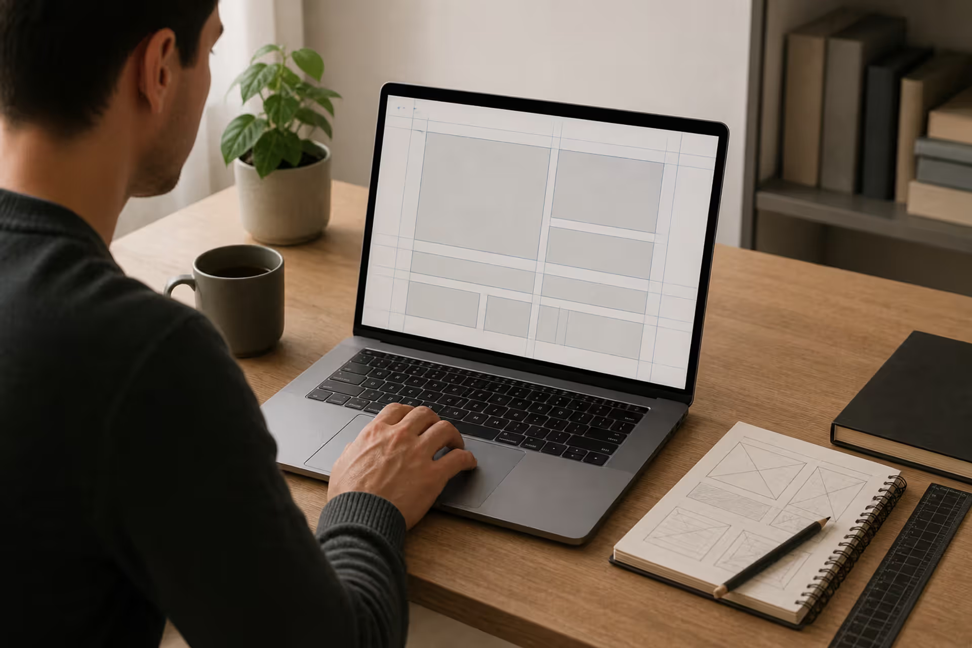
Here's what happens when you apply mathematical proportions to visual work: everything clicks into place faster. You're not pushing elements around endlessly, second-guessing every placement decision. Instead, you're working within proven numerical relationships that organize space in ways our brains instinctively understand.
Think about it—the business card in your wallet, that landing page you visited this morning, the app icon on your phone. None of those dimensions happened randomly. Designers chose specific width-to-height relationships that create structure and guide your eyes exactly where they need to go.
Ratio design taps into something deeper than mere aesthetics. Certain proportions just work. A 1.618:1 relationship feels balanced without being boring. A 3×3 grid creates natural focal points. Your brain processes these arrangements faster, which means less friction, better engagement, and (here's the part clients care about) higher conversion rates.
Professional designers juggle several frameworks depending on the project. The golden ratio—that 1.618:1 proportion you've probably heard about—has shaped everything from the Parthenon to the iPhone. Meanwhile, the rule of thirds gives photographers and web designers a simple 3×3 grid for positioning key elements. Then you've got aspect ratios (16:9, 4:3, 1:1) determining how your content appears across thousands of different screens.
What makes proportional design systems so valuable? They eliminate decision fatigue. You're not starting from nothing. You've got constraints that actually boost creativity because they give you somewhere to begin.
Look at typography. Spacing between elements. Grid layouts. Image crops. Interface components. All of these improve when you think proportionally. A website built with consistent ratio-based spacing feels more professional than one with random margins—even if viewers can't explain why.
The trick isn't memorizing formulas. It's knowing which system fits your specific challenge and when to bend the rules.
Author: Sophie Calder;
Source: crafterholic.com
The Golden Ratio in Design and Art
The golden ratio in design shows up everywhere once you know what you're looking for. This proportion—represented by the Greek letter phi (φ)—equals roughly 1.618. Here's the basic idea: split a line so the whole length compared to the longer piece matches how the longer piece compares to the shorter one.
Ancient Greeks built the Parthenon using these proportions. Leonardo da Vinci organized figures in his paintings around them. Today's designers apply the same math to magazine spreads, logo construction, and smartphone interfaces.
Nature keeps delivering phi ratios without trying. Nautilus shells spiral in these proportions. Flower petals arrange themselves this way. Even faces we find most attractive tend to show 1.618 relationships between features—though whether that's hardwired or learned remains hotly debated.
Check out famous logos. Apple's mark? Built on phi-based circles. Twitter's bird? Golden ratio curves throughout. Toyota's overlapping ellipses? Same principle. Designers didn't stumble into these proportions—they deliberately constructed them using circular grids derived from 1.618.
Web layouts benefit from this approach too. Say you're working with a 960-pixel container. Divide by 1.618 and you get roughly 593 pixels for your main content, 367 for a sidebar. That split creates clear hierarchy without feeling harsh or forced.
Vertical spacing follows similar logic. A 200-pixel header multiplied by 1.618 suggests about 324 pixels for your hero section—creating relationships that feel intentional rather than arbitrary. That's the divine proportion in layout at work.
Author: Sophie Calder;
Source: crafterholic.com
How to Apply the Golden Ratio to Your Projects
Start with whatever dimension you know. Designing a 24-inch tall poster? Divide by 1.618 to get 14.8 inches wide—your golden rectangle. Or work backward, multiplying a known width to find the ideal height.
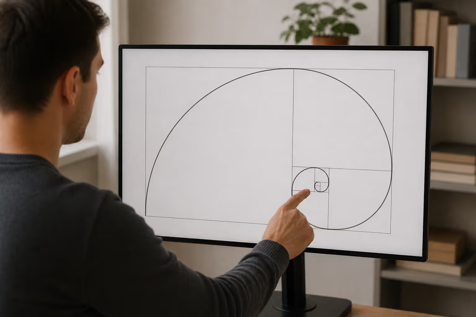
The golden spiral gets interesting. Subdivide your golden rectangle repeatedly, each new rectangle maintaining that 1:1.618 proportion. A spiral emerges through these divisions. Position your most important element where the spiral tightens—that's your natural focal point.
Typography scales beautifully with phi. Running 16px body text? Multiply by 1.618 for 26px subheadings (round from 25.9). Hit it again for 42px headlines. You've just built a modular scale where every size relates harmoniously to the others.
Don't calculate manually unless you enjoy math. PhiMatrix overlays golden grids on any image. Figma and Sketch have plugins that generate these proportions instantly. These tools prevent errors and let you test variations quickly.
One warning: don't force everything into golden proportions. Use phi for major decisions—overall canvas dimensions, primary content zones, main focal points. Smaller elements can break free without destroying the overall harmony.
Examples of the Golden Ratio in Famous Designs
The Gutenberg Bible from the 1450s shows golden rectangle text blocks with margins creating perfectly balanced negative space. We're still copying that approach six centuries later.
Le Corbusier developed his Modulor system in the 1940s by combining phi with human body measurements. He used these proportions for room sizes, window placement, and structural elements in his buildings. Some architects still reference his work today.
Photographer Henri Cartier-Bresson positioned subjects at golden spiral intersections rather than dead center. That technique—placing key elements where the spiral curve intensifies—adds tension while maintaining balance. Flip through his contact sheets and you'll see it repeatedly.
Pepsi's mid-2000s logo redesign explicitly referenced golden circles in construction guides. Those precise curves and proportional relationships between red, white, and blue sections weren't accidents—they calculated every arc.
National Geographic's magazine layout has relied on golden ratio proportions for decades. Image sizing, column widths, caption placement—all informed by phi. It's part of why their publication has such a distinctive, polished feel.
Rule of Thirds Explained for Designers
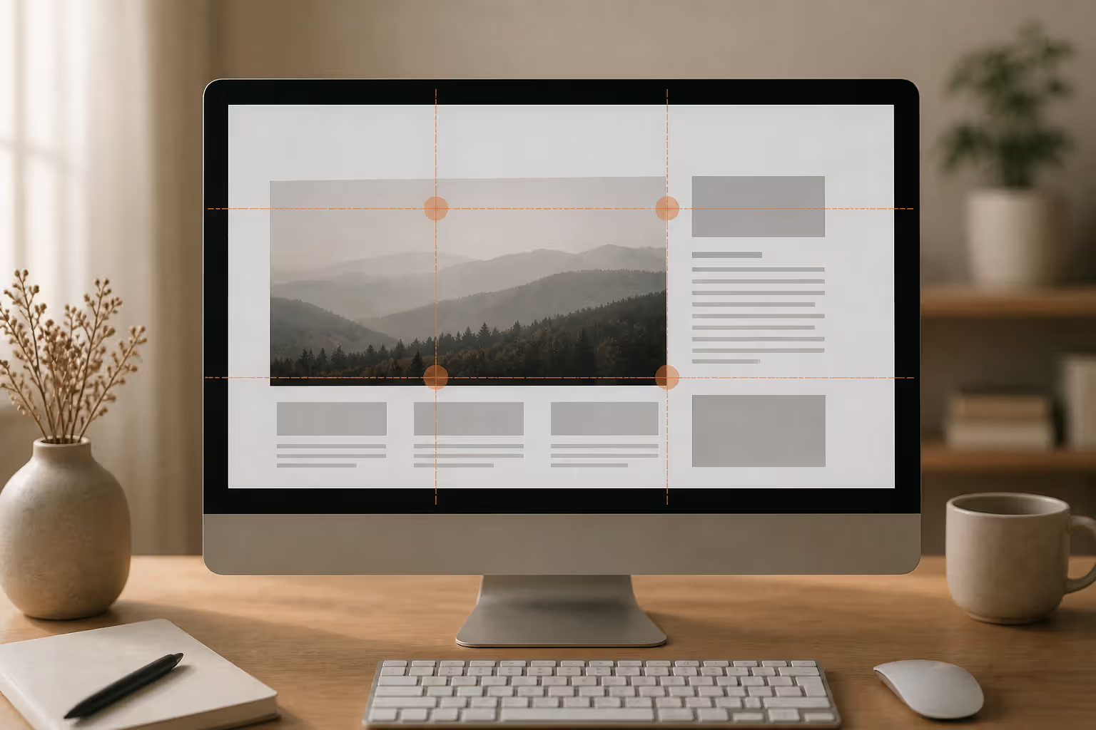
Rule of thirds explained simply: divide any composition into nine equal rectangles. Draw two evenly-spaced horizontal lines, two evenly-spaced vertical lines. Those four points where lines cross? That's where your important stuff should go.
Unlike the golden ratio's 1:1.618 relationship, thirds use straightforward 1:1:1 divisions. No calculator needed. No complicated math. Photographers adopted this first, but it works equally well for web design, illustration, video, you name it.
Drop your subject on one of those intersection points instead of centering it, and suddenly your composition breathes. These "power points" attract eyes naturally, making them perfect spots for call-to-action buttons, product shots, or headlines that matter.
Horizon lines demonstrate this perfectly. Position the horizon along the top third for dramatic foreground emphasis. Drop it to the bottom third when the sky deserves attention. Center it and the image feels static, almost boring. Web designers apply identical logic—navigation in the top band, hero content through the middle section, footer elements below.
This works because it introduces controlled asymmetry. Perfect center alignment feels stiff and formal. Shifting elements to the thirds creates movement, directing viewers through your composition in a deliberate sequence.
Design proportion principles like thirds eliminate endless tweaking. Cropping a product photo? Align the product to a grid intersection, evaluate the result. Works? Done. Doesn't work? Try another intersection. Four options beats infinite possibilities when you're facing a deadline.
Grid frameworks (Bootstrap, Foundation) often incorporate thirds-based divisions. A 12-column grid splits cleanly into 4-column sections—perfect thirds that make responsive breakpoints feel natural rather than arbitrary.
Comparing approaches: golden ratio creates more dramatic asymmetry with mathematical sophistication. Centered compositions deliver formal, symmetrical gravitas. Thirds sit comfortably in the middle—enough asymmetry for visual interest without phi's computational overhead.
Photography apps default to thirds gridlines because the system works regardless of skill level or subject matter. Portraits, architecture, food shots—doesn't matter. Web designers inherit the same universality. Blog layouts, product pages, portfolio grids—thirds deliver consistent results.
Breaking this rule intentionally creates impact. Centered compositions work brilliantly for formal announcements, symmetrical buildings, or minimalist product shots where the subject demands complete dominance. Understanding the rule lets you violate it strategically rather than accidentally.
Mathematical Proportions and Design Systems
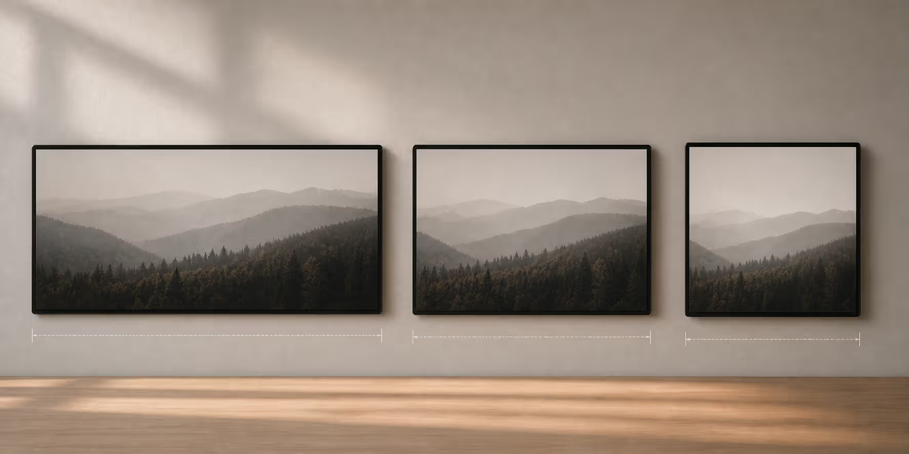
Aspect ratio in graphic design simply describes width-to-height relationships. Unlike golden ratios or thirds, these use straightforward proportions: 16:9, 4:3, 1:1, 21:9. Simple numbers, massive implications.
16:9 dominates screens everywhere. Your monitor right now? Probably 16:9. Phone in landscape? 16:9. Living room TV? Same. Design video content, presentation slides, or full-width headers in this proportion and they'll display correctly across devices without awkward black bars or unwanted cropping.
Square 1:1 ratios rule social media. Instagram posts, Facebook profile pictures, most ad formats—all square. Design in 1:1 and you control exactly what viewers see instead of letting platforms crop your work arbitrarily.
4:3 ratios feel dated now, but PowerPoint defaults to these proportions and some tablets still use them. Legacy content frequently comes in 4:3, which matters when you're updating older presentations or working with archival material.
Mathematical proportions design extends beyond simple aspect ratios into modular scales. Pick a base number (say, 16px) and a ratio (like 1.5). Generate a sequence: 16, 24, 36, 54, 81. Now you've got harmonious measurements for typography, spacing, layout dimensions—all mathematically related.
The Fibonacci sequence (1, 1, 2, 3, 5, 8, 13, 21...) offers another approach. Each number sums the previous two. Ratios between consecutive numbers approach the golden ratio. Designers use Fibonacci numbers for margin sizes, grid columns, element dimensions.
Author: Sophie Calder;
Source: crafterholic.com
Proportional grids in typography establish vertical rhythm. A 24px baseline grid means all text line heights, image heights, and spacing align to 24px multiples. You're creating invisible horizontal lines organizing content even when readers can't consciously see them.
Material Design specifies an 8-point grid system. Every dimension—padding, margins, element sizes—uses multiples of 8px. This constraint creates consistency across sprawling interfaces with hundreds of components.
Responsive design complicates everything. That 16:9 image looking perfect on desktop might need cropping to 4:3 on tablets or 1:1 on mobile. Art direction techniques let you specify different crops per breakpoint, maintaining compositional intent as layouts reflow.
Print traditionally used different proportions. A-series paper (A4, A3) employs a √2 ratio (approximately 1:1.414). Fold or cut an A4 sheet in half and you get A5—same proportions, smaller size. This system makes sense for printed materials that get folded, trimmed, or bound.
Combining multiple systems yields sophisticated results. Use golden ratio for overall dimensions, rule of thirds for image placement, modular scale for typography, 16:9 for video content. Each system solves different problems. Mix them strategically.
How to Choose the Right Ratio for Your Design
Your medium dictates starting constraints. Creating YouTube content? 16:9 isn't optional—that's what the platform expects. TikTok videos? Better shoot 9:16 vertical. Instagram Stories? Also 9:16. Print projects depend on paper stock, which varies by region (US letter versus international A4).
Audience expectations matter more than designers like admitting. Corporate presentations follow 16:9 because conference room projectors expect that format. Try showing 4:3 slides on a 16:9 screen and watch executives squirm at the black bars. Art installations? Explore weird proportions freely—gallery visitors expect experimentation.
Brand identity influences choices too. Luxury brands often favor golden ratio proportions for their classical associations. Tech startups might choose utilitarian aspect ratios prioritizing function over historical reference. A law firm's annual report needs different proportions than a skateboard company's catalog.
Content type guides grid selection. Portrait photography benefits from vertical thirds placement emphasizing the subject. Landscape shots suit horizontal thirds. E-commerce product photography often works best centered, letting the product dominate without compositional distractions.
Design proportion principles should enhance your message, never constrain it. Designing an infographic explaining a complex process? A custom aspect ratio accommodating your narrative flow beats forcing content into predetermined proportions that don't fit.
Testing reveals truth. A/B test different hero image crops—one using thirds, another using golden ratio placement. See which drives more clicks. Analytics trump theory when real user behavior contradicts design assumptions.
Iteration refines everything. Your first attempt might apply the golden ratio too rigidly, creating awkward gaps. Second iteration loosens constraints where content demands flexibility while maintaining proportional relationships in key areas.
Golden ratio works best for: branding projects, editorial layouts, single-image compositions where classical harmony reinforces messaging. The calculation overhead pays off creating timeless designs.
Rule of thirds excels at: photography, web layouts, anything requiring fast iteration. Simplicity accelerates decisions without sacrificing visual interest.
Custom ratios suit: unique content requirements, experimental projects, situations where standard proportions create problems. A data visualization timeline might need ultra-wide 3:1 format displaying information effectively.
Responsive design demands flexibility. Desktop layout uses golden proportions? Mobile constraints force different relationships. Maintain proportional thinking at each breakpoint rather than abandoning the approach when layouts reflow.
Common Mistakes When Using Proportional Design Systems
Over-relying on ratios produces soulless, mechanical designs. The golden ratio doesn't magically fix bad composition—it provides scaffolding that still requires taste, judgment, and iteration. Treating phi like a magic formula solving all compositional problems yields rigid, lifeless work that screams "I just learned about the golden ratio."
Ignoring content hierarchy for mathematical purity creates unusable disasters. Your most important call-to-action lands in a weak position because you're rigidly following a grid? The system failed you. Proportional harmony in art serves communication, never the reverse.
Misapplying mathematical systems happens when designers memorize formulas without understanding reasoning. Positioning every single element at golden ratio points creates visual chaos. The ratio should govern major structural decisions, not every button and icon placement.
Sacrificing usability for aesthetics represents the absolute worst mistake. Navigation sized according to modular scales but too small for thumbs on mobile? Accessibility fails regardless of mathematical elegance. Touch target sizes, readability standards, WCAG compliance—these override proportional systems when conflicts arise.
Forcing inappropriate ratios onto existing content creates awkward results. Cropping a group photo to golden proportions might eliminate important people from the frame. Better approach: use proportional systems during initial composition when you control element placement, not during post-production when content's already locked.
Inconsistent application undermines everything. Golden ratio spacing in your header but arbitrary spacing in your footer? That discord feels wrong even if viewers can't articulate why. Commit to a proportional approach and apply it systematically throughout the project.
Neglecting negative space while obsessing over positive elements misses half the equation. Proportional design systems govern relationships between elements AND the space surrounding them. Perfectly proportioned content blocks surrounded by inconsistent margins still look terrible.
Author: Sophie Calder;
Source: crafterholic.com
Pixel-perfect obsession wastes hours. Rounding 593.827 pixels to 594 doesn't destroy golden harmony. Practical implementation requires sensible rounding while maintaining the spirit of proportional relationships. Your viewers won't notice 0.173-pixel differences.
Assuming one ratio fits everything leads to repetitive, formulaic work. Different projects need different approaches. Developing a signature style? Fine. Applying identical proportional systems to every project regardless of content or context? That's laziness disguised as consistency.
Forgetting that rules exist for strategic breaking limits creative potential. The most memorable designs often violate proportional conventions deliberately. Understanding systems lets you break them intentionally for specific effects rather than accidentally through ignorance.
The harmonious proportioning of space, form, and light is the fundamental problem of architecture and design. Without proportion, there is chaos.
— Le Corbusier
Le Corbusier said that decades ago. Still true in 2025. Digital interfaces, physical products, visual communications—all benefit from proportional thinking. Sure, tools have evolved (AI-assisted design software now suggests optimal ratios based on content analysis), but underlying principles persist.
Ratio design doesn't cage creativity. It provides foundation accelerating decisions and creating visual coherence. Designing a mobile app? Editing photos? Laying out magazines? Proportional systems reduce cognitive load for both designer and viewer.
Most effective approach? Combine multiple systems strategically. Use aspect ratios appropriate to your medium. Apply thirds for quick compositional decisions. Incorporate golden ratio in branding elements. Build spacing on modular scales. Each system addresses different challenges.
Mastery comes from knowing when to apply these principles and when to ignore them. Rigid adherence to any single system produces mechanical work. Thoughtful application informed by content needs, audience expectations, and practical constraints yields designs feeling both intentional and natural.
Start with one system—thirds offer the easiest entry. Practice until proportional thinking becomes intuitive. As you internalize these relationships, you'll recognize them in successful designs everywhere and apply them more fluidly in your work.
The math behind these systems might seem abstract initially. Results are concrete: designs communicating more clearly, interfaces feeling more intuitive, compositions engaging viewers more effectively. That practical impact makes ratio design worth understanding regardless of your discipline.
Frequently Asked Questions About Ratio Design
What separates the golden ratio from the rule of thirds?
Golden ratio uses 1:1.618 proportions derived from phi, creating sophisticated asymmetry requiring calculation. Rule of thirds splits compositions into equal ninths (1:1:1), offering simpler implementation you can visualize instantly. Golden ratio suits branding and editorial work where classical harmony reinforces messaging. Thirds work better for photography and web layouts needing rapid iteration. Both create visual interest through asymmetry, but golden ratio produces subtle, refined proportions while thirds deliver more obvious focal points. Choose based on project complexity and available time.
Must I use mathematical ratios in every design project?
Not even close. Ratios provide helpful frameworks, never mandatory rules. Simple designs with minimal elements often don't benefit from complex proportional systems. Experimental or artistic projects frequently ignore conventional ratios deliberately for impact. Use proportional thinking for structural decisions—overall dimensions, major layout zones, primary focal points. Allow flexibility for smaller elements. Your goal is effective communication, not mathematical purity. If a ratio system solves specific problems (establishing hierarchy, creating balance, accelerating decisions), apply it. If it constrains without adding value, skip it entirely.
Which tools help apply ratio design principles?
Adobe Photoshop and Illustrator include grid overlays and guides for thirds plus custom proportions. Figma and Sketch offer plugins like Golden Ratio Calculator and Grid Generator creating proportional layouts automatically. PhiMatrix overlays golden ratio grids on any image or screen. Modulor generates ratio-based type scales for typography. Mobile apps like Camera+ and Halide display rule of thirds grids during photo capture. For web work, CSS frameworks like Bootstrap incorporate proportional grid systems. Basic calculator apps compute golden ratio divisions quickly—just divide any measurement by 1.618 for the smaller segment.
Does the golden ratio still matter in modern web design?
Absolutely, though application has evolved significantly. Responsive design complicates fixed proportions since layouts adapt to varying screens, but golden ratio still informs column width relationships, spacing systems, and typographic scales. Many designers use phi-based modular scales for responsive typography—proportional relationships scale smoothly across breakpoints. UI frameworks increasingly incorporate golden ratio principles in component sizing and spacing defaults. The ratio's relevance lies less in pixel-perfect implementation than establishing harmonious relationships feeling balanced across devices. Modern tools make golden ratio application faster than manual calculation ever was.
How do aspect ratios affect responsive design?
Aspect ratios create both challenges and opportunities in responsive contexts. A 16:9 hero image displays perfectly on desktop but often needs cropping to 4:3 on tablets or 1:1 on mobile viewports. CSS aspect-ratio property maintains proportions as containers resize, preventing annoying layout shifts during page load. Art direction techniques let you specify different image crops for different breakpoints, maintaining compositional intent as layouts reflow. Video embeds use aspect ratio containers preventing reflow during loading. Responsive images should consider multiple aspect ratios during initial photography or illustration—shoot wider than final crop so options exist for various proportions later.
Can breaking ratio rules actually improve creativity?
Definitely. Understanding proportional systems lets you violate them intentionally for specific effects. Centered compositions create formal, symmetrical impact that thirds-based layouts never achieve. Extreme aspect ratios (ultra-wide panoramas or tall vertical formats) stand out precisely because they break conventions. Chaotic, asymmetrical designs without obvious proportional systems can convey energy and spontaneity that harmonious layouts can't match. The critical difference: breaking rules from knowledge versus ignorance. Learn the systems thoroughly, apply them until they become intuitive, then experiment with violations when your message benefits from unconventional proportions. Most memorable designs often result from informed rule-breaking rather than formula-following.
Modernism transformed 20th-century art and design by rejecting historical tradition and ornament in favor of rationalism, functionalism, and industrial aesthetics. Learn about its origins in industrialization, key philosophical ideas, influence on visual culture, and lasting legacy.
Visual language uses color, shape, typography, and imagery to communicate ideas instantly. Discover how visual elements function as a communication system, how semiotics creates meaning in design, and how to apply graphic communication principles across media effectively.
Proximity gestalt describes how the brain groups nearby visual elements automatically. This guide explains the psychology behind the proximity principle, demonstrates practical spacing strategies, compares proximity with other Gestalt laws, and provides actionable best practices for designers.
A single page can carry an entire pitch, summarize a complex project, or distill a career into a scannable snapshot. This guide breaks down proven layout frameworks, hierarchy techniques, and composition strategies to help you create one-pagers that communicate fast and stick.
The content on this website is provided for general informational and educational purposes only. It is intended to explain concepts related to digital design, visual art, color theory, art techniques, design principles, and design history.
All information on this website, including articles, guides, and examples, is presented for general educational purposes. Creative outcomes may vary depending on individual skill, tools, and practice.
This website does not provide professional design services or guarantee results, and the information presented should not be used as a substitute for formal education or professional consultation.
The website and its authors are not responsible for any errors or omissions, or for any outcomes resulting from decisions made based on the information provided on this website.