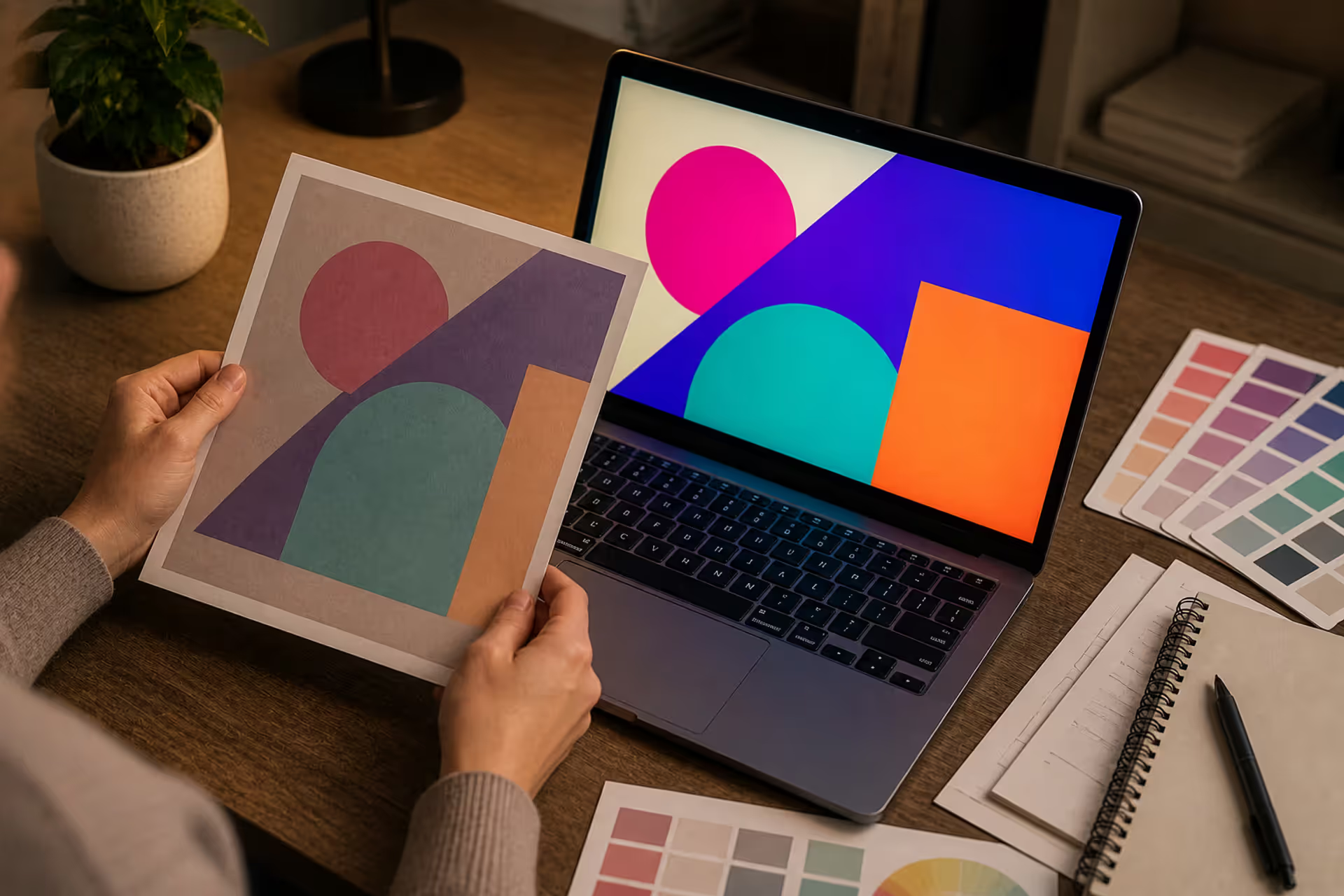
You've designed the perfect logo on your computer. The colors pop. Everything looks incredible. Then you get the printed samples back, and... what happened? That electric blue turned muddy. The vibrant orange looks flat. Welcome to the frustrating world of converting screen colors to print.
Here's what's going on: your monitor speaks RGB (light), but your printer speaks PMS (ink). They're not compatible languages, and there's no perfect translator. But you can get pretty close if you know what you're doing.
What RGB and PMS Color Systems Are
These two color systems solve completely different problems. RGB makes your screen glow. PMS makes sure your business cards match your letterhead three years from now.
How RGB Colors Work on Screens
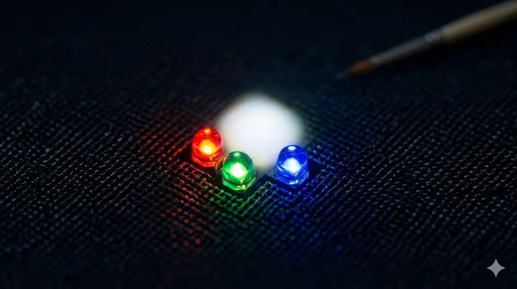
Every pixel on your display contains three tiny lights—red, green, and blue. By changing how bright each light glows, your screen creates millions of different colors.
Crank all three lights to maximum? You get white. Shut them all down? Black.
That's why it's called "additive" color—you're adding different amounts of light together. Your laptop might show a fire-engine red at RGB (255, 0, 0). A seafoam green could be RGB (143, 234, 197). The numbers tell each light how bright to shine, from 0 (off) to 255 (full blast).
But here's the problem: RGB only exists as glowing light. You can't bottle it. You can't mix it into ink. When you need actual printed materials, you're trying to recreate light-based colors using physical pigments. That's where things get complicated.
Author: Adrian Lowell;
Source: crafterholic.com
How the PMS Color System Works in Print
Pantone created something different. Instead of mixing colors on the fly, they pre-mixed over 2,000 ink formulas and gave each one a number. PMS 185 is always the same specific red. PMS 294 is always the same particular blue. The printer literally follows a recipe to mix that exact ink.
When Coca-Cola prints their logo, they don't want "roughly this red." They want the identical red on every can, every billboard, every napkin, everywhere in the world. That's why they specify PMS 484. Any printer with the Pantone system can mix that exact color.
Think of it like paint chips at a hardware store versus describing a color over the phone. "Make it kind of a dusty blue-green" leaves room for interpretation. "Benjamin Moore HC-146" gets you the same color every time.
Why You Can't Directly Convert RGB to PMS
Most designers learn this the hard way. You can't just type RGB values into a calculator and get a perfect PMS match. The physics don't work.
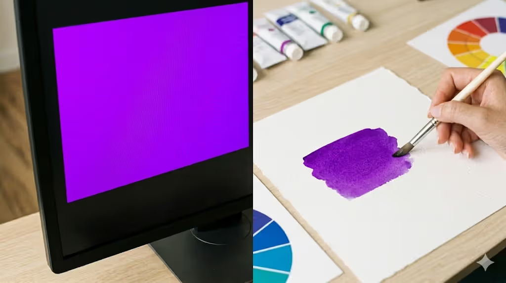
Your glowing monitor can create neon colors that literally don't exist in the physical world. That brilliant cyan you see on screen? It's light shooting directly into your eyeballs. No combination of ink sitting on paper can replicate that luminosity, because ink doesn't emit light—it absorbs it.
This creates what color nerds call "out of gamut" problems. Imagine trying to paint a sunset using only crayons. Some of those glowing oranges and pinks just aren't available in wax form. Same deal with converting RGB to ink.
The substrate throws another wrench in the works. Glossy coated paper keeps ink sitting on the surface, creating brighter colors. Uncoated paper sucks ink into its fibers like a sponge, making everything look duller. You could use identical PMS ink on both papers and get noticeably different results.
Your monitor's lying to you, too. Is it calibrated? How old is it? What's the brightness set to? Two designers looking at the same file on different screens often see completely different colors. I've watched heated arguments about whether a color is purple or blue—both people staring at their own monitors, both convinced they're seeing the "real" color.
Plus, office lighting changes everything. That sample that looked perfect under fluorescent lights? Looks completely different near a window at noon.
Author: Adrian Lowell;
Source: crafterholic.com
How to Convert RGB to PMS Colors
Okay, enough bad news. Here's how to actually do this conversion with reasonable accuracy.
Using Adobe Software for Color Conversion
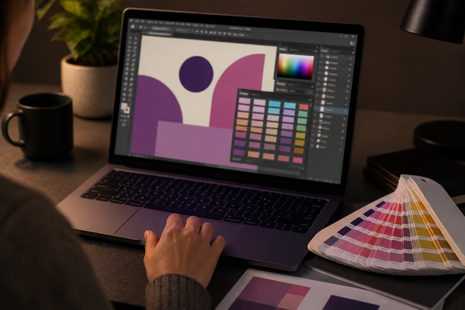
Illustrator and Photoshop have Pantone libraries built in. Click on an object with your RGB color in Illustrator. Open the Swatches panel, hit the menu icon, choose "Color Books." You'll see options like "Pantone+ Solid Coated" or "Pantone+ Solid Uncoated"—pick whichever matches your paper type.
The software suggests the nearest PMS match. But—and this is crucial—don't believe what you see on screen. That preview is an RGB simulation of a PMS color, which is like a photograph of a painting: similar, but not the same thing.
In Photoshop, click your foreground color to open the Color Picker, then hit "Color Libraries" to browse Pantone options.
Here's a trick most people miss: Under Edit > Color Settings, you can configure color management profiles for your intended printing conditions. This helps Adobe make smarter conversion suggestions based on actual printing standards like SWOP or GRACoL.
Using Online RGB to PMS Converters
Type "RGB to PMS converter" into Google and you'll find dozens of free tools. Plug in your RGB numbers, get a PMS suggestion instantly.
The math is straightforward—these tools calculate which PMS color is mathematically closest to your RGB values. Quick, easy, free.
Also wildly inconsistent. Some use ancient Pantone libraries from 2012. Others don't distinguish between coated and uncoated stocks. Most show you that same problematic RGB simulation of the PMS color.
Use these converters as a starting point for conversation, not as gospel. When one suggests PMS 301, go verify that color in a physical guide before committing to a 10,000-piece print run.
Working with Pantone Color Bridge Guides
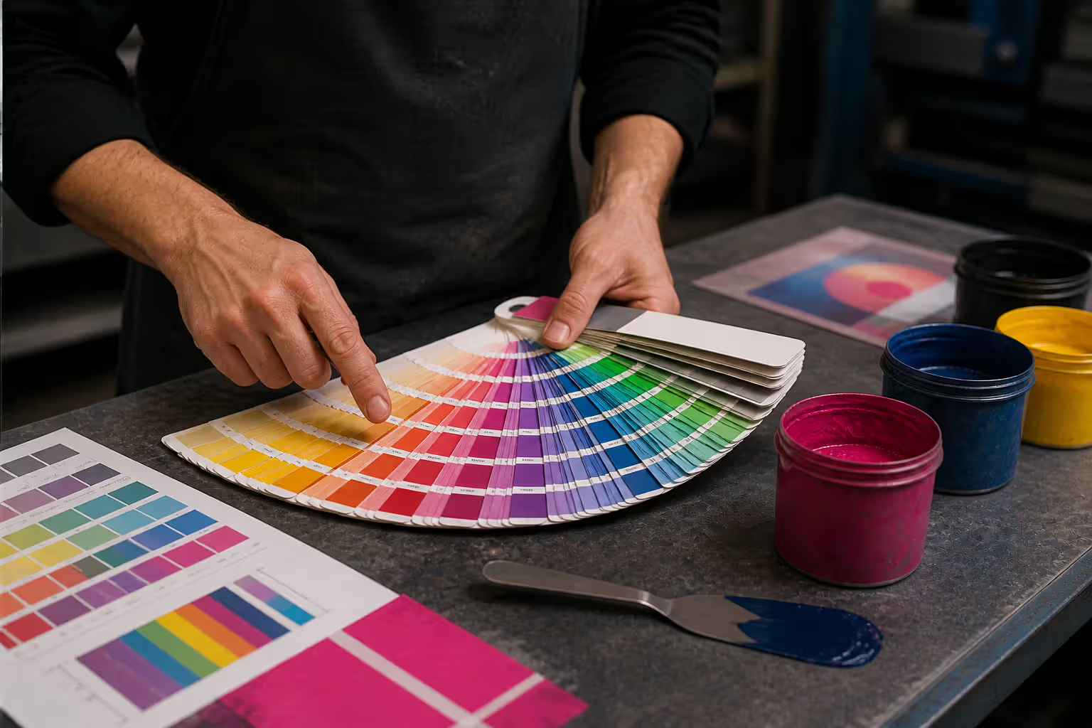
Physical Pantone books are pricey—$150 to $300 depending on which version you get. They also fade, so you need new ones every couple years. Still worth it.
The Color Bridge guide shows each PMS spot color next to its CMYK equivalent, actually printed with real ink on real paper. You're not looking at a simulation or an approximation. You're looking at the actual result.
Here's how to use it: Pull up your RGB color on screen. Flip through the guide under decent lighting (5000K if you're being professional about it, but even regular daylight works better than fluorescent tubes). Find the PMS swatch that looks closest to what you want.
Pro tip: Turn your monitor brightness down to 50% when doing this comparison. It compensates somewhat for the difference between glowing pixels and reflected ink.
Yeah, the book costs money. But it's cheaper than reprinting 5,000 brochures because the color came out wrong.
Author: Adrian Lowell;
Source: crafterholic.com
RGB vs CMYK vs PMS: Which to Use When
Different jobs need different approaches. Here's how to pick.
Color System
How It Works
Best Used For
Color Range
Typical Cost
Conversion Difficulty
RGB
Three light colors combine (red, green, blue)
Websites, phone apps, digital displays, video content
Millions of possible colors—widest range
No printing costs involved
Can't be printed without conversion
CMYK
Four inks overlap (cyan, magenta, yellow, black)
Magazines, full-color photos, marketing brochures
Thousands of achievable colors
Standard rates—most economical
Some RGB colors won't translate
PMS
Custom-mixed ink formulas
Corporate logos, brand-specific colors, packaging
Roughly 2,000 standardized colors
Premium pricing per color
Requires physical color matching
Choosing between spot colors and process colors usually boils down to whether perfect brand consistency matters more than your budget. A Fortune 500 company might pay extra for PMS to guarantee their logo red looks identical everywhere. A local restaurant probably saves money with CMYK printing for their full-color menus.
Sometimes you use both in one project. Business cards might combine two PMS spot colors for the logo plus CMYK for a photograph. You get brand accuracy where it counts and full-color capability where you need it.
Quick decision guide: PMS for anything brand-critical (logos, signature colors). CMYK for photographs and projects where close-enough works fine. RGB stays digital—websites, apps, presentations.
Common RGB to PMS Conversion Mistakes to Avoid
I've seen these errors sink projects, even for experienced designers.
Treating your monitor as the final proof. Your screen can't show you how ink looks on paper. Not even close. The backlight, the color temperature, the technology—everything about it creates a different visual experience than looking at printed ink under regular light. Request physical samples before approving anything important.
Forgetting that paper changes everything. PMS 287 blue on glossy coated stock looks vibrant and saturated. That same ink on uncoated paper looks softer and darker. Always specify your paper type when selecting PMS colors. Better yet, get samples on your actual stock.
Skipping press proofs to save money. Your office inkjet printer doesn't use the same inks or process as the production press. Even high-end digital proofs are approximations. A real press proof costs $100 to $500 extra, but it uses the actual press, actual inks, and actual paper. It's the only way to see what you're actually buying.
Blindly converting PMS to CMYK. Budget cuts sometimes force you to convert specified PMS colors to four-color process. The software will do it automatically. The results are often disappointing. Bright oranges, vibrant greens, and saturated blues particularly suffer in CMYK conversion. Get printed samples comparing the original PMS to the CMYK version before you commit.
Ignoring color management profiles. Professional workflows require embedded color profiles in your documents. Use Adobe RGB or sRGB for RGB work. Use SWOP, GRACoL, or FOGRA for CMYK. Without proper profiles, you're guessing at how colors translate between different devices and processes.
Evaluating colors under bad lighting. Checking printed samples under flickering office fluorescents or sitting by a sunny window gives you inaccurate information. Print evaluation standards call for 5000K lighting at controlled intensity. Many print shops have viewing booths specifically for this. Use them.
Author: Adrian Lowell;
Source: crafterholic.com
Getting Accurate Color Matching for Print Production
Reliable color results require teamwork between you, your client, and your printer.
Start by identifying which colors actually matter. Does that background gradient need perfect accuracy? Probably not. Does your client's 40-year-old logo need to match their existing materials exactly? Absolutely. Flag critical colors when submitting files and request press proofs specifically for those elements.
Partner with a printer who understands your standards. Good print shops will warn you when an RGB color won't convert well, or when your chosen PMS ink might disappoint on your selected paper. They catch problems before they become expensive mistakes. Find someone who answers questions and offers suggestions, not just someone who prints whatever you send.
Set realistic expectations with clients early. Show them physical samples of similar work. Explain why their screen doesn't match printed results. Get approvals on actual printed proofs, not on PDF files viewed on their uncalibrated laptop. Most color disputes trace back to unrealistic expectations created by looking at digital mockups.
Try this approval workflow:
Select PMS colors using physical Pantone swatches
Create your design with those specified colors
Review mockup with client while looking at actual Pantone swatches
Order press proof on the actual paper stock
Review press proof under proper lighting with all stakeholders
Get written approval before starting the production run
Keep detailed records. Note which edition of the Pantone guide you used (they update the formulas periodically). Document lighting conditions during approvals. Get signatures. When a client claims the final product doesn't match their expectations, you'll have documentation showing what they actually approved.
Most designers treat color conversion as a technical problem that needs a technical solution—find the right formula, use the right software, get the right answer. But it's actually a communication problem first. You set realistic expectations, show physical samples early, and make sure everyone understands that screen colors and printed colors aren't the same thing. Software can't fix physics. RGB is light. PMS is ink. They'll never match perfectly.
— Jennifer Martinez
Frequently Asked Questions About RGB to PMS Conversion
Can RGB colors always be matched to PMS colors?
Not even close. RGB exists as emitted light with a much wider range than physical inks can produce. Those super-saturated colors that look amazing on screen—particularly certain blues, greens, and oranges—often have no equivalent in the PMS library. The conversion finds the nearest available option, but "nearest" might still be noticeably different. Some designs need to be adjusted to work within the actual capabilities of ink on paper.
What's the difference between PMS and CMYK printing?
PMS uses premixed inks applied individually. CMYK uses four standard inks (cyan, magenta, yellow, black) printed as tiny overlapping dots that your eye blends together. PMS gives you exact color matching and consistency—the same red every time. CMYK gives you full-color photographs and complex images at lower cost, but with less precision. Each PMS color requires separate setup, making it pricier for multiple colors but sometimes cheaper for one or two colors versus running all four CMYK plates.
Do I need a Pantone color book to convert RGB to PMS?
Software and websites can suggest conversions mathematically, but a physical guide is essential for actual color selection. Your monitor fundamentally cannot show you how ink will look on paper—the physics don't allow it. Pantone guides cost $75 to $300 depending on type, and they need replacing every year or two as the ink samples fade. Expensive? Yes. But cheaper than reprinting jobs that came out the wrong color. If you regularly work with print, it's a necessary tool, not an optional luxury.
Why does my PMS color look different on screen than in print?
Because they're completely different physical phenomena. Screens create color by shining RGB light directly into your eyes. Printed PMS colors reflect ambient light off ink sitting on paper. Your monitor's calibration, brightness level, and your room's lighting all affect what you see on screen. The only trustworthy preview of a PMS color is looking at actual printed ink on actual paper under proper lighting. Those on-screen PMS previews are RGB approximations, not accurate representations.
How much does PMS spot color printing cost compared to CMYK?
Typically 20% to 50% more expensive for most projects, because each spot color needs separate setup, custom ink mixing, and press time. However, for designs using just one or two colors, PMS can actually cost less than running all four CMYK plates. The math changes based on quantity, complexity, and number of colors. For large runs where perfect brand color consistency matters, the premium is usually justified. For short runs or projects where exact color matching isn't critical, CMYK makes more financial sense.
When should I use PMS instead of CMYK for my project?
Use PMS when brand color accuracy is non-negotiable—corporate logos, packaging that needs to match existing product lines, any situation where consistency across different print runs matters. Also consider PMS for simple designs using only one to three colors, where spot color printing can be more economical than four-color process. Choose CMYK for photographic images, complex illustrations with gradients, or projects where slight color variation is acceptable. Many projects combine both approaches: PMS for critical brand elements, CMYK for everything else.
Converting RGB to PMS isn't a simple plug-and-play formula. It's a process requiring color theory knowledge, understanding physical limitations, and managing expectations for everyone involved.
Those glowing colors on your screen will never perfectly translate to ink on paper. Light and pigment operate in fundamentally different ways. The gap can't be eliminated, only managed.
Success requires the right tools—physical Pantone guides instead of screen simulations, proper color management throughout your workflow, press proofs for anything important. It requires building relationships with knowledgeable printers who can guide you through paper choices and color limitations. Most importantly, it requires involving clients in approvals using physical samples they can actually touch and see.
The divide between digital design and physical printing will always exist. But understanding how to bridge it—through careful color selection, proper conversion techniques, and realistic expectations—means your printed projects can match your creative vision as closely as physics allows. Invest in proper tools, follow professional color management practices, and treat color matching as the collaboration it actually is: designer, printer, and client working together toward the best possible result.
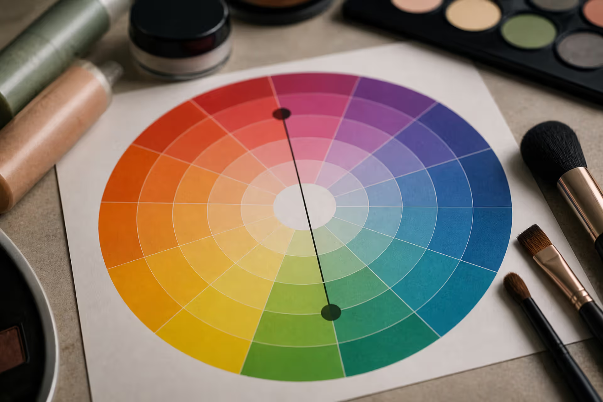
Green tones appearing where they shouldn't can be frustrating. Red cancels out green because these colors sit directly opposite on the color wheel. This principle applies across makeup, hair color, painting, and digital editing, giving you precise control over unwanted hues.
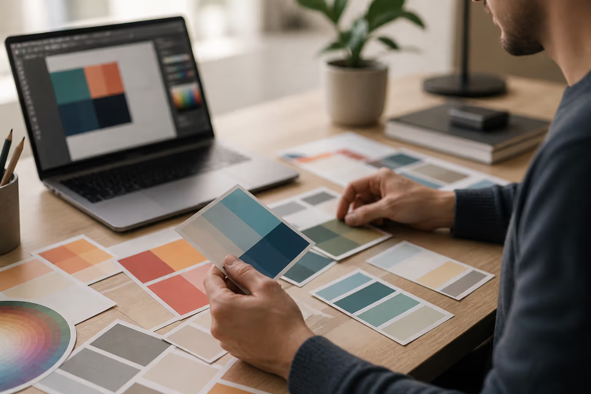
Discover the essential types of color palettes used in design, from monochromatic schemes to complex tetradic systems. Learn how each palette type works, when to use them, and how to choose the right colors for your specific project needs with expert insights and practical examples.
The rounded square has become the defining shape of digital interfaces. From app icons to buttons, this geometric form appears billions of times daily. Learn the mathematical differences between rounded squares, squircles, and superellipses, plus platform-specific implementation standards.
Neon violet stands out as one of the most challenging yet rewarding colors in a designer's toolkit. This comprehensive guide covers technical specifications, effective color combinations, accessibility considerations, and proven applications across cyberpunk, gaming, and tech design.
The content on this website is provided for general informational and educational purposes only. It is intended to explain concepts related to digital design, visual art, color theory, art techniques, design principles, and design history.
All information on this website, including articles, guides, and examples, is presented for general educational purposes. Creative outcomes may vary depending on individual skill, tools, and practice.
This website does not provide professional design services or guarantee results, and the information presented should not be used as a substitute for formal education or professional consultation.
The website and its authors are not responsible for any errors or omissions, or for any outcomes resulting from decisions made based on the information provided on this website.