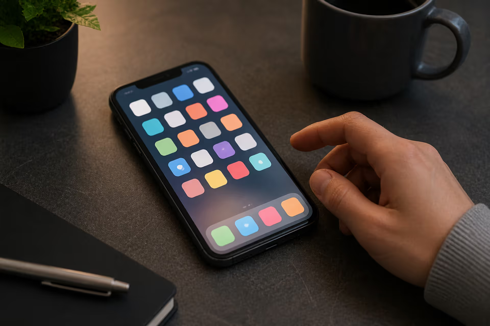
Open your smartphone. Look at the app icons. Notice anything? Nearly every single one is a square with softened corners. This isn't a coincidence—it's the result of deliberate design choices that have shaped how we interact with technology for over a decade.
Why rounded squares? The answer involves psychology, platform requirements, and the simple fact that curves feel better than sharp edges. Let's dig into what makes this shape so dominant in modern interfaces.
What Is a Rounded Square and Why It Matters in Design
Take a standard square and curve its corners—that's your rounded square. The degree of curvature gets measured in pixels or points, starting from where a sharp 90-degree angle would theoretically exist. You're basically blending the efficiency of straight edges with the gentleness of curves.
Here's something interesting: our brains process curved and angular shapes differently. When your eye hits a sharp corner, it stops momentarily to change direction. With curved corners, your gaze flows continuously around the shape's perimeter. You probably never noticed this consciously, but it's happening every time you look at your screen.
Scientists studying visual cognition have found that angular shapes trigger slight threat responses—evolutionary holdovers from when sharp objects posed actual danger. Curves, meanwhile, activate brain regions associated with reward and comfort. A banking app built entirely with hard rectangles might technically function fine, but users will unconsciously find it less inviting than one using soft geometry in design.
Think about physical objects you interact with daily. Your phone's edges are rounded. Your car's dashboard buttons have curves. Even playing cards have rounded corners. Sharp edges exist mainly in contexts requiring extreme precision—architectural blueprints, circuit board diagrams, spreadsheet cells. For everything else, we've collectively decided that softer is better.
Author: Sophie Calder;
Source: crafterholic.com
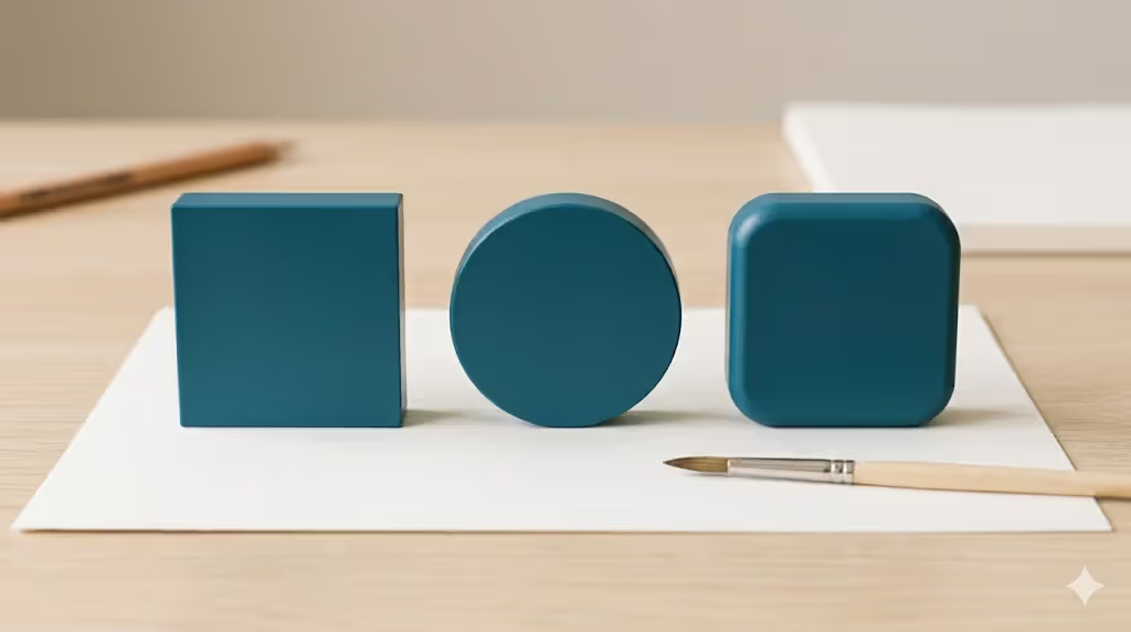
The rounded square splits the difference between circles and squares perfectly. Circles are friendly but directionless—you can't tell which way is up. Squares are organized but harsh. Rounded squares? They give you organizational clarity without the visual aggression.
Rounded Square vs Similar Shapes in UI Design
Here's where things get confusing. People use "rounded square," "squircle," "superellipse," and "rounded rectangle" interchangeably—but they're actually describing different geometric constructions.
Your basic rounded rectangle uses circular arcs at each corner. Set an 8-pixel corner radius on a 60-pixel square, and you get four quarter-circles meeting straight edges. Simple math, predictable results. This is what CSS does when you type border-radius: 8px. It works, but at larger radii, those circular corners can look a bit mechanical.
Now, squircles—that's where it gets interesting. A Danish mathematician named Piet Hein created these back in the 1960s using the formula |x|^n + |y|^n = r^n, typically with n around 4 or 5. Instead of perfect circular arcs, you get curves that transition more gradually from straight to rounded. The result looks smoother, more organic. Apple fell in love with this approach and has used variations of it for iOS icons since 2013.
The superellipse in design is actually the parent category containing squircles. By adjusting that exponent n, you can create anything from almost-rectangles to almost-circles. Lower n values give you sharper corners; higher values make rounder shapes. It's like having a dial that controls geometric personality.
Author: Sophie Calder;
Source: crafterholic.com
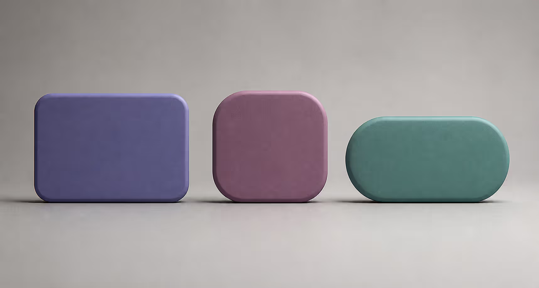
Then there's the pill shape—a rounded rectangle where the corner radius equals exactly half the height. This creates those fully rounded ends you see on tags, chips, and toggle switches. Great for compact buttons, terrible for app icons (too much wasted space on the sides).
Platform wars have influenced which shapes dominate where. iOS committed hard to squircles for app icons, creating that distinctive smooth appearance iPhone users expect. Android initially used simpler rounded squares with circular corners, though Material Design 3 has started incorporating more sophisticated curves. Web developers mostly stick with basic border-radius because it's easy to implement and works everywhere.
Shape Breakdown: What You're Actually Looking At
Shape Name
How It's Built
Where You'll See It
Platform Choice
What Makes It Different
Basic Rounded Rectangle
Quarter-circle arcs at corners, constant radius value
Web buttons, Android cards, form containers
Web platforms, Android apps
Quick to implement but can look stiff at large sizes
Squircle
Mathematical curve using power equation (typically n=4)
iPhone app icons, macOS interface elements
Apple ecosystem exclusively
Exceptionally smooth corner transitions throughout
Superellipse
Variable power equation (adjustable n value)
Custom branding projects, unique icon systems
Bespoke design implementations
Full control over curve character and tension
Pill Button
Corner radius set to 50% of element height
Tags, navigation chips, toggle controls
Universal across all platforms
Creates complete semicircles on both ends
Standard Rounded Square
Equal dimensions, circular corner curves
App icons, profile avatars, grid tiles
Android, Windows, general use
Best balance of approachability and space efficiency
How Corner Radius Affects Visual Design
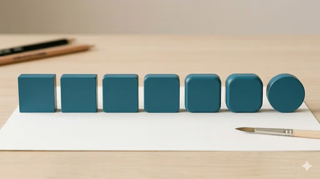
Corner radius in graphic design works like a volume knob for friendliness. Tiny 2-pixel radii barely register visually—you get subtle softening that reduces harshness without overtly "feeling rounded." Bump that to 8 pixels on a 48-pixel button, and you've got noticeable warmth. Push it to 24 pixels, and you're entering playful territory where the shape starts reading more as "pill" than "square."
Financial apps love small radii—think 2-4 pixels. It signals precision and seriousness. Consumer social apps often land around 8-12 pixels, balancing approachability with structure. Gaming apps and kids' products? They'll push 16+ pixels, maximizing that friendly, informal vibe.
The platforms have established their own conventions. iOS generally uses 8-10 point radii for standard buttons. For app icons, they apply roughly 20-22% of the icon size as the basis for their squircle formula (though they don't use simple circular arcs). Android Material Design suggests 4dp for small components, doubles that to 8dp for cards, and goes 16dp for larger surfaces. Windows Fluent Design stays conservative at 2-8 pixels depending on component prominence.
Here's a critical point: absolute pixel values matter less than proportions. A 200-pixel square with a 25-pixel radius looks subtly rounded. That same 25-pixel radius on a 50-pixel square creates a perfect circle. You need to think in ratios, not fixed measurements.
What about accessibility? Large corner radii can technically reduce touchable area slightly, but this rarely causes real problems if you're following minimum touch target guidelines (44×44 points on iOS, 48×48dp on Android). More importantly, rounded shapes help users quickly identify interactive elements versus static content, which actually improves accessibility through better visual hierarchy.
Author: Sophie Calder;
Source: crafterholic.com
Common mistake: radius chaos. I've seen interfaces using 4px, 6px, 8px, 10px, and 12px radii scattered randomly across different components. It creates visual noise that users can't quite pinpoint but definitely feel. Establish a scale—maybe 0, 4, 8, 16, 24 pixels—and stick to it religiously.
Using Rounded Squares in App Icons and Branding
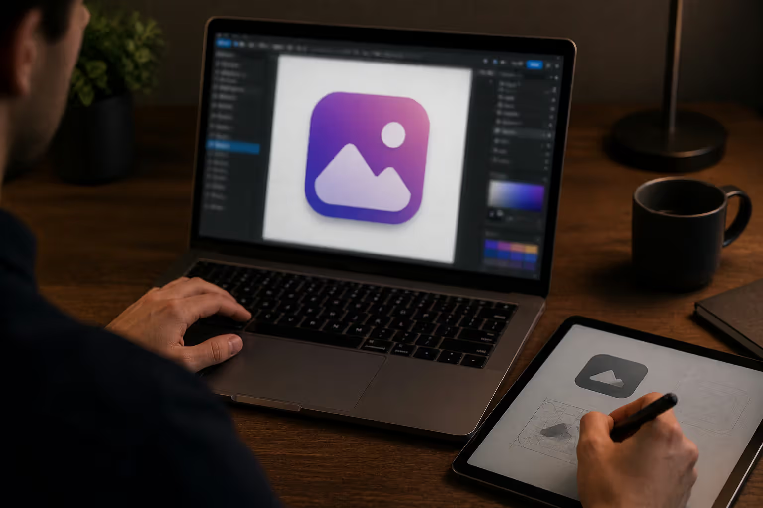
App icons represent the most visible battlefield for rounded square in app icons. These miniature billboards appear on home screens, in app stores, in search results—anywhere your brand needs instant recognition.
iOS makes this interesting by requiring 1024×1024 pixel square artwork with no transparency. Then the system automatically applies its proprietary squircle mask. Designers create artwork filling the entire square, knowing Apple's algorithm will crop it into that signature iOS icon shape. They've refined this formula multiple times since iOS 7 launched in 2013, subtly tweaking the curve characteristics with each iteration.
Android takes a different approach. Since Android 8.0, adaptive icons separate foreground and background into distinct layers. Device manufacturers can then apply whatever mask they prefer—circle, squircle, rounded square, even teardrop shapes on some devices. This means your icon might look different on a Samsung versus a Google Pixel versus a OnePlus phone. Smart designers ensure critical content stays within the safe zone (usually a 66dp diameter circle within the 108dp square) to avoid unwanted cropping.
Windows and web platforms have generally moved toward rounded squares to maintain visual consistency with mobile platforms, though requirements are looser. Progressive Web Apps typically adopt rounded square icons to blend with native app aesthetics.
Beyond icons, rounded edges in branding extend throughout entire design systems. Spotify maintains consistent 8-pixel corner radii across playlist covers, buttons, cards—everything. This repetition builds brand recognition. You could strip away Spotify's green color scheme and users would still recognize the interface from its geometric language alone.
Slack uses rounded squares for channel avatars and message attachments, reinforcing its positioning as friendly workplace software. Stripe's design system employs subtle 4-pixel radii that whisper "precise but not cold." These aren't random choices—they're calculated brand personality expressions.
Instagram's 2016 icon redesign offers a fascinating case study. They abandoned the skeuomorphic camera design for a simple gradient rounded square. The shape itself became the brand. No camera icon needed—just that specific rounded square with those specific colors, and users instantly recognize Instagram.
Author: Sophie Calder;
Source: crafterholic.com
Best Practices for Implementing Soft Corner Design
Technical implementation varies wildly depending on your platform and whether you want basic rounded corners or mathematically precise squircles.
iOS developers have it relatively easy for standard rounded corners—UIKit and SwiftUI both offer simple corner radius properties that apply circular arcs. Want true squircles for smooth corner icon design? You'll need custom bezier paths or third-party libraries implementing the mathematical formula. Most designers create assets with square corners and let iOS's system masking handle the curves automatically.
Android developers work with XML drawables using the <corners> element with android:radius attributes. Material Design components include built-in shape theming, letting you define corner treatments once and apply them globally. Custom squircle implementations require Path objects with quadratic or cubic bezier curves—more complex but totally doable.
Web developers rely heavily on CSS border-radius, which creates circular arc corners. You can specify pixels (border-radius: 8px), percentages (border-radius: 20%), or relative units. Percentages work great for responsive rounded squares since the curve proportion scales with element size. True squircles on the web require SVG paths or CSS clip-path with carefully crafted curves—definitely more work than basic rounding.
Figma has become the go-to design tool for icon work, offering straightforward corner radius controls plus plugins like "Squircley" or "Super Ellipse" that generate mathematically accurate curves. Sketch offers similar plugins. Illustrator users can use Live Corners for rounded rectangles or create custom paths for superellipses using the direct selection tool and convert anchor points function.
When exporting, format matters enormously. Vector formats (SVG, PDF) preserve curve mathematics at any scale—essential for icons that need to work at multiple sizes. Raster exports need sufficient resolution: minimum 2x for standard displays, 3x for high-density screens. iOS requires specific pixel dimensions for different contexts (Settings at 58px, Spotlight at 80px, App Store at 1024px). Android needs multiple density buckets (mdpi, hdpi, xhdpi, xxhdpi, xxxhdpi) for proper rendering across devices.
Biggest mistake? Over-rounding until your shape loses its rectangular character. If users can't quickly distinguish your icon from a circle, you've gone too far. Another trap: ignoring optical adjustments. A mathematically perfect curve sometimes looks off because human perception isn't purely mathematical. Experienced designers frequently tweak curves manually, trusting their eyes over formulas.
Cross-platform consistency deserves special attention. If your iOS app uses 12-point corner radii but your Android version uses 6dp, users switching platforms notice something feels different—even if they can't articulate what. Build a design system that translates intelligently across platforms while respecting each platform's conventions.
Rounded Edges in Modern Design Systems
In 2025, mature design systems treat corner radius as a foundational design token alongside color, typography, and spacing. Teams define tokens like radius-sm, radius-md, radius-lg, and radius-full, then reference these throughout their component library. Change one token value, and hundreds of components update simultaneously.
Component libraries built with React, Vue, or Angular expose radius as configurable properties. A Button component might include a variant="rounded" prop applying the system's standard button radius, while variant="pill" creates fully rounded ends. Card components typically ship with moderate corner rounding by default, with override options for special cases.
Multi-product companies like Google demonstrate why this matters. Gmail, Drive, Calendar, and Photos all feel related despite being distinct applications. Consistent corner radii contribute significantly to that family resemblance. Users might not consciously think "these all use the same 8-pixel radius," but they definitely perceive cohesion.
Where's this headed? Variable fonts demonstrated how typography could become dynamically adjustable based on context or user preference. Similar concepts are emerging for shapes. Some experimental systems let corner radius respond to user preferences, interaction states, or time of day—sharper interfaces for focused work modes, softer curves during evening relaxation.
Accessibility preferences will likely drive future evolution. High-contrast modes and reduced-motion settings already influence design system implementations. Future systems might adjust corner radii based on vision profiles or cognitive preferences, personalizing interface geometry for optimal individual experience.
Spatial computing introduces fascinating new questions. Apple Vision Pro and similar platforms blend digital content with physical space. How do rounded squares translate to floating windows in three-dimensional interfaces? Early implementations suggest familiar 2D conventions—including rounded corners—help ground users in otherwise disorienting environments.
The rounded square represents a perfect balance between the efficiency of straight edges and the friendliness of curves. It's become the universal language of modern digital interfaces.
— Mike Stern
FAQ
What's the difference between a rounded square and a squircle?
Rounded squares use simple circular arcs at each corner—basically a quarter-circle with your specified radius. Squircles employ a mathematical superellipse formula creating more gradual, organic transitions from straight edge to curve. Side by side, squircles look smoother and more refined, particularly at larger sizes. iOS app icons use squircle-based shapes, which is why they have that distinctive appearance compared to Android icons using standard rounded squares.
What corner radius should I use for app icons?
Don't guess—follow platform requirements. iOS designers should create artwork filling the entire 1024×1024 pixel canvas, then let the system apply its squircle mask automatically. Android adaptive icon designers need to keep critical content within the safe zone (typically a 66dp diameter circle centered in the 108dp square). Creating custom web or desktop icons? A radius measuring 18-22% of the icon's width generally produces balanced results that feel professional without looking overly soft.
How do rounded squares improve user experience?
Sharp corners create micro-moments of visual friction where your eye has to redirect. Rounded corners guide your gaze smoothly around elements instead. Multiply this tiny effect across an entire interface containing hundreds of shapes, and the cumulative reduction in cognitive load becomes meaningful. There's also a psychological dimension—curves unconsciously signal safety and approachability, while sharp angles can feel slightly threatening or aggressive. This particularly matters in consumer apps where reducing anxiety and building trust directly impacts engagement.
Can I use rounded squares for all UI elements?
You could, but you shouldn't. Data visualizations often benefit from sharp corners signaling precision—users expect charts and graphs to look analytical. Text input fields work better with subtle rounding (2-4 pixels) to avoid appearing casual when users need to enter important information. Tags and chips function better as pill shapes rather than rounded squares. The key is intentionality: choose corner radius based on each element's purpose and the emotion you want it to convey, then stay consistent within element categories.
What's the mathematical formula for a superellipse?
The formula is |x/a|^n + |y/b|^n = 1, where a and b represent the semi-axes (half the width and height), while n controls curve tension. For squares where width equals height (a = b), this simplifies to |x|^n + |y|^n = r^n. Setting n = 2 produces a circle. Values around n = 4 or 5 create those smooth squircle curves. Higher n values approach a square with barely rounded corners. Most design implementations targeting aesthetic appeal land between n = 4 and n = 5.
Are rounded rectangles better than sharp corners for branding?
Depends entirely on what you're trying to communicate. Rounded rectangles broadcast approachability, modernity, and user-friendliness—perfect for consumer products, lifestyle brands, and social platforms. Sharp corners convey precision, professionalism, and technical sophistication—appropriate for enterprise software, financial services, and analytical tools. Many successful brands use both strategically within the same product: sharp corners for data tables and technical displays, rounded corners for interactive elements and marketing materials. Match your geometry to your message.
The rounded square evolved from a simple geometric variation into fundamental infrastructure for digital interfaces. Its mathematical simplicity—just a square with curved corners—hides remarkable psychological and functional sophistication. By smoothing the harsh transitions of perfect rectangles while preserving directional clarity and space efficiency, this shape addresses core interface design challenges that pure circles and hard squares cannot.
Understanding the distinctions between basic rounded rectangles, squircles, and superellipses empowers you to make informed decisions rather than defaulting to whatever your design tool suggests. Platform-specific requirements and design system integration ensure these choices scale properly across products and contexts.
As interfaces evolve toward spatial computing and personalized experiences, the underlying principles remain constant: balance visual appeal with functional clarity, maintain consistency within systems, and align geometric choices with brand values and user expectations.
Billions of devices now display rounded squares constantly. They've become invisible infrastructure—so ubiquitous that users notice their absence more than their presence. For designers and developers navigating 2025's complex, multi-platform landscape, mastering this seemingly simple shape represents essential craft knowledge directly impacting user engagement and product success.
Green tones appearing where they shouldn't can be frustrating. Red cancels out green because these colors sit directly opposite on the color wheel. This principle applies across makeup, hair color, painting, and digital editing, giving you precise control over unwanted hues.
Discover the essential types of color palettes used in design, from monochromatic schemes to complex tetradic systems. Learn how each palette type works, when to use them, and how to choose the right colors for your specific project needs with expert insights and practical examples.
Converting RGB digital colors to PMS for print requires more than software—it demands understanding color gamut differences, using physical Pantone guides, and managing expectations. This comprehensive guide explains why screen colors don't translate directly to print and shows you proven methods for accurate color conversion.
Neon violet stands out as one of the most challenging yet rewarding colors in a designer's toolkit. This comprehensive guide covers technical specifications, effective color combinations, accessibility considerations, and proven applications across cyberpunk, gaming, and tech design.
The content on this website is provided for general informational and educational purposes only. It is intended to explain concepts related to digital design, visual art, color theory, art techniques, design principles, and design history.
All information on this website, including articles, guides, and examples, is presented for general educational purposes. Creative outcomes may vary depending on individual skill, tools, and practice.
This website does not provide professional design services or guarantee results, and the information presented should not be used as a substitute for formal education or professional consultation.
The website and its authors are not responsible for any errors or omissions, or for any outcomes resulting from decisions made based on the information provided on this website.