Working with neon violet feels like handling electricity. Get it right, and you'll create designs that pulse with energy and stick in people's minds for days. Mess it up? You'll end up with an unreadable, eye-straining disaster that clients reject on sight.
Here's what actually matters: knowing when to use this beast of a color, understanding why it behaves differently across screens and devices, and learning the specific technical constraints that trip up even experienced designers.
What Makes Neon Violet Different from Standard Purple
Most purples play nice. They sit comfortably in your color picker, blending reds and blues in reasonable proportions. Lavender (#E6E6FA) looks pleasant. Royal purple (#7851A9) suggests elegance. You can slap them on backgrounds, use them for text, and they'll generally cooperate.
Neon violet? Not even close.
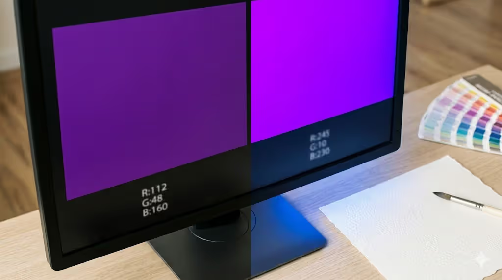
This color lives at the absolute edge of what your monitor can display. We're talking high saturation purple hues that push past 85% in HSB color space—and usually max out completely at 100%. The hex codes that produce true neon violet fall around #8B00FF or #9D00FF, which translates to RGB values of (139, 0, 255) or (157, 0, 255).
Notice something? The green channel sits at zero. Completely absent. The blue channel fires at maximum intensity (255), while red adds just enough presence to shift the wavelength from pure blue into violet territory. That specific combination creates what your brain interprets as a fluorescent glow.
Standard purples don't work this way. They include green channel data—sometimes quite a bit—which softens the overall effect. Royal purple contains RGB values of (120, 81, 169), meaning all three channels contribute. The result feels natural, organic even. Fluorescent purple tones eliminate that middle ground entirely.
Author: Olivia Hartwell;
Source: crafterholic.com
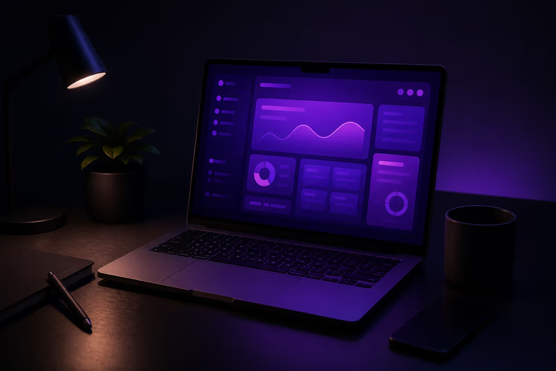
Your display hardware matters more than you'd think. Modern OLED and high-end LED screens can reproduce neon violet with shocking intensity because they emit light directly. Each blue subpixel fires at full blast while the red adds just that violet shift. Against dark backgrounds, the contrast makes the color appear to radiate outward—almost like it's glowing from within the screen.
Here's a problem designers hit constantly: neon violet exists right at the boundary of the sRGB color space. Translation? Not every monitor displays it accurately. I've watched the same design file show vibrant, electric violet on a calibrated MacBook Pro and muddy purple-blue on a client's budget Dell. If you're designing with neon violet, test on multiple devices before delivering files.
How Neon Violet Works in Digital Design
Screens love neon violet. The self-illuminated nature of digital displays lets this color achieve effects that physical media can't touch. But that advantage comes with specific challenges you'll need to navigate.
Screen Display vs. Print Limitations
Want to guarantee disappointment? Design something beautiful with neon violet on screen, then try printing it.
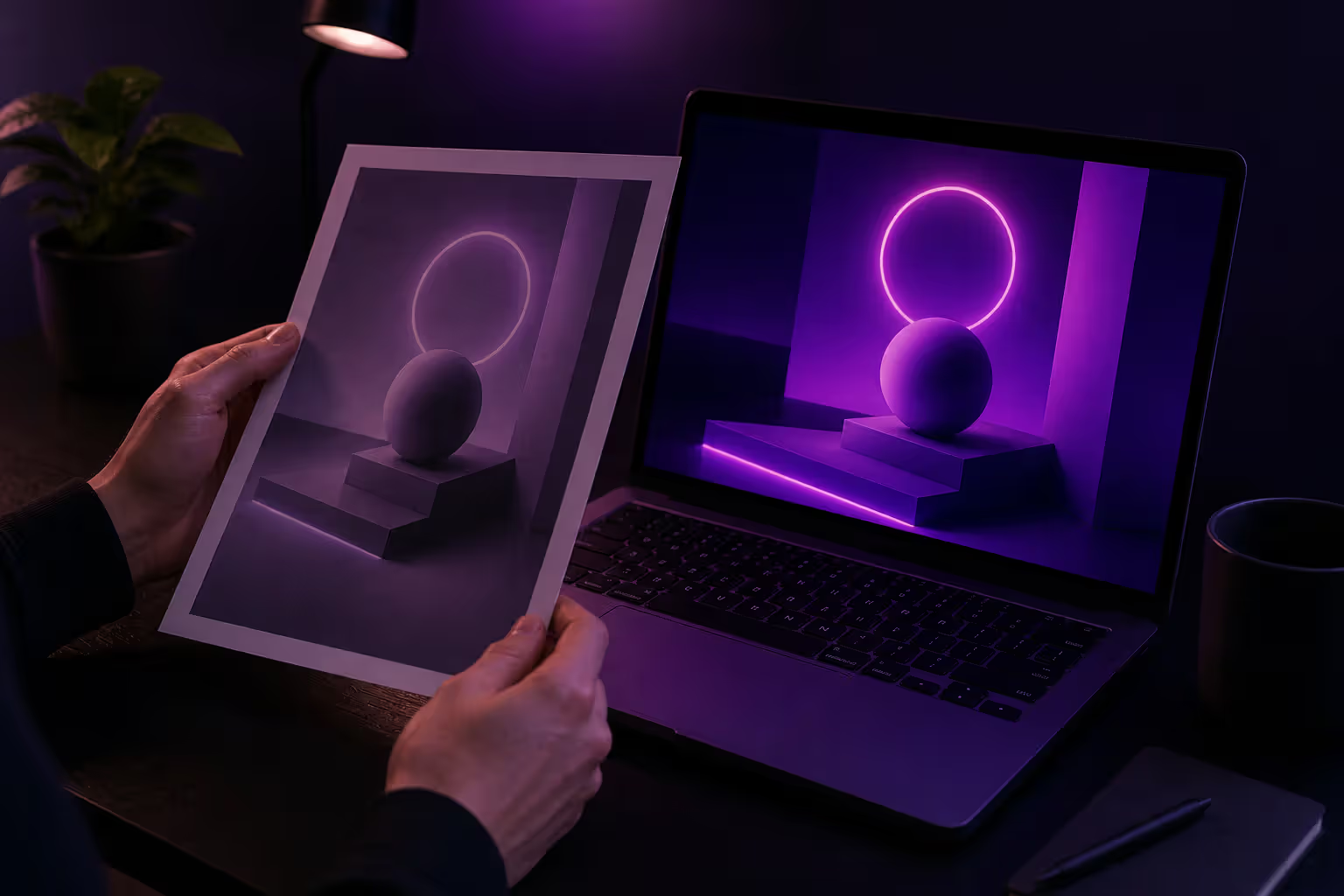
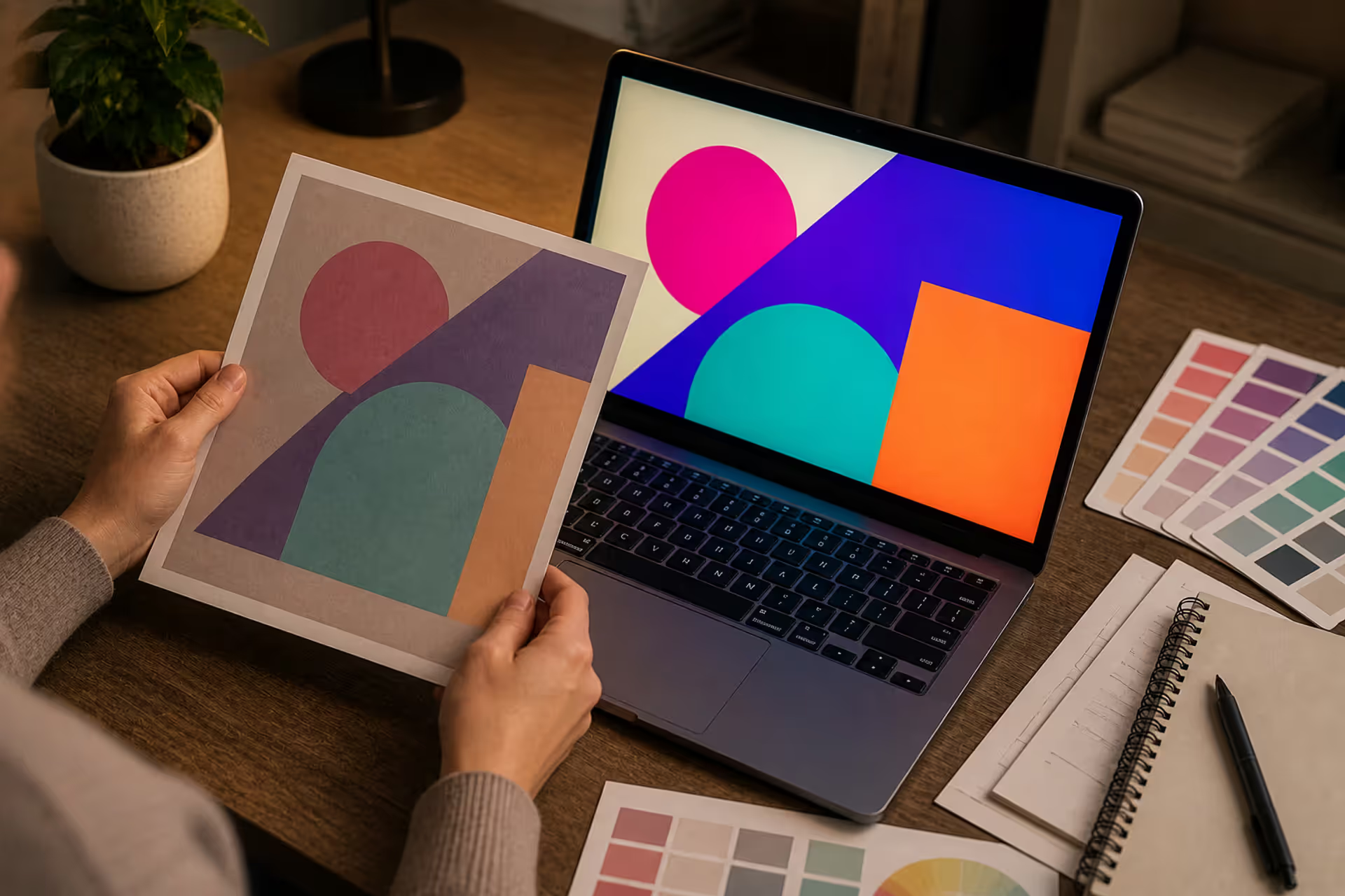
CMYK printing processes can't reproduce that luminous quality. Not even close. You'll lose somewhere between 40-60% of the perceived intensity—sometimes more. What looked electric and futuristic on your monitor comes back from the printer looking like... regular purple. Maybe slightly vibrant purple if you're lucky.
The physics work against you: screens emit specific light wavelengths while printed materials only reflect whatever ambient light hits them. A printed piece with neon violet looks completely different under fluorescent office lights versus warm incandescent bulbs versus natural daylight. The color shifts constantly.
I learned this the hard way on a music festival poster project in 2023. Designed the entire thing around neon violet as the hero color. Looked incredible on screen. The first print proof came back and the client thought we'd used the wrong file. The purple looked flat, lifeless—nothing like the vibrant glow they'd approved digitally.
The fix? Create separate color specifications for digital and print from the start. For print projects, substitute Pantone fluorescent inks like Purple U or Violet U. They won't match the screen intensity, but they'll get closer than standard CMYK. Better yet, redesign the print version using a more printable purple as the primary color and save neon violet exclusively for digital applications.
Author: Olivia Hartwell;
Source: crafterholic.com
Accessibility Considerations for High Saturation Colors
WCAG 2.1 requires contrast ratios of at least 4.5:1 for normal text and 3:1 for large text. Neon violet (#8B00FF) against white backgrounds? You get about 3.2:1. Fails the standard entirely for body text.
People with tritanopia (blue-yellow color blindness) struggle to distinguish neon violet from other colors. Individuals sensitive to light or prone to migraines often find high-intensity colors physically uncomfortable. I've received user complaints about headaches after sessions using interfaces heavy on neon color in digital art elements.
Smart approaches that actually work:
Use neon violet only for decorative elements and accents—never for critical information
Combine it with icons or text labels rather than relying on color alone to communicate
Provide theme options so users can switch to lower-saturation alternatives
Test with accessibility simulation tools before launch (Chrome DevTools has this built in)
Pair neon violet exclusively with very dark backgrounds (charcoal or pure black) when it must carry information
For buttons and interactive elements, neon violet works best as a hover state or active indicator. This reduces eye strain during normal browsing while still giving users that satisfying visual feedback when they interact.
Effective Color Combinations with Neon Violet
The difference between "striking" and "migraine-inducing" often comes down to what colors you pair with neon violet.
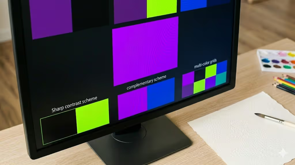
Complementary schemes match neon violet with chartreuse or electric yellow-green (#CCFF00 to #E0FF00). Gaming interfaces love this combination because it creates maximum visual tension. Your eye bounces between the two extremes, which generates energy and movement. Use it sparingly though—this pairing overwhelms fast when applied to large areas. Think accent buttons and small UI indicators, not entire backgrounds.
Analogous approaches combine neon violet with its neighbors: hot pink (#FF00FF) on one side and electric blue (#0080FF) on the other. This builds a cohesive neon purple color palette while maintaining that futuristic vibe. The key? Vary your proportions. Maybe 60% neon violet, 30% electric blue, 10% hot pink. Equal amounts create visual chaos.
Monochromatic schemes using vivid violet hues at different saturation levels offer the most sophisticated option—and the one I recommend for professional projects. Start with neon violet as your accent, then build supporting tones by reducing saturation and adjusting brightness:
Certain aesthetic movements have essentially claimed neon violet as their signature. Learning from these established frameworks saves you from reinventing the wheel.
Cyberpunk aesthetics wouldn't exist without cyber purple color. Games like Cyberpunk 2077 and both Blade Runner films built entire visual languages around this color. It signals artificial intelligence, corporate power, and those rain-slicked urban nightscapes. Designers working in this space pair neon violet with deep blacks, chrome effects, and occasional cyan accents. The formula works because it taps into decades of science fiction visual culture.
Vaporwave emerged in the early 2010s and refuses to die—probably because the aesthetic genuinely works for certain applications. Neon violet alongside hot pink and teal creates those nostalgic-yet-alien compositions. This style intentionally clashes bright violet color combinations with classical sculptures, '80s computer graphics, and tropical imagery. The artificiality isn't a bug; it's the entire point.
Gaming interfaces deploy neon violet for status indicators, power-ups, and rare item highlighting. Why? Because players associate the color with energy, rarity, and special abilities. Successful implementations keep neon violet limited to 5-10% of the total interface. More than that and you're asking for eye fatigue during extended play sessions.
Nightlife and entertainment venues naturally gravitate toward neon color aesthetics in design. Clubs use it for branding. Music festivals plaster it across promotional materials. Streaming platforms incorporate it into their visual identities. The color photographs well in low-light environments and cuts through the visual noise of crowded social media feeds.
Tech startups—particularly those in AI, blockchain, or cutting-edge software—adopt neon violet to differentiate themselves from the endless sea of blue-and-white corporate branding. It suggests innovation without the aggressive red tones associated with "disruptor" brands. Companies like Stripe, Discord, and various crypto platforms have all experimented with violet-heavy palettes.
Common Mistakes When Using Neon Violet as an Accent
I've reviewed hundreds of design files over the years. These mistakes show up constantly, even from designers who should know better.
Overuse kills the impact. Neon violet demands to be the focal point. When you apply it to headlines AND buttons AND borders AND icons, nothing stands out anymore. It becomes visual noise. I've seen landing pages where every interactive element glows neon violet. The result? Users can't figure out what to click first because everything screams for attention simultaneously. Limit neon violet to one or two key elements per screen.
Poor contrast choices destroy readability. Placing neon violet text on light gray (#CCCCCC) or medium blue (#4169E1) creates illegible, vibrating text. I've watched users squint, lean forward, and eventually give up trying to read content styled this way. Always run contrast ratios through WebAIM's Contrast Checker before finalizing designs. Don't trust your eyes—check the actual numbers.
Clashing combinations create optical vibration. Pair neon violet with neon orange (#FF4500) and watch the edges appear to shimmer and move. This causes genuine eye strain. If you absolutely need multiple bright violet color combinations in one design, vary the saturation levels or separate them with neutral buffers like black or dark gray.
Ignoring brand context leads to awkward mismatches. A law firm's website with neon violet accents sends contradictory messages about professionalism. An accountant using cyber purple color for their CTA buttons raises questions. While breaking conventions can work strategically, most traditional industries benefit from subdued palettes. Reserve neon violet for brands where innovation, creativity, or energy align with core values.
Accessibility failures extend beyond just contrast ratios. Some designers use bold violet accent color as the only indicator for interactive elements. Colorblind users end up guessing which elements are clickable. Always combine color with additional cues: underlines for links, icons for buttons, shape changes for different states.
Author: Olivia Hartwell;
Source: crafterholic.com
Tools and Resources for Working with Neon Violet
The right tools make working with neon violet significantly easier.
Adobe Color (color.adobe.com) lets you input #8B00FF as your base, then explore complementary, triadic, and analogous options automatically. The harmony rules work well with extreme colors. You can save palettes directly to Creative Cloud libraries, which syncs across Photoshop, Illustrator, and XD.
Coolors.co generates complete five-color palettes with neon violet as the anchor. Hit "Generate" to cycle through random combinations, or lock neon violet in place and refresh only the supporting colors. Export options include CSS, SVG, PNG, PDF, and even code snippets.
Paletton (paletton.com) excels specifically at creating monochromatic variations. The tool automatically generates lighter and darker versions while maintaining hue consistency. Perfect for building depth in UI designs without introducing new colors.
Figma and Sketch both support HSB color input for precise saturation control. Set hue to 270-280°, saturation to 100%, brightness to 100%—you'll get true neon violet every time. Both platforms support color variables, making it easy to test variations across entire design systems without manually updating hundreds of instances.
Chrome DevTools includes built-in accessibility audits that flag contrast issues. The "Rendering" tab offers vision deficiency simulation, showing exactly how neon violet appears to users with various forms of color blindness. Takes about 30 seconds to test—no excuse for skipping this step.
Dribbble and Behance searches for "neon violet design" or "cyberpunk UI" provide endless inspiration. Filter by "Recent" to see current trends. I've found that studying how other designers solve neon violet challenges accelerates your learning curve significantly.
WebAIM's Contrast Checker specifically tests whether your color combinations meet WCAG standards. Input foreground and background colors, get instant compliance ratings. Bookmark this tool—you'll use it constantly.
For print projects requiring neon effects, consult Pantone's Formula Guide for fluorescent and neon inks. Options like Pantone Purple U or Violet U come closest to approximating screen intensity, though they still won't match perfectly.
High-saturation colors like neon violet aren't just aesthetic choices—they're emotional amplifiers that can elevate a design from forgettable to iconic when used with intention and technical precision.
— Ellen Lupton
FAQ About Neon Violet in Design
What hex code is true neon violet?
Most designers consider #8B00FF or #9D00FF the standard for true neon violet, though some prefer #8000FF for slightly more red bias. The defining characteristics: maximum blue channel (255), zero green channel (0), and minimal red (128-157). These specific values create that fluorescent glow. Keep in mind "neon" is somewhat subjective—saturation levels above 85% in HSB color space generally qualify. Test a few options and pick what looks most electric on your specific display.
Can neon violet work in minimalist design?
Absolutely, but restraint makes the difference between sophisticated and garish. Minimalist designs thrive on negative space and limited color palettes, which actually makes neon violet an ideal accent—when you use it sparingly. Apply it to a single call-to-action button. Or a small icon set. Or thin dividing lines against stark white or black backgrounds. The contrast between minimalist simplicity and neon intensity creates sophisticated tension. Just avoid using it for large blocks or multiple elements simultaneously. One carefully placed accent does the job.
Is neon violet accessible for text and backgrounds?
Against white backgrounds, neon violet achieves only a 3.2:1 contrast ratio—well below the required 4.5:1 for normal text. However, neon violet text on pure black (#000000) reaches approximately 8.5:1 contrast, passing AAA standards comfortably. Never use neon violet for body text regardless of background color. Reserve it for large headings (24px and up) on very dark backgrounds, or use it only for decorative elements that don't carry critical information. When in doubt, test with actual accessibility tools rather than trusting your visual assessment.
How do I tone down neon violet without losing impact?
Reduce saturation to 60-75% while keeping the same hue angle (270-280°). This preserves the violet character while eliminating the harsh fluorescent quality. Another approach: lower the brightness value to 80-90%, creating a deeper, richer violet that still feels energetic. For UI applications, try using full neon violet only on hover or active states, with the toned-down version as the default state. This creates dynamic interaction without constant visual intensity. Users get the satisfying neon feedback when they interact, but their eyes get rest during normal browsing.
What industries use neon violet most effectively?
Gaming companies, entertainment platforms, and tech startups lead the pack. Music streaming services like Spotify (in certain markets) and esports organizations leverage its energetic, youth-oriented associations. Cryptocurrency and blockchain companies frequently adopt neon violet to signal innovation and disruption—sometimes to excess. Nightlife venues, music festivals, and event promoters use it for obvious attention-grabbing properties. Fashion brands targeting Gen Z occasionally employ neon violet for limited releases or digital campaigns. Traditional industries like finance, healthcare, or education rarely benefit from neon violet unless specifically targeting younger demographics or launching innovation-focused sub-brands.
Does neon violet print the same way it appears on screen?
Not even remotely close, which surprises designers constantly. Standard CMYK printing cannot reproduce the luminous quality of screen-based neon violet. Printed versions typically appear 40-60% less vibrant—sometimes they look like completely different colors. The physics explain why: screens emit light at specific wavelengths while printed materials only reflect ambient light. For projects requiring print versions, specify Pantone fluorescent inks (Purple U or Violet U) or redesign the print materials with a more printable palette from the start. Always request physical proofs before committing to full print runs. I've seen too many designers skip this step and end up with unusable printed materials.
Neon violet rewards designers who respect its power while understanding its limitations. This color operates at the extremes of digital display technology, creating unforgettable visual moments when applied with precision—and creating disasters when mishandled.
Success requires balancing intense energy with accessibility considerations. It means choosing appropriate contexts (gaming interfaces, nightlife branding, tech-forward companies) and avoiding inappropriate ones (law firms, medical practices, traditional financial services). It demands building supporting palettes that enhance rather than compete.
The technical specifications actually matter here. Proper hex codes, saturation levels, and contrast ratios separate professional work from amateur experiments. Equally important: understanding where neon violet belongs and where it doesn't.
Avoid the traps. Don't overuse it. Don't ignore contrast ratios. Don't assume it'll print the way it looks on screen. Instead, treat neon violet as a premium accent reserved for moments demanding maximum impact.
The tools available in 2026 make working with neon violet more accessible than ever. Palette generators, accessibility checkers, and simulation tools remove much of the guesswork. Combine these technical aids with solid color theory fundamentals, and you'll unlock neon violet's full potential.
Start small. Test extensively across multiple devices. Remember that sometimes the most powerful design choice involves knowing when NOT to use the most powerful color in your palette.
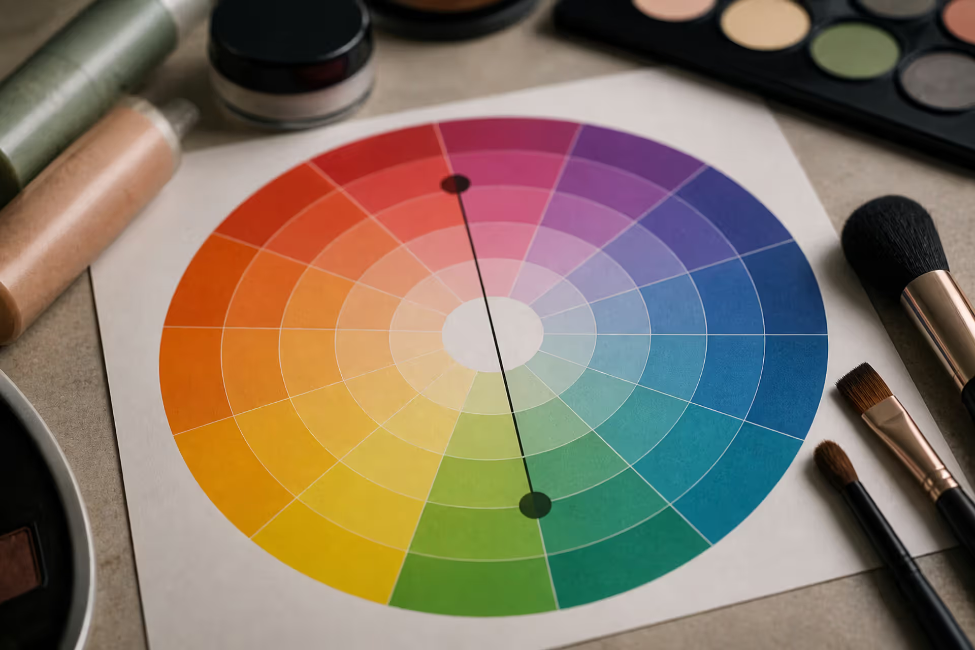
Green tones appearing where they shouldn't can be frustrating. Red cancels out green because these colors sit directly opposite on the color wheel. This principle applies across makeup, hair color, painting, and digital editing, giving you precise control over unwanted hues.
Discover the essential types of color palettes used in design, from monochromatic schemes to complex tetradic systems. Learn how each palette type works, when to use them, and how to choose the right colors for your specific project needs with expert insights and practical examples.
The rounded square has become the defining shape of digital interfaces. From app icons to buttons, this geometric form appears billions of times daily. Learn the mathematical differences between rounded squares, squircles, and superellipses, plus platform-specific implementation standards.
Converting RGB digital colors to PMS for print requires more than software—it demands understanding color gamut differences, using physical Pantone guides, and managing expectations. This comprehensive guide explains why screen colors don't translate directly to print and shows you proven methods for accurate color conversion.
The content on this website is provided for general informational and educational purposes only. It is intended to explain concepts related to digital design, visual art, color theory, art techniques, design principles, and design history.
All information on this website, including articles, guides, and examples, is presented for general educational purposes. Creative outcomes may vary depending on individual skill, tools, and practice.
This website does not provide professional design services or guarantee results, and the information presented should not be used as a substitute for formal education or professional consultation.
The website and its authors are not responsible for any errors or omissions, or for any outcomes resulting from decisions made based on the information provided on this website.