A color palette is a curated selection of colors used consistently throughout a design project. Rather than randomly choosing hues, designers rely on structured palettes to create visual cohesion, guide user attention, and communicate specific emotions or messages.
The role of color palettes extends far beyond aesthetics. In visual communication, colors establish hierarchy, differentiate elements, and create focal points that direct the viewer's eye. A well-constructed palette can reduce cognitive load—users process information faster when colors follow predictable patterns rather than competing for attention.
User experience hinges partly on color decisions. Navigation elements need sufficient contrast for readability, while background colors affect how long visitors stay on a page. Studies show that color increases brand recognition by up to 80%, making palette selection a strategic business decision rather than purely creative choice.
Brand perception shifts dramatically based on color palette categories. Financial institutions typically avoid bright, playful schemes because customers associate muted blues and greens with stability and trust. Conversely, children's brands embrace high-saturation palettes to signal energy and fun. Your palette communicates before users read a single word.
How Color Palette Systems Are Organized
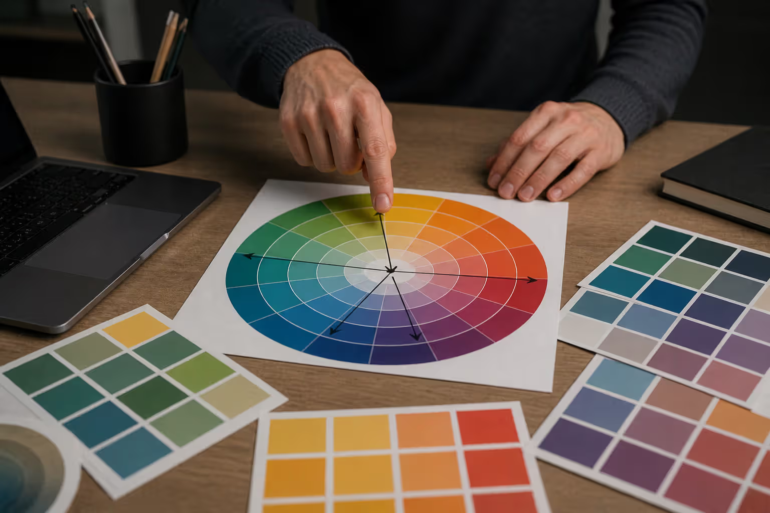
All structured palettes derive from the color wheel—a circular arrangement of hues showing relationships between primary, secondary, and tertiary colors. Understanding this foundation helps designers predict which combinations create harmony versus tension.
Color theory establishes that certain spatial relationships on the wheel produce predictable visual effects. Colors sitting adjacent blend smoothly, while those positioned opposite create dynamic contrast. The distance and angle between selected hues determine the palette type and its inherent characteristics.
Different color harmony types emerge from geometric patterns overlaid on the wheel. A single point creates monochromatic schemes; two points directly across form complementary pairs; three equidistant points produce triadic combinations. These mathematical relationships explain why certain palettes feel balanced while others seem chaotic.
Palette types for designers function as starting frameworks rather than rigid rules. A triadic palette provides three base hues, but designers typically add tints, shades, and tones of those colors to create working palettes with 8-12 variations. The underlying structure remains consistent even as complexity increases.
Temperature plays an equally important role. Warm colors (reds, oranges, yellows) advance visually and stimulate energy, while cool colors (blues, greens, purples) recede and promote calm. Most effective palettes balance temperature to prevent monotony or overwhelming intensity.
Author: Marcus Ellery;
Source: crafterholic.com
Monochromatic and Analogous Palette Types
Monochromatic Color Schemes
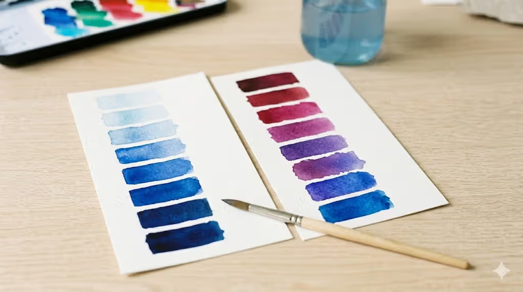
Monochromatic palettes use a single hue varied through different levels of saturation, brightness, and opacity. A blue monochromatic scheme might range from navy to sky blue to pale powder blue, all sharing the same base hue position on the color wheel.
The primary advantage is foolproof harmony—colors derived from the same hue never clash. This makes monochromatic schemes ideal for beginners or projects requiring sophisticated restraint. Luxury brands frequently employ monochromatic approaches because the simplicity reads as refined rather than limited.
However, monochromatic palettes risk monotony if not executed carefully. Without hue variation, designers must create interest through texture, typography, and strategic use of neutrals. Sufficient contrast between light and dark values becomes critical for readability and visual hierarchy.
Common applications include minimalist websites, editorial layouts, and photography portfolios where content should dominate without color distraction. Medical and legal sectors often choose monochromatic schemes to project professionalism and avoid frivolous associations.
The practical challenge involves maintaining accessibility standards. When all colors share the same hue, achieving WCAG-compliant contrast ratios between text and backgrounds requires careful value planning. Test early and often with contrast checkers.
Analogous Color Combinations
Analogous palettes select 3-5 colors positioned next to each other on the color wheel—such as yellow, yellow-orange, orange, and red-orange. These neighbors share underlying pigments, creating natural harmony with more variety than monochromatic schemes.
This approach produces serene, comfortable designs because the eye moves smoothly across similar wavelengths. Nature provides countless analogous examples: sunsets transition from yellow through orange to red; forests blend yellow-greens through blue-greens.
The main pitfall is lack of contrast. Analogous schemes need a dominant color (roughly 60% of the design), a secondary color (30%), and accent colors (10%) to prevent muddy uniformity. Without clear hierarchy, elements blend together rather than standing apart.
Designers often pair analogous palettes with neutral backgrounds to increase versatility. A green-blue-purple analogous scheme works beautifully for organic food brands or wellness apps, especially when grounded with white space or warm gray.
Temperature consistency within analogous schemes creates strong mood associations. All-warm analogous palettes (red-orange-yellow) energize and excite, while all-cool combinations (blue-green-teal) soothe and refresh. Crossing the warm-cool boundary weakens the effect.
Author: Marcus Ellery;
Source: crafterholic.com
Complementary-Based Palette Variations
Standard Complementary Palettes
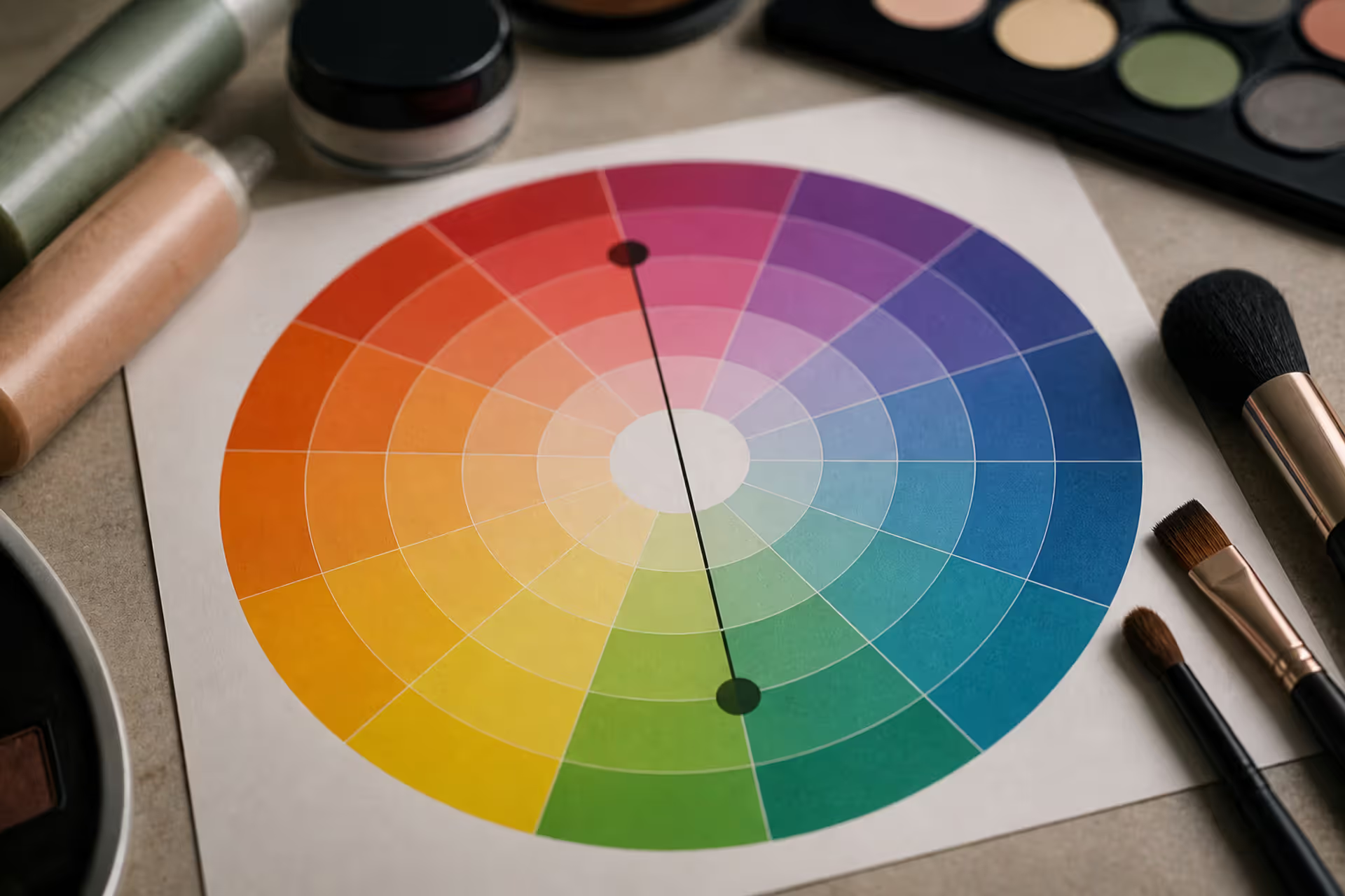
Complementary colors sit directly opposite each other on the color wheel—red and green, blue and orange, yellow and purple. This opposition creates maximum contrast and visual vibration when placed side by side.
The high energy of complementary schemes demands careful handling. At full saturation, complementary pairs can vibrate uncomfortably, causing eye strain. Designers typically desaturate one color or use unequal proportions—pairing a vibrant accent with a muted complement.
Sports teams and retail brands favor complementary palettes for their attention-grabbing properties. The contrast ensures visibility across distances and reproduces reliably across different media. However, this same intensity can overwhelm in contexts requiring extended reading or contemplation.
A practical approach involves using one complementary color as a dominant theme and its opposite sparingly for calls-to-action or important highlights. An e-commerce site might use muted blue throughout with orange buttons—the complementary relationship ensures buttons pop without exhausting viewers.
Cultural considerations matter significantly with complementary schemes. Red and green signal Christmas in Western markets but may carry different associations elsewhere. Always research your audience's color symbolism before committing to high-contrast pairs.
Split Complementary Schemes
The split complementary scheme takes a base color and pairs it with the two colors adjacent to its direct complement. Instead of blue with orange, you'd use blue with yellow-orange and red-orange. This creates strong contrast with less tension than pure complements.
Visual interest increases because three hues provide more variation than two, while the underlying complementary relationship maintains dynamic energy. The split approach softens the sometimes jarring effect of direct opposites.
Beginners often find split complementary schemes more forgiving than standard complementary palettes. The additional color offers flexibility for creating hierarchy and variety without requiring advanced color manipulation skills.
Practical applications include brand identities needing personality without aggression, editorial designs balancing readability with visual interest, and product packaging that must stand out on shelves while remaining approachable.
The main challenge involves color balance. If all three colors compete equally, the design fragments. Establish one color as dominant (60%), use the second for supporting elements (30%), and reserve the third for strategic accents (10%).
Dyadic Color Approaches
Dyadic color schemes use two colors separated by one position on a 12-segment color wheel—such as red and yellow-orange, or blue and blue-violet. This creates moderate contrast without the intensity of complementary pairs.
Less common than other palette types, dyadic schemes offer a middle ground between analogous harmony and complementary tension. The slight separation provides enough distinction for clear hierarchy while maintaining comfortable visual flow.
Dyadic palettes work particularly well when one color leans warm and the other cool, creating temperature contrast even with moderate hue separation. This balance prevents the scheme from feeling either too calm or too aggressive.
Application contexts include educational materials requiring clear differentiation without distraction, user interfaces balancing multiple content types, and branding for services that need to feel both professional and approachable.
The limitation is that dyadic schemes can feel incomplete without additional neutral colors. Most designers expand dyadic foundations with grays, whites, or blacks to create fully functional palettes with sufficient variation for complex layouts.
Author: Marcus Ellery;
Source: crafterholic.com
Complex Multi-Color Palette Systems
Triadic Color Palettes
Triadic palettes select three colors equally spaced around the color wheel—forming a perfect triangle. Classic examples include red-yellow-blue (primary triad) or orange-green-purple (secondary triad).
The equidistant spacing creates inherent balance and vibrant energy. Triadic schemes feel lively and diverse without the potential harshness of complementary pairs. The variety supports complex designs requiring clear categorical distinctions.
However, triadic palettes easily become overwhelming if all three colors compete at equal intensity. Successful implementation requires establishing hierarchy: choose one primary color for 60% of the design, use the second for 30%, and reserve the third for 10% accents.
Children's brands, creative agencies, and entertainment properties frequently employ triadic schemes because the variety signals playfulness and imagination. The approach also works for data visualization where three distinct categories need immediate visual differentiation.
Temperature balance requires attention. Most triadic combinations include both warm and cool colors, which can feel chaotic if not deliberately managed. Adjust saturation levels so warm colors don't dominate purely through their advancing visual properties.
Tetradic (Double Complementary) Palettes
Tetradic color palettes use four colors arranged as two complementary pairs—forming a rectangle or square on the color wheel. A rectangular tetradic might combine blue-orange with yellow-purple; a square tetradic uses red-green with blue-orange.
This complexity offers maximum variety and richness, supporting sophisticated designs with multiple content categories or user pathways. The dual complementary relationships provide multiple contrast options for creating emphasis and hierarchy.
The challenge is proportional balance. Four strong colors competing equally create visual chaos. Establish one color as dominant, one as secondary, and treat the remaining two as accents. Many designers also reduce saturation on some hues to prevent sensory overload.
Tetradic palettes appear in complex applications like dashboard interfaces, editorial designs with multiple content types, and brand systems requiring sub-brands or product lines with distinct identities within a cohesive framework.
Temperature management becomes critical with four colors. Ensure warm and cool colors balance rather than segregating into competing zones. Distribute both temperatures throughout the layout to maintain unity.
The square tetradic variation (four colors equally spaced) tends to feel more balanced than rectangular arrangements, though it offers less flexibility for temperature distribution. Choose based on whether you prioritize equilibrium or temperature contrast.
How to Choose the Right Color Palette for Your Project
Start with project goals rather than personal preference. A meditation app requires different color psychology than a fitness tracker. Define the primary user action—should colors energize users toward activity or calm them toward focus?
Audience research reveals color expectations and associations specific to your users. Financial services targeting retirees need different palettes than cryptocurrency platforms targeting young investors. Age, culture, and industry context all influence which palette types resonate.
Industry conventions exist for practical reasons. Healthcare uses blues and greens because users associate these with cleanliness and calm—deviating risks undermining trust. Conversely, creative industries benefit from unexpected palette choices that signal innovation.
Mood and emotional targets narrow palette selection significantly. Energetic moods align with warm, saturated triadic or complementary schemes. Calm, focused moods require cool, desaturated monochromatic or analogous approaches. Match palette complexity to desired emotional intensity.
Accessibility considerations must inform initial palette selection rather than being retrofitted later. If your audience includes users with color vision deficiencies, avoid relying solely on red-green distinctions. Plan for sufficient luminance contrast from the start.
Content volume influences optimal palette complexity. Text-heavy applications benefit from simple monochromatic or analogous schemes that don't compete with content. Image-heavy designs can support more complex palettes because visual variety already exists.
Brand guidelines provide constraints that actually simplify decision-making. If brand colors are established, your task becomes selecting the appropriate palette type to organize those colors effectively rather than choosing hues from scratch.
Test palettes in context before finalizing. Colors behave differently at various scales, on different backgrounds, and in combination with actual content. Create mockups with real text and images rather than abstract swatches.
The goal of color harmony is not to make everything match, but to create a visual experience where colors work together to guide attention and communicate meaning. A harmonious palette doesn't mean safe or boring—it means intentional. Even the most vibrant, unexpected color combinations can achieve harmony when based on sound color relationships and applied with clear hierarchy.
— Josef Albers
Common Mistakes When Selecting Color Palettes
Ignoring contrast ratios leads to accessibility failures and user frustration. WCAG requires a 4.5:1 contrast ratio for normal text and 3:1 for large text. Many beautiful palettes fail these standards, requiring adjustment before implementation. Check contrast during palette development, not after design completion.
Overcomplicating schemes with too many colors fragments visual hierarchy. Beginners often create palettes with 6-8 distinct hues, assuming variety improves design. In practice, most successful interfaces use 2-3 main colors plus neutrals. Additional colors should serve specific functional purposes, not just add variety.
Neglecting brand guidelines creates inconsistency across touchpoints. A website using different colors than packaging or marketing materials confuses users and weakens brand recognition. Even when guidelines feel limiting, working within constraints typically produces stronger outcomes than starting fresh.
Cultural color meanings vary significantly across markets. White signals purity in Western contexts but mourning in some Asian cultures; red means luck in China but danger in many Western applications. Research color symbolism for your specific audience geography before finalizing palettes.
Failing to test across devices and lighting conditions produces palettes that work on your calibrated monitor but fail in real-world contexts. Colors shift between screens, appear different in sunlight versus indoor lighting, and change based on surrounding colors. View palettes on multiple devices before approval.
Choosing colors in isolation without considering application context leads to implementation problems. A palette perfect for a landing page may lack sufficient variation for a complex dashboard. Consider your most complex use case when developing the palette rather than starting simple and hoping it scales.
Relying on trends over timeless principles creates designs that feel dated quickly. Millennial pink and Gen Z yellow had their moments, but trend-based palettes require frequent updates. Ground decisions in color theory and audience psychology for longer-lasting relevance.
What is the easiest color palette type for beginners?
Monochromatic color schemes offer the easiest starting point because all colors derive from a single hue, making clashing impossible. Choose one base color, then create variations by adjusting brightness and saturation. This approach teaches value and contrast principles without the complexity of managing multiple hues. Once comfortable, progress to analogous schemes for slightly more variety while maintaining natural harmony.
Can I combine different color palette types in one design?
Yes, though it requires careful planning. Many successful designs use a monochromatic or analogous foundation for most elements, then add complementary accents for calls-to-action. The key is establishing one palette type as dominant (80-90% of color usage) and using the second type sparingly for strategic emphasis. Combining multiple complex palette types equally typically creates visual chaos rather than richness.
How many colors should be in a design palette?
Effective palettes typically include 2-3 primary colors plus 2-3 neutral colors (white, black, grays). Add tints, shades, and tones of your primary colors to create a working palette of 8-12 total variations. More colors fragment hierarchy and increase implementation complexity. If you need more than 5 distinct hues, you likely need better organization or content structure rather than additional colors.
What's the difference between triadic and tetradic palettes?
Triadic palettes use three colors equally spaced around the color wheel (120° apart), while tetradic palettes use four colors forming two complementary pairs. Triadic schemes offer vibrant variety with moderate complexity, working well for projects needing three distinct categories. Tetradic schemes provide maximum variety and multiple contrast options but require more sophisticated management to prevent overwhelming viewers. Choose triadic for energetic clarity, tetradic for complex systems requiring rich differentiation.
Do monochromatic palettes work for branding?
Monochromatic palettes work excellently for brands prioritizing sophistication, minimalism, or specific emotional associations with a single color. Luxury brands, tech companies, and professional services often use monochromatic approaches successfully. The limitation is reduced flexibility for sub-brands or product differentiation. If your brand needs to communicate multiple distinct messages or serve diverse audiences, consider analogous or split complementary schemes for additional variety while maintaining cohesion.
How do I test if my color palette is accessible?
Use contrast checking tools like WebAIM's Contrast Checker or Stark plugin to verify WCAG compliance. Test all text-background combinations, ensuring minimum 4.5:1 ratio for normal text and 3:1 for large text (18pt+). Additionally, view your palette in grayscale to confirm sufficient luminance contrast exists independent of hue. Test with color blindness simulators to verify information isn't conveyed through color alone. Plan for accessible contrast from initial palette development rather than adjusting later.
Selecting appropriate palette types transforms color from decoration into strategic communication. Monochromatic and analogous schemes provide harmony and sophistication with minimal complexity, ideal for brands prioritizing clarity and restraint. Complementary variations introduce dynamic contrast for grabbing attention and guiding action. Complex triadic and tetradic systems support rich, multifaceted designs when managed with clear hierarchy.
The most effective approach starts with understanding your project's functional requirements—audience expectations, content complexity, emotional goals, and accessibility standards—then matches those needs to palette types with corresponding characteristics. Rather than choosing colors you personally prefer, select the palette system that best serves user needs and project objectives.
Color palette success depends less on finding perfect individual hues than on understanding the relationships between colors and applying them with intentional hierarchy. Master the foundational palette types outlined here, and you'll develop intuition for when to follow established patterns and when creative deviation serves your specific context. Test palettes with real content, verify accessibility early, and remember that constraints often produce stronger outcomes than unlimited options.
Green tones appearing where they shouldn't can be frustrating. Red cancels out green because these colors sit directly opposite on the color wheel. This principle applies across makeup, hair color, painting, and digital editing, giving you precise control over unwanted hues.
The rounded square has become the defining shape of digital interfaces. From app icons to buttons, this geometric form appears billions of times daily. Learn the mathematical differences between rounded squares, squircles, and superellipses, plus platform-specific implementation standards.
Converting RGB digital colors to PMS for print requires more than software—it demands understanding color gamut differences, using physical Pantone guides, and managing expectations. This comprehensive guide explains why screen colors don't translate directly to print and shows you proven methods for accurate color conversion.
Neon violet stands out as one of the most challenging yet rewarding colors in a designer's toolkit. This comprehensive guide covers technical specifications, effective color combinations, accessibility considerations, and proven applications across cyberpunk, gaming, and tech design.
The content on this website is provided for general informational and educational purposes only. It is intended to explain concepts related to digital design, visual art, color theory, art techniques, design principles, and design history.
All information on this website, including articles, guides, and examples, is presented for general educational purposes. Creative outcomes may vary depending on individual skill, tools, and practice.
This website does not provide professional design services or guarantee results, and the information presented should not be used as a substitute for formal education or professional consultation.
The website and its authors are not responsible for any errors or omissions, or for any outcomes resulting from decisions made based on the information provided on this website.