Ever bleached your hair only to see it turn swamp-green? Or maybe you've mixed paint colors and ended up with a muddy mess instead of the vibrant shade you wanted? Here's the thing: green problems need red solutions. When you place red directly across from green on a standard color wheel, you'll see why these two colors neutralize each other. Mix them together—whether in cosmetics, hair dye, or paint—and that unwanted green disappears into neutral territory. This isn't magic. It's basic color science that works the same way whether you're covering a bruise, fixing chlorine-damaged blonde hair, or adjusting the tones in a landscape painting.
Understanding the Color Wheel and Opposites
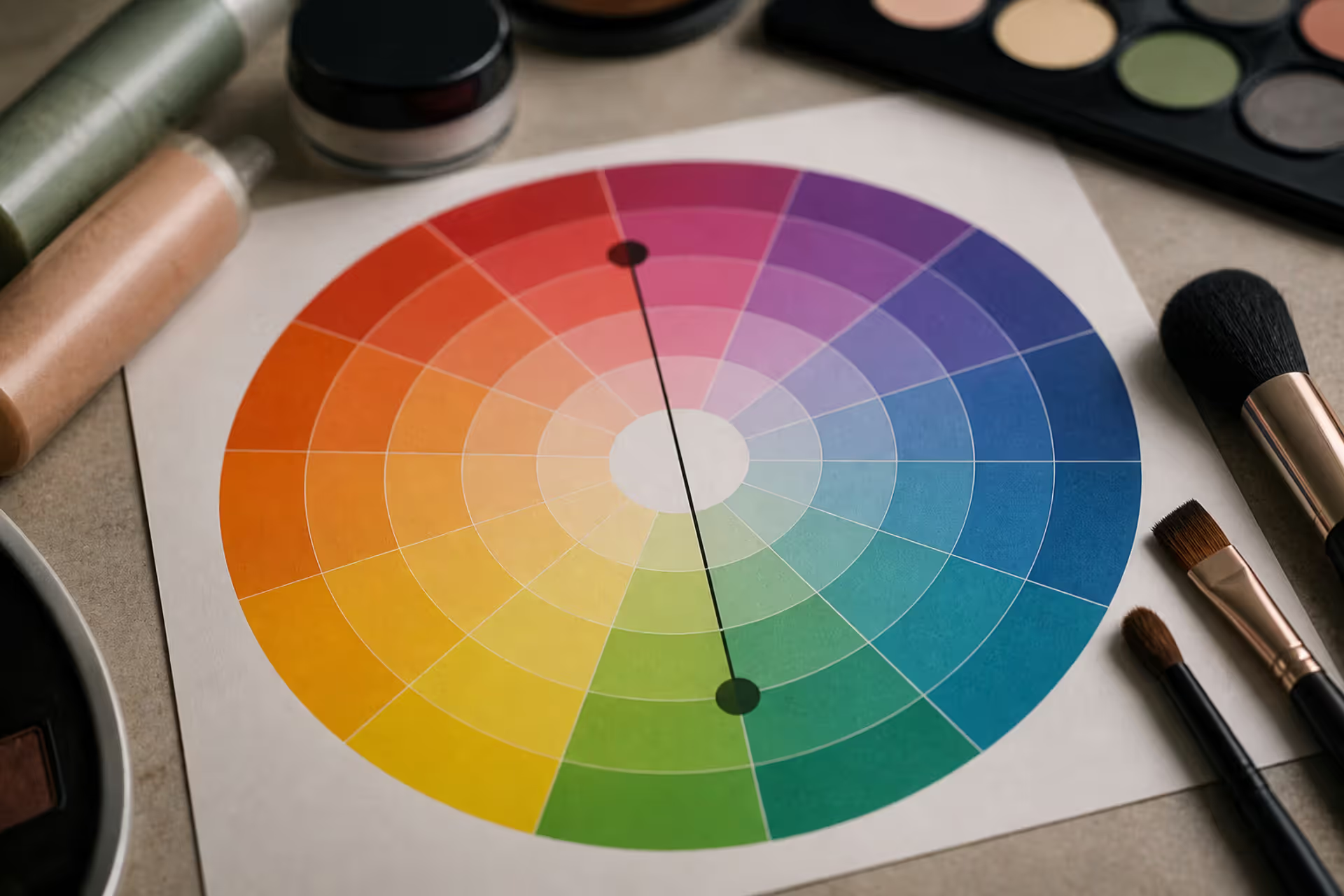
Think of the color wheel as your color GPS. Instead of streets and highways, it maps relationships between different hues in a circle. Red, yellow, and blue anchor everything as your starting points. Mix red with yellow, you'll get orange. Combine yellow with blue, there's your green. Blue mixed with red creates purple. These mixed colors—orange, green, and purple—fill in the spaces between your anchors. Keep mixing, and you'll create even more variations until the entire circle is complete.
Here's where it gets interesting for fixing color problems. Pick any color on the wheel, then look straight across to the opposite side. Those two colors? They're called complements, and they have a special relationship. Place them next to each other in a design, and they'll vibrate with visual energy. But combine them together, and something completely different happens—they destroy each other's intensity, leaving behind neutral grays or browns.
Your main complementary matchups are: - Red faces off against green - Blue opposes orange - Yellow sits opposite purple
Once you grasp this layout, you can predict exactly which color will fix your problem. Got too much purple in something? Add yellow. Orange overload? Bring in blue. The wheel won't steer you wrong—whatever sits 180 degrees from your trouble color becomes your correction tool.
Author: Olivia Hartwell;
Source: crafterholic.com
Why Red Cancels Out Green
Red lives directly across from green on the wheel, making them natural enemies. This setup isn't random—it's connected to how your eyes actually process color information. Your retinas contain specialized cells that respond to different light wavelengths, and when red meets green, these cells register a balanced, neutral signal instead of seeing either color distinctly.
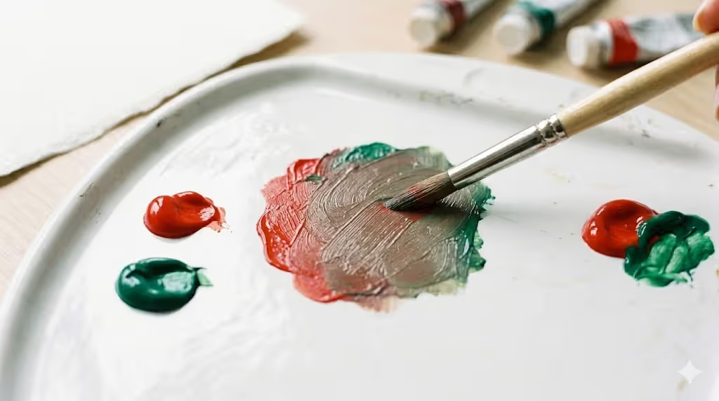
Think about wavelengths for a second. Green reflects light in the 495-570 nanometer range (the middle of the visible spectrum). Red reflects longer wavelengths, up past 620 nanometers. When you mix pigments of these colors together, they essentially cancel out each other's defining characteristics by absorbing the wavelengths that make each color recognizable. What remains? Something neutral—gray if you've mixed pure complements in equal amounts, or various browns if your ratios or color purities differ.
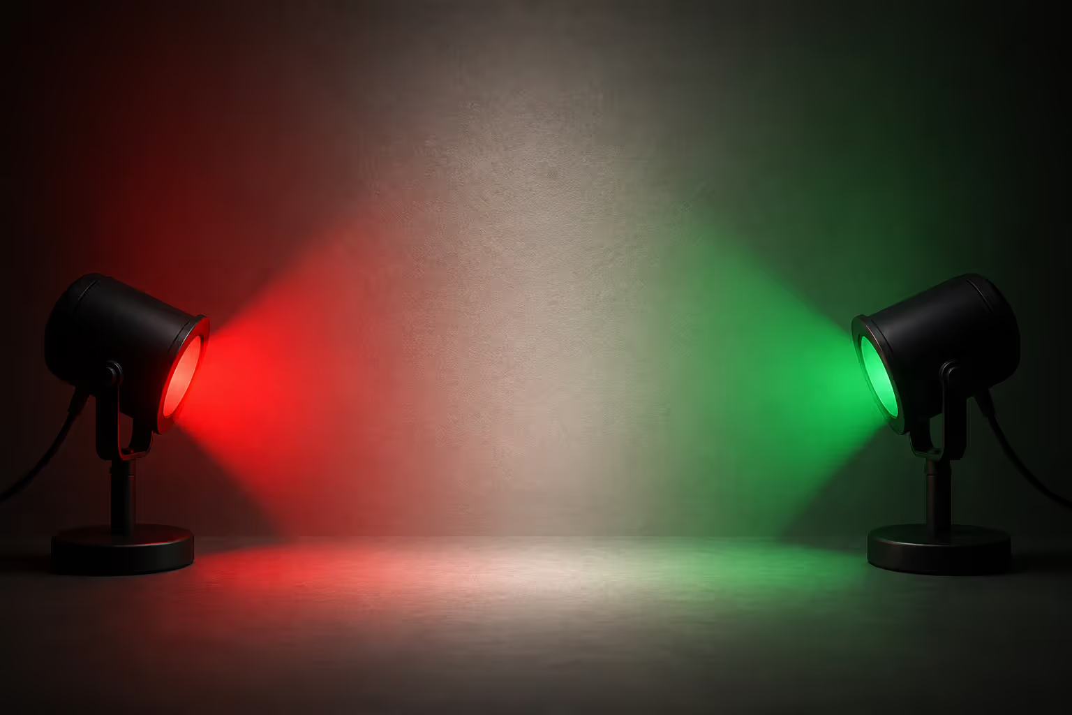
The type of color mixing matters enormously here. Working with light (like on computer screens or in photography) involves additive mixing, where red and green light actually create yellow. But most real-world color corrections involve subtractive mixing—think physical pigments in makeup, hair products, or paint. When red and green pigments combine, they absorb each other's characteristic wavelengths and produce browns or grays instead.
Getting the right result depends on your ratios and starting points. A tiny dab of red can neutralize a pale, washed-out green. But a bright emerald shade? You'll need a more saturated, vibrant red to achieve balance. Temperature plays a role too. Cool reds (leaning slightly purple) behave differently from warm reds (leaning toward orange) when you're trying to neutralize different green shades.
Author: Olivia Hartwell;
Source: crafterholic.com
Practical Uses for Green Color Correction
Makeup and Skin Tone Correction
Most people know green concealer hides redness. But what about the reverse situation? Sometimes you'll over-correct and need to cancel out green instead. Certain foundations oxidize throughout the day, developing a slightly green cast—this happens particularly on people with olive undertones. Applying a pink or peach corrector underneath your foundation stops this shift before it starts.
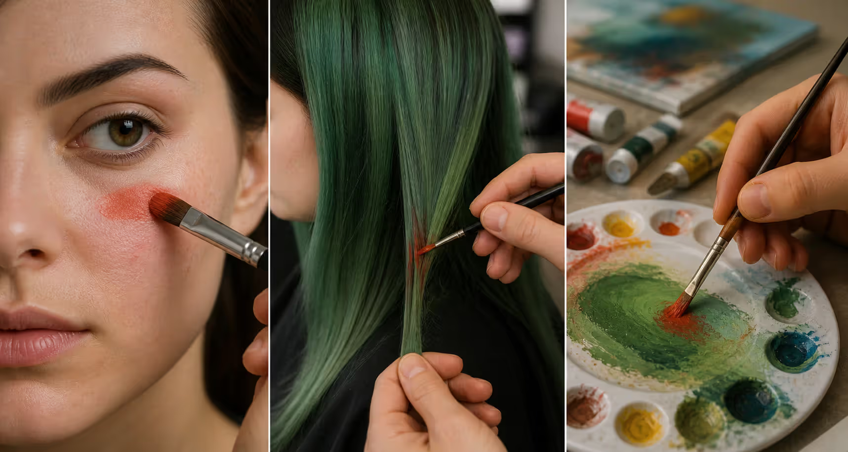
Healing bruises cycle through a rainbow of colors, including a greenish-yellow stage. Your standard beige concealer won't touch it. Red-toned correctors work much better because they neutralize that green component. Match your intensity carefully: sheer pink handles light green discoloration, while deeper green bruising needs coral or even true red underneath your regular concealer.
Professional makeup artists stock multiple shades of red-based correctors precisely because skin varies so much. What neutralizes green undertones on fair Irish skin won't work the same way on deep ebony skin, where green might read more as olive or khaki tones.
Hair Color Fixes
Blonde hair turns green more often than you'd think. Chlorine exposure causes it. Hard water mineral deposits cause it. Ash-toned dyes gone wrong cause it. And honestly? It's not a cute look. Red-based toners become your best friend here. Box dyes labeled "warm blonde," "golden blonde," or "honey blonde" pack red and yellow pigments specifically designed to counteract green.
When the green runs deep, professional colorists sometimes apply what's called a red protein filler before adding the new color. This deposits red pigment directly into the hair shaft, neutralizing the green and creating a clean foundation for whatever color comes next. Skip this step, and your new color mixes with the green, creating muddy, uneven results.
Quick fixes exist for minor green tints. Red-tinted shampoos deposit temporary color. Some people swear by the ketchup trick (yes, really—the red pigment plus mild acidity can help). Tomato paste works on the same principle. These home remedies handle light cases but won't solve serious pigmentation problems.
Painting and Art Applications
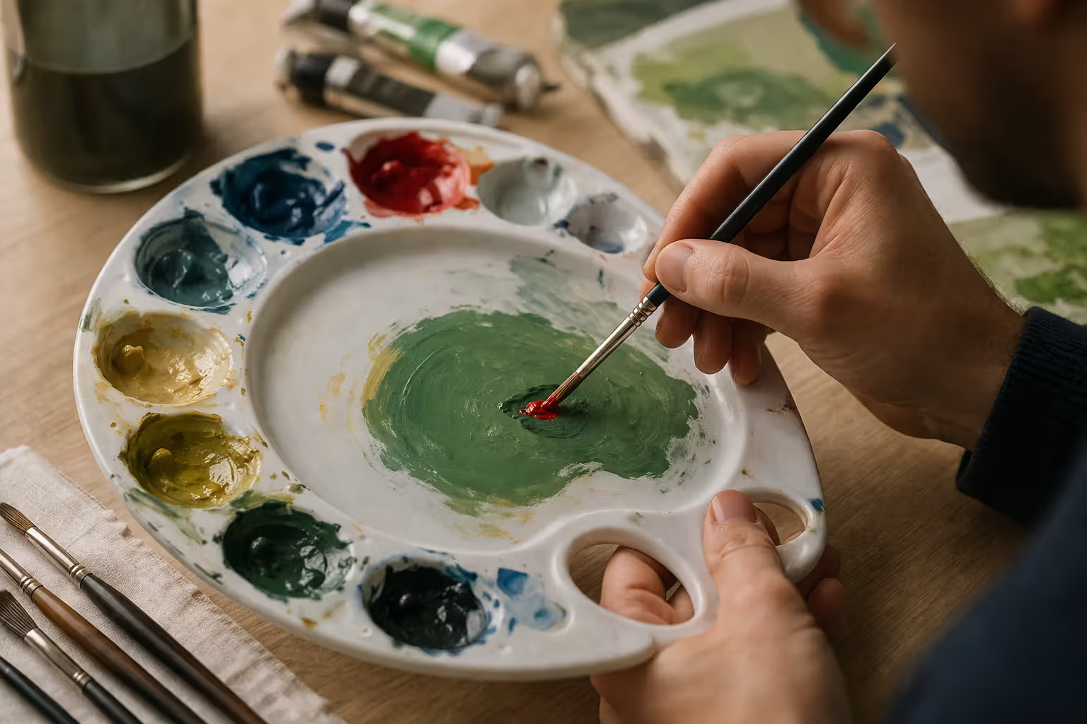
Artists rarely use colors straight from the tube if they want realistic results. A bright, pure green looks artificial in most contexts. Adding just a touch of red—the complement—tones it down without turning it into a completely different color. This technique, which artists call "graying down" or "knocking back," creates more natural, sophisticated color relationships in paintings.
Shadows in green objects present a common challenge. Beginners often paint shadows as just darker versions of the base green, which looks flat and lifeless. Adding red to shadow mixtures creates dimension and depth. Think about painting trees: the shadowed foliage gains complexity and realism when you mix subtle red-greens instead of just darkening with black or more green.
Some artists intentionally use complementary underpaintings. A red underpainting beneath green foliage creates visual vibration where the colors peek through, adding energy to the composition. But if you're not doing this intentionally—if red accidentally shows through your greens—you'll get muddy, unpleasant results instead of that intentional vibrancy.
Author: Olivia Hartwell;
Source: crafterholic.com
Photography and Digital Editing
Digital color correction follows identical complementary principles, just using sliders instead of physical pigments. Images shot under fluorescent lighting often develop a green color cast. Certain camera white balance settings create it too. Adding red through color balance adjustments or curves removes it.
Photo editing programs often include a "magenta" slider specifically for fighting green casts—magenta works because it's essentially a red-purple combination. The histogram and individual color channels let you see exactly where green dominates your image, enabling surgical precision. Over-correct, though, and you'll swing too far into magenta territory. Photographers adjust incrementally, constantly checking skin tones and neutral grays to confirm they haven't overdone it.
RAW photo files give you way more correction flexibility than JPEGs because they contain significantly more color information before compression. A severe green cast that completely ruins a JPEG might be totally fixable in the RAW version by shifting color temperature toward red and tweaking the tint slider.
How to Apply Color Cancellation Techniques
Always start with less corrective color than you think you'll need. Adding more is easy. Removing excess? That's difficult or impossible depending on what you're working with. For makeup, apply your corrector in thin, buildable layers. In painting, add your neutralizing color to your mixture in tiny increments. For hair color, choose a shade one level lighter than your target to prevent overshooting into red-orange territory.
Testing first saves enormous hassle later. Hair color? Do a strand test on a hidden section underneath. Makeup? Try the corrector on your jawline where you can see how it interacts with your actual skin tone. Painting? Mix test samples on scrap material that matches your working surface. Digital editing gives you unlimited testing freedom through adjustment layers and the ability to undo anything.
Match your corrective color's intensity to the intensity of the unwanted green. Pale mint green needs soft, subtle pink—not vibrant cherry red. Deep forest green requires a saturated, strong red to achieve neutralization. Mismatched intensities leave you with incomplete corrections or, worse, new color problems on top of the old ones.
Pay attention to undertones within the green itself. Blue-green shades (think teal or turquoise) need red-orange correctors because they contain blue, which would mix with pure red to create purple. Yellow-greens (lime, chartreuse) respond better to red-violet correctors. Pure green works best with pure red. This gets into tertiary color territory on the wheel, but understanding these nuances separates successful corrections from frustrating failures.
Layering sequence matters significantly in opaque mediums. Makeup goes corrector first, foundation second. Painting requires establishing your neutralized undertone before adding brighter top layers. Hair color applications should target green sections first, process completely, then apply all-over color if needed. Each layer interacts chemically or visually with what's underneath, so order affects your final result.
Author: Olivia Hartwell;
Source: crafterholic.com
Common Mistakes When Neutralizing Green Tones
Using the wrong temperature red causes more problems than it solves. Apply a cool red (with bluish notes) to a warm yellow-green, and you'll create muddy purple-brown instead of neutral tones. Use a warm red (with orange notes) on cool blue-green, and you'll get similarly disappointing results. Your corrective color must match the temperature of the green you're fighting.
Over-application transforms green problems into red problems. Panic leads people to use way too much red pigment, overshooting neutrality and creating entirely new color headaches. This happens constantly with hair color—someone sees green, freaks out, dumps on too much red dye, and ends up with bright orange or copper tones that now need their own correction cycle.
Ignoring existing color relationships in art creates solutions that fix one issue but destroy overall harmony. Sometimes a slight green cast contributes to a painting's mood or atmosphere. Neutralize it completely, and the whole piece feels wrong—sterile, disconnected. Not every color needs perfection; sometimes "good enough" preserves the bigger picture better than "perfect" would.
Skipping the test step wastes your time and materials. Something that seems perfect in theory might fail spectacularly with your specific pigments, lighting conditions, or base colors. Spend five minutes testing now, or spend five hours fixing mistakes later. Easy choice.
Expecting instant results in processes that need time causes premature panic. Hair color requires development time. Paint looks different wet versus dry. Makeup needs to settle and oxidize on skin. Judge too early, and you'll add more correction when the first application would've worked perfectly if you'd just waited.
Common Green Tones and Their Corrective Colors
Green Type
Corrective Color Needed
Where You'll Use It
Saturation Required
Mint/Pale Green
Soft Pink
Color-correcting makeup, watercolor adjustments
Light (10-20% saturated)
Yellow-Green (Lime)
Red-Violet/Magenta
Hair toning products, photo editing
Medium (30-50% saturated)
True/Pure Green
Pure Red
Acrylic/oil painting, foundation correction
Medium-High (50-70% saturated)
Blue-Green (Teal)
Red-Orange/Coral
Chlorine damage repair, bruise concealing
Medium-High (50-70% saturated)
Forest/Deep Green
Saturated Red
Stage makeup, severe bruising, dark pigment issues
High (70-90% saturated)
Olive/Gray-Green
Warm Red/Terracotta
Skin undertone balancing, portrait work
Medium (40-60% saturated)
Color Theory Basics for Better Color Balance
Most physical color corrections happen through subtractive mixing. Whenever you combine pigments—paint, makeup, hair dye, whatever—you're mixing substances that absorb (subtract) certain light wavelengths while reflecting others. Each additional pigment removes more wavelengths from what gets reflected back to your eyes, which explains why mixing too many colors creates muddy neutrals instead of vibrant hues.
Printing uses cyan, magenta, and yellow as subtractive primaries (the CMY system). Traditional art teaching uses red, blue, and yellow as primaries (the RYB system). Both work, just in slightly different contexts. Commercial products might reference either system, so understanding both helps you interpret product descriptions and color charts.
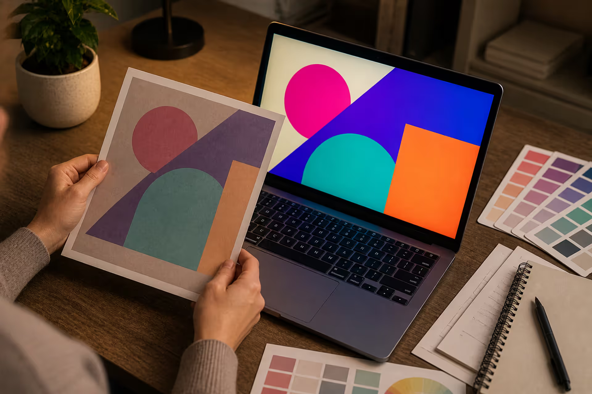
Additive mixing governs light sources—computer screens, projectors, stage lighting. Here, the primaries shift to red, green, and blue (RGB). When adjusting color on a monitor, you're manipulating light emission, not pigment reflection. Red light plus green light produces yellow light, which seems completely backwards if you're thinking in terms of paint mixing. Digital color correction sometimes requires mentally switching between these two different frameworks.
Temperature classifications within each color family affect how hues interact with each other. Reds, oranges, and yellows fall into the warm category—they advance visually and create energetic feelings. Blues, greens, and purples register as cool—they recede visually and feel calming. But here's the catch: within green itself, you'll find warm versions (more yellow content) and cool versions (more blue content). Correcting with the wrong temperature creates visual discord even when you've technically chosen the right complement.
Lighting conditions completely alter how you perceive color. A correction that looks flawless in daylight might appear totally wrong under incandescent bulbs or fluorescent office lights. Makeup artists check their work under multiple light sources. Painters position their easels near north-facing windows for consistent natural illumination throughout the day. Photographers calibrate their monitors and use controlled lighting when editing to ensure what they see matches what prints or displays elsewhere.
Quote from Professional Expert:
I've watched colorists panic over green-toned hair and dump so much red on their clients that they walk out looking like orange traffic cones. The color wheel operates on fixed principles—it doesn't care about your deadline or your panic level. You can't force it to work differently than it works. Test your corrections. Use small amounts. Adjust incrementally. Professional results come from respecting the science, not fighting against it.
— Melissa Chen
Frequently Asked Questions About Color Cancellation
What color is opposite green on the color wheel?
Red sits straight across from green on a traditional color wheel, which makes them complementary colors. This opposite positioning explains why red neutralizes green when they mix together. The exact shade of red that works best varies depending on your specific green—blue-greens need red-orange, yellow-greens need red-violet, and pure greens need pure red for optimal neutralization.
Can I use any red to cancel out green?
Different reds won't all neutralize green equally well. Temperature and intensity both matter. Cool reds (with purple leanings) work on cool greens, while warm reds (with orange leanings) work on warm greens. Using a mismatched red creates muddy, off-putting results instead of clean neutralization. Start by matching your red's temperature to your green's temperature, then fine-tune from there based on results.
Does color cancellation work the same in paint and makeup?
The underlying principle stays consistent—complements neutralize each other—but application techniques differ across mediums. Paint involves directly mixing pigments together, giving you immediate visual feedback in your palette. Makeup sits on top of skin, which contributes its own undertones to the final appearance. Hair color penetrates the shaft and interacts with existing pigment layers. Digital editing manipulates light values rather than physical substances. Each medium needs adjusted techniques, though the color theory remains identical.
How do I know how much red to use to neutralize green?
The green's intensity and saturation determine how much red you'll need. Pale, subtle greens require small quantities of soft pink or coral. Vibrant, saturated greens demand more intense red in greater amounts. Start conservative—add a small amount, evaluate what happens, then add more incrementally if needed. Your desired outcome also affects the ratio: complete neutralization to gray or brown needs more red than simply toning down the green while keeping some color visible.
What if I have blue-green instead of pure green?
Blue-green shades (teal, turquoise, aqua) need red-orange correctors rather than pure red. Since blue-green contains blue pigment, applying pure red would create purple wherever the red meets that blue component. Red-orange neutralizes both the green and blue elements simultaneously, producing cleaner neutral results. The more blue your green contains, the more orange your corrective red should include.
Are there other color pairs that cancel each other out?
Absolutely—all complementary pairs neutralize each other through the same mechanism. Blue cancels orange, which explains why orange correctors hide bluish-purple under-eye circles so effectively. Yellow cancels purple, making yellow-toned products useful for neutralizing purple bruises or overly cool-toned hair color. Each complementary pair on the wheel—red/green, blue/orange, yellow/purple—operates on identical neutralization principles. Understanding all three pairs gives you complete color correction capabilities across any situation.
Understanding what color cancels out green gives you precision control whether you're applying makeup, fixing hair color disasters, mixing paint, or editing photographs. Red's position opposite green makes it the go-to neutralizer for unwanted green tones, but getting good results requires paying attention to temperature matching, intensity levels, and medium-specific application methods. The gap between corrections that work and corrections that create new problems usually comes down to testing first, staying patient, and respecting fundamental color theory principles.
Whether you're salvaging a pool-damaged blonde, perfecting a landscape painting, or adjusting a portrait's color cast, the color wheel provides reliable answers every time. Match your corrective red's temperature to the green you're fighting, start with less than you think necessary, and always test before committing fully. These habits transform abstract color theory into practical problem-solving tools. Next time green shows up where it doesn't belong, you'll know exactly which red will fix it.
Discover the essential types of color palettes used in design, from monochromatic schemes to complex tetradic systems. Learn how each palette type works, when to use them, and how to choose the right colors for your specific project needs with expert insights and practical examples.
The rounded square has become the defining shape of digital interfaces. From app icons to buttons, this geometric form appears billions of times daily. Learn the mathematical differences between rounded squares, squircles, and superellipses, plus platform-specific implementation standards.
Converting RGB digital colors to PMS for print requires more than software—it demands understanding color gamut differences, using physical Pantone guides, and managing expectations. This comprehensive guide explains why screen colors don't translate directly to print and shows you proven methods for accurate color conversion.
Neon violet stands out as one of the most challenging yet rewarding colors in a designer's toolkit. This comprehensive guide covers technical specifications, effective color combinations, accessibility considerations, and proven applications across cyberpunk, gaming, and tech design.
The content on this website is provided for general informational and educational purposes only. It is intended to explain concepts related to digital design, visual art, color theory, art techniques, design principles, and design history.
All information on this website, including articles, guides, and examples, is presented for general educational purposes. Creative outcomes may vary depending on individual skill, tools, and practice.
This website does not provide professional design services or guarantee results, and the information presented should not be used as a substitute for formal education or professional consultation.
The website and its authors are not responsible for any errors or omissions, or for any outcomes resulting from decisions made based on the information provided on this website.