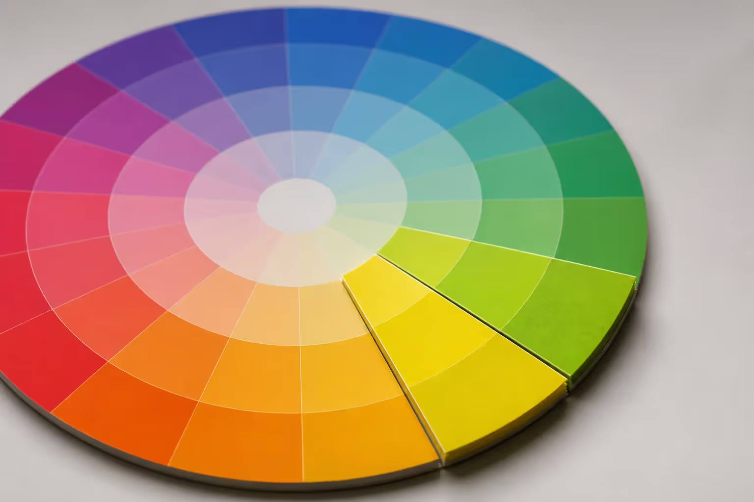
Think of analogous color palettes as neighbors on the color wheel—hues that live side-by-side and get along naturally. The analogous colors definition is straightforward: pick three to five colors sitting consecutively around the wheel, and you've got an analogous scheme.
Here's a concrete example. Grab yellow, then move one step to yellow-orange, then another to orange. Those three neighbors? That's analogous. Or start with blue, add blue-green, then green. Same deal.
Why do these adjacent colors on the color wheel work so well together? They literally share pigment DNA. Red and orange both contain red. Blue and green both have blue in them. This shared foundation means they blend without fighting each other.
You won't find the jarring tension here that other color relationships create. Instead, you get smooth transitions and visual flow. Your brain doesn't work hard processing these combinations because the wavelengths are similar enough to feel related.
Most professionals stick with three to five colors maximum. Two feels limiting. Six starts falling apart because you're stretching beyond that sweet spot—roughly 90 degrees of the wheel's 360-degree circle. That's enough range for interest without breaking the family resemblance.
How Analogous Colors Work on the Color Wheel
The color wheel isn't random—it's organized by light wavelengths. Red sits around 700 nanometers, violet down at 380 nanometers, with everything else distributed between them based on wavelength.
When you pick adjacent hue relationships, you're selecting similar wavelengths. This matters because of how your eyes actually work. Light hits your retina's cone cells, and neighboring colors activate overlapping groups of these receptors. Your visual system doesn't need to make dramatic adjustments, so the experience feels comfortable.
Scientists call this "low chromatic contrast." Basically, your eyes can relax.
Author: Adrian Lowell;
Source: crafterholic.com
Look at what happens on the opposite end of the spectrum. Colors sitting across from each other—let's say red and green—stimulate completely different cone cells. They create what's called the opponent process, where your visual system has to work harder switching between them. That's where you get vibration and tension.
Now consider yellow flowing into green flowing into blue. Each step moves gradually through the cool spectrum. No jarring leaps. These harmonious color schemes mirror what you see constantly in nature—a sunset shifting from yellow through orange to red, or ocean water changing from deep blue to turquoise as it gets shallower.
This natural progression explains why analogous combinations rarely feel dull. Each step introduces enough change to maintain interest while the overall family relationship stays intact. You get rhythm. You get variety. But you don't get chaos.
Warm vs Cool Analogous Color Palettes
Temperature changes everything in color psychology. Pull from the red-orange-yellow section of the wheel, and you've built a warm analogous palette. Grab from blue-green-purple territory for a cool analogous palette. They create completely different moods.
Warm combinations—think red melting into orange melting into yellow—feel active. They advance toward you visually. Fast-food chains love these palettes because warm colors actually stimulate appetite. McDonald's didn't pick red and yellow randomly. Retail stores targeting impulse buyers? Same strategy. Warm colors trigger faster emotional responses.
I've watched actual sunsets that nail this warm analogy. Deep crimson near the horizon, bleeding into coral orange, then golden yellow, sometimes even touching yellow-green before hitting blue sky. You've seen thousands of these in your lifetime, which is exactly why designers use them—instant recognition, instant comfort.
Cool palettes flip the script entirely. Blue sliding into blue-green sliding into green communicates professionalism, stability, calm. These colors recede visually, creating depth. Tech companies default to cool schemes for a reason. Think about how many software companies use blue. Healthcare organizations do this too—hospitals need to reduce anxiety, not amp it up.
Author: Adrian Lowell;
Source: crafterholic.com
Picture the ocean. Deep navy blue in the distance, transitioning to turquoise in the shallows, maybe some green kelp swaying underneath. Completely cohesive because every element shares blue or green pigment.
Your choice depends on what you're trying to accomplish. Need immediate engagement? Warm works. Want people relaxed during a long reading session? Go cool. Warm palettes are extroverted and demanding. Cool palettes are thoughtful and spacious.
You can also split the difference. Yellow-green-blue-green bridges warm and cool zones, giving you flexibility. Red-violet-blue-violet does the same from another angle. These transitional palettes grab benefits from both sides without committing completely.
Analogous vs Complementary Color Schemes
Should you go with analogous harmony or complementary contrast? Depends entirely on your project goals. Each approach solves different problems.
Complementary pairings create instant pop. Slap an orange button on a blue background and watch it scream for clicks. That's because these colors sit on opposite sides of the wheel, activating opposing neural pathways. The tension generates energy—but too much of it exhausts viewers quickly.
Analogous schemes prioritize unity. Build a website background using blue-green-teal, and you've created a cohesive environment where your actual content takes center stage. The colors support your message instead of fighting it. Perfect for reading apps, dashboards, or anything requiring sustained focus.
Here's how I think about the analogous vs complementary colors decision: use complementary contrast sparingly on elements that must grab attention. Your "Buy Now" button, your error messages, your most important headline. Then build everything else with analogous harmony to prevent visual fatigue.
Plenty of successful designs combine both strategies. Start with an analogous foundation—maybe blue-blue-green-teal across your interface. Then add complementary orange accents for buttons and calls-to-action. You get cohesion from the base plus emphasis where it counts.
Complementary schemes demand more skill. The high contrast easily tips into garish if you're not careful with saturation and proportion. Analogous palettes forgive mistakes—even beginners create pleasant combinations by simply selecting neighbors.
How to Create Your Own Analogous Palette
Start by picking your anchor color. This dominant hue should align with your brand, emotional goals, or project requirements. It'll occupy 60-70% of your design's color real estate, so choose carefully.
Next step: grab one or two neighbors. If you've anchored on blue, consider blue-violet and blue-green. Anchored on orange? Try red-orange and yellow-orange. Stay within that roughly 90-degree arc.
Proportion matters more than most beginners realize. I recommend the 60-30-10 rule as a starting framework: 60% your dominant color, 30% your secondary adjacent color, 10% accent from the third. This hierarchy prevents the scattered feeling that equal proportions create.
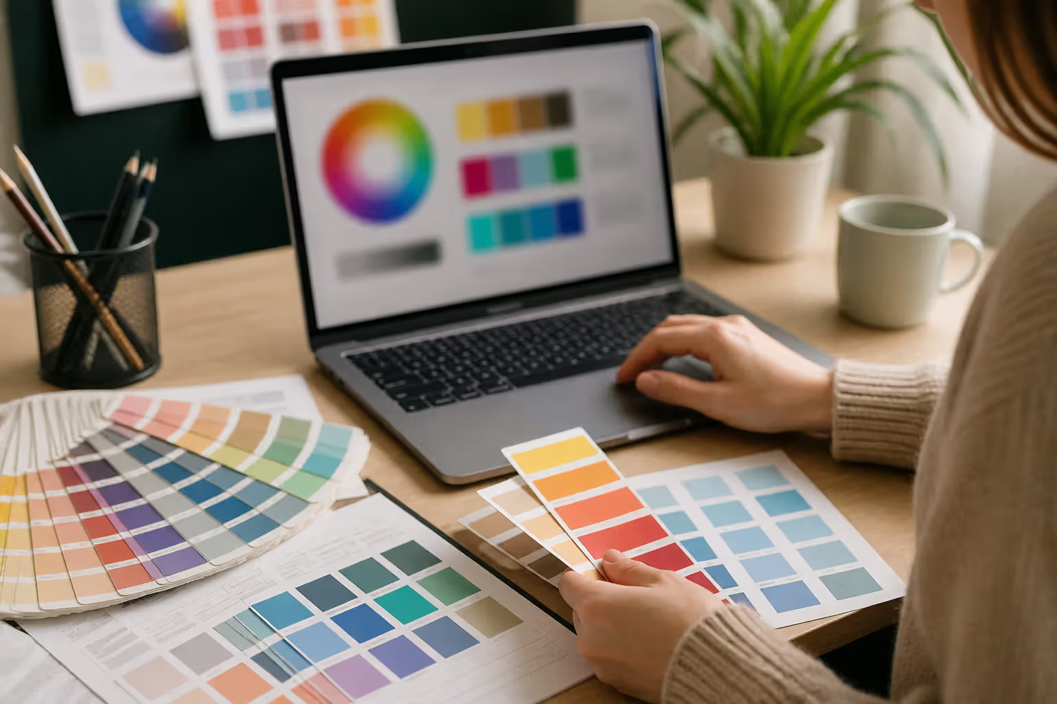
Test your combinations against multiple backgrounds. What looks fantastic on white might disappear on charcoal gray. Check both light and dark contexts. And remember—digital screens, printed materials, and physical products all render colors differently. Preview across whatever media you'll actually use.
Author: Adrian Lowell;
Source: crafterholic.com
Here's a trick many designers miss: vary saturation and brightness to add dimension. Three identical-saturation blues feel flat and lifeless. Instead, try a saturated primary blue, a softer secondary blue-green, and a pale accent blue-violet. You maintain analogous harmony while creating depth.
Don't forget accessibility. Run contrast checks between text and background colors early in the process. Two adjacent hues at similar brightness might look harmonious but completely fail readability tests for users with visual impairments. WCAG guidelines exist for a reason.
Common Mistakes When Building Analogous Palettes
The biggest error I see? Picking colors that are way too similar. Blue, slightly-bluer-blue, and you-can-barely-tell-the-difference-blue doesn't create harmony—it creates monotony. You need enough variation between adjacent hues to justify using multiple colors. If viewers can't distinguish them, you're working with a monochromatic scheme, not analogous.
Second issue: ignoring proportion. Use equal amounts of three analogous colors and watch your design fall apart. Your viewer's eye doesn't know where to land. Establish clear dominance with your primary color (60% or more), then let the others play supporting roles.
Many designers also forget about neutral elements. Your beautiful blue-green-teal combination needs to work alongside blacks, whites, and grays for text, backgrounds, and breathing room. Test with neutrals early. I've seen gorgeous analogous palettes completely clash with the gray a client insisted on using.
Context matters too. That perfect blue-green-purple palette for a yoga studio? Totally wrong for a law firm. The colors might be technically harmonious, but if they don't match your industry and audience, harmony becomes irrelevant.
And here's one that bites people later: building palettes in isolation without considering extensions. Your website colors need to translate to business cards, packaging, signage, Instagram graphics. What works in RGB might fail in CMYK printing. I always build with multiple applications in mind from day one.
Digital Tools for Analogous Color Selection
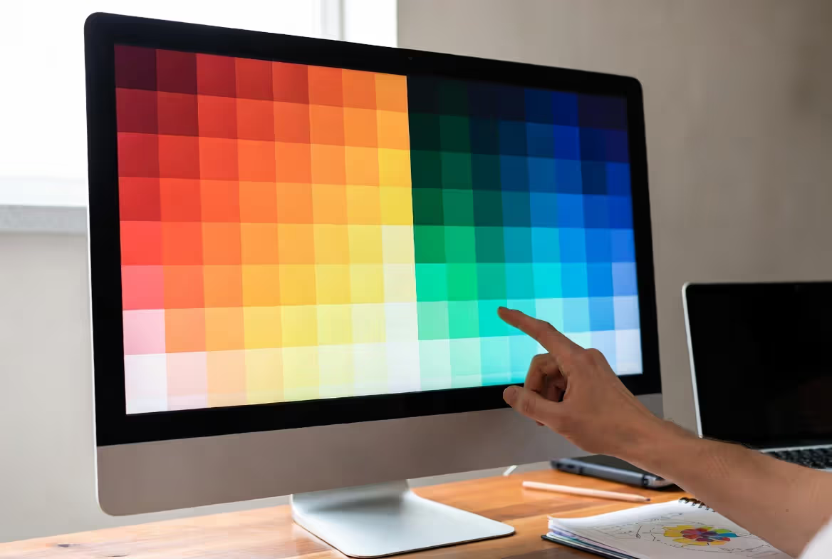
Adobe Color has an analogous rule that auto-generates adjacent combinations. Pick your base hue, and the tool populates harmonious neighbors. You can see everything positioned on the wheel, making relationships crystal clear.
Coolors gives you a similar generator with one killer feature—lock the colors you want to keep while randomizing the rest. Super helpful when you've got a required brand color and need to build companions around it.
Paletton focuses specifically on color scheme theory, with dedicated analogous modes. You can fine-tune the distance between adjacent colors and adjust saturation/brightness independently for each hue. The preview pane shows your palette applied to sample interfaces, which saves time.
Canva's palette generator extracts analogous schemes from uploaded images. Found inspiration in a photo or painting? This tool identifies the dominant adjacent hues and creates a usable palette. I use this constantly for matching real-world color relationships.
For developers, Chroma.js and Color.js (JavaScript libraries) can programmatically generate analogous palettes. Define an anchor color, automatically calculate adjacent hues at specified intervals. Perfect for dynamic theming systems.
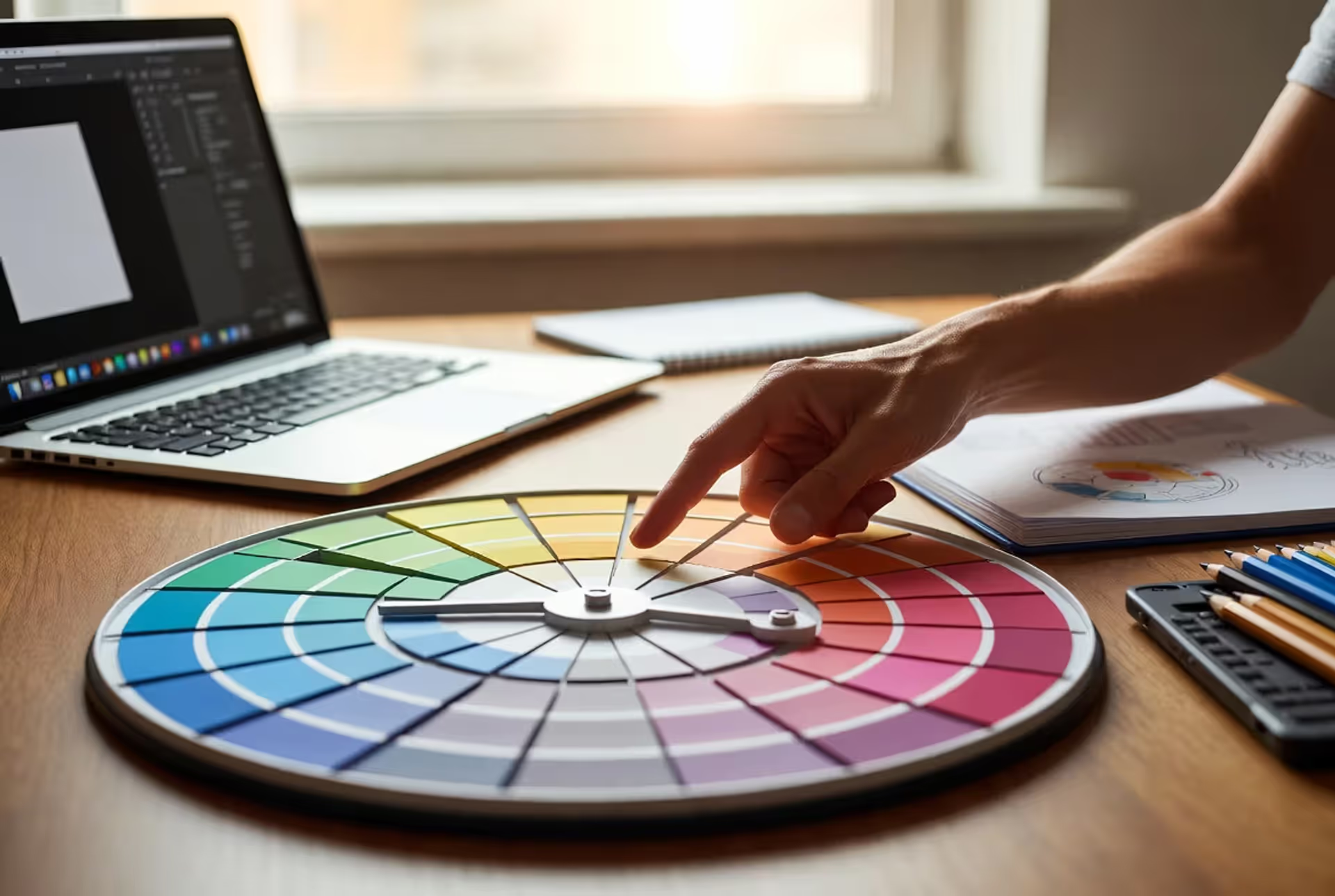
Don't sleep on physical color wheels, though. Despite all these digital tools, a traditional wheel helps you understand spatial relationships in ways screens sometimes hide. I keep one on my desk for quick reference during brainstorming sessions.
Real-World Analogous Color Examples in Design and Branding
Nature serves up endless analogous inspiration. Autumn foliage is the textbook example—leaves shift from yellow to orange to red as chlorophyll breaks down. A single maple tree might display this entire warm spectrum simultaneously, creating cohesion with variety. Landscape designers replicate this constantly by grouping plants with adjacent flower colors.
Fanta's branding leans hard into orange-red-orange-yellow analogy for citrus freshness and youthful energy. The palette feels vibrant without the jarring effect you'd get from complementary contrasts. The colors blend naturally—like actual fruit gradients—making the brand feel authentic instead of artificial.
Author: Adrian Lowell;
Source: crafterholic.com
Spotify used green-yellow-green-blue analogous palettes in their 2018 "Wrapped" campaign. That cool-to-warm transition created energy while maintaining cohesion. Felt fresh and contemporary, appealing to younger demographics without alienating older users who appreciated the sophisticated harmony.
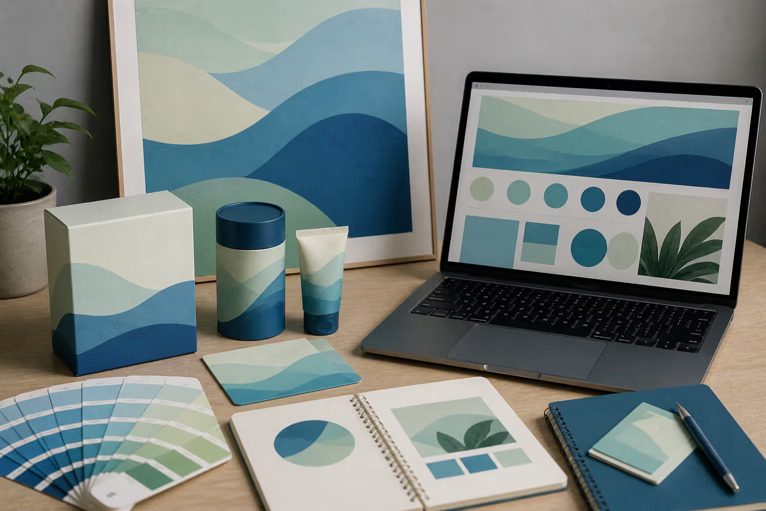
Interior designers default to blue-green-teal analogous schemes for bathrooms constantly. These cool adjacent colors create spa-like tranquility that encourages relaxation. The subtle variation prevents monotony while the shared blue base maintains calm throughout the space.
Sunset photographers naturally capture warm analogous palettes. The sky progresses from deep red near the horizon through orange and yellow to pale yellow-green higher up. Photographers often enhance these natural analogies in Lightroom, knowing viewers find them inherently pleasing because we've evolved seeing these exact progressions.
The National Park Service uses green-yellow-green-brown earth-tone analogies across signage and printed materials. This palette connects to natural landscapes while ensuring legibility. Feels appropriate for an organization literally dedicated to preserving natural beauty.
Financial services like Ally Bank adopted purple-blue-blue-green cool analogies around 2016 to project trustworthiness with a modern edge. Traditional banks stuck with navy blue alone. Analogous variations add personality while maintaining professional credibility—a smart middle ground.
Fashion designers create entire analogous collections so pieces coordinate effortlessly. A spring 2024 line might feature yellow-green-blue-green garments that customers can mix-match confidently. The adjacent hues guarantee compatibility, reducing purchase anxiety and increasing average transaction values.
Colors appearing side-by-side influence each other's appearance through simultaneous contrast. This is perhaps the most important principle of color harmony. When colors are neighbors on the wheel, they minimize this contrast effect, creating perceived harmony—not through sameness, but through shared characteristics that suggest family while maintaining individual identity.
— Josef Albers
Frequently Asked Questions About Analogous Color Palettes
What are the three colors in a basic analogous palette?
You'll pick three consecutive neighbors on the color wheel. Red-orange-yellow works. So does blue-blue-green-green. Or yellow-green-blue. The key? Each color sits directly next to the others without gaps. You're always selecting from adjacent positions, creating a continuous 60-90 degree arc around the wheel.
Can you use more than three colors in an analogous scheme?
Absolutely—you can stretch to four or five while maintaining harmony. A five-color version might include yellow-yellow-orange-orange-red-orange-red. But once you exceed five colors, you risk losing that cohesive quality that defines analogous relationships. The palette becomes too broad, approaching rainbow territory instead of a focused harmonious scheme. I find three to four colors hits the sweet spot between variety and unity.
Do analogous colors work for all design projects?
Not even close. Analogous palettes shine for projects needing sophistication, calm, or natural harmony. Perfect for wellness brands, educational platforms, or background environments where content should dominate. They fall short when you need maximum attention-grabbing power or energetic tension. High-contrast complementary schemes work better for sports branding, clearance sale ads, or warning systems. Choose analogous when color should support rather than star.
How do I choose which color should be dominant?
Your dominant color should align with your primary message or brand identity. Health company? Maybe green dominates with yellow-green and blue-green supporting. Creative agency? Perhaps orange leads with red-orange and yellow-orange accents. Consider emotional associations, industry conventions, and practical factors like how the color reproduces across different media. Remember—this color will occupy 60-70% of visual space, so it needs endurance without causing fatigue.
Are analogous palettes suitable for logos and branding?
Analogous palettes work beautifully for logos when you want to communicate harmony, natural connection, or sophisticated restraint. But they might lack the instant memorability of higher-contrast approaches. I've seen many successful brands use analogous colors in extended branding—websites, packaging, retail environments—while employing higher contrast in the logo itself. This hybrid approach delivers both recognition and cohesion. Consider your competitive landscape too. If rivals use high-contrast logos, analogous harmony might differentiate you through sophisticated restraint.
What's the difference between analogous and monochromatic palettes?
Monochromatic means variations of one single hue—different tints, shades, and tones of blue, for instance. Analogous means multiple distinct hues that happen to be neighbors on the wheel. A monochromatic blue palette includes navy, royal blue, sky blue, and powder blue—all variations of blue itself. An analogous palette would include blue, blue-green, and green—three separate hues. Monochromatic offers unity through sameness. Analogous offers unity through proximity while introducing more variety. Totally different approaches to achieving cohesion.
Analogous color palettes deliver visual harmony through one simple principle: pick neighbors. Select colors sitting next to each other on the wheel, and you'll create schemes that feel naturally cohesive without requiring advanced color theory knowledge. These combinations work because they mirror progressions you see constantly in nature—sunsets, forests, oceans—making them immediately familiar and comfortable.
Warm versus cool makes a massive difference in emotional impact. Warm palettes (red-orange-yellow) energize and invite. Cool palettes (blue-green-purple) calm and professionalize. Both approaches offer beginner-friendly paths to sophisticated color design that rarely produces jarring results.
Knowing when to use analogous versus complementary schemes gives you strategic flexibility. Analogous creates environments where content shines and viewers feel comfortable. Complementary contrast grabs attention and drives action. The smartest designs combine both—analogous foundations with complementary accents where they matter.
Building effective analogous palettes requires attention to proportion, context, and variation. Your dominant color should occupy the majority of space, with adjacent hues in supporting roles. Test across different media and backgrounds to ensure versatility. Avoid colors so similar they blur into monotony, but stay within that 90-degree arc to maintain family relationships.
Look around right now. Autumn leaves, brand identities, sunset photos—analogous principles surround you constantly. Pay attention to color relationships that feel naturally right, and you'll likely discover adjacent hues working together. This observational practice sharpens your color intuition beyond any theoretical framework.
Whether you're designing a website, developing a brand identity, or selecting paint colors, analogous palettes offer a reliable path to visual harmony. They're forgiving enough for beginners yet sophisticated enough for expert applications, making them essential tools in any designer's arsenal.
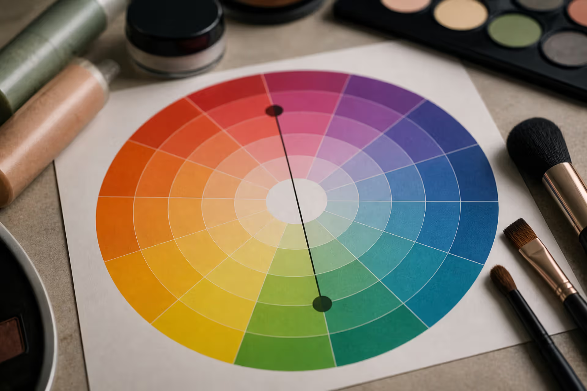
Green tones appearing where they shouldn't can be frustrating. Red cancels out green because these colors sit directly opposite on the color wheel. This principle applies across makeup, hair color, painting, and digital editing, giving you precise control over unwanted hues.
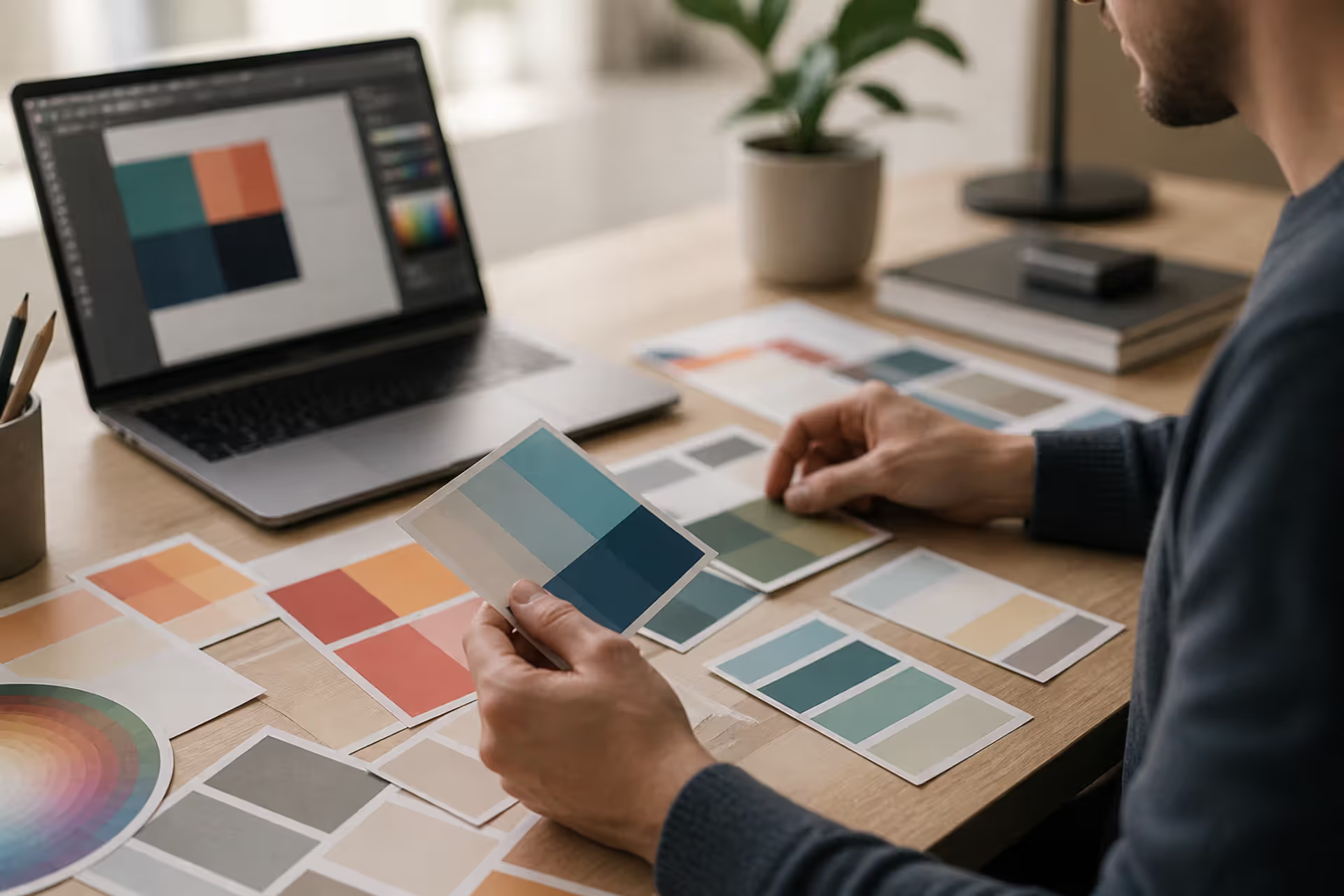
Discover the essential types of color palettes used in design, from monochromatic schemes to complex tetradic systems. Learn how each palette type works, when to use them, and how to choose the right colors for your specific project needs with expert insights and practical examples.
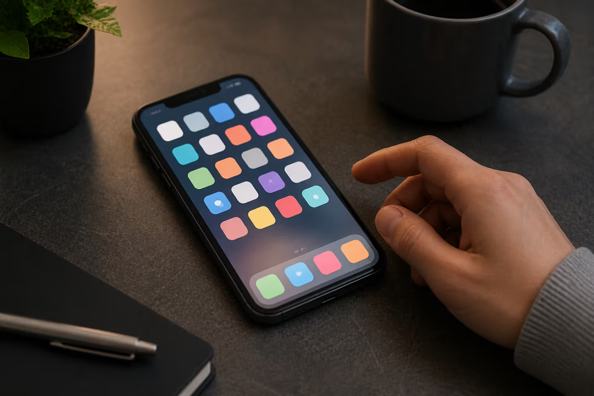
The rounded square has become the defining shape of digital interfaces. From app icons to buttons, this geometric form appears billions of times daily. Learn the mathematical differences between rounded squares, squircles, and superellipses, plus platform-specific implementation standards.
Converting RGB digital colors to PMS for print requires more than software—it demands understanding color gamut differences, using physical Pantone guides, and managing expectations. This comprehensive guide explains why screen colors don't translate directly to print and shows you proven methods for accurate color conversion.
The content on this website is provided for general informational and educational purposes only. It is intended to explain concepts related to digital design, visual art, color theory, art techniques, design principles, and design history.
All information on this website, including articles, guides, and examples, is presented for general educational purposes. Creative outcomes may vary depending on individual skill, tools, and practice.
This website does not provide professional design services or guarantee results, and the information presented should not be used as a substitute for formal education or professional consultation.
The website and its authors are not responsible for any errors or omissions, or for any outcomes resulting from decisions made based on the information provided on this website.