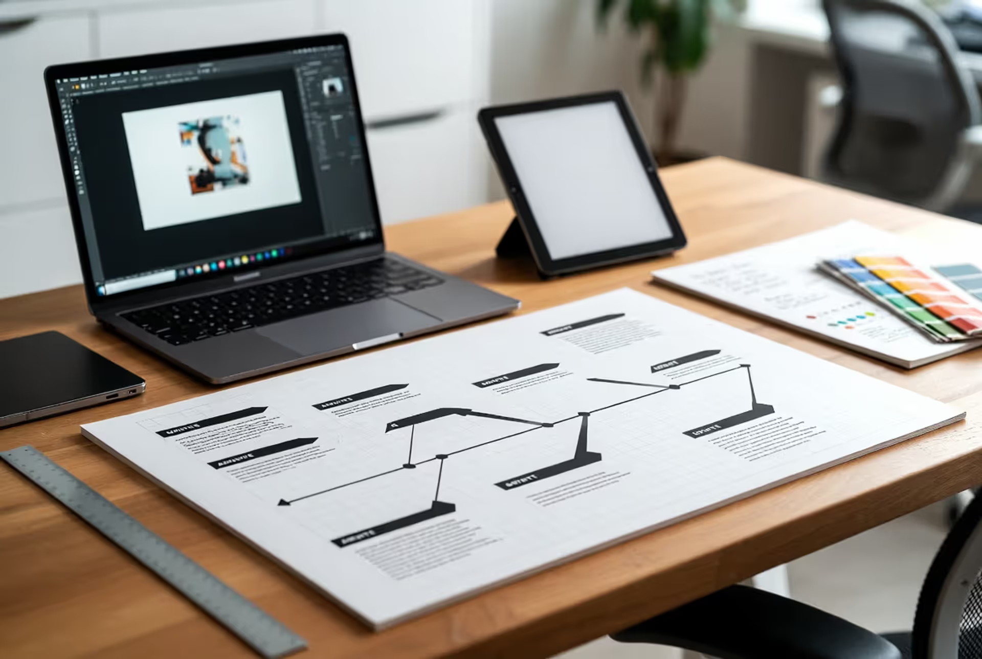
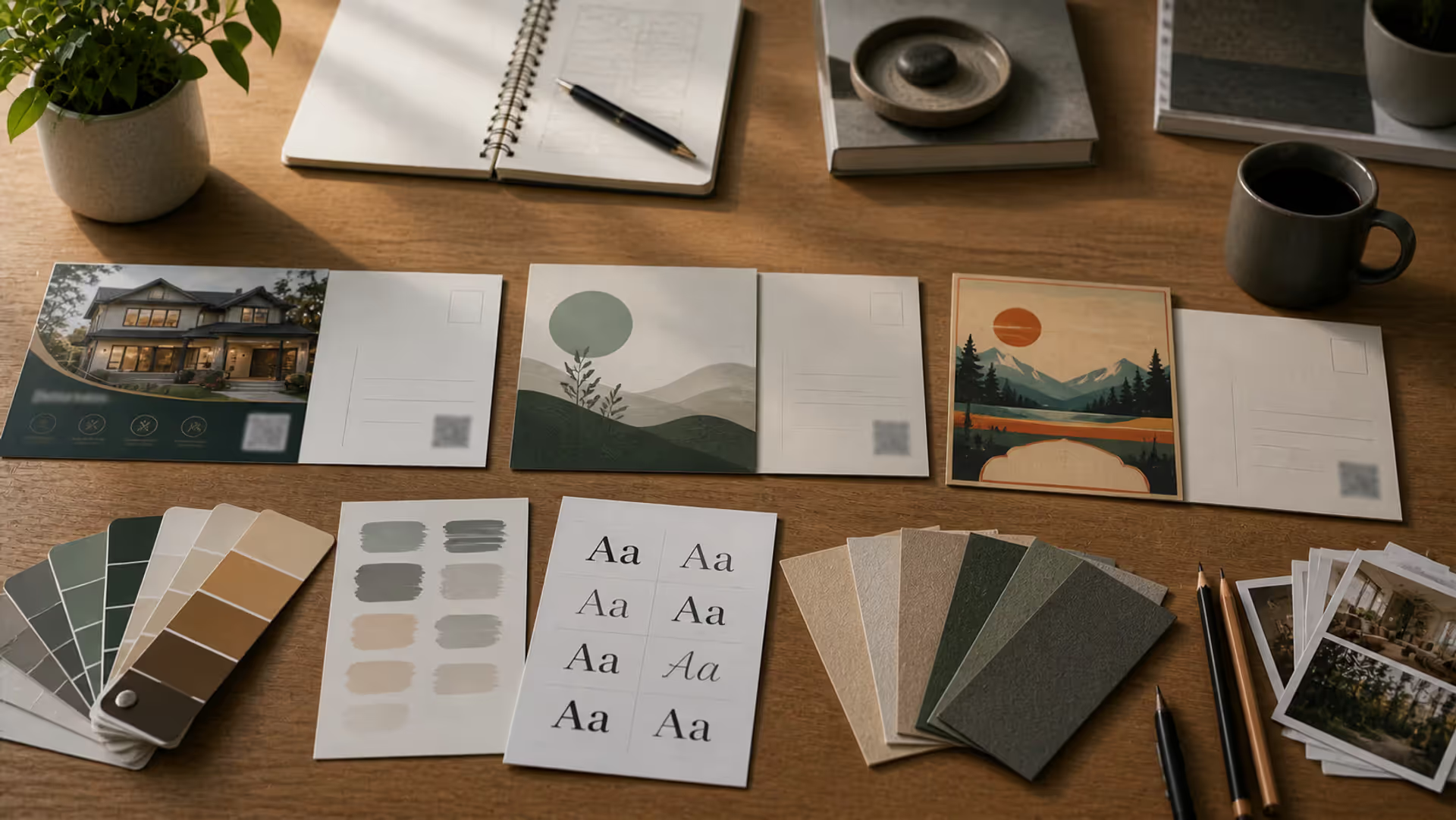
Magazine advertising remains a powerful medium for brands that understand how to harness its unique strengths. Unlike digital ads that flash past in milliseconds, a well-designed magazine ad sits in front of readers for minutes, sometimes days. The tactile experience, the high-quality printing, and the focused attention readers give to magazines create opportunities that demand thoughtful, strategic design.
Creating a magazine ad that stops readers mid-flip requires more than aesthetic appeal. It demands an understanding of how people process visual information, how layout choices guide the eye, and how every design decision either supports or undermines your message. Whether you're designing your first print advertisement or refining your approach, the principles outlined here will help you create ads that don't just look good—they work.
What Makes a Magazine Ad Successful
A successful magazine ad accomplishes three things in rapid succession: it captures attention, communicates a clear message, and prompts action. These objectives might sound straightforward, but achieving all three within a single page requires careful orchestration of every visual element.
The foundation of effective ad visual design starts with understanding reader behavior. Eye-tracking studies consistently show that readers scan magazine pages in predictable patterns. Most begin in the upper left quadrant, sweep right, then move downward in a rough Z-pattern. Strong visuals can interrupt this pattern, pulling eyes exactly where you need them. A compelling image in the lower right can anchor attention just as effectively as a headline at the top—if the visual hierarchy supports it.
Visual hierarchy refers to the deliberate arrangement of elements by importance. Your ad should have one dominant element—typically a striking image or bold headline—that claims attention first. Secondary elements like body copy, product shots, or logos follow in descending order of importance. When everything screams for attention equally, nothing gets heard.
Reader attention patterns also vary by magazine context. Someone reading a fashion magazine expects immersive, image-driven layouts. They'll tolerate minimal copy and artistic abstraction. A reader flipping through a business publication expects clear value propositions and substantive information. Successful advertising design fundamentals adapt to these contextual expectations while maintaining brand identity.
The goal isn't just to be seen—it's to be remembered and acted upon. That requires emotional resonance, clarity of offer, and a friction-free path to the next step, whether that's visiting a website, calling a number, or simply remembering your brand name when they're ready to buy.
Author: Adrian Lowell;
Source: crafterholic.com
Magazine Ad Layout Fundamentals
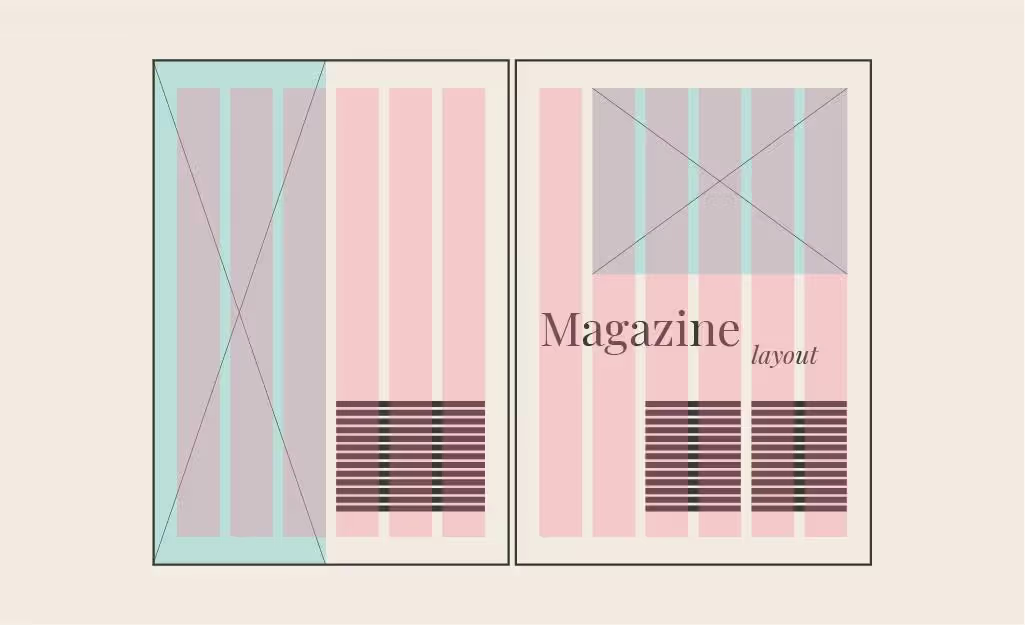
Professional print advertisement design relies on invisible scaffolding: grid systems that organize chaos into coherent communication. A grid divides your ad space into columns and rows, creating alignment points for text and images. This structure doesn't limit creativity—it amplifies it by providing a framework that ensures visual consistency and readability.
Most magazine ads use three-, four-, or five-column grids. A three-column grid offers bold simplicity, ideal for ads dominated by a single large image. Five columns provide flexibility for complex layouts with multiple products or information tiers. The grid you choose should serve your content, not constrain it. Breaking the grid occasionally—letting an image bleed across column boundaries—creates emphasis precisely because it violates the established pattern.
Margins and white space separate amateur designs from professional ones. Adequate margins (typically 0.25 to 0.5 inches from trim edges) prevent important elements from being cut during printing. More importantly, they give your ad breathing room. White space isn't wasted space—it's a design element that creates focus and sophistication. An ad crammed edge-to-edge with content exhausts readers before they absorb your message.
Focal points anchor your composition. Every effective magazine layout composition has a clear entry point where the eye lands first. This might be a face making direct eye contact, a product photographed at an unexpected angle, or a headline set in massive type. From this focal point, secondary elements should guide the viewer through your ad in a logical sequence.
Author: Adrian Lowell;
Source: crafterholic.com
Understanding Visual Hierarchy in Print Advertising
Visual hierarchy in ads operates through size, contrast, color, and positioning. The largest element typically dominates, but a small area of intense color can compete with a much larger neutral element. A dark headline on a light background creates stronger contrast than gray text, regardless of size.
Position matters too. Elements in the upper half of an ad receive more attention than those below. Items placed along the optical center (slightly above the mathematical center) feel naturally balanced. Asymmetrical layouts create energy and movement, while symmetrical arrangements convey stability and tradition.
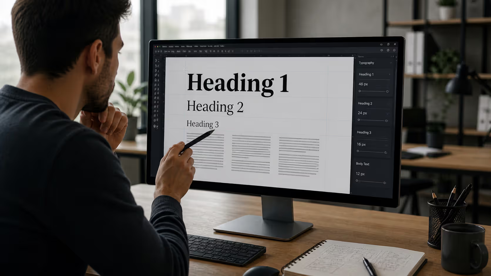
Typography establishes hierarchy as effectively as imagery. A headline set in 72-point bold serif immediately signals importance. Subheadings in 24-point medium weight provide secondary information. Body copy in 10-point regular completes the hierarchy. Mixing too many type sizes creates confusion; three distinct levels usually suffice.
Color guides attention powerfully. Warm colors (reds, oranges, yellows) advance visually, appearing closer to viewers. Cool colors (blues, greens) recede. A warm accent in a predominantly cool palette draws eyes like a beacon. Use this strategically to highlight calls-to-action or key product features.
Image and Text Balance Techniques
The image-to-text ratio fundamentally shapes how readers perceive your ad. Image-heavy ads (80% visual, 20% text) communicate quickly and emotionally—ideal for fashion, lifestyle, and aspirational products. Text-heavy ads (60% text, 40% visual) suit complex offers, B2B products, or anything requiring explanation.
The most common mistake is trying to split the difference with a 50-50 balance. This often creates visual tension without clear purpose. Commit to an approach: either let imagery dominate with minimal, powerful copy, or embrace text-forward design with images serving as supporting elements.
When combining images and text, consider their relationship. Text can overlay images if there's sufficient contrast—light text on dark image areas, or vice versa. Placing text in areas of soft focus or minimal detail ensures readability. Alternatively, separate text and image into distinct zones, using the grid to maintain visual connection.
Captions deserve special attention. Readers consume image captions at nearly twice the rate of body copy. A well-crafted caption can deliver your entire message to skimmers while enticing them to read further.
Author: Adrian Lowell;
Source: crafterholic.com
Essential Design Elements for Print Advertisements
Typography selection shapes perception before anyone reads a word. Serif fonts (like Garamond or Caslon) convey tradition, reliability, and elegance. Sans-serif fonts (Helvetica, Futura) project modernity, clarity, and efficiency. Script fonts suggest luxury or personal touch but sacrifice readability at small sizes.
Your headline font must be readable at a glance. Avoid ultra-thin weights that disappear in print or overly decorative faces that slow comprehension. Body copy should prioritize legibility above personality—readers won't struggle through your message if the type fights them.
Font pairing requires restraint. One serif and one sans-serif provide sufficient variety for most ads. Using fonts from the same family (like different weights of Helvetica) creates unity while maintaining hierarchy. The goal is contrast without conflict.
Color psychology influences perception subtly but significantly. Red triggers urgency and excitement—hence its prevalence in sale ads. Blue builds trust and calm, favored by financial services and healthcare. Green suggests health, growth, or environmental consciousness. Yellow captures attention but can appear cheap if overused.
Editorial ad design principles emphasize color consistency with brand guidelines. Your ad should feel unmistakably "yours" even without a logo visible. This might mean a signature color palette, a specific photographic style, or consistent use of graphic elements.
Imagery choices make or break graphic advertising design. Stock photos that look obviously staged undermine credibility. Custom photography costs more but delivers authenticity and differentiation. Illustrations can solve problems that photography can't—showing abstract concepts, impossible scenarios, or creating distinctive brand worlds.
Image quality matters enormously in print. What looks acceptable on screen may print muddy or pixelated. Professional magazine ads require images at 300 DPI at actual print size. An image that's 8 inches wide in your layout needs to be 2,400 pixels wide minimum.
Brand consistency means every ad reinforces the same identity. This doesn't mean boring repetition—it means maintaining recognizable elements across campaigns. Perhaps your logo always appears in the same position, your product photography uses consistent lighting, or your headlines follow a structural pattern.
Call-to-action placement determines whether readers know what to do next. The CTA should be obvious but not obnoxious—clearly visible without dominating the design. Lower right corners work well, following natural reading patterns. QR codes have resurged as print-to-digital bridges, but they need sufficient size (at least 1 inch square) and explanation to drive usage.
Magazine advertising succeeds when design respects attention. Every inch of the page must guide the reader with purpose — from the first visual impression to the final call to action. The best ads don’t interrupt the reading experience; they become part of it.
— Eleanor Whitmore
Common Magazine Ad Design Mistakes to Avoid
Overcrowding kills more ads than any other single mistake. Designers often panic about "wasted space" and cram in extra product shots, additional copy points, or unnecessary decorative elements. The result: visual chaos that readers skip entirely. If you're tempted to include something, ask whether it actively supports your primary message. If not, cut it.
Poor contrast makes ads invisible. Light gray text on white backgrounds might look sophisticated on screen but disappears in print. Similarly, text overlaid on busy images without sufficient contrast becomes illegible. Test your ad by printing it on a basic office printer—if elements aren't clearly visible, they won't survive professional printing and real-world lighting conditions.
Weak headlines doom even beautifully designed ads. Your headline should communicate a benefit, provoke curiosity, or make a bold statement. "Quality Products Since 1987" says nothing compelling. "Sleep Better Tonight or Your Money Back" gives readers a reason to care. The headline and main image should work together, not repeat the same information.
Confusing layouts violate the natural reading flow. If readers can't immediately determine where to look first and where to go next, they won't invest effort figuring it out. Every element should lead logically to the next, creating a clear path through your message.
Ignoring brand guidelines creates disconnection. Your magazine ad isn't a standalone piece—it's part of an ecosystem that includes your website, packaging, retail presence, and other marketing. Ads that deviate from established brand standards confuse customers and dilute brand equity.
Forgetting bleed and safety zones causes production disasters. Bleed refers to extending design elements past the trim edge to prevent white borders from printing variations. Safety zones keep critical elements (text, logos) at least 0.125 inches from trim edges. Professional layout for print ads always accounts for these technical requirements.
Author: Adrian Lowell;
Source: crafterholic.com
Magazine Spread vs. Single-Page Ad Design
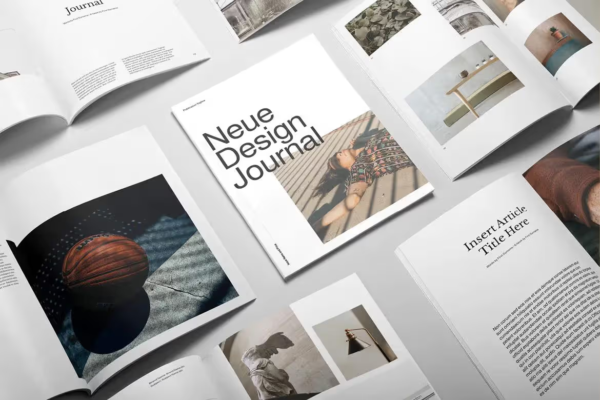
Magazine spread design—advertising across two facing pages—offers dramatic impact but introduces unique challenges. The gutter (where pages meet in the binding) can swallow important elements. Never place faces, text, or critical product details across the gutter. Instead, design spreads that acknowledge the center divide, either by treating each page as a distinct panel or by using the gutter as a compositional element.
Spreads enable storytelling impossible on single pages. You might show a problem on the left page and solution on the right. Or create a panoramic image that unfolds across both pages, with the gutter representing a natural break (like a horizon line or architectural element).
The visual weight needs careful balancing. A spread with all imagery on the left and all text on the right feels lopsided. Distribute visual interest across both pages while maintaining a clear focal point. The strongest position in a spread is typically the upper right of the right-hand page—the last place eyes land before turning the page.
Single-page ads demand tighter focus. You have one shot to communicate one idea. This constraint forces clarity. What's the single most important thing readers should know? Build everything around that.
When to use each format depends on budget, message complexity, and competitive context. Spreads cost roughly double single-page ads but don't deliver double the attention—they deliver different attention. Use spreads for major product launches, brand campaigns, or when competitors are using them and you need parity. Use single pages for tactical promotions, ongoing campaigns, or when frequency matters more than size.
How Magazine Ad Design Differs Across Industries
Fashion magazine ads embrace artistry and aspiration. They often minimize copy, letting imagery create emotional resonance. Unconventional layouts, unexpected cropping, and editorial-style photography blur the line between content and advertising. The product itself might be barely visible—the ad sells a lifestyle, not features.
Automotive advertising balances emotion and information. Car ads need stunning photography that showcases design while communicating performance specs, pricing, or lease terms. The challenge is maintaining visual impact while including legally required disclosures and competitive information.
Technology ads face the unique challenge of visualizing abstract benefits. You can't photograph "faster processing" or "better security." Successful tech ads use metaphor, demonstration scenarios, or focus on outcomes rather than products. Clean, modern layouts with plenty of white space reinforce innovation and simplicity.
Food and beverage advertising lives or dies on appetite appeal. Photography must be impeccable—colors vibrant, textures visible, composition mouth-watering. These ads often succeed with minimal copy. A perfectly photographed burger with a simple headline and logo can outperform verbose descriptions of ingredients.
Each industry has evolved design conventions that signal category membership. Violating these conventions can differentiate you or confuse customers. A pharmaceutical ad that looks like a fashion spread might grab attention but undermine credibility. Understanding your sector's visual language lets you innovate strategically rather than randomly.
*Cost ranges reflect national consumer magazines; trade publications and regional magazines typically cost 40-70% less.
Frequently Asked Questions About Magazine Ad Design
What software do professional designers use for magazine ads?
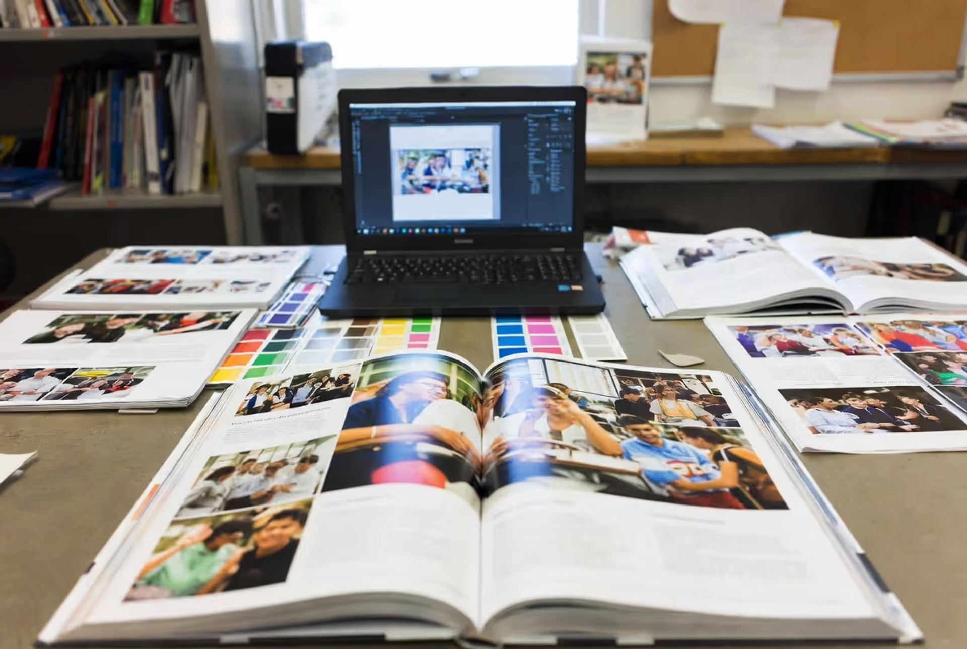
Adobe InDesign dominates professional print advertisement design. It handles typography, layout, and print specifications better than alternatives. Designers typically use Photoshop for image editing and Illustrator for logos and vector graphics, but InDesign assembles the final ad. Affinity Publisher offers a capable, lower-cost alternative. Canva and similar tools work for simple ads but lack the precision and professional output capabilities magazines require.
How much does it cost to design a magazine advertisement?
Professional design fees range from $1,500 to $15,000 depending on complexity, designer experience, and usage rights. A straightforward single-page ad from a mid-level designer might cost $2,500–$5,000. Complex spreads requiring custom photography and extensive revisions can exceed $10,000. These fees cover design only—not photography, illustration, or media placement costs. Freelancers typically charge less than agencies but provide fewer services.
What are standard magazine ad dimensions and bleed requirements?
Full-page magazine ads typically measure 8.375" × 10.875" with 0.125" bleed on all sides (8.625" × 11.125" total). However, dimensions vary by publication. Always request a media kit from your target magazine containing exact specifications. Bleed requirements usually add 0.125"–0.25" beyond trim size. Safety margins (keeping critical elements away from trim edges) should be at least 0.25". Spreads require special attention to gutter positioning, typically keeping important elements 0.5" away from the center bind.
How long does it take to create a professional magazine ad?
Expect 2–4 weeks for a professional magazine ad from concept to print-ready files. Initial concepts and revisions take 1–2 weeks. Photography or illustration adds another 1–2 weeks. Simple template-based ads might be completed in 3–5 days. Complex campaigns requiring multiple stakeholder approvals can extend to 6–8 weeks. Magazine deadlines (typically 4–6 weeks before publication) dictate your timeline—work backward from the on-sale date.
Should I hire a designer or use a template for my magazine ad?
Hire a professional designer if your ad budget exceeds $10,000, you're advertising in premium publications, or you're competing against established brands. Custom design delivers differentiation and strategic thinking that templates can't match. Templates work for small budgets, local publications, or classified-style ads where readers expect simple layouts. The middle ground—hiring a designer to customize a template—often delivers poor results: you pay design fees for template-level work.
What file format should I submit to magazine publishers?
Most magazines prefer high-resolution PDF files (PDF/X-1a or PDF/X-4 standards) with fonts embedded and images at 300 DPI. Some accept native InDesign files with linked images and fonts packaged. Never submit Word documents, PowerPoint files, or low-resolution PDFs intended for web viewing. Request the publication's specifications sheet—it details required color mode (CMYK for print, never RGB), resolution, bleed settings, and file naming conventions. Submitting incorrect formats delays publication and may incur additional fees.
The difference between a magazine ad that gets glanced at and one that gets remembered comes down to intentional design choices. Every element—from the grid structure to the typography, from color selection to white space—either serves your message or dilutes it.
Start with clarity about what you want readers to think, feel, or do. Build your visual hierarchy to support that goal. Respect the fundamentals of composition and readability while finding moments to surprise and delight. Test your design by showing it to someone unfamiliar with your product for three seconds—what do they remember? That's what your actual audience will retain.
Magazine advertising rewards patience and craft. Unlike digital ads you can tweak hourly, your magazine ad will exist unchanged for weeks or months. This permanence demands getting it right before it prints. Invest the time in strategic planning, professional execution, and rigorous review. The result will be an ad that doesn't just fill space—it commands attention and drives results.
Master yearbook spread design with expert guidance on layout planning, grid systems, photo composition, and text balance. Learn to create two-page layouts that tell compelling stories while avoiding common mistakes and maintaining visual consistency across your yearbook.
Timeline arrows guide viewers through chronological information, transforming static data into dynamic narratives. This comprehensive guide covers arrow styles, process visualization techniques, common design mistakes, and practical tools for creating effective directional elements in timelines and infographics.
Symbols compress complex creative concepts into instant visual recognition. This comprehensive guide explores the psychology behind creativity symbols, catalogs the most effective options from lightbulbs to geometric forms, and provides a practical framework for choosing the right symbol for your design, branding, or communication project.
Learn professional postcard design principles for print and direct mail. Covers standard formats, layout composition, visual hierarchy, style approaches, and proven strategies that increase response rates. Includes size comparison chart, expert insights, and common mistakes to avoid.
The content on this website is provided for general informational and educational purposes only. It is intended to explain concepts related to digital design, visual art, color theory, art techniques, design principles, and design history.
All information on this website, including articles, guides, and examples, is presented for general educational purposes. Creative outcomes may vary depending on individual skill, tools, and practice.
This website does not provide professional design services or guarantee results, and the information presented should not be used as a substitute for formal education or professional consultation.
The website and its authors are not responsible for any errors or omissions, or for any outcomes resulting from decisions made based on the information provided on this website.