Book illustration transforms written stories into visual experiences that readers remember long after closing the cover. Whether you're an author planning your first picture book or an illustrator building your portfolio, understanding how images and words collaborate on the page determines whether your project succeeds or gets lost in the slush pile.
What Is Book Illustration and Why It Matters
Book illustration refers to visual artwork created specifically to enhance, complement, or carry forward the narrative of a published book. Unlike standalone fine art or commercial advertising graphics, these illustrations exist in direct conversation with written text, page layout, and the physical act of turning pages.
The distinction matters because book illustrators face unique constraints. A magazine illustrator might create one arresting image to accompany a 2,000-word article. A book illustrator develops dozens of interconnected images that maintain visual interest across 32, 64, or more pages while respecting pacing, character continuity, and the relationship between what readers see and what they read.
Illustrated storytelling serves multiple functions beyond decoration. For emerging readers, pictures provide context clues that support literacy development. A child struggling with the word "enormous" grasps its meaning instantly when facing a full-page illustration of a giant looming over tiny houses. For all ages, illustrations create emotional resonance that pure text cannot achieve alone—think of the wordless spreads in picture books where a character's expression conveys loss, joy, or wonder more powerfully than any description.
Research in visual literacy shows that readers process images 60,000 times faster than text. This speed gives illustrations enormous power to establish setting, convey subtext, and add narrative layers that would bog down prose. A skilled illustrator might show a worried parent in the background while the text focuses on a child's adventure, creating dramatic irony that enriches the story.
Common Types of Book Illustrations
Publishers and designers categorize book illustrations by their relationship to page layout and text. Each format serves specific narrative and practical functions.
Author: Sophie Calder;
Source: crafterholic.com
Full Spread Illustration
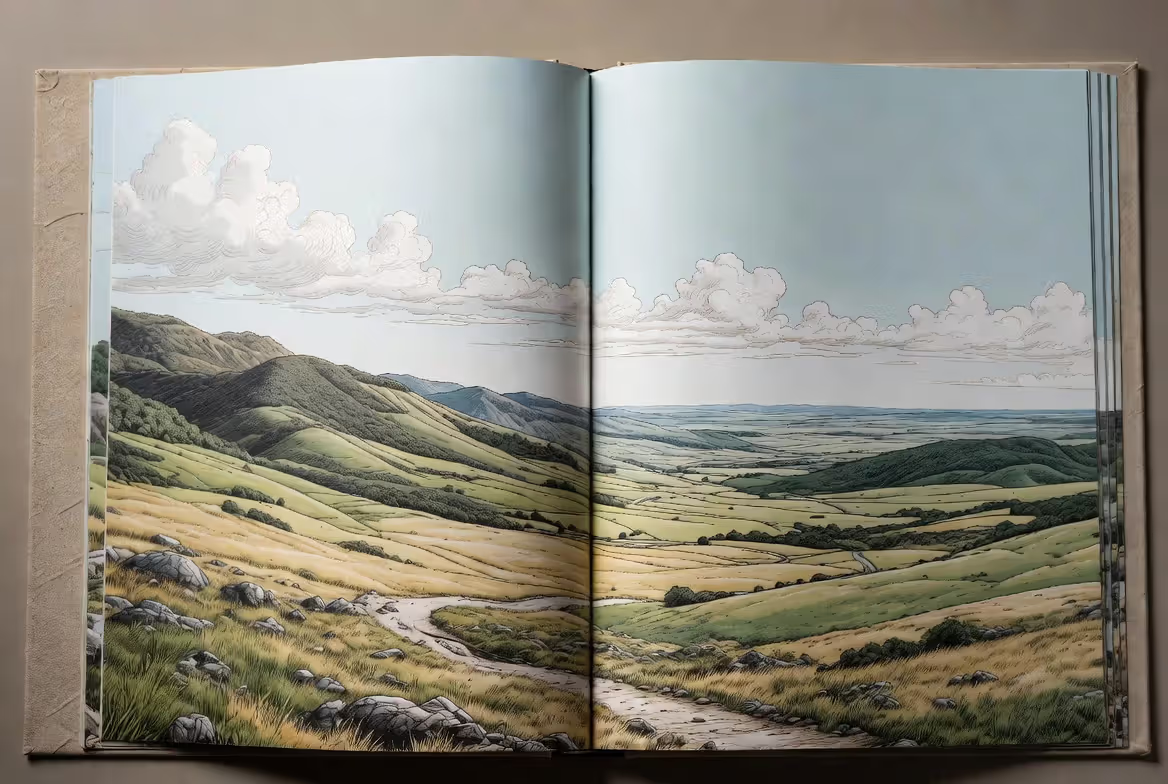
A full spread illustration extends across two facing pages, creating a single panoramic image when the book lies open. This format delivers maximum visual impact and works best for climactic moments, establishing shots of complex settings, or scenes requiring the reader to pause and absorb details.
Picture books typically reserve full spreads for 4-8 key moments per story. Overusing them creates monotony and eliminates pacing variation. Production costs run higher because these illustrations require careful planning around the center gutter—critical visual elements positioned in the binding crease get lost or distorted.
Full spreads excel at showing spatial relationships. When your character explores a vast forest or crowded marketplace, the horizontal expanse lets readers scan the environment as the character would experience it. This format also provides breathing room in emotionally intense moments, giving readers space to process before turning the page.
Spot Illustration
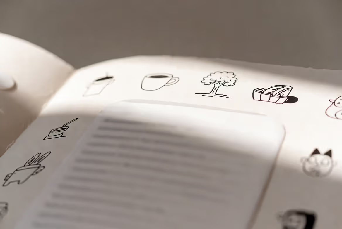
Spot illustration in books refers to small, contained images placed within or around text blocks. These vignettes might show a single object, a character's face, or a quick action. Spot illustrations break up text-heavy pages, provide visual interest without overwhelming the narrative, and offer cost-effective ways to add illustration to chapter books or middle-grade novels.
Effective spot illustrations do more than repeat what the text already states. If the text mentions a mysterious key, the spot illustration might show that key with unusual details—strange markings, an odd shape—that reward close observation and invite speculation. This creates a treasure-hunt quality that engages readers beyond passive consumption.
Publishers often use spot illustrations at chapter openings, scene breaks, or to highlight important objects that recur throughout the story. The format allows flexibility in placement and can be adjusted during layout without major redesign.
Vignettes and Decorative Elements
Author: Sophie Calder;
Source: crafterholic.com
Vignettes are illustrations without defined borders that fade into the white space of the page. Unlike hard-edged spot illustrations, vignettes create softer transitions between text and image. Decorative elements include borders, initial capitals, tailpieces, and ornamental flourishes that establish visual style without carrying narrative weight.
These elements appeared heavily in Victorian-era children's books and have resurged in contemporary middle-grade fantasy and historical fiction. They signal genre, establish period atmosphere, and create visual rhythm across chapters. A fantasy novel might use Celtic knotwork borders, while a 1920s-set mystery could employ Art Deco geometric patterns.
The risk with decorative elements lies in overuse. Too many ornamental flourishes distract from both text and narrative illustrations, creating visual clutter that fatigues readers. The best approach treats these elements as seasoning—present enough to flavor the experience but not overpower it.
How Illustrations and Text Work Together
The illustration and text relationship operates on a spectrum from redundant to complementary to contradictory. Redundant illustration simply depicts what the text already describes explicitly—the least interesting approach. Complementary illustration adds visual information that enriches without contradicting the words. Contradictory illustration deliberately shows something different from the text, creating irony, humor, or unreliable narration.
Picture books for younger readers typically lean complementary, with illustrations carrying roughly 50-80% of narrative information. The text might read, "Max put on his wolf suit," while the illustration shows his messy bedroom, the suit's details, and Max's mischievous expression—none described in words but all essential to the story's meaning.
Visual hierarchy determines what readers notice first on each spread. Eye-tracking studies show that readers typically scan the right page first, move to the left, then read text. Illustrators use composition, color contrast, and character placement to guide this journey. If the critical story moment happens on the left page, the illustration needs strong visual anchors—a character looking left, leading lines, or warm colors—to pull attention against natural reading patterns.
Narrative illustration for books must also respect the page turn. The most engaging picture books treat each turn as a miniature cliffhanger or revelation. The illustration on the right-hand page creates anticipation for what comes next, while the following spread delivers payoff. This rhythm keeps readers engaged and creates memorable moments.
Balance doesn't mean equal distribution. Some spreads might be entirely visual with no text, while others use small spot illustrations supporting longer text passages. The key is intentionality—each choice should serve the story's pacing and emotional arc.
Author: Sophie Calder;
Source: crafterholic.com
Essential Techniques for Narrative Book Illustration
Editorial illustration techniques translate effectively to book work when adapted for sequential narrative. Unlike single editorial images that must communicate everything at once, book illustrations can develop ideas across multiple pages, building visual motifs and evolving character expressions as the story progresses.
Illustrating mood in stories requires consistent use of color temperature, lighting direction, and compositional weight. A story's anxious first act might use cool blues and grays with characters positioned in the lower third of frames, creating visual heaviness. As the character gains confidence, warmer colors and elevated positioning signal emotional shift without a single word addressing it directly.
Visual pacing in illustrated books mirrors film editing. Wide establishing shots alternate with close-ups. Quiet moments with simple compositions give readers rest before action-packed spreads with dynamic angles and movement lines. Page count affects pacing decisions—a 32-page picture book needs tighter pacing than a 48-page book, with less room for contemplative spreads.
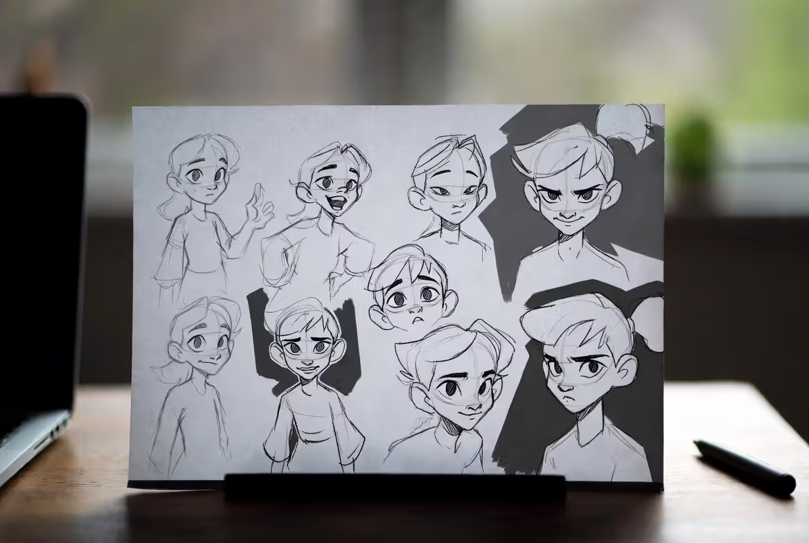
Character consistency across scenes presents one of the most challenging technical demands. Readers notice immediately when a character's hair color shifts or their height relative to furniture changes between pages. Professional illustrators create model sheets showing characters from multiple angles, in various expressions, and with detailed notes about proportions, clothing, and distinguishing features.
This consistency extends beyond physical appearance to body language and expression. Each character should have recognizable movement patterns and emotional tells. One character might cross their arms when worried, while another fidgets with their hair. These repeated visual cues build character personality without exposition.
Visual metaphors add depth for readers who return to books multiple times. A character's emotional state might be reflected in weather, background colors, or the behavior of ambient animals. These layers reward close observation and create richer experiences with each reading.
Author: Sophie Calder;
Source: crafterholic.com
Developing a Picture Book Visual Style
Picture book visual style encompasses medium, color palette, line quality, and compositional approach. These choices should emerge from the story's content, target age range, and emotional tone rather than arbitrary preference.
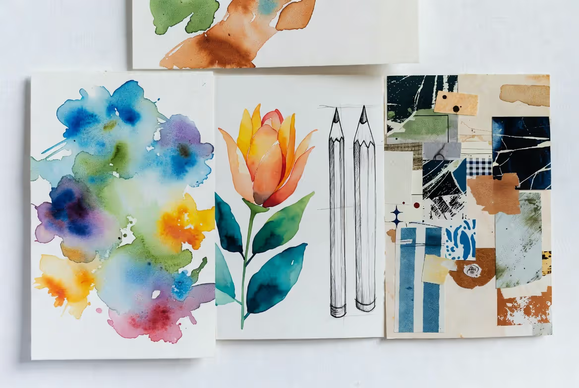
Medium selection carries practical and aesthetic implications. Digital illustration offers easy revision and color adjustment, which matters when publishers request changes. Traditional media—watercolor, gouache, pencil, collage—create textures and happy accidents that add warmth but require careful planning since major revisions mean starting over.
Hybrid approaches combine both worlds. Many illustrators create traditional artwork, scan it, and refine digitally. This preserves organic texture while allowing flexible editing. The choice affects production timelines and budgets, since traditional media requires shipping physical artwork and professional photography or scanning.
Color palette decisions impact emotional tone and age appropriateness. Board books for infants and toddlers typically use high-contrast, saturated colors that developing vision processes easily. Picture books for ages 4-8 can employ more sophisticated, nuanced palettes. Middle-grade illustrated novels often use limited color—perhaps two or three colors plus black—to control printing costs while maintaining visual interest.
Consistent color associations help readers track elements across pages. If magic appears blue on page 5, it should remain blue throughout. If a character wears a red jacket, that red should be color-matched across all appearances. These consistencies seem obvious but require careful color management, especially when working digitally across multiple files.
Age-appropriate design considerations extend beyond color. Very young readers need clear, uncluttered compositions with obvious focal points. Older readers can handle complex, detailed illustrations that reward extended viewing. Text placement must account for emerging literacy—large, well-spaced type for early readers; smaller, more integrated text for confident readers.
The visual style should also reflect genre expectations while offering something distinctive. Fantasy readers expect a certain richness and detail, while contemporary realistic fiction often employs looser, more expressive styles. Study successful books in your category to understand these unwritten rules before deciding which to follow and which to break strategically.
Author: Sophie Calder;
Source: crafterholic.com
Common Mistakes in Book Illustration Projects
Inconsistent character design tops the list of avoidable errors. An illustrator who doesn't create reference materials will inevitably drift—characters gain or lose weight, clothing changes, facial features shift. This breaks reader immersion and signals amateur work to publishers.
Poor text-image coordination happens when illustrators work without seeing final text or when authors write without considering visual possibilities. The text describes a character's blue eyes while the illustration shows brown. The words place characters indoors while the picture shows them outside. These disconnects confuse young readers and frustrate parents reading aloud.
Ignoring pacing creates monotonous reading experiences. Every spread uses the same composition, the same viewing angle, the same level of detail. Readers need variety—quiet moments and explosive action, intimate close-ups and expansive landscapes, simple and complex. Without pacing variation, even beautiful illustrations become wallpaper.
Overcrowding spreads with too many visual elements, characters, or competing focal points overwhelms readers. Young children especially need clear visual hierarchies. If six things demand attention simultaneously, readers don't know where to look and disengage. Effective illustrations guide the eye through deliberate composition.
Mismatched tone between illustration style and story content undermines both. A serious, emotionally complex story illustrated in a cartoonish, overly cute style fails to honor the narrative. Conversely, a lighthearted romp illustrated with dark, heavy-handed imagery confuses readers about how to feel.
Technical issues like poor resolution, incorrect file formats, or RGB color mode instead of CMYK cause production headaches and additional costs. Publishers provide technical specifications for good reason—ignoring them marks you as difficult to work with.
Working With Illustrators: What Authors Should Know
Most traditional publishers handle illustration separately from manuscript acquisition for picture books. They select illustrators whose style matches the story, and authors typically have limited input in this process. Understanding this reality prevents frustration and inappropriate contract demands.
For self-publishing authors hiring illustrators directly, clear communication determines project success. Provide a detailed brief including story summary, character descriptions, key emotional beats, and any specific visual requirements. Share comparable titles whose style appeals to you, but avoid demanding exact imitation.
Art direction basics include understanding that illustration takes time. A 32-page picture book requires 15-16 spreads plus cover art. Professional illustrators need 3-6 months for a complete project, including sketches, revisions, and final art. Rushing this timeline compromises quality.
Contracts should specify deliverables, timeline, revision rounds, payment schedule, and rights. Most illustrators retain copyright while licensing specific publication rights to the author or publisher. Buyout agreements cost significantly more. Standard practice includes 50% payment upfront, 50% on delivery, with 2-3 revision rounds included.
Expect to pay $3,000-$10,000 for professional picture book illustration, with wide variation based on illustrator experience, project complexity, and rights transferred. Bargain pricing usually signals inexperience or overseas illustrators unfamiliar with US publishing standards.
Provide feedback on sketches before approving final art, since major changes become expensive or impossible once color work begins. Frame feedback specifically—"Can you make the dog larger and position it on the left side?" works better than "This doesn't feel right."
Respect illustrators' creative expertise. You hired them for their vision and skill. Micromanaging every detail or demanding endless revisions creates adversarial relationships and inferior work. Collaboration means trusting their professional judgment while ensuring the final product serves the story.
The picture book is a peculiar form. It's the only art form that's experienced communally, out loud, between people who love each other. That intimacy demands honesty in both words and pictures—they must work together to create something neither could achieve alone.
— John Klassen
Comparison of Illustration Types
Type
Typical Page Count Usage
Best Use Cases
Production Cost Range
Reader Age Suitability
Narrative Function
Full Spread
4-8 per 32-page book
Climactic moments, establishing shots, emotional peaks
What is the difference between a book illustrator and a graphic designer?
Book illustrators create narrative artwork that tells or enhances stories, developing characters, settings, and sequential images that work with text. Graphic designers focus on layout, typography, and visual organization—arranging existing elements for clarity and aesthetic appeal. While some professionals do both, illustration requires drawing/painting skills and storytelling ability, while graphic design emphasizes composition, hierarchy, and communication design. For book projects, you need an illustrator to create the images and potentially a separate designer to handle layout, cover design, and typography.
How much does book illustration cost?
Professional picture book illustration typically ranges from $3,000 to $10,000 for a complete 32-page book, with established illustrators commanding $8,000-$15,000 or more. Spot illustrations for chapter books cost $50-$200 each. Factors affecting price include illustrator experience, project complexity, revision rounds, timeline, and rights transferred. Work-for-hire buyouts cost significantly more than licensing agreements. Budget illustrators charging under $1,000 for full books usually lack professional experience or work overseas with potential communication and quality issues.
Do I need illustrations for my children's book?
Picture books for ages 0-8 require professional illustrations—they're half the storytelling medium. Early chapter books (ages 6-8) benefit from spot illustrations but can work without them. Middle-grade novels (ages 8-12) traditionally include minimal or no illustration, though this varies by genre and publisher. Young adult books rarely include interior illustration beyond maps or chapter ornaments. If you're self-publishing, illustrations significantly increase production costs but also market appeal and perceived value for younger age ranges.
How many illustrations should a picture book have?
Standard 32-page picture books typically contain 12-15 full spreads (24-30 pages of illustration), with the remaining pages for title, copyright, and endmatter. Some spreads may be full-bleed illustrations, others combine illustration with text. Board books for toddlers use simpler layouts with one illustration per spread across 12-24 pages. Illustrated early readers might include 1-3 illustrations per chapter. The number matters less than pacing—illustrations should appear frequently enough to maintain visual interest while allowing text and images to breathe.
What file formats do publishers require for book illustrations?
Traditional publishers typically require high-resolution TIFF or PSD files in CMYK color mode at 300-600 DPI, sized to final dimensions plus bleed (usually 0.125-0.25 inches). Full spreads should account for the gutter. Some publishers accept PDF files with embedded fonts and images. For print-on-demand self-publishing, check specific platform requirements—Amazon KDP accepts PDF, while IngramSpark prefers PDF with specific settings. Always save master files in layered formats (PSD, AI) for future edits, providing flattened versions for printing.
Can I use stock illustrations in my book?
Technically yes, legally complicated, practically inadvisable. Stock illustration licenses often prohibit use in products for resale or require additional fees for book publication. More importantly, stock images lack the narrative cohesion and character consistency necessary for effective book illustration. Readers notice when characters change appearance or style shifts between pages. For one-off spot illustrations in non-fiction, properly licensed stock images might work. For picture books and narrative illustration, commissioned original artwork is essential for quality and legal clarity.
Book illustration represents a unique intersection of fine art, commercial design, and narrative craft. Success requires technical skill, storytelling instinct, and understanding of how images and words collaborate across the physical space of a book. Whether you're illustrating your own story or partnering with others, the principles remain constant: maintain visual consistency, respect pacing, create meaningful relationships between text and image, and always serve the story first.
The best book illustrations don't simply depict what the text describes—they expand the narrative, add emotional layers, and create experiences that readers carry long after the book returns to the shelf. As you develop your approach to book illustration, study widely, practice consistently, and remember that every visual choice either strengthens or weakens the reader's connection to your story. Make each one count.
Master the wheatpaste street art technique with this complete guide covering adhesive recipes, poster installation methods, material selection, and legal considerations. Learn to create durable wheat paste art installations using affordable supplies and proven application techniques.
Perspective is the set of techniques artists use to represent three-dimensional space on a flat surface. It governs how objects appear smaller as they recede, how parallel lines converge toward a single point, and how atmospheric conditions affect color and clarity across spatial planes.
Learn to draw compelling three quarter view portraits with this comprehensive guide covering proportions, perspective, and step-by-step techniques. Discover why this angle creates depth and dimension, master foreshortening, and avoid common mistakes that flatten your portraits.
Stippling creates stunning artwork using only dots. This comprehensive guide covers everything from basic dot shading methods to advanced illustration techniques, including tool recommendations, step-by-step tutorials, and common mistakes to avoid.
The content on this website is provided for general informational and educational purposes only. It is intended to explain concepts related to digital design, visual art, color theory, art techniques, design principles, and design history.
All information on this website, including articles, guides, and examples, is presented for general educational purposes. Creative outcomes may vary depending on individual skill, tools, and practice.
This website does not provide professional design services or guarantee results, and the information presented should not be used as a substitute for formal education or professional consultation.
The website and its authors are not responsible for any errors or omissions, or for any outcomes resulting from decisions made based on the information provided on this website.