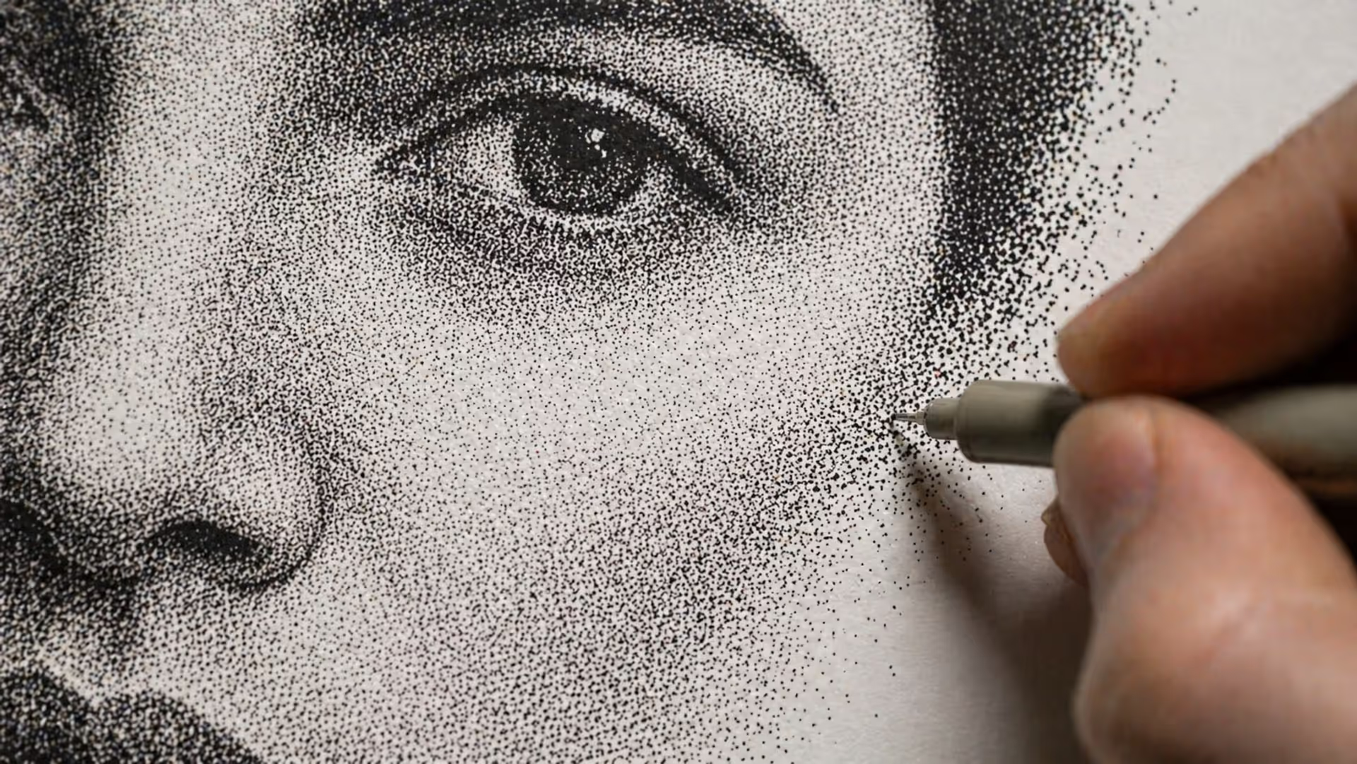
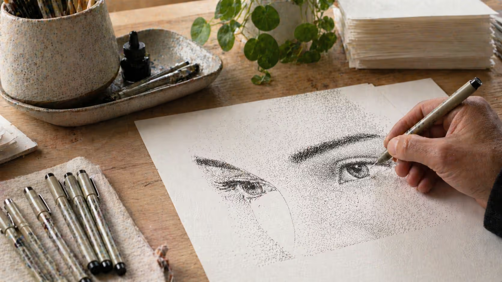
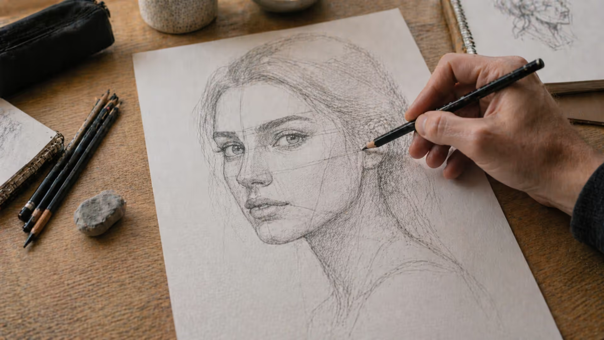
Ever spent an afternoon placing thousands of tiny dots on paper, one after another, watching a face slowly emerge from what looks like chaos up close? That's stippling. Unlike sketching where you drag a pencil across paper or painting where you blend colors, you're just... dotting. Repeatedly. For hours.
Sounds tedious, right? Yet artists have used this method for centuries because it creates effects you can't get any other way—smooth gradients, photorealistic shadows, and a distinctive look that makes people lean in close to figure out how you did it.
What Is Stippling in Art?
Stippling builds images using only dots. No continuous lines. No smudging. Just individual points of varying density that your eye interprets as different shades of gray when you step back.
The basic idea: pack dots close together and you get dark areas. Spread them out and the white paper shows through, creating lighter tones.
This isn't some modern technique either. Metal engravers in the 1400s and 1500s used stippling because their tools couldn't create smooth tones any other way. You can see it in old book illustrations and prints. Then in the 1880s, Georges Seurat took the concept to painting with pointillism—those famous scenes built entirely from colored dots.
Where does stippling show up now? More places than you'd think. Magazine illustrators use it for editorial pieces because it photographs and prints well. Tattoo artists rely on it for portraits that won't blur over time (solid black areas spread under skin, but dotwork maintains clarity for decades). Botanical illustrators choose it for scientific accuracy—dots create precise detail without the ambiguity of brushstrokes.
The stippling art technique has also found fans in contemporary galleries, where artists appreciate both the meditative process and the unique aesthetic it produces.
Author: Olivia Hartwell;
Source: crafterholic.com
How Stippling Works to Create Value and Texture
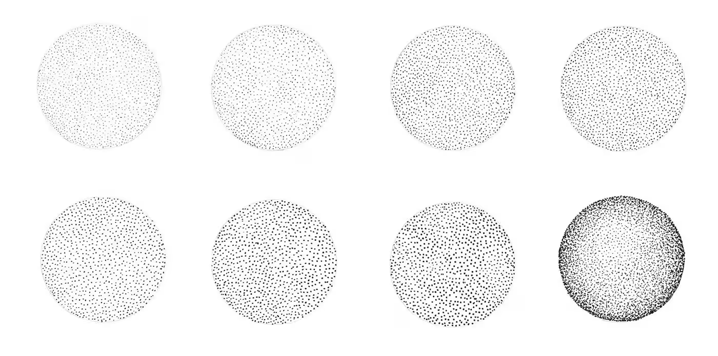
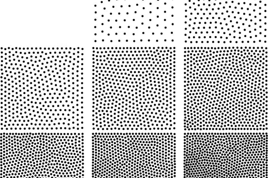
Here's what happens: your brain doesn't register every individual dot from normal viewing distance. Instead, it averages the black ink and white paper into perceived gray. Drop 100 dots in a square inch? Light gray. Pack 400 dots in the same space? Dark gray.
You control three main variables when creating value with dots:
Dot density—how many dots occupy a space. This is your primary darkness control. Shadow areas might have ten times the dot count of highlights.
Dot spacing—the gaps between dots. Even spacing reads as smooth tone. Irregular spacing suggests texture. Want to draw tree bark? Random, clustered dots work better than a precise grid.
Dot size—bigger dots read darker even at identical density. Some artists stick with one pen size throughout a drawing. Others switch between 0.1mm for delicate areas and 0.5mm for quickly filling shadows.
Think of it this way: you're creating a grayscale photograph using only a binary choice—dot or no dot. The dot drawing technique explained in one sentence is optical mixing doing the heavy lifting while you make thousands of tiny decisions about placement.
Tools and Materials for Ink Stippling
You don't need much, but quality matters here more than in sketching.
Pens: Technical pens beat everything else. Sakura Pigma Micron, Staedtler Pigment Liners, or Rotring Isograph—these maintain consistent ink flow so dot #1 looks identical to dot #10,000. Sizes from 0.1mm to 0.5mm cover most needs. Pigment-based ink won't fade in sunlight or smudge after drying.
Why not regular pens? Ballpoints produce inconsistent dots (they skip and blob). Felt tips wear down quickly. Gel pens bleed on some papers. Technical pens cost more upfront but save frustration.
Paper: Smooth Bristol board, plate finish. Not vellum—too textured. At least 100 lb weight so the surface doesn't pill after thousands of pen touches. Strathmore 300 Series Bristol works well for practice. Pro work often uses Strathmore 500 Series.
Skip watercolor paper unless it's hot-press (smooth). Cold-press texture makes even dot placement nearly impossible.
Lighting: You need strong, adjustable light. A cheap desk lamp causes eye strain during three-hour sessions. LED lamps with articulating arms let you position light exactly where needed.
Reference materials: Photo references help, especially when you're learning. Pro tip: convert photos to black and white first. Color distracts from value relationships. Squint at your reference—details blur and you see only light and dark masses. That's what you're recreating.
Author: Olivia Hartwell;
Source: crafterholic.com
Understanding Dot Density and Tonal Range
Picture a value scale from 0 (paper white) to 10 (solid black). In practical ink stippling basics, here's what different densities achieve:
Values 1-2: Sparse dots, maybe 15-30 per square inch, with obvious white space. Use this for subtle highlights and the lightest skin tones.
Values 3-5: Moderate density where you can still count individual dots if you try. Around 50-150 dots per square inch. Most of your drawing lives here.
Values 6-8: Dense packing where individual dots blur together. 200-400 dots per square inch creates rich mid-tones and open shadows.
Values 9-10: Extremely tight dots, potentially overlapping. 500+ dots per square inch approaches solid black.
The tricky part? Values 4-6. Beginners jump from light (value 2) straight to dark (value 7), creating harsh transitions. Professional stipple work often spends 60% of the effort on these middle values because subtle gradations make or break realism.
Author: Olivia Hartwell;
Source: crafterholic.com
Step-by-Step Guide to Creating Your First Stipple Drawing
Start simple or you'll quit. A sphere gives you enough tonal variation to practice without the complexity of, say, a portrait.
Step 1: Pick something with obvious light and shadow. An apple. A tennis ball. A coffee mug. Photograph it in strong directional light from one side. Convert the photo to grayscale on your phone or computer.
Step 2: Make a light pencil outline. Just the basic shape—you'll erase this later or it'll disappear under dots. Keep your pencil barely touching the paper.
Step 3: Map your values. Squint at your reference until details vanish. You'll see maybe 3-5 distinct value zones. Mark these lightly on your drawing: "lightest," "medium," "dark," "darkest."
Step 4: Start with middle tones, not highlights. Counterintuitive, but if you establish the darkest darks first, you might discover you can't go light enough for highlights by comparison. Start at value 5, which gives you room to go both lighter and darker.
Step 5: Build in layers. Add one layer of dots. Step back six feet. How's it look? Need more? Add another layer. This is why stippling takes hours—you're essentially building value one layer at a time like a 3D printer.
Step 6: Push your darks. Once mid-tones exist, you can judge how dark your shadows need to go. Really pack dots into the darkest areas. Don't be timid—solid blacks create the contrast that makes everything else pop.
Step 7: Smooth the transitions. The boundaries between value zones need gradual shifts. Add sparse dots into lighter zones. Reduce density at the edges of darker zones. You're creating gradients by feathering density changes.
Mistakes every beginner makes (I certainly did):
Rushing: You'll want to see results after 20 minutes. Won't happen. A palm-sized practice drawing takes 3-5 hours minimum. Accept this or choose a different technique.
Inconsistent pressure: Press harder and your dots grow larger, disrupting tonal uniformity. Maintain light, consistent pressure throughout.
Working too close: Your nose shouldn't be six inches from the paper. You're making dots, but you need to see values. Step back every 10-15 minutes.
Ignoring hand warnings: Your hand will cramp. Take breaks before it does, not after.
Author: Olivia Hartwell;
Source: crafterholic.com
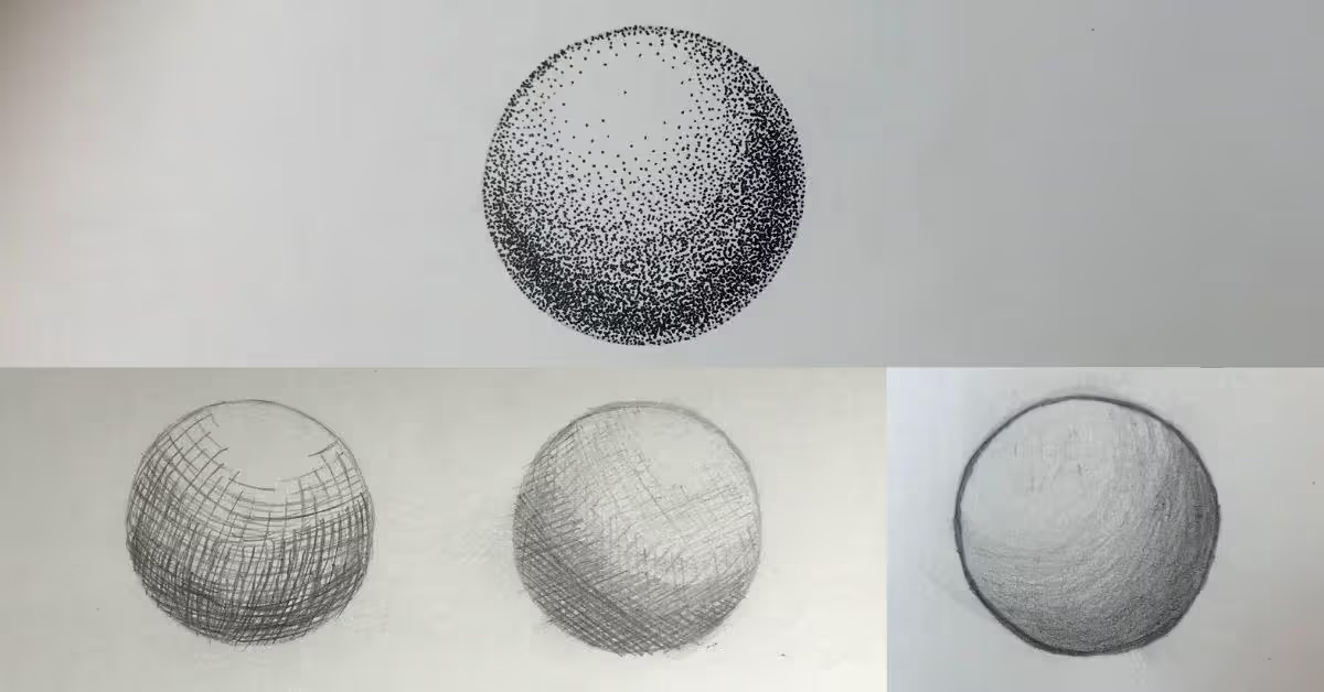
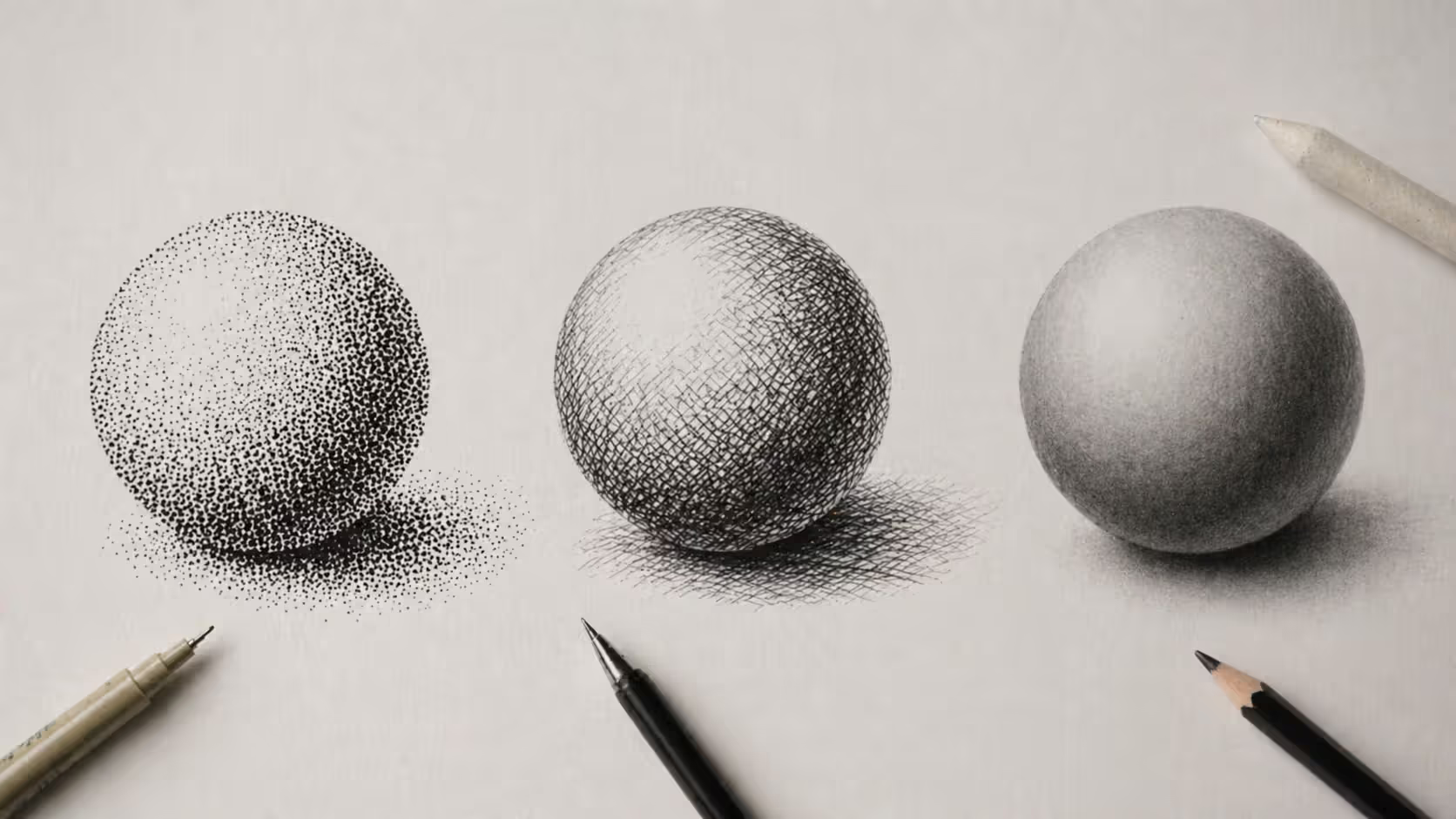
Stippling vs Cross Hatching and Other Shading Methods
The dot shading method isn't inherently better or worse than alternatives—it's different, with specific strengths and trade-offs.
Technique
Visual Effect
Time Required
Skill Level
Best For
Tools Needed
Reversibility
Stippling
Smooth, photorealistic gradients; distinctive texture visible up close
The stipple vs cross hatching choice often comes down to aesthetic preference and deadline. Cross-hatching produces texture through directional lines and creates an energetic, obviously hand-drawn quality. Stippling yields smoother, more photographic results but demands significantly more time.
Plenty of illustrators combine both—stippled faces for smooth skin tones, cross-hatched clothing for texture and speed.
Author: Olivia Hartwell;
Source: crafterholic.com
Advanced Stippling Techniques for Illustrators
Once you've completed a few basic pieces, these approaches expand what's possible:
Directional stippling: Instead of random placement, arrange dots in subtle curves following your subject's form. On a sphere, dots might arc slightly along the surface. On a face, follow the muscle structure. This reinforces three-dimensionality and is borrowed from pointillist rendering method principles developed by painters.
Variable pen sizing: Switch tools mid-drawing. Use 0.1mm pens for delicate eyelashes and distant details, 0.3mm for general work, 0.5mm for quickly establishing deep shadows. The size variation disappears at normal viewing distance but cuts production time by 30-40%.
Professional shortcuts for stippling in illustration: Editorial work has deadlines. Professional illustrators develop time-saving strategies:
Establish your darkest darks first (called "anchor darks") to set the full value range immediately
Use looser, faster stippling in peripheral areas to direct viewer attention toward detailed focal points
Combine stippling with solid black fills for maximum contrast with minimal dots—why stipple 5,000 dots when solid black achieves the same darkness?
Hybrid techniques: Stippling pairs beautifully with other methods. Try stippled shadows combined with fine line work for clothing details. Use stippling for skin tones but render hair with directional hatching. The contrast between techniques adds visual interest and speeds completion.
Scale considerations: Working larger (11x14" instead of 5x7") gives you more surface area for distributing dots, making tonal control easier. The trade-off? Proportionally more dots to maintain density. A face that needs 50,000 dots at 5x7" might need 200,000 dots at 11x14".
Starting small (postcard-sized) helps you complete pieces faster while learning, though you'll need finer pen tips and steadier hands.
Color stippling: Nothing says stippling must use black ink. Colored technical pens or markers let you optically mix hues through dot placement. Red dots placed near blue dots create purple from viewing distance—the same principle Seurat used in Sunday Afternoon on the Island of La Grande Jatte.
Stippling teaches you to see value as a cumulative effect rather than a single mark. That shift in perception—understanding that a thousand small decisions create the whole—changes how you approach all drawing.
— Alphonso Dunn
Common Stippling Mistakes and How to Fix Them
Even after years of stippling, certain problems pop up:
Accidental patterns from rhythmic dotting: Your hand naturally falls into patterns. Sometimes you'll notice visible lines or grids of dots you didn't intend. Fix this by consciously randomizing placement. Rotate your paper frequently—90 degrees every few minutes disrupts habitual hand movements.
Dot size inconsistency: Happens when pen angle shifts or ink flow varies. Keep your pen perpendicular to paper. If dots suddenly grow larger, your pen might be running low on ink or the tip might be wearing. Technical pens with replaceable tips solve this—I keep spares on hand.
Over-stippling highlights: Beginners make everything too dark. You can always add more dots, but removing them means starting over. When uncertain, stop and assess before adding another layer. Walk away for ten minutes and come back with fresh eyes.
Hand and wrist fatigue management: Hours of repetitive dotting strains small muscles. Prevention strategies:
Take 5-minute breaks every 30 minutes (set a timer)
Do hand stretches—spread fingers wide, make gentle fists, rotate wrists clockwise then counterclockwise
Adjust your grip to engage larger muscle groups (shoulder and arm) instead of just fingers
Use a pen with comfortable grip diameter (too thin forces tight gripping)
Switch hands occasionally if you can work ambidextrously (even awkwardly)
Losing sight of overall composition: You'll get absorbed rendering one section perfectly while neglecting the whole, creating unbalanced images. Solution: work across the entire piece simultaneously. Bring all areas forward together rather than completing the eye before touching the nose.
Overworked edges: Boundaries between objects need careful handling. Too many dots create muddy edges where a cup melts into a table. Too few make objects float unconvincingly. The fix: use slightly less density right at edges than in shadow interiors, then sharpen selectively only where you need definition.
Frequently Asked Questions About Stippling
How long does it take to complete a stipple drawing?
Plan on 8-15 hours for a postcard-sized portrait if you're past the absolute beginner stage. Complex pieces with extensive detail? 30-50 hours isn't unusual. I've spent 80+ hours on single pieces. Your speed improves with practice—after your fifth drawing, you'll work maybe 30% faster than your first. But stippling remains time-intensive compared to other shading methods. Many artists appreciate this though. The meditative, repetitive nature becomes the point, not a drawback.
What type of pen is best for stippling?
Technical pens deliver consistent ink flow and uniform dot size. Sakura Pigma Micron (widely available, decent price), Staedtler Pigment Liners (similar to Micron), or Rotring Isograph pens (expensive but refillable and longer-lasting) all work well. For stippling for beginners, start with 0.3mm or 0.35mm size. Fine enough for detail but forgiving enough that slight hand tremors won't ruin your work. Avoid ballpoint pens (inconsistent, skip and blob) and brush pens (too variable for stippling).
Can you erase mistakes in stippling?
Nope. Ink is permanent, which is why careful planning matters. Place dots in the wrong area and your options are limited: incorporate the mistake by adding more dots to create an intentional dark area, or in extreme cases, use white ink or gouache to cover errors (only works on certain papers and isn't archival). Best approach: work in light pencil first to establish composition. Only commit to ink when you're confident about placement.
Is stippling harder than other shading techniques?
Technically? No. Anyone can make dots. The challenge is mental rather than physical. Stippling requires patience, planning, and the ability to envision how thousands of individual dots will combine into coherent values. It's less physically demanding than techniques requiring pressure variation (like graphite blending where you're constantly adjusting how hard you press). But it's more repetitive. The learning curve is moderate—you'll see obvious improvement in your first three or four pieces as you develop intuition about density. After that, progress becomes more gradual as you refine subtle tonal control.
What paper works best for stipple art?
Smooth Bristol board with plate finish (not vellum finish, which has tooth). The ultra-smooth surface allows precise dot placement without paper texture interfering. Weight matters—use at least 100 lb so repeated pen contact doesn't cause pilling or breakthrough. Strathmore 300 or 400 Series Bristol Plate works for practice. Strathmore 500 Series for finished work. Hot-press watercolor paper also works. Avoid sketching paper (too thin, fibers break down), cold-press watercolor paper (texture makes even dots impossible), and standard printer paper (absorbs ink unevenly and bleeds).
How do you prevent hand cramps during stippling?
Prevention beats treatment. Use a pen with comfortable grip circumference—too thin forces you to grip tighter than necessary. Maintain relaxed hand posture. Your grip should be firm enough to control the pen but loose enough that someone could pull it from your hand without meeting much resistance. Take breaks every 20-30 minutes whether you feel you need them or not. Stretch during breaks: extend fingers fully, make gentle fists, rotate wrists in circles. Some artists use compression gloves designed for repetitive stress (the kind gamers or people with arthritis use). If cramping occurs, stop immediately. Pushing through causes longer-term problems that'll keep you from drawing for weeks.
Stippling won't replace every other drawing method in your toolkit. It's too slow for quick studies. Too unforgiving for experimental work. Too meditative for artists who thrive on spontaneity.
But it offers something unique: the combination of dead-simple execution (making dots requires minimal technical skill) with sophisticated results (photorealistic tones and distinctive texture). The basic action anyone can do. The mastery takes years.
This technique particularly suits artists who enjoy process-oriented, meditative work. Unlike rapid gesture drawing or expressive painting, stippling forces you to slow down, make deliberate decisions, and build your image one dot at a time. That measured pace teaches valuable lessons about value structure and tonal relationships that transfer to all other art forms.
Starting doesn't require expensive materials or years of drawing experience. One quality technical pen, smooth Bristol board, and a simple subject (sphere, apple, egg) are enough. Your first attempt will take longer than expected and show uneven tonal control. Normal. Expected. Everyone's first stippled sphere looks a bit lumpy.
The key to improvement? Consistent practice with progressively complex subjects. Start with basic geometric forms to understand how light creates value. Move to simple still life objects—a coffee mug, an orange. Then attempt more challenging subjects like fabric folds, weathered wood, eventually portraits. Each piece builds your intuition about dot density and spacing that no amount of reading can teach.
Whether you incorporate stippling as one technique among many or dedicate yourself to mastering this distinctive method, the discipline it teaches—seeing the whole as the sum of countless small parts—enriches your entire artistic practice. Plus, there's something satisfying about people examining your work up close, realizing it's all dots, and asking "How long did this take?" with a mix of admiration and horror.
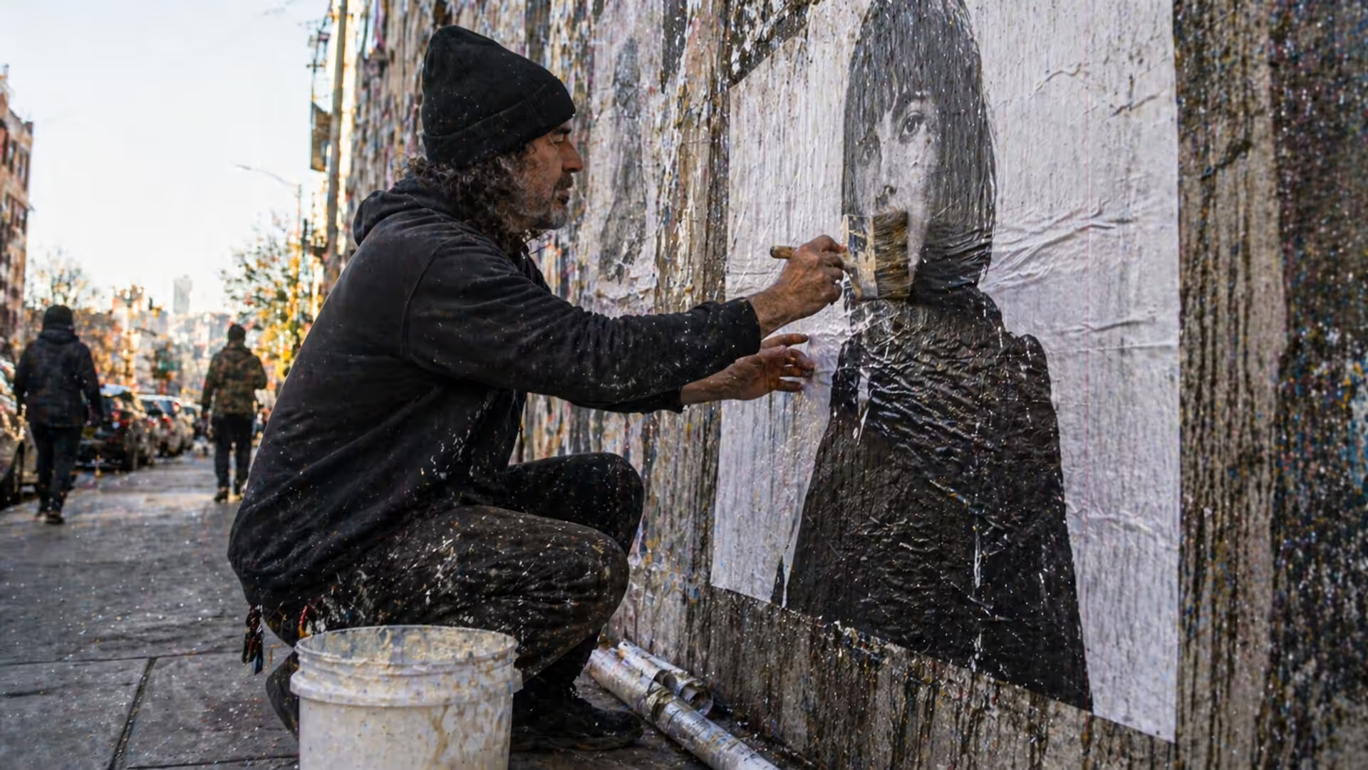
Master the wheatpaste street art technique with this complete guide covering adhesive recipes, poster installation methods, material selection, and legal considerations. Learn to create durable wheat paste art installations using affordable supplies and proven application techniques.
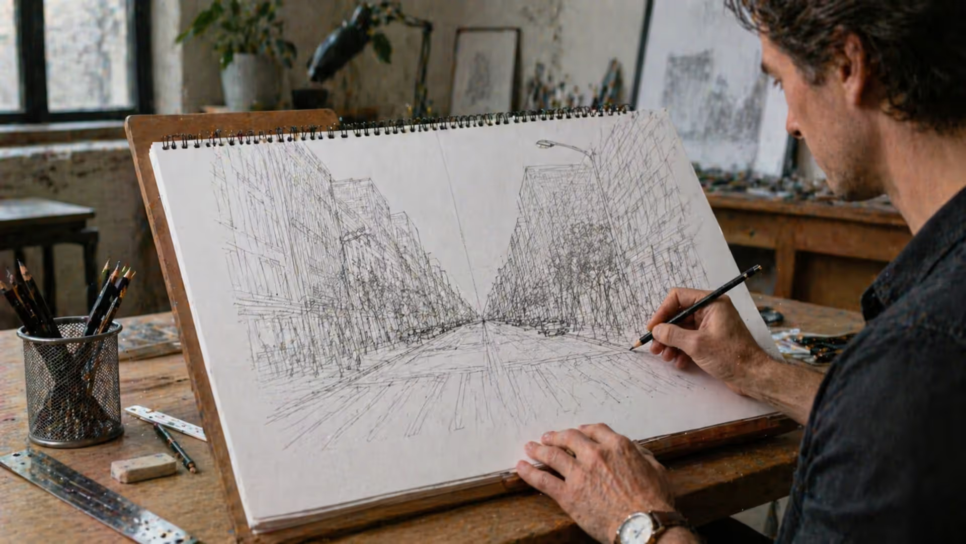
Perspective is the set of techniques artists use to represent three-dimensional space on a flat surface. It governs how objects appear smaller as they recede, how parallel lines converge toward a single point, and how atmospheric conditions affect color and clarity across spatial planes.
Learn to draw compelling three quarter view portraits with this comprehensive guide covering proportions, perspective, and step-by-step techniques. Discover why this angle creates depth and dimension, master foreshortening, and avoid common mistakes that flatten your portraits.
The paper crane carries profound significance beyond its folded form. Discover how this Japanese symbol influences contemporary design, from geometric principles to visual metaphors, and learn the cultural context behind 1,000 cranes, peace symbolism, and minimalist aesthetics.
The content on this website is provided for general informational and educational purposes only. It is intended to explain concepts related to digital design, visual art, color theory, art techniques, design principles, and design history.
All information on this website, including articles, guides, and examples, is presented for general educational purposes. Creative outcomes may vary depending on individual skill, tools, and practice.
This website does not provide professional design services or guarantee results, and the information presented should not be used as a substitute for formal education or professional consultation.
The website and its authors are not responsible for any errors or omissions, or for any outcomes resulting from decisions made based on the information provided on this website.