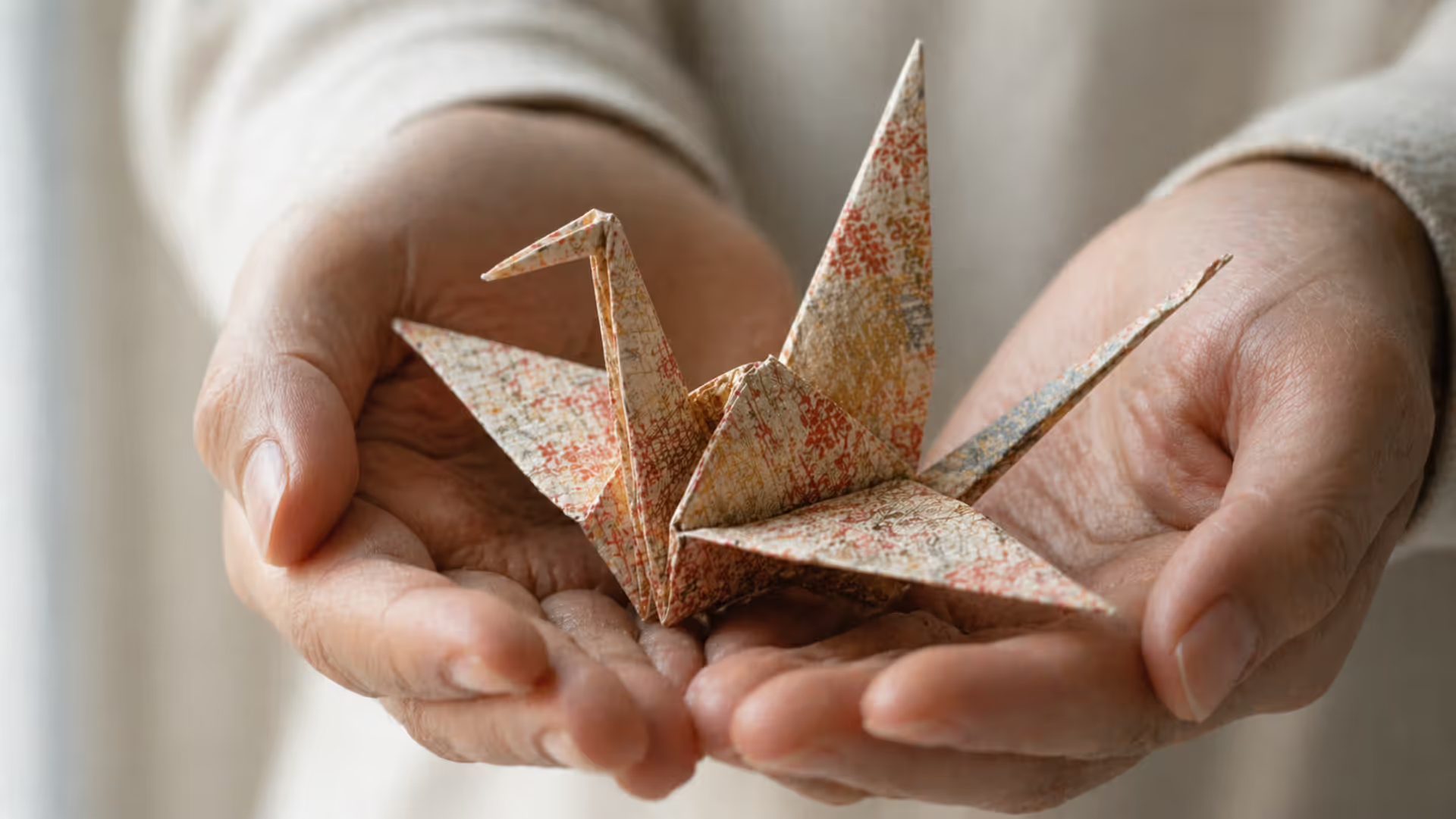
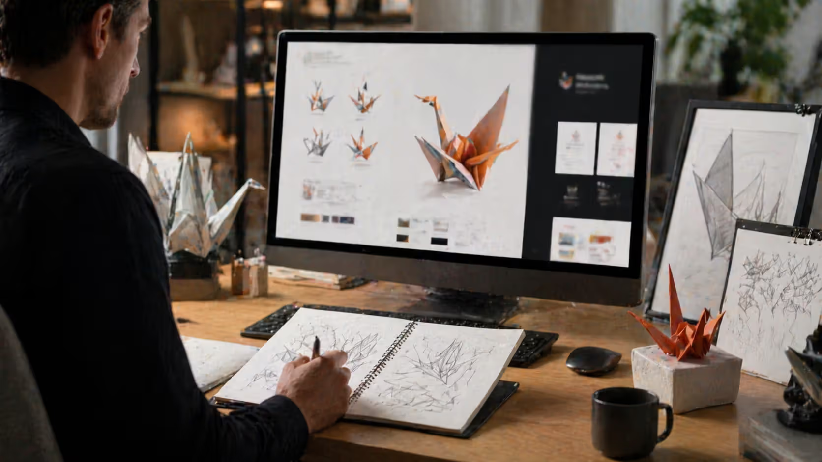
You've probably seen them—those crisp, angular birds folded from squares of paper. Maybe at a wedding. A museum. A peace rally. The paper crane has traveled far from its Japanese roots, and honestly, that journey's worth understanding if you work anywhere near design, branding, or visual storytelling.
Here's what most people miss: this isn't just a pretty decoration. It's geometry meeting grief, mathematics touching hope, and cultural memory folding itself into contemporary design systems. Let's unpack what's actually happening when someone reaches for crane imagery in 2026.
What Does the Paper Crane Symbolize?
In Japanese tradition, cranes—the living birds—were believed to live a thousand years. The folded paper versions inherited this association with longevity. Add good fortune and fidelity to that list. These weren't casual symbols. Families folded them for weddings, for sick relatives, for new beginnings.
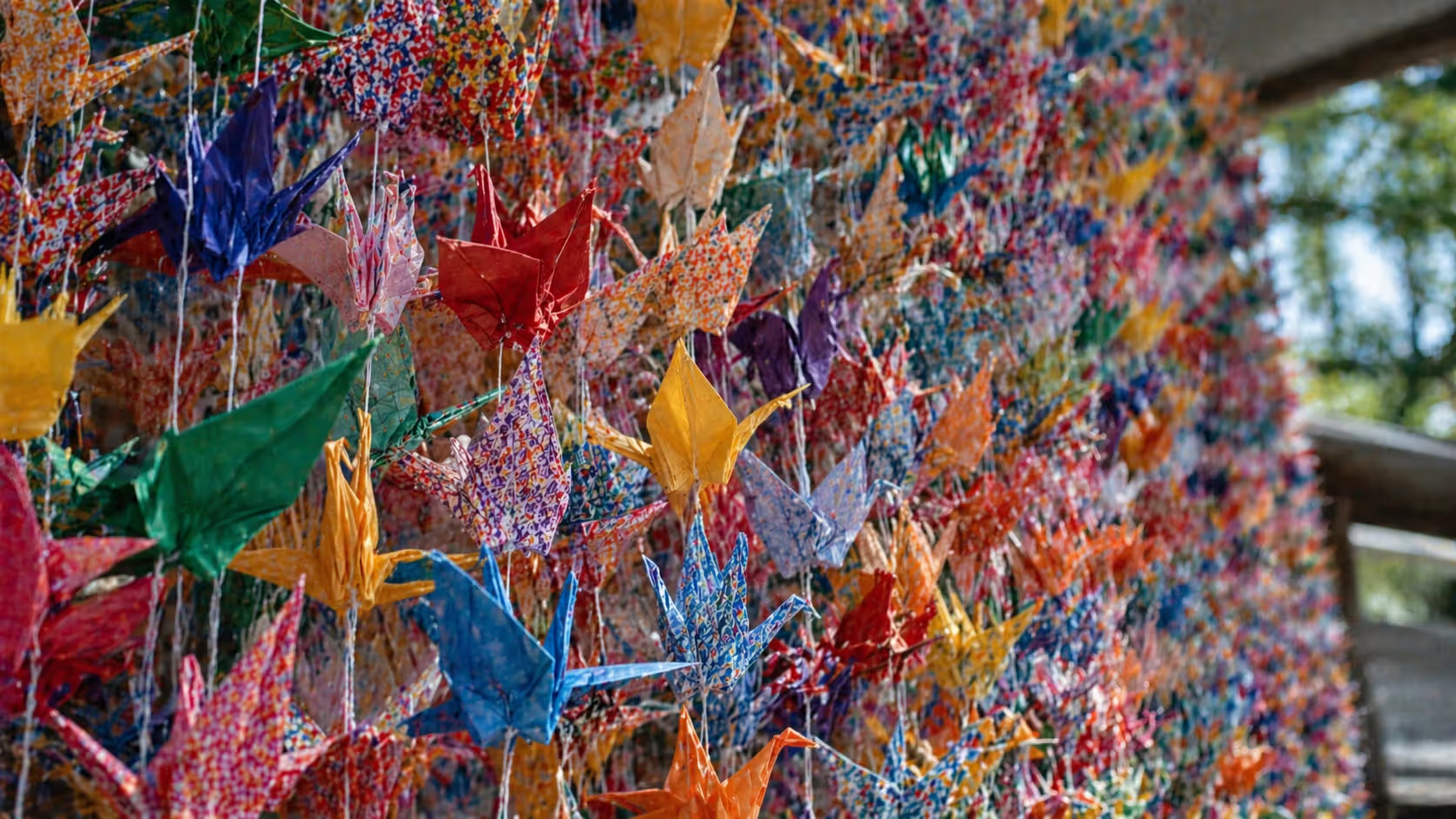
Then came senbazuru. The thousand-crane tradition. Fold a thousand of these angular birds, Japanese folklore said, and the gods might grant you a wish. Usually something around healing or protection. The number wasn't arbitrary—in Japanese numerology, a thousand represents wholeness, abundance, the kind of completion that only comes from serious commitment.
Sadako Sasaki changed everything in 1955. She was twelve, hospitalized with leukemia caused by radiation from Hiroshima's bombing ten years earlier. Someone told her about senbazuru. She started folding. Did she complete all thousand before dying? Accounts conflict. What we know: her classmates folded the rest. They buried them with her. And suddenly this traditional craft became a global peace symbol, its meaning expanding to encompass nuclear disarmament and war's youngest victims.
But that's not the only story these cranes tell. Walk into a Japanese wedding today—you'll likely see gold and silver senbazuru displays, forty cranes on each of twenty-five strings. The math varies based on purpose. Someone visiting a hospitalized friend might bring colored cranes. Memorial services use them differently than celebrations. The paper color matters. The presentation format matters. Context shapes meaning.
Most folders don't literally string together a thousand cranes anymore (though some still do). The practice has become more flexible while keeping its symbolic weight. Twenty-five strands with forty cranes each is common. So are other configurations. The principle endures: completion through repetition, wishes earned through patient work.
Understanding this symbol in contemporary art requires recognizing its shape-shifting nature. A crane folded from recycled newspaper at a climate protest? That's different from gold foil cranes at a luxury wedding. Different from the rainbow-colored ones in a children's hospital. Material, color, setting—all these variables shift the message.
Author: Marcus Ellery;
Source: crafterholic.com
Geometric Principles Behind Folded Paper Forms
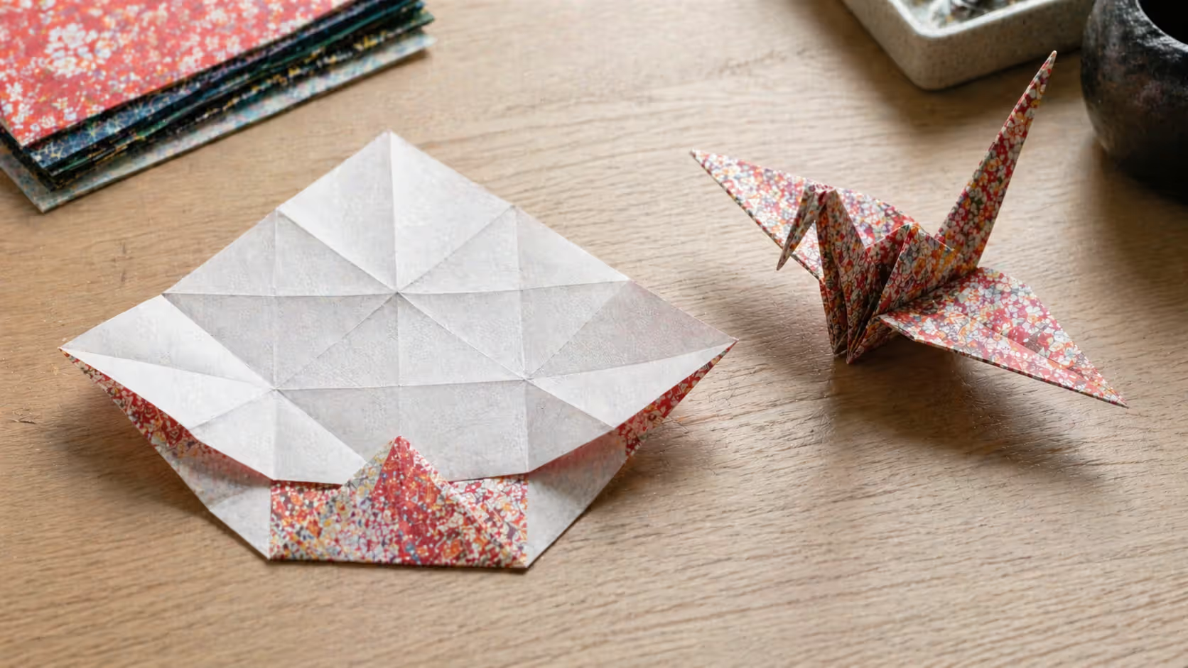
Traditional crane folding operates inside strict mathematical limits. Start with one square. No cuts. No glue. Just folds. Valley folds, mountain folds, specific sequences that mathematicians now study seriously.
The geometry isn't casual. Bilateral symmetry runs along multiple axes. Each fold creates angular relationships—ratios that must stay consistent for the final form to balance. The preliminary base (that's the foundation before you form the actual crane) divides your square into a radial pattern of 22.5-degree angles. Those angles become your structural framework.
Robert Lang, one of the mathematicians pushing modern origami forward, developed software that calculates crease patterns for complex figures. His programs solve equations determining how flat surfaces must fold to achieve specific three-dimensional results. The technical term is "circle packing." The practical result is that designers can now reverse-engineer folded forms, starting with the desired outcome and computing the required folds.
Why does this matter for design? Because geometric constraints force creative solutions. That single-square limitation becomes a design challenge similar to working within a strict grid system or brand guideline. Each fold builds on previous folds. It's sequential logic—almost like programming.
The Miura fold offers a case study. Astrophysicist Koryo Miura created a pattern that collapses efficiently in two directions simultaneously. Now you'll find it in solar panel arrays for satellites, medical stents that compress for insertion then expand inside blood vessels, and deployable emergency shelters. Same geometric principle, wildly different applications.
Author: Marcus Ellery;
Source: crafterholic.com
Understanding Origami Geometry in Modern Applications
Parametric design software borrowed heavily from origami mathematics. Tools like Grasshopper for Rhino include origami-specific components. Designers manipulate variables to generate complex folded structures from simple rules. Change one parameter—paper thickness, fold angle, panel size—and watch the entire form transform.
But there are hard limits. Not every three-dimensional shape can be folded from a single uncut square. Certain forms require specific paper ratios (rectangles at particular proportions, for instance). These constraints matter when you're translating folded aesthetics into metal, plastic, fabric. Material thickness changes everything. So does grain direction. Memory characteristics. A fold that works perfectly in paper might be impossible in quarter-inch steel.
Architects have learned this the hard way. That cool tessellation pattern you generated algorithmically? It might not account for the fact that aluminum panels don't fold—they bend, and bending requires different geometric calculations. The math that describes paper doesn't always describe other materials.
How Paper Folding Functions as Visual Metaphor
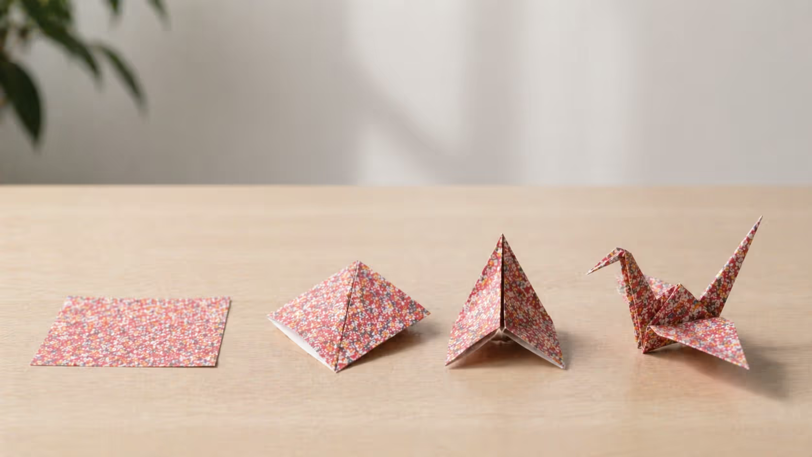
Watch someone fold a crane. Flat square becomes dimensional bird. That transformation? Pure metaphorical gold, which is why everyone from startup CEOs to nonprofit directors reaches for origami imagery.
The journey from simplicity to complexity tells a story. So does the revelation of hidden potential—that the bird was somehow always within the square, waiting. Sequential process matters: step three depends on step two depends on step one. And there's this fascinating tension between fragility (it's just paper) and structural strength (but the form holds).
Corporate presentations love transformation narratives. Startup becomes established company. Traditional business undergoes digital transformation. Individual develops new capabilities. The metaphor suggests deliberate progression rather than random evolution. It implies that the final form existed as potential from the beginning—you just needed the right sequence of folds to reveal it.
Here's what makes origami particularly unforgiving as a metaphor: errors compound. Misplace a fold at step three, and by step ten your crane looks like a crumpled napkin. This makes it effective for discussing processes where early decisions cascade through later stages. Software architecture. Strategic planning. Habit formation. Places where getting the foundation right matters enormously.
Then there's the strength-through-fragility paradox. A properly folded crane maintains shape through geometric tension, not material rigidity. The paper stays thin enough to tear. Yet the form holds. Designers reference this when discussing resilient systems that achieve stability through structure rather than mass. Think bridge trusses. Honeycomb panels. Geodesic domes.
Brand strategists deploy these metaphors carefully (or should). A financial planning firm might use crane imagery to suggest turning scattered resources into organized wealth. A consulting company could reference the folding process to illustrate their change methodology. But here's the catch: this symbol carries cultural weight. Using crane imagery without acknowledging Japanese origins or its connection to Hiroshima? That's how you telegraph either ignorance or appropriation, especially in contexts involving peace, healing, or remembrance.
Author: Marcus Ellery;
Source: crafterholic.com
Origami Influence on Contemporary Graphic Design
The flat design movement that dominated digital interfaces throughout the 2010s—and continues evolving now in 2026—borrowed heavily from folded paper aesthetics. Clean lines. Geometric precision. Suggested dimensionality through angular forms rather than gradients or drop shadows.
Logo designers constantly reference folded forms. Why? They communicate innovation and precision simultaneously. The angular facets create visual interest while maintaining the simplicity required for scalability. You see this particularly with companies in technology, architecture, creative services. Industries where "we're both technically competent and creatively thinking" matters to brand positioning.
Packaging design has gone deep on origami influence. Not just aesthetically—structurally. Designers create boxes, bags, containers that fold from single sheets with minimal waste. Japanese packaging traditions, which treat folding as an art form itself, have pushed Western designers to reconsider standard templates. Brands positioning as sustainable or premium often choose origami-inspired packaging because it communicates thoughtfulness while reducing material use.
Google's Material Design guidelines, introduced in 2014 and refined through multiple versions since, explicitly reference paper metaphors. Digital elements should behave like paper—casting shadows, folding, layering. Menus "unfold." Cards "stack." Buttons "raise" when pressed. These behaviors help users understand spatial relationships in flat interfaces.
Web designers use CSS transforms to create literal fold effects. Hero sections. Navigation menus. Interactive elements. The "fold" concept itself—content visible before scrolling—derives from newspaper layout but gains new relevance when designers create actual fold animations as users navigate.
The challenge by 2026? Avoiding cliché. That low-poly, faceted aesthetic that dominated mid-2010s design has aged poorly in many contexts. It screams "2014 startup pitch deck." Designers now need to decide whether folded aesthetics serve genuine communication purposes or just follow dated trends.
Author: Marcus Ellery;
Source: crafterholic.com
Symbolic Paper Art in Minimalist Design Movements
Japanese aesthetic principles align naturally with minimalist philosophy. Ma—the meaningful void, the negative space—appears literally in origami. The spaces between folds contribute as much to form identity as the paper itself.
Wabi-sabi intersects interestingly with folding practice. This principle finds beauty in imperfection and impermanence. While crane instructions specify precise folds, handmade versions inevitably show slight irregularities. Fingerprints. Uneven creases. Variations in pressure. Contemporary artists working with folded forms often emphasize these human traces rather than pursuing mechanical perfection.
Gallery installations have expanded beyond traditional origami. Sipho Mabona folded a life-sized elephant from a single sheet (it required a massive square and a team of folders working simultaneously, but technically one piece). Richard Sweeney creates organic paper sculptures exploring natural forms—curved shells, cellular structures, botanical shapes. These artists demonstrate how folded paper has entered fine art discourse, not just craft categorization.
The minimalist movement's emphasis on reduction finds perfect expression in origami's constraint-based practice. Working within that single-uncut-square limitation forces elimination of the superfluous. It's a design philosophy that resonates with minimalist architecture, product design, visual communication.
Museums increasingly feature paper art in exhibitions exploring craft-mathematics-culture intersections. The Mingei International Museum in San Diego. The American Museum of Natural History. Both have hosted significant origami shows positioning the practice within broader conversations about human creativity and cross-cultural exchange.
Contemporary designers reference minimalist paper art when creating brand identities for wellness companies, meditation apps, lifestyle products targeting audiences who value simplicity and mindfulness. The aesthetic suggests calm, focus, intentionality—qualities aligned with minimalist philosophy. Though again, there's risk of cliché. "Zen-inspired" branding has its own tired tropes.
The paper crane succeeds as a symbol because it contains real transformation—you take something flat and ordinary and through patient, precise work, create something dimensional and extraordinary. That physical transformation makes the symbolic transformation believable.
— Michael LaFosse
Common Misconceptions About Paper Crane Symbolism
Let's clear up some persistent misunderstandings. First: not all origami is interchangeable decoration. A crane carries different significance than a folded frog, boat, or geometric form. Lumping everything under generic "Japanese aesthetic" ignores meaningful distinctions. Cranes specifically connect to longevity, fidelity, and—through Sadako's story—peace. Other forms carry their own meanings.
Second misconception: folding any number of cranes equals partial wish completion. Like, fold 100 cranes, get one-tenth of a wish? That's not how it works. While a single crane can serve as a gift or decoration, the thousand-crane practice specifically relates to wish-making and carries ceremonial weight. Folding 500 cranes is just... folding 500 cranes. It's a different practice entirely.
Third: the assumption that cranes universally symbolize peace oversimplifies their cultural role. Yes, Sadako's story connected cranes to peace activism. But traditional Japanese symbolism emphasizes longevity, fidelity, good fortune more broadly. Using crane imagery exclusively for peace-related messaging ignores these other dimensions.
Cultural appropriation versus appreciation—this comes up constantly. A company using crane imagery in branding without acknowledging Japanese origins demonstrates cultural insensitivity. Treating it as generic Asian aesthetic? Worse. The distinction between appreciation and appropriation often lies in attribution, context, and whether the use reinforces stereotypes or demonstrates genuine engagement with source culture.
Some purists insist origami must follow traditional patterns to be "authentic," dismissing contemporary innovations as violations. This perspective ignores evolution. Yes, respecting traditional forms matters. But the art continues developing through practitioners worldwide bringing new perspectives and techniques. Tradition and innovation aren't opposites.
Final misconception: machine-folded cranes carry the same meaning as handmade ones. They don't. Part of the crane's symbolic power derives from time, attention, intention invested in creation. Mass-produced origami serves decorative purposes. It lacks the personal investment that gives handmade cranes their ceremonial significance. Laser-cut, pre-scored, pop-out crane kits miss the point entirely.
Traditional vs. Modern Interpretations of Paper Crane Symbolism
Context
Traditional Meaning
Modern Design Application
Examples
Wedding ceremonies
Fidelity in marriage, longevity of union, prosperity for the couple
Wedding invitation layouts, venue decoration schemes, gift packaging design
Gold and silver senbazuru displays (25 strands, 40 cranes each), crane motifs in letterpress stationery
Hospital visits
Wishes for patient recovery, expression of care and support, hope for healing
Healthcare branding systems, patient wellness programs, hospital art installations
Crane-inspired wayfinding graphics in pediatric wards, healing garden sculptures at cancer centers
Memorial services
Honoring the deceased, prayers for peaceful afterlife, communal grieving rituals
Peace monument design, memorial park installations, commemorative event graphics
Hiroshima Peace Memorial's Children's Monument, 9/11 tribute installations at Ground Zero
New Year celebrations
Good fortune for coming year, fresh beginnings, family prosperity and renewal
Tech company New Year brand refreshes, January promotional materials for fitness apps
Corporate gifts
Professional respect, wishes for good business fortune, appreciation of partnership
Business card design systems, corporate identity elements, client appreciation packaging
Architectural firm logos featuring crane geometry, tech startup brand marks
Peace activism
Nuclear disarmament advocacy, anti-war messaging, global unity movements
Nonprofit branding, awareness campaign materials, protest and demonstration imagery
Peace organization logos, demonstration signs at disarmament rallies
Frequently Asked Questions About Paper Cranes
Why do people fold 1,000 paper cranes?
The thousand-crane tradition (senbazuru) stems from Japanese belief that completing this number grants the folder a wish—usually related to health, recovery, or protection. But the number itself represents completion and abundance in Japanese culture, not literal counting. Beyond wish-making, senbazuru appear at weddings (representing marital commitment), hospitals (showing care for sick friends), and memorial services (honoring the deceased). The labor-intensive process itself demonstrates dedication. Folding a thousand cranes takes hours, sometimes days. That investment carries meaning.
What is the difference between a paper crane and other origami symbols?
Cranes hold specific cultural significance that other origami forms don't share. Frogs might symbolize good luck (they're also significantly easier to fold). Boats represent journeys. But the crane specifically connects to longevity, fidelity, and—through Sadako Sasaki's story—peace and healing. The crane's complex folding sequence also makes it a skill benchmark. You can teach someone to fold a boat in two minutes. A crane takes longer, requires more precision. Different origami figures serve different ceremonial and decorative purposes within Japanese culture, and those distinctions matter.
Can paper cranes be used in non-Japanese cultural contexts?
Yes, when users acknowledge cultural origins and avoid misrepresenting meaning. Educational settings, peace initiatives, artistic projects that credit the Japanese tradition demonstrate appropriate cross-cultural exchange. Problems arise when cranes become generic "Asian" decoration, when their significance gets misrepresented, or when commercial entities profit from crane imagery without cultural acknowledgment. A school teaching about Hiroshima and having students fold cranes? Appropriate. A restaurant using crane imagery just because it "looks Asian"? Problematic. Context, attribution, and intent determine appropriateness.
How has the paper crane influenced modern logo design?
The crane's angular geometry and symbolic associations have inspired logos across industries—technology, architecture, creative services especially. Designers abstract the crane's folded form into geometric marks suggesting innovation, precision, transformation. The bilateral symmetry creates balanced compositions. The positive associations (longevity, peace, hope) provide beneficial brand connotations. But effective crane-inspired logos require cultural sensitivity and clear connection between symbol and brand values. Slapping a crane on your logo because it looks cool? That's how you get generic, forgettable marks. Understanding why you're using that specific symbol? That's how you create meaningful identity systems
What makes origami geometry useful in graphic design?
Origami geometry provides mathematically precise forms that suggest depth and movement while maintaining clean lines required for scalable graphics. The angular facets created by folds add visual interest without requiring gradients or complex rendering—crucial for logos that need to work at half-inch size on business cards and twenty-foot size on billboards. Folded forms also carry metaphorical weight: transformation, hidden potential, craftsmanship. That enhances brand messaging. Practically, origami's constraint-based creativity (working within a square, using only folds) mirrors design challenges of working within grids, templates, brand guidelines. It's problem-solving under restrictions, which is basically what design is.
Are there different meanings for different colored paper cranes?
Yes, color carries specific significance in Japanese tradition. Gold and silver cranes typically appear at weddings, representing prosperity and purity. White cranes suit memorial contexts, symbolizing peace and spiritual purity. Red cranes express vitality and celebration. Blue suggests tranquility and healing. Rainbow-colored senbazuru often appear in children's hospitals, bringing visual cheer to difficult environments. However, color meanings aren't rigidly codified like stop-light signals. Context matters. Regional variations exist. Personal preference plays a role. When using colored cranes in design, research the specific cultural context to ensure appropriate selection. Don't just pick colors because they match your brand palette.
The paper crane's enduring presence in both traditional ceremony and contemporary design reflects its unique position as a symbol that bridges cultural boundaries while retaining specific meaning. For designers and artists working in 2026, the crane offers a case study in how cultural symbols can inform visual communication without requiring literal representation.
Understanding geometric principles, cultural contexts, and metaphorical dimensions of folded forms enables more thoughtful application in contemporary work. Whether you're incorporating origami-influenced elements into graphic design, using crane symbolism in branding, or creating paper art installations, the key lies in balancing aesthetic appeal with cultural respect and genuine understanding.
The paper crane's journey from traditional Japanese craft to global peace symbol to design trend demonstrates how cultural forms evolve through cross-cultural exchange. Rather than treating this evolution as dilution of original meaning, we might recognize it as the natural life of symbols in interconnected creative communities—provided that evolution occurs with attribution, respect, and awareness of the traditions that give these forms their enduring power.
Work with these symbols thoughtfully. Acknowledge where they come from. Understand what they carry. Then fold that knowledge into your designs.
Master the wheatpaste street art technique with this complete guide covering adhesive recipes, poster installation methods, material selection, and legal considerations. Learn to create durable wheat paste art installations using affordable supplies and proven application techniques.
Perspective is the set of techniques artists use to represent three-dimensional space on a flat surface. It governs how objects appear smaller as they recede, how parallel lines converge toward a single point, and how atmospheric conditions affect color and clarity across spatial planes.
Learn to draw compelling three quarter view portraits with this comprehensive guide covering proportions, perspective, and step-by-step techniques. Discover why this angle creates depth and dimension, master foreshortening, and avoid common mistakes that flatten your portraits.
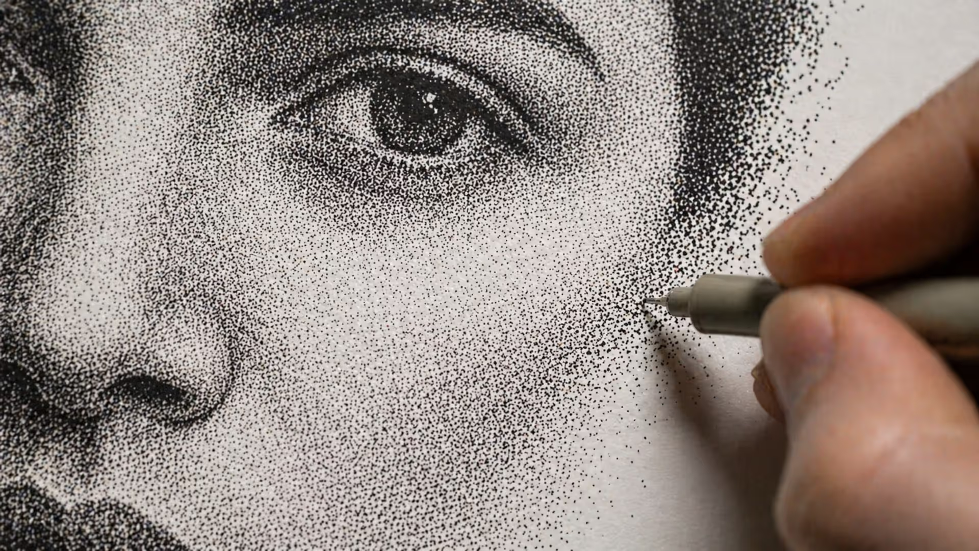
Stippling creates stunning artwork using only dots. This comprehensive guide covers everything from basic dot shading methods to advanced illustration techniques, including tool recommendations, step-by-step tutorials, and common mistakes to avoid.
The content on this website is provided for general informational and educational purposes only. It is intended to explain concepts related to digital design, visual art, color theory, art techniques, design principles, and design history.
All information on this website, including articles, guides, and examples, is presented for general educational purposes. Creative outcomes may vary depending on individual skill, tools, and practice.
This website does not provide professional design services or guarantee results, and the information presented should not be used as a substitute for formal education or professional consultation.
The website and its authors are not responsible for any errors or omissions, or for any outcomes resulting from decisions made based on the information provided on this website.