Pick up any interior design magazine, scroll through Pinterest, or walk past a luxury storefront—you'll spot floral design everywhere, though most people never think about the deliberate choices behind those botanical arrangements. The wedding centerpiece that made guests pause mid-conversation? Intentional design. That wallpaper pattern that somehow makes a cramped room feel airy? Carefully engineered floral composition. Even the tiny flower icon on your shampoo bottle exists because someone applied specific visual principles to plant imagery.
Definition and Scope of Floral Design
Here's what trips people up: what is floral design actually covers a much bigger territory than the flower shops you pass on street corners. Yes, florists practice it when they're wiring roses into bouquets. But so do textile designers creating fabric for Anthropologie dresses, graphic designers building cosmetics packaging, and illustrators drawing botanical prints for museum gift shops.
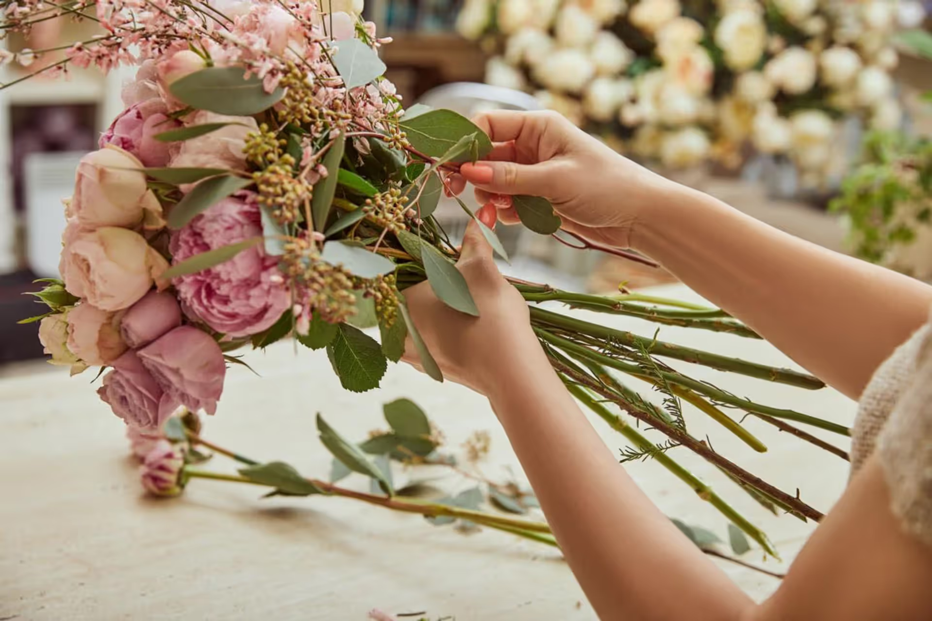
The traditional definition—physically assembling cut flowers and greenery into three-dimensional arrangements—captures maybe 20% of the field. Most people working with their hands in buckets of roses would say they're "arranging flowers," not practicing floral design. Fair enough. But examine what they're actually doing: making decisions about color relationships, manipulating spatial balance, creating rhythm through repetition. Those choices follow the same logic whether you're positioning actual peonies or drawing them in Illustrator.
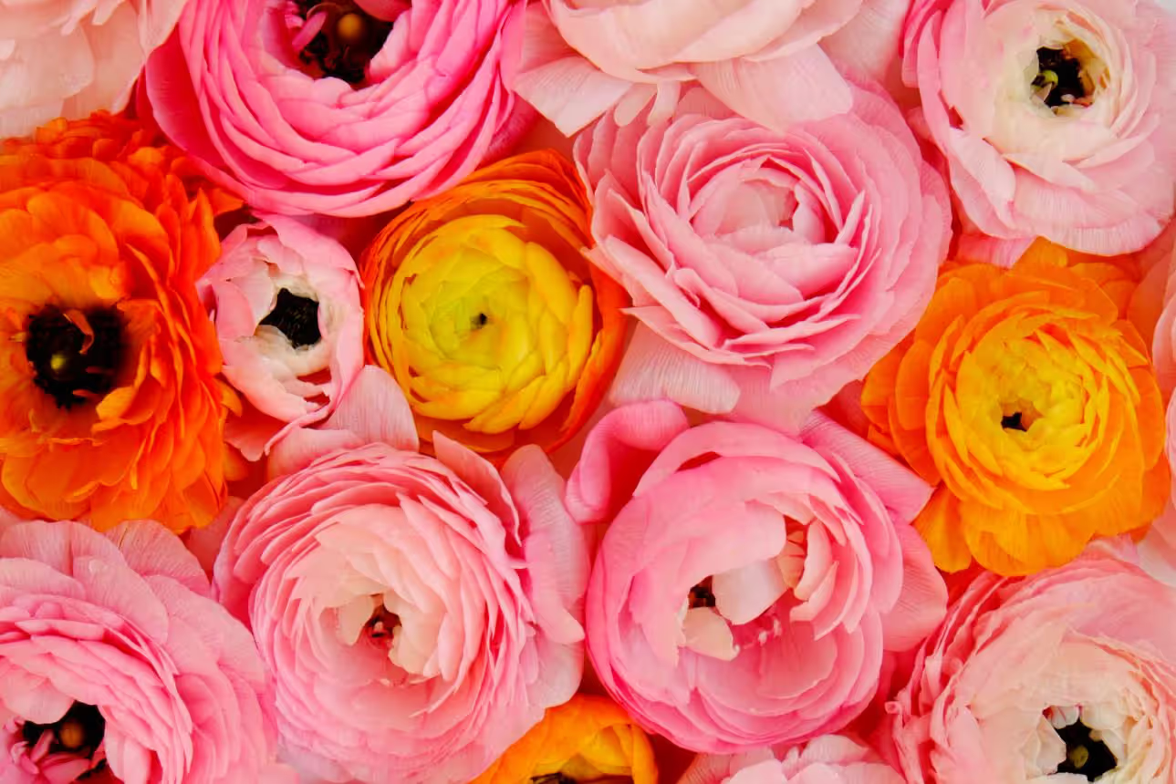
Think about floral design elements this way: they're the vocabulary (line, form, color, texture, space) that works regardless of your medium. I once watched a florist spend fifteen minutes tweaking a bridesmaid bouquet, moving a single ranunculus a half-inch to the left. Then I watched a packaging designer make an identical adjustment to a digital flower element on a tea tin. Different materials, identical principle—both were fixing visual weight distribution.
This cross-pollination between physical and digital floristry has accelerated recently. Florists now post arrangement videos that graphic designers study for color theory. Pattern designers attend hands-on flower workshops to understand how stems actually behave. The woman designing your shower curtain's botanical print might've spent last weekend in a floral foam workshop. These disciplines aren't separate anymore—they're in constant conversation.
Core Principles of Floral Design
Floral design principles sound academic until you've stared at a lopsided arrangement wondering why it looks "wrong." Then they become practical tools for diagnosing and fixing problems.
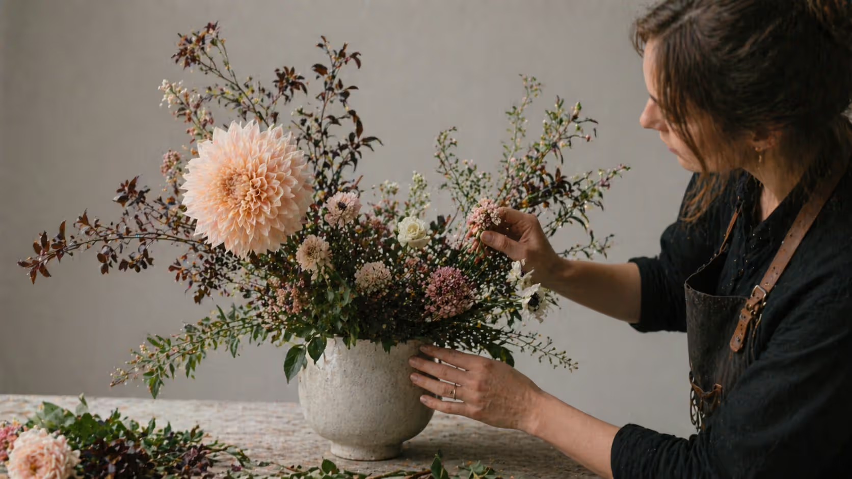
Balance decides whether your eye feels settled or agitated looking at a composition. I've seen eight-hundred-dollar wedding centerpieces that made people uncomfortable because one side felt heavier—not physically tippy, just visually weighted wrong. Your brain processes this instantly, even if you can't articulate why. Place a massive dahlia on the right? You'll need counterweight on the left, maybe through several smaller blooms or a cluster of dark foliage. Some designers deliberately create imbalance for tension, but that's advanced work. Beginners just look incompetent.
Proportion governs size relationships, and conventional wisdom offers actual numbers here. That guideline about arrangements measuring 1.5 to 2 times their container height? It works because those ratios feel natural to human perception. Go way outside it—say, forty-inch stems in an eight-inch vase—and you'd better have a compelling reason. Contemporary designers violate this constantly for drama, but they're making educated choices, not mistakes.
Harmony answers "why are these specific things together?" It's not about matching. I've seen all-white arrangements that felt chaotic and rainbow compositions that felt harmonious. Look for connecting threads instead. Maybe you're repeating a rounded shape at three different scales. Maybe your colors span cool tones from sage to navy. Maybe everything shares a matte, velvety texture. Something needs to tie the room together, as The Dude would say.
Rhythm keeps viewers' eyes moving rather than getting stuck. Watch how your gaze travels through a cascading bouquet—probably following gradually decreasing flower sizes downward. That's engineered rhythm, not accident. In wallpaper patterns, rhythm comes from alternating large and small motifs at regular intervals. Without it, designs feel either frozen in place or completely scattered.
Contrast provides the visual interest that prevents compositions from fading into boring. Too little? Bland. Too much? Your design fragments into chaos. The sweet spot depends entirely on context. A spa brand's logo might use barely-there tonal shifts between leaf illustrations. A concert poster could slam hot pink florals against black backgrounds. Both use contrast correctly for different purposes.
Focal point gives viewers somewhere to land first. According to floral composition rules, this typically sits about two-thirds up from the base and slightly off-center—positions that feel dynamic rather than static. In a physical arrangement, maybe it's one spectacular bloom nobody can ignore. In a pattern, perhaps it's an unexpected color pop. Amateur work often lacks any clear hierarchy, leaving viewers confused about where to look first.
These principles don't operate independently—they're constantly wrestling with each other. Add contrast and you might accidentally break your balance. Improve rhythm and suddenly your focal point disappears. Experienced designers juggle all six simultaneously through intuition built on years of practice. Starting out? Check each one systematically against your work.
Author: Marcus Ellery;
Source: crafterholic.com
Key Elements in Floral Composition
Principles describe relationships between things. Elements are the actual things. Every floral composition combines these basic building blocks, whether you're working in a flower cooler or Photoshop.
Line and Form
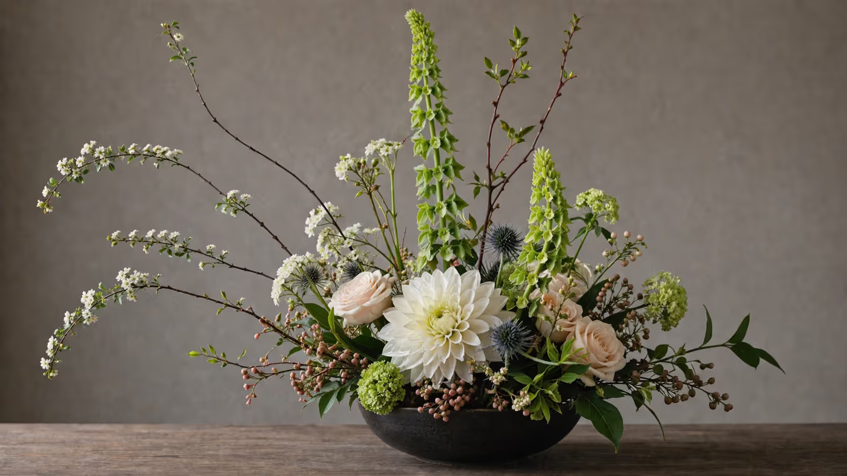
Line builds the skeleton that everything else hangs on. In a physical arrangement, you're probably using branches, stems, or elongated flowers like gladiolus. These lines can shoot upward (formal, suggesting growth), stretch horizontally (stable, calm), or cut diagonally (energetic, dynamic). Curved lines—think pussy willow or the natural arch of an orchid stem—soften compositions that might otherwise feel rigid.
In decorative plant illustration, line quality communicates as much as line direction. Delicate pen strokes suggest fragility. Bold brushwork implies vitality. Those botanical engravings from the 1800s used line weight and density to show volume and shadow before halftone printing existed.
Form means three-dimensional shape. Round flowers (hydrangeas, peonies, garden roses) create mass and visual weight—they're the heavy-hitters. Spiky forms (thistles, eryngium, celosia) add textural punctuation marks. Spray shapes (baby's breath, waxflower, limonium) work as filler that transitions between larger elements.
Here's what beginners get wrong: using just one form type. All round flowers? Visually heavy and monotonous, like eating only potatoes for dinner. All spiky materials? Aggressive and exhausting. Mix forms deliberately—that's where visual complexity comes from.
Author: Marcus Ellery;
Source: crafterholic.com
Color and Texture
Color carries emotional freight immediately. Warm tones (reds, oranges, yellows) advance toward viewers and energize. Cooler shades (blues, purples, certain greens) step back and create calm. White can read as pure or stark or even cold depending on what surrounds it. The color wheel rules you learned in art class all apply—complementary pairs vibrate against each other, analogous schemes flow smoothly, triadic combinations offer variety with balance.
But real-world color gets complicated fast. Those pink roses you chose in morning daylight? They'll look completely different under the client's candlelit reception. Digital floral illustrations display differently on every screen. I've learned to photograph arrangements under multiple light sources before finalizing designs. Saves headaches later.
Texture engages multiple senses even in two-dimensional work. Velvety rose petals, glossy camellia leaves, fuzzy lamb's ear, papery strawflowers—each contributes distinct tactile qualities that viewers process visually. In illustrations, you suggest texture through technique. Stippling implies roughness. Smooth gradients suggest shine. Cross-hatching creates depth and dimension.
Texture contrast prevents that "everything's the same" boredom. Pair rough with smooth, matte with glossy, delicate with substantial. I once saw an all-smooth, all-shiny arrangement that looked completely plastic despite using fresh, expensive flowers. Zero textural variety killed it.
Author: Marcus Ellery;
Source: crafterholic.com
Space and Balance
Space—particularly negative space—separates amateurs from professionals faster than any other element. Empty areas aren't wasted. They're active design choices that provide visual rest, define shapes, and guide eye movement. Ikebana treats space as equally important to the plant material. Western designers often need to consciously practice restraint because our instinct is to fill every gap.
Overcrowding kills more compositions than any other single mistake. Each element needs breathing room to register as itself. In patterns, negative space creates rhythm and prevents overwhelming density. That white background in a botanical watercolor isn't just unpainted paper—it's making active design contributions.
Balance manifests through how you distribute elements in space. Symmetrical balance mirrors things across a central axis—you see this in formal altar arrangements and traditional damask patterns. Asymmetrical balance achieves equilibrium through different elements with equivalent visual weight positioned at varying distances from center. Maybe one large flower near the middle balanced by several small blooms farther out.
Radial balance arranges everything around a central point, like wreaths or mandala-style patterns. Each balance type serves different communication purposes and creates different emotional responses.
Flowers really do intoxicate me. I have the same feeling about them as some people have about wine. I can never get enough of them.
— Designer and educator Constance Spry
This intoxication shouldn't override structural discipline. The most successful floral designs marry passion for botanical beauty with rigorous compositional fundamentals. Your enthusiasm for flowers attracts viewers initially. Your design skill keeps them engaged.
Floral Patterns and Motifs in Visual Art
Floral pattern in visual art has decorated human-made objects since ancient Egypt—tomb paintings, pottery, textiles, architectural details, and now smartphone cases. These patterns serve decorative purposes while carrying symbolic meanings that shift across cultures and centuries.
Contemporary graphic design deploys floral motifs ranging from photorealistic to so abstract you barely recognize the botanical origin. A luxury perfume package might feature meticulously detailed botanical illustrations emphasizing "natural ingredients." Meanwhile, a youth-oriented energy drink might use neon geometric flower shapes that prioritize attitude over realism.
Floral motif in graphic design solves specific communication problems. Need to soften a tech brand? Add florals. Want sophistication on a budget product? Florals. Signaling environmental consciousness? You guessed it. The challenge isn't whether to use florals—they've proven effective across countless applications. The challenge is avoiding cliché, which requires either exceptional execution or unexpected combinations. I've seen this work brilliantly (florals paired with industrial typography, botanical illustrations collaged with grunge textures) and crash spectacularly (generic rose clip art on everything).
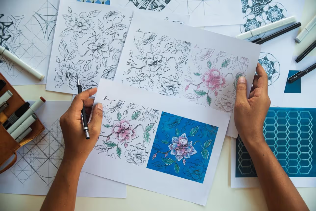
Textile and wallpaper designers face unique technical constraints. Patterns must tile seamlessly—individual motifs need to work in isolation and in infinite repetition. A flower that's charming alone might create visual chaos when repeated across an entire wall. Good designers test patterns at multiple scales and distances, checking that they succeed both as background texture and as close-up focal decoration.
Botanical illustration basics differ fundamentally from decorative florals in purpose. Scientific botanical illustration prioritizes accuracy for identification—every stamen, leaf vein, and seed pod must be precisely rendered. These serve educational and documentary functions, though exceptional specimens achieve beauty that transcends utility. Check out the botanical watercolors at the New York Botanical Garden sometime.
Decorative floral work prioritizes aesthetic impact over accuracy. Want to combine flowers that bloom six months apart? Go ahead. Need to scale a tiny violet to match a dinner-plate dahlia? No problem. Invent entirely fictional blooms in colors that don't exist? Absolutely. This creative freedom allows emotional and conceptual expression that strict botanical work can't achieve.
Contemporary designers increasingly blur this boundary intentionally. Some illustrators adopt botanical precision as a stylistic choice for commercial work. Some scientific illustrators compose their educational plates with sophisticated artistic sensibility. Understanding the distinction helps you choose appropriate approaches for different projects.
Author: Marcus Ellery;
Source: crafterholic.com
Symmetry and Organic Patterns in Floral Design
Floral symmetry in design creates order and formality. Asymmetry introduces naturalism and movement. Neither is inherently better—context and intention determine effectiveness.
Symmetrical floral arrangements mirror elements across a central vertical axis. Everything on the left has a matching partner on the right—same size, same color, same position. These communicate stability, tradition, ceremony. You'll see them in religious settings, corporate lobbies, formal weddings. They project authority and permanence. Creating true symmetry demands precision. Miss by even a little and the whole thing looks sloppy rather than intentional.
Asymmetrical designs feel livelier and more contemporary. They mimic natural plant growth, where perfect mirror-image symmetry rarely occurs. These balance through visual weight rather than matching. One large, dark flower might balance against multiple lighter blooms opposite. Dense clustering in one area balanced by open space elsewhere. More creative freedom, but harder to execute successfully.
Organic pattern design embraces irregular, flowing forms inspired by how plants actually grow. Unlike geometric patterns built on grids and precise angles, organic patterns follow curving, unpredictable paths. Art Nouveau exemplified this—think of those sinuous vines and stylized flowers flowing across Mucha posters.
Nature inspired ornamentation doesn't necessarily replicate nature literally. It might extract underlying principles and apply them abstractly. Study how leaves spiral around stems (phyllotaxis follows mathematical sequences). Notice how trees branch (fractal patterns repeating at different scales). Then translate those structural ideas into logos or layout grids. This approach captures natural feeling without literal representation.
Compare these two approaches:
Design Type
What You're Actually Doing
Where It Works Best
What Viewers Feel
Learning Curve
Symmetrical
Mirroring elements on both sides of a center line; every piece gets a matching twin; creates predictable structure
Formal weddings, church altars, corporate reception areas, traditional interiors
Movement, spontaneity, modern energy, organic authenticity, visual intrigue
Trickier; requires developed eye for visual weight
Many contemporary designers combine both strategies—symmetry provides underlying structure while asymmetrical details add interest. A wedding arch might be symmetrically framed but feature asymmetrical flower clusters within that structure.
Common Mistakes When Creating Floral Compositions
Even designers who understand floral composition rules intellectually make these errors in execution. Spotting them in your own work requires honest self-assessment.
Overcrowding destroys more compositions than any other single problem. Beginners operate on "more flowers equals better results" logic, cramming every available millimeter with blooms. This creates visual noise where individual elements disappear into undifferentiated mass. Commercial pressure makes this worse—clients sometimes expect to literally "see" every dollar they spent, pushing designers toward excessive density. You've got to resist. Strategic restraint creates impact that sheer volume cannot.
Ignoring focal points produces compositions where everything competes for attention and nothing wins. Viewers feel confused rather than engaged. Your eye needs somewhere specific to land first, then a logical path to travel. Without hierarchy, designs fail no matter how beautiful individual components are. Establish a clear star—your largest bloom, brightest color, most unusual texture—then support it rather than compete with it.
Poor color choices sabotage otherwise solid technical work. This manifests several ways: too many colors creating discord, insufficient contrast making elements blur together, or combinations that carry unintended cultural meanings. Bright hot pink and orange funeral arrangements feel inappropriate regardless of execution skill. I always photograph color combinations under actual viewing conditions now—what looks great in my studio might fail miserably under the venue's lighting.
Lack of balance makes designs uncomfortable even when viewers can't articulate why. Physical arrangements literally fall over. Visual compositions feel "heavy" on one side, creating subtle anxiety. Try this: squint at your work to blur details. If your eye consistently pulls to one side, redistribute elements until the visual weight equilibrates.
Neglecting negative space warrants emphasis as a distinct error. Space isn't waste—it's an active design element. Compositions packed edge-to-edge feel suffocating. Strategic emptiness provides contrast, defines shapes, and guides eye movement. Japanese floral artists understand this intuitively. Western designers often need to consciously practice restraint because we're trained to see empty space as "unfinished."
Inconsistent style happens when you combine elements from incompatible aesthetic vocabularies. Mixing ultra-realistic botanical illustrations with flat geometric florals can create interesting tension if you know what you're doing. Usually it just looks confused. Establish a clear style direction first—romantic, minimal, bold, delicate, whatever—then ensure every single element supports that direction.
Ignoring scale relationships produces jarring results that feel "off" even to untrained eyes. A tiny bud vase demands different proportions than a hotel lobby installation. Patterns designed for business cards fall apart when scaled to billboards. Always consider viewing distance and final context from the beginning, not after you've already designed in isolation.
Frequently Asked Questions About Floral Design
What is the difference between floral design and floral arrangement?
Floral arrangement refers specifically to the hands-on work of assembling cut flowers, foliage, and branches into three-dimensional compositions—what florists create for weddings, gifts, and interior decoration. Floral design is the broader umbrella covering all applications of botanical imagery and compositional principles, including pattern design, illustration, graphic design work, and yes, physical arrangements too. Think of it this way: all floral arrangement involves floral design thinking, but plenty of floral design never touches actual flowers.
What are the basic principles of floral design?
Six core principles guide effective compositions: balance (how visual weight distributes), proportion (size relationships between parts), harmony (cohesive connection making elements feel related), rhythm (movement created through repetition and variation), contrast (difference that generates interest), and focal point (hierarchical emphasis directing viewer attention). These work together interdependently—changing one affects the others. They apply universally whether you're working with fresh flowers, creating digital illustrations, or designing repeating patterns.
How is floral design used in graphic design?
Graphic designers deploy floral motifs across branding, packaging, editorial illustration, web design, and advertising. Florals communicate natural ingredients, soften technical products, add elegance, create seasonal relevance, or signal environmental consciousness. Applications run from literal botanical illustrations to extreme abstractions where you barely recognize the botanical origin. The ongoing challenge is avoiding cliché—florals appear so frequently that creating fresh interpretations demands either exceptional technical execution or unexpected combinations like pairing botanical elements with industrial typography or grunge textures.
What is the difference between botanical illustration and decorative floral motifs?
Botanical illustration serves scientific documentation—prioritizing accuracy for plant identification. Every detail gets precisely rendered: stamen count, leaf arrangement, seed structure, vein patterns. These function as educational and research references, though exceptional examples achieve artistic beauty beyond pure utility. Decorative floral motifs prioritize aesthetic impact over scientific accuracy. Designers freely combine flowers from different blooming seasons, invent colors that don't exist in nature, scale elements unnaturally, or create entirely fictional blooms. Purpose determines approach: education demands accuracy, decoration allows interpretation.
Do I need formal training to learn floral design?
Formal training accelerates learning through structured skill development, but it's not absolutely required. Plenty of successful designers are self-taught through deliberate practice, close observation, and systematic study of historical and contemporary work. Online resources, in-person workshops, and books provide accessible education outside traditional schooling. That said, certain applications benefit from formal training's credentialing and networking—high-end wedding floristry and luxury event design particularly. For graphic design applications, strong general design fundamentals matter more than floral-specific training. Start creating, actively seek critique, study work you admire, and pursue formal education if your specific career goals require it.
Floral design operates as a visual language translating across media, historical periods, and cultural contexts. Whether you're arranging dahlias for Saturday dinner guests, designing fabric prints, or building brand identities, identical fundamental principles guide effective composition. Balance, proportion, harmony, rhythm, contrast, and focal point aren't abstract academic theory—they're practical decision-making tools helping you determine what goes where and why.
The elements (line, form, color, texture, space) provide your working vocabulary. Mastering their interactions takes considerable practice, but grasping them intellectually gives you a framework for analyzing both your work and designs you admire. Study historical floral patterns, contemporary illustration, physical arrangements, and botanical art not merely for inspiration but to decode their underlying structural decisions.
Always start with clear intention. What should this composition communicate? Who views it, where, and under what conditions? Let purpose guide decisions about symmetry versus asymmetry, dense versus sparse, realistic versus stylized. Avoid those common mistakes—overcrowding, weak focal points, poor color choices—by regularly stepping back to assess your work holistically rather than fixating on individual elements.
Floral design rewards both systematic study and fearless experimentation. Learn the established rules thoroughly, then violate them intentionally rather than accidentally. The difference between competent composition and exceptional work often lies not in rigidly following principles but in knowing precisely when and how to break them for specific effect. That judgment develops through practice, mistakes, and careful observation of what succeeds and what fails.
Whether your medium involves fresh flowers, vector illustrations, watercolors, or fabric printing, these foundational concepts provide reliable guidance. Specific techniques vary—you manipulate stem wire differently than Bezier curves—but underlying design thinking remains constant. This universality makes floral design skills transferable and enduringly valuable across creative disciplines.
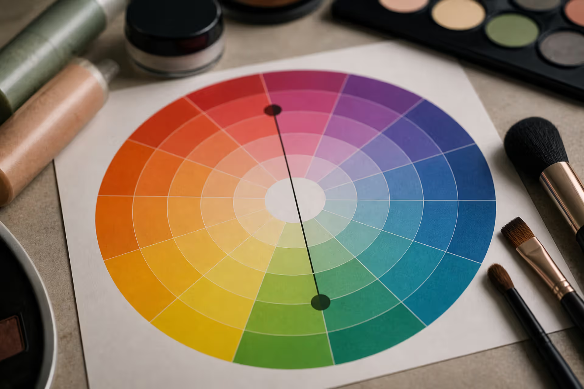
Green tones appearing where they shouldn't can be frustrating. Red cancels out green because these colors sit directly opposite on the color wheel. This principle applies across makeup, hair color, painting, and digital editing, giving you precise control over unwanted hues.
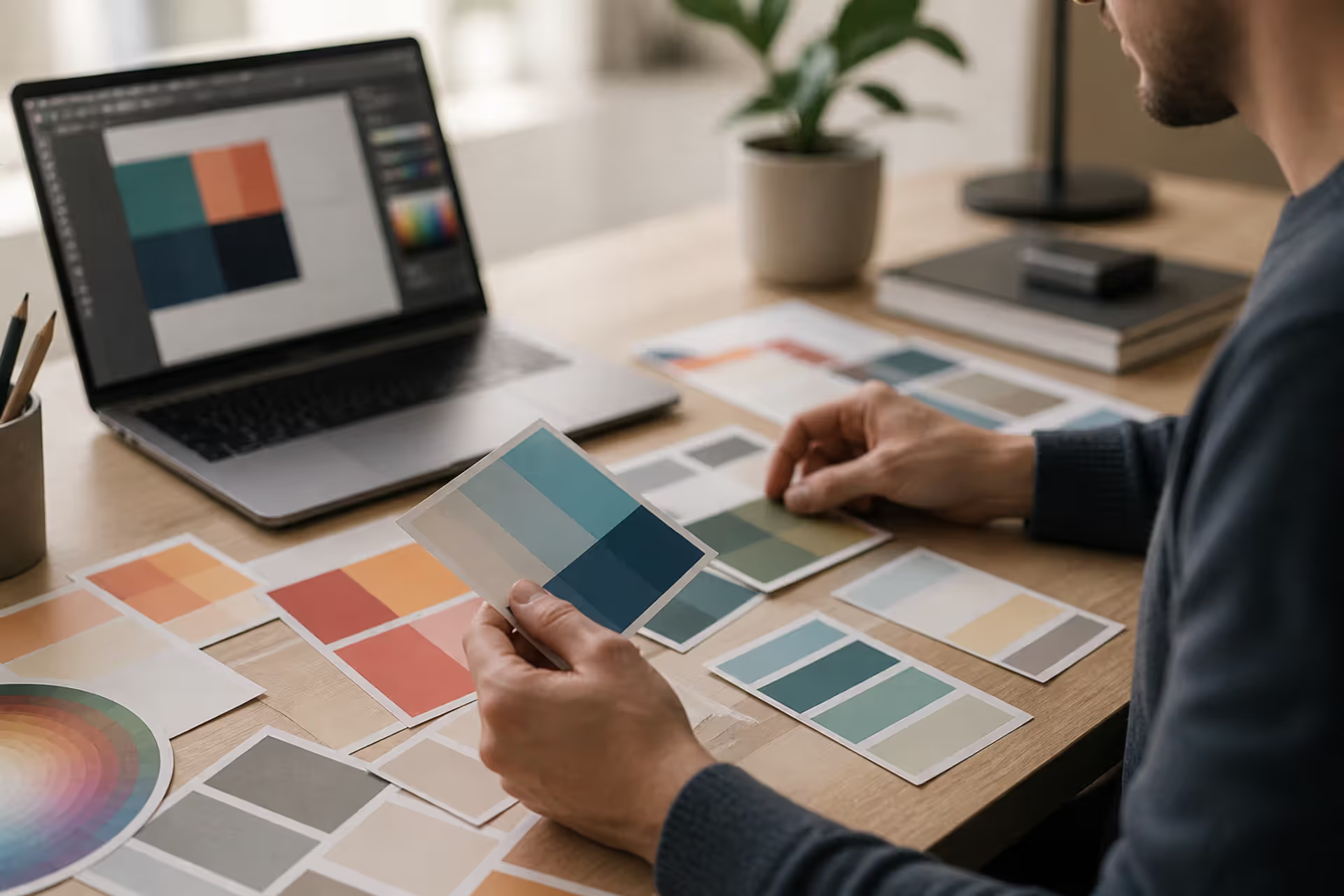
Discover the essential types of color palettes used in design, from monochromatic schemes to complex tetradic systems. Learn how each palette type works, when to use them, and how to choose the right colors for your specific project needs with expert insights and practical examples.
The rounded square has become the defining shape of digital interfaces. From app icons to buttons, this geometric form appears billions of times daily. Learn the mathematical differences between rounded squares, squircles, and superellipses, plus platform-specific implementation standards.
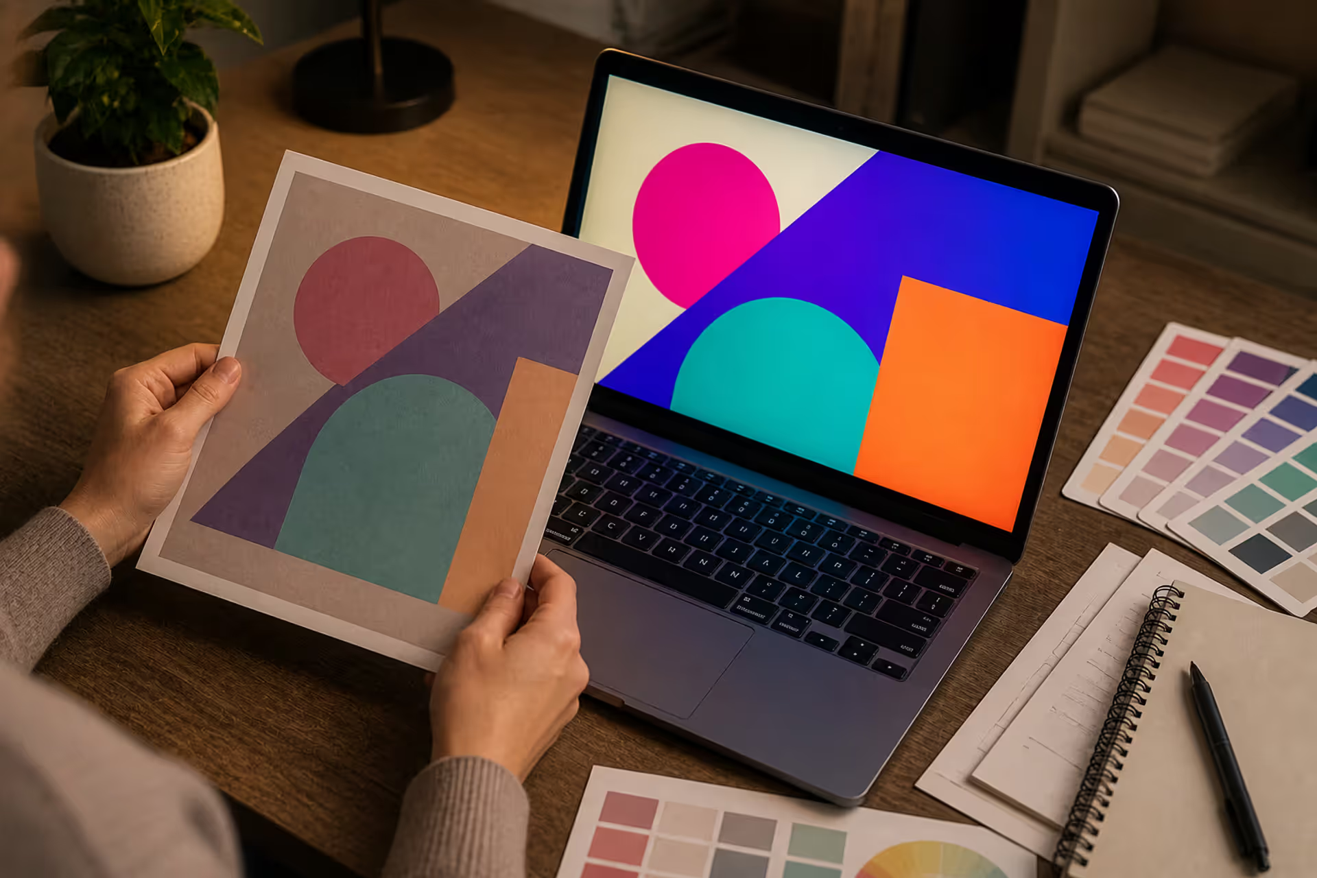
Converting RGB digital colors to PMS for print requires more than software—it demands understanding color gamut differences, using physical Pantone guides, and managing expectations. This comprehensive guide explains why screen colors don't translate directly to print and shows you proven methods for accurate color conversion.
The content on this website is provided for general informational and educational purposes only. It is intended to explain concepts related to digital design, visual art, color theory, art techniques, design principles, and design history.
All information on this website, including articles, guides, and examples, is presented for general educational purposes. Creative outcomes may vary depending on individual skill, tools, and practice.
This website does not provide professional design services or guarantee results, and the information presented should not be used as a substitute for formal education or professional consultation.
The website and its authors are not responsible for any errors or omissions, or for any outcomes resulting from decisions made based on the information provided on this website.