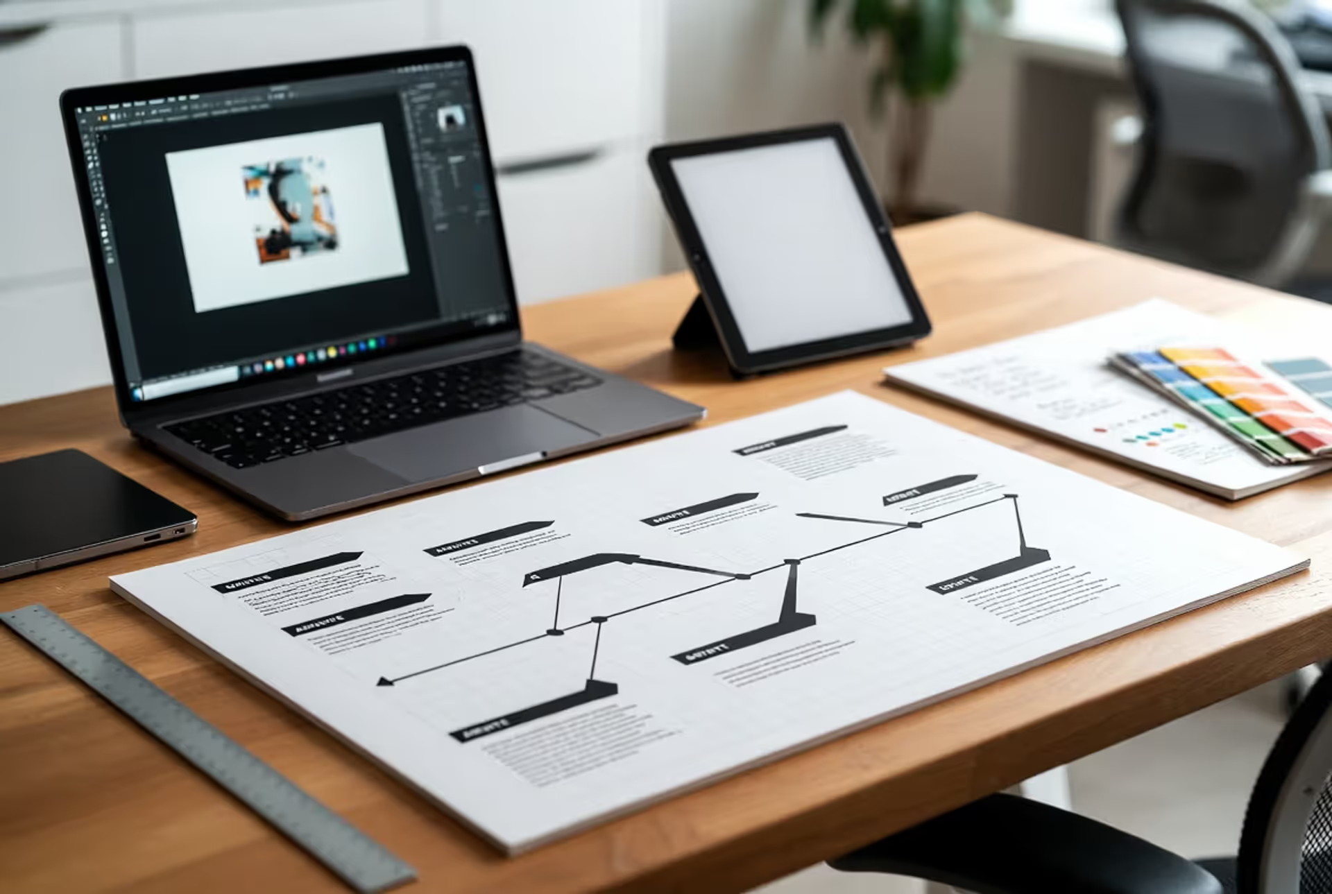
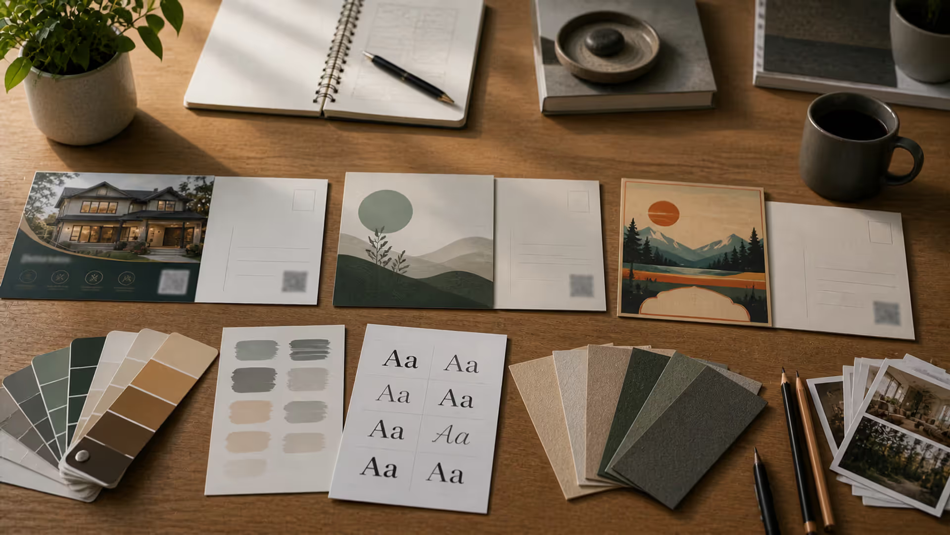
Walk into any design studio or open a wireframe template, and you'll likely encounter blocks of scrambled Latin text beginning with "Lorem ipsum dolor sit amet." This latin paragraph isn't a designer's attempt at classical scholarship—it's a deliberate tool that's been standard practice for centuries. Understanding why this peculiar text exists and how to use it properly can save you from common design pitfalls and help you create better visual layouts.
What Lorem Ipsum Text Actually Means
The most recognizable latin paragraph in design comes from a work by Roman philosopher Cicero, written in 45 BCE. Specifically, it's derived from "De Finibus Bonorum et Malorum" (The Extremes of Good and Evil), a treatise on ethics. The passage designers use today is a corrupted, scrambled version of sections 1.10.32 and 1.10.33.
The original Latin translates roughly to discussions about pain and pleasure in philosophical terms. However, the typographic filler content you see in mockups has been deliberately altered—words are truncated, rearranged, or removed entirely. The phrase "Lorem ipsum" itself comes from "dolorem ipsum," meaning "pain itself," though the word "Lorem" doesn't exist in classical Latin.
This corruption happened sometime during the 1500s when an unknown printer scrambled Cicero's text to create a type specimen book. The result is pseudo-Latin that looks authentic enough to suggest real content without being readable. That's precisely the point: if designers used actual readable text, reviewers would focus on the words rather than the visual presentation.
Richard McClintock, a Latin scholar at Hampden-Sydney College, traced the Lorem Ipsum origins back to Cicero in 1982 after encountering the obscure Latin word "consectetur" in the dummy text. His discovery confirmed what many suspected—this wasn't random gibberish but had classical roots.
The beauty of this latin paragraph lies in its letter frequency and word length distribution, which roughly mirrors natural English. Unlike typing "test test test" or using keyboard mashing, Lorem Ipsum creates realistic visual texture that helps designers evaluate how actual content will look.
Author: Olivia Hartwell;
Source: crafterholic.com
Why Designers Use Placeholder Paragraph Text
Designers rely on dummy body copy in design for three strategic reasons that go beyond simple convenience.
First, placeholder paragraph text prevents premature content critique. When you show a client a layout filled with actual draft copy—even clearly labeled as temporary—they'll inevitably focus on word choice, grammar, and messaging. This derails design conversations. Using nonsensical Latin forces stakeholders to evaluate what matters at that stage: visual hierarchy, spacing, typography, and overall composition.
Good design is as little design as possible.
— Siegel Daniel J.
Second, it simulates reading patterns without distraction. Human eyes recognize readable text and automatically start processing meaning. This cognitive engagement pulls attention away from design elements. A latin paragraph provides the visual weight and texture of real text while keeping viewers focused on form rather than content.
Third, dummy copy purpose in design includes maintaining professional presentation during iterative stages. Leaving content areas blank creates an unfinished appearance that undermines confidence. Placeholder text shows you've considered content volume and structure even when final copy isn't ready.
Consider a common scenario: you're designing a landing page for a product that's still in development. Marketing hasn't finalized messaging, but you need to present layout options. Using Lorem Ipsum lets you demonstrate how different headline lengths affect visual balance, how body text interacts with images, and whether your grid system accommodates varying content volumes—all without waiting for copywriters.
The practice also acknowledges a fundamental truth about design workflows: content and design rarely develop in perfect synchronization. Placeholder text bridges this timing gap without forcing designers to write copy (which isn't their expertise) or delaying projects until every word is finalized.
Author: Olivia Hartwell;
Source: crafterholic.com
When to Use Dummy Body Copy in Your Design Projects
Sample paragraph for mockups serves specific purposes at particular project stages. Knowing when to use—and when to avoid—placeholder text separates thoughtful designers from those who treat it as a permanent crutch.
Appropriate uses:
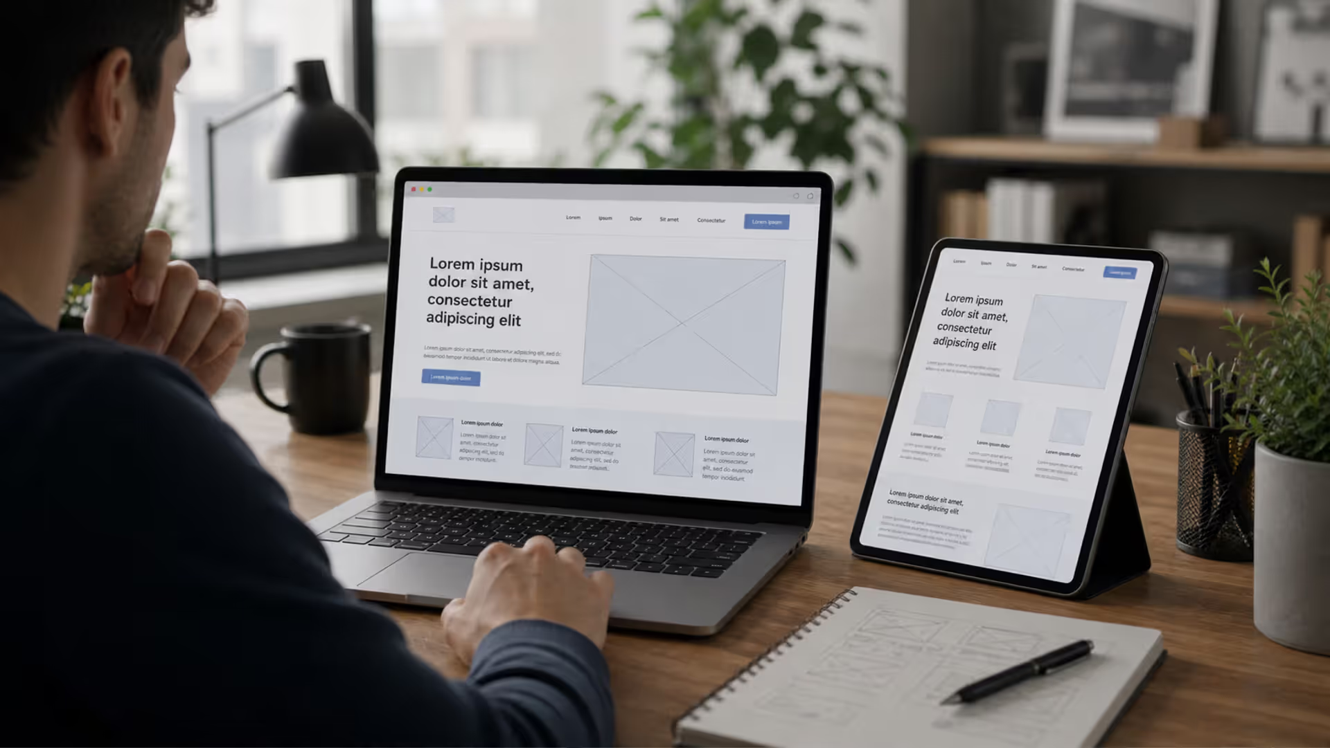
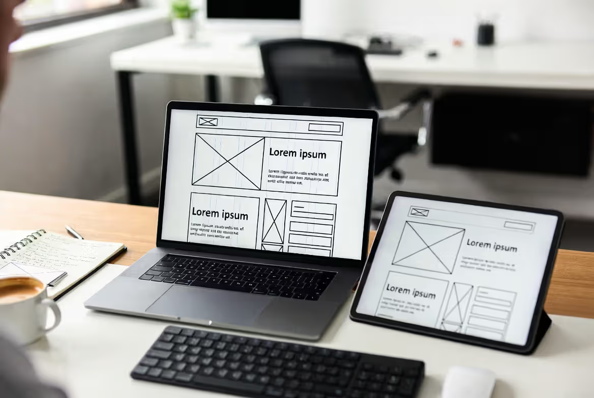
During wireframing, paragraph placeholder in design helps establish information architecture without content being finalized. You're mapping out where text blocks will live, their relative sizes, and how they'll interact with other elements. Actual words don't matter yet; structure does.
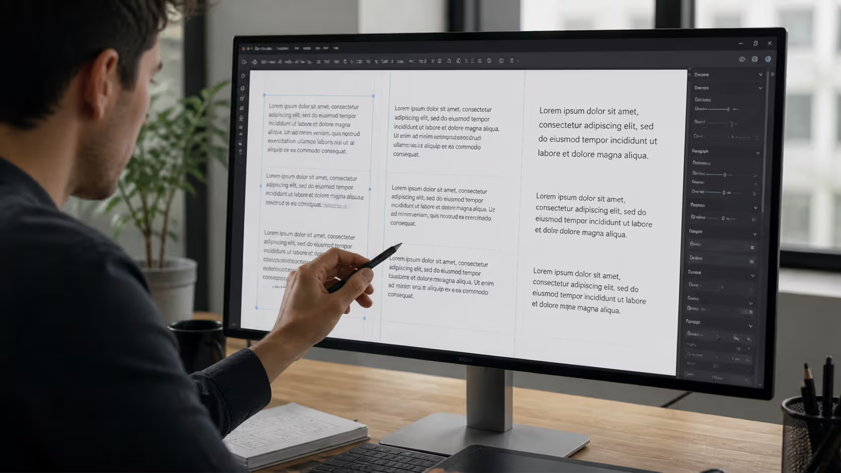
In early visual mockups, placeholder text lets you experiment with typography, color contrast, and spacing. You might test three different font pairings or adjust line height—tasks that don't require real content but do require realistic text volume.
For internal design reviews, dummy text keeps teams focused on design decisions rather than copy edits. When presenting to other designers or developers, Lorem Ipsum signals "evaluate the layout, not the words."
When to avoid placeholder text:
Never use it during user testing. Test participants need real or realistic content to evaluate whether they understand the interface, can complete tasks, or find information useful. Lorem Ipsum makes usability testing worthless because users can't assess clarity, tone, or helpfulness.
Don't use it in late-stage client presentations when content strategy should be locked. If you're presenting what's supposedly near-final designs, placeholder text signals the project is further behind than it should be.
Avoid it entirely in accessibility reviews. Screen readers will announce "Lorem ipsum dolor sit amet" to users who rely on them, providing no useful information. Testing with real content reveals whether your design actually serves all users.
Skip placeholder text when designing content-heavy interfaces like news sites or blogs. The relationship between headlines, subheads, pull quotes, and body text is too critical to fake. You need realistic content to make informed design decisions.
A practical rule: if stakeholders will interact with the design as if it's real, use real content. If they're evaluating visual structure and aesthetics, placeholder text is acceptable.
Author: Olivia Hartwell;
Source: crafterholic.com
Common Types of Text Block Placeholders in Layouts
While Lorem Ipsum dominates, designers have created numerous alternatives for filler paragraph in layouts, each with specific use cases:
Name
Origin/Theme
Best Use Case
Tone
Lorem Ipsum
Classical Latin (Cicero)
Professional business sites, corporate presentations, formal designs
Neutral, traditional, universally recognized
Cicero
Full, readable Cicero passages
Academic or publishing designs where Latin context is appropriate
Scholarly, authentic
Bacon Ipsum
Meat-themed placeholder
Food industry sites, casual restaurant branding, playful projects
Each text block in design layouts serves different presentation needs. Lorem Ipsum remains the safest choice for client presentations because it's immediately recognizable as placeholder content—no one will mistake it for draft copy.
Bacon Ipsum ("Bacon ipsum dolor amet andouille bresaola shank...") and similar themed generators add personality to internal mockups and can make long design sessions more enjoyable. However, they risk seeming unprofessional if shown to conservative clients who might question your seriousness.
Custom placeholder text using industry terminology strikes a middle ground. If you're designing a medical device interface, using realistic-sounding medical terms (even if nonsensical) helps stakeholders visualize how actual content will appear. This approach requires more effort but can prevent the "that won't work with our real content" objection that sometimes emerges when Lorem Ipsum creates false expectations about text length or complexity.
Some designers create project-specific placeholder text that matches expected content structure. For an e-commerce product page, they might use "Product name goes here / Price placeholder / Description of features and benefits" rather than Latin. This hybrid approach provides context while still clearly marking content as temporary.
How Filler Paragraph Content Affects Design Decisions
The body text placeholder explained reveals something crucial: dummy text isn't neutral. The placeholder you choose influences typography, spacing, and hierarchy decisions in ways that may not transfer to real content.
Lorem Ipsum's letter frequency roughly approximates English, but it's not identical. It contains more "m" and "n" characters than typical English prose, which can make text blocks appear denser. If you set line height based on Lorem Ipsum, real content might feel more cramped or loose once inserted.
Word length distribution matters enormously. Lorem Ipsum averages slightly longer words than conversational English. If your design looks balanced with Lorem Ipsum but the final content uses shorter, punchier words, you might end up with awkward line breaks and orphaned words.
Consider a common mistake: designing a card component with exactly three lines of Lorem Ipsum in the description area. The designer sets a fixed height assuming three lines. Then real content arrives—sometimes two lines, sometimes four—and the layout breaks. The layout text stand-in created false assumptions about content consistency.
Realistic content volume prevents this. If you're designing blog post cards, look at actual headlines from similar sites. Note that some are five words while others are fifteen. Design for that variability rather than assuming all content will match your placeholder's length.
Typography choices get tested more honestly with varied placeholder text. Try mixing long and short paragraphs, adding lists, including awkward word combinations that might create bad line breaks. Real content is messy and inconsistent—your placeholder should reflect that.
White space decisions also depend on text density. A layout with generous margins might look spacious with Lorem Ipsum but feel cramped with actual content that includes longer words, technical terms, or frequent paragraph breaks. Test your design with different text volumes: minimum expected content, maximum realistic content, and typical content.
Hierarchy becomes clearer when placeholder text includes realistic heading structures. Don't just use Lorem Ipsum for body text—create placeholder headlines, subheads, captions, and pull quotes that reflect actual content patterns. This reveals whether your typographic scale works across all content types.
Author: Olivia Hartwell;
Source: crafterholic.com
Mistakes to Avoid When Using Layout Text Stand-Ins
The most catastrophic error is leaving dummy copy in production. This happens more often than you'd think—a major company once launched a product page with Lorem Ipsum still in the FAQ section. Someone forgot to check, and placeholder text went live. Implement checklist processes before launch: search your codebase for "lorem," "ipsum," and "dolor" to catch stragglers.
Using inappropriate placeholder length creates false design confidence. If your placeholder paragraph is always exactly 150 words, you're not testing how your layout handles 50-word or 300-word variations. Real content rarely fits neat boundaries. Create placeholder text in realistic ranges: short, medium, and long versions for each content area.
Ignoring accessibility during placeholder stages means you'll discover problems too late. Even with dummy text, run screen reader tests. You'll learn whether your heading structure makes sense, if your content order is logical, and whether interactive elements are properly labeled—all independent of actual words.
Relying exclusively on Lorem Ipsum for every project becomes lazy. If you're designing a medical app, using medical terminology (even nonsensical combinations) helps stakeholders envision the final product more accurately. Customize your placeholder to match content context.
Not explaining placeholder text to stakeholders causes confusion. Some clients don't recognize Lorem Ipsum and wonder why you've filled their site with Latin. Include a note in presentations: "Placeholder text shown—final copy to be provided by [source]." This sets expectations and prevents misunderstandings.
Using placeholder text as an excuse to avoid content strategy is perhaps the subtlest mistake. Design and content should inform each other. If you're deep into visual design without any sense of messaging, tone, or content structure, you're designing in a vacuum. Placeholder text should be temporary—if weeks pass without real content emerging, that's a project management problem, not a design issue.
FAQ
What does Lorem Ipsum mean in English?
The Lorem Ipsum text is scrambled Latin from Cicero's "De Finibus Bonorum et Malorum," a philosophical work about ethics. The original passage discusses pain and pleasure, but the version used in design has been corrupted and rearranged so extensively that it's not coherent Latin. "Lorem ipsum" comes from "dolorem ipsum" (pain itself), but the full placeholder text doesn't translate to anything meaningful—which is exactly why it works as neutral filler.
Is it okay to use Lorem Ipsum in client presentations?
It depends on the presentation stage and client sophistication. For early-stage wireframes and initial design concepts, Lorem Ipsum is generally acceptable because it keeps focus on layout and structure. However, for near-final presentations or when working with clients unfamiliar with design processes, real or realistic content is better. Always explain that text is placeholder and set expectations about when final copy will be integrated. Some clients view Lorem Ipsum as a sign the project isn't progressing, even when that's not accurate.
Can placeholder text hurt SEO if left in a published site?
Absolutely. Search engines will index Lorem Ipsum as your actual content, which provides zero value to users and signals low-quality pages. A site with Lorem Ipsum in published pages will rank poorly because search algorithms detect meaningless content. Beyond SEO damage, it destroys user trust and looks profoundly unprofessional. Implement pre-launch checks that scan for common placeholder text strings to prevent this entirely avoidable mistake.
What are alternatives to Lorem Ipsum for mockups?
Numerous generators create themed placeholder text: Bacon Ipsum (meat terms), Cupcake Ipsum (desserts), Hipster Ipsum (trendy phrases), and Office Ipsum (corporate jargon). For more contextual alternatives, use industry-specific terminology relevant to your project, or create custom placeholder that matches expected content structure. Some designers prefer using excerpts from public domain books or generating text that mimics the tone and length of final content without being actual draft copy.
How much dummy text should I use in a layout?
Match realistic content volumes rather than arbitrary amounts. Research similar sites or content types to understand typical lengths. For a blog post card, check whether real headlines average eight words or fifteen. For product descriptions, note whether they're typically two sentences or two paragraphs. Create placeholder text in realistic minimum, maximum, and typical lengths so your design accommodates real-world variation rather than one idealized scenario.
Why is Lorem Ipsum better than random English text?
Random English sentences distract reviewers who read and critique the words rather than evaluating design. Lorem Ipsum's unfamiliarity (to most English speakers) keeps attention on visual elements: typography, spacing, hierarchy, and composition. It also avoids the problem of placeholder content accidentally being mistaken for draft copy. Additionally, Lorem Ipsum's letter frequency and word length distribution approximate natural language more closely than keyboard mashing or repeated words, making it more useful for testing realistic text flow.
The humble latin paragraph has served designers for centuries because it solves a specific problem: how to visualize content-dependent layouts before content exists. Lorem Ipsum and its alternatives let you make informed decisions about typography, spacing, and visual hierarchy without waiting for final copy or getting distracted by premature content critique.
Use placeholder text strategically—during wireframing, early mockups, and internal reviews—but replace it with real content before user testing or final presentations. Choose placeholder types that match your project's tone and always use realistic content volumes that reflect actual variation rather than idealized consistency.
Most importantly, treat dummy text as a temporary bridge, not a permanent solution. The best designs emerge from close collaboration between content and visual elements. Placeholder text should facilitate that collaboration by keeping projects moving forward, not become a crutch that delays necessary content strategy conversations.
When you understand both the purpose and limitations of layout text stand-ins, you'll use them more effectively and avoid the common pitfalls that undermine otherwise solid design work.
Master yearbook spread design with expert guidance on layout planning, grid systems, photo composition, and text balance. Learn to create two-page layouts that tell compelling stories while avoiding common mistakes and maintaining visual consistency across your yearbook.
Timeline arrows guide viewers through chronological information, transforming static data into dynamic narratives. This comprehensive guide covers arrow styles, process visualization techniques, common design mistakes, and practical tools for creating effective directional elements in timelines and infographics.
Symbols compress complex creative concepts into instant visual recognition. This comprehensive guide explores the psychology behind creativity symbols, catalogs the most effective options from lightbulbs to geometric forms, and provides a practical framework for choosing the right symbol for your design, branding, or communication project.
Learn professional postcard design principles for print and direct mail. Covers standard formats, layout composition, visual hierarchy, style approaches, and proven strategies that increase response rates. Includes size comparison chart, expert insights, and common mistakes to avoid.
The content on this website is provided for general informational and educational purposes only. It is intended to explain concepts related to digital design, visual art, color theory, art techniques, design principles, and design history.
All information on this website, including articles, guides, and examples, is presented for general educational purposes. Creative outcomes may vary depending on individual skill, tools, and practice.
This website does not provide professional design services or guarantee results, and the information presented should not be used as a substitute for formal education or professional consultation.
The website and its authors are not responsible for any errors or omissions, or for any outcomes resulting from decisions made based on the information provided on this website.