A misplaced logo can undermine months of brand-building work. When your logo appears stretched on a billboard, cramped against ad copy in a social post, or rendered in off-brand colors on a partner's website, you're not just breaking design rules—you're diluting brand recognition and confusing your audience.
Logo advertising standards exist to prevent these scenarios. They provide technical specifications and usage rules that ensure your brand mark appears consistently across every touchpoint, from print magazines to streaming video pre-rolls. These guidelines protect your visual identity while giving creative teams enough flexibility to produce compelling campaigns.
What Are Logo Advertising Standards
Logo advertising standards are technical specifications that govern how a brand mark appears in paid media placements. These standards address sizing, spacing, color reproduction, background treatments, and approved variations. They ensure that whether someone sees your ad in a subway car or on their smartphone, the logo communicates the same brand identity.
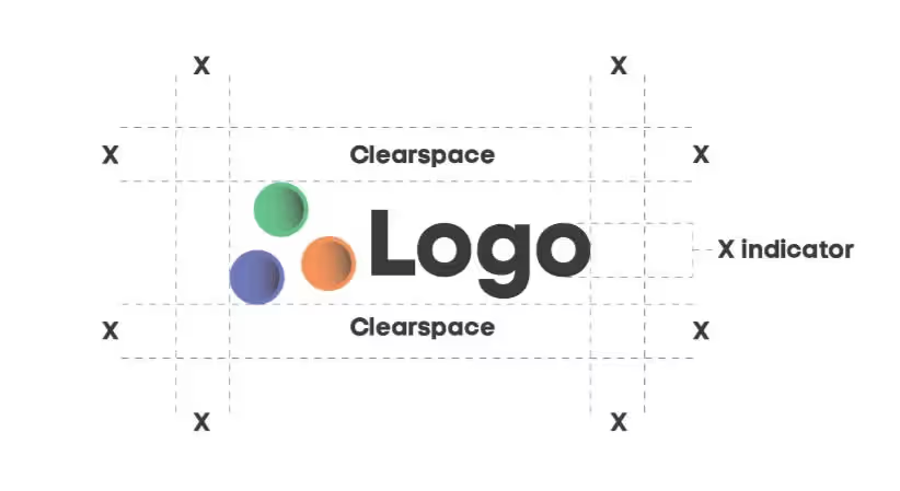
Clearspace defines the minimum protected area around your logo where no other visual elements—text, graphics, borders, or competing logos—should intrude. This buffer zone prevents visual clutter and maintains legibility. Most brands calculate clearspace using the X-height method, where X equals a specific element within the logo itself (often the height of a particular letter or icon component). A typical clearspace requirement might be 2X on all sides.
Minimum size specifications prevent logos from shrinking below the threshold of legibility. A logo that works beautifully at billboard scale may become an unreadable blob at business card dimensions. Brand guidelines typically specify minimum dimensions in both pixels (for digital) and inches or millimeters (for print). These aren't arbitrary—they're based on testing to determine when fine details become indistinguishable.
Approved variations acknowledge that one logo configuration doesn't work everywhere. A horizontal lockup might fit perfectly in a website header but fail in a square social media profile image. Standards documentation should include primary, secondary, and icon-only versions, along with rules for when each is appropriate. Color variations—full color, single color, reversed (white on dark backgrounds)—expand flexibility while maintaining recognizability.
Brand identity in advertising depends on these technical guardrails. Without them, every designer, agency partner, and media vendor makes independent decisions about how to treat your logo, leading to inconsistency that weakens brand recall. Research consistently shows that consistent brand presentation increases revenue—one frequently cited study suggests by as much as 23%—making these guidelines a business imperative, not just a design preference.
Logo Placement Rules in Different Ad Formats
Different advertising formats present unique challenges for logo placement. A brand mark that's perfectly positioned in a magazine spread needs different treatment in a six-second bumper ad or a vertical Instagram Story.
Author: Olivia Hartwell;
Source: crafterholic.com
Print Advertising Requirements
Print advertising offers the most control over logo presentation. Resolution requirements are paramount—logos should be vector-based or rasterized at minimum 300 DPI at actual size. Anything less risks visible pixelation or jagged edges, particularly in high-quality publications.
Position conventions vary by ad size and layout. Full-page ads typically place the logo in the lower right corner or center bottom, where the eye naturally lands after scanning the ad content. This follows the Z-pattern reading flow common in Western cultures. Smaller print ads—quarter-page or business card sizes—often require the logo in the upper left or upper right to establish brand identity immediately.
Background considerations matter more in print than digital. Coated paper stocks can create glare that obscures logos, while uncoated stocks may cause ink spread that affects fine details. Your logo treatment in print ads should account for the publication's paper quality. A logo with thin strokes might need a bolder variation for newsprint versus glossy magazine stock.
Bleed specifications affect logo placement near page edges. Most print production requires a 0.125-inch bleed zone. Logos placed too close to trim edges risk being cut off during the binding process. Maintain at least 0.25 inches between your logo's clearspace boundary and the trim line.
Digital and Social Media Specifications
Digital platforms introduce variables that print doesn't: screen resolution differences, responsive design requirements, and platform-specific aspect ratios. Your logo must remain recognizable whether viewed on a 27-inch desktop monitor or a 5.5-inch smartphone screen.
Display advertising typically uses the lower right corner for logo placement, mirroring print conventions. However, responsive ads that resize automatically need careful attention. Set minimum size requirements that trigger a simplified logo version when the ad scales below a certain threshold. A detailed logo with tagline might reduce to an icon-only version at mobile sizes.
Social media platforms each impose unique constraints. Instagram feed posts (1:1 ratio) need different logo placement than Stories (9:16 ratio) or landscape Facebook posts (1.91:1 ratio). Profile images across platforms are typically circular or rounded square, requiring a square logo variation that works when cropped to a circle. Text and critical elements should stay within the center 80% of the square to avoid being cut off.
Logo visibility guidelines for social media must account for platform interface elements. Instagram Stories place user information at the top and interaction prompts at the bottom. Your logo should avoid these zones—typically the top 14% and bottom 20% of the frame. Similar safe zones exist for YouTube end screens, TikTok interface elements, and LinkedIn sponsored content.
Video and Broadcast Guidelines
Motion adds complexity. Broadcast advertising requires logos to remain visible but not distracting. The lower third of the screen—specifically the right corner—has become standard for logo placement in video ads, avoiding conflict with network bugs, closed captions, and safe title areas.
Minimum display duration matters. A logo that flashes for one second in a 30-second spot doesn't build recognition. Industry practice suggests logos should appear for at least 3-4 seconds, typically as an end card or lower-third bug throughout the ad. Some brands use both: a subtle presence during the narrative and a prominent end card with tagline.
Safe title and safe action areas prevent logos from being cropped by older television sets or different aspect ratio displays. Although modern TVs display edge-to-edge, broadcast standards still recommend keeping logos within 90% of the frame width and height (5% margin on all sides) to ensure visibility across all viewing devices.
Resolution requirements for video have increased with 4K becoming standard. Logos should be provided as high-resolution assets—vector when possible, or rasterized at 4K dimensions minimum. This ensures sharpness whether the ad runs on streaming platforms, broadcast television, or cinema pre-roll.
Clearspace and Proportions for Logo Visibility
Clearspace protects your logo from visual competition. Think of it as the logo's personal space—an area where nothing else belongs. This buffer ensures that even in cluttered advertising environments, your brand mark remains distinct and legible.
The X-height method provides a scalable measurement system. Identify a specific element within your logo—perhaps the height of a capital letter, the width of an icon component, or the thickness of a particular stroke. This measurement becomes your X unit. If your guidelines specify 2X clearspace, you measure two times that unit's dimension and apply it as minimum spacing on all sides.
For example, if your logo includes a wordmark where the capital letters measure 20 pixels tall, and your standard is 2X clearspace, you need 40 pixels of protected space above, below, left, and right of the logo. This measurement scales proportionally—when the logo doubles in size, the clearspace doubles automatically.
Minimum clearspace zones sometimes vary by side. A logo might require 2X on the left and right (where it's most likely to encounter competing elements) but only 1.5X on top and bottom. Asymmetric clearspace accounts for real-world usage patterns while maintaining protection where it matters most.
Logo proportions in media must remain locked. Stretching or squashing a logo—even slightly—damages brand recognition. The human eye detects these distortions, even if the viewer can't consciously identify what looks wrong. Always resize logos proportionally by dragging corner handles (not side or top handles) or by linking width and height dimensions in design software.
Incorrect spacing examples illustrate why these rules exist. A logo placed immediately adjacent to ad copy creates visual tension—the two elements compete for attention rather than working together. A logo overlapping a busy photograph loses definition as background elements intrude into its space. A logo sized so small that its clearspace requirement would extend beyond the ad boundaries indicates the logo needs to be larger or the ad layout needs revision.
Correct application shows the logo breathing within its space, clearly separated from headlines, body copy, images, and borders. The eye should be able to isolate the logo instantly without sorting through visual clutter.
Author: Olivia Hartwell;
Source: crafterholic.com
Common Logo Treatment Mistakes in Campaigns
Even experienced designers make logo errors under deadline pressure. Recognizing common mistakes helps you catch them before ads go live.
Stretching or squashing tops the list. When an ad layout almost works but the logo is slightly too wide, the temptation to compress it horizontally is strong. Don't. A distorted logo signals carelessness and undermines the professionalism of your entire campaign. If the logo doesn't fit, revise the layout.
Wrong colors happen when designers don't have access to proper brand assets. Someone eyeballs the brand color or uses an incorrect file, resulting in a logo that's close but noticeably off. Color shifts are particularly problematic in print, where CMYK conversion from RGB can alter hues if not properly managed. Always provide color specifications in multiple formats: Pantone for spot color printing, CMYK for process printing, RGB for digital, and hex codes for web.
Poor contrast renders logos invisible. A dark blue logo on a black background might seem edgy, but it fails the fundamental test of visibility. Similarly, light logos on light backgrounds disappear. When ad imagery creates contrast problems, solutions include: using the reversed (white) logo version on dark areas, adding a subtle background shape or glow behind the logo, or repositioning the logo to a higher-contrast area of the composition.
Cluttered backgrounds violate the clearspace principle. Placing a logo over a busy photograph, complex pattern, or textured surface creates visual noise that interferes with recognition. If the ad concept requires the logo over imagery, ensure the background area is simplified—perhaps through blur, darkening, lightening, or adding a semi-transparent overlay that creates a clean zone for the logo.
Ignoring exclusion zones occurs when designers don't consult the brand guidelines. They might add drop shadows, outlines, or other effects that aren't approved. They might rotate the logo at an angle for artistic effect. They might separate logo components that should remain locked together. Each of these treatments, while potentially creative, deviates from the established brand identity.
Inconsistent versions across a campaign confuse audiences. One ad uses the horizontal logo with tagline, another uses the icon only, a third uses an outdated version from three years ago. This inconsistency suggests organizational chaos rather than intentional brand flexibility. Establish which logo variation is primary for each campaign and use it consistently across all placements.
Brand assets in advertising should come from a single source of truth—a digital asset management system or brand portal where approved, current logo files live. When everyone pulls from the same repository, version control problems decrease dramatically.
Author: Olivia Hartwell;
Source: crafterholic.com
Maintaining Brand Identity Across Multiple Channels
Consistent logo use in campaigns requires systems, not just guidelines. A PDF document outlining logo rules doesn't enforce compliance—you need processes that make correct usage easier than incorrect usage.
Asset management systems centralize logo files and related brand assets. Platforms like Bynder, Brandfolder, or Frontify provide controlled access where team members and agency partners can download approved assets but can't upload modified versions. These systems often include usage guidelines embedded directly with each asset, so designers see the clearspace requirements and color specifications while downloading the logo file.
Version control becomes critical when logos evolve. A brand refresh might introduce a new logo while the old version still appears in materials already in production. Your asset management system should clearly label which version is current and archive outdated versions with prominent "do not use" warnings. Set a sunset date when old materials must be replaced.
Approval workflows catch errors before publication. Establish a review process where brand guardians—whether in-house marketing team members or agency creative directors—verify logo treatment before ads go live. This review should check:
Correct logo version for the format and context
Proper sizing (meeting minimum size requirements)
Adequate clearspace on all sides
Approved color variation
Appropriate background contrast
No unauthorized effects or modifications
Correct file format and resolution
Vendor guidelines extend brand control to third parties. When working with media partners, co-marketing sponsors, or retail partners who will display your logo, provide simplified one-page usage guides specific to their needs. A retail partner doesn't need your complete 60-page brand book—they need clear specs for how to use your logo on shelf signage and promotional materials.
Adapting while preserving integrity requires judgment. A logo might need simplification for embroidery on promotional products, where fine details don't translate to thread. It might need a high-contrast version for fax or photocopying (yes, some industries still use these). It might need animation principles for video applications. These adaptations should be documented as approved variations, not left to individual interpretation.
Different contexts demand different approaches, but the core brand identity should remain recognizable. A simplified version is still clearly your logo. A monochrome version still communicates your brand. The moment an adaptation becomes unrecognizable, it's no longer serving its purpose.
Logo Usage Checklist for Advertisers
Before any ad goes live, run through this verification process:
File quality check: - Vector format (AI, EPS, or SVG) for print and scalable applications - High-resolution raster (PNG with transparency, minimum 300 DPI at actual size) for digital - Correct color mode (CMYK for print, RGB for digital) - No compression artifacts or pixelation visible at 100% zoom
Sizing verification: - Logo meets minimum size requirements for the medium - Logo is large enough that clearspace requirements don't exceed available space - Logo maintains locked proportions (width-to-height ratio unchanged from original) - Logo is visible and legible at the smallest size the ad will appear (mobile for digital, actual print size for print)
Clearspace confirmation: - Measure clearspace on all four sides using the X-height method - Verify no text, graphics, borders, or other elements intrude into clearspace - Check that clearspace doesn't extend beyond ad boundaries (if it does, logo needs to be smaller) - Confirm background within clearspace is clean and uncluttered
Color and contrast: - Logo uses approved brand colors (match against Pantone, CMYK, RGB, or hex specifications) - Sufficient contrast exists between logo and background (minimum 4.5:1 ratio for accessibility) - If logo is placed over imagery, background area provides adequate contrast - Reversed (white) logo version used appropriately on dark backgrounds
Treatment compliance: - No stretching, squashing, rotating, or distorting - No unauthorized effects (drop shadows, outlines, glows) unless specifically approved - No separating logo components that should remain locked together - No recreating or redrawing the logo - Correct logo variation for the context (horizontal vs. stacked vs. icon-only)
Format-specific requirements: - Print: Resolution minimum 300 DPI, appropriate bleed and trim allowances - Digital display: Meets platform size specs, responsive behavior tested - Social media: Safe zones respected, platform-specific aspect ratios correct - Video: Minimum display duration met, safe title areas observed, resolution sufficient for playback quality
Legal and compliance: - Logo doesn't appear to endorse competing products or problematic content - Co-branding arrangements follow approved lockup specifications - Trademark symbol (® or ™) included if required by guidelines - No modifications that could dilute trademark protection
This checklist should be completed by someone other than the ad's designer when possible. Fresh eyes catch errors that become invisible through familiarity.
Logo Minimum Size Requirements by Media Type
Media Type
Minimum Width
Minimum Height
Clearspace Standard
Notes
Print (magazine/newspaper)
0.75 inches
0.5 inches
2X all sides
Based on 300 DPI; smaller sizes lose detail
Digital display ads
120 pixels
80 pixels
1.5X all sides
Consider high-DPI screens; test on mobile
Social media posts
100 pixels
100 pixels
1X minimum
Platform UI elements require additional margin
Social media profile images
180 pixels
180 pixels
Icon version only
Assumes circular crop; keep elements centered
Video/broadcast
150 pixels
100 pixels
2X, within safe title area
Minimum 3-second display duration
Outdoor/billboard
24 inches
16 inches
3X all sides
Viewed from distance; bolder versions preferred
Email signatures
150 pixels
100 pixels
1X all sides
Balance visibility with email load time
Mobile app interfaces
120 pixels
80 pixels
1.5X all sides
Test across iOS and Android rendering
Logo consistency isn't about being rigid—it's about being recognizable. When your audience sees your brand mark, whether on a billboard or a mobile banner ad, that instant recognition is what you've paid to build. Every time we allow an off-brand treatment, we're asking customers to relearn who we are.
— Jennifer Martinez
FAQ
What is the minimum size a logo should appear in an ad?
Minimum logo size depends on the medium and the logo's complexity. For print advertising, most brands specify 0.75 inches wide as an absolute minimum, though simpler logos may remain legible slightly smaller. Digital display ads typically require at least 120 pixels wide. These minimums exist because below certain thresholds, fine details become indistinguishable and the logo loses impact. Test your specific logo at various sizes to determine where legibility breaks down, then set your minimum slightly above that point. Logos with intricate details or thin letterforms need larger minimum sizes than bold, simple marks.
How much clearspace should surround a logo in advertising?
Standard clearspace ranges from 1X to 3X, where X represents a specific measurement derived from the logo itself—typically the height of a letter or icon element. Most brands use 2X clearspace for general advertising applications, providing adequate breathing room without consuming excessive ad space. Outdoor advertising often requires 3X clearspace because viewing distances are greater and visual competition from surrounding environment is more intense. Social media might use 1X minimum due to space constraints, but additional margin should be added to account for platform interface elements. The goal is ensuring the logo remains visually distinct from surrounding content without appearing isolated or disconnected from the ad's message.
Can I change my logo colors for different ad campaigns?
Only if your brand guidelines specifically include approved color variations. Most brands provide several sanctioned options: full color, single color in brand primary, black, white (reversed), and sometimes grayscale. These variations handle different background situations and printing limitations while maintaining brand recognition. Creating custom colors for specific campaigns—like changing your blue logo to pink for a breast cancer awareness initiative—typically requires explicit approval from brand leadership and should be documented as a limited-time exception. Unapproved color changes risk diluting brand identity and confusing audiences about your visual identity. When special circumstances require color adaptation, ensure the logo remains recognizable through shape and proportion alone.
What file formats should I use for logos in print vs. digital ads?
Print advertising requires vector formats (AI, EPS, or PDF) whenever possible because they scale infinitely without quality loss and provide the sharp edges essential for professional printing. If raster formats are necessary, use TIFF or high-resolution PNG at 300 DPI minimum at actual size, in CMYK color mode. Digital advertising works best with PNG files (for transparency support) or SVG (vector for web). RGB color mode is standard for digital. Resolution should be at least 2x the display size to account for high-DPI screens (Retina displays, 4K monitors). Avoid JPEG for logos due to compression artifacts that damage edge quality. Maintain a library of format-specific files rather than converting a single file for different uses, as each conversion introduces potential quality degradation.
How do I maintain logo consistency across multiple advertising channels?
Implement a centralized digital asset management system where approved logo files and usage guidelines live. This single source of truth prevents version control problems and ensures everyone—internal teams, agency partners, media vendors—accesses identical, current assets. Establish approval workflows requiring brand team review before ads publish. Create channel-specific quick-reference guides that show proper logo treatment for each platform (one page for social media, one for print, one for video). Train all stakeholders on brand standards and the reasoning behind them—people follow rules better when they understand the purpose. Schedule regular audits of published materials to catch and correct inconsistencies. When errors appear, treat them as system failures rather than individual mistakes, and adjust processes to prevent recurrence.
What are the most common logo usage violations in advertising?
Stretching or compressing logos to fit layouts ranks as the most frequent violation, distorting proportions and undermining brand professionalism. Using outdated logo versions occurs often when teams lack access to current assets or don't realize the logo has been updated. Insufficient clearspace happens when designers prioritize other ad elements over logo breathing room, crowding the brand mark with copy or images. Poor color matching results from eyeballing brand colors rather than using specified values, creating logos that are close but noticeably off-brand. Placing logos over busy backgrounds without ensuring adequate contrast makes them illegible. Adding unauthorized effects—drop shadows, outlines, gradients not in the original—modifies the brand identity. Finally, using wrong logo variations for the context, like forcing a horizontal lockup into a square space rather than using the approved stacked version, creates awkward compositions that could be avoided with proper asset selection.
Logo advertising standards aren't creative restrictions—they're tools that protect your brand investment while giving creative teams clear parameters for effective work. When everyone understands the technical requirements for clearspace, sizing, color, and placement, decisions become faster and results become more consistent.
The brands that maintain strongest recognition across advertising channels are those that treat logo guidelines as non-negotiable foundations, not suggestions. They build systems—asset management platforms, approval workflows, vendor education—that make compliance the path of least resistance. They audit their advertising regularly, catching violations quickly and adjusting processes to prevent repetition.
Your logo represents significant brand equity. Every appearance in advertising either reinforces that equity or diminishes it. Stretched logos, wrong colors, inadequate clearspace, poor contrast—these aren't minor aesthetic issues. They're missed opportunities to build the instant recognition that makes advertising investment worthwhile.
Start with the checklist provided here. Verify that your current advertising meets these standards. Identify gaps in your asset management or approval processes. Document your logo requirements in formats appropriate for different audiences—detailed specifications for designers, simplified guides for vendors, quick-reference cards for internal teams.
Brand consistency in advertising compounds over time. Each correct logo treatment adds to cumulative recognition. Each violation requires audiences to work harder to identify your brand. Make the correct choice the easy choice, and your logo will do the work it's designed to do: communicate your brand identity instantly, regardless of where or how your advertising appears.
Master yearbook spread design with expert guidance on layout planning, grid systems, photo composition, and text balance. Learn to create two-page layouts that tell compelling stories while avoiding common mistakes and maintaining visual consistency across your yearbook.
Timeline arrows guide viewers through chronological information, transforming static data into dynamic narratives. This comprehensive guide covers arrow styles, process visualization techniques, common design mistakes, and practical tools for creating effective directional elements in timelines and infographics.
Symbols compress complex creative concepts into instant visual recognition. This comprehensive guide explores the psychology behind creativity symbols, catalogs the most effective options from lightbulbs to geometric forms, and provides a practical framework for choosing the right symbol for your design, branding, or communication project.
Learn professional postcard design principles for print and direct mail. Covers standard formats, layout composition, visual hierarchy, style approaches, and proven strategies that increase response rates. Includes size comparison chart, expert insights, and common mistakes to avoid.
The content on this website is provided for general informational and educational purposes only. It is intended to explain concepts related to digital design, visual art, color theory, art techniques, design principles, and design history.
All information on this website, including articles, guides, and examples, is presented for general educational purposes. Creative outcomes may vary depending on individual skill, tools, and practice.
This website does not provide professional design services or guarantee results, and the information presented should not be used as a substitute for formal education or professional consultation.
The website and its authors are not responsible for any errors or omissions, or for any outcomes resulting from decisions made based on the information provided on this website.