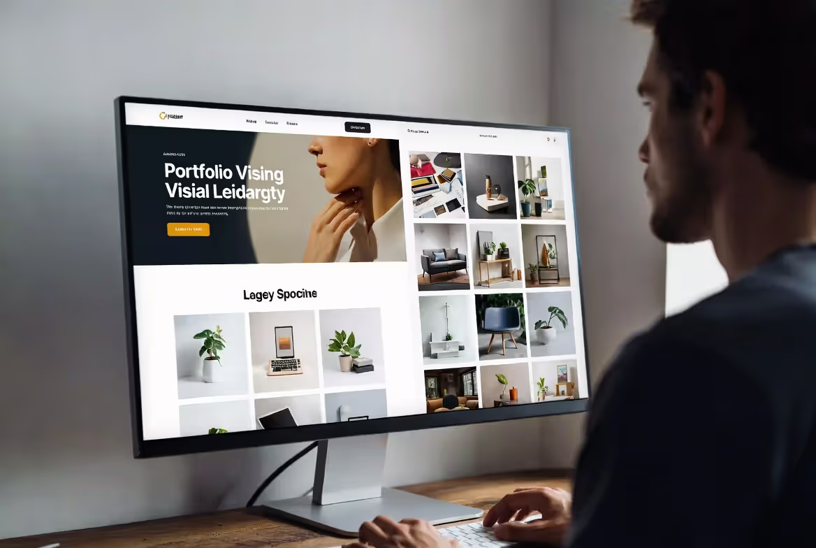
Here's what kills most portfolio sites: designers get so excited showing off their skills that they forget why anyone visits in the first place. Someone lands on your page because they want to see your work—quickly, clearly, without solving a puzzle to find it.
I've reviewed hundreds of creative portfolios, and the pattern repeats itself. The designers who land clients have sites that get out of the way. The ones who don't? Their portfolios are basically art projects that happen to have a contact form buried somewhere.
Your portfolio sits in this weird space where it needs to prove you understand design while staying functionally invisible. That's not a contradiction—it's just hard. You need to grasp principles that matter specifically for showcasing creative work, not the generic website advice everyone repeats.
Visual Hierarchy Principles for Design Portfolios
Think about visual hierarchy on web pages like this: you're directing someone's eyes around a room. Where do they look first? What catches their attention next? What do they notice last, if at all?
On portfolio sites, you're controlling exactly that sequence. Mess it up, and people scan randomly before leaving. Get it right, and you've created a deliberate path through your best work.
Size is your heaviest hammer. Make something twice as big, and it gets noticed first. Simple. A project preview stretching 900 pixels across the screen grabs attention before anything at 450 pixels does. But here's the trap—if everything's huge, nothing stands out. You've just made a loud, uniform wall of content.
Contrast adds the second layer. Place a black-and-white photograph against a cream background, and you've created a focal point. Surround it with similar cream-toned elements, and those fade into supporting roles. This works because our eyes naturally track differences in brightness and color before anything else.
Color creates emotional weight and priority. Pick an accent color—maybe a saturated orange or electric blue—and use it only on elements that deserve attention. Featured project links. Call-to-action buttons. Important labels. When everything shares the same color intensity, you've got visual mush. Reserve your boldest colors for elements you want clicked first.
Spacing determines breathing room and importance. Wrap significant whitespace around your hero project, and you're signaling "this matters most." Cluster secondary projects together with minimal gaps, and they become a supporting ensemble rather than individual stars.
Here's what effective hierarchy looks like in practice: Your homepage opens with one featured project image occupying 70% of the viewport (size), positioned against a contrasting neutral background (contrast), with a bright accent-colored button reading "View Full Case Study" (color), all surrounded by generous margins (spacing). Scroll down, and you see smaller project thumbnails arranged in a tighter grid—instantly communicating their secondary status.
Ineffective hierarchy? A grid of identically-sized thumbnails, all using similar contrast levels, no color variation, uniform spacing throughout. Your visitor's eyes bounce around finding no entry point. They'll either scan randomly or just leave.
Quick test: show your site to someone who's never seen it. Give them three seconds, then hide it. What do they remember? If they can't name the most important element, your hierarchy needs work.
Author: Olivia Hartwell;
Source: crafterholic.com
Grid Systems and Layout Structure
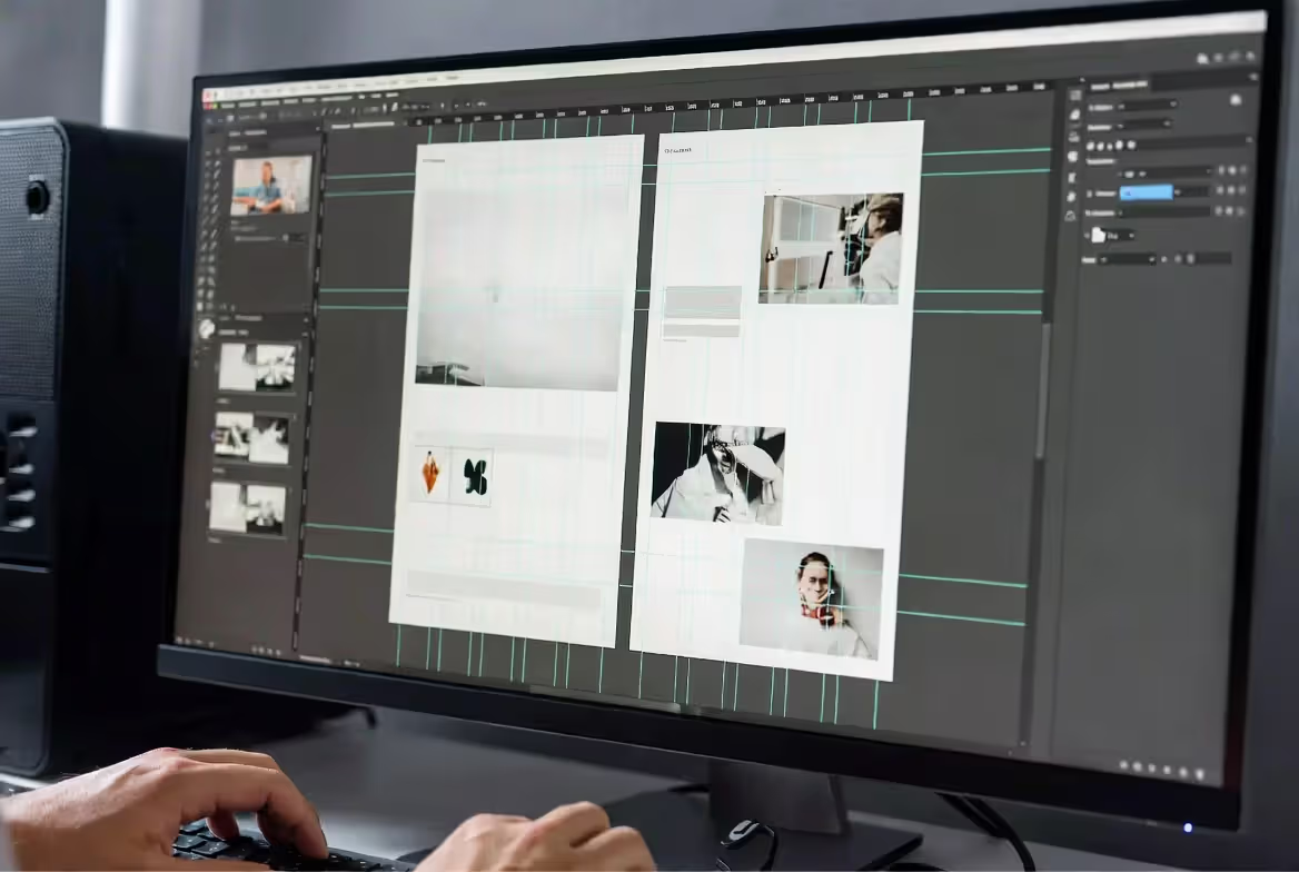
Grid systems in web design function like the studs inside your walls—invisible structure that keeps everything from collapsing. For portfolios, they're especially valuable because you're wrangling different content types (landscape photos, portrait illustrations, videos, text blocks) that need to coexist without looking chaotic.
A twelve-column grid gives you the most flexibility without overthinking it. Need full-width? Span all twelve columns. Half-width? Use six columns. Thirds? Four columns each. The math works cleanly for most layouts. Some designers swear by 16 or 24-column grids, but honestly? That added complexity rarely pays off for portfolio work.
Column gutters—those gaps between columns—typically run 20 to 40 pixels wide. Tighter gutters (20-25px) pack energy and density into your layouts, which works great for portfolios with bold, graphic work. Wider gutters (35-40px) create calm, giving detailed pieces room to breathe. A portfolio of intricate botanical illustrations benefits from wider spacing; a branding showcase of punchy logos can handle tighter arrangements.
Asymmetric layouts break monotony by varying how many columns elements occupy. One row might show a six-column image beside a six-column text block. The next row features an eight-column image next to a four-column caption. This creates visual interest while maintaining underlying structure. Symmetric layouts mirror their column arrangements—producing balanced, formal compositions that work beautifully for minimal portfolios.
The key with layout principles for design sites: establish your grid, then intentionally break it for emphasis. Most of your content respects the column structure. Then occasionally—maybe once per page—you let a full-bleed image escape the boundaries completely. That violation creates impact precisely because you've established a pattern first.
Author: Olivia Hartwell;
Source: crafterholic.com
One-Page vs. Multi-Page Portfolio Layouts
One page website layout examples work best when you've got a focused specialty and limited project count. Five UX case studies? Sure, present them all on a single scrolling page with anchor navigation jumping between sections. No page load delays, continuous narrative, done.
Multi-page layouts make sense when you're juggling diverse work that needs categorization. A studio handling branding, web design, and packaging can't dump everything on one page without overwhelming visitors. You need separate pages—or at minimum, robust filtering—to prevent chaos.
Comparing the approaches:
ONE-PAGE PORTFOLIOS - Works best for: Designers showing 3-8 projects in a single discipline who want storytelling flow - Advantages: Eliminates page load friction, creates narrative continuity, scrolls naturally on mobile - Drawbacks: Gets exhausting beyond 8 projects, makes deep-linking harder, limits SEO targeting options - Who uses this: Freelance illustrators building their first site, recent design graduates, specialists in narrow niches
MULTI-PAGE PORTFOLIOS - Works best for: Studios with 10+ projects, multiple service categories, or complex case studies - Advantages: Better SEO opportunities, visitors navigate directly to relevant work, cleaner structure - Drawbacks: Every click risks losing attention, temptation to design pages inconsistently - Who uses this: Design agencies, freelancers working across disciplines, established studios with extensive portfolios
HYBRID APPROACHES - Works best for: Medium-sized portfolios wanting scroll flow with project depth - Advantages: Maintains scrolling momentum while allowing detailed case study overlays - Drawbacks: Modal windows feel cramped on phones, back-button behavior confuses users - Who uses this: Photographers, web designers, motion designers who need visual flow plus context
Your choice also depends on how much explanation each project needs. Extensive case studies detailing research, process, iterations, and outcomes? Multi-page structure prevents endless scrolling. Work that speaks for itself through visuals alone? One-page layouts maintain momentum.
Responsive Grid Considerations
Desktop grids don't just shrink—they transform on mobile. Your four-column desktop grid typically collapses to two columns on tablets, then a single column on phones. Plan for this transformation from day one, not after you've built the desktop version.
Responsive breakpoints should follow your content, not device dimensions. If your three-column project grid looks cramped at 875 pixels wide, set a breakpoint right there to switch to two columns. Doesn't matter if that doesn't match any specific device—your content dictates the rules.
Image aspect ratios affect responsive grids more than you'd think. Mix vertical images with horizontal ones in a multi-column grid, and you'll get uneven row heights creating awkward gaps. Solutions include cropping all thumbnails to consistent ratios (safe but potentially boring), using CSS object-fit to control how images fill containers (technical but effective), or embracing the irregularity as a design feature (rarely works well, honestly).
Author: Olivia Hartwell;
Source: crafterholic.com
Typography That Enhances Your Work
Typographic web design for portfolios demands restraint. Your fonts should never compete with your portfolio work for attention. They exist to create clarity, establish hierarchy, and add subtle personality—that's it.
Font pairing needs contrast to work. Pair a serif with a sans-serif, or a geometric sans with a humanist sans. Pairing two similar typefaces (like two geometric sans-serifs) just creates confusion. Reliable formula: one distinctive font for headings, one neutral workhorse for body text.
Readability beats personality for body copy, always. Fonts like Inter, Source Sans Pro, or system font stacks (San Francisco on Apple devices, Segoe UI on Windows) disappear into the background, letting your content breathe. Save expressive typefaces for headlines, navigation items, or project titles where short text lengths prevent eye fatigue.
Type scale builds hierarchy through size relationships. A common scale uses a 1.25 multiplier: body text at 16 pixels, H3 headings at 20 pixels (16 × 1.25), H2 headings at 25 pixels (20 × 1.25), H1 headings at 31 pixels (25 × 1.25). Larger ratios like 1.5 or 1.618 create dramatic hierarchies that work beautifully for bold, minimal portfolios.
Line height affects readability more than most designers realize. Body text needs 1.5 to 1.6 times the font size for comfortable reading. That 16-pixel body font? Give it 24-26 pixels of line height. Headings can use tighter spacing (1.1 to 1.3) since they're larger and shorter. A 48-pixel headline works fine at 52-62 pixels of line height.
Letter spacing requires subtle adjustments. Increase tracking slightly (0.01-0.02em) on uppercase text and small body copy to improve legibility. Decrease tracking slightly (-0.01 to -0.02em) on large headings to tighten their visual cohesion. Extreme tracking—whether squeezed tight or blown wide—screams amateur.
Typography mistakes I see constantly: using more than three fonts (pick two, maybe three if you need monospace), setting body text below 16 pixels (stop it, people squint enough already), insufficient contrast between text and background (aim for 4.5:1 minimum), and centering long paragraphs (center alignment works for headlines but kills body text readability).
Navigation Patterns That Work for Creatives
Navigation design patterns for portfolios need to balance minimalism with functionality. The goal: visitors can reach any page within two clicks while the interface stays visually simple.
Fixed top navigation remains the most reliable pattern. A horizontal menu bar that stays visible while scrolling provides constant access to main sections. This works best with five to seven items maximum. Beyond seven, you'll need dropdown menus, which adds complexity.
Hamburger menus (those three-line icons revealing navigation when clicked) work acceptably on mobile where screen space is scarce. On desktop? They hide navigation unnecessarily, forcing an extra click. Reserve hamburger menus for mobile breakpoints only.
Full-screen overlay navigation creates dramatic experiences suitable for design studios and agencies wanting to make a statement. Click a menu icon, and navigation expands to fill the entire viewport—often with large typography and featured project imagery. This pattern works when navigation itself becomes part of your brand experience. But it adds friction, so only use it if the aesthetic value justifies that extra interaction.
Footer navigation provides redundancy for key links without cluttering your main interface. Include primary pages (Work, About, Contact) plus secondary links (Services, Process, Blog) in a well-organized footer. Visitors scrolling to the bottom shouldn't need to scroll all the way back up to navigate elsewhere.
Project filtering and categorization matter when you're showing diverse work. Implement filter buttons (Branding, Web Design, Packaging) that show/hide projects without page reloads. This maintains browsing momentum while letting visitors focus on relevant work. Make "All" the default filter—forcing visitors to choose a category before seeing anything creates an unnecessary barrier.
Design studio website structure often splits an "About/Studio" page from individual project pages. This covers team bios, your process, client logos, and capabilities. Keep it accessible from main navigation, but don't make it your homepage—visitors care about seeing your work first, learning about your team second.
Breadcrumb navigation (Home > Work > Project Name) helps visitors understand their location within multi-level site structures. Essential for large portfolios with categorized projects; totally unnecessary for simple one-page sites.
Author: Olivia Hartwell;
Source: crafterholic.com
Minimalist Design Approaches
Minimalist website design removes everything that doesn't serve a clear purpose. For portfolios, this means giving your work maximum visual space while reducing interface elements to their essential forms.
Whitespace (negative space) provides visual rest and focuses attention. A project image surrounded by generous whitespace draws more focus than one crowded by text, buttons, and decorative elements. Aim for roughly 40-60% of your viewport to be whitespace at any scroll position. Sounds extreme, right? But it produces that clean, professional aesthetic clients associate with high-end design.
Limited color palettes—often just black, white, and one accent color—prevent your interface from competing with portfolio work. Your projects already contain full color ranges. Adding a rainbow interface on top creates visual chaos. Monochromatic interfaces with strategic accent colors let portfolio pieces provide the color variety.
Restrained elements means questioning every interface component. Does this decorative line add value? Does this background texture enhance the experience or just distract? Does this animated transition improve usability or just demonstrate you know how to code animations? Remove anything that fails these tests.
Minimalism in portfolio design isn't about removing everything—it's about removing everything except what's essential. Your work should be the loudest voice in the room.
— Tobias van Schneider
Common minimalism mistakes: taking it too far (removing necessary navigation or project context), confusing minimalism with emptiness (whitespace should be purposeful, not just absent content), and applying minimalism inconsistently (a minimal homepage followed by cluttered project pages creates jarring transitions).
Portfolio website design principles suggest minimalism works best when your portfolio work itself is visually strong. Photographer with striking images? Minimal interface makes perfect sense. UX designer whose work consists of wireframes and process documentation? You might need more interface personality to create visual interest.
Minimalism also requires faster load times, theoretically. Fewer elements mean less to download. But designers sometimes compensate with enormous, unoptimized images. A minimal design taking eight seconds to load defeats its own purpose.
Common Website Design Mistakes to Avoid
Slow load times kill portfolio sites. Visitors—especially potential clients—won't wait more than three seconds for your site to become interactive. Optimize images aggressively: use WebP format, implement lazy loading, and keep individual images under 200KB. A portfolio with 50 unoptimized 2MB images creates a 100MB page weight that's completely unacceptable in 2024.
Poor mobile experience remains surprisingly common among designers who should absolutely know better. Test your portfolio on actual mobile devices, not just browser developer tools. Pay attention to touch target sizes (minimum 44×44 pixels), text readability without zooming, and how images scale. A portfolio looking perfect on a 27-inch monitor but requiring constant pinching and zooming on phones will lose you mobile-first clients.
Confusing navigation shows up in several ways: unclear labels (seriously, what does "Lab" mean instead of "Work"?), hidden navigation requiring hunting, and inconsistent navigation placement across pages. If visitors can't find your contact information within five seconds, you've failed.
Auto-play media—video backgrounds, music, animated intros—annoys far more than it impresses. Visitors want control over their experience. Provide play buttons; never force media playback. Exception: subtle, muted background video can work if it loads quickly and doesn't distract from content.
Cluttered layouts happen when designers try showing everything at once. Twenty projects crammed on a homepage, multiple calls-to-action competing for attention, busy backgrounds behind text—these create cognitive overload. Show less, more clearly.
Outdated work damages credibility. If your portfolio's newest project is from three years ago, clients assume you're not actively working. Regularly refresh your portfolio with recent work, even if that means removing older pieces you're proud of. Quality and recency matter more than quantity.
Broken functionality—non-working contact forms, dead links, missing images—signals carelessness. Clients wonder: if you can't maintain your own site, how will you handle theirs? Test all interactive elements every few months.
Missing context for projects leaves visitors guessing. Include brief descriptions explaining the problem you solved, your solution, and your specific role. "Brand identity for a sustainable fashion startup" provides context; an image alone doesn't. Balance this with brevity—three sentences usually suffice.
Web design for creatives demands higher standards than typical business sites. Your portfolio simultaneously functions as your product and your marketing. Every design decision communicates your capabilities, attention to detail, and understanding of user experience. Mistakes that might slide on a restaurant website become disqualifying factors on a designer's portfolio.
FAQ
What makes a good portfolio website design?
Good portfolios prioritize showing work over interface flourishes. They load fast, work flawlessly on mobile, and make navigation intuitive. You should demonstrate design skills through thoughtful typography, spacing, and layout decisions while keeping the interface neutral enough that portfolio pieces provide the visual interest. Include clear project context and make contacting you dead simple.
Should I use a one-page or multi-page layout for my portfolio?
Go one-page if you're showing fewer than eight projects in a single discipline. Multi-page works better when you've got 10+ projects, multiple service offerings, or work requiring extensive case study explanations. Consider a hybrid approach: one-page overview with detailed project pages accessible through modals or separate URLs.
How much white space should a design portfolio have?
Target roughly 40-60% of your viewport as whitespace at any scroll position. Sounds excessive but creates the clean, focused aesthetic that lets portfolio work shine. Whitespace should be purposeful—used to create visual breathing room, separate sections, and guide attention—not just empty areas where you couldn't figure out what to add.
What navigation style works best for creative websites?
Fixed top navigation works reliably for most portfolios, giving constant access to main sections without hiding functionality. Add footer navigation for redundancy. Use hamburger menus only for mobile breakpoints. Full-screen overlay navigation can work for agencies and studios where navigation becomes a brand experience, but it adds interaction friction that simpler patterns avoid.
How do I choose fonts for my portfolio website?
Pick one distinctive font for headings and one neutral, highly readable font for body text. Make sure they contrast—serif with sans-serif, or geometric sans with humanist sans. Limit yourself to two fonts maximum (three if you need monospace for code samples). Prioritize readability over personality for body copy, and make sure your typography never competes with portfolio work for attention.
Do I need a grid system for my design website?
Grid systems create visual consistency that's especially valuable when displaying varied project types. A twelve-column grid offers enough flexibility for most portfolios without excessive complexity. You don't need to follow the grid rigidly—intentional breaks create emphasis—but establishing underlying structure prevents layouts from feeling arbitrary or chaotic. Even minimal portfolios benefit from invisible alignment systems.
Creating an effective portfolio website means balancing competing priorities: showcasing your aesthetic sensibility while maintaining usability, demonstrating your skills while keeping focus on your work, and creating visual interest while avoiding distraction.
The principles covered here—visual hierarchy, grid systems, restrained typography, intuitive navigation, and thoughtful minimalism—provide a framework for making intentional decisions rather than arbitrary ones. Your portfolio should reflect your unique design perspective, but it should do so through careful application of fundamentals, not by ignoring them.
Your portfolio website is never finished. As your work evolves, your site should evolve with it. Regular updates, performance optimization, and usability testing ensure your portfolio continues serving its purpose: connecting your best work with the clients who need it.
Start with clarity. Add personality sparingly. Always prioritize your visitor's ability to quickly assess whether your skills match their needs. Everything else is secondary.
Master yearbook spread design with expert guidance on layout planning, grid systems, photo composition, and text balance. Learn to create two-page layouts that tell compelling stories while avoiding common mistakes and maintaining visual consistency across your yearbook.
Timeline arrows guide viewers through chronological information, transforming static data into dynamic narratives. This comprehensive guide covers arrow styles, process visualization techniques, common design mistakes, and practical tools for creating effective directional elements in timelines and infographics.
Symbols compress complex creative concepts into instant visual recognition. This comprehensive guide explores the psychology behind creativity symbols, catalogs the most effective options from lightbulbs to geometric forms, and provides a practical framework for choosing the right symbol for your design, branding, or communication project.
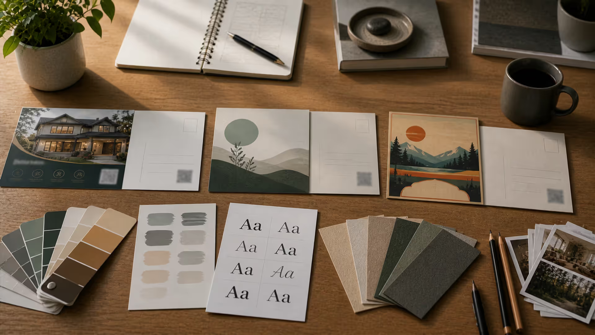
Learn professional postcard design principles for print and direct mail. Covers standard formats, layout composition, visual hierarchy, style approaches, and proven strategies that increase response rates. Includes size comparison chart, expert insights, and common mistakes to avoid.
The content on this website is provided for general informational and educational purposes only. It is intended to explain concepts related to digital design, visual art, color theory, art techniques, design principles, and design history.
All information on this website, including articles, guides, and examples, is presented for general educational purposes. Creative outcomes may vary depending on individual skill, tools, and practice.
This website does not provide professional design services or guarantee results, and the information presented should not be used as a substitute for formal education or professional consultation.
The website and its authors are not responsible for any errors or omissions, or for any outcomes resulting from decisions made based on the information provided on this website.