Then you open your design file the next morning and that icon looks like garbage at 16 pixels. Or legal sends an email asking about licensing. Or your developer points out it clashes with everything else in the navigation bar.
Here's what's actually happening: Format conversions destroy vector data. Free sources hide commercial-use restrictions in tiny print. That "perfect" icon was designed for 32px and mathematically can't work at your target size.
I'm going to show you how to grab icons without wrecking their quality, where to look without risking legal problems, and which technical details determine whether icons work together or fight each other.
Where to Find High-Quality Icons You Can Copy and Paste
Three things matter when picking where to get icons: what you're allowed to do with them legally, which formats you can actually access, and whether they'll stay sharp when you scale them.
Free Icon Libraries
Google's Material Icons library contains 2,000+ icons under Apache License 2.0. You can use them in commercial products, modify however you want, zero attribution needed. Heroicons from the Tailwind CSS team works similarly—MIT licensed, grab the SVG files straight from GitHub.
The downside? Everyone uses these. That shopping cart from Material Design appears in probably 10,000 apps. Sometimes familiarity helps—users instantly know what it means. Other times your app looks like every other Bootstrap website from 2018.
Font Awesome takes a different route. You're copying font characters, not image files. Copy that icon and you're really copying a Unicode reference like \f007. Works great until you paste into something without Font Awesome installed. Then you get a blank square.
Premium Icon Marketplaces
Noun Project, Iconfinder, IconScout—these mix free and paid collections. Here's where people get burned: that free icon works fine while you're building mockups. Ship it in your SaaS product? You needed the $40 license.
I've seen this happen. Designer grabs "free" icons, builds the whole interface, hands off to development. Six months later, Icon Marketplace LLC sends a cease-and-desist because "free for personal use" doesn't cover commercial apps.
Premium sets usually show tighter consistency. Someone actually spent time making sure every icon uses 2px strokes and 3px corner radii. Free sets sometimes have five different people contributing, each with their own style quirks.
Design Tool Libraries
Figma Community and Sketch App Sources let you copy directly into your working file. Vector data transfers perfectly. But try moving those icons to Adobe XD? You're exporting as SVG and reimporting, adding steps.
Figma's got probably 500 icon libraries in their Community section. Quality varies wildly—from professional grade to "my first icon set."
Evaluating Icon Quality
Zoom to 400%. Seeing pixelation? That's raster, won't scale up.
For vectors, look at the anchor points. Clean icons use maybe 12-20 points for a simple shape. Messy icons have 47 points because someone auto-traced a JPEG instead of drawing paths properly.
Check alignment at 100% zoom—your actual implementation size. Icons sitting on whole pixels render sharp. Off-grid icons get blurred by anti-aliasing. At 16px where every pixel counts, a 0.5px offset makes the difference between crisp and fuzzy.
Author: Marcus Ellery;
Source: crafterholic.com
Methods for Copying Icons Across Different File Formats
How you copy determines what you actually get. Each method has quirks that'll wreck quality if you're not paying attention.
From SVG Files
SVG is XML code describing shapes. <circle cx="12" cy="12" r="10"/> draws a circle. When you right-click and "Copy Image" from a webpage, what happens depends entirely on where you paste.
Figma sees the vector data, gives you editable paths. Photoshop might rasterize it based on your zoom level—suddenly your scalable vector is a 72dpi bitmap. Illustrator usually handles it right.
More reliable: right-click, inspect element, find the <svg> tag, copy the entire code block including all nested <path> elements, paste into TextEdit or Notepad, save as "icon.svg". Now you've got a proper file that imports cleanly anywhere.
From Design Tools
Copying within Figma to Figma works perfectly. Figma to Sketch? I've watched effects convert to flattened rasters. Boolean operations from Sketch sometimes lose their editability in XD—merged shapes instead of the original union/subtract operations.
Reliable cross-tool workflow: export SVG from source, import that file into destination. You lose tool-specific features (Figma constraints, Sketch symbols), but core shapes survive intact.
From Icon Fonts
Icon fonts store pictures as typeface characters. Copy an icon from Font Awesome's site and you're copying text. Paste into Figma—you get a text layer that only renders if Font Awesome is installed.
Get editable shapes by converting text to outlines (Type menu in most apps, or right-click). Creates vector paths you can modify. Some people use font-to-SVG converters instead, uploading the .ttf file and downloading individual icons.
Author: Marcus Ellery;
Source: crafterholic.com
Copying Vector Icons vs. Raster Icons
Vectors store math: "draw a circle at coordinates 50,50 with radius 20." Scale to any size and it recalculates. Perfect circle every time, zero quality loss.
Rasters are pixel grids at fixed dimensions. A 24×24 PNG contains exactly 576 pixels. Enlarge to 48×48 and you're stretching 576 pixels across 2,304 positions. Software invents the missing pixels through interpolation (guessing), creating blur.
When both formats are available, grab vector. Stuck with raster? Copy the largest available and only scale down. Shrinking discards pixels cleanly. Enlarging creates mush.
Maintaining Icon Quality During Transfer
Quality dies during conversion and when sites serve compressed versions instead of originals.
File size tells you things. SVG icons typically run 1-5KB. Anything over 20KB probably has embedded rasters, metadata, or wasn't optimized. SVGOMG usually cuts size 50-70% with zero visual change—strips all the Illustrator metadata and excessive decimal precision (who needs 16 decimal places?).
For PNGs on Retina displays, you need @2x versions minimum. A 24px icon on Retina needs 48 actual pixels for sharp rendering. Plenty of sites auto-serve the right resolution. When copying manually, make sure you grabbed the high-res asset.
Icon Design Standards That Affect Usability
Professional sets follow specific rules about sizing, spacing, visual weight. Understanding these helps you pick icons that'll actually work instead of looking tacked-on.
Grid Systems and Sizing
Icon designers work within grid systems guaranteeing consistent sizing and alignment. The grid defines artboard size and guides for placing visual elements.
Grid Size
Where You'll Use These
What Devices
Trade-offs
8×8 pixels
Mobile nav bars, compact toolbars
Phone interfaces, touch UIs
Works for finger-sized tap targets; can't fit intricate details
16×16 pixels
Desktop menu items, status indicators
Windows apps, macOS utilities
Reasonable detail without eating screen space; looks tiny on 4K monitors
24×24 pixels
Website buttons, standard UI actions
Cross-platform web apps
Versatile—works across most screens; might need separate designs for edge cases
32×32 pixels
Feature highlights, marketing sections
Dashboards, landing pages
Room for detailed illustrations; takes up significant real estate
Icons built for 24px grids don't magically work at 16px. Details reading clearly at larger sizes turn into muddy blobs when shrunk. Before copying, verify icons were designed for your target size—or at minimum, tested there.
Author: Marcus Ellery;
Source: crafterholic.com
Visual Weight and Optical Alignment
Icon design principles require balancing visual weight so every icon feels equally prominent. Draw a solid circle and an outline circle at identical pixel dimensions. The solid one looks heavier and larger despite matching measurements perfectly.
Mixing sources often reveals weight mismatches immediately. One set uses 2px strokes, another uses 1.5px. The inconsistency screams amateur. Before copying, select icons and check stroke thickness in your properties panel.
Mathematical centering often looks visually wrong. A triangle centered by coordinates appears to lean down because more visual mass sits below the horizontal midline. Professional designers compensate by nudging shapes slightly off calculated center. When you modify icons, preserve these optical corrections or they'll look broken.
Padding and Safe Area
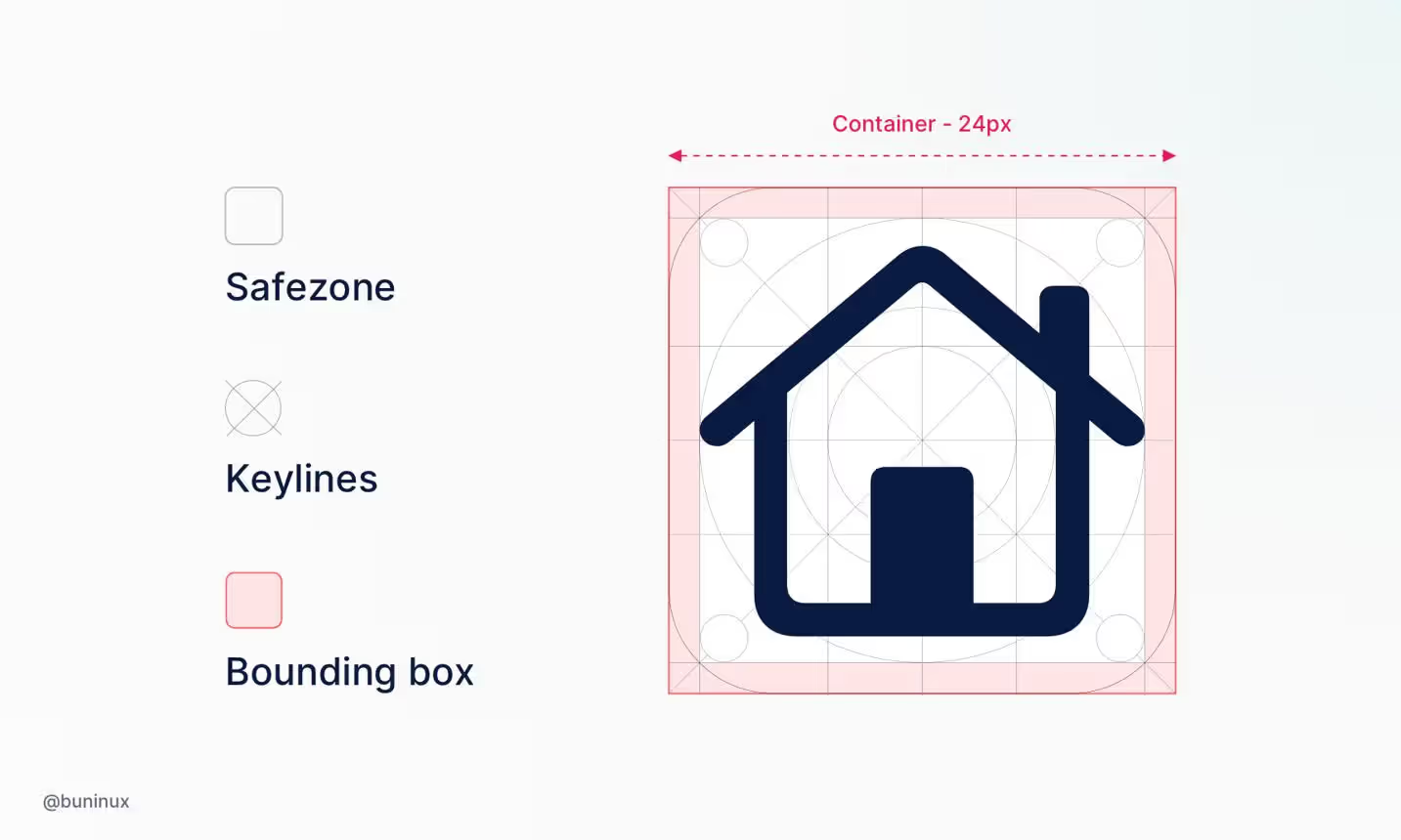
Icon grids include padding—empty space between visual elements and artboard edges. Standard padding runs 10-15% of artboard size. On a 24px icon, that's 2-3px of buffer, giving the actual graphic an 18-20px footprint.
This prevents icons from touching when placed side-by-side and provides room for focus rings. When copying icons, check padding consistency across your collection. Different padding amounts create misalignment—some icons feel cramped while others float loosely.
Ensuring Visual Consistency When Using Multiple Icon Sets
Sometimes you have to mix sources. Your primary set doesn't include that one specific icon. But combining different designers' work creates visual discord unless you're deliberate about matching.
Style Dimensions to Match
Consistent icon sets share these traits:
Stroke weight: Every line uses identical thickness—1.5px throughout, or consistently 2px
Corner radius: Rounded corners maintain same radii—consistently 2px or 3px, not random
Fill treatment: Commits to filled shapes, outline-only, or systematic combination
Detail complexity: Similar intricacy levels—all simple or all detailed, not mixed
Viewing angle: Same perspective throughout—flat front view, isometric, or slight three-quarter
Monoline icon style—built entirely from uniform-weight strokes—got popular partly because it's easier to keep consistent. One rule: 2px strokes everywhere. No fills, no weight variations. This makes mixing sources more forgiving since there's only one variable to match.
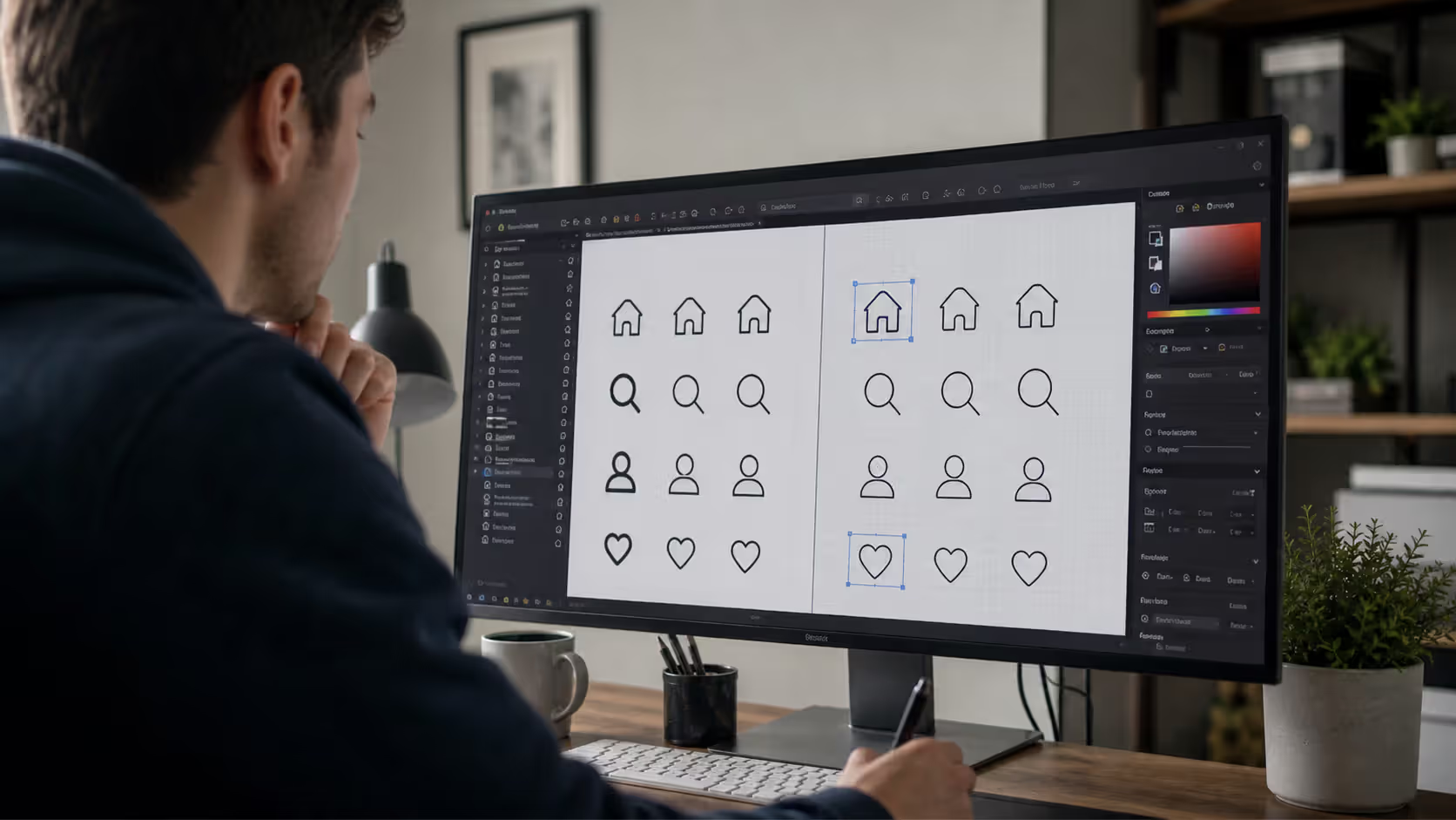
Create a comparison artboard when copying from different sets. Put icons side-by-side at implementation size. Inconsistencies seeming minor in isolation become glaring when adjacent.
Author: Marcus Ellery;
Source: crafterholic.com
Matching Icon Styles Across Your Interface
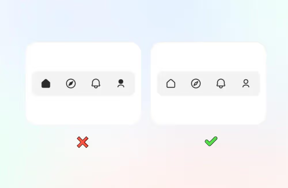
Do you have to mix sources? Establish intentional rules. Maybe filled icons signal active states while outlines show inactive. Or solid icons mark primary actions, outlined represent secondary. Deliberate variation communicates meaning. Accidental variation looks sloppy.
Some designers create unified sets by copying from multiple sources, then editing everything to match. Adjust stroke weights using your stroke panel, apply consistent corner radii through path tools, add or remove details equalizing complexity. More work than using a single set? Yeah. Better results than mixing unmodified icons? Also yeah.
When Icons and Symbols Serve Different Purposes
Icons show pictorial representations resembling their referents. A trash can means delete. An envelope represents email. Visual similarity to real objects.
Symbols use abstract marks representing concepts through learned convention. Three horizontal lines for menu. A magnifying glass for search (when's the last time you searched anything with an actual magnifying glass?). Hamburger menus and floppy disk save buttons rely entirely on convention.
Icons leverage recognition. Symbols depend on learned patterns. When copying for interfaces, consider whether users will immediately grasp meaning or need to learn it. Unfamiliar symbols require text labels. Recognizable icons sometimes work standalone.
Don't mix pictorial icons with abstract symbols in the same functional category. Navigation uses representational icons (house for home, magnifying glass for search, person silhouette for profile), then you add an abstract symbol (three dots for "more")? Breaks consistency. Commit to either pictorial or abstract throughout a functional group.
Technical Considerations for Icon Implementation
Copying icons is step one. Implementation determines performance, accessibility, and actual visual quality in production.
File Size and Optimization
SVGs copied from websites frequently carry baggage—hidden layers, coordinates with absurd decimal precision (16 places when 2 work fine), embedded metadata about which version of Illustrator created them.
SVGOMG (browser-based tool) typically shrinks files 30-70% without changing appearance. I've taken 47KB icons down to 8KB just by removing unnecessary precision and metadata.
For raster icons, PNG handles anything requiring transparency. WebP offers better compression but check browser support. Skip JPG entirely—doesn't support transparency and creates artifacts around sharp edges.
Responsive Scaling
Icons need to scale across device sizes and pixel densities. CSS scales SVG smoothly, but details optimized for 24px might become illegible at 16px or look overly simple at 48px.
Test at small sizes before committing. A complex icon looking gorgeous at 32px might become an indecipherable blob at 16px. When you're copying detailed icons, make sure simplified alternatives exist for smaller breakpoints.
You can't make a good icon by just reducing a complex image. Each size needs to be designed specifically, with details appropriate to that resolution. The best icons remain recognizable even when you can barely see them.
— Susan Kare
Accessibility Requirements
Icons in interfaces need to accommodate users with visual impairments, color blindness, and those using assistive technologies.
Never use color alone to convey information. Red icons indicate errors, green shows success? Users with red-green color blindness can't distinguish them. Add shapes, text labels, or patterns providing redundant cues.
Provide text alternatives for screen readers. In HTML, that means aria-label attributes or visible text. Decorative icons should be hidden from assistive tech using aria-hidden="true" to prevent cluttering the accessibility tree.
Verify sufficient contrast between icons and backgrounds. WCAG 2.1 requires 3:1 minimum for graphical objects. Light gray icons on white backgrounds often fail this.
Testing for Legibility
Icon legibility at small sizes comes down to simplicity and contrast. Test at actual implementation sizes—not zoomed to 400% in your design file where everything looks perfect.
View on real devices, not just emulators. A phone screen at arm's length reveals different detail than a desktop monitor at desk distance. Icons seeming crisp on your 27-inch monitor might vanish on a phone in bright sunlight.
Check icons surrounded by actual interface elements. An icon looking fine on a clean artboard might get lost beside text, buttons, and other visual stuff competing for attention.
Author: Marcus Ellery;
Source: crafterholic.com
Common Mistakes When Copying and Pasting Icons
Distorting Icons Through Improper Scaling
Stretching an icon by dragging one corner destroys proportions. Circles become ovals. Squares turn rectangular. Always scale proportionally—hold Shift while dragging or enter percentage values maintaining aspect ratio.
Worse: stretching icons to force-fit inconsistent containers. Some are 20px, others 24px, so you stretch the smaller ones to match. Now stroke weights vary wildly. Either use icons at their designed size or scale everything proportionally from the same baseline.
Ignoring Licensing Terms
Ability to copy doesn't equal legal right. Plenty of icon sites allow copying for personal projects but require purchasing licenses for commercial deployment. Some free icons demand attribution somewhere in your product or docs.
Read licenses before copying. "Free for personal use" excludes client work and products you sell. "Attribution required" means crediting the creator somewhere users can see. Violating licenses creates legal exposure and cheats designers who shared work under specific conditions.
Mixing Incompatible Visual Styles
Copy a flat icon, a skeuomorphic icon, and a gradient icon into the same interface? Visual chaos. Each style speaks a different design language. Users won't consciously notice the clashing, but something will feel "off" in a way they can't articulate.
Need icons your primary set lacks? Find sources matching your existing style or modify copied icons until they match.
Poor Contrast and Color Treatment
Copying colorful icons into an interface using monochrome breaks consistency even if styles otherwise match. Color treatment matters.
Many designers copy full-color icons, then apply monochrome overlays matching interface palettes. Works for simple icons but creates problems with multi-color icons where different elements need distinct colors for clarity.
Sizing Issues and Pixel Misalignment
Placing a 23px icon in 24px space creates blur because the icon doesn't align to the pixel grid. Use icons at sizes matching your grid system—typically multiples of 4 or 8.
When copying, check designed size. An icon designed for 24px won't necessarily look good at 20px despite the seemingly minor difference. That 4px scaling creates fractional pixels browsers must anti-alias, reducing sharpness.
Accessibility Failures
Copy decorative icons and treat them as functional without text labels? Creates accessibility barriers. Users relying on screen readers encounter unlabeled buttons they can't identify.
Similarly, icon-only buttons without visible labels assume everyone recognizes your choices. Even common icons like hamburger menus or vertical ellipsis (kebab menu) confuse some users. When uncertain, include labels.
FAQ
Do I need permission to copy and paste icons from websites?
Usually, yeah. Copyright protects icons as creative works automatically. Websites displaying icons might have licenses permitting viewing but not copying. Look for terms of service and license information accompanying the icons. Free libraries typically use MIT, Apache, or Creative Commons licenses explicitly permitting copying under defined conditions. Commercial sites generally require purchasing licenses. No license mentioned? Assume you need permission before copying.
What's the difference between an icon and a symbol in UI design?
Icons show pictorial representations resembling what they represent. A printer icon resembles an actual printer. A folder icon looks like a physical file folder. Users understand through visual similarity to real objects. Symbols are abstract marks representing concepts through learned convention. Three horizontal lines mean menu. A magnifying glass means search. This affects usage significantly: icons can sometimes work without labels because they're self-explanatory, while symbols often require labels or depend on conventions users learned from other apps.
How do I ensure icons remain clear at small sizes?
Start with icons specifically designed for small sizes rather than scaling down complex ones. Reduce detail—fewer elements stay recognizable when small. Increase stroke weights slightly. A 1px stroke may disappear at small sizes where 1.5px or 2px remains visible. Ensure strong contrast between icons and backgrounds. Test at actual implementation sizes on real devices—not zoomed out in your design tool. Consider creating simplified alternate versions of complex icons for small sizes instead of relying on automatic scaling.
Can I edit icons after copying them into my project?
Depends on the license. Some (MIT, Apache) allow modification freely. Others (certain Creative Commons) prohibit creating derivatives or require sharing modifications under identical licenses. Even when legally permitted, consider whether modifications preserve visual integrity. Changing colors or sizes usually works fine, but significantly altering shapes may degrade quality unless you've got icon design experience. If you're modifying for consistency with other icons, document your changes so you can apply them uniformly across your entire set.
What file format is best for scalable icons?
SVG (Scalable Vector Graphics). SVG files contain mathematical shape descriptions that scale to any size without quality loss. They're resolution-independent, making them perfect for responsive designs adapting to different screen sizes and pixel densities. SVG also supports CSS styling, letting you change colors and properties without editing the file itself. When SVG isn't supported, use PNG at 2x or 3x the display size to accommodate high-DPI screens, though this requires maintaining multiple file sizes rather than one scalable file.
How do I maintain consistency when using icons from different sources?
Create a style guide documenting your specifications: stroke weight, corner radius, padding amount, fill versus outline treatment, detail complexity level. When copying from new sources, compare against this guide. Modify copied icons to match—adjust stroke weights, unify corner radii, simplify or add details matching complexity levels. Use a single artboard in your design tool to compare all icons side-by-side at implementation size. Inconsistencies become obvious when icons sit adjacent. Consider establishing one primary source for most icons and only copying from others when absolutely necessary, then modifying those exceptions to match your primary set.
Copy and paste looks simple until you hit blurry results, licensing complications, or jarring visual inconsistencies. Technical aspects—file formats, resolution, optimization—determine whether icons display crisply across devices. Design aspects—grid systems, visual weight, style consistency—determine whether icons feel cohesive or look like a random collection.
Successful implementation starts with choosing quality sources matching your needs and license requirements. Continues through careful copying that preserves vector data when possible and maintains appropriate resolution for raster formats. Concludes with testing at actual sizes, ensuring accessibility compliance, and verifying visual consistency across your complete set.
Extra time spent selecting compatible icons, optimizing files, and testing legibility pays dividends in interfaces feeling polished and professional rather than hastily assembled.
Master yearbook spread design with expert guidance on layout planning, grid systems, photo composition, and text balance. Learn to create two-page layouts that tell compelling stories while avoiding common mistakes and maintaining visual consistency across your yearbook.
Timeline arrows guide viewers through chronological information, transforming static data into dynamic narratives. This comprehensive guide covers arrow styles, process visualization techniques, common design mistakes, and practical tools for creating effective directional elements in timelines and infographics.
Symbols compress complex creative concepts into instant visual recognition. This comprehensive guide explores the psychology behind creativity symbols, catalogs the most effective options from lightbulbs to geometric forms, and provides a practical framework for choosing the right symbol for your design, branding, or communication project.
Learn professional postcard design principles for print and direct mail. Covers standard formats, layout composition, visual hierarchy, style approaches, and proven strategies that increase response rates. Includes size comparison chart, expert insights, and common mistakes to avoid.
The content on this website is provided for general informational and educational purposes only. It is intended to explain concepts related to digital design, visual art, color theory, art techniques, design principles, and design history.
All information on this website, including articles, guides, and examples, is presented for general educational purposes. Creative outcomes may vary depending on individual skill, tools, and practice.
This website does not provide professional design services or guarantee results, and the information presented should not be used as a substitute for formal education or professional consultation.
The website and its authors are not responsible for any errors or omissions, or for any outcomes resulting from decisions made based on the information provided on this website.