Pick up a pen filled with permanent ink, and you've eliminated the safety nets other artists take for granted. No erasing. No blending stumps. No layering washes of varying opacity. You're left with one option: building shadow, volume, and texture through nothing but lines.
This constraint isn't a limitation—it's a superpower once you know how to wield it. Strategic line placement creates everything from whisper-soft mid-tones to inky-black shadows. The catch? You need a solid grasp of spacing, layering, and directional control.
I'll walk you through the exact techniques that turn bare paper into dimensional drawings. We'll cover when to use single-direction lines versus multiple crosshatched layers, how to avoid muddy textures, and which tools actually make a difference (spoiler: it's not always the expensive ones).
What Is Hatching and Why Artists Use It
Hatching means drawing closely spaced parallel lines to simulate gray tones. Since pens don't produce actual gray—just black marks on white paper—your eye blends these lines into perceived values.
This approach goes back centuries. Before photography, engravers carved illustrations into copper plates for book printing. Rembrandt created some of his most celebrated works through hatched etchings. Albrecht Dürer's woodcuts showed that you could render anything—fabric folds, weathered skin, animal fur—using only systematic line arrangements.
Why choose hatching art over smoother methods like graphite shading? Three reasons stand out:
Permanence. Your lines stay crisp indefinitely. No smudging, no accidental blending, no degradation over time. Archival ink on quality paper outlasts most other media.
Reproduction clarity. Hatched artwork scans beautifully and prints without losing fidelity. Before digital tools existed, illustrators relied on pen and ink shading methods because these translated perfectly to printed pages. That advantage still holds.
Descriptive precision. You control exactly where each mark lands. Wash techniques spread unpredictably. Pencil shading requires fixative to prevent smearing. Ink commits immediately, demanding intentionality that produces razor-sharp results.
Use these techniques when accuracy matters—technical diagrams, architectural renderings, scientific illustration. They also shine in expressive work where bold, deliberate marks add energy your composition wouldn't have with blended tones.
Author: Marcus Ellery;
Source: crafterholic.com
How Parallel Line Shading Creates Value and Tone
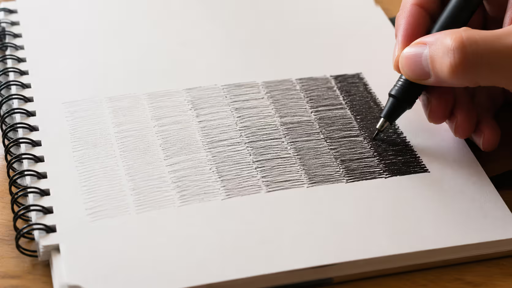
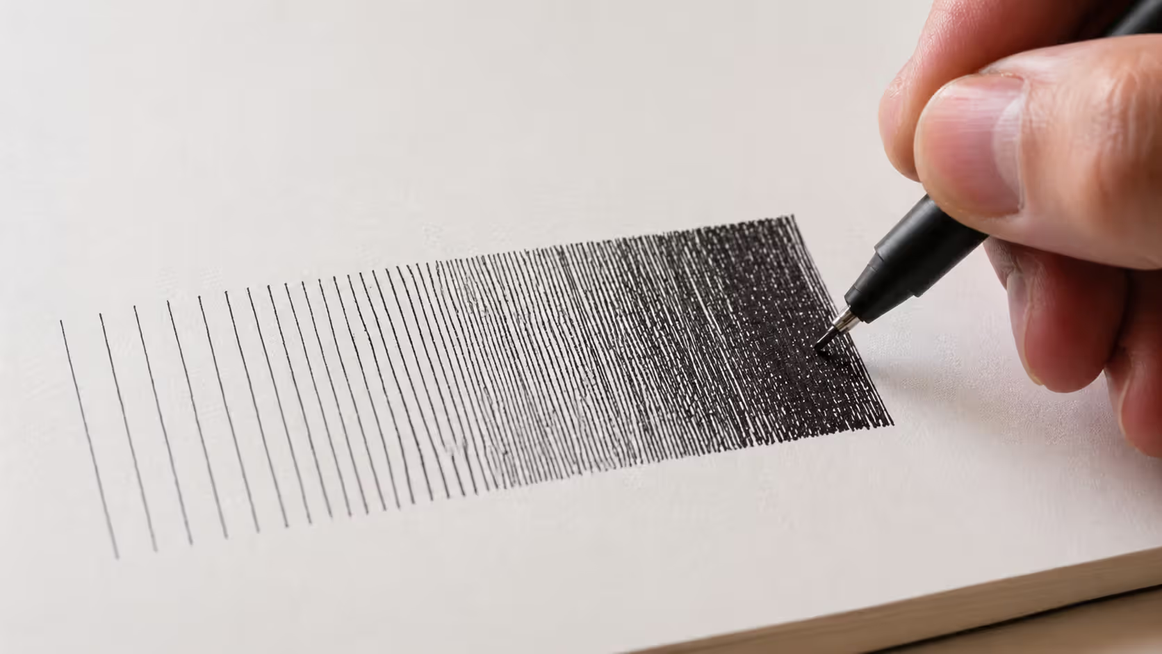
Start simple: draw parallel lines in one direction. Space them close together for darker areas, farther apart for lighter zones. That's the entire foundation of tonal hatching guide principles.
Spacing determines value more than any other factor. Lines 3mm apart appear light gray. Tighten that to 1mm for medium gray. Pack them at 0.5mm intervals and you're approaching charcoal-dark tones—all without changing your pen.
Here's what separates clean hatching from amateurish scratching: consistency. Your lines should maintain relatively uniform gaps within each value zone. Wobbly spacing creates visual static that fights against the form you're trying to describe.
The angle you choose affects everything. Vertical lines feel stable and architectural. Horizontal lines suggest calm, landscape-oriented compositions. Most artists default to 45-degree diagonals because they flow naturally from your wrist and don't compete with obvious compositional elements. Experiment with all three, but commit to one angle per layer.
Pressure matters if you're using dip pens or flexible nibs. Push harder and your line widens, darkening the tone even with identical spacing. Technical pens eliminate this variable—the line width stays constant regardless of pressure. Beginners often find technical pens easier for this exact reason.
Building smooth gradations requires working in stages:
Start with your lightest areas using widely spaced lines (3-4mm apart)
Add mid-tones by introducing intermediate lines (2mm spacing)
Create your darkest shadows with tight packing (1mm or less)
Work light to dark. You can always add more lines to darken an area, but removing them requires starting over.
One practical limit: when you can't fit another line between existing marks without them touching, you've maxed out single-direction hatching. Going darker means either switching to a thicker nib or adding cross-hatched layers.
Author: Marcus Ellery;
Source: crafterholic.com
Cross Hatching Shading Technique for Form and Shadow
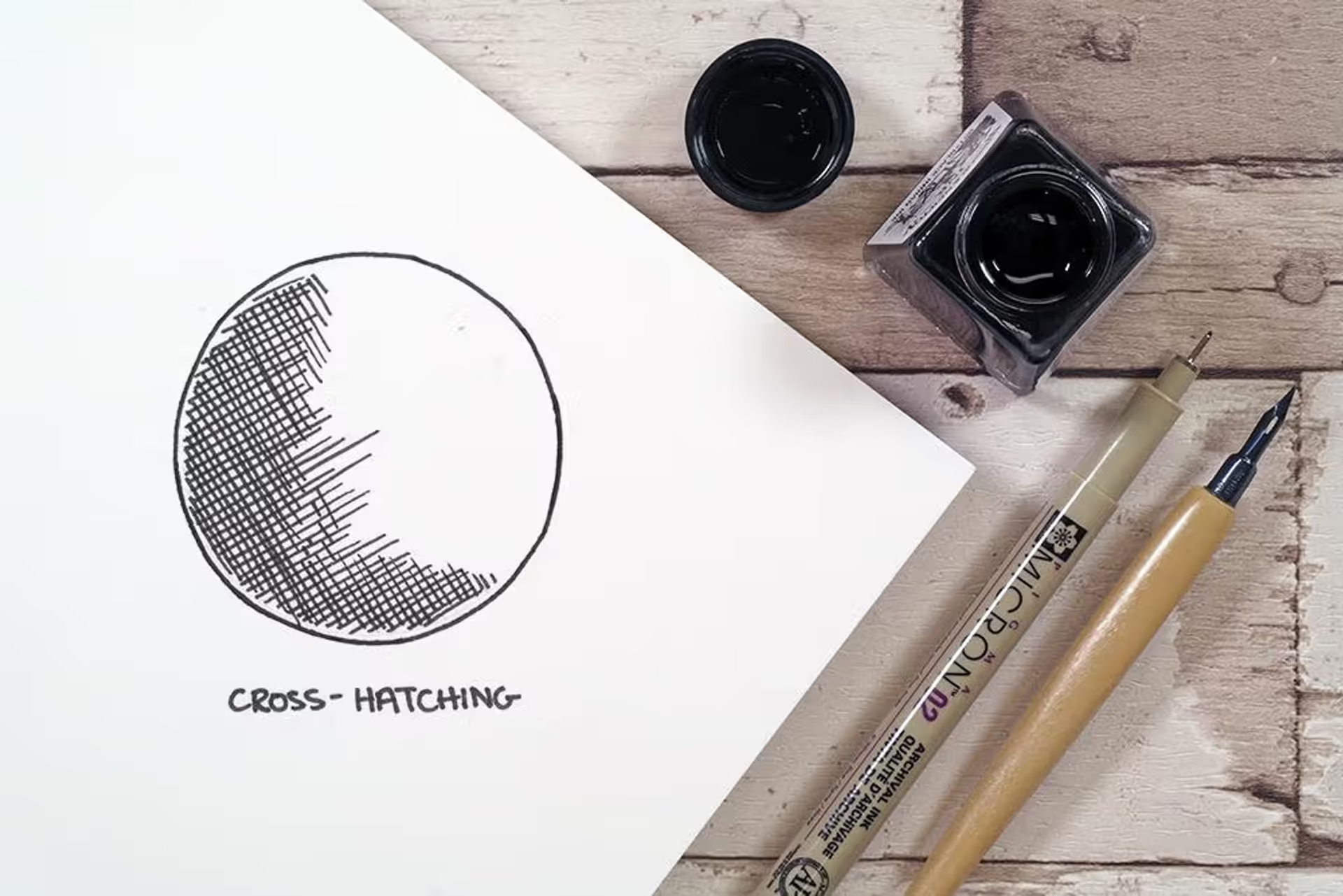
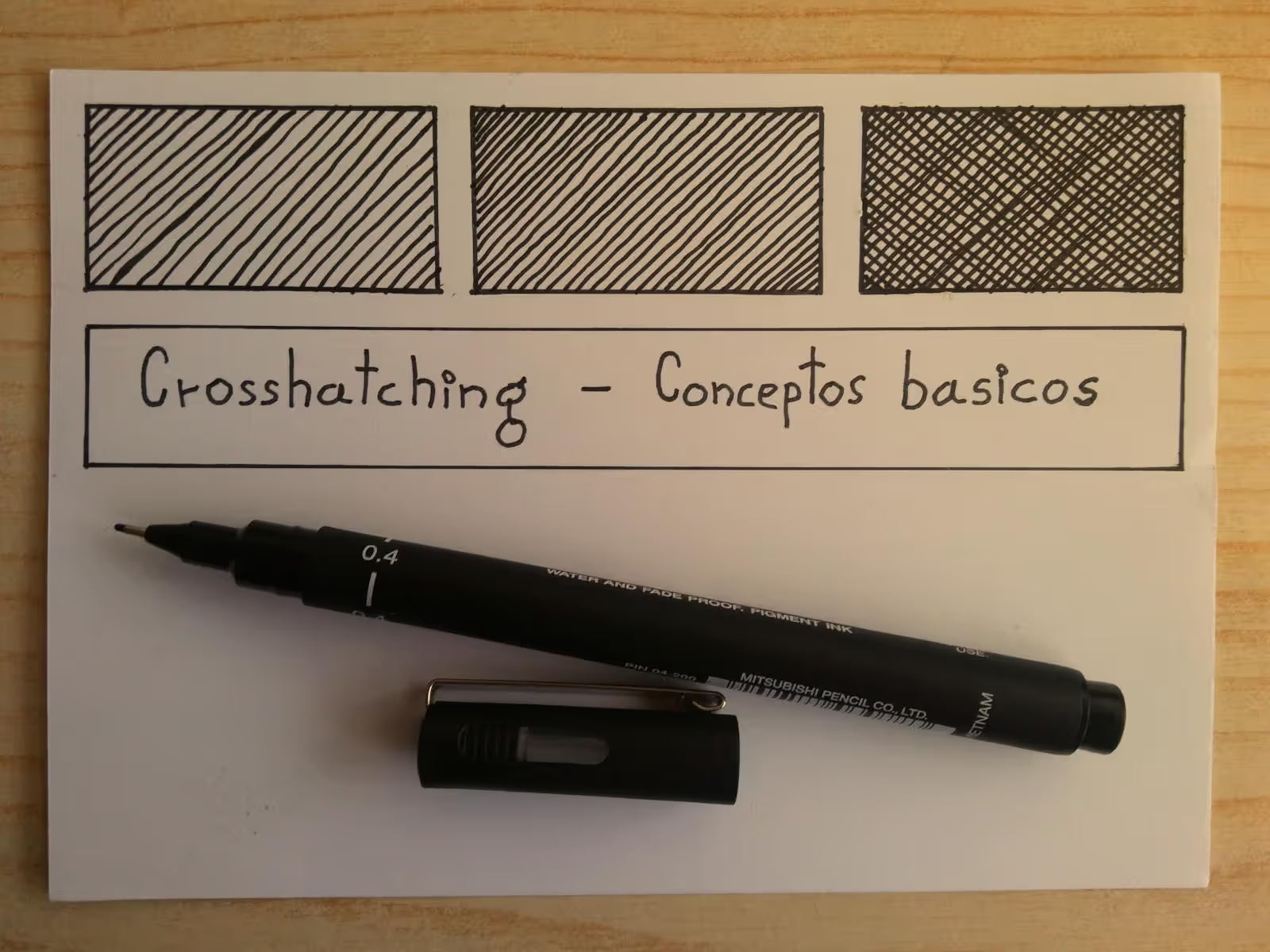
Cross-hatching multiplies your tonal range by layering new sets of parallel lines at different angles over your initial hatching. Each additional layer blocks more paper from showing through, driving values darker.
The angle between layers creates different textural effects. Perpendicular crossing (90 degrees) produces neutral, even tones. Acute angles (30-45 degrees) generate tighter weaves with more character. Avoid angles too close to your base layer—lines that nearly parallel each other create confusing streaks instead of unified tones.
Planning prevents mud. Rushed cross-hatching looks like chaotic scribbling. Each new layer needs its own internal logic—consistent spacing, clear direction, deliberate intersections. Don't randomly slash lines hoping they'll average into smooth shadows.
Here's a professional approach: align some hatching directions with your subject's contours. Rendering a cylindrical vase? Use curved hatching that wraps around its surface, then reinforce shadows with straight cross-hatching. This combination of form-following and structural lines creates convincing volume through crosshatch for form and shadow techniques.
Single vs. Multiple Layer Cross-Hatching
Two layers handle about 80% of shading scenarios. Your base hatching establishes light-to-mid tones, then one perpendicular cross-hatch layer pushes mid-tones toward dark. Clean, readable, effective.
Three or four layers enable dramatically dark shadows but demand careful execution. Each addition darkens while adding textural complexity. Beyond four layers, individual lines blur together into solid black—sometimes exactly what you want, but often a sign you've pushed past the technique's sweet spot.
Strategic layering means saving multiple layers for actual shadow cores and cast shadows. Highlights get bare paper. Light tones receive single-direction hatching. Mid-tones get two-layer treatment. Only your deepest darks justify three-plus layers.
Common Cross-Hatching Mistakes to Avoid
Repeating angles accidentally. Rotating your paper helps maintain comfortable drawing positions, but if you're not tracking your rotation, you might duplicate a previous layer's angle. That wasted effort adds zero darkness.
Inconsistent spacing between layers. If your first layer uses 2mm spacing and your second uses 0.5mm spacing, the visual texture gets chaotic. Keep spacing relatively similar across all layers for cohesive tones.
Rushing. Sloppy intersections where lines waver or curve unintentionally undermine your work. The fourth layer deserves the same careful attention as your first. Slow, controlled strokes always beat hurried scribbling.
The secret of drawing is line. It is not the shading, the modelling, the chiaroscuro. It is the placing of lines that gives the illusion of form, and the weight and character of those lines that gives the drawing life.
— Andrew Loomis
Controlling Line Density to Achieve Depth and Dimension
Line density in shading means how many marks occupy any given square inch. You control this two ways: spacing between lines and the weight (thickness) of individual lines themselves.
Tight spacing with thin lines (0.3mm technical pen with 1mm gaps) produces smooth, delicate gradations perfect for botanical drawings or portrait work. Wide spacing with thick lines (0.8mm pen with 3mm gaps) creates bold, graphic contrasts ideal for architectural subjects.
Convincing depth requires establishing clear tonal hierarchy. Your lightest lights—usually bare paper—anchor one extreme. Your darkest darks—maximum density cross-hatching—anchor the other. Everything else falls between in organized steps, not random scatter.
Try this: squint at your reference until details dissolve and you see only major light and dark shapes. Map those simplified zones onto your drawing before hatching anything. This prevents the beginner mistake of making everything mid-tone with no true lights or compelling darks.
Consider both local value and illumination. A white egg in shadow might still appear lighter than a black velvet cube in direct light. Your hatching for depth and shadow needs to account for both the object's inherent color and how light affects it.
Highlights demand restraint. New artists often hatch everywhere, leaving no pure whites. Don't do this. Reserve untouched paper for your brightest spots—these create essential contrast that makes adjacent tones appear darker by comparison.
Gradual density shifts prevent harsh transitions. Abrupt jumps from light to dark look jarring unless you're deliberately rendering a sharp cast shadow edge. For smooth form transitions, build intermediate density zones that bridge your extremes.
Step-by-Step Rendering with Hatching Methods
Start with a light pencil sketch establishing proportions and major shapes. This underdrawing acts as your roadmap, though ink will eventually cover it. Keep it subtle—heavy pencil lines show through ink and muddy your final result.
Identify your light source before making the first ink mark. Everything—every shadow, every highlight, every mid-tone—derives from this single illumination point. Inconsistent lighting where shadows contradict each other destroys believability faster than any technical flaw.
Begin with your lightest tones using single-direction hatching. Work across the entire composition rather than finishing one section completely before starting another. This holistic approach maintains consistent value relationships throughout.
Build progressively darker tones through additional layers. Step back frequently—literally walk across the room—to assess overall value structure. Better yet, photograph your work-in-progress. Digital images reveal imbalances your adjusted eyes miss after staring at the drawing for hours.
Mid-tone development demands patience during rendering with hatching. These transitional values occupy the largest area in most drawings and require the subtlest adjustments. Resist rushing through them toward more dramatic darks.
Add your darkest accents last. Deep shadows and core shadows provide punch and anchor your entire value structure. Place them too early and they bias your perception—everything else looks weak by comparison, leading to overworked mid-tones.
Blend hatching styles within a single piece for visual interest. Straight hatching might define architectural elements while curved, contour-following strokes describe organic forms. This variation prevents monotony while maintaining technical coherence.
Finishing touches include sharpening edges where forms overlap, deepening shadows that feel anemic, and occasionally adding stippling (dots) where additional line work would create unwanted texture. Step away from "finished" work for at least a day before declaring it done—fresh eyes catch issues fatigue blinds you to.
Author: Marcus Ellery;
Source: crafterholic.com
Choosing the Right Pen and Ink for Shading Through Line Work
Technical pens—Microns, Copic Multiliners, Staedtler Pigment Liners—deliver unwavering line widths perfect for controlled hatching in ink drawing. The 0.3mm to 0.5mm range handles general work. Finer nibs (0.1mm, 0.05mm) suit tiny details. Thicker sizes (0.8mm and up) quickly establish bold darks.
Dip pens with flexible nibs offer expressive variation but demand more skill. Pressure creates swells and tapers that add organic character. Great for artistic illustration, problematic for technical work requiring mechanical precision.
Fountain pens split the difference—more predictable than dip pens, more variable than technical pens. Quality fountain pens with fine or extra-fine nibs work beautifully for hatching, especially paired with waterproof, quick-drying inks.
How ink flows and dries changes based on its thickness. Pigmented inks deliver deep blacks but sometimes skip on textured paper. Dye-based inks flow smoothly but often lack archival permanence. Waterproof formulations prevent smearing if you add washes later, though they demand more frequent pen cleaning.
Paper texture dramatically impacts hatching quality. Smooth bristol or hot-press paper allows crisp, clean lines with minimal feathering. Rough or cold-press surfaces grab your pen, creating textured marks that either enhance or sabotage your intent depending on desired effect.
Tooth (surface texture) also limits line density. Smooth paper accepts tightly packed lines that would blur together on textured surfaces. Test your specific pen-and-paper combination with density swatches before committing to final artwork.
Weight matters for ink—lighter papers (under 90 lb) may buckle or bleed through with heavy ink application. Bristol board (100+ lb) or heavyweight drawing paper (140 lb) provides stable surfaces that withstand multiple hatching layers without warping.
Comparison of Hatching Techniques
Technique
Difficulty Level
Best Use Cases
Tonal Range
Time Investment
Parallel Hatching
Beginner-friendly
Light to mid-tones, creating texture, filling backgrounds
Limited (roughly 10-40% gray equivalent)
Quick—covers areas fast
Cross-Hatching
Intermediate skill required
Mid to dark tones, defining shadows, building form
Moderate (follows form rather than maximizing darkness)
High—demands careful planning
Frequently Asked Questions About Hatching Art
What's the difference between hatching and cross-hatching?
Hatching uses one set of parallel lines running in a single direction to build tonal value. Cross-hatching adds more parallel line sets at different angles over that initial layer, creating darker values through overlapping marks. Think of hatching as your foundation and cross-hatching as the tool for pushing beyond what single-direction work can achieve.
How do I avoid making my hatching look messy or uneven?
Keep spacing and angle consistent within each individual layer. Use smooth, confident strokes instead of tentative, scratchy marks. Rotate your paper to maintain comfortable hand positions rather than contorting your wrist into awkward angles. Work deliberately—fast enough that each line flows smoothly, slow enough to maintain control. Daily hatching swatches build the muscle memory you need for even spacing and straight lines.
Can hatching be used with other shading techniques?
Absolutely. Hatching pairs well with stippling (dots) for textural variety, solid blacks for dramatic punch, and even light washes if your ink is waterproof. Many illustrators use hatching for primary form-building and switch to stippling where additional lines would muddy the texture. The key: mixed techniques should feel intentional, not indecisive.
What type of pen is best for beginners learning hatching?
Start with a 0.3mm to 0.5mm technical pen. These deliver consistent lines without requiring pressure control, letting you focus entirely on spacing and direction. Sakura Pigma Micron and Staedtler Pigment Liners are reliable, affordable, widely available options. Once basic hatching feels comfortable, experiment with flexible dip pens or brush pens to explore line variation.
How long does it take to master hatching techniques?
Basic competence develops within weeks of daily practice—30 minutes per day produces visible improvement in about a month. Intermediate proficiency, where you confidently render simple objects with convincing form, typically requires three to six months of consistent work. True mastery, where hatching becomes intuitive and you tackle complex subjects with subtle tonal control, develops over years. This technique rewards steady incremental practice more than intensive cramming.
Should I practice hatching on specific subjects first?
Geometric forms—spheres, cubes, cylinders—make ideal first subjects because their predictable surfaces let you focus on technique rather than complex contours. Once comfortable with basic forms, progress to still life objects with clear lighting—a single apple or coffee mug provides enough complexity to challenge your skills without overwhelming you. Save portraiture and organic subjects for later; these demand the most sophisticated hatching control.
Hatching converts simple lines into sophisticated tonal systems capable of rendering delicate botanical studies, dramatic portraits, or precise architectural scenes. The technique demands patience and deliberate practice, but delivers precise control unavailable through blended shading methods.
Begin with basic parallel line exercises building consistent spacing and angle control. Progress to two-layer cross-hatching for expanded tonal range. Test different pens and papers discovering combinations that match your working style and subject preferences.
Even master artists refine their hatching throughout entire careers. Each drawing teaches something new about line spacing, directional choices, or density control. Your hundredth hatched sphere will dramatically outperform your first, and your thousandth will show even more growth.
Permanent ink demands confidence, but don't let that freeze you into paralysis. Accept that early attempts contain mistakes. Those "failures" teach more than tentative marks that never commit to clear direction. Build your hatching vocabulary through volume of work, and watch these fundamental techniques expand your expressive range far beyond what seemed possible when you made those first wobbly parallel lines.
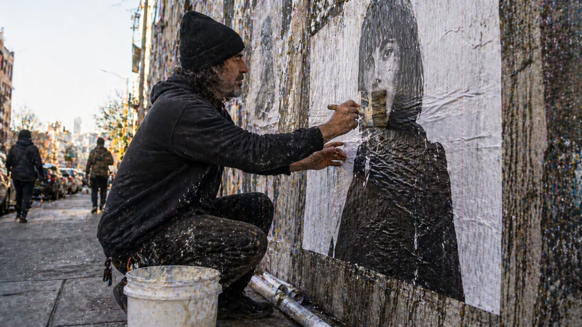
Master the wheatpaste street art technique with this complete guide covering adhesive recipes, poster installation methods, material selection, and legal considerations. Learn to create durable wheat paste art installations using affordable supplies and proven application techniques.
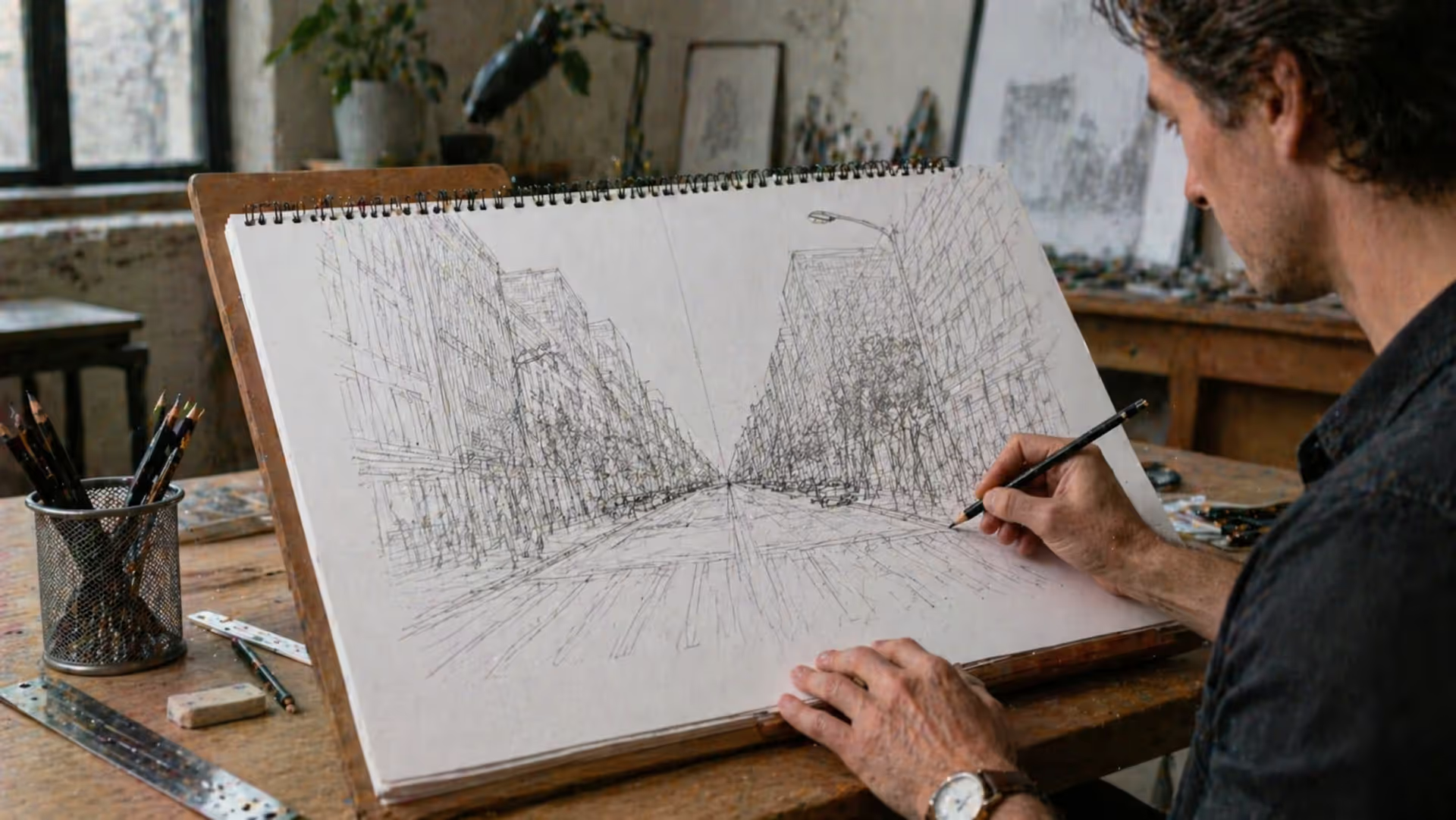
Perspective is the set of techniques artists use to represent three-dimensional space on a flat surface. It governs how objects appear smaller as they recede, how parallel lines converge toward a single point, and how atmospheric conditions affect color and clarity across spatial planes.
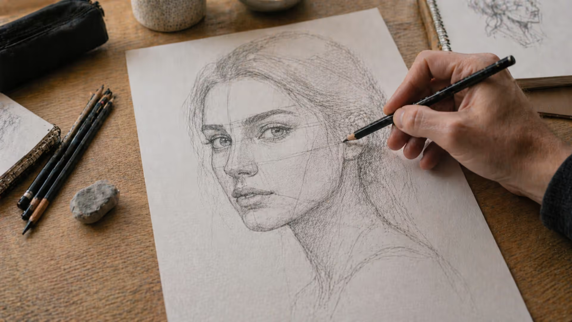
Learn to draw compelling three quarter view portraits with this comprehensive guide covering proportions, perspective, and step-by-step techniques. Discover why this angle creates depth and dimension, master foreshortening, and avoid common mistakes that flatten your portraits.
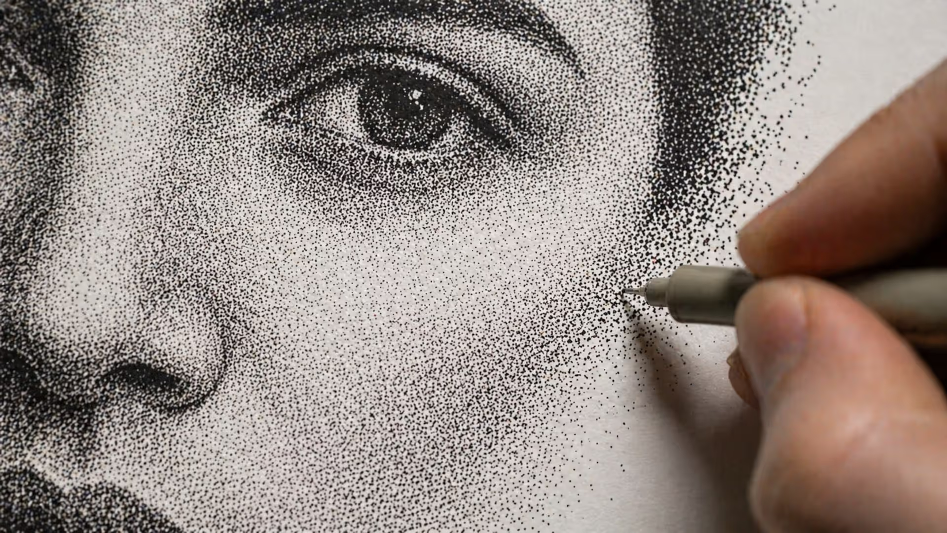
Stippling creates stunning artwork using only dots. This comprehensive guide covers everything from basic dot shading methods to advanced illustration techniques, including tool recommendations, step-by-step tutorials, and common mistakes to avoid.
The content on this website is provided for general informational and educational purposes only. It is intended to explain concepts related to digital design, visual art, color theory, art techniques, design principles, and design history.
All information on this website, including articles, guides, and examples, is presented for general educational purposes. Creative outcomes may vary depending on individual skill, tools, and practice.
This website does not provide professional design services or guarantee results, and the information presented should not be used as a substitute for formal education or professional consultation.
The website and its authors are not responsible for any errors or omissions, or for any outcomes resulting from decisions made based on the information provided on this website.