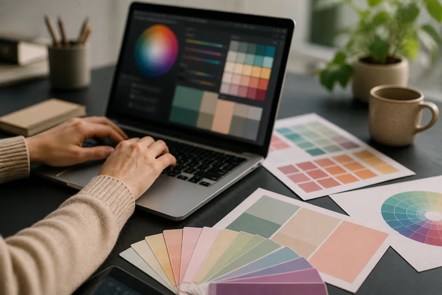
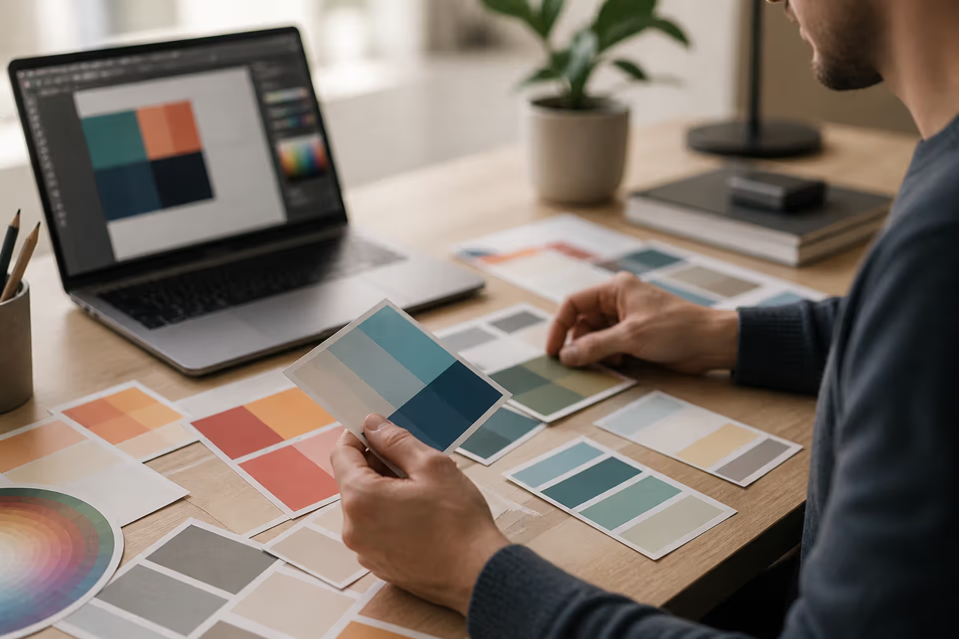
Choosing the right colors can transform a blank canvas into something memorable. Whether you're designing a logo, redecorating your bedroom, or planning a wedding mood board, understanding which hues work together makes the difference between "nice" and "I need to screenshot this immediately."
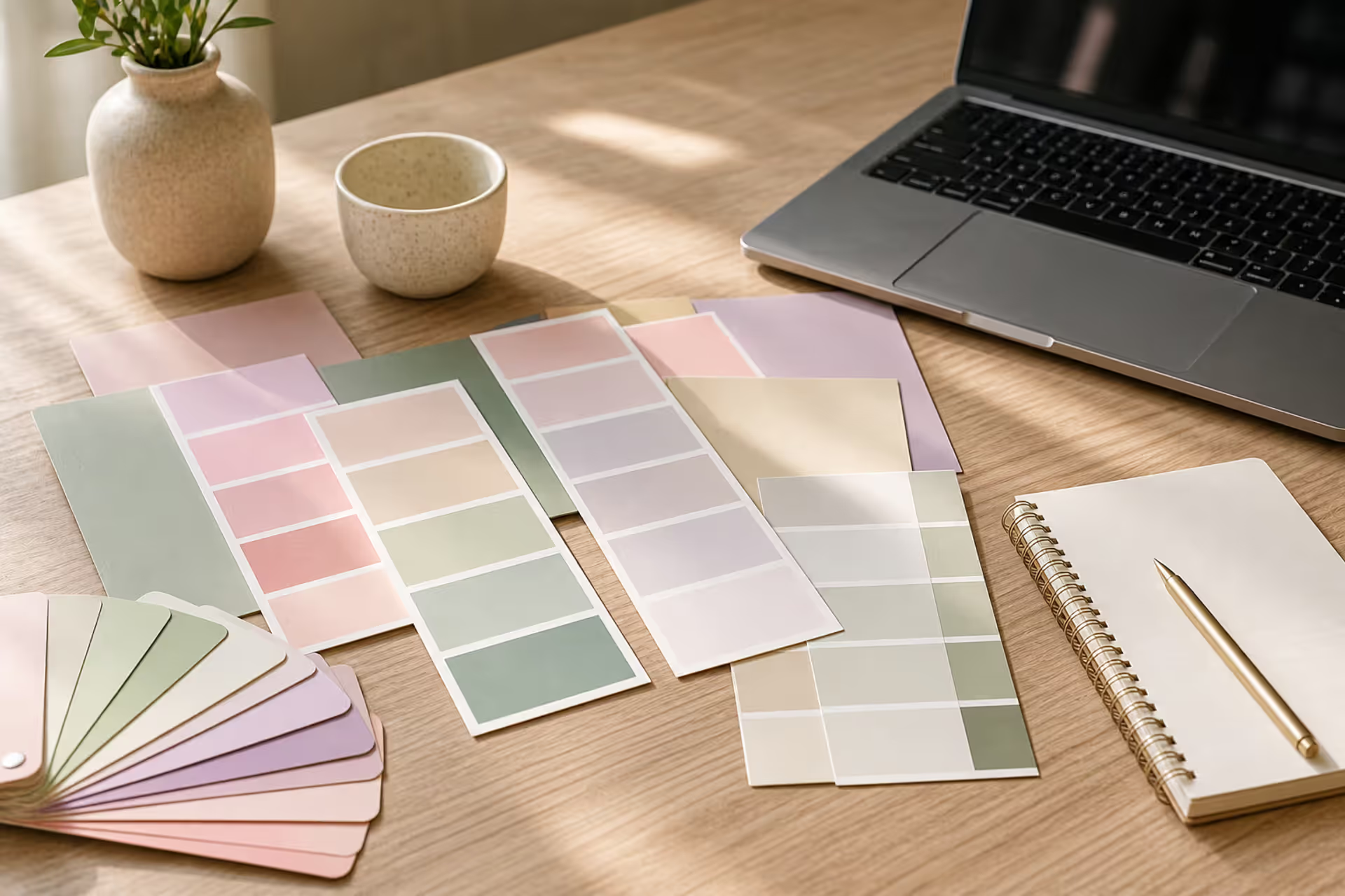
Color pairing isn't about memorizing rules—it's about recognizing patterns that naturally appeal to the human eye. Soft pinks next to sage greens, buttery yellows alongside lavender, or peachy tones paired with cream all create that instant visual comfort we associate with well-designed spaces and graphics.
What Makes a Color Combination Cute
The word "cute" in color theory typically refers to palettes that feel approachable, gentle, and visually comfortable. These combinations share several characteristics that distinguish them from bold or dramatic schemes.
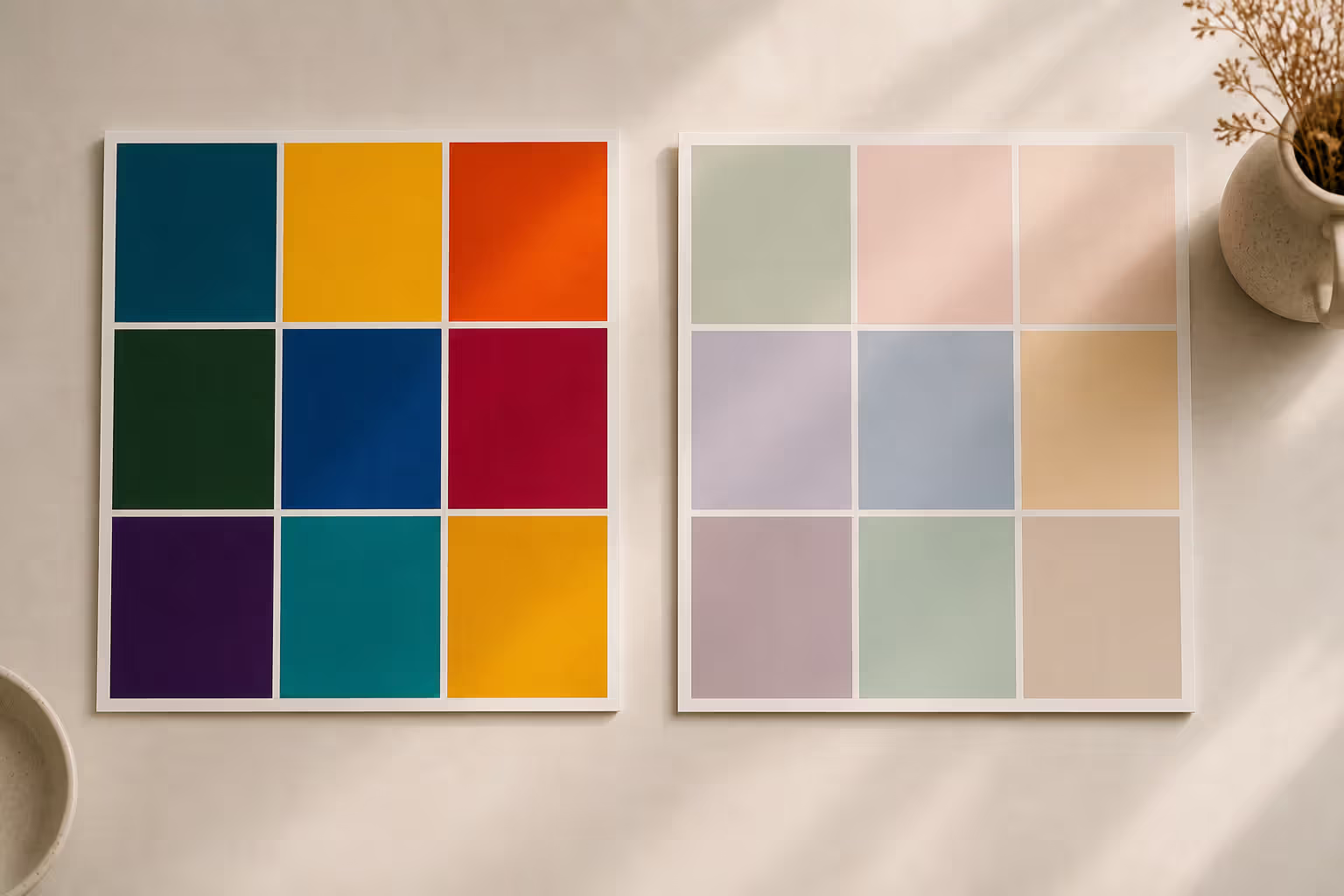
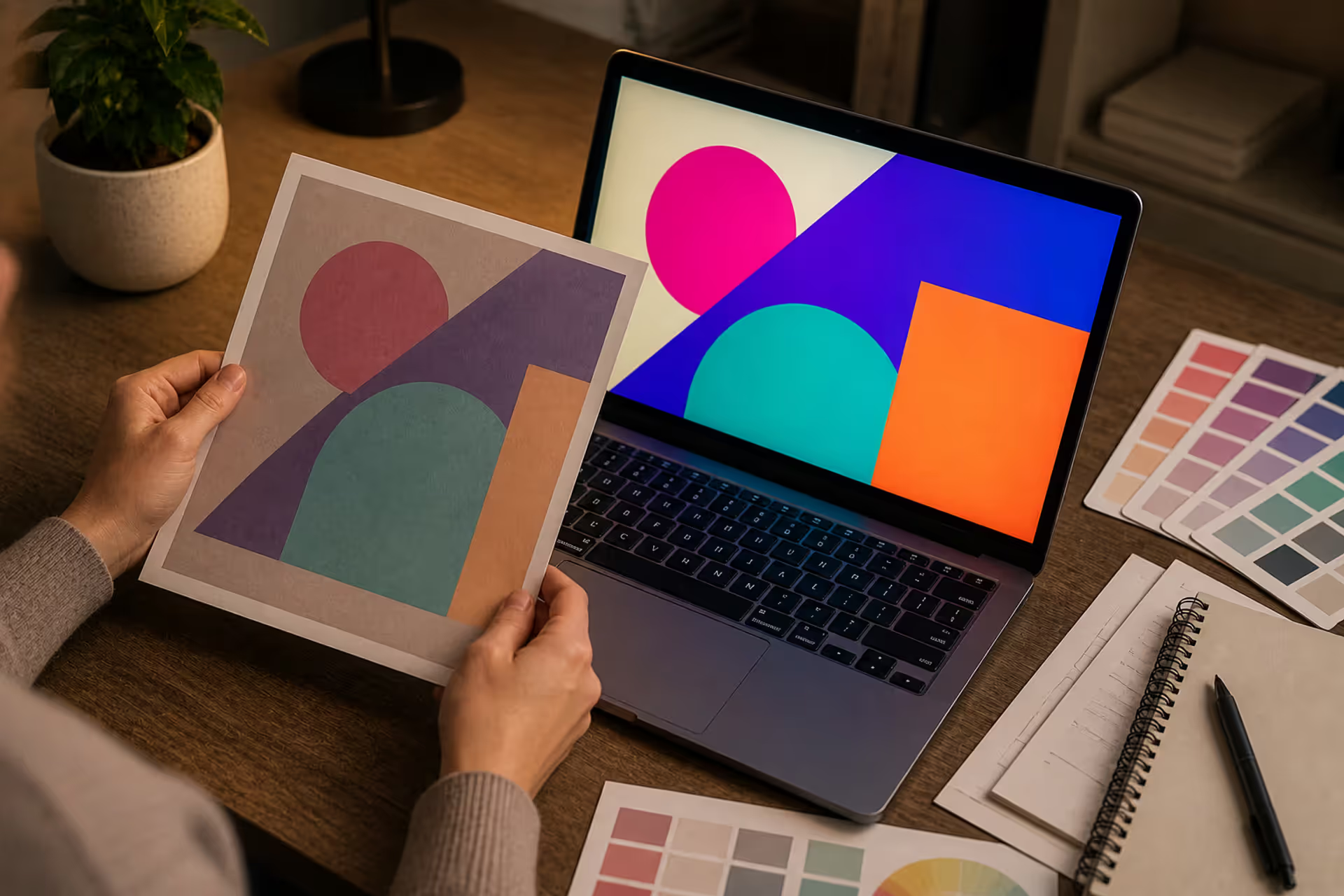
Softness ranks as the primary trait. Cute palettes avoid harsh contrasts and aggressive saturation levels. Instead, they lean toward colors with added white (tints) or gray (tones), creating that signature gentle appearance. A bright magenta might feel energetic or loud, but a dusty rose—the same hue with reduced intensity—reads as sweet and inviting.
Harmony matters just as much as individual color choice. Pleasing color duos work because they share underlying qualities: similar saturation levels, comparable warmth or coolness, or positions on the color wheel that naturally complement each other. When colors fight for attention or clash in temperature, the "cute" quality disappears.
Visual balance keeps these palettes from becoming monotonous. A harmonious pastel palette might pair three light colors, but typically one serves as the dominant shade while others provide accent notes. This creates visual interest without overwhelming the eye.
Psychology plays a role too. Soft color schemes trigger associations with comfort, nostalgia, and calm. Peach and mint might remind someone of vintage diners or childhood nurseries. Lavender and cream evoke spa days or spring mornings. These emotional connections make certain combinations feel inherently "cute" beyond their technical color properties.
Light values contribute to the effect. Most cute palettes sit in the lighter half of the value scale, though they're not necessarily pale. A medium-toned mauve paired with warm beige can feel just as cute as baby pink with white, because both maintain that approachable softness.
Author: Marcus Ellery;
Source: crafterholic.com
Popular Pastel and Soft Color Pairings
Specific combinations have proven their appeal across design contexts. Here are ten pastel color pairings and muted color combinations that consistently deliver that cute aesthetic:
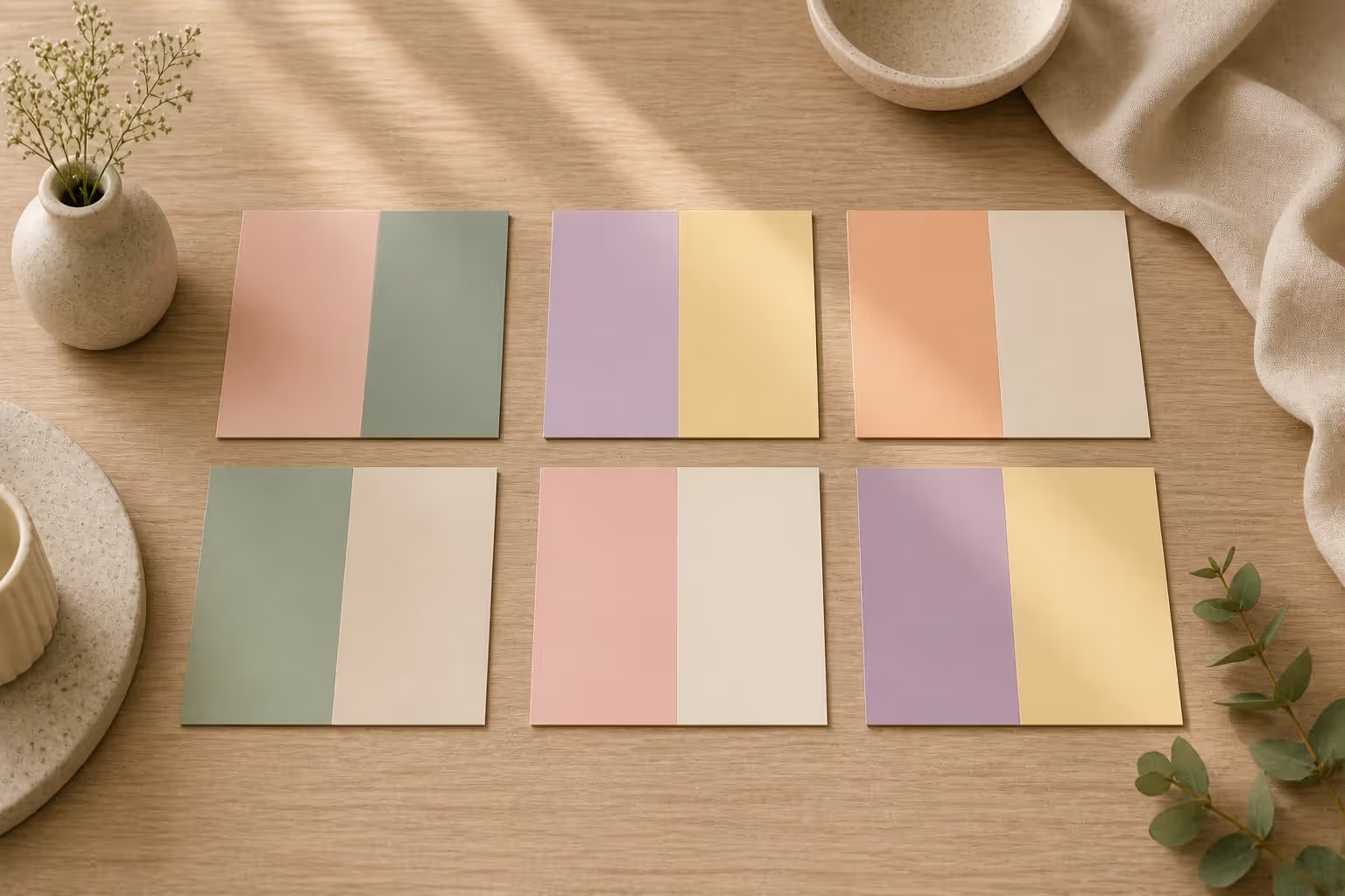
Blush and Sage: Dusty pink (#D4A5A5) meets muted green (#9CAF88). This pairing balances warm and cool without creating tension. The pink prevents the green from feeling clinical, while the sage keeps the pink from reading too sweet.
Lavender and Butter: Soft purple (#C5B4E3) alongside pale yellow (#F7E7A1). These sit opposite on the color wheel but at such gentle saturations that they complement rather than clash. Perfect when you want contrast without drama.
Peach and Cream: Warm peachy-orange (#FFDAB9) with off-white (#FFF8E7). This combination feels vintage and cozy, like faded photographs or well-loved linens. The minimal contrast makes it soothing for longer viewing.
Sky Blue and Rose: Light blue (#A8D8EA) paired with dusty rose (#D4A5A5). A classic combination that appears in everything from baby shower invitations to coastal cottage interiors. The slight coolness of both colors keeps them unified.
Mint and Coral: Pale mint green (#B2E0D4) with soft coral (#F88379). This duo brings more energy than some softer options while maintaining that gentle quality. The shared lightness level prevents either color from dominating.
Lilac and Gray: Pale purple (#C8A2C8) alongside warm gray (#B8B8AA). This sophisticated pairing works well when you need something cute but professional. The gray grounds the lilac without dulling its charm.
Honey and Ivory: Golden yellow (#E8C468) with creamy white (#FFFEF2). This warm combination feels like afternoon sunlight. The low contrast makes it restful, while the yellow adds just enough personality.
Powder Blue and Lemon: Very pale blue (#C1E1EC) with soft yellow-green (#F4F1BB). These cool-leaning colors create an airy, fresh feeling. They work especially well in spring-themed or minimalist contexts.
Mauve and Taupe: Grayish purple (#B89B9B) paired with warm brown-gray (#8B7E74). This muted combination skews more sophisticated while retaining softness. Ideal when bright pastels feel too young for your project.
Apricot and Seafoam: Warm orange-pink (#FBCEB1) with pale blue-green (#9FE2BF). This unexpected pairing brings warmth and coolness together at similar saturation levels, creating visual interest with maintained harmony.
Author: Marcus Ellery;
Source: crafterholic.com
Each of these soft color palette ideas works because the colors share key characteristics—whether that's similar value, comparable saturation, or complementary temperatures that balance rather than fight.
How to Create Harmonious Color Palettes
Building your own cute combinations follows a logical process. You don't need formal design training, just attention to a few key principles and willingness to experiment.
Start with a base color that resonates with your project's mood. This anchor color should feel right for the overall vibe you want. If you're designing something romantic, maybe that's a dusty rose. For a fresh, spring-inspired project, perhaps mint green. This first choice guides everything else.
Next, decide on your palette structure. Will you use two colors (a duo), three (a trio), or four to five (a full palette)? For beginners, matching colors in design works best with two or three options. More colors increase complexity and the chance of creating visual chaos.
Consider the color wheel relationship you want. Analogous colors (neighbors on the wheel) create gentle, unified palettes—think pink, peach, and coral. Complementary colors (opposites) offer more contrast—like lavender and butter yellow. Triadic schemes (three colors equally spaced) provide balance—such as mint, peach, and lavender.
Color Wheel Basics for Beginners
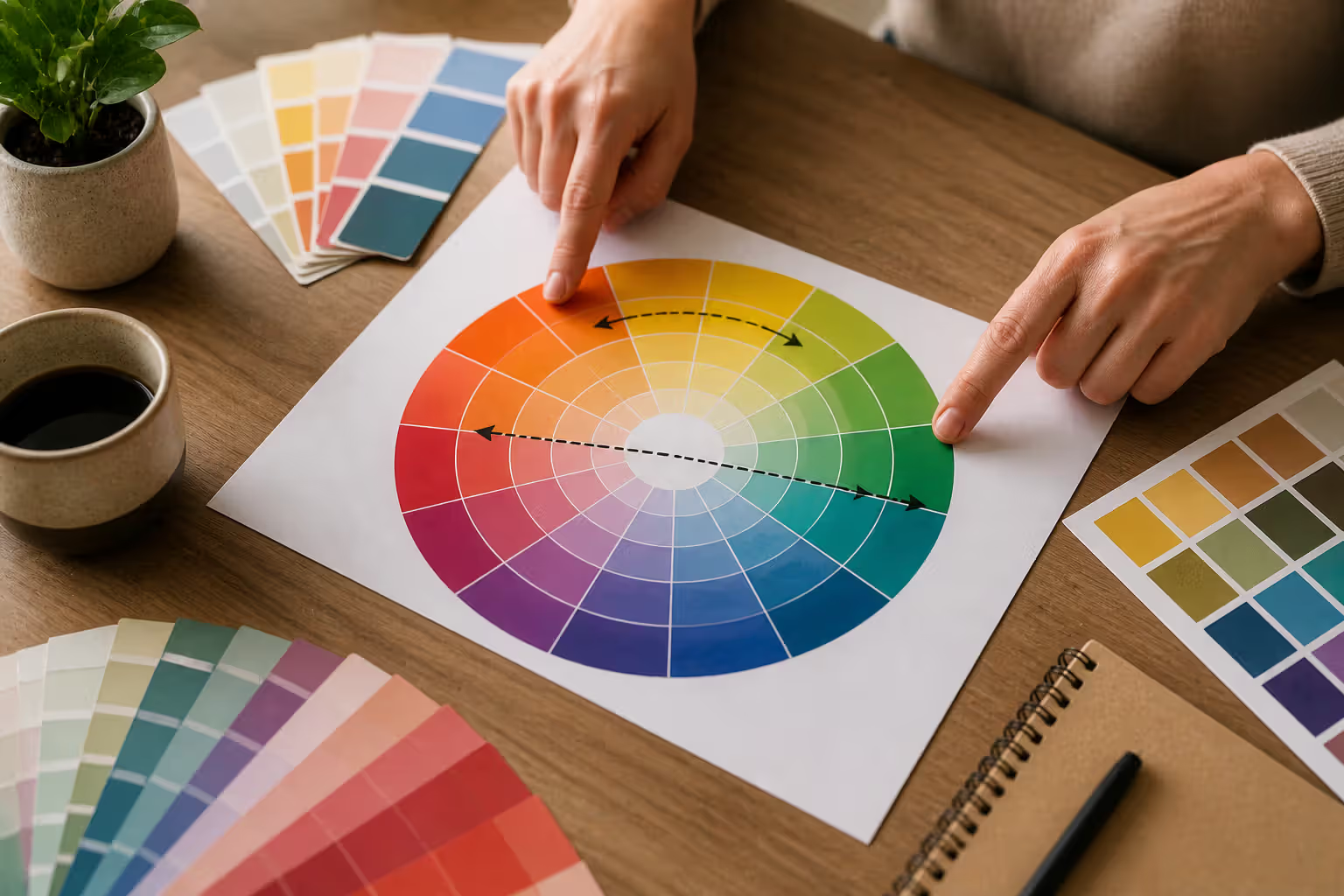
The color wheel organizes hues in a circle, showing relationships between colors. Primary colors (red, yellow, blue) sit equally spaced. Secondary colors (orange, green, purple) fall between them, created by mixing primaries. Tertiary colors fill the gaps, mixing primary and secondary hues.
For color pairing for beginners, focus on three simple relationships:
Complementary: Colors directly across from each other. Red and green, blue and orange, yellow and purple. At full saturation these can vibrate uncomfortably, but softened versions create pleasing tension.
Analogous: Three to five colors sitting next to each other on the wheel. Yellow, yellow-orange, and orange. Or blue, blue-green, and green. These combinations feel naturally harmonious because they share underlying pigments.
Monochromatic: Variations of a single hue using different tints (adding white), shades (adding black), or tones (adding gray). This approach practically guarantees harmony since you're working with one color family.
Author: Marcus Ellery;
Source: crafterholic.com
When creating warm palette creation, stick to the warm half of the wheel: reds, oranges, yellows, and warm variations of other hues (peachy pinks, golden greens). For cool palettes, use blues, greens, purples, and their cooler variations.
Adjusting Tone and Saturation
Once you've selected colors based on their wheel positions, refine them by adjusting saturation and tone. This step transforms ordinary color choices into cute combinations.
Saturation refers to color intensity or purity. Fully saturated colors look vivid and bold. Desaturated colors appear muted, dusty, or grayed. For cute palettes, aim for medium to low saturation across all colors. When every color in your palette sits at similar saturation levels, they naturally harmonize.
Tone describes how much gray has been added to a pure hue. Adding gray creates sophisticated, muted versions that feel mature and cohesive. A palette of toned colors—dusty rose, sage, and taupe—feels more refined than their bright counterparts—hot pink, lime green, and brown.
Value indicates lightness or darkness. Most cute combinations use light to medium values, avoiding very dark shades that can feel heavy or dramatic. Keep your colors in a similar value range for maximum harmony.
Test your palette by placing color swatches side by side. Do they feel balanced? Does one color scream for attention while others whisper? Adjust saturation or value until all colors feel like they belong to the same family, even if they're different hues.
Feminine and Aesthetic Color Schemes by Style
Different aesthetic movements favor specific types of cute color combinations. Understanding these style-specific palettes helps you create cohesive designs that speak to particular audiences or moods.
Cottagecore: This nostalgic, rural-inspired aesthetic embraces soft, nature-derived colors. Think cream (#F8F4E3), sage green (#9CAF88), and dusty lavender (#C5B4E3). Another cottagecore palette combines butter yellow (#F7E7A1), terracotta (#D4A5A5), and warm white (#FFF8E7). These feminine color combinations evoke handmade quilts, wildflower gardens, and sun-drenched kitchens.
Minimalist: Clean aesthetics require restrained palettes with subtle sophistication. Try warm gray (#B8B8AA), blush (#E8D5D5), and ivory (#FFFEF2). Or pair cool gray (#A8A8A8), powder blue (#C1E1EC), and white (#FFFFFF). Minimalist aesthetic color schemes use fewer colors with more negative space, letting each hue breathe.
Vintage: Mid-century and retro-inspired designs pull from faded photographs and aged materials. Mint green (#B2E0D4), coral pink (#F88379), and cream (#FFF8DC) capture 1950s diners. Mustard yellow (#E8C468), avocado green (#A4A860), and burnt orange (#CC8866) channel 1970s home decor. These palettes feel lived-in and nostalgic.
Y2K: The early 2000s revival favors playful, digital-inspired colors with slightly higher saturation than other cute aesthetics. Baby blue (#A8D8EA), bubblegum pink (#FFB6D9), and lavender (#C5B4E3) create that iconic Y2K look. Add silver or white for the full tech-nostalgia effect. These combinations feel youthful and optimistic.
Romantic: Soft, dreamy palettes for weddings, date nights, and intimate spaces. Dusty rose (#D4A5A5), champagne (#F7E7CE), and mauve (#C9A0B6) create elegant romance. Or try blush pink (#F4C2C2), ivory (#FFFEF2), and gold (#D4AF37) for something more luxurious. These palettes whisper rather than shout.
Each aesthetic uses color to communicate specific values and moods. Cottagecore celebrates simplicity and nature. Minimalism prizes clarity and calm. Vintage honors nostalgia and craftsmanship. Y2K embraces optimism and technology. Romantic aesthetics prioritize tenderness and intimacy.
10 Cute Color Combinations with Hex Codes and Best Uses
Palette Name
Color 1 + Hex
Color 2 + Hex
Color 3 + Hex
Best Use Case
Garden Party
Blush #D4A5A5
Sage #9CAF88
Cream #FFF8E7
Wedding decor, spring branding
Lavender Dreams
Lavender #C5B4E3
Butter #F7E7A1
White #FFFFFF
Nurseries, spa branding
Vintage Diner
Mint #B2E0D4
Coral #F88379
Cream #FFF8DC
Retro designs, food packaging
Coastal Cottage
Sky Blue #A8D8EA
Rose #D4A5A5
Ivory #FFFEF2
Home decor, lifestyle blogs
Sunset Glow
Peach #FFDAB9
Apricot #FBCEB1
Cream #FFF8E7
Fashion, beauty products
Sophisticated Soft
Mauve #B89B9B
Taupe #8B7E74
Warm Gray #B8B8AA
Professional services, stationery
Spring Morning
Powder Blue #C1E1EC
Lemon #F4F1BB
White #FFFFFF
Digital art, social media
Honey Glow
Honey #E8C468
Ivory #FFFEF2
Warm White #FAF9F6
Bakery branding, warm interiors
Romance
Dusty Rose #D4A5A5
Champagne #F7E7CE
Mauve #C9A0B6
Weddings, intimate events
Fresh & Clean
Seafoam #9FE2BF
Apricot #FBCEB1
White #FFFFFF
Wellness brands, minimalist design
Common Color Pairing Mistakes to Avoid
Even experienced designers occasionally create combinations that don't quite work. Recognizing these pitfalls helps you troubleshoot palettes that feel "off."
Mismatched saturation levels create the most common problem. When one color in your palette screams at full intensity while others whisper at low saturation, the bright color hijacks attention. If you choose a vibrant coral, pair it with equally vibrant companions—or desaturate the coral to match softer partners. Consistency matters more than the specific saturation level you choose.
Ignoring temperature conflicts produces uncomfortable tension. Warm and cool colors can coexist beautifully, but they need similar saturation and value to balance. A cool, pale blue paired with a warm, deep orange creates jarring contrast. That same pale blue with a pale peach works because both sit at similar lightness levels despite different temperatures.
Too many colors overwhelm the eye and dilute your message. Beginners often think more colors equal more interest, but the opposite holds true. Three well-chosen colors create more impact than seven competing ones. If you need variety, use different tints and tones of your core colors rather than adding entirely new hues.
Poor contrast for readability becomes critical when text enters the picture. That dreamy combination of cream and pale yellow looks gorgeous in a mood board but fails completely when you need to read paragraph text. Always test text colors against backgrounds, ensuring sufficient contrast for comfortable reading. Tools like WebAIM's contrast checker verify accessibility.
Forgetting context and purpose leads to technically correct palettes that miss the mark emotionally. A cute combination perfect for a baby boutique might feel inappropriate for a law firm. Pastel rainbow gradients work for a craft blogger but could undermine a financial advisor's credibility. Consider where and how people will experience your colors, then choose accordingly.
Over-relying on trends creates designs that feel dated quickly. That specific shade of millennial pink dominated 2016-2019 but now signals "trying too hard to be trendy." Choose colors because they serve your project, not because everyone else uses them. Classic soft combinations outlast trend-driven ones.
Author: Marcus Ellery;
Source: crafterholic.com
Where to Use Cute Color Combinations
These gentle palettes work across numerous applications, each with specific considerations for implementation.
Graphic design embraces soft palettes for brands targeting feminine audiences, wellness industries, creative services, or anyone wanting to project approachability. Logos, business cards, websites, and marketing materials all benefit from cohesive cute color schemes. Keep in mind that these colors often require careful contrast management for text readability.
Home decor might be the most natural application. Bedrooms, nurseries, bathrooms, and living spaces all welcome soft color combinations. Paint walls in your base color, use a second color for larger furniture or curtains, and accent with a third shade in pillows, artwork, or accessories. Remember that lighting affects color perception—test paint samples in your actual space before committing.
Fashion uses cute palettes for clothing, accessories, and personal styling. Soft colors flatter many skin tones and create approachable, friendly impressions. Build a capsule wardrobe around two or three complementary soft colors for maximum versatility. These combinations work especially well in spring and summer collections.
Social media branding relies heavily on consistent color use to build recognition. Instagram feeds, Pinterest boards, YouTube thumbnails, and TikTok graphics all benefit from cohesive palettes. Choose colors that photograph well and maintain their appearance across different screens and devices. Soft palettes create scroll-stopping content without overwhelming viewers.
Digital art and illustration leverage cute combinations to establish mood and style. Character designs, backgrounds, UI elements, and decorative graphics all communicate through color choices. Digital formats allow precise color control, so you can use exact hex codes to maintain consistency across projects.
Wedding planning practically invented cute color combinations. Invitations, florals, table settings, bridesmaid dresses, and decor all coordinate around chosen palettes. Soft colors photograph beautifully and create romantic, timeless aesthetics. Consider how colors will appear in different lighting—outdoor ceremonies versus indoor receptions, daytime versus evening events.
Product packaging uses gentle palettes to communicate quality, care, and attention to detail. Handmade goods, beauty products, stationery, and specialty foods often employ soft colors to stand out from mass-market competitors using bold primaries.
Color is a power which directly influences the soul. Color is the keyboard, the eyes are the hammers, the soul is the piano with many strings. The artist is the hand which plays, touching one key or another, to cause vibrations in the soul.
— Wassily Kandinsky
Frequently Asked Questions About Color Pairing
What are the best color combinations for a soft aesthetic?
Blush and sage, lavender and cream, peach and mint, or powder blue and lemon all create that signature soft look. The key lies in choosing colors with similar saturation levels and light values rather than specific hues. Any colors can work softly if you adjust their intensity and add enough white or gray to reduce harshness.
How do I choose colors that go well together?
Start with the color wheel to identify harmonious relationships—complementary, analogous, or triadic. Then adjust all colors to similar saturation and value levels. Test your choices by placing them side by side and asking whether they feel balanced. Trust your eye; if something feels off, it probably is. Make small adjustments to tone or saturation until the combination clicks.
What's the difference between pastel and muted colors?
Pastels are created by adding white to pure hues, resulting in light, soft colors with relatively high saturation for their value—think baby pink or mint green. Muted colors are created by adding gray to pure hues, producing colors that feel dusty or subdued regardless of their lightness—like dusty rose or sage green. Pastels feel lighter and brighter; muted colors feel sophisticated and toned down. Both work for cute aesthetics but create different moods.
Can I use cute color combinations in professional design?
Absolutely, though context matters. Law firms and financial institutions might avoid very sweet palettes, but creative agencies, wellness brands, boutique shops, and service businesses often benefit from approachable, soft color schemes. The key is adjusting saturation and pairing choices to match your industry's expectations. A sophisticated combination like mauve and warm gray reads as professional while maintaining softness.
What tools help create matching color palettes?
Adobe Color (color.adobe.com) generates palettes based on color theory rules and allows you to adjust individual colors. Coolors (coolors.co) provides quick palette generation with easy tweaking. Paletton (paletton.com) shows how colors work together with different combinations. For testing accessibility, use WebAIM's Contrast Checker. Pinterest serves as excellent inspiration, showing real-world applications of color combinations.
Do warm and cool colors work together?
Yes, when balanced properly. The trick is keeping them at similar saturation and value levels. A pale warm peach with a pale cool mint works because both sit at comparable lightness despite different temperatures. A deep warm orange with a pale cool blue creates jarring contrast. When mixing temperatures, aim for similar intensity across all colors to maintain harmony.
Color combinations shape how people experience your designs, spaces, and brands. Cute palettes—characterized by softness, harmony, and approachable appeal—create instant visual comfort that draws people in rather than pushing them away.
The process of building these combinations doesn't require artistic genius, just attention to key principles: maintaining similar saturation across colors, balancing warm and cool temperatures, using the color wheel to identify natural relationships, and adjusting tone until everything feels cohesive.
Whether you're painting a bedroom, designing a logo, planning a wedding, or building a social media presence, these gentle color schemes communicate care, attention to detail, and thoughtful curation. They work because they respect how human eyes process color relationships, creating harmony that feels both intentional and effortless.
Start with one of the proven combinations listed here, then experiment by adjusting individual colors to match your specific needs. Pay attention to context—what works for a craft blog might not suit a consulting firm—and always test your choices in their actual application environment before finalizing.
The best color palette is the one that serves your specific project while creating the emotional response you want from your audience. Trust your instincts, make small adjustments when something feels off, and remember that even professional designers refine their choices multiple times before landing on the perfect combination.
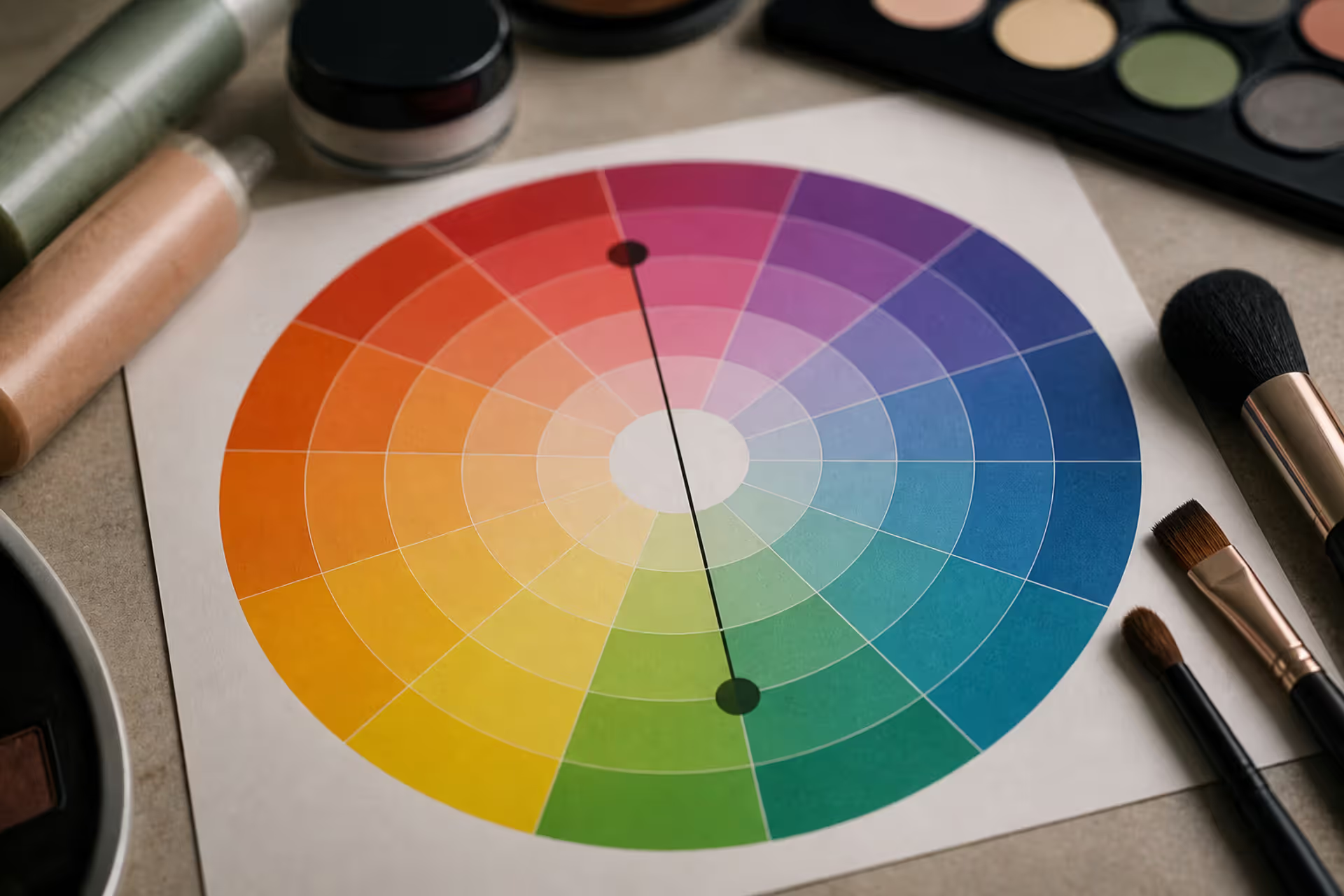
Green tones appearing where they shouldn't can be frustrating. Red cancels out green because these colors sit directly opposite on the color wheel. This principle applies across makeup, hair color, painting, and digital editing, giving you precise control over unwanted hues.
Discover the essential types of color palettes used in design, from monochromatic schemes to complex tetradic systems. Learn how each palette type works, when to use them, and how to choose the right colors for your specific project needs with expert insights and practical examples.
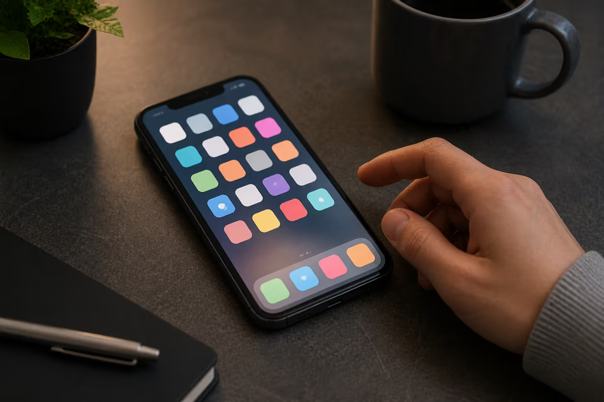
The rounded square has become the defining shape of digital interfaces. From app icons to buttons, this geometric form appears billions of times daily. Learn the mathematical differences between rounded squares, squircles, and superellipses, plus platform-specific implementation standards.
Converting RGB digital colors to PMS for print requires more than software—it demands understanding color gamut differences, using physical Pantone guides, and managing expectations. This comprehensive guide explains why screen colors don't translate directly to print and shows you proven methods for accurate color conversion.
The content on this website is provided for general informational and educational purposes only. It is intended to explain concepts related to digital design, visual art, color theory, art techniques, design principles, and design history.
All information on this website, including articles, guides, and examples, is presented for general educational purposes. Creative outcomes may vary depending on individual skill, tools, and practice.
This website does not provide professional design services or guarantee results, and the information presented should not be used as a substitute for formal education or professional consultation.
The website and its authors are not responsible for any errors or omissions, or for any outcomes resulting from decisions made based on the information provided on this website.