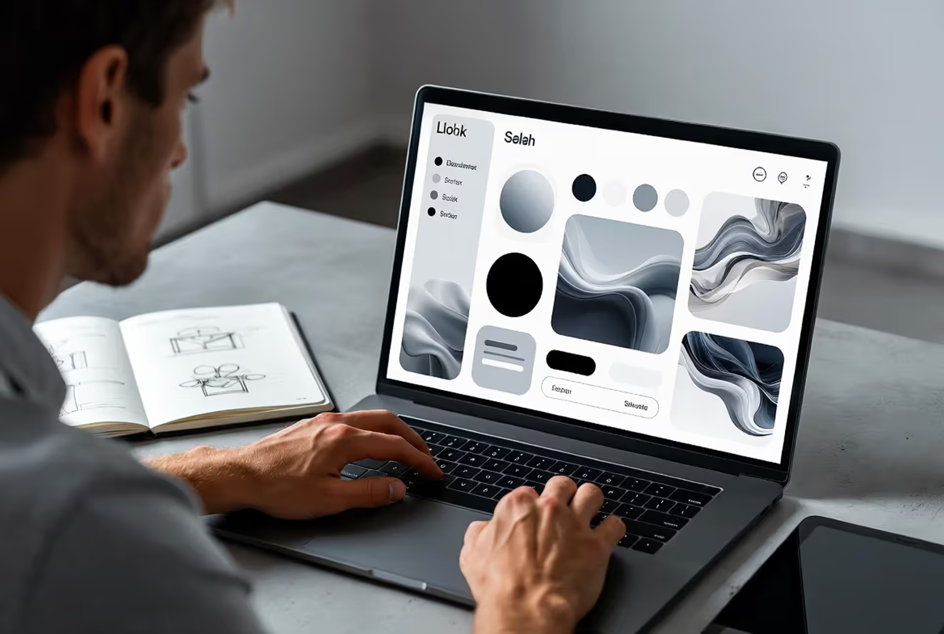
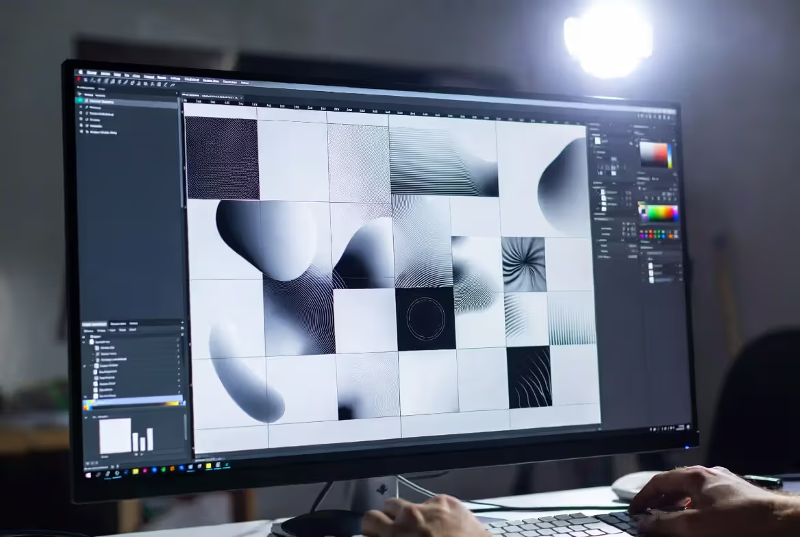
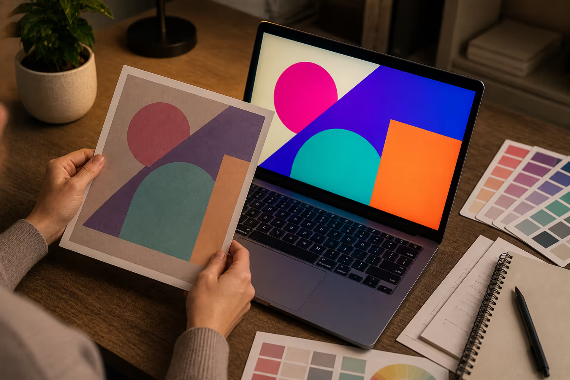
Look at any design that makes you stop scrolling. Chances are, it's doing something interesting with shapes. Not just using them—playing with them, breaking rules, making you feel something before you've read a single word.
Here's what most designers miss: shapes aren't just containers for content. They're the first language your brain processes when looking at any composition. And some shapes? They just hit different.
What Makes a Shape "Cool" in Visual Design
A shape becomes cool when it surprises you without being weird for weird's sake.
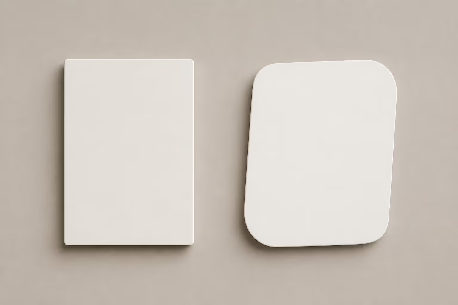
Think about it. When you see the same rounded rectangle for the hundredth time, your brain doesn't even register it. But tweak those corner radii asymmetrically—maybe two sharp, two soft—and suddenly people notice. That's the difference between filling space and creating an experience.
Three things separate forgettable shapes from ones that stick:
First, they're unexpected but not random. A blob shape in a financial app might feel off-brand, but that same organic form makes a meditation app feel instantly calming. Context is everything.
Second, they earn their place. Every shape needs a job. Is it directing your eye? Creating breathing room? Building brand recognition? If you can't answer that, you're just decorating.
Third, they tap into how humans actually perceive things. We've spent millions of years reading our environment through shapes. Sharp angles? Potential threat—our brains stay alert. Soft curves? Safe, approachable. This isn't design theory. It's biology.
The simpler the shape, the more important the proportions become. A perfect circle is boring. A circle that's slightly off, that has tension, that's where design lives.
— Franz Roh
Paula Scher's right, and here's why it matters: your audience processes shape psychology before they've even consciously looked at your design. Law firms pack their branding with triangles and rectangles because angular forms signal "we're serious professionals who won't mess up your case." Children's hospitals flood their spaces with circles and soft blobs because curves whisper "you're safe here."
But context flips everything. That hand-drawn, slightly wonky circle? Looks unprofessional in most corporate settings. Drop it into a startup's brand identity, though, and it screams authenticity and human touch.
The real secret to cool shapes? Contrast. A jagged polygon surrounded by nothing but smooth curves becomes the focal point. A massive circle dwarfing tiny rectangles commands attention immediately. What makes a shape interesting isn't the shape itself—it's what you put next to it.
Author: Sophie Calder;
Source: crafterholic.com
Types of Cool Shapes Designers Use
Let's break down the main categories. Each one has specific superpowers.
Geometric Shapes and Basic Forms
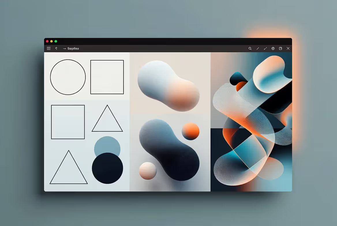
Circles, squares, triangles. The building blocks. You've seen them a million times, which is exactly why they work.
Geometric shapes follow rules. Mathematical precision. Clean edges. They scale perfectly from favicon to billboard because they're based on formulas, not feeling. Target's bullseye? Still instantly recognizable at 16 pixels. CBS's eye? Works on a business card or a Times Square screen.
But don't mistake basic for boring. Modern designers torture these forms in fascinating ways. Apple's iOS icons use a complex "squircle" formula—not quite circle, not quite square—that took engineers serious math to perfect. The result feels friendly but premium. Instagram's gradient-filled rounded square became so iconic they literally trademarked the shape's proportions.
Circles suggest wholeness. Your brain reads them as complete, unified, inclusive. That's why community-focused brands love them.
Squares and rectangles communicate stability. Microsoft's Windows logo. Credit card designs. Website grids. Anything that needs to feel trustworthy defaults to right angles.
Triangles create movement. They point. They suggest direction, growth, hierarchy. Tech companies building "cutting edge" products lean on sharp triangular elements to reinforce that message visually.
Then designers started mutating these basics. Stretched hexagons for that sci-fi tech vibe. Overlapping geometric forms to build depth. Truncated corners on rectangles. Each variation changes the emotional temperature slightly.
Organic and Irregular Shapes
Now we're getting into the shapes that feel alive.
Organic forms don't follow grids. They flow. Blob like. Asymmetric. They're what happens when you stop measuring and start feeling. These shapes resist perfect reproduction—even if you're using vector tools, they maintain a handcrafted quality that geometric forms can't touch.
The organic versus geometric debate misses the point entirely. You're not choosing one or the other. You're choosing which emotion you want to lead with.
Organic shapes inject warmth into cold digital spaces. Spotify's wrapped campaigns use flowing, amoeba-like shapes because they feel celebratory and personal. Wellness brands drench their designs in soft, nature-inspired curves because harsh angles would contradict their whole message.
But here's the catch: organic shapes are way harder to execute well. Get them slightly wrong and your design looks amateurish instead of artful. They don't scale as cleanly as geometric forms. And they can make text readability tank if you're not careful.
Where they excel: backgrounds, accents, creating atmosphere. A blob shape behind your headline adds visual interest without fighting for attention. Ribbon-like flowing forms guide users through content more gracefully than rigid arrows.
Abstract Shape Compositions
This is where shapes become art.
Abstract compositions combine multiple forms to suggest concepts that single shapes can't communicate. Three overlapping triangles might represent interconnected systems. Scattered circles of varying sizes could visualize growth, diversity, community—whatever story you're telling.
These require the most skill because you're creating meaning from scratch. A triangle is a triangle. But three triangles arranged in a specific relationship? That's a statement you're making, and it needs to work without explanation.
Done right, abstract shape compositions become unreplicable brand assets. Competitors can't knock off your abstract mark the way they might copy a simple geometric logo. The arrangement itself is the IP.
Brand systems, editorial design, cultural institutions
Advanced—needs strong design sense
Author: Sophie Calder;
Source: crafterholic.com
How Shapes Function as Design Elements
Shapes work as a system, not in isolation. Miss this and your designs fall flat.
Shape hierarchy determines what people look at first, second, third. Size matters, sure. But a tiny red triangle will dominate a sea of large gray circles every time. Contrast creates hierarchy just as powerfully as scale.
Try this in your next interface: use subtle shape variations to categorize content types. Product cards get sharp corners. Promotional content uses rounded forms. Users won't consciously notice, but they'll navigate faster because their brains are pre-sorting information based on shape patterns.
Negative space creates shapes most designers completely ignore. FedEx's arrow exists only in the gap between letters. Look at it once and you'll never unsee it. That's negative space working overtime.
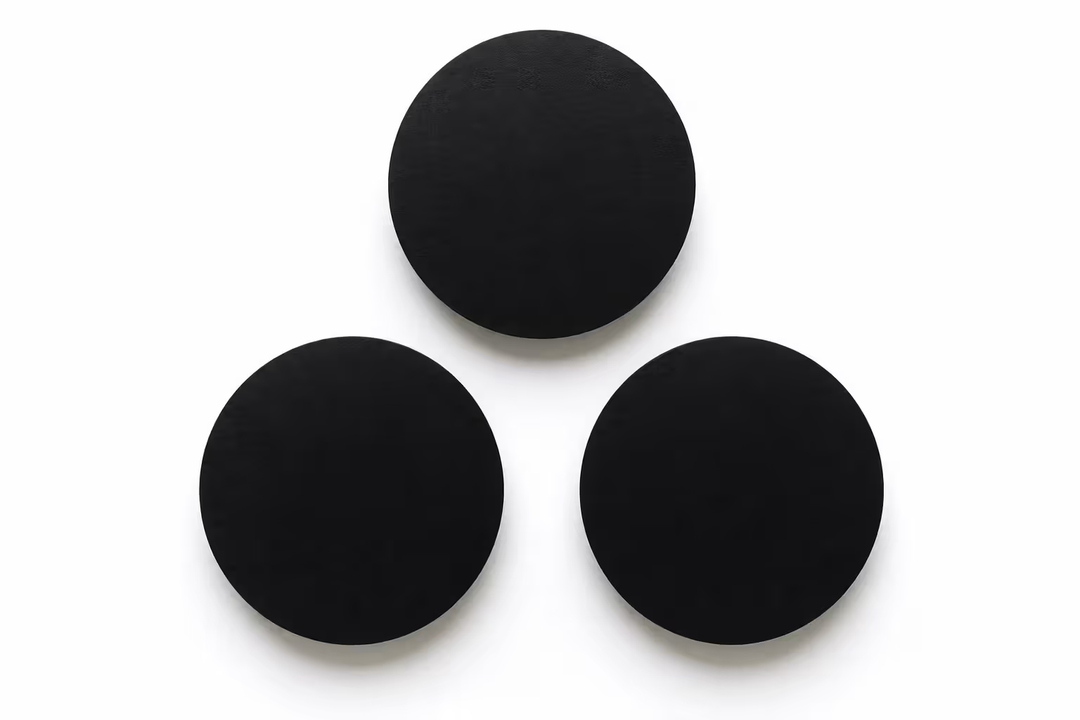
Here's an exercise that'll change how you see design: place three circles on a blank page. Notice the triangle formed by the empty space between them? That negative triangle is as real as the circles themselves. Move the circles around. Watch the negative triangle shift from stable to dynamic to awkward depending on spacing. Every adjustment changes the invisible shape's personality.
Professional designers obsess over negative space because it's free real estate. The gaps organize content as effectively as visible containers, but they feel lighter. Minimal. Sophisticated.
Shape contrast operates on multiple channels simultaneously. You can contrast size (massive versus tiny), complexity (simple versus intricate), or style (geometric versus organic). The strongest designs layer all three. A huge, simple circle paired with small, detailed polygons creates way more tension than shapes differing in just one dimension.
Layering builds depth. Overlapping generates new forms at intersections. Transparency reveals underlying shapes while keeping boundaries distinct. Shadows and offsets fake three-dimensional space on flat screens. But—and this is crucial—every layer needs justification. Random layering looks like you couldn't decide, so you included everything.
Author: Sophie Calder;
Source: crafterholic.com
Cool Shapes in Different Design Applications
What works for a logo dies in an interface. Context determines everything.
Shapes in brand identity face brutal constraints. Your logo shape needs to work at 16x16 favicon size and 40-foot billboard scale. In full color and pure black. On screens and embroidered on shirts. This reality eliminates 90% of "cool" shapes that only function in specific contexts.
Airbnb's loop symbol nails this challenge. Organic enough to feel human and welcoming. Geometric enough to scale perfectly clean. It works standalone, as a pattern element, in animations. Before committing to identity shapes, stress-test them across every application you can imagine.
Layout and interface design prioritizes function over pure aesthetics. Always. Shapes must guide users, contain content clearly, adapt across devices. Rounded rectangles dominate mobile because they're thumb-friendly and signal "tap here" without words. Circular profile images became standard because they focus attention on faces while creating consistent rhythm in user lists.
Resist trendy shapes that sacrifice usability. Diagonal containers might look dynamic in that Dribbble shot, but they create awkward text wrapping and waste tons of space in production. Extremely organic shapes work as accents but fail catastrophically as primary content containers.
Illustration and artistic compositions remove all safety rails. Here, shapes can prioritize pure expression. Clash geometric and organic forms deliberately. Create impossible shapes that couldn't exist in physical space. Build abstract compositions that communicate mood without literal representation.
Packaging and print work sits between identity and interface concerns. Shapes must grab attention on crowded shelves while communicating product qualities instantly. Beverage brands use bottle shapes as three-dimensional trademarks. Cosmetic packaging employs geometric precision to signal luxury or organic curves to imply natural ingredients. Physical products add considerations digital designers skip: how shapes feel in hand, how products stack on shelves, how they photograph for Instagram.
How to Choose and Combine Shapes Effectively
Start with strategy, not aesthetics. Your favorite shape might be completely wrong for the project.
Matching shapes to brand personality requires understanding shape psychology at a gut level. Luxury brands favor clean geometric forms—perfect rectangles and precise circles signal refinement and obsessive attention to detail. Playful brands embrace irregular, organic shapes that feel spontaneous and fun. B2B tech companies gravitate toward angular, interconnected shapes suggesting networks and systems.
Before touching design software, create a shape mood board. Working on a kids' education app? Collect organic, friendly shapes that feel safe and inviting. Building a financial dashboard? Gather clean geometric forms that communicate precision and reliability. This research phase prevents you from realizing three weeks in that your shape choices completely contradict brand values.
Balancing geometric versus organic forms within one design creates visual interest without losing coherence. A reliable ratio: 70% geometric for structure, 30% organic for warmth. Or flip it for brands prioritizing approachability over authority. Pure geometric designs often feel cold and sterile. Pure organic designs usually lack enough structure to guide users effectively. The magic happens in thoughtful combination.
Here's a practical technique: establish a geometric grid or framework first, then introduce organic shapes as accents. Your website uses rectangular content blocks with blob shapes floating in the background. This grounds the design in usable structure while injecting personality where it won't interfere with function.
Creating contrast without chaos requires ruthless restraint. Limit yourself to three or four distinct shape types, then vary them through size, color, and arrangement. A design using circles, rounded rectangles, and triangles maintains visual coherence. Start adding hexagons, stars, and irregular blobs and you've created visual noise that confuses rather than engages.
Author: Sophie Calder;
Source: crafterholic.com
Common mistakes that kill otherwise good designs:
Shape overload: Using every interesting shape you've ever bookmarked. Pick a focused vocabulary and stick to it.
Inconsistent application: Switching from geometric to organic between sections for no strategic reason. Looks indecisive.
Ignoring alignment: Cool shapes still need to align to grids or relate to each other spatially. Randomness isn't freedom.
Sacrificing readability: Shapes should enhance content comprehension, not obscure it. That wavy text container might look cool but tank your conversion rate.
Trend-chasing: That blob shape everyone's using this month probably doesn't fit your 5-year brand strategy.
FAQ
What are the most popular geometric shapes in modern design?
Rounded rectangles dominate right now, especially in app design and digital interfaces. You'll see them everywhere from iOS buttons to card-based layouts. Circles maintain consistent popularity for icons, avatars, and interactive elements. Hexagons gained serious traction in tech and science sectors—they suggest networks and molecular structures. Triangles appear frequently as directional indicators and dynamic accents. The broader trend leans toward "soft geometry"—geometric shapes with slightly rounded corners that feel more approachable than pure hard edges.
How do organic shapes differ from geometric shapes?
Geometric shapes follow mathematical rules. You can draw them with compass, ruler, and protractor—circles, squares, triangles, polygons. Organic shapes mimic natural forms with irregular curves and asymmetry that resist perfect replication. Think amoebas, clouds, water spills. Geometric shapes feel structured and intentional. Organic shapes appear spontaneous and human-made. In actual practice, many designers use "controlled organic" shapes—forms that look natural but follow subtle geometric constraints for consistency across applications.
Can you mix geometric and organic shapes in one design?
Absolutely, and it often produces the most engaging work. The contrast between geometric structure and organic warmth creates visual interest while maintaining usability. Use geometric shapes for primary structure—grids, containers, navigation elements—and organic shapes as accents or atmospheric elements. The critical part is establishing clear hierarchy so viewers understand which shapes provide functional structure and which add personality. Without hierarchy, mixing shape styles just looks confused.
What is negative space and how does it create shapes?
Negative space refers to empty areas between and around design elements. These "empty" zones form their own shapes that can be just as important as filled areas. Classic example: the arrow hidden in the FedEx logo, formed entirely by space between letters. Skilled designers intentionally shape negative space, using it to create secondary imagery, improve readability, establish visual rhythm, or reduce cognitive load. Train yourself to see negative space by inverting your designs or squinting to blur details—the shapes between elements become more obvious.
How do you create hierarchy using shapes?
Shape hierarchy works through contrast in size, complexity, position, and style. Larger shapes visually dominate smaller ones—basic but effective. Complex, detailed shapes draw more attention than simple forms because brains notice novelty. Shapes positioned at the top or center of layouts carry more visual weight due to reading patterns. Unique shapes stand out among repeated forms immediately. Combine these strategically: your most important content might sit in a large, uniquely-shaped container at the top, while secondary content occupies smaller, simpler, repeated shapes below.
What shapes work best for minimalist designs?
Minimalist design favors simple geometric forms—circles, squares, rectangles, triangles—used sparingly with generous negative space. The shapes should be perfect or near-perfect without decorative embellishment. Rounded rectangles work particularly well, offering geometric precision with subtle approachability. Limit your shape vocabulary to one or two primary forms, varying them through size and proportion rather than introducing multiple shape types. The restraint itself becomes the design statement. Adding more shape variety contradicts minimalism's core principle.
Shapes communicate before you've written a word or chosen a color. The gap between forgettable design and work that sticks often comes down to thoughtful shape selection and application—not talent, not budget, just intentionality.
Start by understanding what geometric, organic, and abstract forms actually communicate emotionally and functionally. Learn how shapes interact through hierarchy, negative space, and contrast. Match your choices to brand personality and project requirements instead of personal preference or whatever's trending on design Twitter this week.
The most effective approach? Combine geometric structure with organic warmth. Create designs that feel both usable and human. Test your shapes across applications—what works at one scale or in one context frequently fails elsewhere. Watch for common traps like shape overload, inconsistent application, or sacrificing readability for visual interest.
Master fundamentals before experimenting with complex compositions. Practice seeing negative space as actively as positive forms. Develop a focused shape vocabulary for each project rather than throwing every interesting form you've collected into one design. With enough intentional practice, you'll develop intuition for which shapes serve your actual design goals and which just add noise.
The coolest shapes aren't necessarily the most complex or trendy. They're the ones that perfectly balance uniqueness, function, and emotional resonance for your specific context. Sometimes that's a perfect circle. Sometimes it's an irregular blob. Often it's something in between.
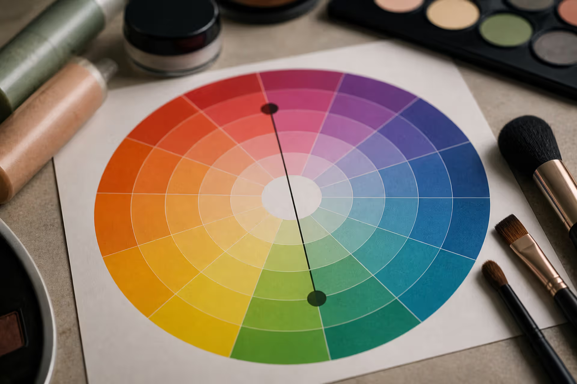
Green tones appearing where they shouldn't can be frustrating. Red cancels out green because these colors sit directly opposite on the color wheel. This principle applies across makeup, hair color, painting, and digital editing, giving you precise control over unwanted hues.
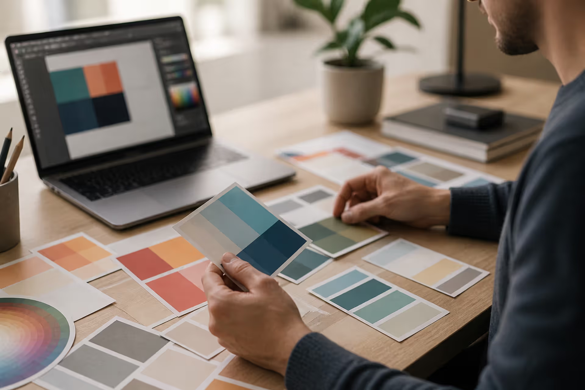
Discover the essential types of color palettes used in design, from monochromatic schemes to complex tetradic systems. Learn how each palette type works, when to use them, and how to choose the right colors for your specific project needs with expert insights and practical examples.
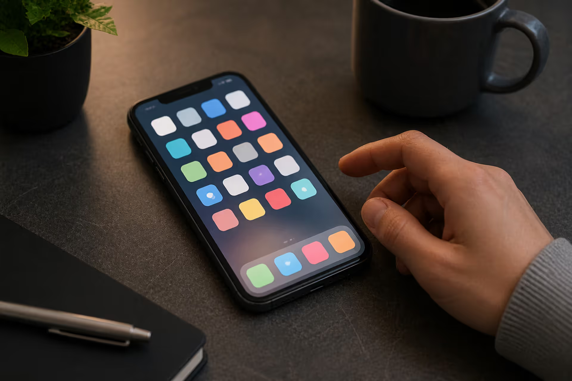
The rounded square has become the defining shape of digital interfaces. From app icons to buttons, this geometric form appears billions of times daily. Learn the mathematical differences between rounded squares, squircles, and superellipses, plus platform-specific implementation standards.
Converting RGB digital colors to PMS for print requires more than software—it demands understanding color gamut differences, using physical Pantone guides, and managing expectations. This comprehensive guide explains why screen colors don't translate directly to print and shows you proven methods for accurate color conversion.
The content on this website is provided for general informational and educational purposes only. It is intended to explain concepts related to digital design, visual art, color theory, art techniques, design principles, and design history.
All information on this website, including articles, guides, and examples, is presented for general educational purposes. Creative outcomes may vary depending on individual skill, tools, and practice.
This website does not provide professional design services or guarantee results, and the information presented should not be used as a substitute for formal education or professional consultation.
The website and its authors are not responsible for any errors or omissions, or for any outcomes resulting from decisions made based on the information provided on this website.