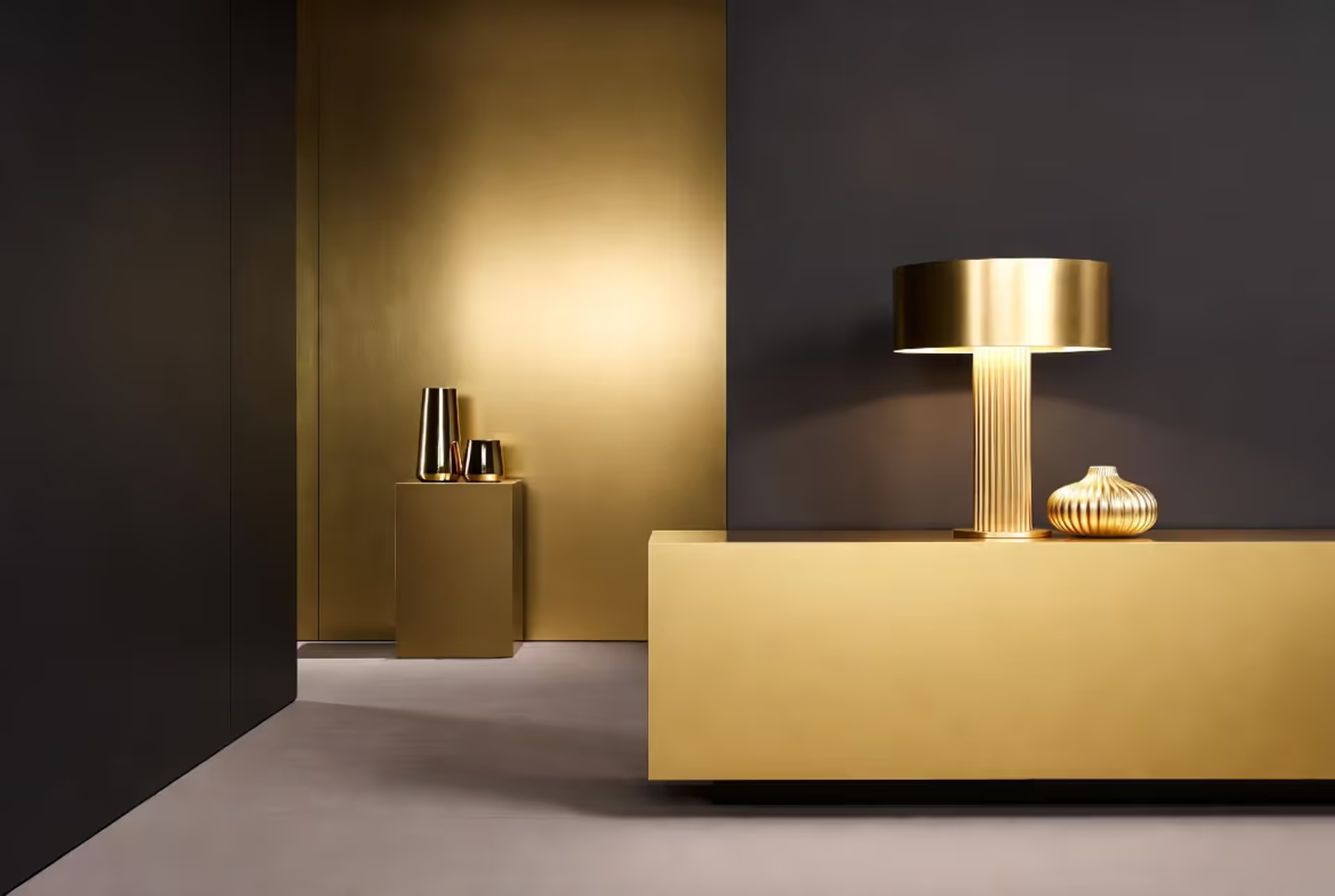
Here's what makes gold different from almost every other color choice: it's technically a metallic, but it behaves like a chameleon in your design palette.
Use a little gold? You've got sophisticated accent pieces that catch the eye. Go bold with gold across larger surfaces? Now you're making a theatrical statement that demands attention. This flexibility explains why you'll find gold in everything from minimalist Scandinavian apartments to maximalist Parisian salons.
Gold taps into something primal in how we respond to color. We've associated it with sunlight and wealth for thousands of years—Egyptian pharaohs knew what they were doing. When you walk into a room with gold elements, your brain unconsciously registers "quality" and "warmth." It's not magic; it's psychology that designers have leveraged for centuries.
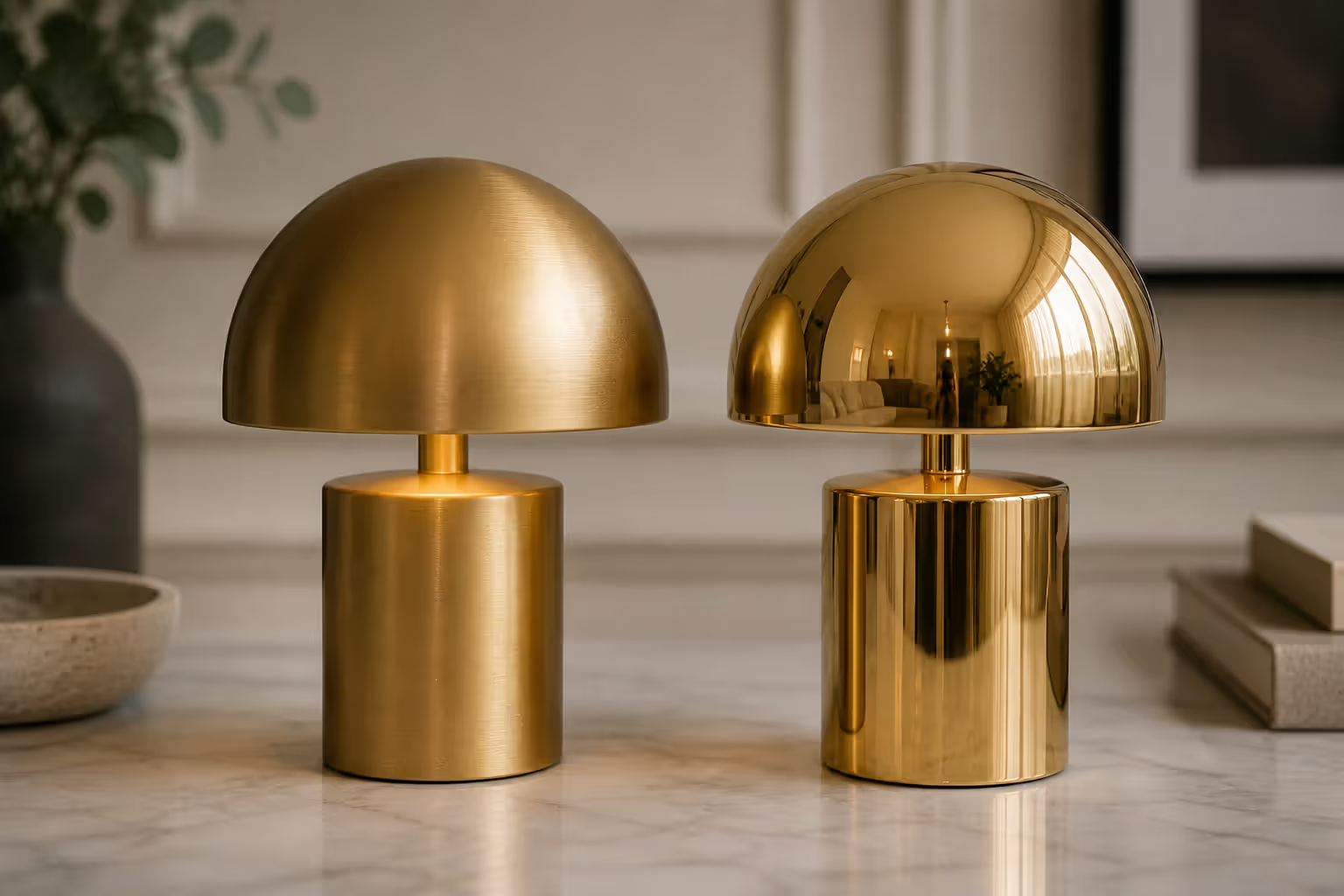
The finish matters enormously. Matte gold has this soft, almost buttery quality that absorbs light. It whispers rather than shouts. Polished gold, though? That's your showstopper. It reflects everything around it, amplifying other colors and bouncing light into dark corners. I've seen a single polished gold mirror completely transform a dim hallway.
Because gold leans warm—think sunset, honey, amber—it naturally clicks with other warm tones. But here's the interesting part: pair it with cool colors like navy or teal, and you get this electric contrast that makes both colors more interesting. That temperature tension is where gold in luxury design palettes really earns its keep, pulling together colors that might otherwise clash.
Author: Adrian Lowell;
Source: crafterholic.com
Classic Color Pairings with Gold
Black and Gold Palette
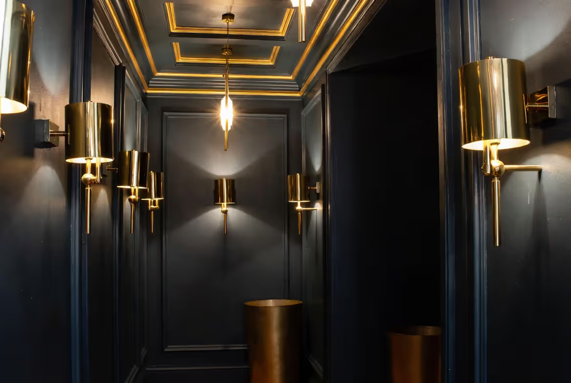
Walk into any high-end hotel lobby, and you'll probably spot this combination within thirty seconds. The black and gold palette works because black doesn't compete—it steps back and lets gold shine.
Think about it: black absorbs light, gold reflects it. You've got this perfect visual balance happening. In residential spaces, I've seen black accent walls with brass sconces create this moody, gallery-like atmosphere that makes art pop. Black velvet dining chairs with gold legs? That's instant sophistication without trying too hard.
But here's where people mess up: they use equal amounts of both colors. A room that's 50% black and 50% gold feels heavy, almost oppressive. You want roughly 70-80% black (or other neutrals) with gold as your punctuation mark. Add some cream or ivory to soften the whole thing. Nobody wants to feel like they're dining in a tuxedo.
For events, this pairing photographs beautifully under almost any lighting. Wedding planners have been riding this combination for decades because it works with both modern venues and traditional ballrooms.
Navy and Gold Combination
If black and gold is a tuxedo, the navy and gold combination is a perfectly tailored blazer—still sophisticated, but you can actually relax in it.
Navy gives you that depth and richness without feeling severe. I've specified navy grasscloth wallpaper with brushed gold picture lights in living rooms where clients wanted luxury they could live with, not just look at. The combination feels approachable. Your guests won't worry about touching anything.
In fashion, this pairing never fails. Navy suit, gold watch, gold cufflinks—you're projecting "I've got my life together" without being flashy about it. For branding work, financial firms and luxury hotels love this combo because navy says "trustworthy" while gold whispers "exclusive."
Pay attention to undertones, though. Cool navy (more blue) needs yellow gold. If your navy has purple undertones—and many do—rose gold harmonizes better. Test your samples together in actual room lighting, not under the hardware store's fluorescents.
Author: Adrian Lowell;
Source: crafterholic.com
White and Gold for Timeless Elegance
This pairing maximizes every photon of light in your space. White and gold together create this airy, expansive feeling that tricks the eye into seeing more square footage than you actually have.
The specific whites matter more than you'd think. Pure white with bright yellow gold reads formal—think French palace. Off-white or cream with champagne gold feels organic and livable. I've seen this play out in dozens of kitchen renovations: white cabinets with polished brass hardware became the modern alternative to everyone's chrome and stainless obsession.
The big risk? Sterility. A white room with gold accents but no texture feels like a fancy hospital room. You need layers: linen curtains, wool rugs, carved wood furniture, honed marble. Mix your whites, too—use ivory, cream, and pure white in the same room to create depth instead of flatness.
Warm and Rich Colors That Go with Gold
Gold's warmth makes it click instantly with saturated, earthy colors. These warm colors with gold create spaces that feel like wrapping yourself in a cashmere blanket.
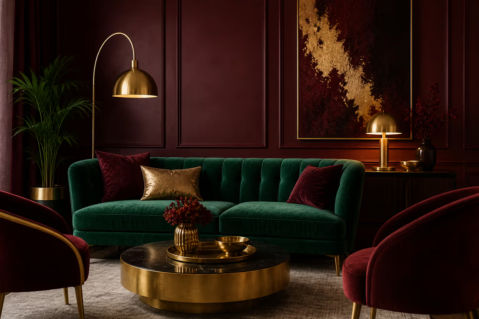
Burgundy and gold? You're channeling Victorian libraries and old-money dining rooms. The deep wine tone gives you richness without black's severity, while gold adds shimmer that prevents things from feeling too dark. I've upholstered dining chairs in burgundy velvet with gold nailhead trim—the combination ages beautifully and hides stains better than lighter options.
Emerald green with gold delivers those rich color combinations with gold that look expensive even when they're not. This pairing shows up constantly in Art Deco design because it mimics natural malachite with gold veining. Use emerald on your largest pieces—a sofa, an accent wall, floor-length curtains—and let gold play supporting role through hardware, lighting, and smaller accessories. Add cognac leather or walnut wood to ground everything.
Author: Adrian Lowell;
Source: crafterholic.com
True crimson or brick red creates drama that works surprisingly well in dining rooms and powder rooms (spaces where you want impact but won't spend eight hours daily). Here's the trick: use deep red on one wall, not all four. Or bring it in through textiles and art. Four red walls with gold accents can feel like you're trapped inside a jewelry box.
Burnt orange and terracotta give you warmth that feels collected and global rather than matchy-matchy. These earth tones share gold's sunset connection. Skip the shiny yellow gold here—go for antique brass or aged bronze instead. The slightly tarnished quality makes everything feel curated over time rather than bought in one shopping trip.
Chocolate brown grounds gold perfectly. It prevents gold from reading too precious or untouchable. Brown leather Chesterfield sofa with gold velvet pillows? That's a home office that means business but doesn't feel corporate. Chocolate walls with gold-framed artwork work beautifully in libraries and media rooms where you want cocooning warmth.
Jewel Tones and Bold Gold Color Schemes
Jewel tones with gold create schemes that make no apologies. These are saturated, confident colors that match gold's intensity instead of shrinking from it.
Sapphire blue goes deeper and brighter than navy—it's got this electric quality that pairs with gold for maximum impact. Byzantine mosaics used this combination because it reads as "royal" across cultures. Modern applications? Sapphire velvet curtains with gold hardware and tiebacks in a bedroom, or sapphire subway tile with gold fixtures and grout in a bathroom. Fair warning: you need good natural light to pull this off. In a dark room, sapphire can go muddy.
Amethyst purple with gold works beautifully in spaces dedicated to getting ready—bedrooms, dressing rooms, luxury bathrooms. Use real jewel-tone amethyst, not pale lavender. The saturation matters. I've seen amethyst wallpaper with gold leaf details in boutique hotels that absolutely nail this combination. It's indulgent without being sweet.
Ruby red—brighter than burgundy, more energetic than crimson—creates celebratory schemes with gold. Yes, it shows up in Christmas décor constantly, but that shouldn't scare you off year-round. Ruby red lacquered console table with gold hardware? Ruby silk pillows on a neutral sofa with gold legs? Both work if you commit to the boldness.
Emerald deserves another mention here because it bridges categories beautifully. It's warm enough to feel cozy, saturated enough to read as luxurious, and creates some of the best gold color schemes when you want both sophistication and energy. The combination mimics nature—gold sunlight filtering through dense leaves—so it never feels forced.
Teal and peacock blue offer slightly unexpected options. These blue-greens give you jewel-tone richness with more versatility than pure sapphire. Teal specifically works better with rose gold or champagne gold than bright yellow gold. The undertone compatibility matters.
Gold brings warmth and richness to any palette—it's both a neutral and a statement, depending on how you use it.
— Sarah Chen
Soft and Neutral Gold Accent Colors
Not every space needs to make a loud statement. These gold accent colors in muted palettes create understated luxury that feels current and livable.
Blush pink with gold reads romantic without being saccharine if you exercise restraint. Use dusty, muted blush—not bubble gum. I've designed bedrooms with blush linen bedding, rose gold lighting, and brushed brass hardware that feel sophisticated and gender-neutral. This pairing works in boutique retail too, especially beauty and lifestyle shops targeting adults, not teens.
Cream and beige with gold deliver quiet wealth. These neutral gold color pairings let gold provide just enough visual interest without competing for attention. Cream linen sofa with gold legs, beige grasscloth walls with gold sconces, layered neutral textiles with gold threading—you're creating serene spaces that feel elevated but not stuffy. This approach shines in open-plan homes where you need cohesion across multiple zones.
Sage green offers an organic, earthy neutral that surprises people when paired with gold. The combo feels fresh and natural—picture golden hour light on silvery olive trees. Sage cabinets with brass hardware have taken over design blogs for good reason. Sage walls with gold-framed botanical prints create calming spaces that still have personality.
Soft gray works if you nail the undertones. Warm gray (greige) pairs with yellow gold. Cooler dove gray wants white gold or mixed metals with gold as accent, not dominant player. The combination reads contemporary and sophisticated without feeling cold. Gray linen headboard with brushed gold table lamps? Modern without being stark.
Taupe and mushroom tones create subtle, grown-up foundations for gold. These complex neutrals have enough depth to prevent washed-out looks while staying understated. Taupe upholstery with gold nailhead trim or mushroom walls with gold sconces produce refined spaces that don't scream for attention.
How to Choose the Best Gold Color Schemes for Your Space or Style
Selecting the best gold color schemes requires looking beyond Pinterest boards to practical realities of your actual space.
Author: Adrian Lowell;
Source: crafterholic.com
Lighting changes everything. Natural light makes gold glow and reveals its warmth. Got a north-facing room with cool, indirect light? Warmer gold tones add missing warmth. South-facing rooms with abundant warm light can handle cooler champagne or white gold without feeling cold. Primarily artificial lighting? Test your gold finishes under your actual bulbs—LED color temperature (2700K versus 3500K) dramatically affects how gold reads. I've seen clients choose hardware in a showroom that looked completely different once installed under their home's lighting.
Match function to boldness. High-energy spaces—kitchens, dining rooms, entertaining areas—can handle bold pairings like navy and gold or emerald and gold. Bedrooms and bathrooms typically benefit from softer combinations: blush and gold, sage and gold, cream and gold. Home offices need the credibility of classic pairings like navy and gold or chocolate and gold. Would you trust financial advice from someone with a hot pink and gold office?
Work with what you've got. Warm wood floors or cabinetry? Gold harmonizes naturally. Cool-toned gray floors or white oak? You'll need to be more selective—champagne or rose gold instead of bright yellow gold. Existing artwork, inherited furniture, or beloved rugs should inform your palette rather than being fought against. I can't count how many clients have tried to force gold into spaces where their existing elements clearly wanted silver or bronze.
Define your mood first. Want energizing and dramatic? Choose jewel tones with gold. Need calming and serene? Soft neutrals with gold accents deliver. After sophisticated and traditional? Classic pairings like navy, black, or burgundy with gold never fail. Looking for warm and inviting? Earthy tones like terracotta, chocolate, or sage with gold create approachable luxury.
Start small. If you're uncertain, introduce gold through changeable elements—cabinet hardware, light fixtures, decorative objects, throw pillows. You can always add more gold. Removing it from permanent built-in fixtures requires demolition and real money.
Mix metals strategically. Current design absolutely embraces mixed metallics, but keep gold as your dominant metal (60-70% of metallic finishes) with others as supporting players. Gold pairs beautifully with aged brass, oil-rubbed bronze, and copper. Mixing gold with chrome or stainless requires careful balancing—keep them in separate zones or make sure one clearly dominates. A chrome faucet, chrome cabinet pulls, and gold lighting fixtures? That's confusion, not curation.
Frequently Asked Questions About Gold Color Pairings
What colors make gold stand out the most?
Deep, saturated colors create maximum contrast that makes gold pop. Black provides the starkest backdrop, followed by navy, emerald, and sapphire. These dark, rich backgrounds let gold's reflective qualities do their thing. Want gold to blend more subtly instead? Pair it with colors close to its own warmth and value—cream, beige, champagne, or warm taupe. The color sits quietly instead of shouting.
Can you use gold with cool colors?
Absolutely—the warm-cool contrast creates visual interest that prevents monotony. Navy, teal, sapphire, and even cool grays work beautifully with gold. The temperature difference adds energy to the palette. Balance your proportions, though: typically use cool colors as dominant tones with gold as warm accent (70-30 ratio), or bring in a neutral third color like cream to bridge the temperature gap. I've designed plenty of navy-and-gold rooms that feel cohesive because cream softened the transition.
Is gold better with matte or glossy finishes?
Depends entirely on your goals. Matte or brushed gold feels contemporary, organic, and subtle. It works in modern, minimalist, or transitional spaces and pairs naturally with wood, linen, and stone. Polished gold reads traditional, glamorous, and formal. It maximizes light reflection and creates drama. The smartest schemes mix both finishes—brushed gold drawer pulls with a polished gold mirror frame, for example. The variation adds depth and prevents the one-note monotony of using identical finishes everywhere.
What's the difference between gold and brass in color pairing?
Gold typically means a brighter, more yellow metallic. Brass has this muted, slightly orange or brownish undertone. Brass pairs beautifully with warmer, earthier colors—terracotta, rust, chocolate, olive green. Gold works with a wider range, including cooler jewel tones like sapphire. Brass feels casual and collected over time. Gold reads more refined and intentional. In practice, though, antique brass and brushed gold often look similar enough to use interchangeably, especially in eclectic or transitional spaces where perfection isn't the goal.
Does rose gold pair with the same colors as yellow gold?
The pink undertones shift ideal pairings slightly. Rose gold pairs exceptionally well with blush, mauve, dusty purple, and soft grays—colors that feel too cool or washed out with yellow gold. It also works beautifully with navy, emerald, and teal. Rose gold feels more contemporary and romantic than yellow gold's traditional warmth. You can mix rose and yellow gold in one space, but make sure one clearly dominates (70-30 split) to avoid looking confused about your intent.
What colors should you avoid with gold?
Few colors truly clash, but some combinations need extra care. Bright, pure primary colors—fire-engine red, electric blue, pure yellow—compete with gold rather than complementing it. Choose deeper, more complex versions instead: burgundy, navy, mustard. Neon or fluorescent colors fight gold's inherent richness and make everything look cheap. Very cool, icy colors like pale blue-gray or stark white can make gold feel out of place unless you're deliberately creating high contrast for effect. When uncertain, choose colors with depth and complexity rather than flat, pure hues straight from a kindergarten paint set.
Gold's versatility—functioning as both neutral and statement depending on how you deploy it—makes it endlessly adaptable whether you're designing interiors, planning events, or building brands.
The most successful gold schemes balance proportion carefully, respect actual lighting conditions, and align with your space's function and desired atmosphere. Start by evaluating what you already have and what mood you're chasing, then refine through real-world testing in your actual environment.
Gold trends shift between yellow, rose, and champagne tones every few years, but the fundamental pairing principles stay constant. Focus on creating schemes that feel authentic to your style instead of chasing whatever's currently flooding design blogs. When thoughtfully applied—whether you're going classic with navy and gold or unexpected with sage and gold—gold elevates palettes from ordinary to memorable. It's that essential warmth and polish that separates spaces that are simply decorated from ones that feel genuinely designed.
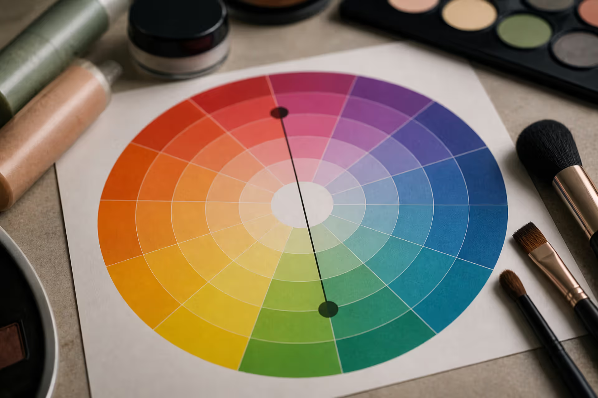
Green tones appearing where they shouldn't can be frustrating. Red cancels out green because these colors sit directly opposite on the color wheel. This principle applies across makeup, hair color, painting, and digital editing, giving you precise control over unwanted hues.
Discover the essential types of color palettes used in design, from monochromatic schemes to complex tetradic systems. Learn how each palette type works, when to use them, and how to choose the right colors for your specific project needs with expert insights and practical examples.
The rounded square has become the defining shape of digital interfaces. From app icons to buttons, this geometric form appears billions of times daily. Learn the mathematical differences between rounded squares, squircles, and superellipses, plus platform-specific implementation standards.
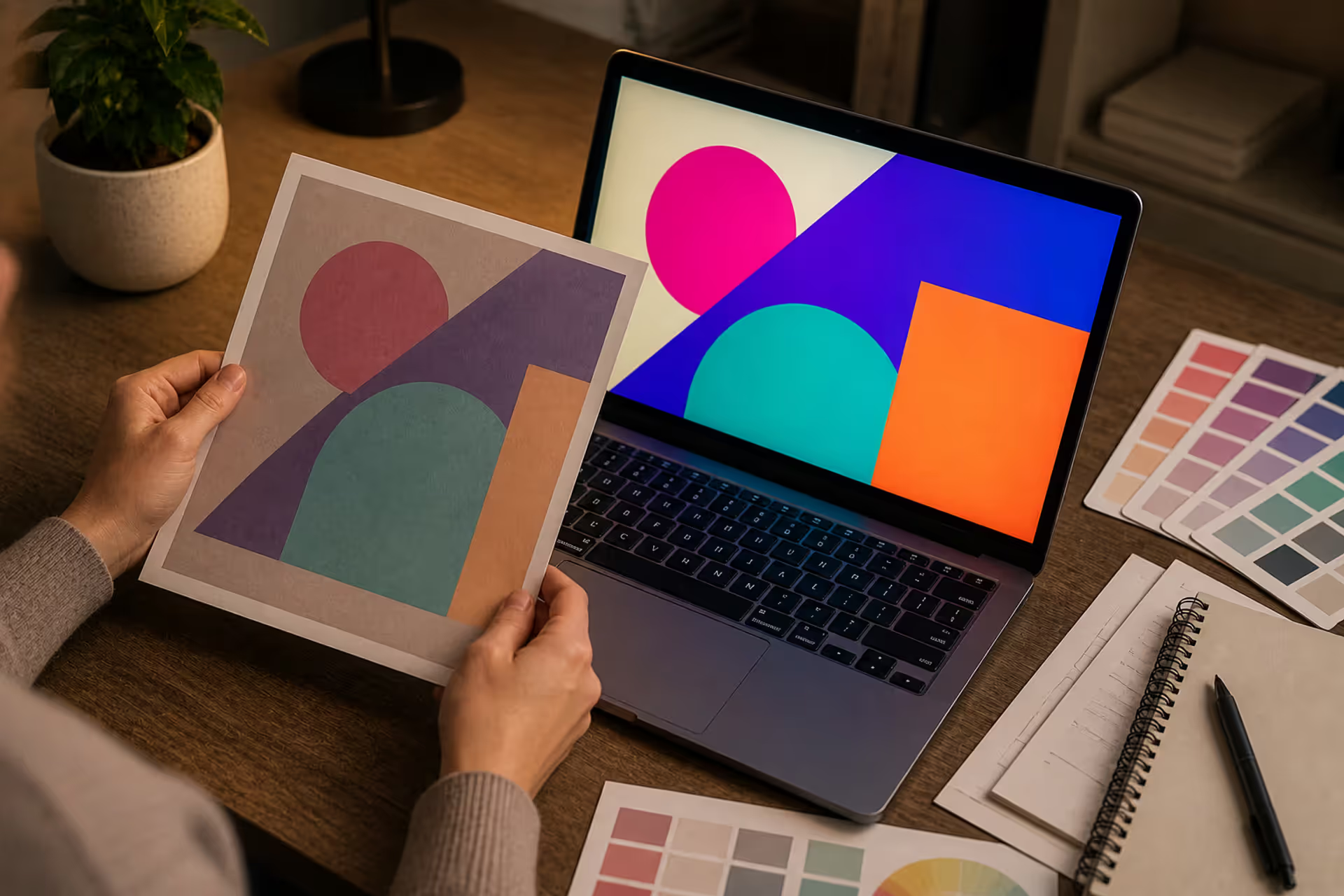
Converting RGB digital colors to PMS for print requires more than software—it demands understanding color gamut differences, using physical Pantone guides, and managing expectations. This comprehensive guide explains why screen colors don't translate directly to print and shows you proven methods for accurate color conversion.
The content on this website is provided for general informational and educational purposes only. It is intended to explain concepts related to digital design, visual art, color theory, art techniques, design principles, and design history.
All information on this website, including articles, guides, and examples, is presented for general educational purposes. Creative outcomes may vary depending on individual skill, tools, and practice.
This website does not provide professional design services or guarantee results, and the information presented should not be used as a substitute for formal education or professional consultation.
The website and its authors are not responsible for any errors or omissions, or for any outcomes resulting from decisions made based on the information provided on this website.