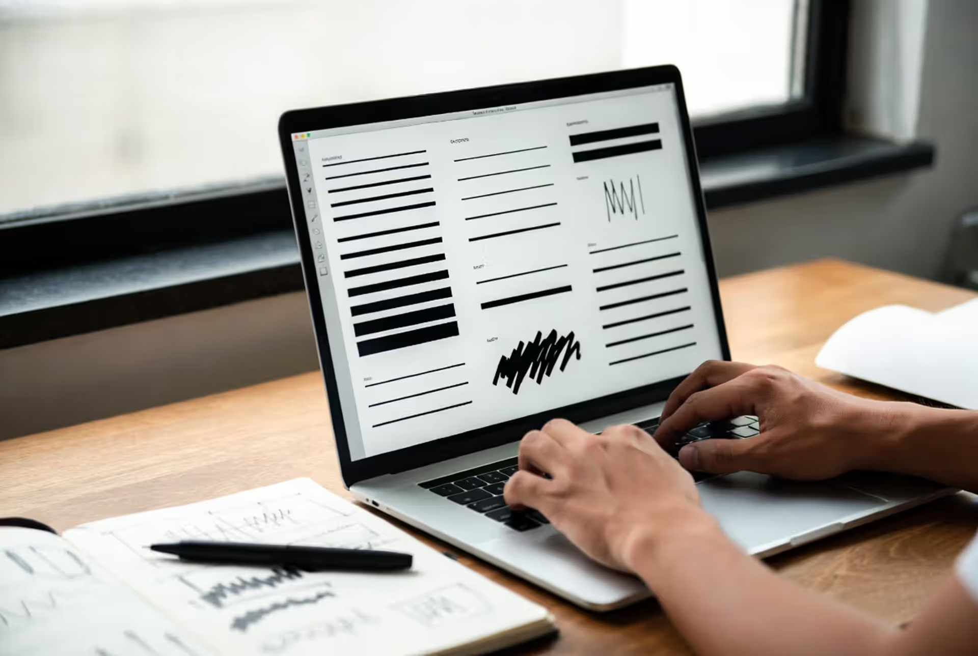
Here's something most people don't think about: that simple black line you see everywhere—from your favorite app's icon to the comic book you read last night—is doing a lot more work than you'd imagine. It's not just separating one thing from another. It's controlling where you look first, what feels close or far away, and whether a design reads as playful or serious, cheap or expensive.
I've seen talented designers struggle with linework for years before it clicks. The difference between a 2pt stroke and a 2.5pt stroke seems trivial until you realize that tiny choice determines whether your logo looks balanced or lopsided at small sizes. Get it right, and nobody notices. Get it wrong, and something just feels... off.
What Is a Black Line in Visual Design
Let's start simple. A black line connects two points, right? But in design and illustration, it's become shorthand for several related concepts that professionals use differently.
When someone talks about an outline, they mean the edge that separates a shape from everything around it. Think of how a cookie cutter works—that outer boundary defining where the cookie ends and the counter begins. Stroke is more technical. That's what you're adjusting in Illustrator or Figma when you change that dropdown from 1pt to 3pt. It's the actual thickness your software applies to any path. Then there's the contour line, which artists use to follow an object's form, creating that sense of volume on a flat surface. Ever seen those contour drawings where someone traces their hand without looking at the paper? Same concept, just more controlled.
Graphic designers use black lines constantly. They're organizing page layouts, making sure headlines don't crash into body text, adding that crucial definition around button edges in an interface. Illustrators lean on them to construct entire worlds—every character, prop, and background element starts with linework decisions. Vector artists? They're obsessed with getting strokes perfect because their work needs to look crisp whether it's printed on a business card or stretched across a building.
What makes black lines so reliable is their contrast. Unlike color (which shifts depending on your monitor's calibration or the printer's ink levels), a black line stays black. That's why instruction manuals, technical drawings, and wayfinding systems default to linework. When clarity matters more than aesthetics, you want that guaranteed readability.
Author: Marcus Ellery;
Source: crafterholic.com
Line Weight and Stroke Principles
A hairline whispers. A chunky outline shouts. Everything between those extremes gives you control over what people notice first.
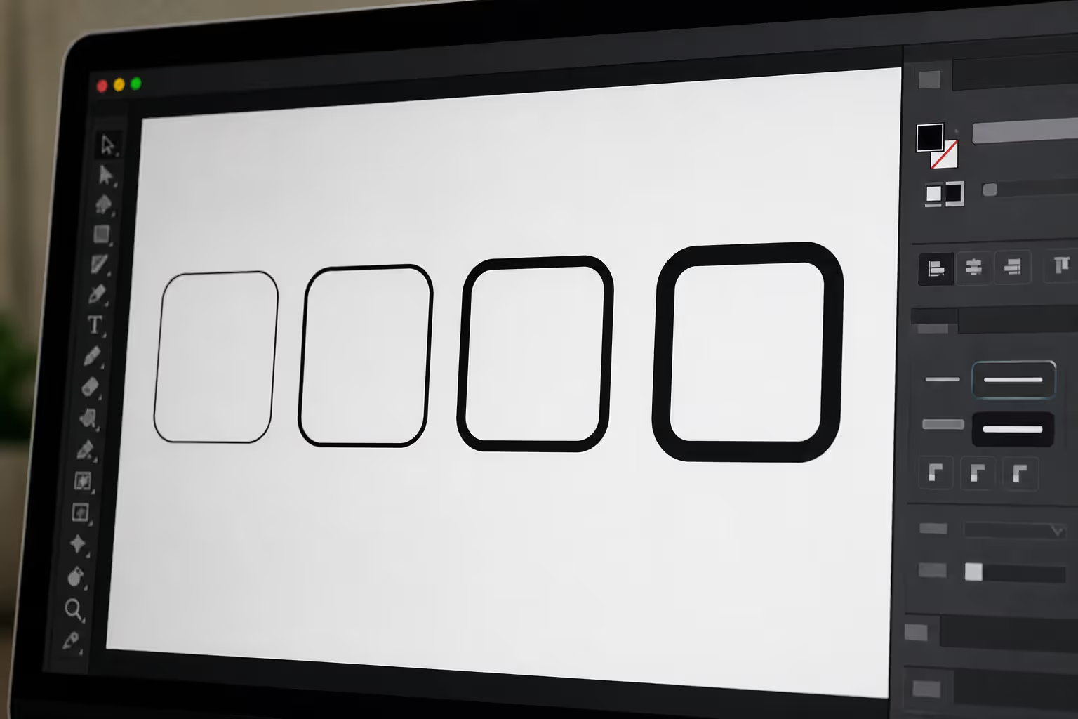
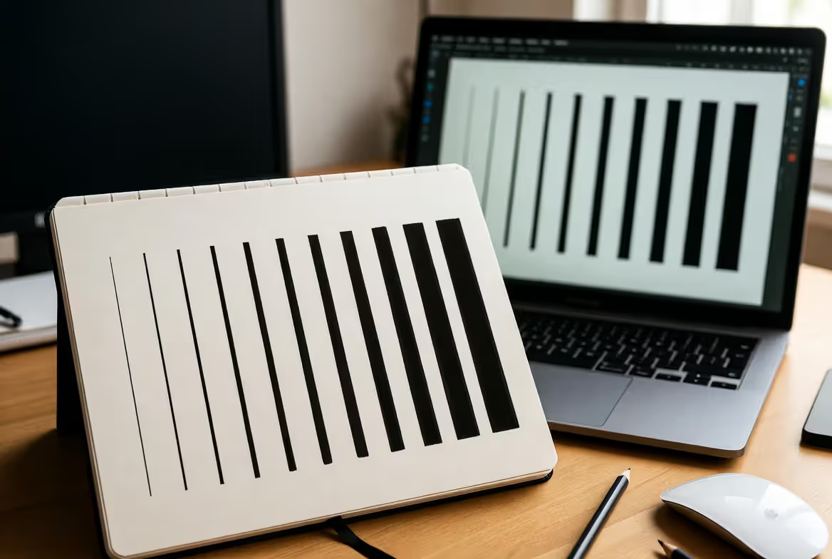
Stroke weight—how thick or thin your line appears—works like the volume knob on visual information. In Illustrator, you're usually working in points (pt) or pixels (px). Print folks sometimes use millimeters. The unit matters less than understanding this: heavier lines pull your eye and feel closer, lighter lines recede into supporting roles.
Getting the balance right takes practice. I've reviewed portfolio pieces where every line uses the exact same 2pt weight, and they look... flat. Lifeless. Like those coloring books before anyone adds the color. But I've also seen work where the designer went wild with variation—hairlines next to ultra-bold strokes with no logic—and it's just visual chaos. Your eye doesn't know where to land.
The pros vary line weight with intent. A simple icon might have a 3pt outer edge establishing the overall shape, then 1.5pt details inside for texture or function. This creates instant hierarchy. Even at thumbnail size, you grasp the icon's meaning because the weight differences guide your perception.
Author: Marcus Ellery;
Source: crafterholic.com
Line Weight Comparison
Thickness Range
Point Measurement
What Designers Call It
Where You'll See It
How It Behaves
Ultra-fine
0.25–0.5pt
Hairline
Blueprint details, delicate botanical illustrations, fine print boxes
Sophisticated but fragile—disappears at small sizes or on rough paper
Powerful in the right context, overwhelming in the wrong one
Ultra heavy
9pt and up
Statement stroke
Billboard graphics, experimental typography, intentionally graphic styles
Only works at large scale; totally dominates smaller compositions
Here's the catch: a 1pt line looks different on your screen versus printed on cardstock versus printed on newsprint. That crisp stroke in your design file might nearly vanish on textured paper. Or a bold 6pt outline that packs punch on a billboard becomes awkward and clumsy inside a mobile interface. You've got to test in the real world, not just trust your monitor.
Black Line Techniques in Different Art Forms
Different creative fields have evolved their own approaches to linework. What works for comic book artists won't work for logo designers, and vice versa.
Outline Illustration Style
This approach builds images through edges and contours instead of filled shapes or shading. It's why so many modern brands love it—outline illustrations scale beautifully and reproduce cleanly across every medium you can imagine.
Bold outlines (3pt or thicker) give you that confident, contemporary character. Those friendly mascots in fintech apps? The illustrated icons in your meditation app? Almost always thick, consistent outlines. They read instantly at any size, even when they're shrunk down to favicon dimensions (that tiny icon in your browser tab). The trade-off is subtlety—bold outlines make a statement, not a whisper.
Thin outlines (1pt or lighter) signal sophistication. Fashion magazines love them. Botanical prints, editorial spot illustrations, luxury brand graphics—they all lean toward delicate linework that suggests refinement and allows for intricate detail. But you pay a price. Small sizes become problematic. Low-quality printing turns those elegant lines into broken, muddy messes.
Smart illustrators mix weights in a single piece. The character's silhouette gets a 4pt stroke so it pops, but facial features use 1pt lines for nuance. Background elements drop to 0.75pt, which pushes them back spatially without needing color or shading. This variation creates depth and controls where viewers look first.
Black Stroke in Vector Art
Vector artwork changes everything because lines aren't made of pixels—they're mathematical paths. Zoom in 1000%, and that stroke stays perfectly crisp. This makes vector linework essential for anything that needs to work at multiple sizes. Your logo on a business card and on a highway billboard? Same file, zero quality loss.
But vectors introduce technical quirks. Stroke alignment matters more than you'd think. Most vector programs give you three options: center (the path sits in the middle of the stroke), inside (the stroke builds inward), or outside (builds outward). For closed shapes like logo elements, inside strokes prevent the outline from expanding your overall dimensions. Sounds nerdy, but try creating a logo with specific size requirements using center stroke—you'll end up with measurements that don't match your artboard because the stroke extends beyond the path.
Consistency becomes non-negotiable in professional vector work. A logo where some elements use 2pt strokes and others use 2.1pt looks amateurish, even if nobody consciously spots the difference. Their brain just registers "something's off." I always work with a defined system—maybe 1pt, 2pt, and 4pt only—throughout a project. No in-between weights. No exceptions.
Corner treatment affects how strokes behave at angles. Miter joins create sharp corners, which looks clean until you hit acute angles—then you get weird spikes extending way past where you'd expect. Round joins soften everything, which works great for friendly, approachable designs but can look imprecise in technical contexts. Bevel joins split the difference with flat edges at corners.
Author: Marcus Ellery;
Source: crafterholic.com
Contour Line in Traditional Illustration
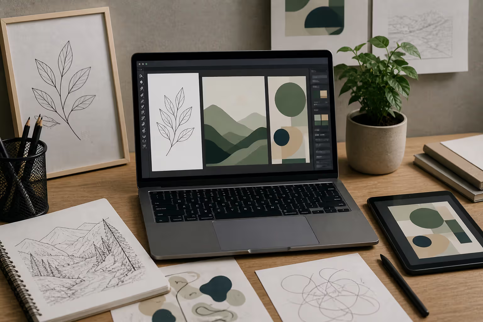
Art schools drill contour drawing into students because it trains you to really see. You follow your subject's edges and interior forms with continuous lines, building a map of visual information that suggests volume, texture, and spatial relationships.
There's technical contour work—measured, accurate, faithful to what's actually in front of you. Architectural renderings need this. Product design sketches. Medical illustrations. Anywhere precision trumps personality.
Then there's expressive contour drawing, which cares more about energy and interpretation than accuracy. Lines swell and taper based on what deserves emphasis, not optical reality. They might break and reconnect, vary in darkness to suggest form through pure linear means. You see this in editorial illustration, fine art, anywhere the artist's hand matters more than photographic accuracy.
Most working illustrators blend both. They'll use technical precision for structural elements (the architecture of a face, the mechanics of a product) while introducing expressive variation in details and secondary forms. Clients get recognizable subjects; viewers get the human touch that makes illustration different from photography.
How to Use Black Lines Effectively in Composition
Your eye follows lines automatically. Can't help it. We're wired to trace paths and edges, especially clear ones. Understanding this gives you control over where viewers look and in what order.
Heavier lines naturally become focal points. Draw a circle with a 1pt stroke next to a circle with a 4pt stroke, and everyone looks at the bold one first. No color needed. No size difference required. The weight creates the hierarchy.
You can fake depth through line variation alone. Draw a figure with 3pt outlines and a background with 1pt lines. Even though both exist on the same flat surface, the figure appears closer. Our brains interpret heavier, darker marks as nearer and lighter marks as farther away. Illustrators exploit this constantly to suggest atmospheric perspective without introducing shading or color.
The mistakes I see most often? Random line weights with no system—just whatever felt right in the moment. Results in compositions where your eye bounces around finding no clear entry point or hierarchy. Or the opposite problem: everything gets heavy outlines, so everything competes for attention and nothing wins. Then there's poor contrast—black lines on dark gray backgrounds or heavily textured surfaces where the line gets lost in visual noise.
Combining black lines with color requires a decision about which element carries the load. Some approaches use black outlines to contain color like stained glass. Others let color contrasts define edges, reducing line weight or eliminating it where color already does the job. Try to make both elements equally prominent, and you usually get muddy, overworked results.
When you're adding shading, decide whether lines or tone define the form. If linework establishes volume, shading should support and enhance, not compete. If your tonal rendering creates the three-dimensionality, lines can retreat to suggesting edges and details.
Author: Marcus Ellery;
Source: crafterholic.com
Choosing Line Weight for Your Design Project
A children's book and a law firm's annual report both might use illustrations, but they need different line approaches. Where do you start?
Begin with medium and context. Digital screens are actually kinder to thin lines than most printing processes. Ink spread and paper absorption can make hairline strokes break up or disappear completely. I learned this the hard way on an early project—gorgeous delicate linework on screen, barely visible ghost lines when printed on the client's preferred uncoated stock.
Print projects demand real-world testing. Export a test page, print it at actual size on the actual paper, and look at it in the actual lighting conditions where people will see it. A 0.5pt line might look elegant on coated paper and vanish on newsprint. Don't trust your screen. Ever.
Digital design involves different headaches. Retina displays can render fine details that older monitors blur. Then responsive design adds another layer—a 2pt stroke balanced perfectly in your desktop layout might overwhelm the same design scaled down on mobile. Some designers now create responsive stroke weights that adjust based on viewport size using CSS, maintaining appropriate visual impact across devices.
Brand aesthetics guide your decisions in identity work. A tech startup chasing young professionals might embrace bold geometric outlines communicating confidence and modernity. A luxury fashion brand probably wants delicate hairlines suggesting refinement and exclusivity. The line weight becomes part of the brand voice, as recognizable as its colors or fonts.
Line weight is where design becomes decision-making. Every time you choose a stroke thickness, you're making a statement about what matters in the composition. I tell my students that if you can't explain why you chose 2pt over 1.5pt, you're not designing—you're decorating. The best work comes from intentional choices about hierarchy, emphasis, and visual flow, all of which line weight controls more directly than almost any other tool in our kit.
— Marcus Chen
Scale matters enormously. Signage visible from 50 feet away needs substantially heavier strokes than a mobile app icon viewed from 12 inches. Quick rule: lines should stay clearly visible at the intended viewing distance without looking clumsy or overwhelming. Test at actual size and distance. Designing at 100% zoom on your monitor, then discovering the work fails at its real-world size? That's a painful learning experience everyone goes through once. Learn from my mistakes and test early.
FAQ
What is the difference between a black line and an outline?
Any continuous black mark qualifies as a black line—could be decorative, structural, textural, whatever. An outline specifically traces the exterior boundary of a shape or object, defining where it ends and everything else begins. So all outlines are black lines (when rendered in black), but plenty of black lines aren't outlines. Think of interior details, cross-hatching for texture, decorative flourishes—those are black lines serving other purposes besides edge definition.
How do I choose the right line weight for my illustration?
Start by considering final size and reproduction method. Small-scale or screen-based work generally needs 1.5–2pt lines that stay visible without crushing detail. Larger formats or print can handle finer lines (0.75–1pt) or bolder statements (3–4pt) depending on your aesthetic goals. Here's what I do: create a test version with three different weight options, view each at actual size (not zoomed in), and pick whichever maintains clarity while supporting your style. Consistency beats choosing the "perfect" weight—establish a system (maybe 1pt for details, 2pt for main elements, 4pt for emphasis) and stick to it throughout the piece.
What stroke weight works best for vector logos?
Most professional logos settle around 2–3pt as a baseline because it scales reliably from business cards to billboards. Simpler logos with minimal elements can push heavier (4–5pt) for bold impact. Complex logos with intricate details might need thinner strokes (1.5–2pt) to prevent everything from mushing together visually. The critical test: shrink your logo to one inch wide and verify all strokes remain clearly visible and distinct from each other. If lines blur together or disappear, bump the weight up.
Can line thickness affect readability in design?
Absolutely, and more than most people realize. Lines too thin disappear at small sizes or in poor lighting, forcing viewers to strain (or just give up). Lines too heavy create visual noise where thick strokes compete for attention, reducing the contrast between important and secondary elements. Optimal readability comes from establishing clear hierarchy through intentional weight variation—heavier strokes for primary information, medium weights for supporting elements, fine lines for details or decoration. The goal isn't making everything equally visible; it's making important things more visible than less important things.
What are the standard line weights in graphic design software?
Most programs default to a range from 0.25pt to 12pt or higher, with common presets at 0.5pt, 1pt, 2pt, 3pt, and 4pt. But honestly? Professionals rarely use defaults. Illustrator and similar tools let you specify stroke weight down to hundredths of a point (1.37pt if that's what your project needs). Better approach: establish a custom stroke weight system for each project—using only specific increments like 1pt, 2pt, and 4pt throughout. This maintains visual consistency way better than randomly picking from preset options.
How does line weight change between print and screen?
Screen display typically renders lines slightly thinner and crisper than print reproduction, where ink spread and paper absorption can add thickness. A 1pt line on screen might print closer to 1.2–1.3pt depending on paper quality and printing method. This means designs optimized purely for screen often need slightly heavier line weights (10–15% increase) when moving to print to maintain the same visual impact. Professional workflows involve either creating separate versions or adjusting stroke weights when switching between digital and print applications. Never assume what looks good on screen will translate directly to print—always request a physical proof at actual size before finalizing line weights for production.
Every visual discipline depends on black lines for structure, clarity, and emphasis. That seemingly trivial decision—how thick should this stroke be?—ripples through your entire composition, affecting hierarchy, readability, aesthetic character, and whether the thing even reproduces properly.
Getting good at line weight means moving past arbitrary choices toward intentional systems. You need to understand how stroke thickness affects perception, how different media handle reproduction, and how variation creates depth and emphasis. That's when linework transforms from a basic necessity into a sophisticated design tool you can actually control.
Whether you're building a minimal logo, developing a character illustration, or constructing a complex infographic, the principles stay consistent. Establish a clear system. Maintain intentional hierarchy. Test at actual size in the actual medium. Remember that every line weight choice communicates something about what matters in your composition.
The gap between amateur and professional work? Often comes down to exactly this kind of thoughtful control over supposedly small details. Because in design, there are no small details. Just details you've considered carefully and details you haven't.
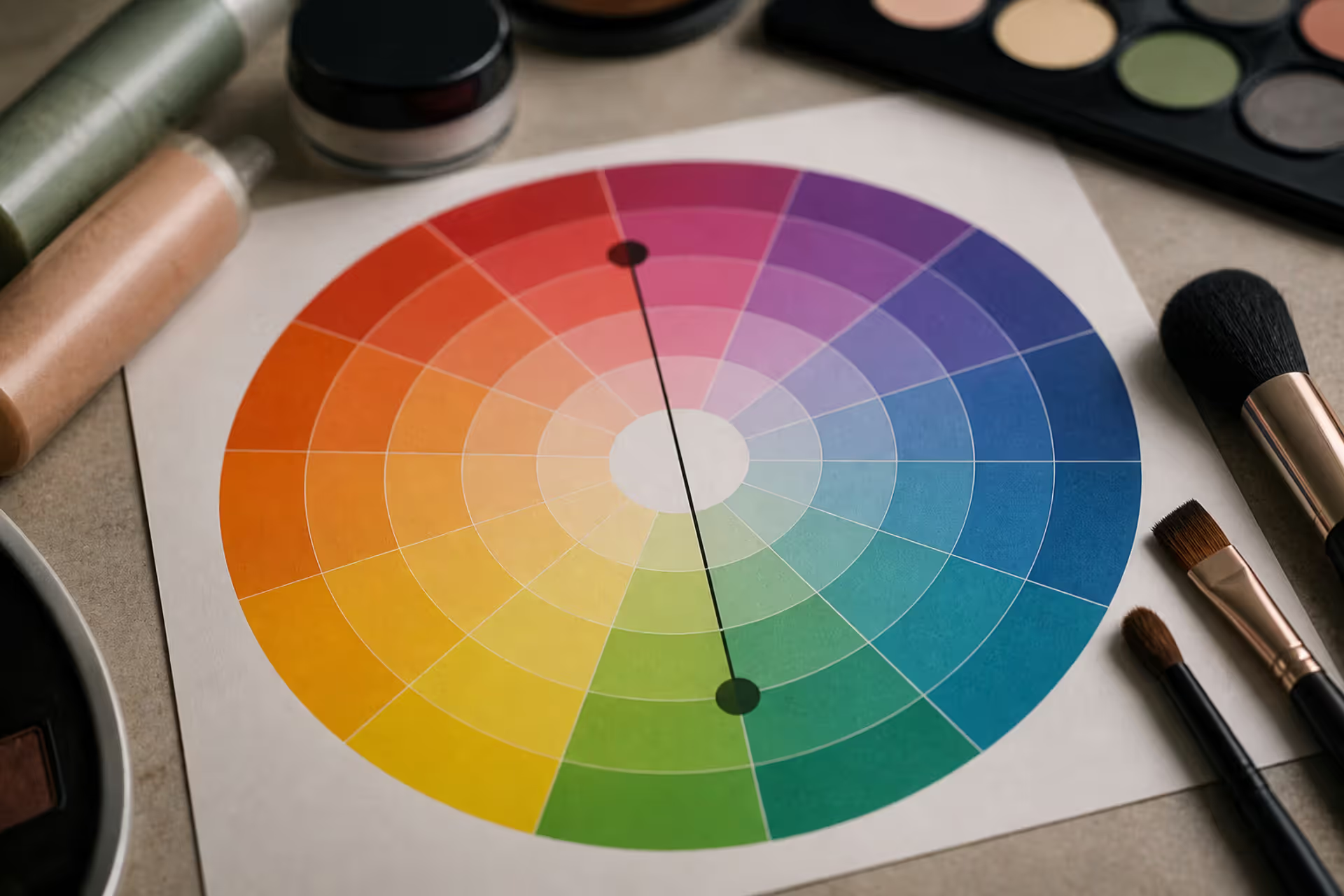
Green tones appearing where they shouldn't can be frustrating. Red cancels out green because these colors sit directly opposite on the color wheel. This principle applies across makeup, hair color, painting, and digital editing, giving you precise control over unwanted hues.
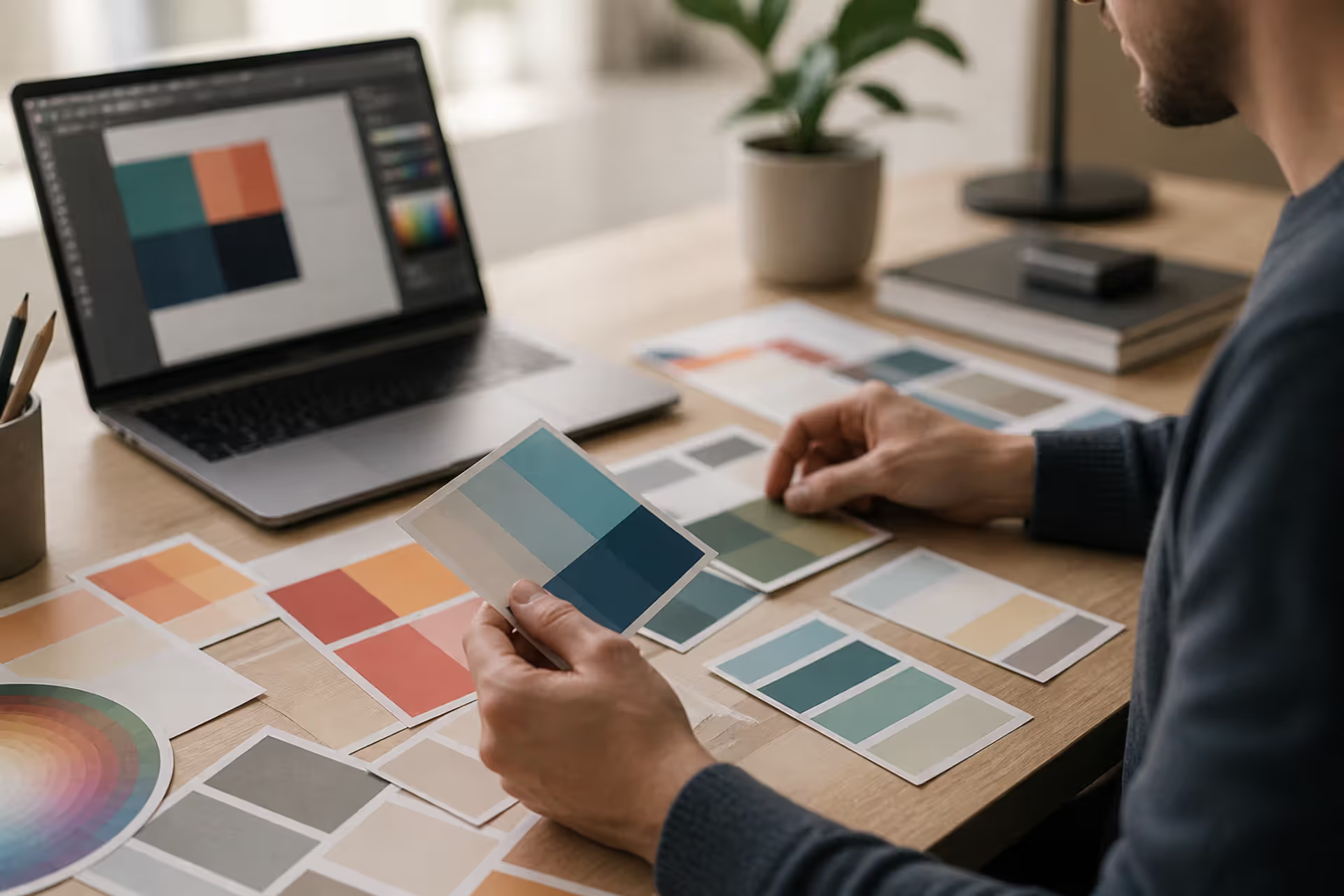
Discover the essential types of color palettes used in design, from monochromatic schemes to complex tetradic systems. Learn how each palette type works, when to use them, and how to choose the right colors for your specific project needs with expert insights and practical examples.
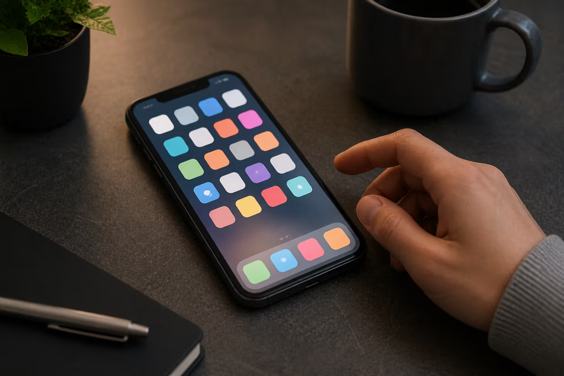
The rounded square has become the defining shape of digital interfaces. From app icons to buttons, this geometric form appears billions of times daily. Learn the mathematical differences between rounded squares, squircles, and superellipses, plus platform-specific implementation standards.
Converting RGB digital colors to PMS for print requires more than software—it demands understanding color gamut differences, using physical Pantone guides, and managing expectations. This comprehensive guide explains why screen colors don't translate directly to print and shows you proven methods for accurate color conversion.
The content on this website is provided for general informational and educational purposes only. It is intended to explain concepts related to digital design, visual art, color theory, art techniques, design principles, and design history.
All information on this website, including articles, guides, and examples, is presented for general educational purposes. Creative outcomes may vary depending on individual skill, tools, and practice.
This website does not provide professional design services or guarantee results, and the information presented should not be used as a substitute for formal education or professional consultation.
The website and its authors are not responsible for any errors or omissions, or for any outcomes resulting from decisions made based on the information provided on this website.