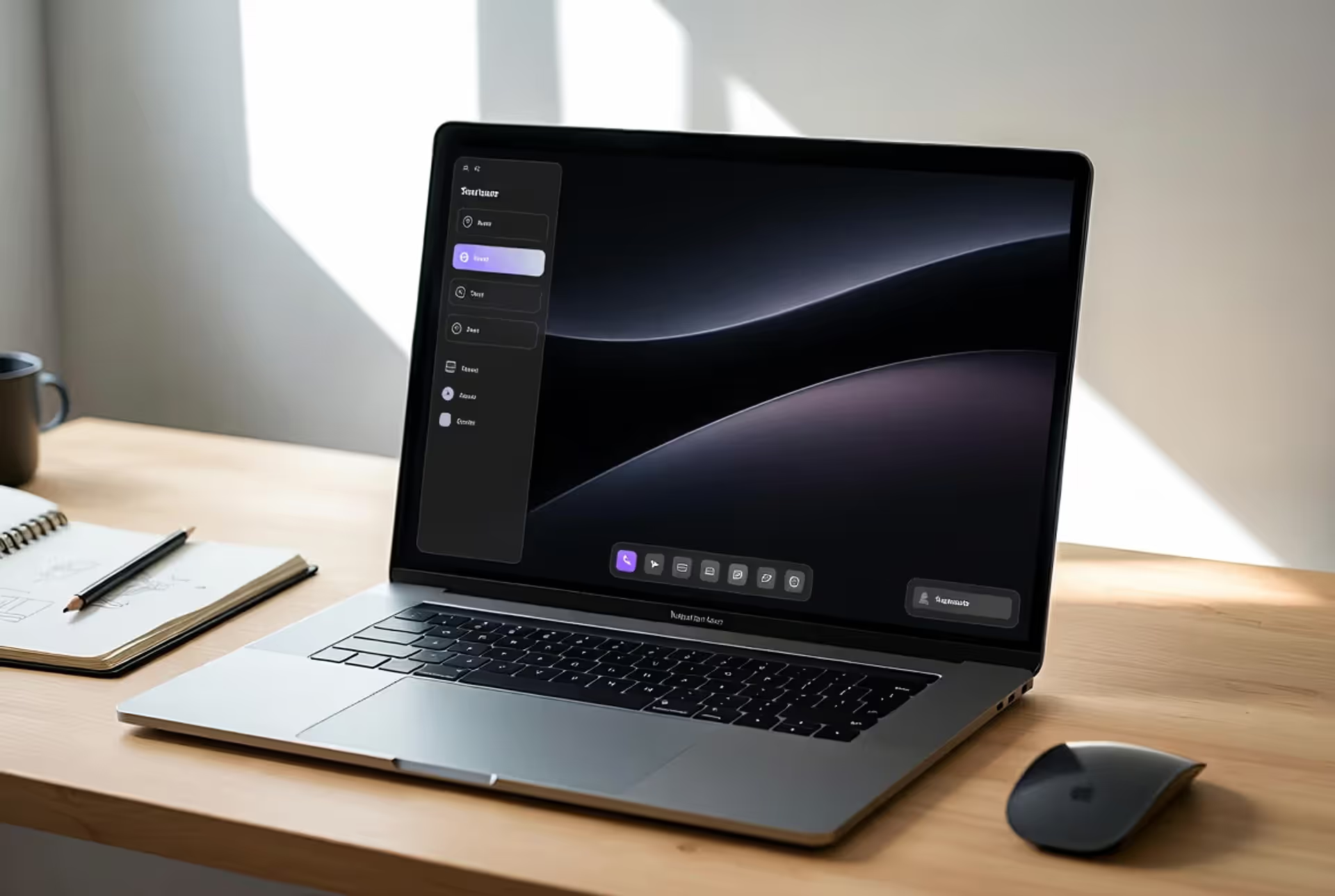
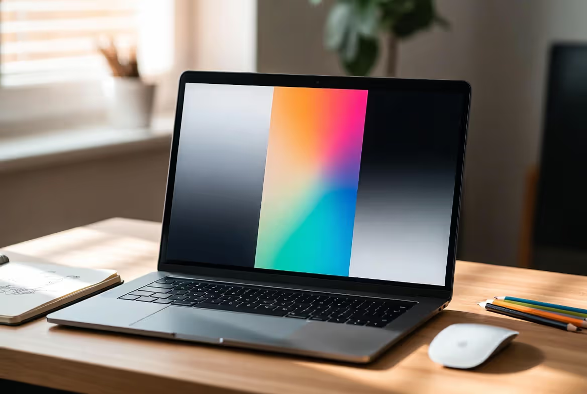
You'll find black gradients everywhere once you start looking—scrolling through Netflix, opening your banking app, even in those slick product shots on Amazon. They're the quiet workhorses of modern digital design, creating depth and visual interest without screaming for attention.
What Is a Black Gradient and When to Use It
Think of a black gradient as a smooth fade that starts with pure black and transitions toward something lighter—usually gray tones, white, or even complete transparency. Unlike slapping down a solid color, this dark gradient background technique gives you tonal movement that creates dimension while keeping things visually simple.
The monochromatic dark gradient strategy works because it builds hierarchy through brightness levels rather than competing colors. Your eye naturally follows the light.
When should you reach for a black gradient? They're perfect when you want atmosphere without the distraction of color. I see web designers dropping them into hero sections constantly—those big header areas at the top of websites. The dark backdrop makes white headlines jump off the screen, and the subtle fade keeps things from feeling flat. Way better than stark black, which can look cheap if you're not careful.
UI and UX folks love these gradients for creating zones. Imagine your phone's settings menu. A gentle shift from charcoal (#2B2B2B) down to true black (#000000) can separate the header from your actual settings list without drawing a harsh line across the screen. It's subtle spatial organization that doesn't eat up precious mobile screen space.
Photographers discovered that laying a gradient overlay in design over product images mimics expensive studio lighting setups. Darkening the edges naturally pulls your focus toward the center—same vignette effect you'd get from a $3,000 lens, but you're doing it in post-production for free. E-commerce sites do this constantly to make products pop.
For branding work? Black gradients signal different things depending on how you use them. Luxury brands lean on them heavily—think of high-end watch websites or premium audio equipment pages. Tech companies use them differently, letting those dark fades suggest innovation and precision. There's something about smooth gradient color transitions that communicates attention to detail.
Author: Sophie Calder;
Source: crafterholic.com
How to Create a Black Gradient in Popular Design Tools
Let's get practical. Each design program handles gradients a bit differently, and knowing these quirks saves you serious frustration.
Creating Black Gradients in Photoshop and Illustrator
In Photoshop, grab the Gradient Tool (keyboard shortcut: G). You'll see a gradient preview bar up top—click it to open the Gradient Editor. Here's where beginners mess up: they accept whatever default gradient is loaded. Don't do that.
Set your left color stop to pure black. In RGB, that's 0, 0, 0 across the board. Your right stop? Try medium gray at first—RGB 128, 128, 128 works as a solid starting point for testing.
Now here's the secret sauce: that little diamond icon between your color stops controls where the transition happens. Slide it left, and you get more black before the fade kicks in. Slide it right for the opposite effect. For natural-looking results, I usually keep mine somewhere between 45-55%. Going too far either direction creates smooth color fade effects that look forced.
Illustrator handles this as vector data, which means infinite scalability—critical for logos or anything you'll resize later. Open your Gradient panel (Window > Gradient if you can't find it). Pick Linear or Radial depending on your needs. Click along the gradient slider to add stops, then assign your black and gray values from the Swatches panel.
Pro tip I learned the hard way: work in RGB mode for screen projects (websites, apps, videos) and CMYK for anything heading to a printer. Black behaves totally differently between these color spaces. Switching modes after you've built your gradient? You're asking for color shifts.
CSS Code for Web-Based Black Gradients
Developers can skip image files entirely and code gradients right into stylesheets. This keeps your page loading fast and looking sharp on any screen resolution.
That gives you top-to-bottom movement from black to medium gray. The direction parameter is flexible—"to right," "to top left," or specific degree values. Want a perfect diagonal? Try 45deg. Straight down from top to bottom? That's 180deg.
You can build more complex effects with radial gradients:
background: radial-gradient(circle at center, #404040, #000000);
This creates a spotlight effect, starting with dark gray in the middle and darkening toward the edges. Move that "circle at center" to something like "circle at 30% 70%" and you get asymmetrical lighting—useful for dynamic compositions.
Browser support is solid in 2026, but always include a fallback:
Older browsers ignore the second line and just show black. Modern browsers use the gradient. Everyone's covered.
Black Gradients in Figma and Canva
Figma treats gradients as fill properties. Select your object, look at the Fill section in your right panel, click that solid color icon, and switch to Linear or Radial. Click anywhere on the preview to add color stops, then drag them around for positioning.
Teams working in Figma should save gradients as styles. Right-click the fill property, hit "Create style," and everyone on your team can apply identical dark to light gradient treatments across all your design files. This consistency matters when you're building multi-page sites or mobile apps with dozens of screens.
Canva simplified everything for non-designers, which means less precision but faster results. Find gradients in the Elements tab or apply them directly to shapes and text. You won't get exact RGB value control like in Photoshop, but Canva's preset black gradients handle social media graphics and quick mockups just fine.
The tradeoff? If you need exact brand color matching across platforms, create your gradient in professional tools first, document the specifications, then recreate it in Canva for template distribution.
Types of Black Gradients and Color Transitions
Different gradient types solve different problems. Knowing which to grab makes your design work go faster.
Linear gradients move along a straight path—vertically, horizontally, or at whatever angle you choose. A black to grey gradient running from top to bottom mimics how we see light in real life (brighter above, darker below). This creates that grounded feeling you want for website backgrounds. Flip it horizontal and you've got a nice subtle effect for navigation bars.
Radial gradients spread out from a center point in circles or ellipses. These nail spotlight effects and vignettes. Start with dark gray in the middle and fade to black at the edges—instant studio lighting effect. Product photographers use this constantly because it adds drama without setting up actual lights.
Black to transparent gradients serve one specific purpose really well: overlaying images while keeping parts of them visible. Video creators on YouTube do this all the time. They apply a gradient overlay in design to the bottom third of thumbnails, darkening that area so their title text pops against any background image.
The dark to light gradient approach typically runs the full tonal range—pure black through various grays toward white or very light shades. This maximum contrast creates strong depth cues. Landing pages love this treatment, starting with black at the top and transitioning to charcoal near the bottom.
Author: Sophie Calder;
Source: crafterholic.com
Sticking to pure monochromatic gradients (only black, white, and gray values) creates timeless designs that won't look dated when color trends shift next year. Financial firms and law offices favor this approach because it reads as serious and professional.
Black to color gradients introduce chromatic elements while maintaining overall darkness. Try black transitioning into deep navy blue—you get subtle color interest without losing that sophisticated dark aesthetic. Tech brands do this when they want to suggest innovation without going full rainbow.
Black Gradient Direction and Composition Techniques
Which direction your gradient flows isn't just aesthetic preference—it fundamentally changes how people experience your design.
Top-to-bottom gradients feel natural because that's how light works in the physical world. Brighter sky above, darker ground below. This creates psychological stability. Websites use this constantly, putting important content in lighter zones where eyes naturally land first.
Bottom-to-top gradients flip expectations and create energy. Starting black at the bottom and lightening toward the top feels uplifting—like growth or achievement. Fitness apps and motivational platforms use this because it reinforces their messaging at a subconscious level.
Horizontal gradients create sideways movement. Left-to-right (dark to light) supports how Western readers process information—it feels progressive and forward-moving. Right-to-left does the opposite, creating a more contemplative, reflective mood.
Diagonal gradients inject modernity and dynamism. A 45-degree angle from upper-left to lower-right creates forward momentum. Tech startups love diagonal gradients because they suggest disruption and innovation—breaking away from traditional vertical/horizontal conventions.
Layering opens up serious possibilities. Take a deep shadow gradient and place it over a solid background at 70% opacity. Use blend modes like Multiply or Overlay and you'll get color interactions that single gradients can't touch. This technique adds complexity without creating visual chaos.
Author: Sophie Calder;
Source: crafterholic.com
The overlay approach puts gradients above images or textures. Drop a radial black-to-transparent gradient over a textured background and you create a spotlight that preserves the texture where it's lighter. More visual interest than a solid gradient, but still controlled.
Direction affects mood dramatically. Gradients radiating outward from center create focus and intensity—great for call-to-action buttons or important announcements. Gradients moving inward create a funneling effect that suggests convergence or concentration.
Common Mistakes When Working with Dark Gradients
Even designers with years of experience hit these snags. Knowing them helps you troubleshoot faster.
Banding—those visible steps between gradient tones instead of smooth color fade transitions—happens more with dark gradients than light ones. Our eyes catch subtle value changes more easily in shadows. The fix? Always work in 16-bit mode in Photoshop for gradients covering large areas. For web work, add subtle noise to break up bands, or insert multiple color stops with slightly varied values to force smoother interpolation.
Contrast issues pop up when your gradient doesn't vary enough. Going from RGB 0,0,0 to RGB 20,20,20 looks basically flat on most screens—you've wasted the gradient's potential. Aim for at least 30-40 points of RGB difference for visible transitions. What looks subtle on your calibrated monitor might completely disappear on a phone screen, so test on multiple devices.
Readability crashes when text sits on transitioning backgrounds. White text perfectly legible over pure black becomes a strain where your gradient lightens to medium gray. Solutions? Add a subtle drop shadow to text, use semi-transparent background boxes behind text blocks, or make sure text placement stays in the darkest gradient zones.
Over-blending creates muddy, undefined results. Gradients that transition too gradually over too short a distance lose impact. A gradient spanning 100 pixels needs more pronounced color stops than one stretching across 1000 pixels. Adjust stop positions to create faster transitions in compact spaces.
Muddy color blending techniques happen when you fade black into saturated colors. Black has no hue, so going from pure black to bright red often hits a dull brownish zone in the middle. The fix? Use very dark versions of your target color instead of pure black. For a black-to-red gradient, start with RGB 20,0,0 (super dark red) rather than RGB 0,0,0. This maintains saturation throughout.
Ignoring color mode causes headaches when moving between screen and print. A perfect RGB black gradient might print with weird color casts after CMYK conversion. Always create print gradients in CMYK from the start, using rich black (C:60, M:40, Y:40, K:100) instead of pure black (K:100 only) for deeper, more saturated printed results.
Black Gradient Design Examples and Use Cases
Seeing real applications makes the theory click.
Website backgrounds use subtle dark gradient background treatments constantly. Netflix's homepage runs a super gentle vertical gradient from RGB 10,10,10 to RGB 35,35,35 behind all those content thumbnails. Most users never consciously notice it, but remove it and the page feels flat and lifeless. That's good gradient work—invisible infrastructure.
Author: Sophie Calder;
Source: crafterholic.com
Mobile apps lean on radial gradients for focus. Headspace (the meditation app) uses a radial gradient starting dark gray at center and fading to pure black at screen edges. This natural vignette draws your eye to the central timer while reducing edge distractions—exactly what you want for a calming meditation interface.
Instagram templates from fitness influencers frequently use diagonal black-to-color gradients for attention-grabbing posts. I've seen templates with black-to-deep-purple diagonal fades that make white text pop while maintaining that premium, energetic brand vibe. Consistent gradient application across posts creates instant recognition in crowded feeds.
E-commerce product photography overlays maintain text readability without covering the product. Best Buy applies bottom-to-top black-to-transparent gradients over hero banner images. Products stay visible up top while the darkened bottom third creates a perfect zone for white product names and prices—no need for separate text boxes that block the image.
YouTube thumbnail creators apply vignette gradients to make videos stand out in search results. Darkening edges while keeping subjects bright makes thumbnails pop in suggested video lists. The gradient also provides consistent dark zones for text placement regardless of what's actually in the thumbnail image.
Print applications include conference posters and brochure covers. I saw a tech conference poster last month with a diagonal black gradient fading into dark blue. It suggested innovation and forward movement while staying dark enough that white text remained crisp across the entire composition.
Black gradients work like good lighting in photography—when they're doing their job right, people don't notice them consciously. They just notice that everything else looks better. The gradient creates the depth and guides the eye, but it never becomes the star of the show. That restraint is what makes them so powerful in modern interface design.
Good flexibility—angle control, multiple stops, radial patterns
Code only (no file export)
Web development, responsive sites, performance-critical projects
Canva
Dead simple
Basic controls—mostly presets with limited tweaking
PNG, JPG, PDF, MP4
Social graphics, quick templates, non-designer workflows
Frequently Asked Questions
What is the difference between a black gradient and a dark gradient?
Black gradients start specifically from pure black—RGB values of 0, 0, 0. Dark gradients begin with any dark shade: deep navy, charcoal gray, dark brown, whatever. The distinction matters for color theory. Black gradients stay completely neutral and achromatic. Dark gradients introduce subtle color casts even when they look "basically black" on screen. If you need strict monochromatic design, stick with black gradients. If you want to hint at a color family while staying dark, dark gradients give you more flexibility.
How do I prevent banding in black gradients?
Banding shows up as visible steps instead of smooth fades. Fix it by working in 16-bit color depth rather than 8-bit—this gives you way more tonal values to work with. Add subtle noise or grain textures to break up those visible bands. Use more color stops with smaller incremental changes between them. Make sure your gradient covers enough physical space—cramming a huge tonal range into 50 pixels creates banding almost automatically. For web gradients coded in CSS, add intermediate color stops between your start and end points to force browsers to interpolate more smoothly.
What color modes work best for black gradients?
RGB mode wins for anything showing on screens—websites, mobile apps, video content, digital presentations. CMYK mode is mandatory for print projects because black renders completely differently on paper. Use rich black in CMYK (mixing all four ink channels) instead of pure black (100% K only) for deeper, more saturated printed gradients. If you're creating something that needs to work both digitally and in print, make separate versions in the appropriate color mode. Converting between RGB and CMYK after building your gradient usually causes unexpected color shifts.
Can I use black gradients for print design?
Absolutely, but print adds complications. You must work in CMYK color mode and watch your ink coverage carefully. Very dark gradients can oversaturate certain paper stocks with ink, causing drying issues or color bleed. Talk to your actual printer about their equipment's gradient handling—digital presses and offset presses behave differently. Always request a physical proof before final printing because gradients rarely look on paper exactly how they appear on your monitor. Stick with rich black formulations and avoid super-fast transitions from near-black to pure white over short distances, which often reveal printer banding.
What is the best gradient direction for website backgrounds?
Top-to-bottom gradients (darker up top, lighter below) work best for most website backgrounds. They create natural, grounded feelings that don't fight with content hierarchy. This direction matches how we experience light in real life—sky above, ground below—so it feels stable and comfortable. For landing pages emphasizing growth or achievement, try bottom-to-top gradients (dark below, lighter above) for that uplifting, aspirational vibe. Radial gradients suit focused landing pages with central calls-to-action. Skip horizontal gradients for full-page backgrounds—they create uncomfortable lateral tension that conflicts with vertical scrolling.
How do I make text readable over a black gradient?
Place text in the darkest gradient areas, or use light text only where backgrounds stay sufficiently dark (RGB values below 60,60,60 for white text). Add subtle drop shadows or glows to separate text from backgrounds. Consider placing semi-transparent dark boxes behind text blocks to guarantee consistent contrast regardless of how your gradient shifts. Test readability on multiple devices at different brightness levels—perfect legibility on your bright desktop monitor often fails on a phone with brightness turned down. When in doubt, add more contrast than you think you need.
Black gradients deserve their spot as design fundamentals because they solve real problems elegantly. They add dimension to flat layouts. They create focus without adding visual noise. They guide viewer attention while maintaining the restraint contemporary design demands.
Success comes from balancing technical execution with compositional awareness. Master your tools—whether that's Photoshop's gradient editor, hand-coded CSS, or Figma's real-time interface. But also develop instinct for how gradient direction in composition affects viewer perception and emotional response.
Dodge common traps like banding, weak contrast, and readability failures by working in appropriate color modes, testing across devices, and building adequate tonal variation into your designs. When problems pop up, solutions usually involve adjusting color stop positions, adding intermediate values, or rethinking the gradient's role in your composition.
The techniques covered here give you a foundation, but the most effective gradient use comes from experimenting within your specific project constraints. Test different directions. Try unexpected color pairings with black. Layer multiple gradients to discover effects that serve your unique design goals.
Black gradients work because they're simultaneously simple and infinitely variable. That combination ensures they'll stay relevant regardless of which design trends come next.
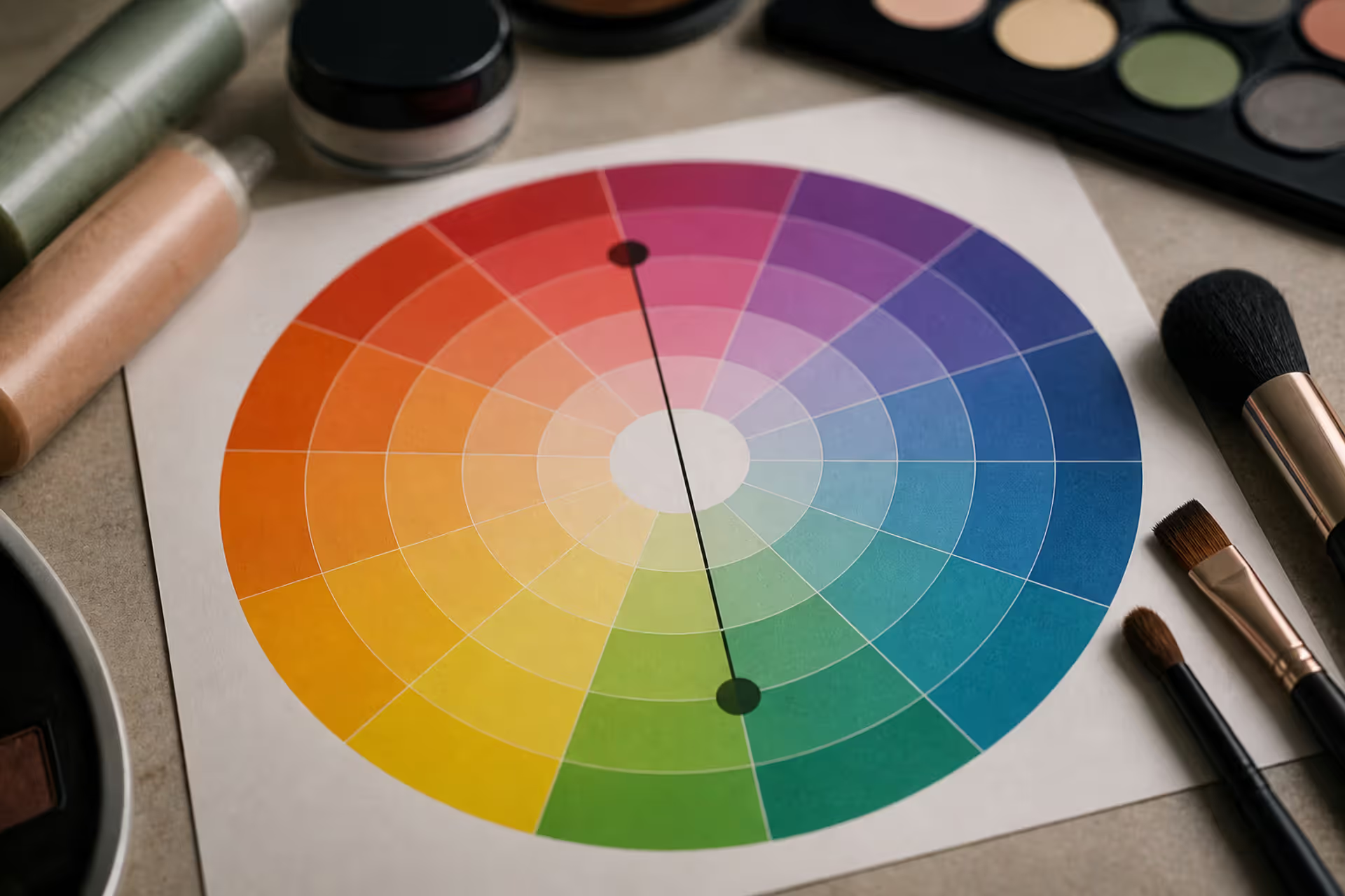
Green tones appearing where they shouldn't can be frustrating. Red cancels out green because these colors sit directly opposite on the color wheel. This principle applies across makeup, hair color, painting, and digital editing, giving you precise control over unwanted hues.
Discover the essential types of color palettes used in design, from monochromatic schemes to complex tetradic systems. Learn how each palette type works, when to use them, and how to choose the right colors for your specific project needs with expert insights and practical examples.
The rounded square has become the defining shape of digital interfaces. From app icons to buttons, this geometric form appears billions of times daily. Learn the mathematical differences between rounded squares, squircles, and superellipses, plus platform-specific implementation standards.
Converting RGB digital colors to PMS for print requires more than software—it demands understanding color gamut differences, using physical Pantone guides, and managing expectations. This comprehensive guide explains why screen colors don't translate directly to print and shows you proven methods for accurate color conversion.
The content on this website is provided for general informational and educational purposes only. It is intended to explain concepts related to digital design, visual art, color theory, art techniques, design principles, and design history.
All information on this website, including articles, guides, and examples, is presented for general educational purposes. Creative outcomes may vary depending on individual skill, tools, and practice.
This website does not provide professional design services or guarantee results, and the information presented should not be used as a substitute for formal education or professional consultation.
The website and its authors are not responsible for any errors or omissions, or for any outcomes resulting from decisions made based on the information provided on this website.