An audience icon is basically your design's way of saying "hey, we're talking about people here" without actually typing those words. Could be two teammates, could be 10,000 newsletter subscribers. Either way, you're looking at simple human shapes—usually silhouettes—doing the heavy lifting.
You've seen these everywhere, probably without thinking twice. Instagram? That little cluster of heads next to your follower count. Google Analytics? Those grouped figures showing how many people visited your site last Tuesday. Slack channels display a people icon listing who's actually in the conversation. They're not just sitting there looking pretty.
Your brain processes images about 60,000 times faster than text (yeah, really). When you're skimming a crowded dashboard at 9 AM with coffee still brewing, that symbolic people representation saves you time. Instead of parsing "Active Users: 1,247," you spot the figure symbol and immediately understand you're looking at visitor stats.
Digital products drop people icons into pretty predictable places:
Analytics platforms – Visitor counts, demographic breakdowns, user segments all get those clustered silhouettes
Collaboration tools – Showing who can edit, who's watching, who left comments
Social networks – Follower tallies, group memberships, team workspace indicators
Project management apps – Team assignments, project contributors, stakeholder views
The difference between a "user icon" and an "audience icon"? Honestly, just quantity. One silhouette means individual—like a profile or account. Multiple overlapping figures? That's your groups, teams, crowds.
Types of People Icons for Different Design Needs
Single vs. Group Representations
Solo figure icons work great for anything personal. Login buttons, profile pages, account settings, author bylines. There's something unmistakable about one silhouette standing alone.
Group icon design throws multiple figures together, but here's the thing: three people is the magic number. Two figures look like a partnership or couple instead of a proper group. Four or more? They'll squish into an unreadable blob once you shrink them to 24 pixels.
Clever designers use depth layering for crowd symbol design. Put one bigger figure up front, two smaller ones tucked behind. Add a touch of transparency to those background shapes. Suddenly you've suggested "lots of people" without drawing forty tiny heads that'll turn into mush.
Author: Adrian Lowell;
Source: crafterholic.com
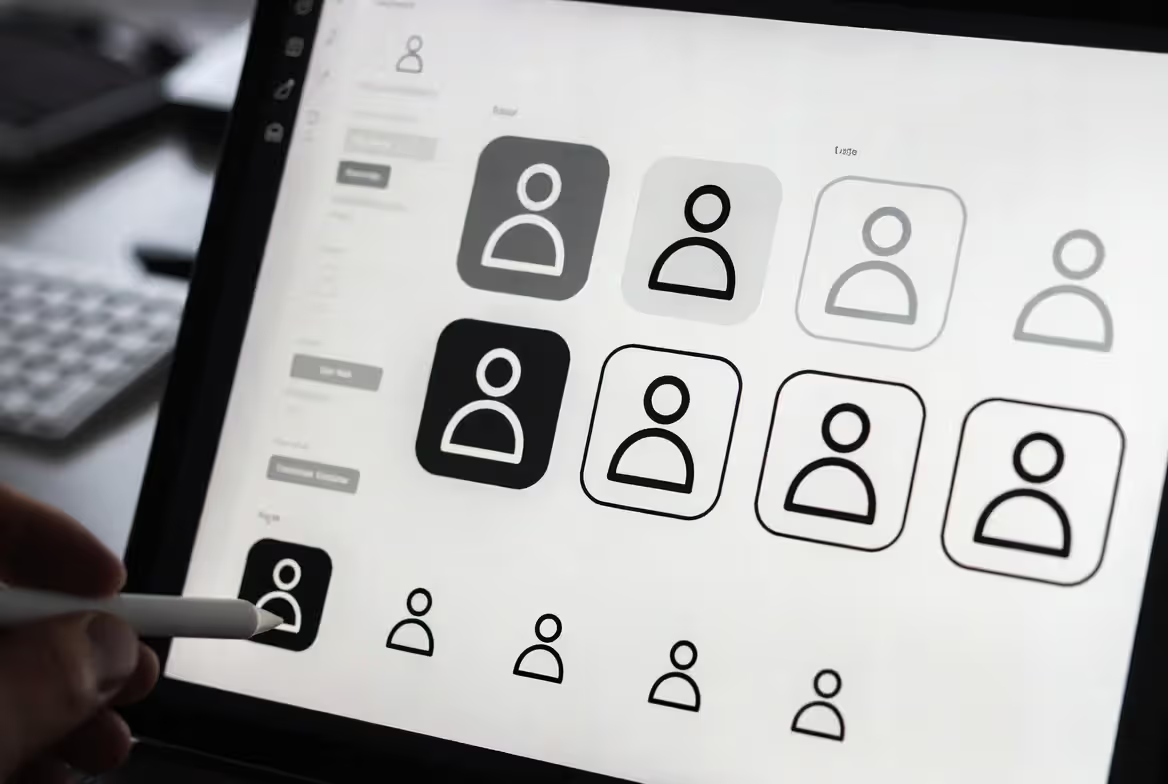
Filled, Outlined, and Line-Style Variations
Your human figure icon set basically comes in three flavors, and each behaves differently on screen:
Style
Visual Weight
Best Use Cases
Scalability
Typical File Size
Accessibility Score
Filled
Heavy, impossible to miss
Primary buttons, selected states, anywhere you need high contrast
Still crisp at 16px
Smallest files
9/10 contrast
Outlined
Middle ground, pretty flexible
Secondary buttons, general UI work, mixed contexts
Needs 20px minimum
Medium files
8/10 contrast
Line
Light, contemporary feel
Supporting actions, minimalist layouts, modern aesthetics
Don't go below 24px
Largest files
6/10 contrast
Filled icons pack a punch. Those solid shapes stay readable on mobile screens where people are making quick decisions. You can shrink them down to favicon territory—16×16 pixels—and they'll still work in a data table.
Outlined versions give your interface room to breathe. That hollow center lightens things up, which helps when you're grouping multiple icons close together. They're ideal for card layouts or light themes where solid black would feel too aggressive.
Line-style icons—built from strokes rather than fills—deliver that sleek, modern vibe everyone wants. But they're fussy about sizing. Drop below 24 pixels and those stroke weights start looking weird across different browsers. Fine details blur into mud on regular screens.
Author: Adrian Lowell;
Source: crafterholic.com
Abstract vs. Realistic Human Figures
Icon for people group design ranges from "extremely simplified" to "almost like a photo." Ultra-abstract versions turn humans into circles for heads and rectangles for bodies. Sometimes just overlapping circles, period. These geometric approaches scale beautifully and completely avoid cultural representation headaches.
Medium abstraction adds shoulders, hints at posture, maybe suggests arms. Enough human characteristics for instant recognition without getting into anatomical details. Most professional icon libraries camp out here—obviously human, not attempting realism.
Realistic figures venture into clothing details, hairstyle variations, maybe facial features. They've got warmth and personality, sure. They also completely fall apart at small sizes and raise uncomfortable questions about whose version of "realistic" you're showing.
How to Choose the Right Audience Icon for Your Project
Author: Adrian Lowell;
Source: crafterholic.com
Your brand personality should lead this decision. Banks and hospitals? They typically stick with filled, conservative designs broadcasting trustworthiness. Creative studios and entertainment apps can play with quirky line-based interpretations. Enterprise software usually sits in the outlined middle zone—professional without feeling corporate-stuffy.
Size requirements matter way more than most designers want to admit. Maybe your icon design for users needs to work in a cramped table cell at 16×16 pixels but also serve as a header graphic at 256×256. That massive range demands simple filled designs. Complex outlines and intricate details just vanish across such extremes. Always test at the smallest size first—when shapes merge or details disappear, you've gotten too complex.
Context goes beyond just pixel dimensions. Icons sitting on top of photos need aggressive contrast, possibly white strokes or drop shadows. Icons in consistently light or dark interfaces can optimize specifically for that background. Planning to use the same icon everywhere? You'll need higher contrast ratios and probably separate variants for light/dark modes.
Accessibility isn't negotiable. Your scalable people icon has to stay recognizable for users with low vision:
Hit at least 3:1 contrast against backgrounds (shoot for 4.5:1)
Create distinct shapes that don't rely solely on color
Icons people can tap need 44×44 pixel minimum touch targets on mobile
Add alt text or ARIA labels when icons carry functional meaning
Cultural sensitivity prevents accidental offense. Skip icons suggesting specific ethnicities, religions, or cultural practices unless you're deliberately representing diversity. Gender-neutral designs avoid assumptions and work for broader audiences. Some organizations now prefer geometric abstractions specifically to sidestep these complexities.
The perfect community icon visual is invisible in the best sense. When users pause to decode an icon, you've lost them. Your choice should feel obvious—so naturally aligned with context that it registers instantly and disappears, letting people focus on their actual work instead of figuring out your interface.
— Maya Patel
Common Mistakes When Using Group Icons
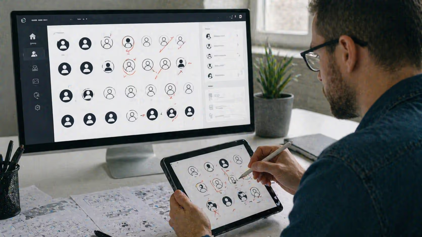
Weak contrast kills more icons than anything else. You pick something that looks gorgeous in Figma against that pristine white artboard, then it completely vanishes in your actual product. Test against real backgrounds, not idealized mockups. That medium-gray icon on a light-gray panel? Failing accessibility standards and frustrating anyone with even slightly impaired vision.
Mixing icon families creates visual chaos. You can't combine a geometric audience icon with hand-sketched navigation icons without broadcasting "amateur hour." Users read inconsistency as unreliability. Grab an icon system early—same creator, same style, same stroke weights—and stick to it.
Getting the size wrong happens both ways. Oversized icons steal attention from your actual content. Undersized ones force squinting and mis-taps. Here's a starting point: icons should roughly match your body text height when used inline, or about 1.5× to 2× body text for standalone buttons. With iconography for groups specifically, make sure individual figures stay distinguishable at your target size before you commit.
Accessibility collapses when icons work solo. Never use people icon in design as your only information channel. Pair icons with text labels, especially for unusual or complex actions. Decorative images get skipped by screen readers, so functional icons need proper ARIA labeling or adjacent text.
Cultural tone-deafness usually stems from unconscious assumptions. An icon showing three figures in Western business suits might alienate users from cultures with different professional dress. Religious symbols, hand gestures, or family structures in icons can mean completely different things across cultures. When you're uncertain, test with diverse user groups or embrace maximum abstraction.
Overusing icons dilutes their impact. Some interfaces slap audience icons on everything remotely people-related: authors, collaborators, viewers, editors, administrators, guests, members, followers, subscribers—all get identical three-person silhouettes. Differentiate through color, size, or subtle variations. Or question whether every instance truly needs an icon.
Author: Adrian Lowell;
Source: crafterholic.com
Where to Find Quality Audience and People Icon Sets
Free resources work well for prototypes and non-commercial projects. Google's Material Symbols collection offers 2,500+ icons including various human figure icon set options, available in filled, outlined, rounded, and sharp variations. Heroicons from Tailwind Labs provides clean, MIT-licensed SVGs in outline and solid versions. Bootstrap Icons packs people representations into its 1,800+ icon library, all commercially usable without fees.
Premium marketplaces serve up specialized options. Noun Project hosts thousands of designer-submitted icons with free (attribution required) and paid licensing tiers. Iconfinder and Flaticon curate collections with advanced filters for style, format, and usage rights. Expect $10–40 per icon or $50–200 for complete sets.
Quality libraries share certain characteristics:
Geometric consistency – Every icon follows identical grid systems and optical sizing
Complete coverage – Not random standalone icons but coordinated families spanning related concepts
Format variety – SVG for web, PNG for quick deployment, often AI or Sketch files for customization
Active maintenance – Regular updates bringing new additions and refinements
Licensing terms vary wildly. Creative Commons licenses might demand attribution even in commercial products. Some "free for commercial use" icons prohibit redistribution in competing icon libraries or template shops. Enterprise licenses typically cover unlimited internal projects but not client work. Read the actual terms before building mission-critical interfaces around any icon set.
How much you can customize matters for brand alignment. SVG files let you change colors, adjust sizes, even modify shapes without quality loss. Icon fonts enable easy CSS-based styling but limit multi-color designs. PNG sets lock you into fixed colors unless you're handy with image editing software. Maximum flexibility? Prioritize SVG-based scalable people icon collections with editable source files.
Design systems from tech giants offer battle-tested options. IBM's Carbon Design System, Atlassian's Design System, Microsoft's Fluent UI—all include people and group icons refined through extensive user testing. They carry implicit quality guarantees but might feel too corporate for some brand identities.
Frequently Asked Questions About Audience Icons
What file formats work best for audience icons?
SVG (Scalable Vector Graphics) wins for modern web work. These XML-based files scale infinitely without degrading, accept CSS styling, and typically clock in under 2KB. For web applications, inline SVG or SVG sprites deliver optimal performance and flexibility. PNG works for email templates or platforms that reject vector graphics, but you'll want to export at 2× or 3× your display size for retina screens. Icon fonts had their moment but have fallen out of favor due to accessibility headaches and loading quirks. JPEG? Skip it completely—compression artifacts destroy icon sharpness.
Can I customize audience icons for my brand colors?
Most icon sets allow color customization, though licensing varies. Free icons under Creative Commons or MIT licenses typically permit modifications. Premium sets usually bundle customization rights into standard licenses. SVG files make color swaps easy—just edit the fill or stroke attributes in any text editor or vector software. Icon fonts accept CSS color properties directly. For PNG sets, you'll need image editing software or might need to purchase the original vector source. Always check modification rights in the license before distributing customized versions.
Are audience icons accessible for users with disabilities?
Properly implemented icons can be accessible, but they're not automatically so. Decorative icons that don't convey unique information? Add aria-hidden="true" to hide them from screen readers. Functional icons need text alternatives via aria-label or adjacent visually-hidden text. Maintain sufficient color contrast—minimum 3:1 for graphical objects, better to hit 4.5:1 for essential icons. Never depend solely on icons for critical information; pair them with text labels. For users with motor impairments, keep those touch targets at least 44×44 pixels on mobile. Test with actual screen readers and confirm keyboard navigation works.
What's the difference between a people icon and a user icon?
The split usually comes down to quantity and usage context. A user icon typically shows a single figure representing individual accounts, personal profiles, or singular actions (login screens, account settings, my profile page). An audience icon or people icon displays multiple figures or implies groups—representing communities, teams, or collective concepts (followers, members, audience metrics). Some design systems use identical single-figure icons for both, depending on context and labels for clarity. Others maintain visual separation—a circle with one silhouette for "user" versus overlapping circles for "users" or "audience."
Do I need a license to use audience icons commercially?
Depends entirely on where the icon came from and its terms. Icons you create yourself or hire someone to make? No external license needed. Free icon sets come with varying licenses: Creative Commons Zero (CC0) permits unrestricted use including commercial; Creative Commons Attribution (CC BY) requires crediting the creator; some "free for personal use" licenses ban commercial deployment completely. Premium icon purchases typically include commercial licenses, but check whether they cover client work, SaaS products, or resale situations. When uncertain, contact the icon creator directly or choose from clearly-licensed sources like Material Symbols or Heroicons that explicitly allow commercial use.
How many people should a group icon show?
Three figures hit the sweet spot for most applications. Two can read as "partnership" or "comparison" instead of "group." Three clearly signals plurality without crowding at small sizes. Four or more figures risk becoming unreadable below 32×32 pixels—those overlapping shapes merge into an unclear mass. For concepts requiring "crowd" or "large audience," designers sometimes deploy graduated sizing (one large figure forward, two smaller behind) or add visual cues like ellipsis dots suggesting continuation. Test your approach at the smallest deployment size; if individual figures aren't distinguishable, reduce the count or increase abstraction.
Picking the right audience icon means balancing visual preferences against real-world constraints. The most effective choices blend seamlessly into their context—instantly recognizable, properly scaled, accessible to everyone. Start by nailing down your size requirements and brand personality, then test candidates at actual deployment sizes instead of trusting how they look in design tools.
Dodge common mistakes by maintaining consistency across your icon family, ensuring adequate contrast, and never depending on icons alone for critical information. The strongest resources combine transparent licensing with comprehensive sets covering related concepts, typically delivered as SVG files for maximum flexibility.
Icons serve users, not designers. Your personal favorite might flop in real use if it doesn't scale properly, lacks contrast, or makes cultural assumptions. Validate with actual users, check accessibility with screen readers, and prioritize clarity over cleverness. The audience icon that works best? The one users never consciously notice—it communicates its meaning and gets out of the way.
Master the wheatpaste street art technique with this complete guide covering adhesive recipes, poster installation methods, material selection, and legal considerations. Learn to create durable wheat paste art installations using affordable supplies and proven application techniques.
Perspective is the set of techniques artists use to represent three-dimensional space on a flat surface. It governs how objects appear smaller as they recede, how parallel lines converge toward a single point, and how atmospheric conditions affect color and clarity across spatial planes.
Learn to draw compelling three quarter view portraits with this comprehensive guide covering proportions, perspective, and step-by-step techniques. Discover why this angle creates depth and dimension, master foreshortening, and avoid common mistakes that flatten your portraits.
Stippling creates stunning artwork using only dots. This comprehensive guide covers everything from basic dot shading methods to advanced illustration techniques, including tool recommendations, step-by-step tutorials, and common mistakes to avoid.
The content on this website is provided for general informational and educational purposes only. It is intended to explain concepts related to digital design, visual art, color theory, art techniques, design principles, and design history.
All information on this website, including articles, guides, and examples, is presented for general educational purposes. Creative outcomes may vary depending on individual skill, tools, and practice.
This website does not provide professional design services or guarantee results, and the information presented should not be used as a substitute for formal education or professional consultation.
The website and its authors are not responsible for any errors or omissions, or for any outcomes resulting from decisions made based on the information provided on this website.