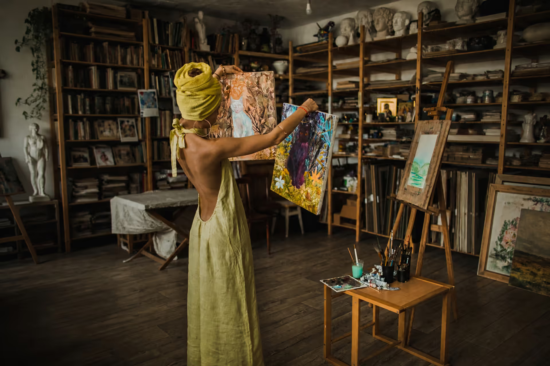
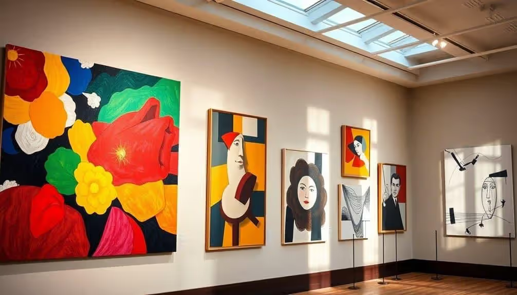
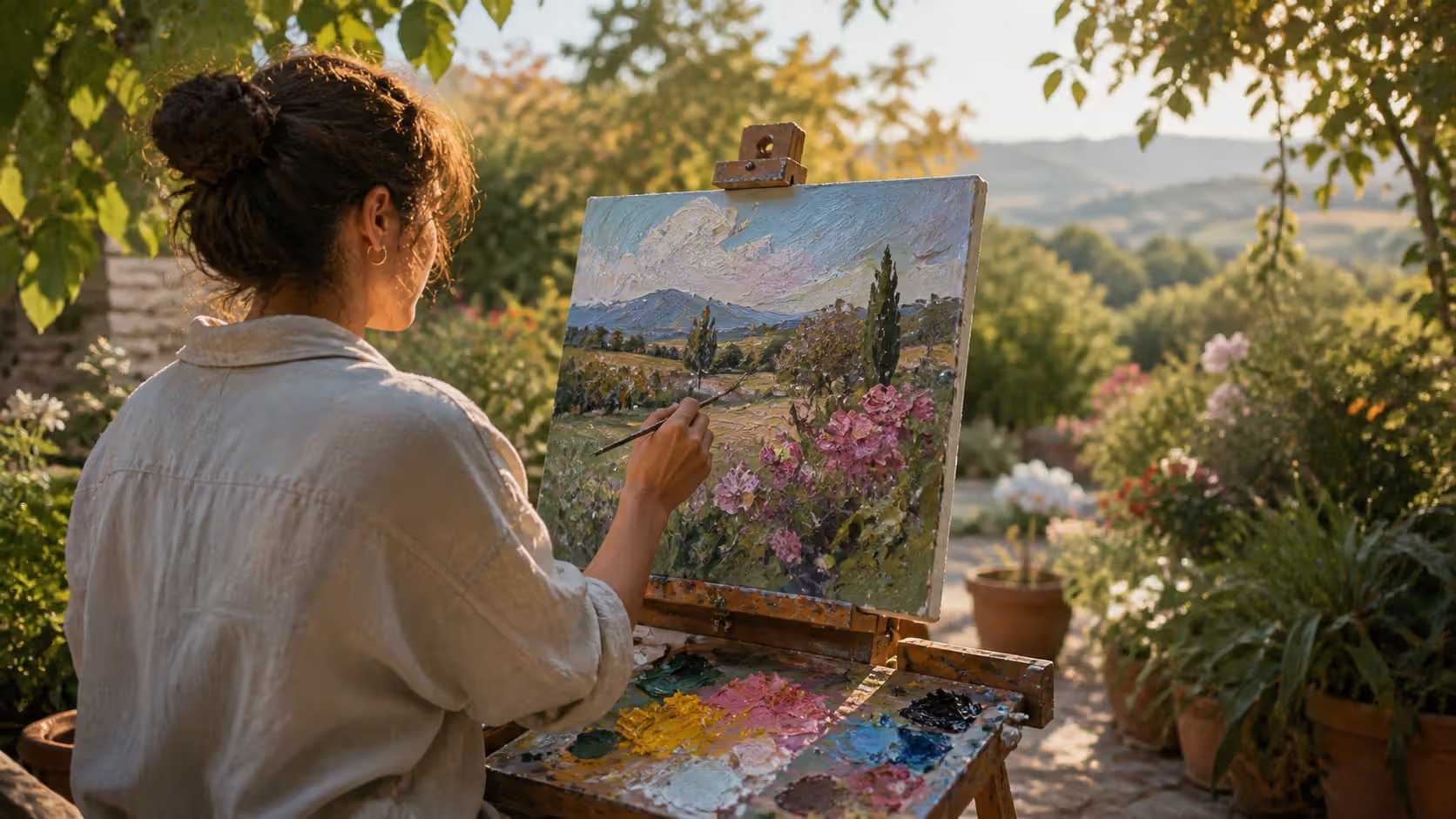
Here's what artist styles actually are: they're the specific combination of choices—brushwork, color, composition, subject matter—that makes one creator's work instantly recognizable. You know a Frida Kahlo when you see one, just like you can spot a Banksy from across the street.
Why should you care? Well, if you're making art, understanding styles gives you a framework for your own work. Instead of randomly trying techniques, you're making informed decisions. That choice between tight, photorealistic rendering and loose, expressive marks? It's not just about skill level—it positions your work in a conversation that's been happening for centuries.
Here's something most people miss: styles aren't just aesthetic choices. They're cultural artifacts. When Cubism exploded in Paris around 1907, it wasn't just painters being weird. Artists like Picasso and Braque were responding to Einstein's relativity theories, new ideas about the fourth dimension, and a world that suddenly felt less certain. Their fragmented paintings matched a fragmented reality.
Or take mid-century modernism. Those clean lines and minimal ornamentation didn't appear randomly. Post-WWII optimism, new industrial materials like bent plywood and molded plastic, and a desire to break from the past all fed into that aesthetic. Charles and Ray Eames weren't just designing chairs—they were visualizing a new era.
For viewers and collectors, knowing your styles turns museum visits from "that's pretty" to "I see what they're doing here." When you understand why an illustrator used flat colors instead of gradients, or why a sculptor left rough tool marks instead of polishing everything smooth, you're having a conversation with the artist across time and space.
Today's Instagram-friendly illustration styles—bold outlines, limited palettes, maximum contrast—aren't accidents either. They're responses to how we consume images now: scrolling fast on small screens. Art still shapes culture while culture shapes art. It's always been a two-way street.
Major Visual Art Style Categories Through History
Let's map the major territories in the art world. Think of these as continents, each with countless regions and subcultures.
Realism hit its stride as a capital-M Movement in the 1850s, though humans have been trying to depict reality accurately since cave painting days. Realists like Gustave Courbet shocked Paris by painting peasants and laborers with the same seriousness previously reserved for nobles and saints. Today, hyperrealists like Chuck Close create paintings you'd swear are photographs—until you stand inches away and see they're built from thousands of tiny decisions.
Abstraction said "forget copying reality—let's explore what paint itself can do." This encompasses everything from Piet Mondrian's precise grids to Helen Frankenthaler's stained color fields. Jackson Pollock dripped and splattered. Mark Rothko built glowing color rectangles that make people weep in museums. Same category, completely different energy.
Between 1910 and 1950, movements exploded faster than you could catalog them. Impressionism started the revolution in the 1870s—Claude Monet and friends painting outdoors, capturing how light actually looks instead of how it "should" look in a studio. Their visible brushstrokes scandalized critics who expected smooth, invisible technique.
Expressionism took the opposite approach from Impressionism. Instead of recording external light, artists like Edvard Munch and Ernst Ludwig Kirchner projected internal psychology onto canvas. Faces turned green, bodies distorted, colors screamed. Accuracy? Who cares—they were after emotional truth.
Surrealism dove into dreams and the unconscious. Salvador Dalí's melting clocks, René Magritte's men in bowler hats raining from the sky—this wasn't randomness, but attempts to access deeper realities beyond rational consciousness.
Minimalism stripped everything down to essentials. Donald Judd's identical metal boxes. Agnes Martin's subtle grid paintings. Dan Flavin's fluorescent tubes. They removed everything personal, everything decorative, asking "what's left?"
Pop Art crashed into the 1960s, grabbing imagery from advertising, comics, and celebrity culture. Andy Warhol's soup cans and Marilyn Monroe screen prints blurred the line between high art and commercial design—and that was precisely the point.
Author: Adrian Lowell;
Source: crafterholic.com
Realism vs Abstraction Styles
This divide runs deep. On one end, you've got artists committed to depicting observable reality. A realist landscape painter studies how morning fog diffuses light, how distance affects color saturation, how water mirrors and distorts reflections. Richard Estes spends months painting New York storefronts with every reflected detail intact. That's realism pushed to an extreme.
Abstraction abandons recognizable subjects entirely. When you look at a Wassily Kandinsky painting, you're not asking "what is that?" You're experiencing color relationships, spatial tensions, rhythmic movements. The painting doesn't depict anything—it is something.
Most interesting work happens between these poles. Gerhard Richter blurs photorealistic paintings until they become almost abstract. Amy Sillman paints figures that teeter on the edge of dissolving into pure gesture. This middle ground—call it abstracted representation—lets artists have it both ways.
Author: Adrian Lowell;
Source: crafterholic.com
Impressionist Style Features
Impressionists broke rules that had stood for 400 years. First, they ditched the studio. Monet hauled his easel into fields and gardens, trying to catch specific light conditions before they changed. This "plein air" approach meant working fast, which led to their signature visible brushwork.
Instead of carefully blending colors on their palettes, they placed separate strokes of complementary colors next to each other—orange near blue, red near green. Your eye does the mixing. Stand close to a Renoir, and you see distinct dabs of pink, yellow, and blue. Step back, and they become luminous skin.
Subject matter shifted hard. No more Greek gods or biblical scenes. Impressionists painted modern Paris: weekend boating trips, café concerts, train stations, ballet rehearsals. Gustave Caillebotte's "Paris Street; Rainy Day" shows exactly that—umbrellas, wet cobblestones, everyday life.
Compositional rules got tossed too. Edgar Degas cropped figures like a photographer might, cutting off heads and bodies at frame edges. He studied Japanese prints and borrowed their asymmetrical arrangements. Revolutionary stuff in 1874.
Expressionist Style Explained
Expressionism emerged in Germany around 1905, and it wasn't subtle. While Impressionists asked "how does this scene look?" Expressionists demanded "how does this feel?"
Colors stopped being descriptive. Kirchner painted city streets in acidic yellows and harsh greens—not because Berlin actually looked that way, but because urban life felt that way to him. Anxiety, alienation, and intensity got translated into visual terms.
Proportions warped for emotional effect. Oskar Kokoschka stretched and twisted bodies. Egon Schiele made figures angular and raw. These weren't mistakes—they were choices, amplifying psychological states through distortion.
Brushwork got aggressive too. Thick, slashing strokes. Paint applied with palette knives or squeezed straight from tubes. The physical act of painting became visible, urgent, almost violent.
When Neo-Expressionism revived in the 1980s with artists like Jean-Michel Basquiat and Anselm Kiefer, it brought back this emotional intensity. Today, any figurative painter dealing with difficult subjects—trauma, identity, social pressure—probably owes something to Expressionist strategies.
Author: Adrian Lowell;
Source: crafterholic.com
How to Distinguish Between Different Art Styles
Start with the marks. Get close to the surface. Are brushstrokes visible or blended into invisibility? Do you see the artist's hand, or has technique been concealed? A 17th-century Dutch painting by Vermeer shows no brushwork at all—it's smooth as glass. A Franz Kline abstract expressionist painting is all gesture—bold black slashes on white.
Color tells you tons. Is the palette naturalistic—green trees, blue water, brown earth? That suggests realist intentions. Non-naturalistic color—purple shadows, orange skin, red grass—points toward expressionist or fauvist approaches. Henri Matisse's "The Green Stripe" portrait features a bright green line down the subject's face. Not realistic. Definitely memorable.
Check how space works. Linear perspective, where parallel lines converge to a vanishing point, dominated Western art from the Renaissance through the 1800s. It creates depth, recession, realistic space. Modernist movements flattened that space. Gustav Klimt packed his paintings with decorative patterns that deny depth. Cubists showed objects from multiple angles simultaneously, shattering coherent space entirely.
Subject matter offers clues but can mislead. Surrealists painted realistic-looking objects in impossible combinations. A Magritte pipe looks photographic—until you notice it's floating in the sky. Social Realists depicted workers and political themes. Pop Artists grabbed from advertising and mass media.
Surface quality matters more than people realize. Smooth versus textured. A polished bronze sculpture sends different messages than one with visible chisel marks. Vincent van Gogh's thick impasto—paint applied so heavily it creates three-dimensional texture—became as important as his colors and subjects.
Try this exercise: pull up Monet's "Water Lilies" and Vermeer's "Girl with a Pearl Earring" side by side. The differences jump out. Visible versus invisible brushwork. Outdoor versus controlled indoor light. Broken color versus smooth gradations. Modern versus historical subject. Five minutes of comparison teaches more than an hour of reading descriptions.
Common Illustration Style Types in Modern Practice
Flat design illustration owns the digital world right now. Open any app, check any infographic, browse Dribbble portfolios. You'll see solid colors, simplified shapes, zero shading. Why? It scales perfectly, loads fast, reproduces clearly on any screen. Designers like Malika Favre use flat design with such sophistication it transcends its utilitarian origins.
Line art ranges wildly. Delicate contour drawings that capture form with minimal marks. Bold, graphic approaches where line weight does all the heavy lifting. Editorial illustrators love line work because it reproduces cleanly in print. Christoph Niemann's conceptual illustrations often use simple lines to communicate complex ideas—a line becomes a graph becomes a subway map becomes a narrative.
Watercolor illustration brings organic unpredictability to children's books, packaging, and editorial work. Carson Ellis's book illustrations show what watercolor can do—atmospheric washes, controlled wet-into-wet blooms, layered transparency. Digital tools can fake it, but traditional watercolor still offers happy accidents no software fully replicates.
Vector illustration creates graphics you can scale to billboard size without losing quality. That's because vectors use mathematical curves instead of pixels. Logo designers, poster artists, and pattern makers rely on vector workflows. DKNG Studios produces concert posters with intricate vector details that look crisp at any size.
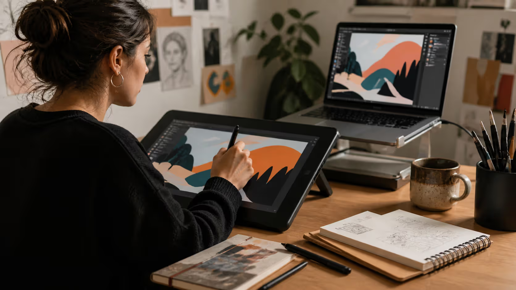
Digital painting mimics traditional media while adding layers, unlimited undo, and non-destructive editing. Entertainment industry concept artists like Sparth (Nicolas Bouvier) create entire science fiction worlds in Photoshop. The line between digital and traditional painting keeps blurring as tablets get more responsive and brushes more realistic.
Mixed media illustration combines techniques strategically. Start with ink drawing, scan it, add digital color and texture. Or paint traditionally, photograph it, then collage and composite digitally. Laura Carlin layers drawn elements, painted textures, and found materials into editorial pieces that feel handmade even when digitally assembled.
Editorial style conventions vary by context. Political cartoons exaggerate and caricature—think of Pat Oliphant's sharp satire. Fashion illustration emphasizes gesture and movement—David Downton's loose, confident lines capture runway energy. Scientific illustration demands accuracy above personality—medical illustrators render anatomy with precise, neutral clarity.
Author: Adrian Lowell;
Source: crafterholic.com
How Artist Styles Evolve Over Time
Picasso didn't start with Cubism. At 15, he painted like a Spanish old master. His Blue Period work from ages 20-23 shows melancholic realism—skilled, but not revolutionary. Only after mastering traditional techniques did he co-invent Cubism at 26. By 30, he'd moved beyond it. By 50, he was reinventing himself again. He died at 91 still experimenting.
That pattern repeats constantly. Early work shows obvious influences. You can see exactly what young artists are studying. A beginning painter might go through a clear Edward Hopper phase—lonely urban scenes, specific light angles, isolated figures. That's not copying, it's education. You learn languages by immersion.
Technical mastery buys creative freedom. Once skills become automatic, you stop thinking about how to draw a hand and start thinking about why this hand needs to be twisted that way. Expertise lets you break rules intentionally. Jenny Saville distorts figures dramatically, but her anatomical knowledge makes those distortions powerful rather than clumsy.
Technology shifts everything. Photography forced painters to reconsider representation—why compete with cameras at recording reality? That pressure pushed art toward expressionism, abstraction, conceptualism. Digital tools enabled illustration approaches impossible with traditional media. Procreate's interface affects how iPad illustrators work just as oil paint's slow drying time shaped how Renaissance painters layered glazes.
Cultural moments leave marks on styles. Street art and graffiti went from illegal vandalism to gallery-accepted art form in about 30 years. Jean-Michel Basquiat's career from 1980-1988 bridged that transition. Banksy's subsequent celebrity completed it. The style didn't change—cultural perception did.
Markets influence evolution whether artists like it or not. Illustrators working commercially adapt to client briefs and trending aesthetics. Instagram's algorithm favors high-contrast, bold imagery that reads well in tiny squares—so guess what aesthetic dominates there? Some artists resist market pressures. Others ride trends strategically.
Geographic context shapes available materials and traditions. Kehinde Wiley paints Black subjects in poses borrowed from European aristocratic portraits, but uses patterns inspired by African textiles. His style synthesizes influences from multiple cultural contexts—that hybridity is his style.
Most artists cycle between consolidation and experimentation. Develop a recognizable approach, get known for it, then feel trapped by it. Push into new territory, risk alienating your audience. Balance these tensions differently at different career stages. Early on, consistency helps build recognition. Later, experimentation prevents stagnation.
Developing Your Personal Artistic Style
Stop waiting for style to strike like lightning. It won't. Style emerges gradually from thousands of hours of work, not from a single breakthrough moment.
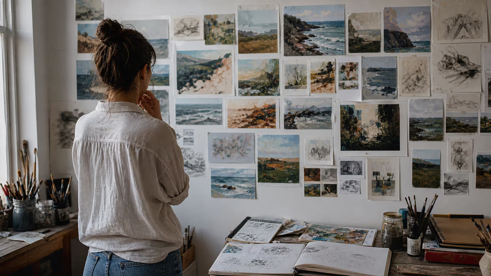
Cast a wide net first. Spend three months looking at everything. Renaissance frescoes. Japanese woodblock prints. Soviet propaganda posters. Contemporary digital illustration. Street photography. Animated films. Don't limit yourself to one medium or period. Note what makes you want to grab your tools immediately. Those visceral responses reveal authentic interests, not borrowed tastes.
Dissect what you love. When you find work that resonates, don't just admire it—reverse engineer it. Take Sophie Blackall's watercolor illustrations. What specifically appeals? The limited palette? The texture from rough paper? The way she balances detail and simplification? The handwritten type integration? Breaking down influences into components helps you borrow thoughtfully instead of copying wholesale.
Set up constrained experiments. Constraints liberate. Try these: spend one week using only three colors. Create ten variations on the same subject. Work for a month using only ink and white space. Make everything square format for two weeks. These artificial limitations force creative problem-solving and reveal what feels natural versus forced.
Copy masterworks without shame, but with purpose. Renaissance apprentices copied their masters for years. That's still legitimate education. Spend time reproducing artists you admire—but treat it as study, not output. Copy to understand technique and decision-making. Then put those lessons into original work.
Review your portfolio quarterly. Photograph everything, including failures. Every three months, lay out your last 50 pieces. Look for patterns. Do you consistently gravitate toward warm colors? Do diagonal compositions keep appearing? Does certain subject matter recur? Your emerging style often shows up in patterns you don't consciously recognize while working.
Match visual choices to conceptual interests. Style isn't just aesthetic—it's the marriage of form and content. Kara Walker uses black paper silhouettes to address slavery and race. That stark, graphic approach reinforces her themes. If you're interested in environmental themes, maybe your style incorporates organic forms and earth tones. Someone exploring urban isolation might develop harsh contrasts and fragmented compositions.
Accept the timeline. Most illustrators and painters need 5-10 years of consistent practice before developing distinctive voices. Not 5-10 years of casual dabbling—5-10 years of serious, regular work. That's 10,000+ hours. Anyone promising shortcuts is lying.
Balance influence and synthesis. Complete originality doesn't exist. We're all building on predecessors. But your specific combination of influences is unique. You love Matisse's colors and Edward Hopper's compositions and manga's economy of line? Synthesize all three. That particular mixture has never existed before.
Let style evolve. The approach you develop at 25 will shift by 35. That's growth, not failure. Philip Guston painted elegant abstractions until age 55, then shocked everyone by switching to crude, cartoonish figuration. Some artists maintain consistent styles for decades. Others reinvent themselves repeatedly. Either path works if it's authentic.
Author: Adrian Lowell;
Source: crafterholic.com
Style Comparison: Essential Differences Between Major Art Movements
Movement Name
Peak Years
Defining Visual Traits
Key Practitioners
Typical Content
Realism
1850-1900
Precise observation, contemporary subjects, rejection of idealization, accurate light
Learn the rules like a pro, so you can break them like an artist.
— Picasso
Sounds like a motivational poster cliché until you look at his actual trajectory.
At 14, Picasso could paint like Velázquez. His early academic exercises show complete mastery of realistic anatomy, classical composition, traditional technique. He proved he could play by the rules before he started breaking them. Those Cubist paintings that fragmented reality? They came from deep understanding of how to depict reality accurately. He earned the right to distort.
This matters now because social media rewards instant visual recognition. Artists feel pressure to develop signature styles immediately—before they've built solid foundations. But sustainable style grows from technical competence and conceptual depth, not trendy gimmicks.
Learn to draw accurately before you decide how to distort. Understand color theory before you violate it strategically. Study composition before you deliberately break its principles. Master doesn't mean perfection—it means understanding enough to make informed creative decisions instead of accidental ones.
That's the path Picasso mapped: competence first, revolution second. Still good advice 50 years after his death.
Frequently Asked Questions About Artist Styles
Can an artist work in multiple styles at once?
Absolutely, and many do it strategically. Julia Rothman maintains two distinct approaches—detailed line illustrations for editorial clients and looser watercolor paintings for personal projects. Sam Weber shifts between tight, controlled illustration for commercial work and experimental mixed media for gallery shows. The challenge isn't technical—it's about audience perception. Working in multiple styles simultaneously can confuse professional branding, especially early in your career when people are still figuring out who you are. Later, after you're established, stylistic range can demonstrate versatility. Context matters too: one style for client projects, another for personal exploration makes practical sense.
How long does it take to develop a recognizable artistic style?
Plan on 5-10 years of regular practice. That's not a discouraging number—it's realistic. Consider that 10 years at 20 hours weekly equals over 10,000 hours. Skills become automatic. Influences get digested and synthesized. Authentic preferences emerge from accumulated experience. Sure, some elements appear earlier—maybe you're drawn to specific color combinations or compositional structures within your first year. But fully developed, mature style usually requires time. Forcing premature consistency backfires by locking you into superficial mannerisms before you've explored enough to know what actually matters to you. Focus on skill-building and genuine exploration instead of rushing to "find your style."
What's the difference between style and technique?
Technique means specific skills and methods: how you hold your tools, mix your colors, layer your paint, use your software. Style is the recognizable visual character that emerges from combined technical choices, aesthetic preferences, and conceptual concerns. Example: both Wayne Thiebaud and Giorgio Morandi painted still lifes in oil. Same basic technique. Completely different styles—Thiebaud's candy-colored desserts with exaggerated shadows versus Morandi's muted bottles in subtle earth tones. The technique (oil painting) is shared. The style (what the paintings actually look and feel like) is utterly distinct. Technique is your vocabulary. Style is what you say with it.
Do I need formal training to develop an artistic style?
No, but it helps. Art school provides structured curriculum, expert feedback, peer community, and forced exposure to art history. Those advantages accelerate development. But plenty of successful artists—from Henri Rousseau to Vivian Maier to many contemporary illustrators—learned independently. What actually matters is consistent engagement: making work regularly, studying others' work critically, seeking honest feedback somewhere. You can get that through online courses, local workshops, critique groups, and disciplined self-study. Formal programs speed things up by organizing learning and providing accountability, but motivated self-direction works too. The key factor isn't institutional credentials—it's hours invested in deliberate practice.
How do I avoid copying another artist's style?
Study at least a dozen influences, not just one or two. When you love someone's work, identify specific elements—their color palette, their compositional rhythm, their mark-making approach—rather than absorbing their total package. Then mix influences. If you're drawn to Charley Harper's geometric simplification and also to Beatrix Potter's naturalistic detail, figure out how to combine both impulses. That synthesis creates something more personal than imitating either one completely. Also examine why you're attracted to particular styles—what values or sensibilities resonate? Understanding your own aesthetic priorities helps you make authentic choices. Finally, develop work addressing your unique experiences and perspectives. Personal content naturally generates distinctive form because nobody else has lived your specific life.
What are the most popular art styles today?
In 2026, several trends dominate different spaces. Digital illustration skews toward flat design with bold outlines, limited palettes, and high contrast—approaches that work great on screens. Figurative painting is having a moment, with artists blending realistic technique and expressive distortion (see Amoako Boafo, Somaya Critchlow). Street art aesthetics continue migrating from walls to galleries, with artists like KAWS bridging both worlds. Environmental consciousness is influencing material choices and subject matter—lots of artists incorporating natural elements and sustainability themes. Social media platforms favor visually immediate approaches: strong silhouettes, vibrant colors, graphic clarity that reads in thumbnail size. But here's the thing: "popular" shouldn't dictate your direction. Trends shift constantly. Authentic personal style outlasts temporary aesthetic fashions. Follow what genuinely interests you instead of chasing what's currently hot.
Understanding artist styles changes both making and viewing art. If you're creating, this knowledge gives you vocabulary for intentional decisions, context for your influences, frameworks for developing your own voice. If you're looking at art, recognizing stylistic characteristics turns passive consumption into active conversation.
The path from studying established styles to forging personal approaches takes patience. There's no shortcut. You've got to absorb diverse influences, build technical foundations, then make deliberate choices about which traditions to honor and which to challenge. Your specific mix of skills, preferences, and concerns will eventually coalesce into recognizable style—not through forced invention, but through authentic exploration of what genuinely compels you.
Style isn't a destination where you arrive and plant a flag. It shifts as you grow, as culture changes, as new tools emerge. Cy Twombly's work evolved continuously from the 1950s through 2011. Lynda Barry's drawing style today differs significantly from her early comic strips. That evolution represents vitality, not inconsistency.
The most sustainable practices balance enough consistency for recognition with enough flexibility for growth. Whether you're just starting to explore creative work or you've been at it for decades, understanding the rich range of artistic styles provides both inspiration and practical guidance. Make work. Look at work. Think about what you're seeing and doing. Repeat for years. Your style will emerge from that accumulation—not as something you invent, but as something you gradually discover was there all along, waiting for enough experience to reveal itself.
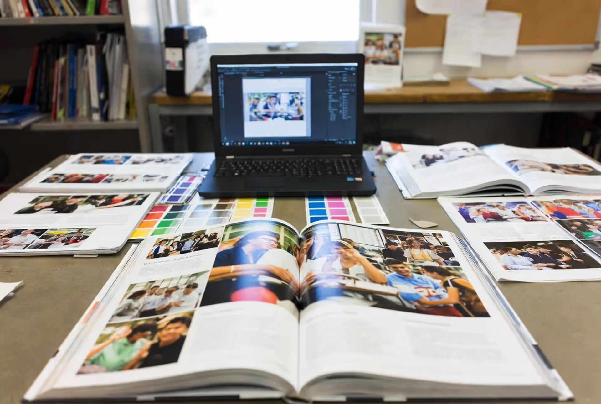
Master yearbook spread design with expert guidance on layout planning, grid systems, photo composition, and text balance. Learn to create two-page layouts that tell compelling stories while avoiding common mistakes and maintaining visual consistency across your yearbook.
Timeline arrows guide viewers through chronological information, transforming static data into dynamic narratives. This comprehensive guide covers arrow styles, process visualization techniques, common design mistakes, and practical tools for creating effective directional elements in timelines and infographics.
Symbols compress complex creative concepts into instant visual recognition. This comprehensive guide explores the psychology behind creativity symbols, catalogs the most effective options from lightbulbs to geometric forms, and provides a practical framework for choosing the right symbol for your design, branding, or communication project.
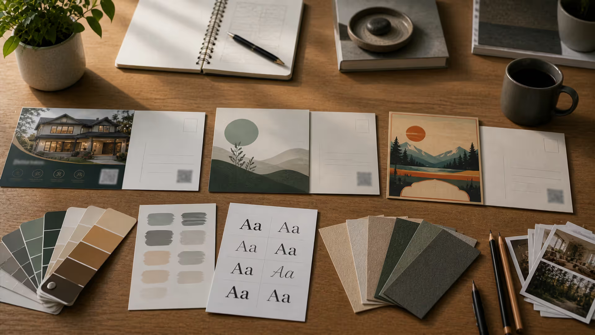
Learn professional postcard design principles for print and direct mail. Covers standard formats, layout composition, visual hierarchy, style approaches, and proven strategies that increase response rates. Includes size comparison chart, expert insights, and common mistakes to avoid.
The content on this website is provided for general informational and educational purposes only. It is intended to explain concepts related to digital design, visual art, color theory, art techniques, design principles, and design history.
All information on this website, including articles, guides, and examples, is presented for general educational purposes. Creative outcomes may vary depending on individual skill, tools, and practice.
This website does not provide professional design services or guarantee results, and the information presented should not be used as a substitute for formal education or professional consultation.
The website and its authors are not responsible for any errors or omissions, or for any outcomes resulting from decisions made based on the information provided on this website.