When you first glance at the FedEx logo, you see a simple wordmark. But look again—there's an arrow hiding between the "E" and "x." That moment of discovery isn't accidental. It's the result of deliberate design thinking rooted in gestalt psychology, where designers manipulate how your brain processes visual information to create surprise, delight, and lasting memory.
Gestalt clever design goes beyond aesthetics. It taps into the fundamental ways humans perceive patterns, complete incomplete shapes, and find meaning in visual chaos. The best examples feel almost magical—once you see the hidden element, you can't unsee it, and the brand becomes unforgettable.
How Gestalt Principles Create Visual Surprises
Your brain doesn't passively receive visual information. It actively searches for patterns, fills gaps, and organizes chaos into meaningful wholes. Gestalt psychology, developed in the 1920s by German researchers, identified specific rules governing this process: proximity, similarity, closure, continuity, and figure-ground relationships.
Visual perception tricks in design exploit these hardwired tendencies. When a logo designer places two shapes near each other, your brain automatically groups them. When they leave a shape incomplete, your mind fills the missing pieces. This automatic processing happens faster than conscious thought—usually within 50 milliseconds.
The "clever" part emerges when designers layer multiple readings into a single image. Your brain processes the obvious interpretation first, then—sometimes seconds later, sometimes after someone points it out—discovers the secondary meaning. This delayed revelation triggers a small dopamine release, the same neurochemical reward you get from solving a puzzle.
Author: Olivia Hartwell;
Source: crafterholic.com
Perceptual cleverness in branding works because it creates active engagement. Passive viewers become active participants. They've done cognitive work to "find" the hidden element, which makes them feel invested in the discovery. Research from the Design Management Institute shows that logos with discoverable elements generate 23% higher recall rates in blind testing compared to straightforward designs.
Optical illusions in graphic design function differently than magic tricks. Magicians use misdirection and sleight of hand. Designers use your brain's predictable shortcuts. The Rubin vase—which shows either a vase or two faces depending on whether you focus on black or white space—demonstrates how figure-ground ambiguity creates dual readings without any deception.
The key is balance. Push too hard and the design becomes a visual riddle that frustrates rather than delights. Pull back too much and the cleverness disappears entirely, leaving a generic mark that fades from memory within minutes.
Negative Space Techniques That Hide Images in Logos
Negative space—the "empty" area around and between design elements—offers the richest territory for gestalt-based cleverness. When designers treat negative space as an active design element rather than leftover background, they can embed secondary images that reward careful observation.
Famous Examples: FedEx, NBC, and Toblerone
The FedEx arrow remains the gold standard. Lindon Leader created it in 1994 by carefully adjusting the spacing and letter shapes until the negative space between "E" and "x" formed a perfect forward-pointing arrow. The arrow reinforces brand attributes—speed, precision, forward motion—without adding a single graphic element.
NBC's peacock uses negative space differently. The white shape in the center isn't just background; it forms the peacock's body while the colored petals create feathers. This figure-ground reversal lets one element do double duty, creating visual efficiency.
Toblerone hides a bear in the mountain on its packaging—a reference to Bern, Switzerland (the "city of bears") where the chocolate originated. The bear emerges from the mountain's negative space, visible only when you know to look for it. Unlike the FedEx arrow, which enhances brand messaging, the Toblerone bear adds storytelling depth.
Logo Name
Gestalt Principle Used
Hidden Element
Industry
Year Created
FedEx
Figure-Ground
Arrow between E and x
Logistics
1994
NBC
Figure-Ground Reversal
Peacock body in white space
Broadcasting
1986
Toblerone
Closure & Figure-Ground
Bear in mountain
Food & Beverage
1970
Spartan Golf Club
Negative Space
Spartan warrior profile
Sports/Recreation
1998
Baskin-Robbins
Figure-Ground
"31" in B and R
Food & Beverage
2005
Formula 1
Negative Space
"1" between F and red stripes
Motorsports
1994
How Designers Plan Negative Space Reveals
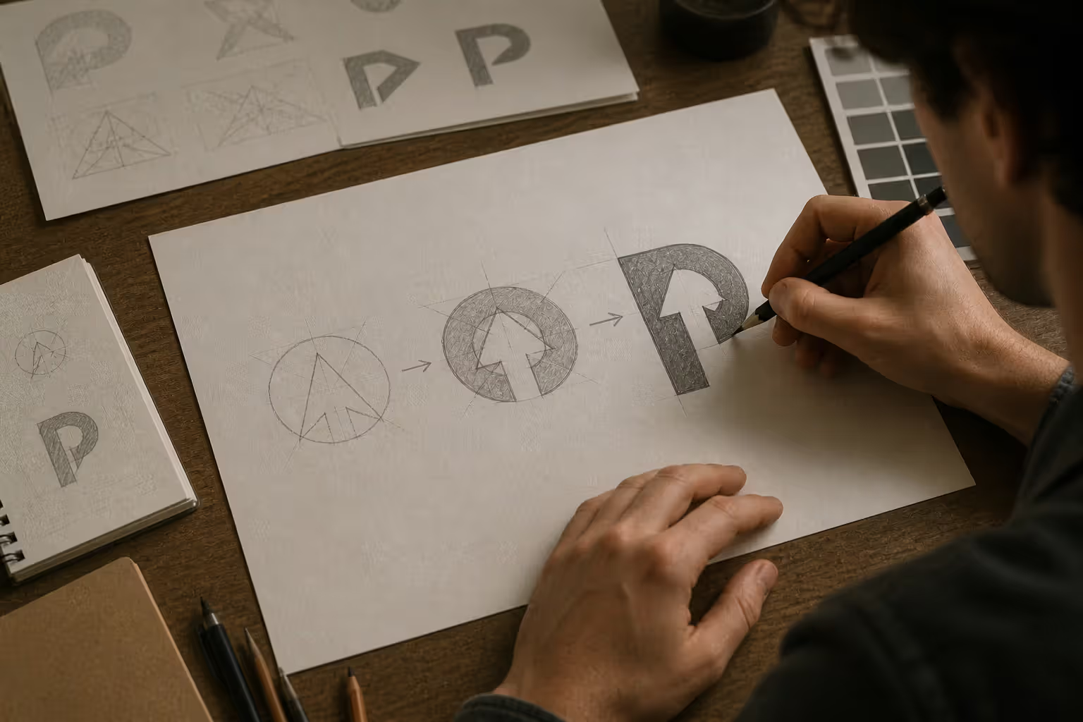
Creating effective negative space designs requires working backward. Designers typically start with the hidden element—the arrow, the face, the symbol—then build the primary letterforms or shapes around it. This inverted process ensures the negative space image has proper proportions and clarity.
Grid systems help maintain precision. Most successful negative space logos align the hidden element to the same geometric structure as the primary forms. The FedEx arrow, for instance, follows the same baseline and x-height as the letterforms, making it feel integrated rather than forced.
Testing happens in stages. Designers first verify that the primary reading works independently—if viewers can't read "FedEx" quickly and clearly, the arrow becomes irrelevant. Then they test discoverability: roughly 40-60% of first-time viewers should notice the hidden element within 30 seconds without prompting. Higher discovery rates often mean the primary design lacks strength; lower rates suggest the hidden element is too obscure.
Author: Olivia Hartwell;
Source: crafterholic.com
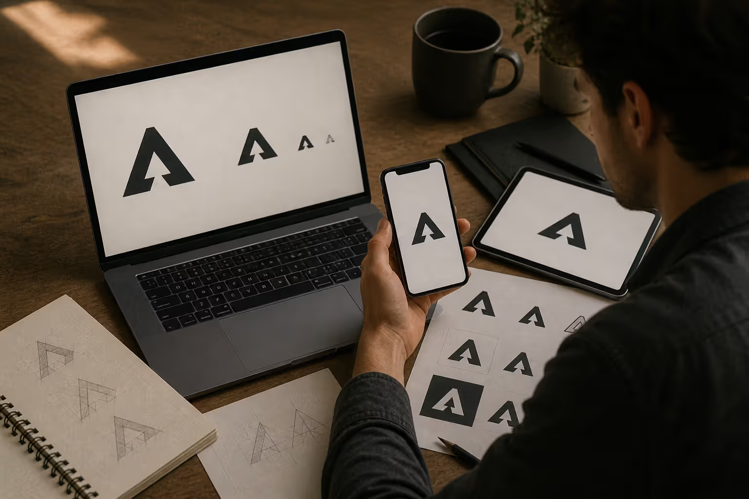
Scale testing matters enormously. A negative space element that works beautifully at poster size might disappear entirely when the logo shrinks to favicon dimensions (16×16 pixels). Designers create the logo at the smallest required size first, ensuring the negative space element maintains clarity even in challenging contexts.
Dual Meaning Designs Using Figure-Ground Illusion
Figure-ground illusion creates ambiguous figures in art where viewers can perceive two completely different images depending on whether they interpret dark areas as foreground or background. This perceptual flexibility lets designers pack two distinct concepts into one visual space.
The Girl Scouts logo demonstrates this principle clearly. The profile silhouettes of three girls also form a trefoil (the Girl Scout symbol) in the negative space between them. Neither reading takes priority—both coexist equally, creating visual democracy between the human element and the organizational symbol.
Dual meaning in design works best when both readings reinforce brand identity. The Guild of Food Writers logo shows a nib and a spoon sharing the same outline—one object morphs into the other depending on which edge you trace. Both tools represent the organization's focus (writing and food), so the visual pun strengthens rather than distracts from the message.
Author: Olivia Hartwell;
Source: crafterholic.com
Milwaukee Brewers' classic logo (used from 1978-1993) created a baseball glove from the letters "m" and "b," with the thumb forming the "m" and the fingers creating the "b." The dual reading felt natural because baseball gloves and the team name share obvious connections. When designers force unrelated concepts together—a law firm logo that's also somehow a tree, for instance—the cleverness feels arbitrary.
Ambiguous figures work through careful edge-sharing. The boundary line between figure and ground must make logical sense for both interpretations. In the Yoga Australia logo, the figure in meditation pose also forms the outline of Australia's continent. The shared edge—the person's curved back—matches Australia's eastern coastline closely enough that both readings feel intentional rather than accidental.
The most successful figure-ground logos don't announce their cleverness. They whisper it. The viewer should feel like they've discovered something the designer left for them to find, not like they've been shown a trick.
— Dr. Ellen Lupton
The risk with dual meaning designs is creating visual confusion. If viewers can't quickly settle on a primary reading, the logo fails its basic job: clear brand identification. The secondary meaning should emerge after the primary meaning establishes itself, creating a layered experience rather than competing messages.
Common Mistakes When Attempting Clever Gestalt Design
Forced cleverness ranks as the most frequent failure mode. A designer decides "this logo needs a hidden element" before determining whether the brand actually benefits from that approach. The result feels like a visual pun that exists for its own sake—impressive as a portfolio piece, weak as brand communication.
Illegibility follows close behind. When designers prioritize the hidden element over primary readability, the logo stops functioning. A restaurant logo that's also a chef's hat sounds clever until diners can't remember the restaurant's name because the letterforms distorted beyond recognition.
Over-complexity kills gestalt designs in digital contexts. A logo with three layers of hidden meaning might work in print, but when it appears as a 32-pixel app icon, all that subtlety vanishes. The designer spent weeks crafting intricate details that 90% of viewers will never see at actual usage sizes.
Cultural misreads create unexpected problems. Negative space that forms one shape in Western visual interpretation might read completely differently to viewers from cultures with different figure-ground conventions. The "okay" hand gesture means approval in the US but has offensive connotations elsewhere—similar issues arise with visual symbols.
Timing misjudgment happens when designers reveal the hidden element too quickly or too slowly. If the secondary meaning is too obvious, there's no discovery moment. If it's too obscure, viewers give up before finding it. The sweet spot—noticeable within 15-45 seconds for attentive viewers—requires extensive testing to achieve.
Some brands simply don't benefit from gestalt cleverness. A funeral home probably shouldn't have a playful hidden element. An emergency medical service needs instant recognition, not delayed discovery. Clever design serves the brand strategy; when strategy calls for immediate clarity and serious tone, gestalt tricks become inappropriate.
How to Apply Gestalt Cleverness to Your Brand Identity
Start with strategic questions before touching design software. Does your brand personality support playfulness and discovery? Do your customers have time to engage with subtle visual elements, or do they need instant recognition? A quick-service restaurant during lunch rush has different needs than a craft brewery that wants to project artisanal attention to detail.
Visual wit in design works best for brands that want to communicate intelligence, creativity, or attention to detail. Technology companies, creative agencies, educational institutions, and lifestyle brands often benefit from clever gestalt approaches. Banks, insurance companies, and medical practices typically need straightforward clarity instead.
If gestalt cleverness fits your strategy, follow a structured process:
Map your brand attributes. List 5-7 words that capture your brand essence. Then identify visual symbols that represent each word. Look for overlap—concepts that could share visual space or create meaningful figure-ground relationships.
Sketch in quantity. Generate 50-100 rough concepts before judging any of them. Gestalt solutions often emerge from unexpected combinations, and premature editing kills creative exploration.
Test the primary reading first. Show your strongest concepts to people unfamiliar with your brand. Can they read the name? Do they understand the industry? Only after the primary reading succeeds should you evaluate the secondary elements.
Verify at multiple scales. Print your logo at business card size, billboard size, and everything between. View it on a phone screen. The hidden element should work at every scale or gracefully disappear at small sizes without damaging the primary design.
Time the discovery. Show the logo to 10-15 people who haven't seen it before. Track how long it takes them to notice the hidden element without prompting. If everyone sees it immediately, it might overpower the primary design. If nobody finds it within a minute, it's too subtle.
Consider longevity. Gestalt-clever logos tend to age well because they're based on timeless perceptual principles rather than style trends. The FedEx arrow works as effectively in 2026 as it did in 1994. Ask whether your hidden element will feel clever or dated in five years.
Author: Olivia Hartwell;
Source: crafterholic.com
When simplicity serves better, embrace it. Apple's logo contains no hidden elements. Nike's swoosh is just a swoosh. Both are among the world's most valuable brand marks because they prioritize instant recognition and emotional resonance over intellectual puzzle-solving.
The best gestalt-clever designs feel inevitable once you see them—so natural that you wonder why every brand doesn't use the same approach. That feeling of inevitability comes from deep strategic alignment between the visual trick and the brand truth it communicates.
FAQ: Gestalt Clever Design Questions
What does "gestalt clever" mean in logo design?
Gestalt clever refers to logos and graphics that use perceptual psychology principles to create hidden meanings, dual images, or visual surprises. The design leverages how your brain naturally groups shapes, completes patterns, and interprets figure-ground relationships to embed secondary messages that viewers discover through careful observation. The "clever" aspect comes from the "aha!" moment when the hidden element reveals itself.
Why do negative space logos work so well for branding?
Negative space logos create active viewer engagement rather than passive recognition. When people discover a hidden element themselves, they experience a small cognitive reward that makes the brand more memorable. Studies show this discovery process increases logo recall by 20-30% compared to straightforward designs. Additionally, negative space designs achieve visual efficiency—communicating multiple concepts without adding graphic complexity.
Can gestalt design tricks confuse viewers?
Yes, when executed poorly. If the hidden element competes with the primary reading or creates ambiguity about the brand name or industry, the design fails its fundamental purpose. The secondary meaning should enhance the primary message, not obscure it. Confusion typically results from prioritizing cleverness over clarity, using unrelated concepts, or creating figure-ground relationships that lack a dominant reading.
What industries benefit most from clever gestalt logos?
Creative industries—design agencies, advertising firms, entertainment companies—benefit strongly because the logo itself demonstrates creative thinking. Technology companies use gestalt cleverness to signal innovation and attention to detail. Educational institutions, publishing houses, and consulting firms also benefit because the hidden element suggests depth and intelligence. Industries requiring immediate trust and clarity—healthcare, finance, emergency services—typically benefit less.
How do you know if a gestalt design is too complex?
Test it at the smallest size it will appear in real use. If the hidden element disappears or the primary reading becomes unclear at favicon size (16×16 pixels) or on a business card, the design is too complex. Also track discovery time: if fewer than 30% of viewers find the hidden element within 60 seconds, or if it requires verbal explanation, you've crossed into over-complexity.
Are gestalt-clever logos still effective in digital/mobile formats?
They can be, but require careful scale planning. The best digital-friendly gestalt logos work in two modes: the hidden element enhances the design at larger sizes but gracefully disappears at small scales without damaging the primary mark. Designers often create simplified versions for app icons and social media avatars while using the full version for websites and marketing materials. The FedEx arrow, for instance, remains visible even at small digital sizes because it's built into the letterform spacing rather than added as fine detail.
Gestalt clever design represents the intersection of psychology, artistry, and brand strategy. When a logo uses negative space, figure-ground illusion, or dual meaning effectively, it transforms passive viewers into active participants who experience the satisfaction of discovery. That moment—when the hidden arrow, face, or symbol suddenly reveals itself—creates a neural connection that simple logos rarely achieve.
The approach isn't right for every brand. It requires audiences willing to engage, brand personalities that support playfulness or intellectual depth, and designers skilled enough to maintain clarity while embedding complexity. Forced cleverness fails quickly, but strategic cleverness creates lasting brand equity.
As digital contexts continue to dominate brand touchpoints in 2026, gestalt-clever designs face new challenges around scale and context. The most successful approaches build hidden elements into the fundamental structure rather than adding fine details, ensuring the cleverness survives across all sizes and applications.
Whether you're designing a new brand identity or evaluating your existing logo, ask the core question: does this visual trick serve the brand truth, or does it just serve the designer's ego? When the answer is the former, gestalt cleverness becomes a powerful tool for building memorable, engaging, and strategically sound brand marks that viewers remember long after the first glance.
Modernism transformed 20th-century art and design by rejecting historical tradition and ornament in favor of rationalism, functionalism, and industrial aesthetics. Learn about its origins in industrialization, key philosophical ideas, influence on visual culture, and lasting legacy.
Visual language uses color, shape, typography, and imagery to communicate ideas instantly. Discover how visual elements function as a communication system, how semiotics creates meaning in design, and how to apply graphic communication principles across media effectively.
Discover how mathematical proportions like the golden ratio (1.618), rule of thirds, and aspect ratios create visual balance in design. Learn practical applications, compare popular ratio systems, and avoid common mistakes when applying proportional design principles to logos, layouts, and interfaces.
Proximity gestalt describes how the brain groups nearby visual elements automatically. This guide explains the psychology behind the proximity principle, demonstrates practical spacing strategies, compares proximity with other Gestalt laws, and provides actionable best practices for designers.
The content on this website is provided for general informational and educational purposes only. It is intended to explain concepts related to digital design, visual art, color theory, art techniques, design principles, and design history.
All information on this website, including articles, guides, and examples, is presented for general educational purposes. Creative outcomes may vary depending on individual skill, tools, and practice.
This website does not provide professional design services or guarantee results, and the information presented should not be used as a substitute for formal education or professional consultation.
The website and its authors are not responsible for any errors or omissions, or for any outcomes resulting from decisions made based on the information provided on this website.