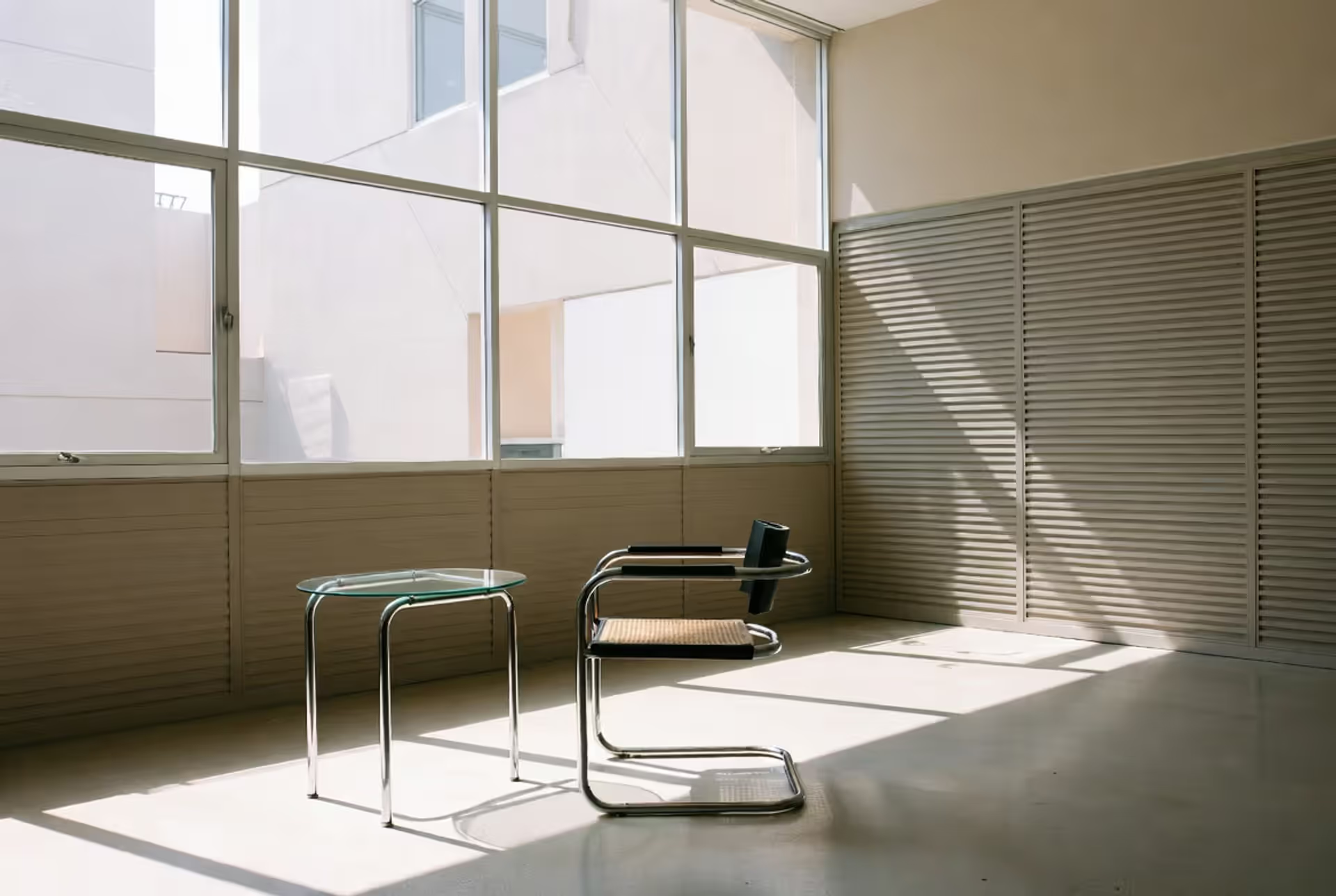
Walk into any mid-century home or flip through a 1930s design magazine, and you'll spot modernistic design immediately. It's that sleek chrome chair with leather straps. The building that's all glass panels and right angles. Typography so clean it almost disappears into the page.
But here's what modernistic design actually meant when it took off between the World Wars: designers stopped hiding what things were made of. They quit adding curly decorations just because Victorians loved ornament. Steel looked like steel. A factory looked like a factory. If you couldn't justify why something existed, you removed it.
This wasn't just an aesthetic choice—it was almost a moral position. Early modernistic designers believed good design could fix social problems. Mass-produce a well-designed chair, sell it cheaply, and suddenly working families could afford furniture that wasn't junk. Noble idea, even if reality got more complicated.
The movement gave us buildings that still look contemporary ninety years later. It changed how we think about everything from kitchen appliances to airport terminals. And yes, it also gave us some pretty cold, uncomfortable spaces where nobody wanted to spend time.
Origins and Philosophy of Modernistic Design
Picture this: it's 1925, and factories can suddenly produce identical objects by the thousand. Ocean liners cross the Atlantic in five days. Airplanes actually work now. The whole world feels mechanized, accelerated, transformed.
Designers looked around and thought, "Why are we still putting fake carved roses on machine-made furniture?"
Machine age visual grammar emerged from this collision. Raymond Loewy studied locomotives—those massive steel machines built purely for speed and power. He wondered: what if everything looked that purposeful? No fake wood grain. No decorative frills pretending this object was hand-carved in some medieval workshop.
The principle architects kept repeating was "form follows function," though Louis Sullivan coined that phrase back in the 1890s. By the 1920s, designers took it further than Sullivan imagined. A chair's back angle? Calculate it from spine curvature studies. Building facade? Let it express the steel frame inside instead of applying decorative stonework.
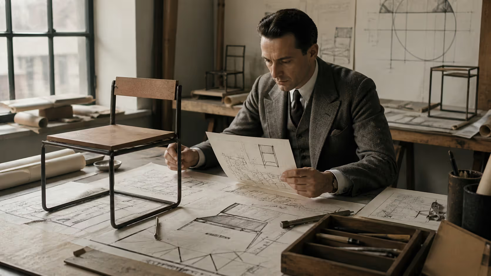
Rationalist design features meant treating every project like a math problem. What's the real purpose? What's the simplest solution? Can we standardize components for factory production? One Dutch designer, Gerrit Rietveld, built a chair from standard lumber dimensions available at any mill—two by fours and one by ones, basically. His Red and Blue Chair looked radically modern but cost almost nothing to manufacture.
This rationalist approach had political dimensions too. Many modernistic designers leaned left politically. They genuinely believed affordable, well-designed products could improve workers' lives. Why should only rich people own beautiful things? Mass production could democratize design.
Reality check: most modernistic products still cost plenty. That noble worker's housing often felt institutional and grim. But the ideology shaped everything these designers made.
Critics called it all cold and mechanical. "Where's the humanity?" they asked. "Where's the warmth?" Fair questions that modernistic designers sometimes struggled to answer. Turns out pure logic doesn't always create spaces where people feel comfortable.
Author: Sophie Calder;
Source: crafterholic.com
Core Visual Features of Modernistic Style
Modernistic visual style features share a family resemblance, even when designers worked in different countries and never met each other. Spot one of these characteristics, and you're probably looking at modernistic work.
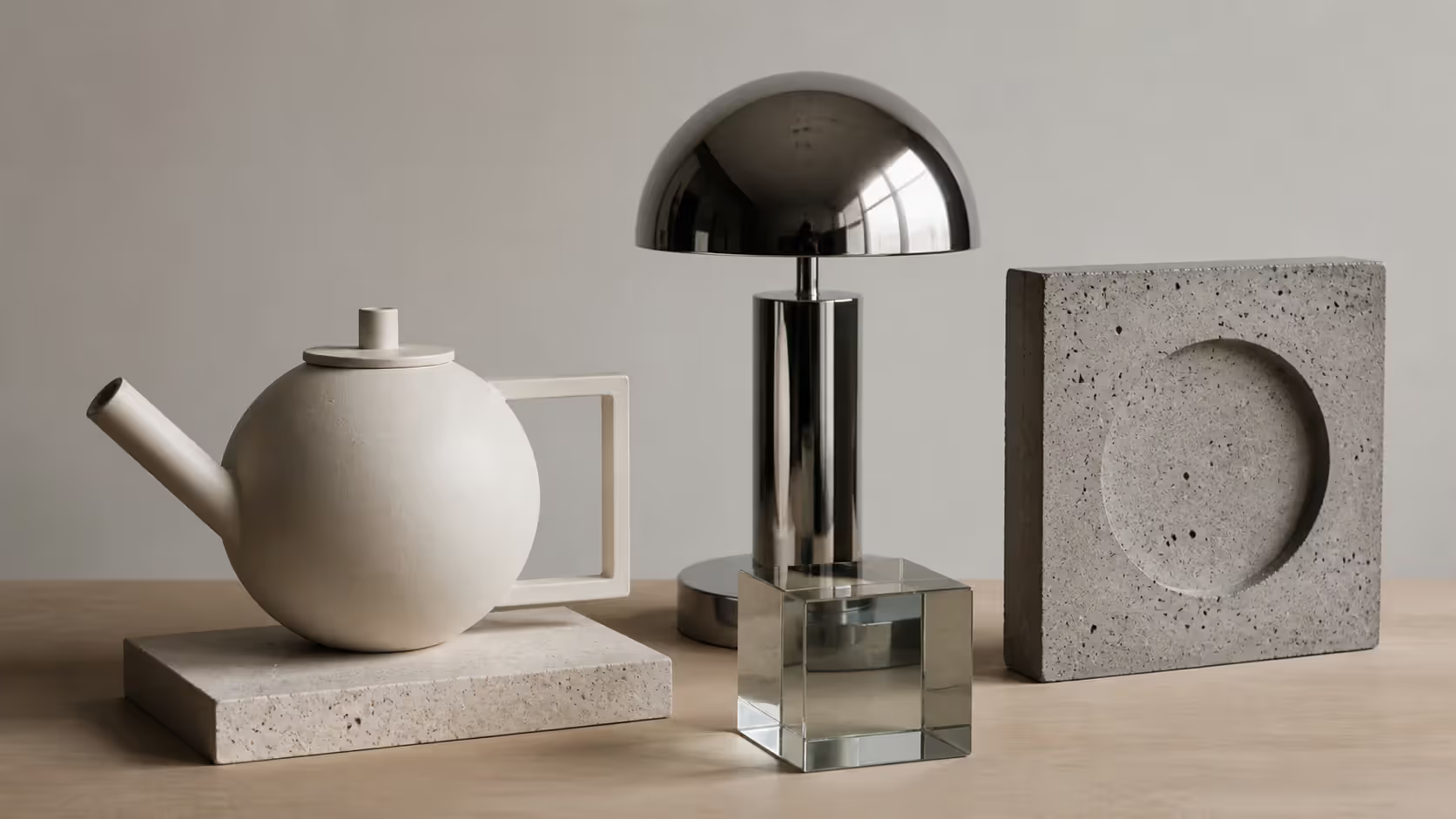
First: geometry everywhere. Not the decorative geometry of Art Deco zigzags, but pure shapes—perfect circles, clean rectangles, true cylinders. A modernistic teapot from 1930 might use a sphere for the body, a cylinder for the spout, a half-circle for the handle. Each part geometrically pure, precisely where circle meets cylinder.
Second: materials looked like themselves. Revolutionary concept at the time. Chrome stayed shiny chrome, not painted over. Glass remained transparent or got sandblasted for translucency—nobody faked it as something else. Concrete showed its aggregate and formwork patterns. After decades of Victorian-era tricks—wood painted like marble, plaster molded like carved stone—this honesty felt radical.
Color? Mostly neutral. White, black, gray, beige dominated. When designers added color, they grabbed primary reds, blues, yellows straight from the tube. Piet Mondrian's paintings influenced this—pure colors in pure geometric arrangements, nothing muddy or complicated.
The functionalist visual style meant zero applied decoration. Look at an Art Nouveau cabinet with its flowing botanical carvings, then at a modernistic cabinet—flat surfaces, maybe exposed screw heads, nothing added purely for looks. Any visual interest came from proportions, material contrasts, or functional elements like hinges and handles.
Author: Sophie Calder;
Source: crafterholic.com
Streamlined Shapes and Aerodynamic Lines
The streamlined aesthetic in design became modernistic style's signature look, even though it started from actual aerodynamics research.
Engineers studying air resistance discovered that rounded, continuous surfaces reduced drag. Locomotives got streamlined cowlings. Race cars evolved teardrop shapes. Makes total sense for objects moving 100 miles per hour.
Then designers started streamlining staplers.
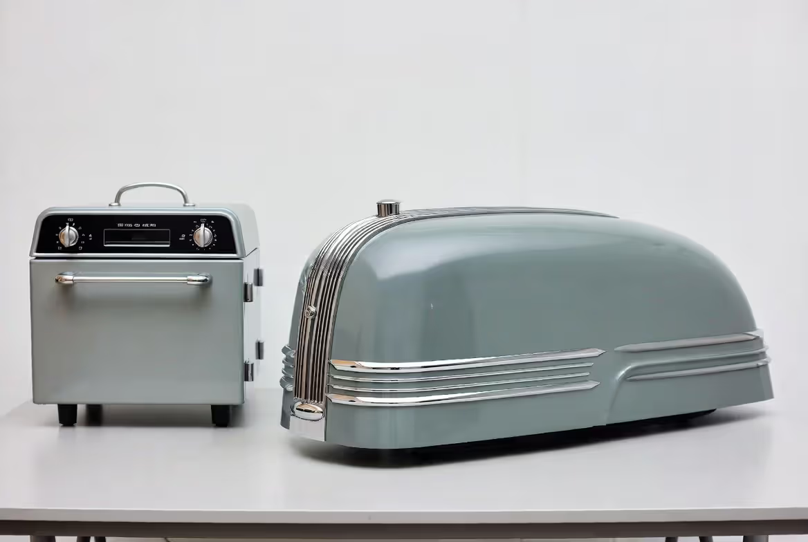
By 1935, you could buy streamlined pencil sharpeners, streamlined toasters, streamlined radios that never moved from the kitchen counter. Raymond Loewy streamlined a Coldspot refrigerator for Sears in 1934—horizontal chrome strips, rounded corners, teardrop handle—and it became a massive bestseller. Not one aerodynamic advantage for a stationary appliance, but it screamed "modern!"
The aesthetic worked because those horizontal lines and smooth curves suggested speed, efficiency, progress. A streamlined train looked fast even sitting still. That visual language transferred psychological meaning even to stationary objects.
Critics noticed the contradiction immediately. If you're claiming form follows function, why add aerodynamic curves to a building? The building never moves. Isn't that decorative streamlining just ornament pretending to be functional?
Defenders argued streamlining communicated efficiency even when not literally reducing drag. It was functionally expressive—the form expressed modern values and industrial capabilities. Sounds like rationalization, maybe, but that's how they justified it.
Author: Sophie Calder;
Source: crafterholic.com
Typography in Modernistic Design
Modernistic typography characteristics broke completely from centuries of type design tradition.
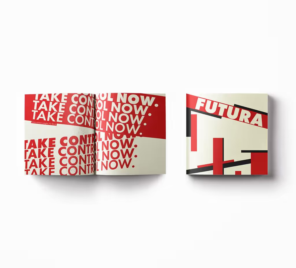
Paul Renner designed Futura in 1927—a typeface built from circles, triangles, and straight lines measured with drafting tools. The letter O was a perfect circle. The letter A looked like you'd constructed it with a compass and T-square. No hand-drawn curves, no calligraphic references, pure geometry.
Compare that to traditional serif fonts with their thick-and-thin strokes mimicking pen pressure from handwriting. Modernistic designers called that historical baggage. Why should mechanical type pretend someone wrote it by hand?
Jan Tschichold published "Die neue Typographie" in 1928, basically a manifesto for modernistic layout. His rules:
Ditch centered alignment. Asymmetric layouts based on functional hierarchy instead.
Sans-serif fonts only—those serifs were decorative holdovers.
White space matters as much as printed areas.
Photographs, not illustrations—photos document reality objectively.
Lowercase preferred over capitals (less space wasted, faster reading).
That lowercase preference went extreme at the Bauhaus. Herbert Bayer tried eliminating capital letters entirely. Argued they were redundant—why have two versions of every letter? His experiment never caught on broadly, but it showed how thoroughly modernistic designers questioned inherited conventions.
Layouts got dramatic. Huge photographs cropped asymmetrically, bold sans-serif headlines, text in narrow columns running vertically sometimes. A modernistic poster from 1930 looked shockingly different from Victorian typography's centered, decorative letterforms and illustrated borders.
Author: Sophie Calder;
Source: crafterholic.com
Art Deco vs Modernistic Style Compared
Here's where confusion runs deep. Art Deco and modernistic design overlapped historically—both peaked in the 1920s and 1930s. Both used geometric forms. Both responded to industrialization and modern life. So what's the difference?
Feature
Art Deco
Modernistic
Ornamentation level
Heavy decoration with stylized geometric and natural motifs, zigzags, sunbursts
Usually zero applied ornament—any decoration emerges from form, materials, or structural expression
Think about a 1925 Art Deco chair versus a 1925 modernistic chair. The Art Deco version might feature exotic rosewood veneer with geometric inlay patterns, upholstered in velvet, carved legs with stylized floral motifs. Expensive, custom-made, celebrating the craftsman's skill. Maybe $500 in 1925 dollars—serious money.
The modernistic chair? Marcel Breuer's Wassily Chair used bent tubular steel (bicycle tubing, basically) and canvas slings. Standardized components, factory-produced, no handcraft required. Revolutionary looking but designed for mass production. Cost maybe $30.
Art Deco embraced ornament as essential—it just organized decoration geometrically instead of the organic curves Art Nouveau preferred. Modernistic design rejected ornament as dishonest addition. Well-proportioned functional forms needed nothing extra.
Culturally, Art Deco expressed 1920s boom optimism, Jazz Age glamour, sophisticated urban life. Modernistic design pushed utopian social goals—better living through better design for everyone, not just elites.
Both movements influenced architecture, but differently. Art Deco skyscrapers like the Chrysler Building added decorative spires and ornamental facades. Modernistic buildings like the Bauhaus school in Dessau kept surfaces plain, expressing internal function through exterior form.
After World War II, Art Deco fell out of fashion completely—too associated with pre-war luxury and escapism. Modernistic principles evolved into the International Style that dominated 1950s architecture and design worldwide.
Bauhaus Influence on Modernistic Visual Language
You can't discuss modernistic design without the Bauhaus. The school operated only 14 years (1919–1933) in Germany, but bauhaus visual influence spread globally and lasted decades.
Walter Gropius founded the school with a specific mission: eliminate the separation between artists and craftspeople, between fine art and industrial design. Students learned material properties, color theory, geometric composition—then applied that knowledge designing furniture, textiles, typography, architecture.
This integrated approach was radical. Traditional art academies taught painting and sculpture. Trade schools taught carpentry and metalwork. The Bauhaus said: future designers need both. Understand aesthetic principles AND manufacturing processes. Then you can design for mass production without losing quality.
Rationalist design features got codified through Bauhaus teaching methods. László Moholy-Nagy taught the preliminary course, making students analyze materials systematically. What are steel's inherent properties? How does glass behave under stress? How do geometric forms relate spatially? Students spent months just exploring basics before touching a real design problem.
Marcel Breuer's tubular steel furniture exemplified results. His 1925 Wassily Chair reduced seating to essential elements—a frame providing structure, fabric providing support. Nothing extra. The design expressed both material properties (steel's strength and flexibility) and manufacturing logic (bent tubing, industrial fasteners).
Marianne Brandt designed metal teapots, lamps, ashtrays using pure geometric volumes. Her 1924 teapot combined a sphere, cylinder, and arc—each element geometrically perfect, assembled with functional clarity. Beautiful and manufacturable.
Herbert Bayer revolutionized typography, developing the "Universal" typeface—purely geometric sans-serif designed for maximum legibility and mechanical reproduction. His poster layouts used asymmetry, bold sans-serif type, photography, and dramatic cropping.
The creation of a new building type demands a new kind of designer: one who can think in three dimensions and who has been trained to understand the relationship between form, material, and function.
— Walter Gropius
But here's an important distinction: Bauhaus wasn't identical to broader modernistic movements. The school maintained stronger fine art connections than many modernistic practitioners wanted. Paul Klee and Wassily Kandinsky taught there—brilliant abstract painters whose work influenced design pedagogy but didn't serve industrial production directly.
Some Bauhaus products remained expensive craft objects despite theoretical commitment to mass production. Those geometric teapots? Hand-fabricated by skilled metalworkers, costly to make. The contradiction between ideology and economic reality troubled the school throughout its existence.
When Hitler's government closed the Bauhaus in 1933, calling it "degenerate," many masters fled to America. Gropius taught at Harvard. Mies van der Rohe directed architecture at Illinois Institute of Technology. Moholy-Nagy founded the New Bauhaus in Chicago. Josef Albers taught at Black Mountain College then Yale.
This diaspora spread Bauhaus methods across American design education. By 1950, Bauhaus principles—geometric abstraction, material honesty, form-follows-function thinking—had become standard modernistic practice taught in design schools everywhere.
Modernistic Design in Architecture and Interiors
Modernistic in architecture produced buildings that still look contemporary nearly a century later. Steel frame construction enabled the aesthetic—suddenly walls didn't need to support the building's weight.
Before steel frames, thick masonry walls carried loads. The taller the building, the thicker the ground-floor walls. Narrow windows because you needed wall surface for structure.
Steel skeletons changed everything. Columns carried weight, walls became thin curtains of glass and metal. This structural logic became an aesthetic principle: express the construction honestly rather than hiding it behind decorative facades.
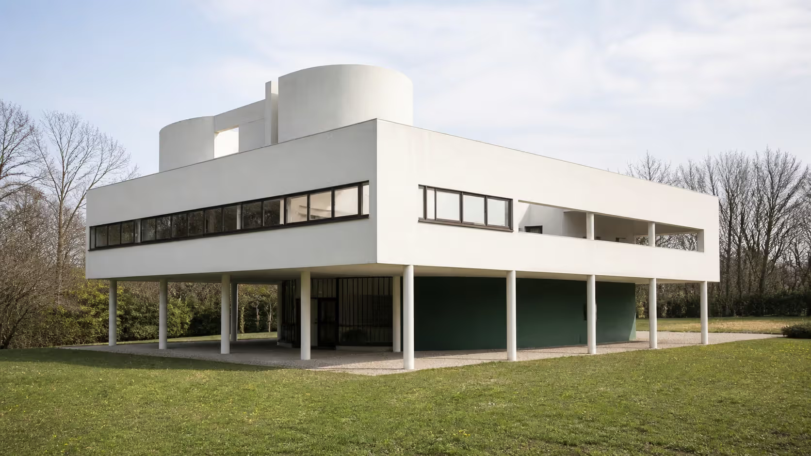
Le Corbusier's Villa Savoix (1931) demonstrated five points of modernistic architecture. First, pilotis—columns lifting the building above ground, freeing the land beneath. Second, roof garden—flat roofs became usable outdoor space. Third, free plan—interior walls didn't support anything, so you could arrange them anywhere. Fourth, ribbon windows—horizontal bands of glass wrapping the building. Fifth, free facade—exterior walls unconstrained by structural requirements.
The result? A white box floating above slender columns, geometric and pure. Revolutionary in 1931. Still striking today.
Ludwig Mies van der Rohe pushed even further toward reduction. His 1929 Barcelona Pavilion used almost nothing—a flat roof on chrome columns, free-standing walls that didn't enclose spaces, luxurious materials (marble, onyx, travertine) in simple geometric planes. The building contained virtually no furniture beyond Mies's Barcelona chairs.
Less is more, Mies said. Every element that remained after ruthless elimination became precious, powerful.
Form follows function in practice looked different for different building types. Factories needed efficient workflows, natural light for workers, flexible spaces for machinery. The 1911 Fagus Factory by Gropius showed how: glass curtain walls flooding interiors with light, open floor plans adaptable to changing production needs, honest expression of steel frame structure.
Housing projects applied standardization to reduce costs. J.J.P. Oud's Kiefhoek Housing in Rotterdam (1925–1930) used modular construction, minimal ornamentation, and standardized components to build affordable worker housing. Repetitive? Yes. But clean, modern, vastly better than slum tenements.
Interiors followed architectural principles. Open floor plans instead of compartmentalized rooms. Built-in furniture maximizing efficiency. Neutral colors with occasional bright accents on functional elements. Everything streamlined and uncluttered.
Problem: purely functionalist interiors sometimes felt institutional. Cold. Unwelcoming. People added plants, textiles, decorative objects—softening the austere rationalism whether designers approved or not.
This tension never fully resolved. Was psychological comfort a function? If people needed warmth and personality in their homes, shouldn't design provide it? Some modernistic architects adapted, others held firm to purism.
Author: Sophie Calder;
Source: crafterholic.com
Applying Form Follows Function in Modern Practice
Contemporary designers still reference modernistic principles, though usually mixed with other influences. Pure functionalism rarely dominates today—we've learned its limitations.
Product design often employs streamlined aesthetic in design, particularly electronics. Look at Apple's iPhone evolution: minimal physical controls, smooth surfaces, geometric forms, honest materials (glass, aluminum). Each element serves purposes—touchscreen maximizes display, thin profile aids portability, rounded corners improve ergonomics. Classic modernistic thinking.
But Apple also obsesses over how products feel emotionally. That's post-modernistic thinking—acknowledging that user experience includes psychology, not just mechanics. The iPhone's weight, the haptic feedback, the packaging experience—none of that emerged from pure functionalist analysis.
Digital interface design embraced modernistic principles enthusiastically. Flat design aesthetics that dominated 2013–2018 eliminated skeuomorphic textures (fake leather, wood grain, dimensional shadows) for simple geometric shapes, sans-serif typography, functional clarity. Google's Material Design and Apple's iOS 7 redesign both drew heavily from modernistic visual language.
Why? Partly ideology—honest design for digital materials. Partly technical—flat graphics load faster, scale better across screen sizes. Partly cyclical fashion—skeuomorphism had dominated 2007–2013, time for something different.
Architecture continues debating modernistic legacy. The International Style produced countless glass-and-steel office towers from 1950–1980. Critics called them monotonous, contextless, inhuman. Postmodern architecture reintroduced ornament and historical reference as explicit reaction against modernistic orthodoxy.
Yet modernistic principles persist, especially in sustainable design. Material efficiency, structural honesty, functional optimization all align with environmental goals. A green building designed for minimum energy use often looks modernistic—simple forms, honest materials, no wasted resources on decoration.
When should you apply modernistic principles today? They work well for:
Medical devices or industrial tools needing clear functional communication
Information-dense interfaces where clarity trumps decoration
Sustainable projects where material efficiency serves environmental goals
Flexible spaces needing adaptability over time
They may fit poorly for:
Residential interiors where warmth matters more than spatial efficiency
Cultural buildings where symbolic meaning and community identity require expressive forms
Luxury goods where craftsmanship and uniqueness justify decorative elaboration
Historic contexts where local architectural traditions provide cultural continuity
The key? Understand modernistic design as principles and methods, not fixed aesthetics. Form follows function still offers valuable guidance. But today's definition of "function" includes psychological comfort, cultural meaning, environmental impact—not just mechanical utility.
Frequently Asked Questions About Modernistic Design
What does modernistic mean in design?
Modernistic describes design emphasizing functionality, geometric simplicity, industrial materials, and minimal decoration. It refers specifically to movements from roughly 1920–1960 that rejected historical ornament for forms derived directly from purpose and manufacturing methods. These designers believed mass production could democratize good design, making well-designed objects affordable for ordinary people rather than just wealthy clients. The term covers related movements including Bauhaus, International Style, and streamline aesthetics—all sharing core principles despite regional variations.
How is modernistic different from modern design?
"Modernistic" pinpoints specific historical movements from 1920–1960, including Bauhaus, International Style, and streamline design. "Modern design" is vaguer—sometimes referring to the same period, sometimes meaning contemporary design generally, sometimes describing any preference for simplicity over historical styles. Confusingly, "mid-century modern" (1945–1969) overlaps with late modernistic design but developed distinct characteristics. Essentially: modernistic is a precise historical term, while modern can mean "current," "not traditional," or "from the modernistic era" depending on context.
What are the main features of modernistic visual style?
Look for pure geometric forms (circles, rectangles, cylinders), industrial materials (steel, glass, concrete), zero or minimal applied ornament, asymmetric compositions, sans-serif typography, neutral colors with primary color accents, streamlined shapes suggesting motion and efficiency, and honest material expression. The overall effect should communicate functionality and precision—nothing purely decorative, everything justified by purpose or manufacturing logic. If you see exposed structural elements, horizontal emphasis, or aerodynamic curves on stationary objects, you're probably seeing modernistic influence.
Is modernistic the same as minimalist design?
Not quite, though they overlap visually. Modernistic design appears minimal because it rejects ornament, but minimalism emerged later (1960s–1970s) with different philosophical roots. Minimalists pursued reduction for aesthetic and conceptual reasons, sometimes creating deliberately non-functional art objects. Modernistic designers reduced elements for functional reasons while maintaining utility. Minimalism is often more austere—white walls, empty spaces, extreme simplification. Modernistic design accepted streamlined curves and expressive forms if they served functional or communicative purposes. Think of minimalism as even more reduced than modernistic functionalism.
When was the modernistic design movement most popular?
Peak years ran 1925–1960. The Bauhaus operated 1919–1933. Streamline aesthetics dominated the 1930s. The International Style flourished in architecture from the 1930s through the 1960s. By the 1970s, postmodern reactions challenged modernistic orthodoxy—Robert Venturi published "Complexity and Contradiction in Architecture" (1966) explicitly arguing against modernistic reductionism. That said, modernistic influence never disappeared. It continues shaping product design, architecture, and digital interfaces today, usually blended with other approaches rather than applied dogmatically.
How can I identify modernistic typography?
Look for sans-serif typefaces with geometric construction—circular O's, uniform stroke weights, letterforms built from basic shapes. Classic examples include Futura (1927), Helvetica (1957), Univers (1957), and Akzidenz-Grotesk. Layouts should be asymmetric with clear hierarchies, generous white space functioning as active design element, preference for lowercase over all-caps, photography rather than illustration, and functional clarity prioritized above decorative arrangement. The text should look mechanically precise—nothing hand-drawn or calligraphic. If it feels like it came from a machine (even though someone designed it carefully), that's probably modernistic typography.
Modernistic design changed how designers work, establishing principles still taught in design schools worldwide. By prioritizing function, embracing industrial materials, and developing visual language appropriate to machine production, these designers created an aesthetic vocabulary that remains influential nearly a century later.
But we should recognize both achievements and limitations. Yes, the movement democratized access to designed goods through mass production. Yes, it developed rational methodologies and created enduring beauty through geometric clarity. But purely functionalist approaches sometimes sacrificed human warmth for theoretical purity.
Contemporary practice benefits from studying modernistic precedents without dogmatic application. Form follows function still guides effectively, but today's understanding of function encompasses psychological comfort, environmental sustainability, cultural significance—not just mechanical utility.
The streamlined aesthetic, rationalist analysis, and material honesty that defined modernistic design can inform current work without constraining it to historical formulas. That's the real lesson: these designers developed powerful tools and principles, not fixed rules. Applied thoughtfully and adapted to contemporary contexts, modernistic thinking helps create designs serving human needs while expressing our own technological and cultural moment.
Media arts harnesses electronic technologies and digital tools to create experiences that challenge traditional art forms. From immersive installations to interactive environments, this dynamic field transforms how we perceive and engage with contemporary artistic expression through video, performance, and screen-based work.
A conceptual artist creates work where the underlying idea holds more importance than the finished physical object. Unlike traditional artists who focus on mastering materials, conceptual artists treat the concept itself as the artwork, with execution serving merely as documentation of the idea.
Text message art transforms written language into visual compositions. From ASCII characters to monumental installations, artists use typography, concrete poetry, and calligraphy to create work where words function as both message and image, challenging traditional boundaries between reading and viewing.
Writing about your artwork feels awkward at first. You're translating visual ideas into sentences that don't sound pretentious. Every art student faces this challenge for applications, portfolios, and exhibitions. See real examples and learn the structure that works.
The content on this website is provided for general informational and educational purposes only. It is intended to explain concepts related to digital design, visual art, color theory, art techniques, design principles, and design history.
All information on this website, including articles, guides, and examples, is presented for general educational purposes. Creative outcomes may vary depending on individual skill, tools, and practice.
This website does not provide professional design services or guarantee results, and the information presented should not be used as a substitute for formal education or professional consultation.
The website and its authors are not responsible for any errors or omissions, or for any outcomes resulting from decisions made based on the information provided on this website.