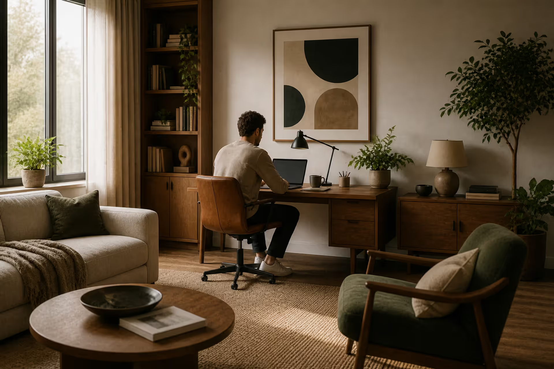
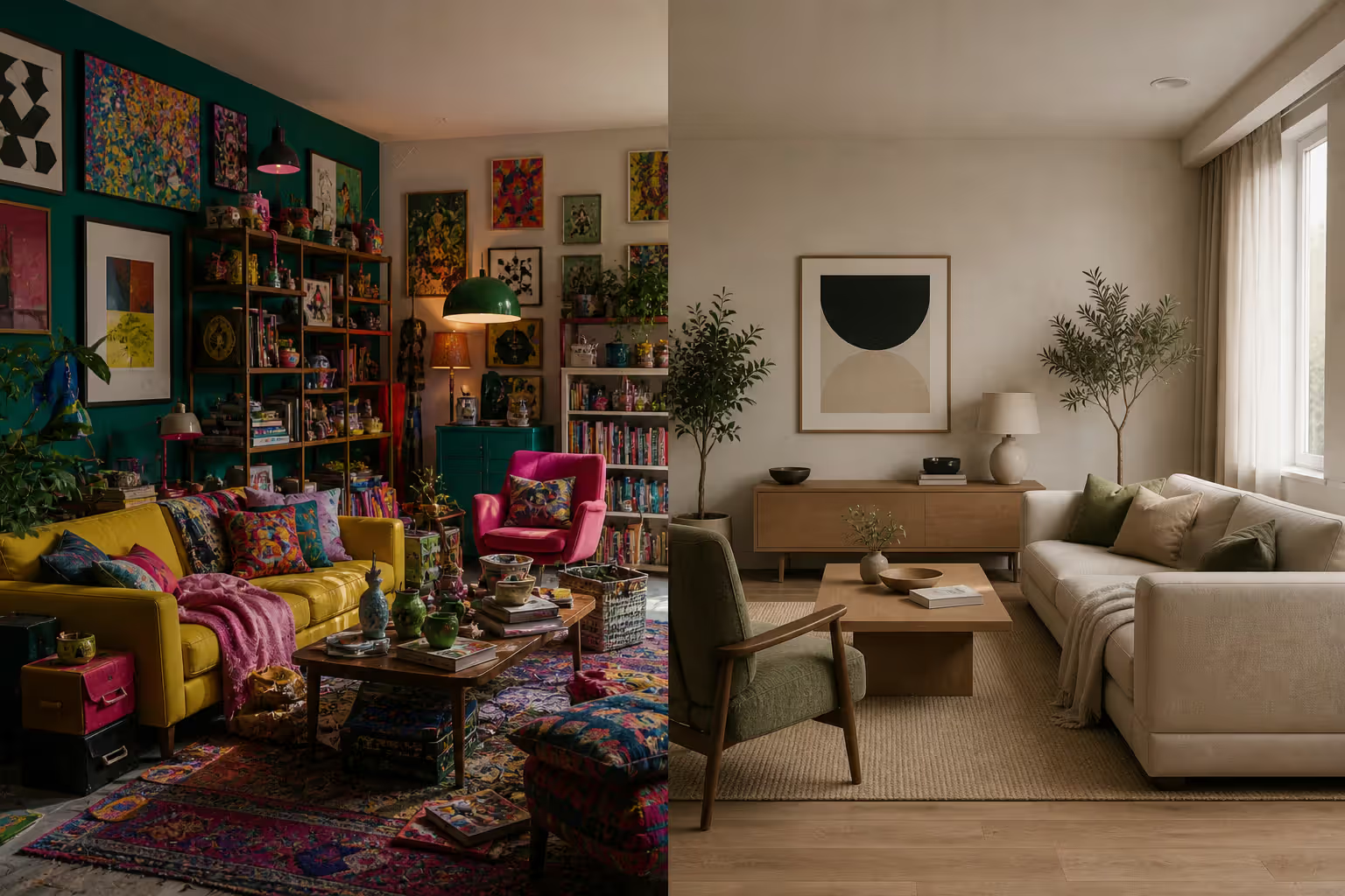
When you walk into a room and immediately feel at ease—or look at a painting that just "works"—you're experiencing harmony. It's that quiet force binding disparate elements into a coherent whole. Unlike dramatic contrast or bold asymmetry, harmony whispers rather than shouts. Yet its absence is jarring. A poster with six different typefaces, a room where nothing relates to anything else, a website where colors clash and spacing jumps erratically—these failures of harmony stick with us precisely because our eyes crave order.
Harmony in art isn't about making everything identical or safe. It's about establishing relationships. A red square and a blue circle can coexist harmoniously if their saturation levels match, if they share a visual rhythm, if the space around them follows consistent logic. The challenge lies in creating enough variety to maintain interest while building enough commonality to feel intentional.
This guide breaks down how harmony functions as a design principle, how it differs from related concepts like balance and unity, and which specific techniques produce harmonious results. Whether you're arranging a gallery wall, designing a brand identity, or painting a landscape, understanding these principles transforms guesswork into deliberate craft.
Understanding Visual Harmony and Its Role in Design
Visual harmony definition centers on the pleasing arrangement of elements that feel like they belong together. In formal terms, harmony occurs when components within a composition share visual characteristics—color temperature, scale relationships, stylistic treatment, or spatial rhythm—that create a sense of agreement rather than conflict.
As a design principle, harmony serves several functions. First, it reduces cognitive load. When elements relate predictably, viewers process information faster and with less mental friction. Second, it establishes credibility. A harmonious layout signals professionalism and intentionality, while disharmony often reads as amateurish or careless. Third, it directs attention. By creating a consistent visual field, harmony allows strategic variations to stand out meaningfully.
Author: Adrian Lowell;
Source: crafterholic.com
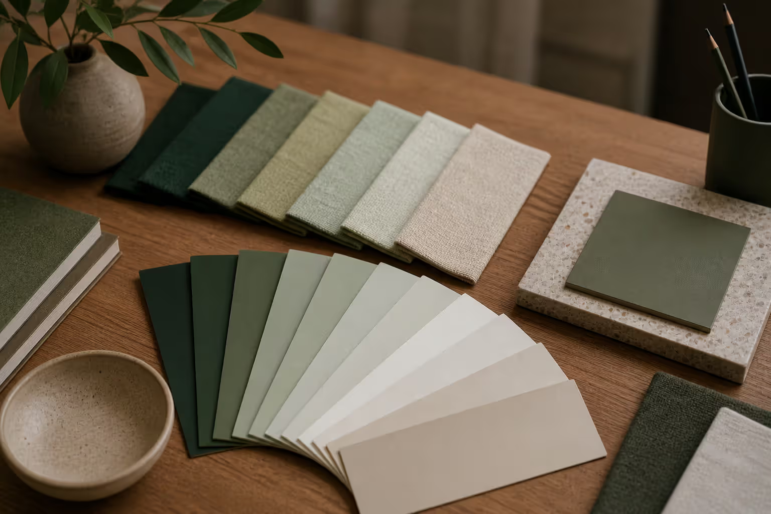
Harmony differs from mere repetition. Repeating a single element creates pattern, but harmony requires varied elements that still relate. Think of music: harmony isn't one note repeated, but different notes played together that complement each other. A composition using three shades of green, two organic shapes, and one geometric accent can achieve harmony through careful calibration of those relationships.
The concept matters across disciplines. In graphic design, harmony keeps multi-page documents readable. In interior design, it prevents rooms from feeling chaotic. In painting, it allows complex scenes to read as unified experiences rather than collections of unrelated objects. The principle scales from business cards to murals.
One common misconception: harmony equals blandness. Skilled designers achieve harmony while maintaining strong visual interest. The key lies in establishing a clear system—a limited palette, a consistent geometric language, a defined tonal range—then working expressively within those constraints.
Core Principles That Create Harmony in Visual Composition
Harmony in visual composition emerges from specific, controllable relationships. While intuition plays a role, understanding the mechanics lets you diagnose problems and apply solutions systematically.
Repetition and Pattern
Repetition for visual harmony works by creating predictable echoes throughout a composition. When a viewer sees a curved line in one area, then encounters similar curves elsewhere, their brain registers connection. This doesn't mean copying elements exactly—it means establishing a visual vocabulary and using it consistently.
Consider a magazine spread. If headlines use a rounded sans-serif, body text uses a humanist serif, and pull quotes use a geometric sans-serif, the typography lacks harmony. But if all type shares either rounded or geometric characteristics, even across different weights and sizes, the spread coheres.
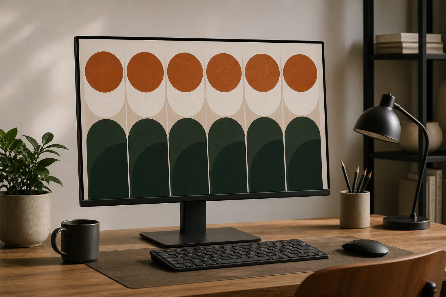
Pattern extends repetition into rhythm. A grid of evenly spaced circles creates stronger harmony than randomly scattered circles, even if every circle is identical. The regularity itself becomes a unifying force. However, perfect regularity can feel mechanical. Strategic variation—adjusting size slightly, shifting position within a consistent structure—maintains harmony while adding organic life.
Practical application: Identify three to five visual characteristics you want to repeat. These might include a specific corner radius on all rectangles, a consistent line weight, or a recurring angle. Use these characteristics across different elements rather than repeating entire elements unchanged.
Color and Tone Relationships
Color creates or destroys harmony faster than any other variable. Harmonious color relationships typically follow one of several models: analogous colors (neighbors on the color wheel), monochromatic schemes (variations of a single hue), or carefully balanced complementary pairs with adjusted saturation.
The critical factor isn't which colors you choose, but how their properties relate. Two bright, saturated colors at full intensity will fight for attention. But if you reduce one to a tint and the other to a tone, they can coexist harmoniously. Temperature matters too—mixing warm and cool versions of the same color family often creates subtle discord.
Tonal harmony operates independently of hue. A black-and-white photograph achieves harmony through relationships between light and dark values. If shadows are consistently deep and highlights consistently bright, with midtones distributed according to a clear pattern, the image feels resolved. Conversely, if tonal jumps occur randomly—a very dark element beside a very light one with no transition—the composition fragments.
One reliable technique: establish a tonal hierarchy with three to five distinct value levels, then ensure every element in your composition falls into one of those levels. This creates automatic harmony because everything relates to a shared tonal structure.
Author: Adrian Lowell;
Source: crafterholic.com
Shape and Form Consistency
Geometric harmony comes from shared formal characteristics. Compositions using exclusively rectilinear shapes (squares, rectangles, straight lines) possess inherent harmony. Compositions using exclusively organic shapes (curves, irregular forms, flowing lines) do too. Mixing both requires care.
The solution isn't avoiding mixture—it's establishing dominance. If 80% of your shapes are organic with soft edges, the remaining 20% geometric elements will read as intentional accents rather than confusion. But a 50-50 split often creates ambiguity about the composition's formal language.
Scale relationships contribute to shape harmony. If elements relate proportionally—each approximately 1.5× or 2× the size of the next smaller element—they feel systematically related. Random size variations break this connection. The golden ratio (1:1.618) appears frequently in harmonious compositions, though simpler ratios (2:3, 3:5) work equally well if applied consistently.
Edge treatment matters. Hard edges and soft edges create different visual textures. A composition mixing both needs a clear logic: perhaps all foreground elements have hard edges while background elements soften, or all organic shapes blur slightly while geometric shapes stay crisp. Without this logic, the mixture reads as inconsistent rather than dynamic.
Unity and Harmony in Art: How They Work Together
Unity and harmony in art function as related but distinct principles. Unity describes the overall sense that a composition forms a single, complete work rather than separate fragments. Harmony describes the specific quality of agreement between elements. You can think of unity as the destination and harmony as one major route to get there.
A composition achieves unity through several means: conceptual connection (all elements relate to a single theme), compositional structure (elements arranged according to a clear organizing principle), or visual consistency (elements sharing formal characteristics). Harmony specifically addresses that third path—the visual consistency route.
Consider a collage combining photographs, hand-drawn elements, and digital graphics. This work might achieve unity through conceptual connection (all images relate to urban life) or compositional structure (all elements arranged in a radial pattern). But it achieves harmony only if those varied elements share visual characteristics: similar color grading, consistent edge treatment, related textures, or proportional scaling.
The two principles reinforce each other. Strong harmony makes unity easier to achieve because the visual agreement between elements naturally suggests they belong together. Conversely, a clear unifying concept makes harmony more forgiving—viewers accept greater visual variation if they understand why elements coexist.
They can also exist independently. Some effective designs sacrifice harmony for other goals—visual tension, dramatic contrast, deliberate discord—while maintaining unity through strong conceptual or structural organization. A punk rock poster might intentionally clash colors and mix incompatible typefaces, breaking harmony, but still achieve unity through aggressive commitment to that aesthetic.
The practical takeaway: use harmony as your default approach to unity, but recognize when breaking harmony serves a larger purpose. Just ensure you're breaking it intentionally, not accidentally.
Author: Adrian Lowell;
Source: crafterholic.com
Techniques for Achieving Harmony in Design
Achieving harmony in design requires specific methods, not just good intentions. These techniques translate abstract principles into concrete decisions.
Limited palettes: Restrict yourself to three to five colors maximum, including neutrals. This constraint forces harmony by eliminating the possibility of unrelated color relationships. Within that palette, establish clear roles: one dominant color covering 60-70% of the composition, one secondary color at 20-30%, and one accent at 5-10%. This creates both harmony and hierarchy.
Consistent spacing systems: Define a base unit (say, 8 pixels or 0.5 inches) and make all spacing decisions in multiples of that unit. Margins become 16 or 24 units, padding becomes 8 or 16 units, gaps become 4 or 8 units. This creates invisible but perceptible harmony—viewers don't consciously notice the consistent spacing, but they register its effect as order.
Visual weight distribution: Harmony requires not just similar elements but balanced distribution of visual weight. Heavy elements (dark, large, detailed) need counterbalancing with other heavy elements or multiple lighter elements. Map your composition's visual weight—squint to see which areas feel dense—and ensure weight distributes according to a clear pattern: symmetrically, along a diagonal, in a triangular arrangement, or radiating from a center.
Grid systems: Grids provide automatic harmony by establishing consistent relationships between elements. A three-column grid ensures elements align at predictable intervals. A modular grid creates proportional relationships automatically. Even organic, flowing compositions benefit from underlying grid structure that governs approximate placement.
Stylistic consistency: If one element features a hand-drawn aesthetic, apply similar treatment to other elements—or keep that element isolated as a deliberate accent. Mixing photorealistic rendering, flat graphic shapes, and sketchy linework in equal measure creates discord unless connected by other strong harmonizing factors like color or composition.
Texture and pattern control: Limit yourself to two or three distinct textures. If you're using a rough paper texture, a smooth gradient, and a photographic grain, ensure each appears multiple times and in related contexts. Random texture application—a different treatment for every element—fragments the composition.
One scenario: You're designing a restaurant menu. Choose two typefaces (one serif for dish names, one sans-serif for descriptions), establish a three-color palette (dark for text, medium for section headers, light for backgrounds), define two spacing values (tight for within-item spacing, generous between sections), and use one decorative element (a small flourish) repeated at consistent intervals. These constraints create harmony automatically while allowing plenty of creative expression within the system.
Design Harmony Examples
Example 1: Swiss International Style posters These mid-century designs achieve harmony through rigid grid systems, limited sans-serif typefaces (often just Helvetica), restricted color palettes (frequently one or two colors plus black), and consistent geometric shapes. The harmony is so strong that posters by different designers in this style feel related, demonstrating how systematic application of harmonizing principles creates a recognizable visual language.
Example 2: Wes Anderson film frames Anderson's cinematography exemplifies color harmony through carefully coordinated palettes where every visible element—costumes, props, architecture, lighting—relates to a defined scheme. His use of symmetrical composition and centered framing creates spatial harmony, while consistent production design establishes formal harmony across scenes.
Example 3: Japanese woodblock prints Traditional ukiyo-e prints achieve harmony through limited color palettes (determined by available pigments), consistent line quality (governed by woodblock carving technique), and shared compositional conventions (diagonal rain, flattened perspective, decorative pattern integration). The technical constraints of the medium enforced harmony.
Example 4: Modern minimalist websites Sites following minimalist principles create harmony through generous white space (consistent empty areas that let elements breathe), limited type systems (one or two fonts maximum), restricted color use (often monochromatic with one accent), and aligned grid structures. The harmony makes content hierarchy immediately clear.
Balance vs Harmony in Art: Key Differences Explained
Balance vs harmony in art represents a distinction many beginners miss, yet understanding it unlocks more sophisticated compositional control.
Balance addresses weight distribution—the visual mass of elements and how they relate across a composition's structure. A balanced composition feels stable, whether through symmetrical arrangement (equal weight on both sides of a central axis), asymmetrical arrangement (different elements of equivalent visual weight distributed to create equilibrium), or radial arrangement (weight distributed evenly around a center point). Balance is structural and spatial.
Harmony addresses element relationships—how components agree or disagree based on shared characteristics. A harmonious composition feels cohesive, its elements related through color, form, texture, or other visual properties. Harmony is perceptual and qualitative.
Here's the comparison:
Principle
Definition
Visual Effect
Techniques Used
Common Examples
Harmony
Agreement between elements through shared visual characteristics
You can have balance without harmony. Imagine a composition with a large red circle on the left balanced by a small black square on the right. The weight distribution might achieve perfect balance—the dark, small square counterbalancing the bright, large circle—but the elements share no visual characteristics, creating no harmony. The composition feels balanced but fragmented.
You can have harmony without balance. Picture a composition filled entirely with similar blue rectangles of various sizes, all clustered in the bottom-left corner. The rectangles harmonize beautifully—they share color, shape language, and formal treatment—but the composition is unbalanced, with all visual weight concentrated in one area.
The most resolved compositions employ both. A symmetrical portrait (balanced) rendered in a limited palette with consistent brushwork (harmonious) satisfies our desire for both structural stability and visual agreement. A magazine spread with text and images distributed asymmetrically across columns (balanced) using a defined type system and coordinated color scheme (harmonious) achieves the same dual resolution.
Practical application: diagnose compositional problems by identifying which principle is lacking. If your design feels chaotic despite elements being evenly distributed, you probably have balance but lack harmony—add shared characteristics. If your design feels lopsided despite elements looking related, you probably have harmony but lack balance—redistribute visual weight.
Author: Adrian Lowell;
Source: crafterholic.com
Common Mistakes That Disrupt Visual Cohesion
Creating visual cohesion fails in predictable ways. Recognizing these patterns helps you avoid them.
Over-complexity: Adding too many different elements destroys harmony through sheer variety. A poster using five typefaces, eight colors, three illustration styles, and four different textures gives viewers nothing to latch onto—no clear visual system to understand. The solution isn't simplification necessarily, but systematization. You could use eight colors harmoniously if they follow a clear relationship (all pastels, all earth tones, all sharing a common undertone). Limit the number of different types of elements, even if you use many instances of each type.
Clashing elements without purpose: Contrast serves important functions—creating hierarchy, generating energy, directing attention. But unmotivated clashes simply confuse. A script typeface paired with a brutalist sans-serif, a photorealistic image beside a flat icon, a warm color scheme interrupted by a single cool element with no clear reason—these create discord without payoff. The fix: ensure every clash serves a specific purpose and is supported by other harmonizing factors.
Inconsistent style application: Applying effects or treatments randomly breaks cohesion. If three of five images have drop shadows but two don't, if some text is centered while other text aligns left with no pattern, if borders appear on some containers but not others arbitrarily—these inconsistencies register as sloppiness. Establish rules (all foreground elements get shadows, all headlines center, all interactive elements get borders) and follow them.
Ignoring visual flow: Harmony requires not just static relationships but consideration of how the eye moves through a composition. If visual weight, color intensity, and detail density jump erratically—dense detail here, then empty space, then dense detail again with no rhythm—the composition lacks flow harmony. Map the path you want viewers to follow and ensure visual characteristics guide them along that path with consistent transitions.
Failing to establish hierarchy: When everything competes equally for attention, nothing achieves it. Harmony doesn't mean making everything the same size or intensity—it means creating clear, consistent levels of importance. Use your harmonizing system (color, size, position, detail) to establish three to five distinct hierarchy levels, then assign elements to those levels consistently.
Mixing too many organizing principles: A composition might use a grid, then break it for diagonal elements, then introduce a radial pattern, then add some floating elements with no clear spatial logic. Each organizing principle is valid, but mixing them without a unifying framework creates confusion. Choose one primary organizing principle and use others only as deliberate variations within that system.
One common scenario: You're designing a presentation deck. Slide one uses a centered layout with a bold headline. Slide two uses a two-column layout with the headline left-aligned. Slide three uses a single column with the headline right-aligned. Each slide might look fine in isolation, but the deck lacks cohesion. Fix it by choosing one layout system and applying it throughout, varying only the content within that consistent structure.
Harmony is not about the absence of contrast or tension, but about the relationships that make contrast meaningful. When elements share enough common ground, their differences become expressive rather than chaotic.
— Ellen Lupton
Frequently Asked Questions About Harmony in Art
What is the difference between harmony and unity in art?
Unity describes the overall sense that a composition forms one complete work rather than disconnected parts. Harmony is one specific way to achieve unity—by making elements share visual characteristics so they feel related. You can achieve unity through conceptual connection (all elements relate to one theme) or structural organization (all elements follow one compositional pattern) without harmony, but harmony is the most common and reliable path to unity in visual work.
Can a design have balance without harmony?
Yes, absolutely. Balance concerns weight distribution—ensuring visual mass spreads across a composition to create stability. Harmony concerns element relationships—ensuring components share characteristics to feel cohesive. A composition might distribute weight perfectly (balanced) while using unrelated colors, clashing shapes, and inconsistent styles (not harmonious). The result feels structurally stable but visually fragmented. The strongest designs typically employ both principles together.
What colors create the most harmony in composition?
Analogous color schemes (colors next to each other on the color wheel, like blue, blue-green, and green) create easy harmony because they share common hues. Monochromatic schemes (variations of a single color through different tints, tones, and shades) create even stronger harmony. However, any colors can harmonize if their properties relate—matching saturation levels, similar value ranges, or shared undertones. The key isn't which specific colors you choose but how their characteristics relate to each other.
How does repetition contribute to visual harmony?
Repetition creates harmony by establishing recognizable patterns that connect disparate elements. When viewers see a curved line in one area, then encounter similar curves elsewhere, their brain registers those elements as related. This doesn't require identical repetition—varying the size, color, or orientation of repeated elements while maintaining their core characteristics creates harmony with visual interest. Repetition essentially builds a visual vocabulary that makes a composition feel like a coherent language rather than random symbols.
What are some famous examples of harmony in art?
Claude Monet's Water Lilies series demonstrates color harmony through limited, related palettes where every element shares similar temperature and saturation. Piet Mondrian's compositions achieve harmony through strict limitation to primary colors, black, white, and rectangular forms. The Bauhaus movement produced countless examples of harmony through systematic design—consistent geometric shapes, limited type families, and coordinated color schemes. In contemporary work, Apple's product design exemplifies harmony through consistent materials, proportional relationships, and unified formal language across different devices.
How do you fix a composition that lacks harmony?
Start by identifying which visual characteristics are inconsistent—color, shape, scale, texture, spacing, or style. Choose one characteristic to harmonize first, usually color because it has the most immediate impact. Reduce your palette to three to five related colors and recolor elements to fit that system. Next, address shape language—identify whether your composition should favor geometric or organic forms, then adjust elements to align with that choice. Finally, systematize spacing and scale using a consistent unit or proportional relationship. The goal isn't making everything identical, but establishing clear relationships between varied elements.
Harmony in art functions as the invisible architecture that makes visual work feel intentional and resolved. It's not about eliminating variety or playing it safe—it's about establishing clear relationships between elements so that variety reads as deliberate expression rather than accidental chaos.
The practical path to harmony involves specific, controllable decisions: limiting your palette, repeating visual characteristics, establishing consistent spacing, choosing a dominant formal language, and applying effects systematically. These constraints don't limit creativity—they focus it, providing a coherent framework within which you can work expressively.
Understanding how harmony differs from related principles like balance and unity gives you diagnostic power. When a composition feels off, you can identify whether it lacks structural stability (balance), overall cohesion (unity), or element agreement (harmony), then apply targeted solutions rather than guessing.
The most important shift is moving from intuitive adjustment—"this feels wrong, let me try something else"—to systematic analysis—"these elements share no visual characteristics, so I'll give them a common color temperature." That shift transforms harmony from a happy accident into a reliable tool you control.
Start small. Take a current project and identify three visual characteristics you can harmonize: perhaps color temperature, corner radius, and line weight. Apply those consistently, then evaluate the result. You'll likely find that even modest harmonization dramatically improves visual cohesion. From there, you can build more sophisticated harmonic systems that support increasingly complex and expressive work.
Modernism transformed 20th-century art and design by rejecting historical tradition and ornament in favor of rationalism, functionalism, and industrial aesthetics. Learn about its origins in industrialization, key philosophical ideas, influence on visual culture, and lasting legacy.
Visual language uses color, shape, typography, and imagery to communicate ideas instantly. Discover how visual elements function as a communication system, how semiotics creates meaning in design, and how to apply graphic communication principles across media effectively.
Discover how mathematical proportions like the golden ratio (1.618), rule of thirds, and aspect ratios create visual balance in design. Learn practical applications, compare popular ratio systems, and avoid common mistakes when applying proportional design principles to logos, layouts, and interfaces.
Proximity gestalt describes how the brain groups nearby visual elements automatically. This guide explains the psychology behind the proximity principle, demonstrates practical spacing strategies, compares proximity with other Gestalt laws, and provides actionable best practices for designers.
The content on this website is provided for general informational and educational purposes only. It is intended to explain concepts related to digital design, visual art, color theory, art techniques, design principles, and design history.
All information on this website, including articles, guides, and examples, is presented for general educational purposes. Creative outcomes may vary depending on individual skill, tools, and practice.
This website does not provide professional design services or guarantee results, and the information presented should not be used as a substitute for formal education or professional consultation.
The website and its authors are not responsible for any errors or omissions, or for any outcomes resulting from decisions made based on the information provided on this website.