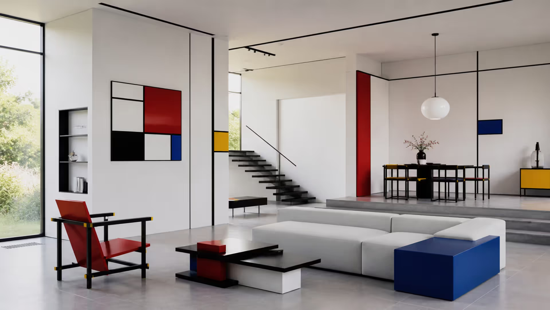
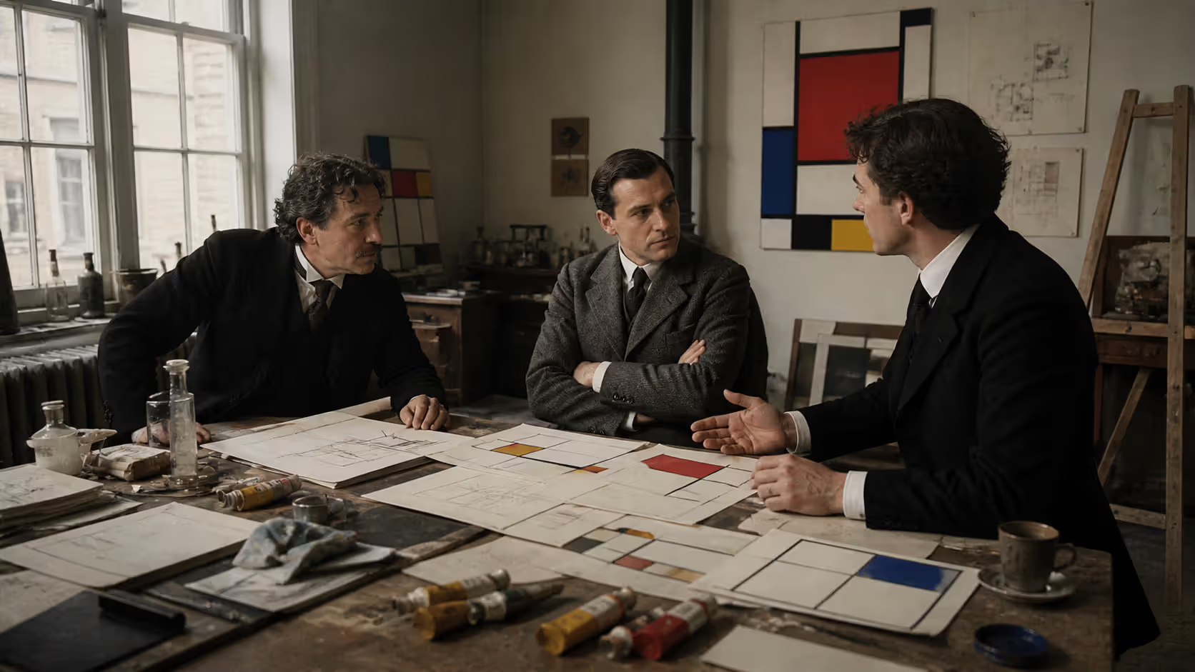
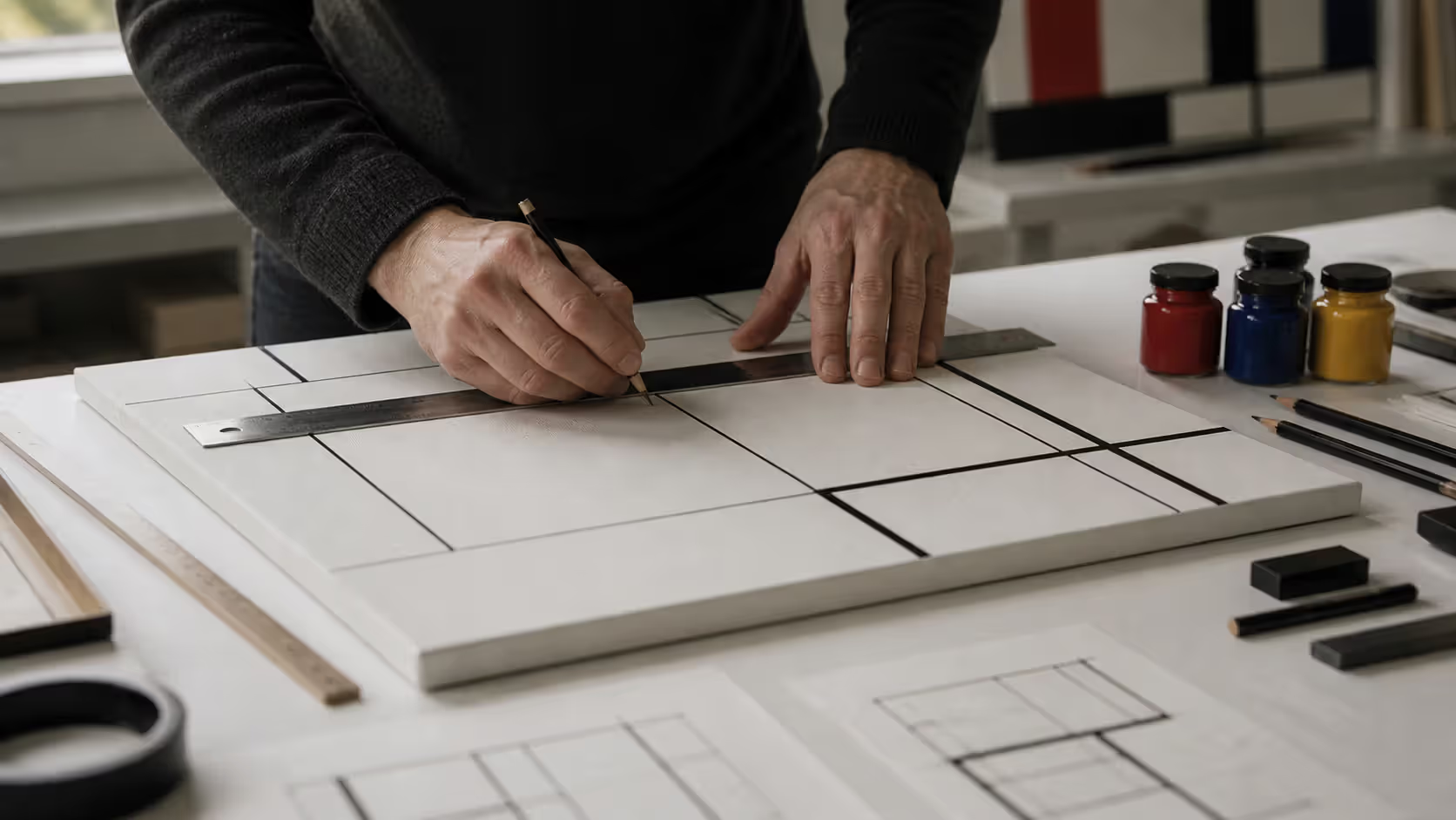
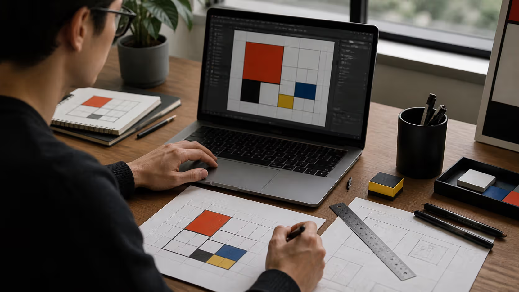
Walk into any modern building with clean lines and bold color accents, or scroll through a minimalist brand identity, and you're likely seeing echoes of a radical Dutch art movement that started over a century ago. De Stijl didn't just create paintings—it proposed an entirely new visual language that would reshape how we think about space, form, and color.
Origins of the De Stijl Movement in the Netherlands
The Dutch abstract art movement known as De Stijl emerged in 1917, in the midst of World War I's devastation. While much of Europe grappled with chaos and destruction, a small group of Dutch artists and architects in neutral Netherlands began meeting to discuss a fundamentally different approach to art and design. They believed that the old ways of thinking had led to war, and that a new universal visual language could help rebuild society on rational, harmonious principles.
Piet Mondrian and Theo van Doesburg founded the movement and launched a journal also called De Stijl (Dutch for "The Style") in October 1917. The magazine became the movement's primary vehicle for spreading ideas, publishing manifestos, designs, and theoretical essays. Early contributors included painter Bart van der Leck, architect J.J.P. Oud, and furniture designer Gerrit Rietveld.
The timing mattered. Post-war Europe craved order and rationality after years of senseless violence. The geometric abstraction history of this period shows multiple movements pursuing similar goals—Russian Constructivism, German Bauhaus—but De Stijl distinguished itself through its particularly strict formal vocabulary and its ambition to apply these principles across all visual disciplines, from painting to typography to urban planning.
Van Doesburg traveled extensively throughout Europe in the early 1920s, evangelizing De Stijl principles and establishing connections with other avant-garde movements. This networking helped the de stijl design movement gain international recognition despite its small core membership.
Author: Olivia Hartwell;
Source: crafterholic.com
Core Principles of Neoplasticism and Visual Language
Neoplasticism in art—the philosophical foundation of De Stijl—proposed that art should express universal truths rather than individual emotions or natural appearances. Mondrian coined the term "neoplasticism" (Nieuwe Beelding in Dutch) to describe this approach, which sought to strip away everything subjective, decorative, or particular to reveal underlying cosmic order.
The reductive art movement operated on strict formal constraints. Artists limited themselves to straight horizontal and vertical lines meeting at right angles. Curved lines, diagonals, and organic forms were forbidden as too naturalistic and subjective. This wasn't arbitrary minimalism—practitioners believed that horizontal and vertical forces represented fundamental cosmic oppositions: male and female, material and spiritual, positive and negative.
Author: Olivia Hartwell;
Source: crafterholic.com
Why Primary Colors and Geometric Forms Define De Stijl
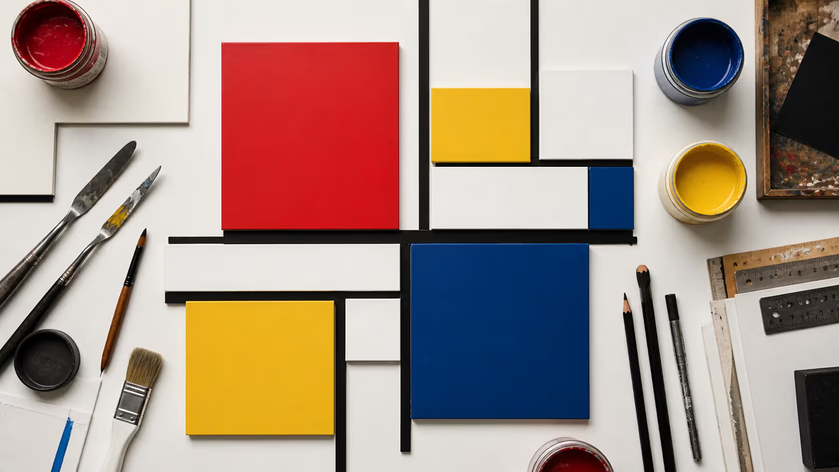
Primary colors in abstract design served a specific philosophical purpose within De Stijl. Artists restricted their palette to the three primary colors (red, yellow, blue) plus the three non-colors (black, white, gray). This limitation wasn't aesthetic preference but ideological commitment.
The primary color theory in art that De Stijl embraced held that these hues were irreducible—they couldn't be created by mixing other colors, making them "pure" and "universal." Secondary colors like green or orange resulted from mixing, making them derivative and particular. By using only primaries, De Stijl artists believed they were working with fundamental visual elements that transcended cultural specificity.
In practice, many canonical De Stijl works use surprisingly little color. Mondrian's mature paintings often feature mostly white space with black lines and small rectangles of primary color. The restraint amplified impact—a single red square could activate an entire composition.
The Grid System as a Foundation for Harmony
Grid based abstract art became De Stijl's most recognizable feature. The grid represented rational organization of space, creating what practitioners called "dynamic equilibrium"—balance achieved through asymmetry and proportion rather than symmetry.
Mondrian spent years developing his grid system, moving from early works that still suggested landscapes to completely abstract compositions. He would adjust the position and thickness of black lines for months, seeking perfect balance. A line moved a few millimeters could destroy a composition's equilibrium.
The grid also had practical advantages for designers. It provided a systematic method for organizing space that could scale from a small poster to a building facade. This scalability helped De Stijl principles migrate successfully into architecture and graphic design.
Author: Olivia Hartwell;
Source: crafterholic.com
Key Artists and Architects Who Defined the Movement
Piet Mondrian (1872-1944) remains the most famous De Stijl artist. His journey from naturalistic landscapes to pure abstraction mirrors the movement's evolution. After moving to Paris in 1911 and encountering Cubism, Mondrian began simplifying forms. By 1920, he had arrived at the mature style he would refine for the rest of his life: compositions of black lines and primary-colored rectangles on white backgrounds.
Mondrian's commitment to neoplasticism was absolute. He famously broke with Theo van Doesburg in 1924 when van Doesburg began introducing diagonal lines into his work, violating De Stijl's foundational principle. For Mondrian, this wasn't artistic disagreement—it was philosophical betrayal.
Theo van Doesburg (1883-1931) played a different but equally crucial role. While Mondrian was the movement's spiritual center, van Doesburg was its promoter and theorist. He edited De Stijl magazine, organized exhibitions, gave lectures across Europe, and wrote prolifically. His introduction of diagonals through "Elementarism" in the mid-1920s reflected his more experimental temperament.
Van Doesburg also worked extensively in architecture and interior design, creating color schemes for buildings by architects like J.J.P. Oud and Cornelis van Eesteren. These collaborations demonstrated how neoplastic principles could organize three-dimensional space.
Gerrit Rietveld (1888-1964) brought De Stijl into furniture and architecture. Trained as a cabinetmaker, Rietveld designed the Red-Blue Chair in 1918—a three-dimensional translation of neoplastic principles into functional furniture. The chair's exposed structure, primary colors, and right-angle construction made it a manifesto in wood.
De Stijl Architecture and the Rietveld Schröder House
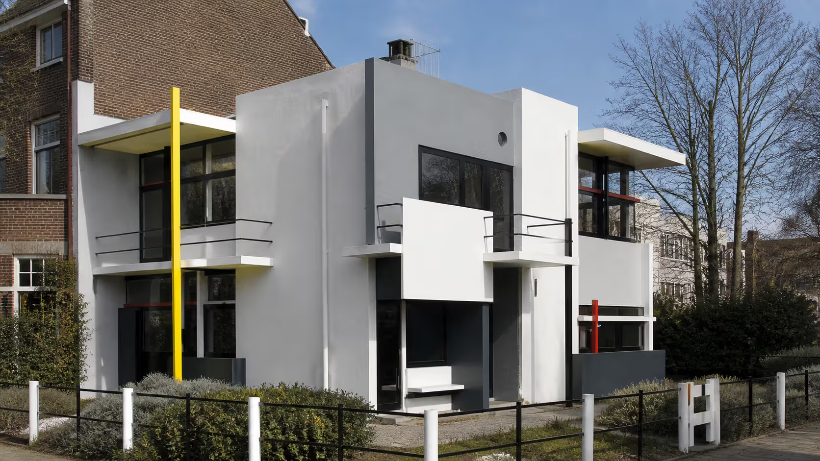
De stijl architecture reached its pinnacle with the Rietveld Schröder House, completed in Utrecht in 1924. Designed by Rietveld in close collaboration with client Truus Schröder-Schräder, the house remains the only building fully realized according to neoplastic principles.
The exterior demonstrates the movement's visual vocabulary: white and gray planes punctuated by black steel beams and primary-colored accents. Corners are open rather than enclosed, with structural elements extending beyond walls to emphasize the composition's dynamic balance. The building appears to be assembled from floating planes rather than constructed from solid masses.
Inside, the second floor featured a revolutionary open plan with sliding and rotating partitions that allowed the space to be reconfigured. This flexibility reflected De Stijl's belief in universal aesthetic in design—spaces should adapt to life rather than constraining it. During the day, partitions could be retracted to create one large studio space; at night, they could be deployed to create separate bedrooms.
The house's furniture, lighting, and color scheme were all integrated into the architectural design. Rietveld designed built-in cabinets, lamps, and other elements using the same formal language as the building itself. This total design approach—Gesamtkunstwerk—aimed to create a completely harmonious environment.
Beyond the Schröder House, De Stijl principles influenced numerous architects. J.J.P. Oud applied them to social housing projects, demonstrating how the movement's aesthetic could serve practical needs. The Café Aubette interior in Strasbourg, designed by van Doesburg in 1928, showed how neoplastic color could activate large public spaces.
Author: Olivia Hartwell;
Source: crafterholic.com
How De Stijl Influenced Modern Design and Art Movements
The geometric abstraction history of the 20th century is unimaginable without De Stijl's influence. The movement's impact spread through multiple channels: van Doesburg's lectures at the Bauhaus in the early 1920s introduced German designers to neoplastic principles; emigration of artists to America brought the ideas across the Atlantic; and the visual clarity of the work made it easily reproducible and adaptable.
The Bauhaus, despite maintaining its own distinct identity, absorbed several De Stijl ideas. The emphasis on primary colors, geometric forms, and the integration of art and design reflected shared values. László Moholy-Nagy's work shows clear De Stijl influence, as does much Bauhaus typography and graphic design.
The International Style in architecture—the glass-and-steel modernism that dominated mid-century building—owes significant debt to De Stijl's spatial innovations. The open floor plans, emphasis on horizontal and vertical elements, and integration of color as architectural element all trace back to experiments by Rietveld and van Doesburg.
Graphic design absorbed De Stijl principles enthusiastically. The movement's grid-based layouts, asymmetric balance, and limited color palettes became foundational to modern typography and page design. Swiss Style designers in the 1950s refined these ideas into the systematic approaches still taught in design schools today.
Contemporary minimalism in art, design, and architecture continues the universal aesthetic in design that De Stijl pioneered. When Apple creates a product with clean lines and restrained color, or when a fashion designer uses color-blocking with primary hues, they're working within a visual tradition De Stijl established.
Many people encounter De Stijl through Mondrian's iconic grid paintings and assume the movement was purely decorative—a pleasant arrangement of lines and colors. This misses the point entirely. Neoplasticism in art was fundamentally philosophical and even spiritual. Mondrian believed his paintings revealed cosmic truths and could contribute to human evolution toward greater harmony.
Another common mistake is conflating all geometric abstraction with De Stijl. While the movement pioneered certain approaches, it maintained strict rules that distinguished it from related movements. The prohibition on diagonals, the limitation to primary colors, and the specific philosophical framework separated De Stijl from Russian Constructivism (which embraced diagonals and political messaging) or Bauhaus (which was more pragmatic and less doctrinaire).
Some viewers assume the reductive art movement's simplicity made the work easy to create. In reality, achieving the "dynamic equilibrium" De Stijl artists sought required painstaking refinement. Mondrian would adjust compositions for months, and the apparent simplicity concealed complex decisions about proportion, rhythm, and balance.
The movement's utopian ambitions are often forgotten. De Stijl artists genuinely believed their visual language could help create a better society. This wasn't naive decoration—it was an attempt to provide humanity with tools for rational, harmonious living. The movement's decline in the 1930s coincided with the rise of fascism and the failure of many modernist social projects, suggesting the limits of aesthetic solutions to political problems.
Finally, De Stijl shouldn't be reduced to Mondrian alone. While his paintings are most famous, the movement's real innovation was applying neoplastic principles across disciplines. Rietveld's architecture and furniture, van Doesburg's typography and interior design, and the various collaborative projects all contributed to De Stijl's vision of total environmental design.
The emotion of beauty is always obscured by the appearance of the object. Therefore, the object must be eliminated from the picture.
— Piet Mondrian
Frequently Asked Questions About De Stijl
What does "De Stijl" mean in English?
"De Stijl" translates directly as "The Style" in English. The name reflected the movement's ambition to create not just another artistic style, but the definitive visual language for modern life. This confident claim to universality was central to the movement's philosophy—practitioners believed they had discovered fundamental principles of visual harmony that transcended personal taste or cultural tradition.
Why did De Stijl artists only use primary colors?
De Stijl artists restricted themselves to red, yellow, and blue (plus black, white, and gray) because they considered these "pure" colors that couldn't be created by mixing others. This purity aligned with the movement's goal of reducing art to universal essentials. Secondary colors like green or purple were seen as derivative and particular rather than fundamental. The restriction was philosophical, not aesthetic—using only irreducible elements supposedly revealed cosmic truths rather than personal preferences.
How is De Stijl different from Bauhaus?
While both movements embraced geometric abstraction and sought to integrate art with design, De Stijl was more philosophically rigid and visually restricted. De Stijl prohibited diagonals and limited colors to primaries plus black/white/gray, while Bauhaus allowed more formal freedom. Bauhaus focused on practical education and industrial production, whereas De Stijl emphasized spiritual and cosmic harmony. Bauhaus was an institution with hundreds of students; De Stijl was a small group of committed practitioners. However, van Doesburg's visits to the Bauhaus created significant cross-pollination between the movements.
What ended the De Stijl movement?
The movement gradually dissolved rather than ending abruptly. Theo van Doesburg's death in 1931 removed its primary organizer and promoter, and the final issue of De Stijl magazine appeared that year. Philosophical disagreements had already fractured the group—Mondrian broke with van Doesburg in 1924 over the diagonal controversy. By the early 1930s, many original members had moved on to other projects or styles. The rise of fascism in Europe also made the movement's utopian internationalism seem increasingly irrelevant to the political crises of the era.
Can I see De Stijl art in American museums?
Yes, major American museums hold significant De Stijl works. The Museum of Modern Art in New York has several important Mondrian paintings, including "Broadway Boogie Woogie" (1942-43), created after he moved to New York. The Art Institute of Chicago, Philadelphia Museum of Art, and National Gallery of Art in Washington also own key works. For architecture, while the Rietveld Schröder House remains in Utrecht, some American buildings show clear De Stijl influence, and museums occasionally feature reconstructions or exhibitions of De Stijl interiors and furniture.
How did De Stijl influence graphic design?
De Stijl revolutionized graphic design by introducing asymmetric grid-based layouts, limited color palettes, and the integration of text as visual element rather than mere information carrier. Van Doesburg's typographic experiments demonstrated how letters could become abstract forms. The movement's emphasis on white space, primary colors, and geometric organization became foundational to modern graphic design. Swiss Style designers in the 1950s directly built on De Stijl principles, creating the systematic approaches to layout and typography that still dominate professional design practice. Contemporary minimalist branding and web design continue this tradition.
De Stijl emerged from a specific historical moment—post-war Netherlands in 1917—but its influence extends far beyond that context. By reducing visual language to horizontal and vertical lines, right angles, and primary colors, the movement created a vocabulary that proved remarkably adaptable across painting, architecture, furniture, and graphic design. The Rietveld Schröder House demonstrates how these principles could organize lived space, while Mondrian's paintings show their capacity for spiritual expression.
The movement's legacy lives in every grid-based layout, every piece of minimalist furniture, and every building that uses color as an architectural element. Understanding De Stijl means recognizing that what appears simple often conceals complex thought, and that aesthetic choices can embody philosophical commitments.
Media arts harnesses electronic technologies and digital tools to create experiences that challenge traditional art forms. From immersive installations to interactive environments, this dynamic field transforms how we perceive and engage with contemporary artistic expression through video, performance, and screen-based work.
A conceptual artist creates work where the underlying idea holds more importance than the finished physical object. Unlike traditional artists who focus on mastering materials, conceptual artists treat the concept itself as the artwork, with execution serving merely as documentation of the idea.
Text message art transforms written language into visual compositions. From ASCII characters to monumental installations, artists use typography, concrete poetry, and calligraphy to create work where words function as both message and image, challenging traditional boundaries between reading and viewing.
Writing about your artwork feels awkward at first. You're translating visual ideas into sentences that don't sound pretentious. Every art student faces this challenge for applications, portfolios, and exhibitions. See real examples and learn the structure that works.
The content on this website is provided for general informational and educational purposes only. It is intended to explain concepts related to digital design, visual art, color theory, art techniques, design principles, and design history.
All information on this website, including articles, guides, and examples, is presented for general educational purposes. Creative outcomes may vary depending on individual skill, tools, and practice.
This website does not provide professional design services or guarantee results, and the information presented should not be used as a substitute for formal education or professional consultation.
The website and its authors are not responsible for any errors or omissions, or for any outcomes resulting from decisions made based on the information provided on this website.