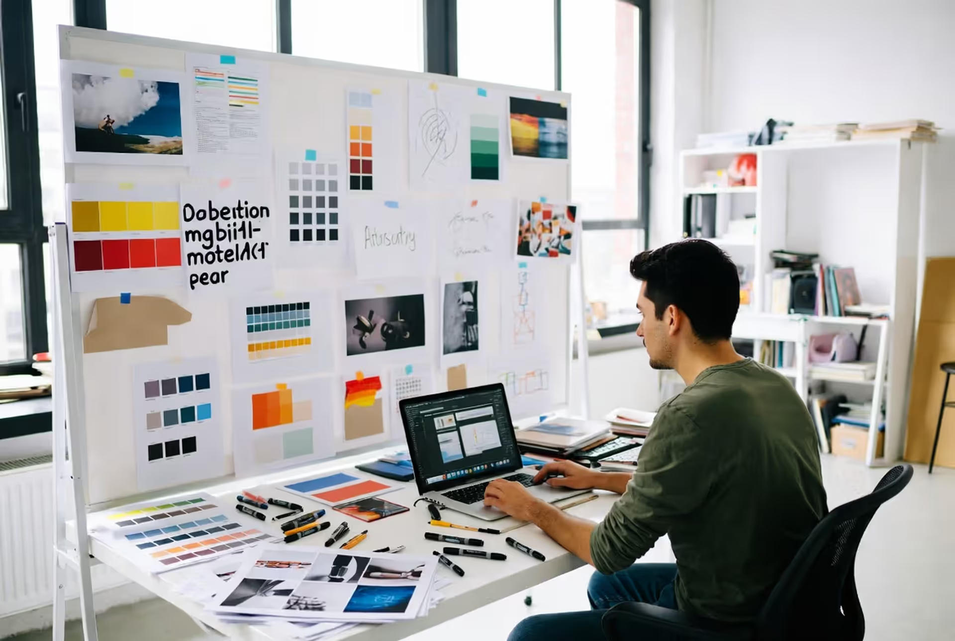
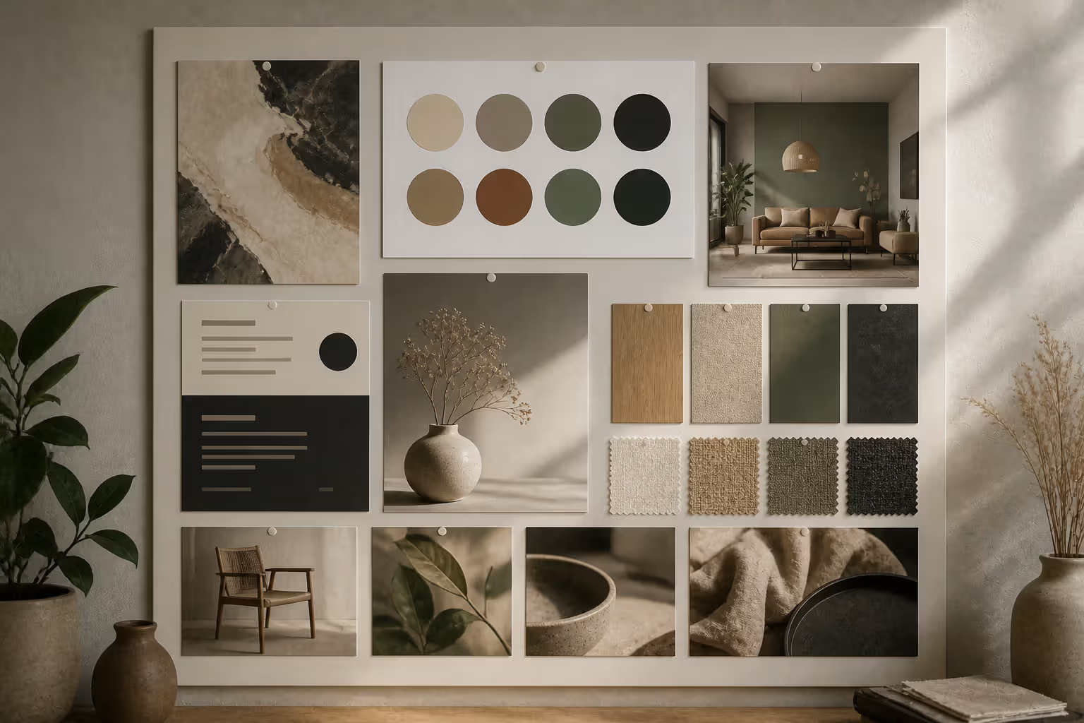
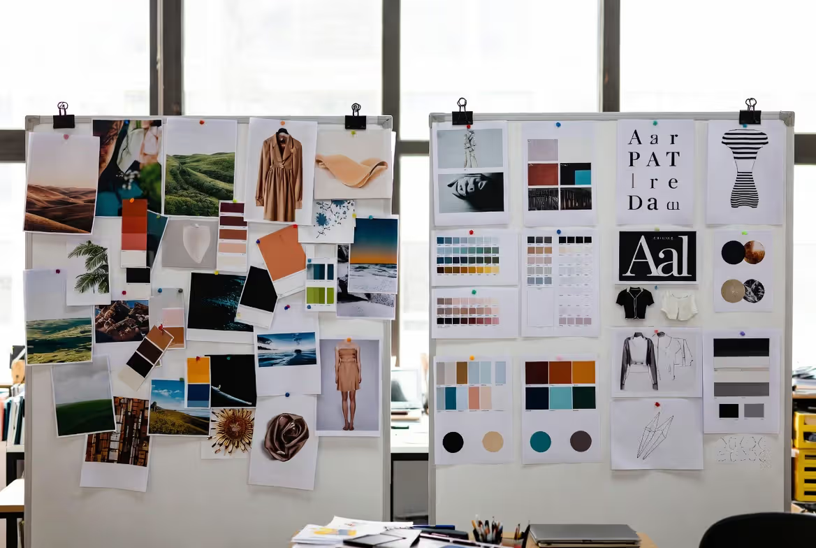
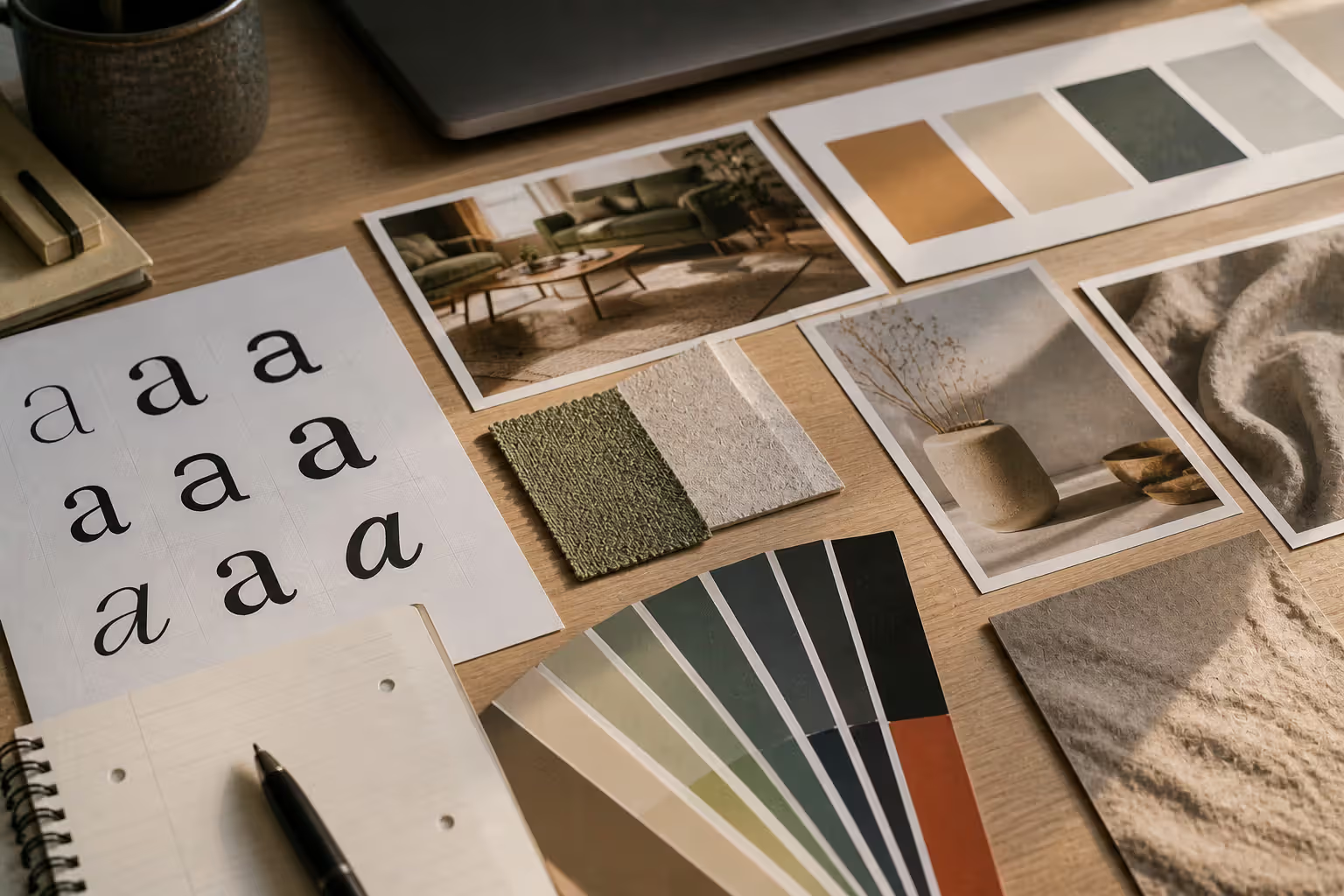
When a design project moves beyond initial brainstorming, you need something more strategic than a collection of pretty images. That's where concept boards come in—visual documents that translate creative direction into tangible design decisions. Unlike casual inspiration collections, concept boards serve as strategic communication tools that bridge the gap between abstract ideas and concrete execution.
For designers, marketers, and creative teams working on branding, product launches, or environmental design, concept boards transform vague client requests into actionable visual frameworks. They reduce revision cycles, align stakeholders, and establish clear design rationale before significant resources get committed to execution.
Understanding Concept Boards in Design
A concept board is a curated visual presentation that communicates specific design directions for a project. It combines imagery, typography, color palettes, textures, and annotations to articulate how design elements will work together to achieve project objectives. Where casual inspiration gathering casts a wide net, concept boards narrow focus to defendable choices backed by strategic thinking.
The purpose extends beyond aesthetics. Concept boards serve as decision-making tools that help teams evaluate whether proposed visual directions align with brand positioning, target audience preferences, and functional constraints. A retail interior concept board, for example, might show flooring samples alongside lighting fixtures, color swatches, and reference images—all annotated to explain how these choices create the intended customer experience.
In design thinking visual tools, concept boards occupy a crucial middle ground. They're more refined than initial sketches or brainstorming outputs, yet more flexible than final mockups or prototypes. This positioning makes them ideal for testing ideas with stakeholders before committing to detailed design development.
Author: Sophie Calder;
Source: crafterholic.com
Designers typically deploy concept boards during the conceptual design exploration phase, after understanding project requirements but before creating detailed designs. An architect might present three concept boards showing different spatial approaches for a restaurant renovation. A packaging designer could develop boards exploring premium versus accessible market positioning. A web designer might create boards that visualize different navigation philosophies and content hierarchies.
The visual concept development process benefits from concept boards because they force specificity. Instead of discussing "modern" or "sophisticated" in abstract terms, teams examine actual typefaces, specific color combinations, and concrete imagery that define what those words mean for this particular project.
Mood Board vs Concept Board
The terms "mood board" and "concept board" often get used interchangeably, but they serve distinct purposes in the design process. Understanding this difference prevents confusion and helps you create the right tool for your project stage.
Mood boards capture feeling and atmosphere. They're intentionally loose, gathering images, colors, and textures that evoke an emotional response or aesthetic direction. An interior designer might create a mood board with sunset photography, fabric swatches, and lifestyle imagery to convey "warm, inviting, coastal." The goal is establishing vibe, not making specific design decisions.
Concept boards take that atmospheric foundation and translate it into actionable design elements. They show how you'll execute that feeling through specific typography choices, exact color values, material specifications, and layout approaches. The same interior designer would follow their coastal mood board with a concept board showing actual paint colors, specific furniture styles, lighting fixtures, and flooring options—all annotated with rationale.
Feature
Mood Board
Concept Board
Purpose
Establish emotional direction and aesthetic feel
Communicate specific design solutions and strategic choices
Content type
Inspirational imagery, loose color swatches, atmospheric references
Exact typography, precise color palettes, specific materials, annotated examples
Project stage
Early ideation and exploration
Post-strategy, pre-execution development phase
Audience
Internal teams, initial client alignment
Stakeholders who approve design direction and budget
Level of detail
Abstract, suggestive, open to interpretation
Concrete, specific, defendable with rationale
Deliverable format
Collage-style arrangement, minimal text
Organized presentation with annotations and context
This distinction matters when managing client expectations. Presenting a mood board when stakeholders expect concrete direction causes frustration. Conversely, jumping straight to detailed concept boards without establishing aesthetic alignment through mood boarding can lead to fundamental misalignment that requires backtracking.
Many projects benefit from using both tools sequentially. The ideation board for design phase produces mood boards that get refined into concept boards once direction is approved. This progression moves teams from "what could this feel like?" to "here's exactly how we'll achieve that feeling."
Author: Sophie Calder;
Source: crafterholic.com
Key Elements of an Effective Concept Board
Successful concept boards balance visual impact with strategic communication. Each element serves a specific purpose in conveying your design direction.
Typography samples demonstrate actual typefaces you'll use, not just font names. Show headlines, body copy, and supporting text in context. Include weight variations and sizing relationships. A concept board for a magazine redesign should display the proposed serif for features, sans-serif for captions, and display face for section openers—all set in representative text at actual sizes.
Color schemes require precision. Instead of generic color families, specify exact values with HEX codes, Pantone numbers, or material samples. Show primary, secondary, and accent colors with approximate usage percentages. A brand concept board might allocate 60% neutral gray, 30% deep blue, and 10% energetic orange, demonstrating color hierarchy visually.
Imagery establishes visual language through photography style, illustration approach, or graphic treatment. Rather than random attractive images, select examples that demonstrate specific qualities—candid versus staged photography, minimal versus detailed illustration, abstract versus literal representation. A tech startup's concept board might show authentic workspace photography with natural lighting, avoiding stock photo aesthetics.
Materials and textures ground digital concepts in physical reality. For environmental design, product design, or packaging, include actual material samples or high-quality representations. Show how matte finishes contrast with glossy elements, or how rough textures balance smooth surfaces. These tactile considerations often determine whether designs feel premium, approachable, or utilitarian.
Annotations transform a pretty collage into a strategic document. Brief notes explain why you selected each element and how it supports project goals. "Sans-serif typeface provides accessibility for older demographics" carries more weight than unlabeled font samples. Annotations demonstrate design thinking, not just aesthetic preference.
Brand alignment connects every choice back to established brand values, audience insights, or project requirements. If the creative brief emphasizes sustainability, your concept board should explicitly show how material choices, color palette, and imagery reinforce environmental consciousness. This alignment proves you're solving the right problem, not just creating attractive visuals.
Author: Sophie Calder;
Source: crafterholic.com
The concept visualization in design depends on balancing these elements. Too many components create confusion; too few leave stakeholders unable to envision the final direction. Most effective concept boards include 8-15 distinct elements arranged with clear visual hierarchy.
How to Create a Design Concept Board Step by Step
Building an effective concept board follows a structured process that ensures your creative decisions support project objectives rather than personal preferences.
Analyzing the Creative Brief
Start by extracting specific requirements from project documentation. Identify target audience demographics and psychographics, brand positioning statements, functional constraints, and success metrics. A concept board for a fitness app targeting busy professionals aged 35-50 requires different visual language than one for Gen Z users.
Look for tension points in the brief—places where requirements seem to conflict. "Approachable yet authoritative" or "innovative but trustworthy" signal opportunities where your concept board must demonstrate how visual choices resolve these apparent contradictions. Make notes about which elements you'll use to address each requirement.
The creative brief visual board process depends on truly understanding what the project needs to accomplish. If the brief emphasizes converting skeptical customers, your concept board should show how design choices build credibility. If rapid user onboarding is critical, demonstrate how visual hierarchy and typography support intuitive navigation.
A well-crafted concept board doesn't just show what something might look like—it explains why those visual choices support the project's goals. It's the difference between saying 'I like this blue' and demonstrating how that specific blue connects to brand values, audience expectations, and functional requirements.
— Jennifer Kinon
Gathering Visual References
Collect more material than you'll ultimately use—typically 3-4 times the amount that will appear on your final board. This abundance lets you curate strategically rather than settling for the first acceptable options you find.
Source references from multiple categories: direct competitors, adjacent industries, aspirational brands, historical references, and unexpected inspiration. A restaurant concept board might pull from hospitality design, retail experiences, editorial photography, and residential interiors—not just other restaurants.
Organize references by the element they represent (typography, color, imagery, texture) rather than by source. This organization reveals patterns and helps you identify gaps. You might discover you've collected abundant color inspiration but limited typography examples, signaling where to focus additional research.
Avoid the Pinterest trap of collecting only polished, beautiful imagery. Include rough sketches, material samples, technical diagrams, and analytical references that inform your thinking even if they won't appear on the final board.
Organizing and Curating Content
Ruthlessly edit your collection down to elements that directly support your strategic direction. Each item should earn its place by either demonstrating a specific design decision or providing necessary context.
Group related elements to show relationships. Place your primary typeface near the headline it would set. Position color swatches adjacent to imagery that uses similar palettes. This spatial organization helps viewers understand how elements work together, not just how they look in isolation.
Create visual hierarchy through sizing, positioning, and spacing. Your most important design decisions—typically color palette and primary typography—deserve prominent placement. Supporting elements like texture references or secondary imagery can occupy less visual weight.
Test different arrangements before committing. A grid layout suggests systematic, organized brand personality. An asymmetric composition conveys dynamic, creative energy. Your visual planning for projects should extend to how you arrange the board itself, since that arrangement communicates as much as the content.
Finalizing Your Concept Board Layout
Add annotations that explain your reasoning without overwhelming the visuals. Position text near relevant elements using consistent formatting. Keep notes concise—one to two sentences maximum. "Geometric sans-serif conveys precision and modernity expected in fintech category" says more than paragraphs of justification.
Include a brief project context statement at the top: project name, target audience, and primary objective. This header ensures viewers understand the lens through which to evaluate your choices.
Establish a clear visual boundary for your board, whether through a consistent background, border, or contained canvas. This framing separates your curated content from surrounding context and signals intentional composition.
Review the board from your audience's perspective. Can stakeholders understand your direction without you present to explain it? Does the board answer likely questions before they're asked? Would someone unfamiliar with the project grasp the intended aesthetic and strategic rationale?
Author: Sophie Calder;
Source: crafterholic.com
Tools and Formats for Concept Board Creation
The choice between digital and physical concept boards depends on your project type, presentation context, and stakeholder preferences.
Digital platforms offer flexibility and easy sharing. Tools like Figma, Miro, and Milanote provide infinite canvases where you can arrange images, add annotations, and adjust layouts non-destructively. Digital boards work well for remote collaboration, allowing team members to comment directly on specific elements. They're easily updated when direction shifts and can be shared via link or PDF.
Adobe Creative Suite remains standard for designers who want precise control over typography, color accuracy, and print output. InDesign particularly suits concept boards destined for formal presentations, offering sophisticated layout tools and export options.
Specialized tools like Morpholio Board or Canva provide templates and pre-built elements that speed creation but may limit customization. These work well for straightforward projects but can feel restrictive when exploring unconventional design directions.
Physical boards create tangible impact in face-to-face presentations. Actual material samples, printed imagery, and hand-arranged compositions engage viewers differently than screens. Interior designers, fashion designers, and product designers often find physical boards essential for conveying texture, scale, and material quality that digital representations can't fully capture.
Foam core or mat board provides sturdy backing for pinning or adhering elements. Magnetic boards allow easy rearrangement during working sessions. Some designers create hybrid approaches, printing digital layouts on large-format printers then adding physical material samples.
Presentation formats should match your delivery context. Client presentations often require polished PDFs or slide decks with your concept board as hero images supported by explanatory slides. Internal reviews might use collaborative digital workspaces where team members can add comments and suggestions.
Consider creating multiple versions: a detailed working version for your team with extensive notes, and a cleaner presentation version for stakeholders that emphasizes visual impact. The working version captures your complete thinking; the presentation version communicates decisions without overwhelming viewers.
File organization matters for design concept board creation. Name files clearly, maintain version history, and keep source materials organized. You'll often need to revisit or revise boards as projects evolve, and searching through poorly labeled files wastes time and creates frustration.
Common Mistakes When Building Concept Boards
Even experienced designers fall into predictable traps when creating concept boards. Recognizing these pitfalls helps you avoid them.
Overcrowding happens when you include too many elements, creating visual chaos rather than clear direction. More isn't better—precision is better. A concept board with 30 images dilutes focus and forces viewers to guess which elements matter most. Limit yourself to the essential components that communicate your direction, typically 8-15 distinct elements maximum.
Lack of focus occurs when your board tries to accommodate multiple divergent directions simultaneously. "We could go modern or traditional, minimal or decorative, bold or subtle" leaves stakeholders unable to evaluate anything concrete. Each concept board should represent one clear direction. If you're exploring multiple approaches, create separate boards for each rather than hedging within a single presentation.
Ignoring the brief produces boards that showcase your aesthetic preferences rather than solving the actual problem. That beautiful Art Deco typography might not serve a healthcare brand targeting anxious patients who need reassurance, not glamour. Every element should trace back to specific brief requirements. If you can't explain how a choice supports project goals, it doesn't belong on the board.
Poor hierarchy treats all elements equally, making it unclear which decisions are primary and which are supporting details. Your color palette and typography typically deserve more visual weight than texture references or supplementary imagery. Use sizing, positioning, and spacing to signal importance.
Missing context leaves viewers unable to understand how to evaluate your choices. A concept board for an inspiration board for projects needs annotations that connect visual decisions to strategic rationale. Without that context, stakeholders judge based on personal taste rather than strategic fit.
Another common error: using low-quality images or poorly represented materials. Pixelated photography or inaccurate color reproduction undermine confidence in your design judgment. Invest time in sourcing high-resolution references and ensuring color accuracy, especially for printed presentations.
Finally, many designers create concept boards that look impressive but aren't actually useful for moving projects forward. Beauty without strategic clarity wastes everyone's time. Your board should enable decisions, not just admiration.
Frequently Asked Questions
What's the difference between a concept board and a mood board?
Mood boards establish emotional direction and aesthetic feel through loose, inspirational imagery. Concept boards translate that feeling into specific design decisions with exact typography, precise colors, and annotated rationale. Mood boards ask "what should this feel like?" while concept boards answer "here's exactly how we'll achieve that feeling." Use mood boards early in ideation; create concept boards when you need stakeholder approval for concrete design direction.
How many images should be on a concept board?
Most effective concept boards include 8-15 distinct elements. This range provides enough variety to communicate your direction without overwhelming viewers. Quality and relevance matter more than quantity—each element should serve a specific purpose in explaining your design approach. If you're including more than 15 items, you're likely diluting focus or trying to show multiple directions on one board.
Can I create a concept board digitally?
Yes, digital concept boards work well for most projects. Tools like Figma, Miro, Adobe InDesign, and Milanote offer flexible layouts, easy sharing, and simple updates. Digital boards suit remote collaboration and projects where material texture isn't critical. However, physical boards remain valuable for interior design, fashion, and product design where actual material samples and tactile qualities significantly impact design decisions. Many designers create digital layouts then print and add physical samples for hybrid presentations.
When in the design process should I create a concept board?
Create concept boards after you've completed research and strategy but before investing in detailed design execution. They sit between initial brainstorming and final production. Specifically, develop concept boards once you understand project requirements, target audience, and brand positioning, but before creating comprehensive mockups or prototypes. This timing lets you test strategic direction with stakeholders and make adjustments before significant resources get committed to execution.
Do I need design experience to make a concept board?
While design training helps, anyone can create useful concept boards by following structured processes. Focus on clearly communicating your visual direction rather than achieving design perfection. Non-designers should emphasize annotations that explain reasoning, since you may lack intuitive visual composition skills. Use templates from tools like Canva or Milanote to handle layout while you focus on selecting relevant imagery, colors, and typography that support your project goals. The strategic thinking matters more than polished presentation.
How do I present a concept board to clients?
Start by restating the project brief and objectives so everyone evaluates the board against the same criteria. Walk through your board element by element, explaining how each choice supports project goals rather than just describing what viewers can already see. Invite questions but guide discussion toward strategic fit rather than personal preferences. Present 2-3 distinct concept boards when possible, giving stakeholders meaningful choices while maintaining control over the options. End by clarifying next steps and what decisions you need to move forward.
Concept boards transform abstract design thinking into concrete visual direction that teams can evaluate, refine, and execute. They bridge the gap between creative exploration and strategic implementation, reducing misalignment and revision cycles while establishing clear rationale for design decisions.
The difference between effective and ineffective concept boards comes down to strategic focus. Beautiful collections of imagery might inspire, but concept boards must communicate specific solutions to defined problems. Every element should connect back to project requirements, audience needs, and brand positioning.
Success requires balancing visual impact with explanatory context. Your concept board should work as both a compelling visual presentation and a strategic document that withstands scrutiny. Annotations explain your thinking without overwhelming the visuals. Careful curation demonstrates judgment and restraint.
Whether you're designing a brand identity, planning a retail environment, or developing a digital product, concept boards help stakeholders visualize direction before committing resources to execution. They enable productive conversations about design strategy rather than subjective aesthetic debates.
Start your next project by investing time in thorough concept board development. The clarity you establish early prevents costly misalignment later and sets the foundation for design work that achieves both aesthetic excellence and strategic objectives.
Modernism transformed 20th-century art and design by rejecting historical tradition and ornament in favor of rationalism, functionalism, and industrial aesthetics. Learn about its origins in industrialization, key philosophical ideas, influence on visual culture, and lasting legacy.
Visual language uses color, shape, typography, and imagery to communicate ideas instantly. Discover how visual elements function as a communication system, how semiotics creates meaning in design, and how to apply graphic communication principles across media effectively.
Discover how mathematical proportions like the golden ratio (1.618), rule of thirds, and aspect ratios create visual balance in design. Learn practical applications, compare popular ratio systems, and avoid common mistakes when applying proportional design principles to logos, layouts, and interfaces.
Proximity gestalt describes how the brain groups nearby visual elements automatically. This guide explains the psychology behind the proximity principle, demonstrates practical spacing strategies, compares proximity with other Gestalt laws, and provides actionable best practices for designers.
The content on this website is provided for general informational and educational purposes only. It is intended to explain concepts related to digital design, visual art, color theory, art techniques, design principles, and design history.
All information on this website, including articles, guides, and examples, is presented for general educational purposes. Creative outcomes may vary depending on individual skill, tools, and practice.
This website does not provide professional design services or guarantee results, and the information presented should not be used as a substitute for formal education or professional consultation.
The website and its authors are not responsible for any errors or omissions, or for any outcomes resulting from decisions made based on the information provided on this website.