Picture a chrome-plated diner crowned with a roof that swoops upward like it's about to launch. Your grandmother's starburst clock ticking on the wall. A 1952 magazine spread showing families in flying cars, everyone smiling in matching jumpsuits. These images? They're all pieces of the same fascinating puzzle: how yesterday's dreamers imagined tomorrow—and why that vision still captivates us.
What Is Retro Futurism Aesthetic
Here's the beautiful contradiction at the heart of this whole thing: retro futurism mashes together mid-20th century design with wildly optimistic predictions about what life would look like in the year 2000. It's nostalgia and forward-thinking rolled into one chrome-finished package.
This vision of future in past design captures a specific moment—roughly 1935 to 1965—when people genuinely believed technology would solve everything. Atomic energy? It'd power entire cities for pennies. Space travel? As routine as catching a bus. Automation? It would eliminate tedious work and give everyone more leisure time. Those beliefs weren't just talk. They shaped physical objects, from the buildings people worked in to the packaging on their breakfast cereal.
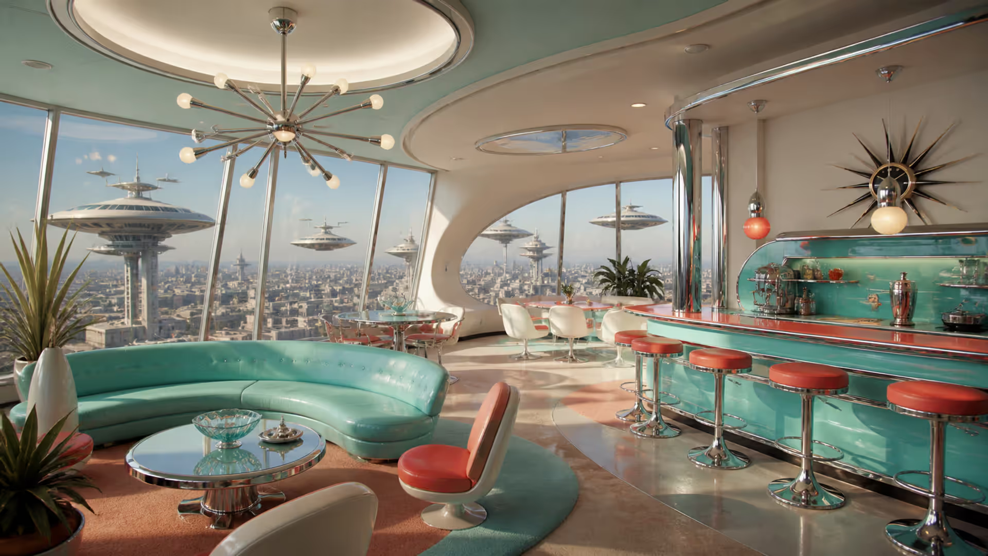
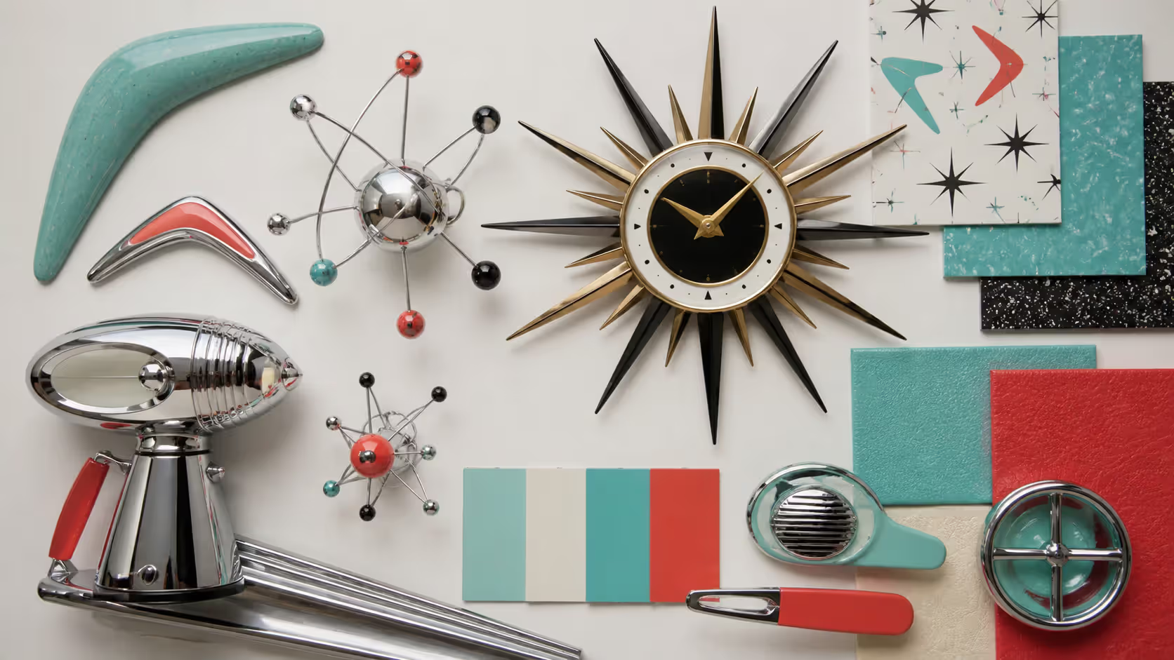
The visual language speaks volumes: aerodynamic curves suggesting unstoppable momentum. Atomic symbols celebrating science's power. Swooping angles that ignore conventional architectural rules. And colors—metallic finishes paired with cheerful pastels that somehow make technological futures feel friendly rather than cold.
What makes futurist vintage design so compelling isn't just the aesthetics. It's the worldview behind them. These designers treated technology as inherently beautiful, something to celebrate rather than hide behind minimalist shells. The contrast with today's approach? Pretty stark. Modern tech design obsesses over making devices disappear. Mid-century designers wanted them to announce themselves boldly.
Walking through a preserved 1950s coffee shop or watching an episode of The Jetsons delivers more than visual information. You're experiencing an entire philosophy about human potential, encoded in every curve and chrome accent. These people believed design could actually make society better. Quaint? Maybe. But also genuinely inspiring.
Author: Olivia Hartwell;
Source: crafterholic.com
Historical Roots and Design Movements
Atomic Age and Space Age Origins (1940s–1960s)
The atomic age design aesthetic didn't emerge gradually. It exploded onto the scene after 1945, directly tied to the atomic bomb and nuclear power. Suddenly that orbital atom symbol—electrons spinning around a nucleus—showed up everywhere. Corporate logos. Kitchen appliances. Jewelry. Bathroom tiles. This wasn't random decoration. Americans saw it as humanity's mastery over nature's fundamental forces.
The 1950s brought unprecedented prosperity, at least for middle-class Americans. Manufacturers got experimental. Why should a toaster look boring when it could look like something from a rocket ship? After the Soviets launched Sputnik in October 1957, space age graphic design went into overdrive. The space race was real, immediate, and it affected everything.
By 1962, you couldn't escape space-age styling. Detroit added tail fins to automobiles that served zero aerodynamic purpose—they just looked fast and futuristic. Furniture designers created egg-shaped chairs that resembled spacecraft seats. Even vacuum cleaners got sleek casings suggesting they belonged on a lunar base rather than in someone's living room.
General Electric's 1950s tagline captured the mood perfectly: "Progress is our most important product." And progress needed to look progressive.
Author: Olivia Hartwell;
Source: crafterholic.com
Googie Architecture and Streamline Moderne
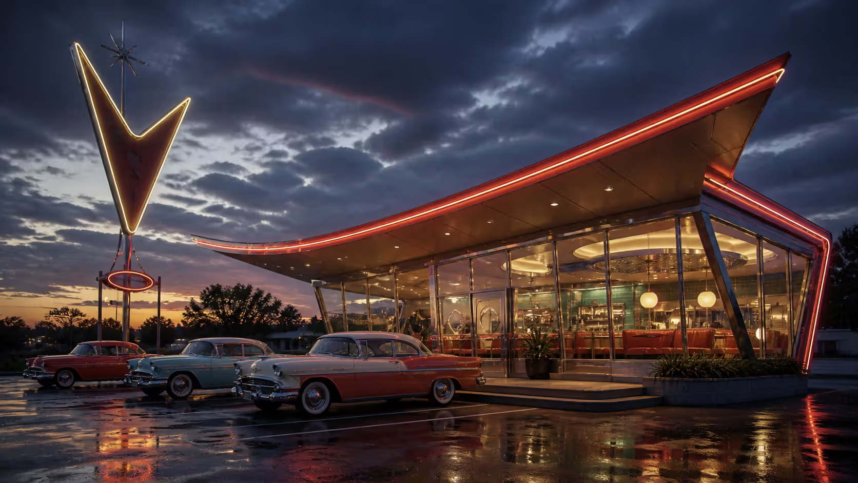
The googie architecture style gets its name from Googie's Coffee Shop, which architect John Lautner designed in 1949 on the Sunset Strip in West Hollywood. (The original building? Demolished in 1989, unfortunately.) The style featured gravity-defying roofs that swept upward at impossible angles, geometric shapes that seemed to defy physics, massive starbursts, and floor-to-ceiling glass.
Why did Googie look this way? Cars. Architects designed for drivers zooming past at 40 mph. Buildings needed to grab attention instantly. Signs had to be visible from blocks away. The result: structures so exuberant they practically shouted. Neon-blazing bowling alleys. Diners with parabolic arches. Gas stations where the canopy looked like airplane wings.
The Space Needle in Seattle (built 1961-1962) became Googie's most famous monument—a 605-foot tower topped with a flying saucer. Tourists still flock to it.
Streamline moderne aesthetic came earlier, flourishing during the 1930s. This style worshipped speed and industrial efficiency. Ocean liners, locomotives, and aircraft inspired everything from apartment complexes to pencil sharpeners. Horizontal lines dominated. Curved forms suggested aerodynamics. Smooth surfaces eliminated unnecessary ornament.
Where Streamline Moderne celebrated mechanical motion, later styles would embrace atomic power and space exploration. But they shared DNA: both treated the future as something you could see and touch.
Author: Olivia Hartwell;
Source: crafterholic.com
Mid-Century Futurism in Popular Culture
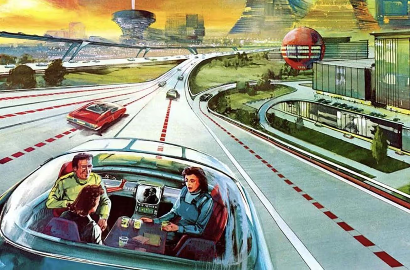
The 1939 New York World's Fair introduced 44 million visitors to "The World of Tomorrow." Norman Bel Geddes' Futurama exhibit let people glimpse an imagined 1960—superhighways crisscrossing gleaming cities, with cars controlled by automated systems. Attendees received buttons declaring "I have seen the future."
Walt Disney opened Tomorrowland at Disneyland in July 1955. Kids who rode the Rocket to the Moon or explored the Monsanto House of the Future absorbed specific messages about what tomorrow would bring. Television amplified these visions. The Twilight Zone ran from 1959 to 1964, each episode featuring opening credits with futuristic typography and space imagery. Rod Serling's show explored technological anxieties, sure—but the set design and graphics shouted "future."
Comic books offered even wilder speculation. Magnus, Robot Fighter 4000 A.D. (debuted 1963) depicted a world where everyone wore form-fitting jumpsuits and lived in transparent towers connected by moving sidewalks. These images saturated American culture so thoroughly that certain visual shortcuts became universal. A swooping curve? Progress. Chrome finish? Sophistication. Atomic symbol? Power and modernity.
The optimism wasn't baseless. Between 1945 and 1970, American median household income nearly doubled. Antibiotics conquered diseases that had killed millions. Jets made intercontinental travel routine. These weren't fantasies—they were happening. Why wouldn't cities in transparent domes come next?
Lewis Mumford, the architectural critic, wrote in 1952: "Today, the degradation of the inner life is symbolized by the fact that the only place sacred from interruption is the private toilet." He was criticizing mid-century culture, but even critics couldn't ignore how dramatically technology was reshaping daily existence.
Core Visual Elements and Design Features
The retro futurist visual style relies on specific design elements you can learn to spot instantly. Think of it as a visual vocabulary.
Color Palettes: Chrome dominates—polished, reflective, catching light. But here's the twist: designers paired cold metallics with unexpectedly soft pastels. Mint green straight from a 1955 Frigidaire. Coral pink like a Miami hotel. Turquoise that matched swimming pools and Thunderbirds. Butter yellow cheerful as a daisy. These gentle colors made futurism approachable instead of intimidating. Atomic orange and electric blue provided accent pops suggesting radiation and energy. Black-and-white combos added sophistication, especially in graphic work.
Shapes and Forms: Aerodynamic teardrops appeared on everything, even objects that never moved. Parabolic curves suggested motion and momentum. The atomic symbol—electrons orbiting a nucleus—became pure decoration. Rocket ships, satellites, planetary rings: standard imagery. Boomerang and kidney shapes defined furniture and architectural elements. Tail fins extended from car fenders, sometimes reaching absurd lengths. (The 1959 Cadillac Eldorado's fins stretched nearly four feet tall.)
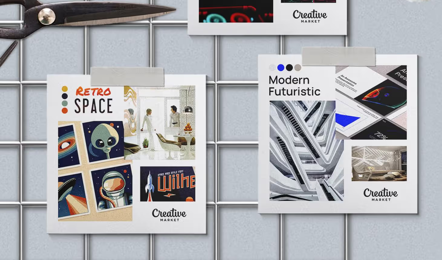
Typography and Graphic Design: Retro sci fi design favored geometric sans-serifs—clean, bold, usually extended or condensed for drama. Letters got futuristic modifications: extended ascenders reaching skyward, sharp terminals suggesting precision, embedded stars or atomic symbols. Designers abandoned traditional grid layouts for dynamic diagonals. Illustrations simplified technology into optimistic, approachable forms with clean lines and minimal fussy details.
Materials and Textures: Formica laminate came in wild patterns—boomerangs, atomic starbursts, terrazzo-inspired speckles. Chrome plating covered furniture legs, automotive trim, light fixtures, practically everything. Actual terrazzo flooring embedded colored chips in cement. Vinyl upholstery in bold hues—easier to clean than fabric, perfectly modern. Glass blocks built translucent walls that glowed when backlit. Neon tubing created signage that transformed darkness into art.
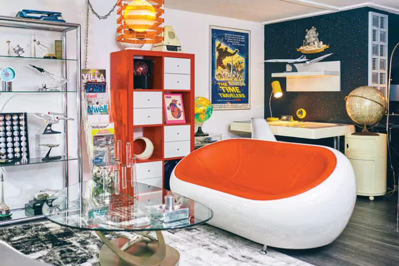
The atomic era visual culture loved contrast. Smooth against rough. Organic against geometric. Warm against cool. A typical 1958 living room might feature a curvy sofa in coral vinyl paired with a sharp-angled coffee table topped in black laminate, all sitting on terrazzo. This deliberate mixing created visual excitement while maintaining cohesive identity.
Nobody worried about subtlety. Why should they? The future was coming, and it deserved to look spectacular.
Author: Olivia Hartwell;
Source: crafterholic.com
Retro Futurism Across Different Media
The aesthetic adapted to different contexts while keeping its core DNA intact.
Architecture and Interior Design: Beyond Googie's commercial showpieces, residential architecture absorbed futuristic elements more quietly. Eichler homes in California featured floor-to-ceiling windows, radiant heated floors, and post-and-beam construction that eliminated unnecessary walls. These weren't gimmicks—they reflected genuine beliefs about how modern families should live. Interior designers specified pieces from Herman Miller (the Eames Lounge Chair debuted in 1956) and Knoll (Saarinen's Tulip Chair came in 1957). Residential applications usually moderated the wildest commercial extremes, but the principles remained.
Graphic Design and Advertising: Space age graphic design dominated print. Pan Am used jet imagery in ads showing glamorous passengers jetting to Paris. General Electric promised push-button futures where appliances thought for themselves. Even banks—traditionally conservative—deployed starburst logos suggesting innovation. The visual approach stayed remarkably consistent: diagonal compositions creating dynamic movement, starburst elements radiating optimism, simplified tech illustrations, and copy promising unprecedented convenience.
Film, TV, and Sci-Fi Illustration:Forbidden Planet (1956) created an alien civilization using contemporary design pushed to extremes. The film's production designer borrowed from industrial design catalogues. Lost in Space premiered in 1965 with a robot whose design screamed "space age"—bubble head, accordion arms, flashing lights. Magazine illustrators like Frank Tinsley drew cities under the sea and highways in the sky, all using visual vocabulary borrowed from Googie and product design.
Product Design and Consumer Goods: Consumer products went wild. Radios shaped like atoms. Clocks with starburst faces and triangular hour markers. Kitchen appliances available in turquoise-and-white or pink-and-white combos. Cars grew increasingly elaborate chrome grilles and fins. The 1958 Edsel—a commercial disaster—failed partly because its styling went too far, but that didn't stop designers from trying. Manufacturers understood something crucial: futuristic styling moved merchandise, regardless of whether the underlying technology changed at all.
Era
What It Looked Like
Colors They Used
What They Built With
You've Seen These
Streamline Moderne (1930s)
Long horizontal lines, rounded corners, nautical touches, speed lines carved into facades
Chrome, white, black, occasional deep blue
Stainless steel, glass blocks, terra cotta, aluminum
Chrysler Building tower (NYC), Cincinnati's Union Terminal, Miami Beach hotels
Digital rendering, 3D-printed prototypes, sustainable materials, LED lighting
Fallout game series, retro-themed breweries, Disneyland's Tomorrowland refresh
Modern Applications and Contemporary Influence
The retro futurist visual style roared back around 2005 and hasn't left. We're in 2026 now, and it's still going strong. This isn't just nostalgia—it's genuine hunger for the aesthetic's optimistic energy, something that feels scarce in contemporary design's minimal, ultra-serious approach.
Branding and Marketing: Companies use futurist vintage design to signal "we're innovative but not intimidating." Tech startups occasionally adopt retro-futurist branding specifically to differentiate from identical sans-serif logos. Craft breweries love the aesthetic—it communicates creativity and doesn't take itself too seriously. Restaurants and bowling alleys lean into full immersion. Killer ESP Coffee in Seattle occupies a preserved 1954 Googie building. The branding practically designs itself.
This approach works because it sidesteps contemporary tech anxiety. Modern interfaces often feel invasive, tracking everything. Mid-century futurism believed technology would liberate people. That message resonates even when we recognize its naivety.
Video Games, Movies, and Entertainment: The Fallout franchise (started 1997, still releasing new titles) popularized "atompunk"—a specific subset imagining what happens when 1950s predictions come true, then collapse into nuclear apocalypse. Players explore a world stuck aesthetically in 1957 but existing in 2077. The cognitive dissonance creates the entire game's appeal.
The Incredibles (2004) explicitly referenced mid-century design throughout. Brad Bird, the director, grew up surrounded by this aesthetic and wanted to recreate its optimistic energy. Tomorrowland (2015) similarly drew from Googie architecture and 1964 World's Fair imagery, though the film underperformed financially despite stunning production design.
Contemporary sci-fi increasingly mixes design eras rather than defaulting to sleek minimalism. The Expanse (2015-2022) showed spacecraft interiors with layers of retrofitted equipment—a more realistic vision where futures contain visible history.
Fashion and Product Design: Fashion designers reference space-age silhouettes cyclically. André Courrèges pioneered go-go boots and vinyl in 1964. Pierre Cardin created geometric shapes and metallics throughout the 1960s. Contemporary designers like Jeremy Scott and Iris van Herpen revisit these ideas periodically. Furniture manufacturers license official reproductions—Herman Miller still produces Eames chairs decades after Charles and Ray designed them. Others create inspired pieces: West Elm and CB2 both offer "mid-century modern" collections adapting period principles.
Limited-edition consumer electronics occasionally embrace the aesthetic. Smeg's refrigerators deliberately evoke 1950s rounded shapes and pastel colors, commanding premium prices. Teenage Engineering's synthesizers and speakers reference 1960s product design with bold colors and geometric forms.
Why does this keep working? The aesthetic offers emotional relief. Mid-century futurism trusted technology. That's increasingly rare. The style's optimism provides comfort even as we acknowledge its predictions flopped.
Author: Olivia Hartwell;
Source: crafterholic.com
How to Recognize and Use Retro Futurist Design
Identifying Authentic vs. Inspired Elements: Real period pieces reveal themselves through construction. A genuine 1956 Eames lounge chair uses specific rosewood veneers, leather grades, and shock mount configurations. Contemporary reproductions—even quality ones—employ modern materials. You can spot differences: original foam degrades in particular ways; vintage chrome develops specific patina; period fabrics have different weaves.
Inspired designs borrow aesthetics without claiming authenticity. A 2026 lamp might use atomic symbols and boomerang shapes but with LED technology and contemporary proportions. That's not fakery—it's interpretation.
Authentic retro futurism also carried genuine belief. Original designers truly thought they were building tomorrow. Contemporary work often adds irony or self-awareness. Fallout uses retro aesthetics specifically to critique mid-century assumptions about nuclear power and American exceptionalism. That critical distance didn't exist in 1955.
Common Mistakes When Applying the Style: Biggest error? Treating retro futurism aesthetic like costume. Randomly slapping atomic symbols and chrome everywhere creates visual chaos, not coherent design. Successful applications understand underlying principles: optimism about technology, celebration of scientific progress, belief that design shapes society.
Another pitfall: ignoring context. Googie worked for roadside businesses competing for drivers' attention. Those principles applied to, say, a law firm's office? Confusing at best, inappropriate at worst. The aesthetic serves specific purposes. Forcing it into wrong contexts undermines both the design and the message.
Overcommitment backfires too. A completely retro-futurist interior feels like a museum diorama rather than a functional space. Better approach: selective incorporation. One starburst clock. A boomerang coffee table. Period colors. These elements anchor the aesthetic without overwhelming everything else.
Practical Tips for Incorporating the Aesthetic: Start simple: color. The retro futurist palette instantly evokes the era without requiring structural changes. Paint one wall atomic orange. Choose throw pillows in mint green and coral pink. Done.
Select one or two statement pieces. A genuine Eames shell chair costs $300-500 for licensed reproductions. An atomic-era clock runs $50-200 depending on condition. These become focal points without demanding total commitment.
Lighting delivers huge impact for modest investment. Sputnik chandeliers range from $150 for basic versions to thousands for vintage originals. Nelson bubble lamps (designed 1952) still get manufactured under license. Period-appropriate lighting transforms spaces dramatically.
For graphic design, apply principles rather than copying elements. Use optimistic color combos. Create dynamic diagonal compositions. Choose geometric sans-serifs. Reference space age graphic design's spirit without literally reproducing 1955 Cadillac ads.
Resources and Inspiration Sources: Preserved Googie buildings survive mainly in California and the Southwest, though demolition claimed many. LAX's Theme Building (1961) still operates as a restaurant. Pann's Restaurant in Los Angeles (1958) serves customers in its original Googie building. Norms Restaurants maintains several vintage locations.
The Museum of Neon Art in Glendale, California displays rescued signage. The Henry Ford Museum in Dearborn, Michigan houses extensive mid-century collections. The Denver Art Museum and Smithsonian American Art Museum maintain significant holdings.
Books: Alan Hess's Googie Redux (2004) documents the architecture comprehensively. Thomas Hine's Populuxe (1986) examines consumer culture. Jim Heimann's All-American Ads series reproduces period advertising. Online, vintage Popular Science and Popular Mechanics archives show how manufacturers marketed futures to regular people. Pinterest and Instagram curate examples, though quality varies wildly—verify sources before trusting information.
The future was not just a time—it was a place you could visit if you drove far enough down the right highway.
— Thomas Hine
Frequently Asked Questions About Retro Futurism
What's the difference between retro futurism and steampunk?
Different centuries, different technologies. Retro futurism pulls from mid-20th century (1930s-1960s) visions emphasizing atomic energy, space exploration, streamlined shapes. Steampunk imagines futures rooted in Victorian-era (1800s) tech—brass fittings, steam power, visible gears and mechanisms. Retro futurism tends toward optimism and clean lines. Steampunk embraces ornate complexity and mechanical intricacy. They're both retrofuturistic, just anchored in different historical moments with completely different technological assumptions.
When was retro futurism most popular?
Original designs flourished between 1935 and 1965, hitting peak intensity from 1955-1963. The aesthetic revived during the 1980s when postmodern architects started referencing it. Another surge came in the early 2000s as digital designers discovered the style. We're experiencing another wave right now in 2026, appearing across video games, entertainment, branding, and product design. Each revival reinterprets rather than reproduces—contemporary versions add layers of meaning originals lacked.
What colors are used in retro futurism aesthetic?
Chrome and metallics form the foundation—polished, reflective finishes. Pastels provide the surprise: mint green, coral pink, turquoise blue, butter yellow. These soft colors make technological futures feel friendly. Atomic orange and electric blue add energy pops. Black-and-white combinations bring sophistication. The palette mixes optimistic, approachable hues with sophisticated metallic finishes, creating distinctive contrast between warm organic colors and cool technological surfaces. Companies like Benjamin Moore and Sherwin-Williams offer historically accurate color matches if you want period-specific paint.
Is Googie architecture the same as retro futurism?
Googie's one piece of the larger puzzle. Googie architecture style specifically describes commercial buildings from roughly 1945-1970 featuring upswept roofs, geometric shapes, space-age decoration. Retro futurism encompasses way more: Streamline Moderne buildings, product design, graphic design, film production design, even fashion. Think of it this way: all Googie buildings are retro-futurist, but plenty of retro-futurist design isn't Googie. The Eames Lounge Chair? Retro-futurist but not Googie. A 1959 diner with a flying-saucer roof? That's Googie.
Why is retro futurism popular again?
The aesthetic offers optimistic alternatives when contemporary design feels cold. Mid-century futurism believed technology would improve human lives—an appealing message during our current moment of tech anxiety. Nostalgia plays a role, sure, but the revival goes deeper. People genuinely appreciate the era's design innovation, bold color use, and willingness to embrace joy in functional objects. Plus, it's visually distinctive. Everything now looks identical—minimal, neutral, serious. Retro futurism doesn't care about fitting in. That rebellion resonates.
Where can I see examples of authentic retro futurist design?
Preserved Googie buildings: LAX's Theme Building, Seattle's Space Needle, Pann's Restaurant in Los Angeles, several surviving Norms locations. Museums: The Henry Ford in Dearborn, Denver Art Museum, Smithsonian American Art Museum all maintain substantial mid-century design collections. The Museum of Neon Art in Glendale preserves signage and architectural fragments. Online resources include architectural preservation databases, vintage design dealers (1stDibs, Chairish), and specialized auction houses. eBay's honestly decent for period furniture if you know what you're looking for. Instagram accounts like @savegoogie document surviving buildings before demolition claims them.
The retro futurism aesthetic endures because it captures something we've lost: unabashed enthusiasm for what's possible. Mid-century designers believed tomorrow would be better, brighter, more exciting. They encoded that optimism into every swooping roofline, atomic symbol, chrome detail.
Whether you're hunting vintage pieces for your apartment, studying the aesthetic for client work, or just appreciating its visual energy, understanding retro futurism means recognizing it as more than surface style. It's a complete worldview rendered in chrome and pastels, atomic symbols and boomerang shapes—a vision of the future that never arrived but keeps inspiring designers who believe tomorrow might still surprise us in good ways.
Media arts harnesses electronic technologies and digital tools to create experiences that challenge traditional art forms. From immersive installations to interactive environments, this dynamic field transforms how we perceive and engage with contemporary artistic expression through video, performance, and screen-based work.
A conceptual artist creates work where the underlying idea holds more importance than the finished physical object. Unlike traditional artists who focus on mastering materials, conceptual artists treat the concept itself as the artwork, with execution serving merely as documentation of the idea.
Text message art transforms written language into visual compositions. From ASCII characters to monumental installations, artists use typography, concrete poetry, and calligraphy to create work where words function as both message and image, challenging traditional boundaries between reading and viewing.
Writing about your artwork feels awkward at first. You're translating visual ideas into sentences that don't sound pretentious. Every art student faces this challenge for applications, portfolios, and exhibitions. See real examples and learn the structure that works.
The content on this website is provided for general informational and educational purposes only. It is intended to explain concepts related to digital design, visual art, color theory, art techniques, design principles, and design history.
All information on this website, including articles, guides, and examples, is presented for general educational purposes. Creative outcomes may vary depending on individual skill, tools, and practice.
This website does not provide professional design services or guarantee results, and the information presented should not be used as a substitute for formal education or professional consultation.
The website and its authors are not responsible for any errors or omissions, or for any outcomes resulting from decisions made based on the information provided on this website.