Pick up any well-designed magazine from the past fifty years and you'll notice something: even across wildly different articles—a photo essay here, a data-heavy feature there, an interview somewhere else—the pages feel related. Not identical, but harmonious. That's a modular grid at work.
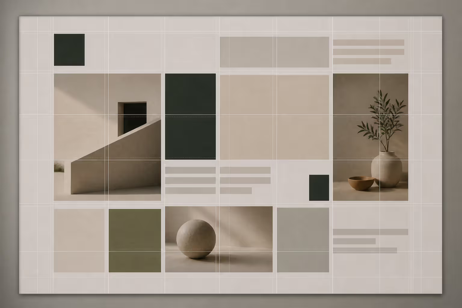
Here's what makes them special: you're dividing your canvas both horizontally and vertically, creating a matrix of rectangular cells. Think of it less like the simple vertical columns in a newspaper and more like a waffle iron—you've got intersections going both ways. Each rectangular "waffle square" becomes a unit you can work with. String several together for a large image. Stack some vertically for text. Grab a single square for a small caption.
What makes this approach brilliant for complex publications? You get consistency without sameness. The same underlying framework accommodates a three-page photo spread on Monday and a text-intensive analysis piece on Tuesday. Both look like they belong to the same magazine because they're built from the same basic units, just arranged differently.
What Is a Modular Grid in Design
Start with the basics: a modular grid creates rectangular units by running vertical columns and horizontal rows across your page. Where these lines intersect, you get modules—your building blocks.
Here's where people get confused. A regular column grid (like you'd see in a newspaper) only slices the page vertically. You might have five columns running from top to bottom, and that's it. Content flows down these columns, and you can make elements span two or three columns wide, but there's no systematic horizontal division.
Now add horizontal rows to those vertical columns. Suddenly you've got a proper matrix. Let's say you build six columns and four rows—that gives you 24 distinct rectangular modules. Your headline might stretch across all six columns in the top row, occupying six modules. The main article text could occupy a vertical stack of three modules down the left side. A featured image might grab a four-module square in the upper right.
Author: Sophie Calder;
Source: crafterholic.com
Think about chocolate bars (the fancy kind divided into neat rectangles). Each rectangle is one module. You can snap off one piece, you can break off an entire row, you can grab a 2×2 cluster—whatever you need. But the underlying structure stays constant, which means everything maintains visual relationships even when individual pieces vary.
Compare this to other grid types. A manuscript grid is basically one big text block (great for novels, boring for magazines). Column grids split things vertically but lack the horizontal control. Hierarchical grids throw out regular divisions entirely and create custom zones for each unique layout. Modular grids sit in the sweet spot: more flexible than manuscripts, more organized than hierarchical approaches, more versatile than simple columns.
Core Components of a Modular Grid System
Columns, Rows, and Grid Modules
Your vertical divisions—columns—typically number anywhere from three to twelve, depending on page size and how complex your content gets. Working on a standard 8.5×11 inch page? Six columns work well. Designing a tabloid newspaper or large-format magazine? You might push to ten or even twelve columns for finer control.
More columns mean more flexibility, but also more decisions. It's a trade-off worth considering upfront.
Rows slice horizontally across your page. Unlike columns (which usually run the full height), rows create distinct horizontal bands. How many you need depends on your content's natural rhythm and your page proportions. Square formats often use roughly equal numbers of columns and rows—a 6×6 grid, for instance. Tall, narrow pages might run 4×8 to maintain reasonable module proportions.
The magic happens where columns and rows intersect. These modules form your fundamental working units. Their proportions shape your entire layout's personality. Square modules (1:1 ratio) feel stable and neutral. Slightly rectangular modules (maybe 2:3 or 3:4) introduce subtle directional flow and accommodate text blocks more naturally. Strongly rectangular modules create obvious horizontal or vertical emphasis.
Author: Sophie Calder;
Source: crafterholic.com
Gutters, Margins, and Spatial Zones
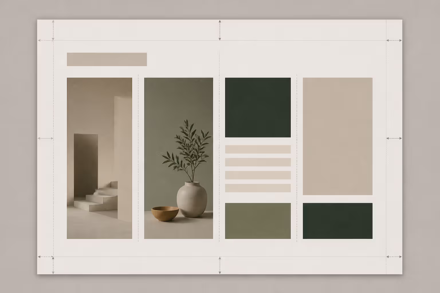
Gutters—the breathing space between your columns and rows—prevent visual collisions. Without adequate gutters, different elements crash into each other and readers struggle to distinguish where one thing ends and another begins.
How wide should they be? In print, you might use 1-3mm for a dense, information-packed feel or 5-8mm for something more open and contemporary. Digital work scales differently: 10-20 pixels creates compact layouts, while 30-50 pixels feels airier and more modern.
Here's something many designers miss: your vertical and horizontal gutters don't need to match. Actually, slightly wider horizontal gutters often work better because they strengthen the visual break between different content sections, making it easier for readers to tell stories apart.
Margins frame your entire grid, providing buffer space between content and page edges. Generous margins (maybe 15-20% of your page dimension) signal quality and leave room for binding, reader's thumbs, and handwritten notes. Tight margins squeeze more content onto the page but risk looking cramped or getting trimmed during printing.
Over time, you'll notice certain module combinations appearing repeatedly. Maybe you consistently use the top two rows for headlines and hero images, middle rows for body text, bottom rows for captions and metadata. These patterns create "spatial zones"—unofficial regions within your grid that readers unconsciously recognize. This recognition speeds up comprehension because readers learn your visual language.
Baseline Grid Integration
Here's where typography nerds get excited. A baseline grid establishes invisible horizontal lines at regular intervals matching your body text's line spacing (called leading in typography). Every line of text sits on these baselines.
Why bother? Hold a well-designed magazine up to the light and look at facing pages. The text lines align perfectly through the paper. That's baseline grid discipline, and it's a hallmark of quality typography.
Making this work with your modular grid requires math. If your body text uses 12-point type with 14-point leading (meaning 14 points from one baseline to the next), your row heights should accommodate whole multiples of 14 points. Maybe 42 points (three text lines), 56 points (four lines), or 70 points (five lines). This ensures text flows naturally within modules while maintaining that through-the-page alignment.
The challenge? Not everything is text. Images, captions in different sizes, white space—these can all disrupt your baseline alignment. Skilled designers make judgment calls: align when possible, intentionally break alignment for emphasis when necessary. The system serves the content, not the other way around.
Author: Sophie Calder;
Source: crafterholic.com
Types of Grid Systems in Layout Design
Understanding your full toolkit helps you pick the right grid for each job. Not everything needs modular complexity.
Manuscript grids suit continuous reading—novels, academic papers, long essays. One text block running down the page maximizes uninterrupted reading but offers zero flexibility for varied content.
Column grids shine when content flows vertically but needs horizontal variety. Newspapers pioneered this: stories of different lengths sit side by side, text wraps around images, headlines span multiple columns. But without systematic horizontal divisions, vertical alignment happens through designer intuition rather than built-in structure.
Modular grids excel at taming diverse content across many pages. You need to present feature articles, short news items, photo essays, data visualizations, pull quotes, and author bios—all within one coherent publication. The grid provides enough structure to maintain family resemblance while offering enough flexibility to emphasize what matters and accommodate different content proportions.
Hierarchical grids abandon regular divisions completely. Every page gets custom spatial divisions based on that page's specific content and creative goals. This works beautifully for one-off designs like posters, infographics, or unique landing pages where maximum expression trumps systematic consistency. The downside? Hierarchical grids don't scale. Try designing 150 pages with custom grids for each spread and you'll understand why magazines use modular systems.
Match your grid complexity to project scope. Single-page designs rarely justify modular grids. Publications spanning dozens or hundreds of pages? That's where modular grids earn their keep.
How Modular Grids Are Used in Print and Digital Design
Walk into any bookstore and grab a few magazines. Look at how a feature article might spread across two pages: large photograph spanning six modules (three columns wide, two rows tall), headline stretched across the full width above it, body text flowing through remaining modules in two or three vertical stacks. Flip the page and the same grid supports completely different content—maybe a vertical image occupying two columns and four rows with text wrapping around. Different arrangements, identical underlying structure.
Editorial design extends well beyond magazines. Annual reports juggle financial tables, executive portraits, infographics, and narrative storytelling. Product catalogs present hundreds of items with varying image orientations, different amounts of descriptive text, pricing, specifications. Without systematic grids, each page becomes a puzzle. With a modular grid, you establish patterns: premium products get six modules, standard products get four, budget items get two. Images always align to module boundaries. Text fills remaining space according to clear, predetermined rules.
Consider a 120-page catalog. Each page could be a unique design challenge—or you could build a modular grid that handles everything. The second approach saves enormous time while producing more consistent, professional results.
Digital design has embraced modular thinking with adaptations for responsive contexts. A desktop layout might use six columns and four rows. On a tablet, that same content reflows to three columns and eight rows. On a phone, two columns and twelve rows. The specific implementation changes, but the principle remains: organize content into proportional units that maintain visual relationships across different viewing contexts.
Dashboard interfaces lean heavily on modular grids. Each module (or module cluster) contains a specific metric, chart, or control panel. Users scan efficiently because the grid creates predictable zones and consistent spacing relationships. You always know where to look for the information you need.
The consistency advantage goes deep. After a few pages, readers unconsciously learn your visual language. Captions always appear in certain positions. Pull quotes occupy specific module combinations. Page numbers sit in consistent locations. This learned pattern recognition accelerates reading comprehension—people understand faster because they're not constantly reorienting themselves to new layouts.
But flexibility matters just as much. Some articles need more images, others need more text. Some data visualizations run horizontal, others vertical. A rigid system forcing everything into identical boxes gets monotonous fast and may compromise clarity. Modular grids solve this: give important content more modules, vary arrangements to create visual rhythm, adapt to content needs while maintaining overall coherence.
How to Build a Modular Grid for Your Project
Define Content Requirements and Hierarchy
Start by cataloging everything your layout needs to accommodate. A typical magazine article includes headlines, subheads, body text, images, captions, pull quotes, author bios, page numbers—list it all. Then rank items by importance and frequency.
Think about size relationships. Headlines need more visual punch than captions. Feature images deserve more real estate than author headshots. These relationships suggest module allocations: maybe headlines span full width (all columns, one or two rows), body text occupies three or four modules vertically, captions fit into one or two modules.
Study your content proportions. If most images are horizontal (3:2 aspect ratio), your modules should accommodate that proportion efficiently. Lots of square images? Square modules make sense. Mismatched proportions force awkward cropping or leave wasted space.
Set Up Columns and Row Structure
Column count depends on page width and content complexity. Narrow pages (5-6 inches) work well with three to five columns. Standard letter or A4 pages suit six to eight. Large formats (tabloids, broadsheets) can support ten to twelve.
Here's the catch with column count: twelve columns offer more flexibility than six, but also require more decisions for every single element. Six columns give you clear options: span one, two, three, or six columns—four straightforward choices. Twelve columns multiply your options, which can be liberating or paralyzing depending on your workflow and decision-making speed.
Row count flows from page height and content rhythm. Count distinct horizontal zones your content naturally creates. Simple layouts might need four rows (header zone, primary content, secondary content, footer). Complex magazine pages might run six to eight rows to accommodate varied content blocks without forcing everything to match heights.
Calculate module dimensions by dividing available space (page size minus margins) by your column and row counts, remembering to account for gutters. Working with a 6-inch-wide content area divided into six columns with 0.125-inch gutters? Each column runs about 0.9 inches wide. If your 9-inch-tall content area uses six rows with 0.125-inch gutters, each row is roughly 1.4 inches tall, creating approximately 0.9×1.4 inch modules.
Establish Module Proportions and Rhythm
Module proportions drive your layout's entire character. Square modules (1:1) create balanced, neutral compositions. Slightly rectangular modules (2:3 or 3:4) introduce subtle directional emphasis without becoming obvious. Strongly rectangular modules (1:2 or wider) create dramatic horizontal or vertical movement that dominates the design.
Here's critical advice many designers skip: test your grid with real content before committing. Drop in actual headlines, real text blocks, genuine images. Do headlines fit comfortably or feel cramped? Does body text spanning three modules create readable line lengths (roughly 50-75 characters)? Do images crop well to module proportions or require awkward adjustments?
Adjust based on testing results. If body text spanning three modules creates 80-character lines (too long for comfortable reading), consider narrower modules or plan for text to span fewer modules. If images consistently need weird cropping to fit module proportions, revise those proportions.
Build rhythm through repetition and variation. Decide which module combinations you'll use frequently (establishing rhythm) and which you'll reserve for special emphasis (creating variation). A magazine might default to four-module vertical text blocks as the standard rhythm, saving six-module or eight-module combinations for feature openings or special content that deserves extra attention.
Document everything. Create a specification sheet showing column count, row count, module dimensions, gutter widths, margins, and common module combinations with intended uses. This documentation maintains consistency when multiple people work on the same project or when you return to a project months later.
Author: Sophie Calder;
Source: crafterholic.com
Common Mistakes When Using Modular Grids
Treating the grid like law instead of tool ruins good design. Some designers force all content into module boundaries even when slight adjustments would dramatically improve results. Your pull quote would read better extending slightly beyond the grid? Let it break free. The goal is effective communication, not perfect grid compliance.
Designing grids for theoretical content rather than actual content produces constant frustration. If your real-world content includes mostly vertical images but you've built a grid with horizontal modules, you'll fight the system constantly. Build the grid around the content you actually have, not the content you wish you had.
Inconsistent baseline alignment creates subtle visual chaos that readers feel but can't identify. When text on facing pages doesn't align horizontally, the layout feels amateurish. Readers can't articulate why—it just looks "off." Maintain baseline discipline: all text aligns to the baseline grid, row heights accommodate whole multiples of baseline increments.
Gutter sizing errors happen at both extremes. Gutters too narrow make elements visually collide, creating density and confusion. Gutters too wide waste precious space and weaken relationships between related elements. Test gutter sizes with real content at actual size—what looks balanced on a screen at 50% zoom might feel wrong in print at full size or on a different device.
Ignoring production realities leads to disappointment later. In print, anything too close to page edges might get trimmed during binding. In digital design, browser rendering differences affect precise alignment. Build tolerance into your grid: keep critical elements away from boundaries, test across target platforms before finalizing.
Using too many tiny modules creates decision paralysis. A grid with 100+ modules offers enormous theoretical flexibility but requires constant micro-decisions about every element placement. Most projects work better with 20-50 modules—enough flexibility for variety without overwhelming complexity that slows you down.
Failing to vary module arrangements produces monotony. If every article uses identical module arrangements, readers perceive sameness even when actual content varies significantly. Use the grid's flexibility deliberately: give important content more modules, vary arrangements between sections, establish rhythmic patterns that guide reader attention rather than numbing it through repetition.
The grid system helps, but doesn't automatically solve problems. It allows many possible solutions, and each designer can find approaches matching their personal style. But using grids well requires learning through practice—it's a skill, not a formula.
— Josef Müller-Brockmann
FAQ: Modular Grid Design
What separates a modular grid from a column grid?
Column grids divide pages only vertically, creating columns running the full page height. Content flows down these columns and can span multiple columns horizontally, but there's no systematic horizontal division—you're winging it vertically. Modular grids add horizontal rows that intersect with columns, creating rectangular modules. This two-dimensional structure gives you precise control over both horizontal and vertical space, making it far easier to combine different content types (images, text blocks, captions) with consistent proportions. Think columns as one-dimensional, modular as two-dimensional.
When does a modular grid make more sense than simpler alternatives?
Reach for modular grids when your project includes diverse content types needing systematic organization across multiple pages. Magazines, annual reports, product catalogs, and complex websites benefit from modular grids because they juggle text, images, data, and other elements while maintaining visual rhythm. For simple, text-heavy documents like novels, a manuscript grid works better—why add complexity you won't use? For single-page designs with unique requirements, a hierarchical grid offers more creative freedom without the systematic overhead.
How many modules should my layout have?
Start with your content requirements. Count distinct content types and consider their typical proportions. Layouts with 5-7 content types typically work well with 20-40 modules (achieved through grids like 4×5, 5×6, or 6×6). More modules provide finer control but increase complexity and decision-making time. Test by placing real content in the grid—if you're constantly merging many modules just to fit basic elements, you've got too many modules. If you can't achieve necessary variety, you need more. The right number balances flexibility and simplicity for your specific content mix.
Do modular grids work for responsive web design?
Absolutely, with adaptations. Responsive design requires grids that reflow as screen size changes. The modular principle—organizing content into proportional units—remains valuable, but specific column and row counts change at different breakpoints. Your desktop layout might use an 8×6 modular grid, tablets might reflow to 4×8, phones to 2×12. Modern CSS Grid and Flexbox make implementing responsive modular grids straightforward. The key is maintaining proportional relationships and content hierarchy as the grid reconfigures across devices.
How does a baseline grid relate to modular grids?
Baseline grids establish horizontal lines at regular intervals matching your text's line spacing. All text aligns to these baselines, creating vertical rhythm and ensuring text on facing pages aligns perfectly (hold a well-designed magazine to the light and you'll see this). In modular grids, baseline grids work best when row heights equal whole multiples of the baseline increment. Example: with 14-point line spacing, rows might be 42 points (3 text lines), 56 points (4 lines), or 70 points (5 lines) tall. This integration lets text flow naturally within modules while maintaining typographic alignment—best of both worlds.
Can I build a modular grid without expensive design software?
Professional tools like InDesign, Figma, or Sketch make creating and using modular grids easier with built-in grid features and guides, but you don't need them. You can build modular grids with anything allowing precise measurement—even pencil and ruler work. For print, calculate module dimensions mathematically and mark them on your artboard. For web, CSS Grid provides native modular grid capabilities built into the browser. The conceptual understanding matters more than the tool. Once you grasp how columns, rows, gutters, and modules work together, you can implement the system in any medium using whatever tools you have access to.
Modular grids transform complex design challenges into manageable systems. Dividing space into repeating rectangular modules formed by intersecting columns and rows gives you structured flexibility—enough consistency to maintain visual coherence across many pages, enough adaptability to accommodate diverse content without awkward compromises.
The upfront investment in building a thoughtful modular grid pays dividends throughout your project. Content placement becomes faster and more confident because the grid provides clear options. Visual consistency emerges naturally because all elements align to the same underlying structure. Readers navigate more intuitively because the systematic approach creates predictable patterns they unconsciously learn.
Success with modular grids requires balancing system and flexibility. Build the grid around actual content needs, not abstract aesthetic preferences. Use the grid as guide and foundation, not absolute law. Allow important content to break the grid when necessary. Test with real content before committing, and adjust based on results rather than theory.
The best modular grids become invisible—readers and viewers perceive clarity, organization, and visual rhythm without consciously noticing the underlying structure. This transparency represents the highest achievement: a system so well-matched to content and purpose that it disappears, leaving only effective communication.
Modernism transformed 20th-century art and design by rejecting historical tradition and ornament in favor of rationalism, functionalism, and industrial aesthetics. Learn about its origins in industrialization, key philosophical ideas, influence on visual culture, and lasting legacy.
Visual language uses color, shape, typography, and imagery to communicate ideas instantly. Discover how visual elements function as a communication system, how semiotics creates meaning in design, and how to apply graphic communication principles across media effectively.
Discover how mathematical proportions like the golden ratio (1.618), rule of thirds, and aspect ratios create visual balance in design. Learn practical applications, compare popular ratio systems, and avoid common mistakes when applying proportional design principles to logos, layouts, and interfaces.
Proximity gestalt describes how the brain groups nearby visual elements automatically. This guide explains the psychology behind the proximity principle, demonstrates practical spacing strategies, compares proximity with other Gestalt laws, and provides actionable best practices for designers.
The content on this website is provided for general informational and educational purposes only. It is intended to explain concepts related to digital design, visual art, color theory, art techniques, design principles, and design history.
All information on this website, including articles, guides, and examples, is presented for general educational purposes. Creative outcomes may vary depending on individual skill, tools, and practice.
This website does not provide professional design services or guarantee results, and the information presented should not be used as a substitute for formal education or professional consultation.
The website and its authors are not responsible for any errors or omissions, or for any outcomes resulting from decisions made based on the information provided on this website.