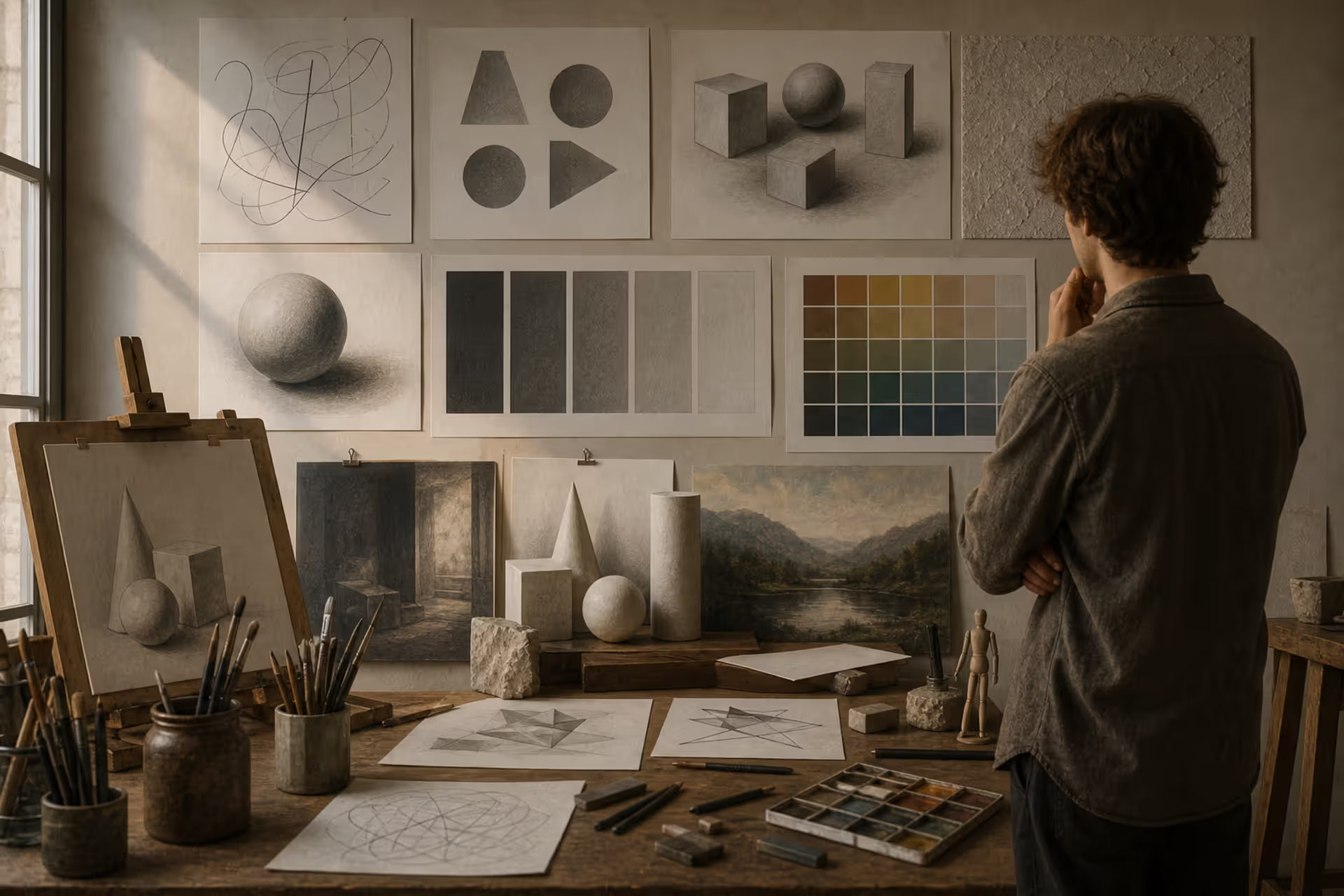
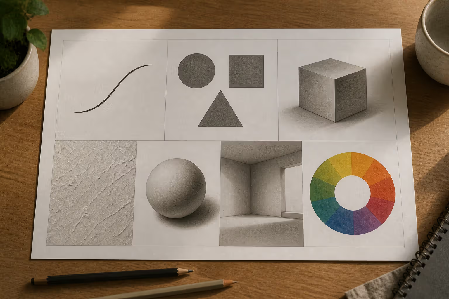
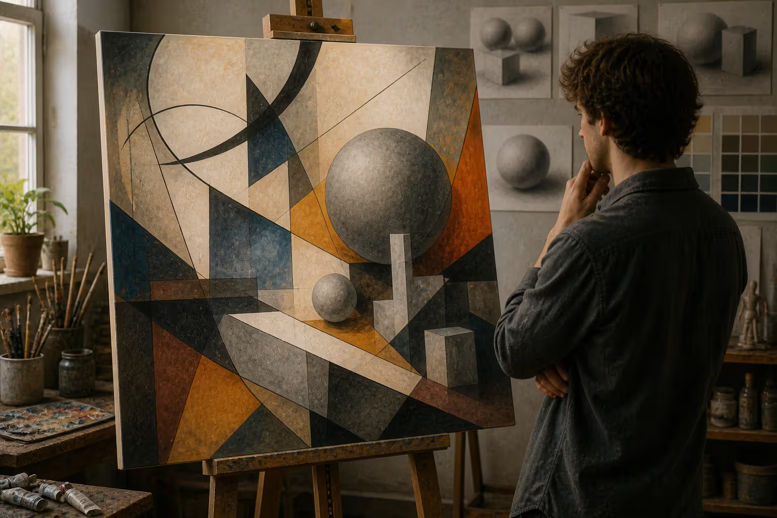
The elements of art definition refers to the fundamental building blocks that artists use to create visual works. Think of them as the vocabulary of visual language—just as letters form words, these basic art elements combine to create meaning, emotion, and impact in paintings, sculptures, photographs, and digital media.
Seven distinct visual elements of art form the foundation: line, shape, form, texture, value, space, and color. This framework emerged from art education reforms in the early 20th century, when educators sought to standardize how students learned to see and create. Before this systematization, apprentices learned through observation and repetition without a common terminology.
Understanding these elements matters for three reasons. First, they give you a shared language to discuss what you see in artwork. Second, they help you diagnose why a composition feels unbalanced or incomplete. Third, they provide a starting point when facing a blank canvas or screen.
The seven-element framework isn't arbitrary. Each element addresses a different aspect of visual perception. Your eyes naturally detect edges (line), recognize silhouettes (shape), perceive depth (form and space), distinguish lightness from darkness (value), sense surface qualities (texture), and respond to wavelengths (color). Artists manipulate these perceptual triggers deliberately.
The Seven Elements of Art Explained
Line in Art
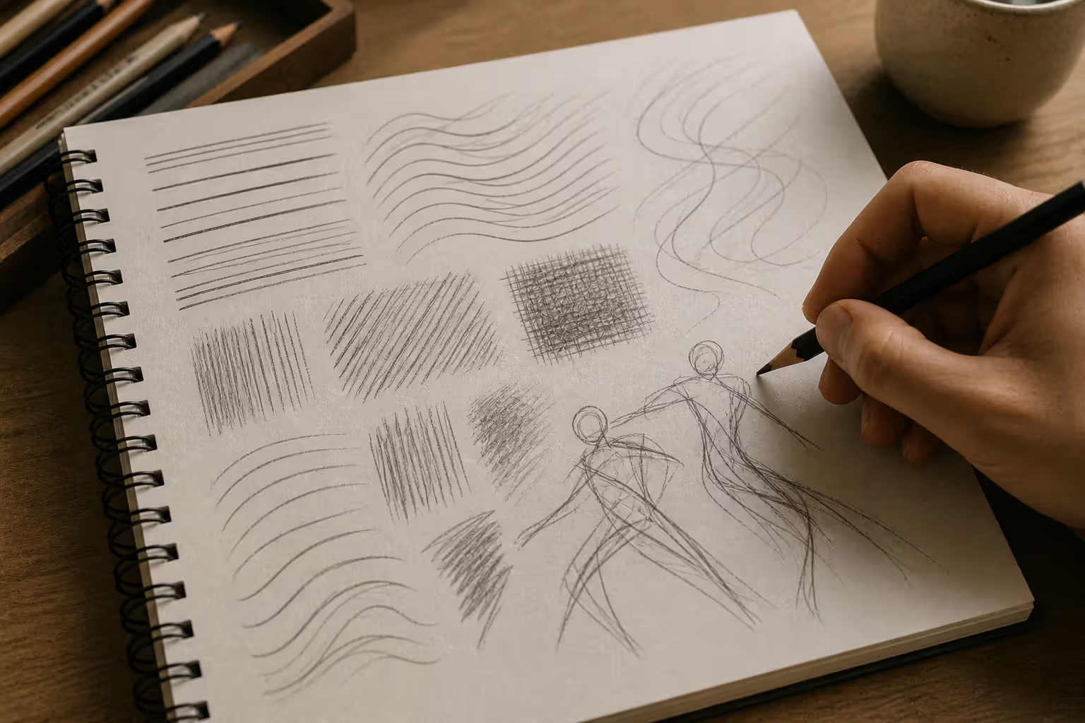
A line is a continuous mark made by a moving point. It sounds simple, but lines carry enormous expressive weight. A jagged line communicates tension or chaos. A flowing curve suggests grace or movement. Horizontal lines feel stable and calm, while vertical lines imply strength or growth.
Lines define boundaries, create patterns, suggest movement, and guide the viewer's eye through a composition. In Leonardo da Vinci's sketches, rapid gestural lines capture motion and energy. In contrast, the precise contour lines in Japanese woodblock prints create clarity and elegance.
Author: Marcus Ellery;
Source: crafterholic.com
Artists categorize lines several ways: actual lines (visible marks) versus implied lines (suggested by aligned elements); contour lines (outlining shapes) versus gesture lines (capturing movement); and thick versus thin, straight versus curved. Hatching and cross-hatching use multiple parallel or intersecting lines to build value and texture.
When analyzing artwork, ask: Are the lines organic or geometric? Do they create movement or stability? Are they delicate or bold?
Shape in Art
Shapes are two-dimensional areas with defined boundaries. They have width and height but no depth. The line shape form texture relationship is hierarchical—lines create shapes, and shapes can suggest forms.
Geometric shapes (circles, squares, triangles) feel structured and intentional. Organic shapes (irregular, flowing forms found in nature) feel spontaneous and natural. Abstract shapes don't represent recognizable objects but create visual interest through their relationships.
Positive shapes are the main subjects or objects. Negative shapes are the spaces around and between them. Skilled artists design both simultaneously. The FedEx logo's hidden arrow exists in negative space between letters—a famous example of intentional negative shape design.
Shapes establish composition, create patterns, suggest symbolism, and guide visual hierarchy. Piet Mondrian's compositions use only rectangles and primary colors, proving how much expression simple geometric shapes can carry.
Author: Marcus Ellery;
Source: crafterholic.com
Form in Art
Form adds the third dimension—depth. While shapes are flat, forms have volume and occupy space. A circle is a shape; a sphere is a form. A square is a shape; a cube is a form.
In two-dimensional media like painting, artists create the illusion of form through shading, perspective, and overlapping. Sculptors and architects work with actual three-dimensional forms. The difference between shape and form confuses beginners, but remember: if it looks like you could walk around it or pick it up, you're seeing form.
Forms divide into geometric (spheres, cubes, cylinders, cones, pyramids) and organic (irregular, natural forms like clouds, rocks, or human bodies). Cézanne famously advised painters to "treat nature by means of the cylinder, the sphere, and the cone"—reducing complex organic forms into simpler geometric components.
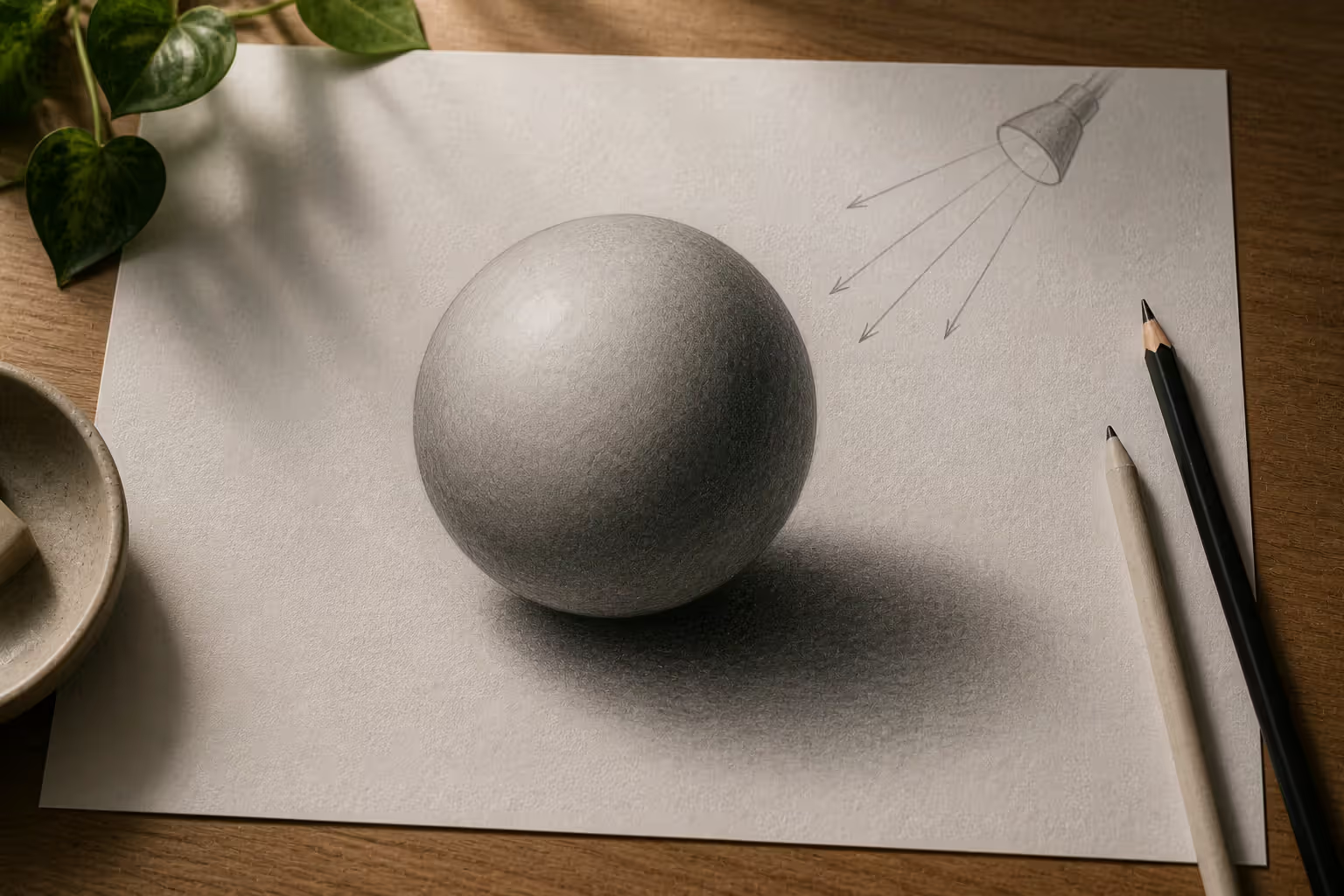
Light reveals form. Without value changes indicating highlights and shadows, a painted sphere looks like a flat circle. This is why value and form work together inseparably.
Texture in Art
Texture describes surface quality—how something feels or appears it would feel if touched. Actual texture (also called tactile texture) exists physically. You can run your fingers over an impasto oil painting and feel the raised brushstrokes. Implied texture (or visual texture) is an illusion created through careful rendering.
Artists create implied texture by manipulating marks, patterns, and value contrasts. A skilled painter can make you "feel" rough tree bark, smooth glass, or soft fabric purely through visual cues. Vincent van Gogh's thick, directional brushstrokes create both actual and implied texture simultaneously—the paint itself has physical texture while also depicting textured subjects.
Texture adds realism, creates visual interest, establishes mood, and provides tactile associations. Smooth textures often feel calm or elegant. Rough textures suggest age, naturalism, or energy. Digital artists use texture brushes and overlays to add this dimension to otherwise flat digital images.
Collage artists exploit actual texture by incorporating fabric, paper, sand, or found objects. Contemporary mixed-media work often emphasizes texture as a primary element rather than a supporting detail.
Value in Art
Value refers to the lightness or darkness of a color or tone. The value in art explained simply: it's the grayscale version of what you see. If you converted a color painting to black-and-white, you'd see its value structure.
Value creates form, establishes depth, generates contrast, sets mood, and controls focus. Many artists consider value the most important element because strong value structure makes artwork readable even with poor color choices, while weak value structure undermines even beautiful color palettes.
The value scale runs from pure white through grays to pure black. Most artists work with at least five distinct values: highlight, light, midtone, shadow, and core shadow. Skilled rendering requires controlling subtle value transitions.
High-value contrast (stark lights against darks) creates drama and clarity. Low-value contrast (similar values) creates subtlety and atmosphere. Caravaggio's dramatic chiaroscuro lighting uses extreme value contrast to create theatrical intensity. In contrast, atmospheric perspective in landscape painting uses progressively lighter values to suggest distance.
Beginners often ignore value, focusing only on color. This creates muddy, unclear compositions. Professional artists frequently create value sketches before beginning finished work, ensuring strong underlying structure.
Author: Marcus Ellery;
Source: crafterholic.com
Space in Art
The space in art definition encompasses both the areas objects occupy (positive space) and the areas around them (negative space). Space also refers to the illusion of depth in two-dimensional work.
Artists manipulate space through overlapping (closer objects block distant ones), size variation (larger objects appear closer), placement (lower objects often seem closer), detail (distant objects have less detail), atmospheric perspective (distant objects appear lighter and bluer), and linear perspective (parallel lines converge toward vanishing points).
Shallow space keeps elements close to the picture plane, creating a flat, decorative quality. Deep space creates the illusion of vast distance, pulling viewers into the composition. Ambiguous space intentionally confuses depth cues, creating visual tension.
Negative space isn't empty—it's an active design element. Japanese aesthetics particularly value ma (negative space), considering it as important as positive forms. The white space around a simple ink brush painting isn't leftover—it's carefully designed to balance the composition.
Three-dimensional artists work with actual space, considering how sculptures interact with their surroundings and how viewers move through installations. Environmental artists like Christo and Jeanne-Claude transformed entire landscapes, making space itself the primary medium.
Color in Art
Color as element of art involves three properties: hue (the color name—red, blue, yellow), value (lightness or darkness), and intensity (brightness or dullness, also called saturation or chroma).
The color wheel organizes hues: primary colors (red, yellow, blue) mix to create secondary colors (orange, green, violet), which combine to make tertiary colors (red-orange, yellow-green, etc.). Complementary colors sit opposite each other on the wheel and create maximum contrast when paired.
Color temperature divides hues into warm (reds, oranges, yellows) and cool (blues, greens, violets). Warm colors advance visually; cool colors recede. This creates spatial effects independent of perspective.
Color carries powerful psychological and cultural associations. Red signals danger or passion in Western contexts but represents luck and prosperity in Chinese culture. Blue feels calm and trustworthy, which is why corporations favor it in branding.
Artists use color to establish mood, create emphasis, suggest space, achieve harmony, and convey symbolism. Henri Matisse's Fauvist paintings use non-naturalistic, intensely saturated colors for emotional impact rather than realistic description. Mark Rothko's color field paintings reduce composition to large areas of subtly interacting hues, making color the sole subject.
Digital designers work in RGB (additive color mixing with light) while painters use subtractive color mixing with pigments. Understanding color theory helps both, but the technical execution differs.
The elements of art are not just academic concepts—they're the tools that transform a simple mark into meaningful communication. Master these, and you master the foundation of all visual thinking.
— Sarah Chen
Elements of Art vs Principles of Art
The elements vs principles of art distinction confuses many students, but the relationship is straightforward: elements are the "what" (the ingredients), and principles are the "how" (the recipe). Elements are the raw materials; principles describe how to arrange them effectively.
Category
Name
Definition
Example in Art
Element
Line
A continuous mark or implied connection between points
Contour lines defining figures in Picasso's line drawings
Element
Shape
A two-dimensional area with defined boundaries
Geometric shapes in Mondrian's "Composition with Red, Blue, and Yellow"
Element
Color
Hue, value, and intensity of light wavelengths
Vibrant complementary colors in Van Gogh's "The Night Café"
Principle
Balance
Distribution of visual weight creating stability or tension
Symmetrical balance in Leonardo's "The Last Supper"
Principle
Contrast
Juxtaposition of opposing elements to create visual interest
Value contrast in Rembrandt's dramatic lighting
Principle
Emphasis
Creating a focal point that draws primary attention
The red-cloaked figure in Bruegel's "Hunters in the Snow"
Principle
Movement
Guiding the viewer's eye through the composition
Spiraling composition in Hokusai's "The Great Wave"
Principle
Pattern
Repetition of elements creating rhythm and unity
Repeated motifs in Islamic geometric tile work
Principle
Unity
Harmonious relationship among all parts
Consistent color palette creating cohesion in Monet's "Water Lilies" series
This art fundamentals guide framework helps you analyze any artwork systematically. First, identify which elements are present and dominant. Then examine how the principles organize those elements into effective composition.
You can't apply principles without elements. You can't create emphasis without having something (an element) to emphasize. You can't achieve balance without having forms, colors, or values to balance. Elements are nouns; principles are verbs.
How Artists Combine Visual Elements
Understanding individual elements matters less than recognizing how they interact. Masterful artwork orchestrates multiple visual elements of art simultaneously, creating effects no single element could achieve alone.
Consider Grant Wood's "American Gothic" (1930). Line creates the rigid vertical pitchfork and architectural details, reinforcing the subjects' stern demeanor. Geometric shapes in the house's Gothic window echo the pitchfork's triangular form. Form is rendered through careful value gradations on faces and clothing. Texture appears in the man's denim overalls and the woman's rickrack trim. Value contrast between the dark figures and lighter background creates emphasis. Space is relatively shallow, keeping figures close to the picture plane. Color is muted and earthy, supporting the serious, rural mood.
Each element reinforces the others. The vertical lines wouldn't feel as rigid without the geometric shapes echoing them. The somber mood depends on both the muted color palette and the controlled value range. Remove any single element, and the composition weakens.
Contemporary digital design applies the same principles. A website homepage might use clean lines to organize content, geometric shapes for buttons, gradients to suggest form, texture overlays for visual interest, value contrast to establish hierarchy, white space to prevent crowding, and brand colors for identity. The elements of visual design in digital media are identical to traditional art—only the tools differ.
Beginners often focus on one element at the expense of others. A student might obsess over getting colors perfect while ignoring value structure, creating a composition with beautiful hues but no clarity. Or they might render texture meticulously but place it in a composition with poor spatial arrangement.
Professional artists think holistically. When adding texture, they consider how it affects value patterns. When choosing colors, they evaluate how temperature influences spatial perception. This integrated thinking separates competent work from exceptional work.
Author: Marcus Ellery;
Source: crafterholic.com
Common Mistakes When Identifying Art Elements
Confusing shape with form. Students frequently describe flat shapes as forms or fail to recognize how shading creates form illusion. Remember: if it's on a flat surface and doesn't appear three-dimensional, it's a shape. If it appears to have volume and depth, you're seeing form (even if it's an illusion).
Ignoring negative space. Most beginners see only positive shapes and objects, treating the space around them as leftover emptiness. Train yourself to see negative space as deliberate design. Squint at artwork or mentally reverse figure and ground—what was background becomes foreground. This reveals whether negative space is intentionally designed or accidentally created.
Overlooking value. Color attracts attention, but value creates structure. A common exercise asks students to create a value study (grayscale version) before adding color. Many discover their composition lacks contrast or has confusing value patterns that color was hiding. If your artwork feels unclear or flat, check your value structure first.
Misunderstanding texture. Beginners sometimes think texture means "detailed" or "realistic." Texture specifically refers to surface quality. A painting can be highly detailed but have minimal texture variation (like a smooth, evenly rendered photograph). Conversely, abstract work can have rich texture with no recognizable details.
Treating color and value as separate. Every color has a value, but many students think about them independently. When choosing colors, always consider their value relationships. Two different colors with identical values create low contrast and may appear to vibrate or merge visually—sometimes desirable, often problematic.
Forgetting line can be implied. Not all lines are visible marks. When objects align, your eye connects them, creating implied lines. These invisible lines direct attention and organize composition just as actual lines do. Missing implied lines means missing major compositional structure.
Assuming all elements must be equally present. Some artwork emphasizes one or two elements while minimizing others. Minimalist compositions might use only value and space, nearly eliminating color, texture, and complex form. That's not wrong—it's a deliberate choice. Not every element needs equal representation.
Frequently Asked Questions About Art Elements
What is the easiest way to remember the seven elements of art?
Use the mnemonic "Lazy Snakes Forget Valuable Space Constantly Texting" for Line, Shape, Form, Value, Space, Color, and Texture. Alternatively, group them logically: the mark-making elements (line, shape, form), the visual qualities (color, value, texture), and the spatial element (space). Creating your own memory device based on personal associations works better than memorizing someone else's list. Some students draw a simple sketch incorporating all seven elements labeled clearly, then reference that image when needed.
How do line, shape, and form differ from each other?
Think dimensionally. Line is one-dimensional—it has length but theoretically no width (though actual drawn lines do have width). Shape is two-dimensional—it has length and width but no depth. Form is three-dimensional—it has length, width, and depth. In practice: a line creates a shape when it connects back to its starting point; a shape becomes a form when shading, perspective, or actual three-dimensional construction adds the illusion or reality of depth. A circle drawn with a single line is still a shape. That same circle with graduated shading to appear spherical represents form.
Why is value considered one of the most important art elements?
Value creates the structure that makes compositions readable. Without sufficient value contrast, viewers can't distinguish figure from ground, identify focal points, or perceive depth. Color attracts attention, but value does the heavy lifting of organizing information. Historical proof: masterful black-and-white photography, charcoal drawings, and ink paintings achieve complete artistic expression without color, relying entirely on value. The reverse isn't true—color without strong value structure produces weak, confusing work. When professional artists troubleshoot failing compositions, they check value relationships first.
Can you create art using only one or two elements?
Absolutely. Minimalist and conceptual artists often work with restricted elements intentionally. A simple pencil contour drawing uses primarily line with minimal value variation. Ellsworth Kelly's monochromatic paintings use shape and color while minimizing line, texture, and form. Richard Serra's massive steel sculptures emphasize form and space while reducing color to raw material tones. These restrictions aren't limitations—they're focused explorations of specific visual phenomena. Beginners benefit from similar exercises: create a composition using only line, then only value, then only shape. This builds understanding of each element's unique capabilities.
How do the elements of art apply to digital design?
Identically to traditional media. Web designers use line (borders, dividers, underlines), shape (buttons, containers, icons), form (shadows and gradients creating dimensional illusion), texture (background patterns, noise overlays), value (contrast for readability and hierarchy), space (white space, padding, margins), and color (brand identity, mood, calls-to-action). The tools differ—CSS instead of brushes, vectors instead of pencils—but the fundamental visual principles remain unchanged. A well-composed painting and a well-designed app both rely on effective element arrangement. Digital designers who study traditional art fundamentals make better visual decisions than those who only learn software.
What is the difference between positive and negative space?
Positive space is occupied by the main subjects or objects—the "things" in your composition. Negative space is everything else—the areas around, between, and behind those objects. The figure-ground relationship describes this. However, the distinction isn't always obvious. In M.C. Escher's tessellations, what appears as positive space (black birds) simultaneously functions as negative space for the white birds, and vice versa. Well-designed compositions treat both as equally important. Poor compositions fill positive space carefully but leave negative space as unconsidered leftovers, creating awkward, unbalanced results. Practice drawing negative space directly—outline the spaces between objects rather than the objects themselves—to train your eye to see both simultaneously.
The elements of art provide a universal language for creating and discussing visual work. Whether you're analyzing a Renaissance masterpiece, designing a mobile app, or teaching a child to draw, these seven fundamental components—line, shape, form, texture, value, space, and color—form the foundation of all visual communication.
Mastery doesn't mean memorizing definitions. It means training your eye to recognize how elements interact, understanding the trade-offs between different choices, and developing intuition about which elements to emphasize for specific effects. A portrait artist might prioritize value and form to create dimensionality. A graphic designer might emphasize shape and color for immediate impact. An abstract painter might explore texture and space while minimizing recognizable forms.
Start by identifying elements in artwork you encounter daily—advertisements, photographs, architecture, nature. Notice which elements dominate and which recede. Then experiment in your own work, deliberately restricting yourself to explore one or two elements deeply. Create a composition using only line. Then create another using only value. This focused practice builds stronger understanding than trying to master everything simultaneously.
The elements aren't rules to constrain creativity—they're tools to expand it. Understanding how value creates depth gives you control over spatial illusion. Recognizing how line quality affects mood lets you fine-tune emotional impact. Seeing negative space as an active design element opens new compositional possibilities.
Every visual decision you make involves these elements, whether consciously or not. Making those choices deliberately, with full awareness of how each element functions and interacts, transforms accidental success into repeatable skill.
Modernism transformed 20th-century art and design by rejecting historical tradition and ornament in favor of rationalism, functionalism, and industrial aesthetics. Learn about its origins in industrialization, key philosophical ideas, influence on visual culture, and lasting legacy.
Visual language uses color, shape, typography, and imagery to communicate ideas instantly. Discover how visual elements function as a communication system, how semiotics creates meaning in design, and how to apply graphic communication principles across media effectively.
Discover how mathematical proportions like the golden ratio (1.618), rule of thirds, and aspect ratios create visual balance in design. Learn practical applications, compare popular ratio systems, and avoid common mistakes when applying proportional design principles to logos, layouts, and interfaces.
Proximity gestalt describes how the brain groups nearby visual elements automatically. This guide explains the psychology behind the proximity principle, demonstrates practical spacing strategies, compares proximity with other Gestalt laws, and provides actionable best practices for designers.
The content on this website is provided for general informational and educational purposes only. It is intended to explain concepts related to digital design, visual art, color theory, art techniques, design principles, and design history.
All information on this website, including articles, guides, and examples, is presented for general educational purposes. Creative outcomes may vary depending on individual skill, tools, and practice.
This website does not provide professional design services or guarantee results, and the information presented should not be used as a substitute for formal education or professional consultation.
The website and its authors are not responsible for any errors or omissions, or for any outcomes resulting from decisions made based on the information provided on this website.