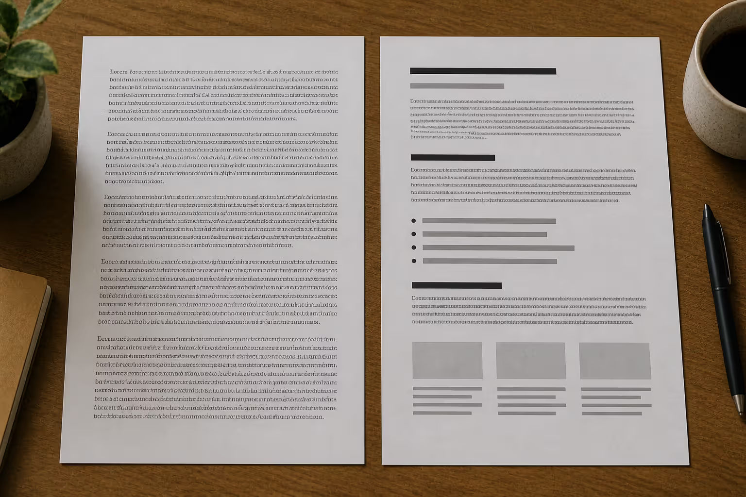
Ever landed on a website where the text made your eyes hurt? Where you couldn't tell headlines from body copy, or the font was so fancy you gave up reading? That's bad typography in action—and it's costing businesses thousands in lost conversions every day.
Typography isn't just about picking pretty fonts. It's the architecture of information. When done right, you don't notice it. When done wrong, it's all you can notice.
What Makes Typography Bad
Here's the thing about typography: it should be invisible. The moment readers start thinking about the fonts instead of the content, something's broken.
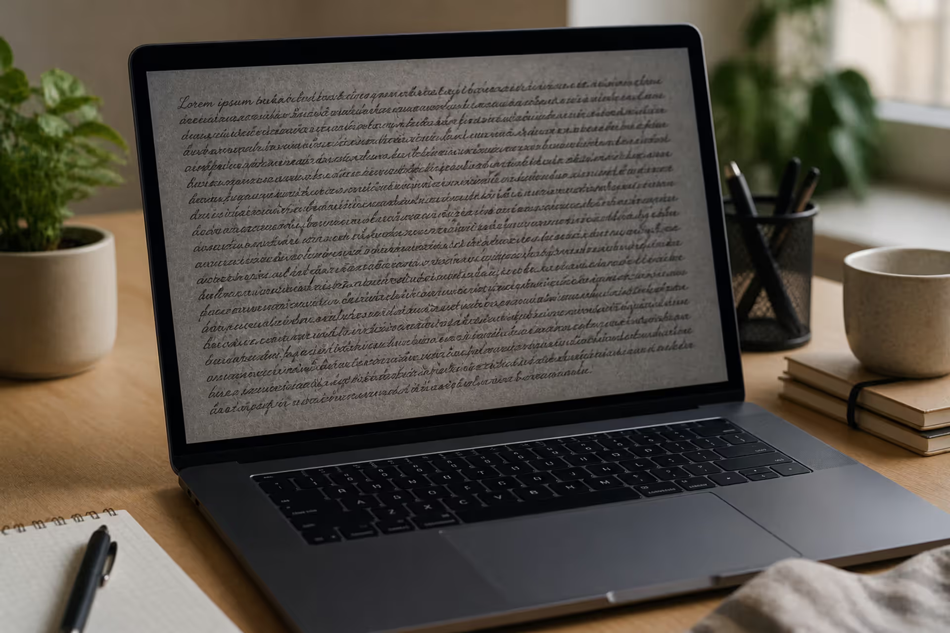
Bad typography happens when your type decisions get between readers and your message. You've picked the wrong tool for the job. Maybe you've chosen a delicate script font for legal disclaimers (good luck reading that). Or you've crammed lines so close together that sentences blur into striped wallpaper.
Three core measures tell you if typography works:
Readability answers whether people can distinguish individual letters and words. Can someone actually decode "rn" versus "m" in your chosen typeface? Can they tell apart similar characters like I, l, and 1?
Legibility goes deeper—it's about stamina. Sure, readers can parse your 200-word paragraph set in 11-point Decorativa Ultra Thin, but will they want to? Or will they bail after the second line because their eyes are working overtime?
Context match considers whether your font speaks the same language as your content. A punk rock concert poster set in Times New Roman? That's a context mismatch. So is a children's hospital website in harsh industrial typefaces.
Real-world impacts are brutal. Microsoft's usability research found that readers abandon web pages with poor typography 38% faster than well-designed alternatives. Eye-tracking studies from the Nielsen Norman Group show that improper spacing forces readers to backtrack 2-3 times per paragraph. For e-commerce, Adobe discovered that unclear call-to-action button text reduces conversions by up to 72%.
Author: Adrian Lowell;
Source: crafterholic.com
The evaluation checklist is straightforward: Can someone with moderately impaired vision read this? Does your text maintain 4.5:1 contrast ratio with the background (WCAG minimum)? Can readers scan a page and immediately understand what's important? If you're answering "no" or "I'm not sure," you've got typography problems.
Poor Font Choices That Ruin Design
Font selection separates designers who understand their craft from those who just like pretty things. The wrong typeface screams "amateur hour" before anyone reads a single word.
Think about those restaurants using Papyrus for their menus. Or medical offices with Comic Sans on their appointment cards. These aren't just aesthetic missteps—they're credibility killers. A 2019 study from the Design Management Institute showed that businesses with poor typography choices were rated 43% less trustworthy by consumers, even when the actual content was identical to professionally-typeset alternatives.
Context mismatches happen constantly. Investment firms using playful rounded fonts. Tech startups choosing ornate Victorian serifs. Dating apps set entirely in condensed corporate typefaces. Each mismatch creates cognitive dissonance—the visual language contradicts the verbal message.
Accessibility violations represent another category of poor choices. Fonts with stroke weights below 300 (extra light or thin weights) fail WCAG standards for body text. Typefaces where "cl" looks identical to "d" create barriers for readers with dyslexia. All-caps text set in fonts without proper letterspacing exhausts everyone.
Author: Adrian Lowell;
Source: crafterholic.com
When Decorative Fonts Backfire
Display fonts exist for specific jobs: mastheads, logos, posters, short bursts of attention-grabbing text. They're specialists, not generalists.
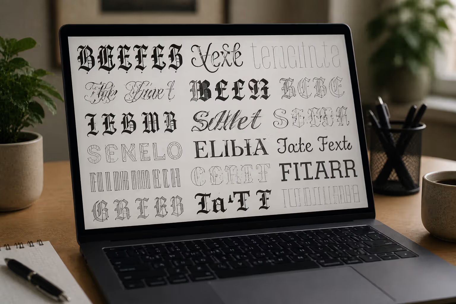
The problems start when someone discovers Bleeding Cowboys or Lobster or Brush Script and thinks "this looks amazing—let's use it everywhere!" Suddenly you've got body paragraphs, navigation menus, form labels, and button text all set in fonts designed for 72-point headlines.
Over-decorative fonts create three specific failures. First, they tank reading speed—studies show decorative fonts reduce reading velocity by 15-40% compared to standard text faces. Your brain burns extra calories decoding unfamiliar letterforms instead of processing meaning.
Second, they massacre scannability. Users spend 80% of their time scanning rather than reading, according to F-pattern eye-tracking research. Decorative fonts with irregular rhythm and unusual letterforms make scanning nearly impossible.
Third, they collapse at small sizes. That ornate wedding script with delicate swirls and elegant flourishes? At 16 pixels on an iPhone, it's an illegible blob. Professional decorative fonts include guidance like "for display use only—not suitable below 24pt." Beginners ignore these warnings and wonder why their text looks terrible.
I've seen portfolios where designers used eight different display fonts on a single page, each screaming for attention, creating complete visual anarchy. One client proudly showed me a website with body text set in a distressed grunge typeface—550 words of sandblasted, paint-splattered letters. Reading it felt like optical torture.
Font Legibility Problems
Legibility gets confused with readability, but they're different beasts. Readability means you can technically identify letters. Legibility means you can do it comfortably for more than thirty seconds.
Some fonts optimize for short bursts—signage, headlines, labels. Others excel at long-form comfort. Mix them up and you're fighting your own design.
Common legibility killers include insufficient x-height (the height of lowercase letters like "x" relative to capitals). Fonts with tiny x-heights look anemic even at decent point sizes. Georgia has a large x-height (great for screen reading). Garamond has a smaller x-height (beautiful in print, trickier on screens).
Uneven stroke weight creates the "dancing text" effect where some letters look darker than others. This happens with poorly-designed free fonts that lack professional optical adjustments. Your eyes perceive uneven color across the text block—some words appear bolder, disrupting reading rhythm.
Screen rendering issues plague web typography especially. Fonts without proper hinting (mathematical instructions for pixel-perfect screen rendering) look blurry, jagged, or inconsistent across browsers. What looks crisp in Chrome might blur in Firefox, or render with awkward spacing in Safari.
Illegible font combinations multiply these problems. Pairing a font with large x-height to one with small x-height creates visual confusion—the lowercase letters appear completely different sizes even at the same point setting. Mixing fonts with different optical centers (where the visual weight sits) produces an unbalanced, tipsy appearance.
Spacing Mistakes That Break Readability
You could pick the world's perfect font and still ruin everything with bad spacing. Letter spacing, line spacing, and breathing room around text blocks determine whether typography sings or screeches.
Letter spacing divides into tracking (overall spacing across words and paragraphs) and kerning (spacing between specific letter pairs like AV, WA, or To). Mess up either one and readability craters.
Excessive tracking—spreading letters too far apart—breaks word recognition. We read words as shapes, not individual letters. When you space letters too generously, readers must reconstruct each word letter by letter. Research from MIT's AgeLab found that tracking beyond 5% of character width reduces reading speed by 12-20%.
Tight tracking creates the opposite problem: letters crash into each other, forming dark blotches that interrupt flow. All-caps text suffers especially because capital letters have more angular shapes that collide. "WAREHOUSE" set with tight tracking looks like "W AREHOUSE" with a weird gap, or worse, the letters blur together into visual mush.
Kerning problems show up in letter combinations. Professional fonts include thousands of kerning pairs—adjustments for specific combinations. Budget fonts or improperly-licensed web fonts often skip these refinements. You get weird gaps in "Yo" or collisions in "ff" that look sloppy.
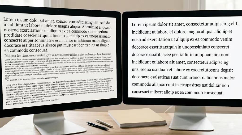
Leading errors—that's the vertical space between text lines—probably destroy more designs than any other single mistake. Too little leading and your descenders (the tails on g, j, p, q, y) almost touch the ascenders (the stems on b, d, f, h, k, l, t) on the line below. Text becomes a dense thicket.
Author: Adrian Lowell;
Source: crafterholic.com
The traditional guidance suggests 120-145% of font size for body text leading. That's your starting point, not your answer. Line length matters hugely—short lines (40-50 characters) tolerate tighter leading. Long lines (90+ characters) need generous leading or readers lose their place jumping from line end to line start.
X-height affects required leading too. Fonts with large x-heights (like Verdana or Tahoma) need more leading because the letters occupy more vertical space. Fonts with small x-heights (like Garamond) can work with tighter leading.
I once reviewed a financial report where someone set 95 lines per page in 10-point type with 11-point leading. That's 110% leading—technically readable, actually excruciating. Each page felt claustrophobic. Readers couldn't track from line to line without their place slipping.
Margins and padding create breathing room. Text crammed against edges triggers anxiety—humans need white space to process information comfortably. The Baymard Institute found that inadequate padding around text increased reading time by 23% and comprehension errors by 38%. Your brain needs rest stops between dense information clusters.
Typography Hierarchy Errors
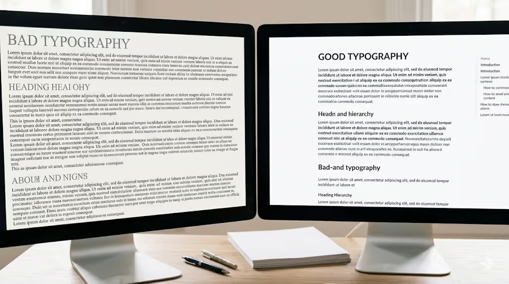
Visual hierarchy tells readers what matters most and what to read next. When hierarchy fails, everything becomes equally important—which means nothing is important.
Hierarchy depends on contrast. Size contrast, weight contrast, spacing contrast, sometimes color contrast. Remove enough contrast and hierarchy vanishes, leaving readers stranded in a sea of undifferentiated text.
Inconsistent heading styles wreck hierarchy fast. When H2 headings vary randomly—20-point bold in one section, 18-point semibold in another, 22-point regular elsewhere—readers lose the structural map. They can't tell if sections are equal weight or nested hierarchies.
I reviewed a 40-page white paper once where the designer used seventeen different heading treatments. Seventeen! Some H2s were larger than H1s. Some H3s matched body text exactly except for color (terrible for accessibility). The document had no navigational logic whatsoever.
Insufficient contrast between levels creates invisible hierarchy. Body text at 16 points, headings at 17 points—that's a 6% size difference. Imperceptible. Human vision needs roughly 20% difference to perceive distinct hierarchy levels. That means 16-point body text needs 19-point minimum for subheads, realistically 20-22 points to feel clearly different.
Weight contrast suffers similar problems. Regular weight body text paired with medium weight headings provides marginal distinction. You need regular-to-bold or regular-to-heavy for obvious differentiation. Some designers use light weight for body and regular for headings—better than nothing but backwards from conventional hierarchy where headings carry more visual weight.
Poor size relationships invert hierarchy entirely. Pull quotes larger than main headlines. Captions matching body text size. Footnotes printed in the same size as subheads. Each relationship violation confuses readers about information priority.
Typography hierarchy failures often stem from timidity—designers afraid to make bold enough choices. They nudge sizes up by single points, add spacing in tiny increments, make headings slightly bolder but not dramatically so. The result looks tentative, unsure of itself.
Professional approach: establish a type scale before designing anything. Choose 4-6 sizes with clear mathematical relationships. Common ratios include 1.25 (major third), 1.333 (perfect fourth), 1.5 (perfect fifth), or 1.618 (golden ratio). If body text is 16px, a 1.5 ratio gives you 24px, 36px, and 54px for ascending heading levels—obvious, harmonious differences.
Author: Adrian Lowell;
Source: crafterholic.com
Font Pairing Failures
Combining multiple typefaces offers sophistication opportunities and disaster potential in equal measure. Font pairing mistakes range from subtle disharmony to screaming visual chaos.
The pairing paradox: fonts must be similar enough to feel coherent, different enough to justify using both. Too similar and people wonder why you bothered with two fonts. Too different and the design feels like a ransom note assembled from magazine cutouts.
Incompatible combinations happen when typeface personalities clash. Geometric sans-serifs (like Futura or Gotham with their perfect circles and uniform strokes) paired with calligraphic scripts creates whiplash. The geometric font screams "modernist precision!" while the script whispers "handcrafted warmth!" Unless you're deliberately contrasting those concepts, the pairing just feels confused.
Structural conflicts cause subtler problems. Pairing a narrow condensed font with an extended wide font creates awkward rhythm. Mixing fonts with different stress angles (the tilt of curved strokes—compare Garamond's old-style angled stress to Bodoni's vertical stress) produces disharmony your eye registers even if you can't articulate why it feels wrong.
Too many fonts in one design remains the most obvious amateur tell. Every additional typeface increases visual complexity exponentially. Two fonts can feel sophisticated. Three fonts demands serious justification and careful handling. Four or more fonts is almost never appropriate outside deliberately eclectic designs like concert posters or vintage-inspired layouts.
I consulted for a startup whose founding designer had used nine different fonts on their homepage. Nine! Headings, subheads, body text, buttons, navigation, footer, testimonials, feature callouts, and special offers each got unique typefaces. The page looked like a typography sample book, not a coherent brand experience.
Conflicting personalities create messaging problems. Every font carries historical and cultural baggage. Copperplate Gothic suggests formal engraving and official documents. Brush Script evokes 1950s casual advertising. Helvetica reads as neutral corporate modernism. Pair Copperplate headlines with Brush Script body text and you're sending mixed signals about formality, era, and purpose.
Insufficient contrast in pairings—the too-similar problem—happens when designers pair two sans-serifs with comparable proportions, or two serifs with similar characteristics. Why use both? What does the second font accomplish that weight and size variations of the first couldn't? If you can't answer clearly, you're wasting a font slot.
Typography Error
How It Appears
Impact on Readers
Solution Approach
Cramped letter spacing
Text where words seem to collapse together without clear boundaries
Slows word recognition; creates uncomfortable visual tension
Add 0-50 units of tracking for body copy; always test at final output size
Compressed line spacing
Text blocks where lines stack tightly with letters from different lines nearly overlapping
Triggers eye fatigue; users lose position when tracking between lines
Apply line-height of 1.4-1.6 times your font size for comfortable reading
Unclear visual structure
Pages where headings don't stand out distinctly from regular text
Restrict to maximum two fonts; create variety through weights and sizes
How to Fix Common Typography Mistakes
Fixing typography requires methodical review rather than random adjustments. Start with an audit, not guesswork.
Document every typographic element in your current design. Font families, weights, sizes, spacing values, colors, line heights—everything. Spreadsheet it. You'll probably discover inconsistencies you never noticed during creation. Five different heading sizes when you meant to use three. Random line-height values. Spacing that varies without reason.
Build your type scale next—a limited palette of sizes with intentional relationships. The scale prevents random size choices and ensures appropriate hierarchy contrast.
Mathematical ratios create harmonious scales. Choose a base size (typically 16px for web body text) and a multiplier:
1.25 ratio (major third): 16px, 20px, 25px, 31px, 39px
1.333 ratio (perfect fourth): 16px, 21px, 28px, 37px, 50px
1.5 ratio (perfect fifth): 16px, 24px, 36px, 54px, 81px
1.618 ratio (golden ratio): 16px, 26px, 42px, 68px, 110px
Pick one ratio and stick with it. You now have 4-5 sizes that mathematically harmonize while providing clear differentiation.
Testing matters more than most designers realize. Typography that looks perfect at 200% zoom in Figma might be illegible on an actual iPhone. Print materials must be evaluated as physical prints—ink on paper behaves differently than pixels on screens. Web typography demands testing across Chrome, Firefox, Safari, and Edge since rendering engines handle fonts differently.
For accessibility compliance, run contrast checkers on every text element. WebAIM's tool is free and instant—paste in your text color and background color, get immediate WCAG conformance results. Anything below 4.5:1 for body text fails accessibility standards and needs adjustment.
Readability analyzers evaluate line length (45-75 characters optimal for body text), leading relative to font size, and other readability factors. Hemingway Editor, though designed for writing clarity, highlights dense paragraphs that might need typographic adjustment.
Spacing corrections: Enable baseline grids in your design tool to maintain consistent leading throughout. Create paragraph styles with locked spacing values so nothing drifts. For all-caps text, add 5-15% more tracking than sentence case—capital letters need extra breathing room.
Hierarchy repairs: Define exactly three to four heading levels maximum. Combine size, weight, and spacing for unmistakable distinctions. Test by squinting—hierarchy should remain obvious when everything's slightly blurred.
Font pairing improvements: Start with superfamilies like Merriweather (with serif and sans versions designed together) or FF Meta Serif/Sans. These eliminate pairing guesswork since the designer already solved harmony problems. When pairing unrelated fonts, choose obvious structural differences (serif/sans-serif) while matching proportions or x-heights for coherence.
Poor font choice replacements: Swap decorative fonts in body text for professional text faces—Georgia, Merriweather, or Lora for serif options; Open Sans, Inter, or Source Sans for sans-serif. Reserve decorative choices exclusively for large-size headlines. Verify complete character sets (numbers, punctuation, accented characters) before committing.
Before-and-after documentation teaches more than any tutorial. Screenshot your design before corrections. Make adjustments. Screenshot again. Compare side-by-side. You'll train your eye to spot problems faster next time.
Typography needs to be audible. Typography needs to be felt. Typography needs to be experienced.
— Helmut Schmid
Frequently Asked Questions About Typography Mistakes
What is the most common typography mistake beginners make?
Weak hierarchy tops the list—beginners make changes too subtle to register. They'll use 16-point body text with 18-point headings, or regular weight versus book weight (slightly heavier regular). These tiny differences are imperceptible to readers. Professional typography requires obvious jumps: body text at 16px needs headings at 28px minimum, ideally 32-36px. Weight differences should be regular-to-bold, not regular-to-medium. The beginner mistake stems from fear of going "too big" or "too bold." Start by exaggerating, then scale back if truly necessary. You'll find that what feels too extreme to you often reads as appropriately clear to users.
How does bad typography affect website conversion rates?
Dramatically and measurably. Baymard Institute's e-commerce research found that illegible call-to-action buttons reduce clicks by 62-79% compared to clearly readable alternatives. If users can't confidently read "Add to Cart" or "Subscribe Now," they simply don't click. Google's HEART metrics showed that sites with poor readability increased task completion time by 47% and error rates by 33%, both of which correlate with abandonment. The financial impact compounds: readable typography doesn't just look professional, it directly guides users toward conversion actions while building trust through polish. One of my clients increased email signups by 34% just by increasing their form button text from 14px to 18px and improving contrast—no other changes.
Can you use more than two fonts in one design?
Technically yes, practically risky. Most professional work uses two fonts—one for display (headlines, UI elements) and one for text (body copy, captions). A third font might work for specialized elements like pull quotes, code samples, or branded callouts, but only when it serves clear functional purpose distinct from your primary pair. Using four or more fonts almost never makes sense outside intentionally eclectic contexts (music posters, art-directed editorials, vintage reproductions). Before adding a third font, explore the full range of your existing choices: different weights, italic versions, size variations, spacing adjustments. Often you'll find that one well-chosen font family offers enough variety for sophisticated hierarchy without additional typefaces.
What is the difference between kerning and leading?
Kerning adjusts horizontal spacing between specific letter pairs, while leading controls vertical spacing between text lines. Kerning solves micro problems—when "AV" has too much space between the letters because of their shapes, or "To" looks awkwardly gapped. Most fonts include kerning tables with hundreds or thousands of pair adjustments. Designers typically adjust kerning manually for headlines and logos rather than body text. Leading (named for lead strips typesetters once used) affects readability over extended reading. Too little leading and text becomes a cramped stripe pattern. Too much leading and lines feel disconnected, forcing readers to work harder tracking from line to line. Both affect rhythm, but kerning works at the character level while leading works at the line level.
How do you know if your font pairing works?
Run three quick tests. First, the distinction test: set a sample paragraph with your pairing and confirm that readers immediately recognize headings versus body text without conscious thought. If there's any hesitation or confusion, your pairing lacks sufficient contrast. Second, the harmony test: do the fonts share something—similar proportions, comparable x-heights, related historical origins, or compatible stroke modulation—that creates visual family resemblance despite their differences? Third, the context test: do both fonts suit your project's purpose and audience? A pairing might be technically sound but contextually wrong (like Blackletter and Comic Sans for a tech startup—they contrast clearly but both are inappropriate). Set real content at actual sizes, then evaluate. If you're squinting or second-guessing, keep searching.
Are decorative fonts ever appropriate to use?
Absolutely, within strict boundaries. Decorative fonts excel for logos, event posters, book covers, magazine mastheads, and short headline treatments where personality matters more than reading comfort. The restrictions: use them for small text amounts (ideally 1-5 words), display them at large sizes (36px minimum, often 72px+), and never apply them to body text or interface elements that require extended reading. A wedding invitation can feature gorgeous calligraphic scripts for the couple's names while using a readable serif for details like time and location. A concert poster might use aggressive display type for the band name but switch to clean sans-serif for venue information. Professional designers test decorative fonts rigorously at intended sizes before committing—what looks stunning at 144px often becomes illegible at 24px.
Typography mistakes follow predictable patterns, which means they're completely avoidable with the right knowledge and systematic approach. Poor font choices, spacing errors, weak hierarchy, and clumsy pairings all trace back to specific misunderstandings about how typography functions.
Better typography starts with systematic thinking instead of aesthetic guessing. Establish your type scale, spacing standards, and font selection criteria before touching design tools. Test everything at actual output sizes and real usage contexts—never trust how typography looks at 200% zoom in your design software.
Remember that every typography decision either helps or hinders communication. There's no neutral typography. Decorative fonts have legitimate uses, just not in body paragraphs. Spacing might seem like finicky detail work, but it determines whether readers engage comfortably or bail after two sentences. Hierarchy might be invisible when executed well, but its absence creates confusion that drives people away.
The encouraging news: typography skills improve rapidly with deliberate practice. Start identifying mistakes in designs you encounter daily—websites, emails, printed materials, apps. Analyze why certain typography succeeds while other examples fail. Build a reference collection of effective typography to consult during your own projects. Over time, recognizing and avoiding typography errors becomes intuitive rather than analytical.
Professional typography doesn't require expensive software licenses or years of design school. It requires understanding principles that make text readable, accessible, and appropriate for context. Master spacing fundamentals, establish clear hierarchy, choose fonts that serve your message rather than your ego, and pair them with intention. These core skills, applied consistently, transform typography from an obstacle into an advantage that elevates every design project you touch.
Modernism transformed 20th-century art and design by rejecting historical tradition and ornament in favor of rationalism, functionalism, and industrial aesthetics. Learn about its origins in industrialization, key philosophical ideas, influence on visual culture, and lasting legacy.
Visual language uses color, shape, typography, and imagery to communicate ideas instantly. Discover how visual elements function as a communication system, how semiotics creates meaning in design, and how to apply graphic communication principles across media effectively.
Discover how mathematical proportions like the golden ratio (1.618), rule of thirds, and aspect ratios create visual balance in design. Learn practical applications, compare popular ratio systems, and avoid common mistakes when applying proportional design principles to logos, layouts, and interfaces.
Proximity gestalt describes how the brain groups nearby visual elements automatically. This guide explains the psychology behind the proximity principle, demonstrates practical spacing strategies, compares proximity with other Gestalt laws, and provides actionable best practices for designers.
The content on this website is provided for general informational and educational purposes only. It is intended to explain concepts related to digital design, visual art, color theory, art techniques, design principles, and design history.
All information on this website, including articles, guides, and examples, is presented for general educational purposes. Creative outcomes may vary depending on individual skill, tools, and practice.
This website does not provide professional design services or guarantee results, and the information presented should not be used as a substitute for formal education or professional consultation.
The website and its authors are not responsible for any errors or omissions, or for any outcomes resulting from decisions made based on the information provided on this website.